Code
library(tidyverse)

knitr::opts_chunk$set(echo = TRUE, warning=FALSE, message=FALSE)library(tidyverse)
knitr::opts_chunk$set(echo = TRUE, warning=FALSE, message=FALSE)Today’s challenge is to
read in a dataset, and
describe the dataset using both words and any supporting information (e.g., tables, etc)
I read in the railroad_2012_clean_county.csv⭐ Using the read_csv function.
#First I installed the readr function
install.packages("readr")
#Next I loaded the tidyverse library
library(tidyverse)
#open data set
Trains <- read_csv("_data/railroad_2012_clean_county.csv")
Trains
# A tibble: 2,930 × 3
state county total_employees
<chr> <chr> <dbl>
1 AE APO 2
2 AK ANCHORAGE 7
3 AK FAIRBANKS NORTH STAR 2
4 AK JUNEAU 3
5 AK MATANUSKA-SUSITNA 2
6 AK SITKA 1
7 AK SKAGWAY MUNICIPALITY 88
8 AL AUTAUGA 102
9 AL BALDWIN 143
10 AL BARBOUR 1
# … with 2,920 more rowsI chose to analyze the railroad_2012_clean_county.csv data set as a beginner. There are 3 columns in this data set and 2930 rows. The columns values are “state”, “county” and “total_employees”. The state column provides the 2 letter abbreviation for the state in which the railroad data was collected from in 2012.
There were 53 “states” included in this data set, which was 50 states, as well as the District of Columbia, the Armed Forces, and the Armed Forces Pacific. The county column refers to every county in the state that railroad data was collected from, with data from 2930 counties included in the data set. The total_employees column refers to the total number of railroad employees in said county in the year 2012. Data was only collected in the year 2012, meaning that this data set does not show trends over time.
#Determining min, max, median, and mean number of total employees

summarise(Trains, min = min(total_employees), max = max(total_employees), median = median(total_employees), mean = mean(total_employees))
# A tibble: 1 × 4
min max median mean
<dbl> <dbl> <dbl> <dbl>
1 1 8207 21 87.2There was a wide range of total county railroad employees in counties in 2012, with a minimum of 1 employee and a maximum of 8207 employees. The median number of employees was 21 and the mean number of employees was ~87. A few counties with high totals employees in some counties skewed the mean higher than the median.
#Creating a boxplot of total county railroad employees
ggplot(Trains, aes(state,total_employees)) + geom_boxplot() + theme_minimal() + labs(title = "Total County Railroad Employees in 2012")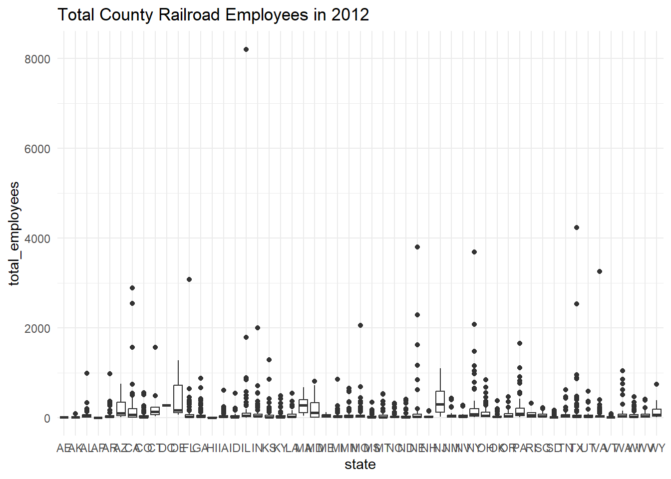
#Finding IQR of total employees
summarise(Trains, IQR= IQR(total_employees))
# A tibble: 1 × 1
IQR
<dbl>
1 58#removing outlier from Trains
Outlier_free_trains <- Trains %>%
filter(total_employees<8200) %>%
arrange(total_employees)
Outlier_free_trains# A tibble: 2,929 × 3
state county total_employees
<chr> <chr> <dbl>
1 AK SITKA 1
2 AL BARBOUR 1
3 AL HENRY 1
4 AP APO 1
5 AR NEWTON 1
6 CA MONO 1
7 CO BENT 1
8 CO CHEYENNE 1
9 CO COSTILLA 1
10 CO DOLORES 1
# … with 2,919 more rows#Calculating summary statistics with outlier removed
summarise(Outlier_free_trains, outlier_free_min = min(total_employees), outlier_free_max = max(total_employees), outlier_free_median = median(total_employees), outlier_free_mean = mean(total_employees))# A tibble: 1 × 4
outlier_free_min outlier_free_max outlier_free_median outlier_free_mean
<dbl> <dbl> <dbl> <dbl>
1 1 4235 21 84.4Looking at the above box-plot, the maximum of 8027 total employees looks like a visual outlier. To confirm, I calculated the IQR was 58 employees. From running summary statistics, I know that Q1 is 7 employees and Q3 is 65 employees. Using the rule that Q3 + 1.5(IQR) is the threshold for upper outliers, which equals 152 employees, the maximum value of 8,207 employees meets the criteria for outlier. However, removing this point from the data would not change the median from 21 employees and would only decrease the mean total employees slightly from ~87 to ~84.4 employees.
#Identifying 10 counties with most total employees
Trains %>%
  arrange(desc(total_employees)) %>%
  slice(1:10)
# A tibble: 10 × 3
state county total_employees
<chr> <chr> <dbl>
1 IL COOK 8207
2 TX TARRANT 4235
3 NE DOUGLAS 3797
4 NY SUFFOLK 3685
5 VA INDEPENDENT CITY 3249
6 FL DUVAL 3073
7 CA SAN BERNARDINO 2888
8 CA LOS ANGELES 2545
9 TX HARRIS 2535
10 NE LINCOLN 2289After seeing visually from the box plot that most counties had lower numbers of total employees, I used the arrange() and slice() functions to identify the counties with the top 10 total railroad employees in 2012. These counties were in the states of IL,TX,NE,NY,VA,FL, and CA.
#Recode `total_employees` using case_when, numerical > categorical
Trains <- Trains %>%
  mutate(Number_employees = case_when(
    total_employees>= 5000 ~ "5000+ employees",
    total_employees>= 2500 & total_employees<5000 ~ "2500-4999 employees",
    total_employees>= 1000 & total_employees<2500 ~ "1000-2499 employees",
    total_employees>= 500 & total_employees<1000 ~ "500-999 employees",
    total_employees>= 100 & total_employees<500 ~ "100-499 employees",
    total_employees <100 ~ "0-99 employees")
  )

#Create table with the recoded values
table(select(Trains, Number_employees))
Number_employees
0-99 employees 100-499 employees 1000-2499 employees 2500-4999 employees
2396 442 18 8
500-999 employees 5000+ employees
65 1 #Create prop.table with recoded values
prop.table(table(select(Trains, Number_employees)))Number_employees
0-99 employees 100-499 employees 1000-2499 employees 2500-4999 employees
0.8177474403 0.1508532423 0.0061433447 0.0027303754
500-999 employees 5000+ employees
0.0221843003 0.0003412969 Lastly, I re-coded the numerical total_employees to the categorical number_employees mutate() and case_when() and created a table and prop.table with these new categorical values. Just as the box_plot suggested, the majority of counties in the data set had fewer than 100 railroad employees in 2012, nearly 82%. Additionally over 95% of counties had less than 500 total employees, and only 9 counties total had more than 2500 total employees.