library(tidyverse)
library(ggplot2)

knitr::opts_chunk$set(echo = TRUE, warning=FALSE, message=FALSE)
Challenge 5
Challenge Overview
Today’s challenge is to:
- read in a data set, and describe the data set using both words and any supporting information (e.g., tables, etc)
- tidy data (as needed, including sanity checks)
- mutate variables as needed (including sanity checks)
- create at least two univariate visualizations
- try to make them “publication” ready
- Explain why you choose the specific graph type
- Create at least one bivariate visualization
- try to make them “publication” ready
- Explain why you choose the specific graph type
R Graph Gallery is a good starting point for thinking about what information is conveyed in standard graph types, and includes example R code.
(be sure to only include the category tags for the data you use!)
Read in data
Read in one (or more) of the following datasets, using the correct R package and command.
- cereal.csv ⭐
- Total_cost_for_top_15_pathogens_2018.xlsx ⭐
- Australian Marriage ⭐⭐
- AB_NYC_2019.csv ⭐⭐⭐
- StateCounty2012.xls ⭐⭐⭐
- Public School Characteristics ⭐⭐⭐⭐
- USA Households ⭐⭐⭐⭐⭐
data = read_csv("../posts/_data/AB_NYC_2019.csv")
data
# A tibble: 48,895 × 16
id name host_id host_…¹ neigh…² neigh…³ latit…⁴ longi…⁵ room_…⁶ price
<dbl> <chr> <dbl> <chr> <chr> <chr> <dbl> <dbl> <chr> <dbl>
1 2539 Clean & … 2787 John Brookl… Kensin… 40.6 -74.0 Privat… 149
2 2595 Skylit M… 2845 Jennif… Manhat… Midtown 40.8 -74.0 Entire… 225
3 3647 THE VILL… 4632 Elisab… Manhat… Harlem 40.8 -73.9 Privat… 150
4 3831 Cozy Ent… 4869 LisaRo… Brookl… Clinto… 40.7 -74.0 Entire… 89
5 5022 Entire A… 7192 Laura Manhat… East H… 40.8 -73.9 Entire… 80
6 5099 Large Co… 7322 Chris Manhat… Murray… 40.7 -74.0 Entire… 200
7 5121 BlissArt… 7356 Garon Brookl… Bedfor… 40.7 -74.0 Privat… 60
8 5178 Large Fu… 8967 Shunic… Manhat… Hell's… 40.8 -74.0 Privat… 79
9 5203 Cozy Cle… 7490 MaryEl… Manhat… Upper … 40.8 -74.0 Privat… 79
10 5238 Cute & C… 7549 Ben Manhat… Chinat… 40.7 -74.0 Entire… 150
# … with 48,885 more rows, 6 more variables: minimum_nights <dbl>,
# number_of_reviews <dbl>, last_review <date>, reviews_per_month <dbl>,
# calculated_host_listings_count <dbl>, availability_365 <dbl>, and
# abbreviated variable names ¹host_name, ²neighbourhood_group,
# ³neighbourhood, ⁴latitude, ⁵longitude, ⁶room_typeBriefly describe the data
The data contains Air BnB listings in New York City from 2019. Each listing has a location, a host with a unique ID, a price rate and information about the place itself.
This data could be used to compare prices of similar listings and even hosts in case some hosts have multiple listings.
Tidy Data (as needed)
Some tidying is needed as there are some N/A values in reviews per month. There are also manually entered NA values in the “data of last review” column, but these are fine to keep in as there actually is no data available.
For reviews_per_month, we just replace NA values with 0. These NA values are caused by there not being any reviews up until this point.
replace_na(data, list(reviews_per_month = 0))# A tibble: 48,895 × 16
id name host_id host_…¹ neigh…² neigh…³ latit…⁴ longi…⁵ room_…⁶ price
<dbl> <chr> <dbl> <chr> <chr> <chr> <dbl> <dbl> <chr> <dbl>
1 2539 Clean & … 2787 John Brookl… Kensin… 40.6 -74.0 Privat… 149
2 2595 Skylit M… 2845 Jennif… Manhat… Midtown 40.8 -74.0 Entire… 225
3 3647 THE VILL… 4632 Elisab… Manhat… Harlem 40.8 -73.9 Privat… 150
4 3831 Cozy Ent… 4869 LisaRo… Brookl… Clinto… 40.7 -74.0 Entire… 89
5 5022 Entire A… 7192 Laura Manhat… East H… 40.8 -73.9 Entire… 80
6 5099 Large Co… 7322 Chris Manhat… Murray… 40.7 -74.0 Entire… 200
7 5121 BlissArt… 7356 Garon Brookl… Bedfor… 40.7 -74.0 Privat… 60
8 5178 Large Fu… 8967 Shunic… Manhat… Hell's… 40.8 -74.0 Privat… 79
9 5203 Cozy Cle… 7490 MaryEl… Manhat… Upper … 40.8 -74.0 Privat… 79
10 5238 Cute & C… 7549 Ben Manhat… Chinat… 40.7 -74.0 Entire… 150
# … with 48,885 more rows, 6 more variables: minimum_nights <dbl>,
# number_of_reviews <dbl>, last_review <date>, reviews_per_month <dbl>,
# calculated_host_listings_count <dbl>, availability_365 <dbl>, and
# abbreviated variable names ¹host_name, ²neighbourhood_group,
# ³neighbourhood, ⁴latitude, ⁵longitude, ⁶room_typeMutate
For our specific use case, this dataset may not need any mutation, as all of the values I’m interested in are in good shape and have been thoroughly tidied up.
Univariate Visualizations
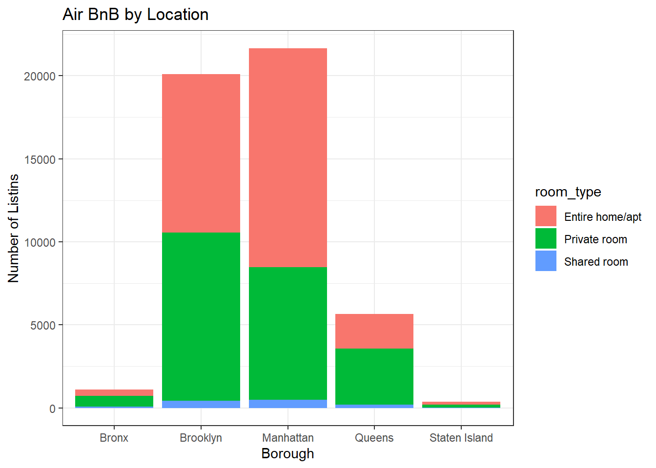
One area of analysis I’m curious about is a breakdown by borough of where the listings are. You might expect Manhattan to have the most, since it attracts the most tourists, but as someone who lives outside of NYC, I’m not sure what to expect for the other boroughs.
ggplot(data, aes(neighbourhood_group, fill = room_type)) + geom_bar() +
  theme_bw() +
  labs(title = "Air BnB by Location ", y = "Number of Listins", x = "Borough")
As expected, Manhatten has the most Air BnB listings, but Brooklyn is a very close second. with Queens having a few and the Bronx and Staten Island having very few.
This graphic also shows us a breakdown of listing count by room type as well. Visually, we can tell that Entire Homes/Apartments make up the majority of listings, but there is another interesting takaway here in that there appears to be a higher proportion of these kind of listings in Manhattan than in other areas.
I chose a bar graph for this data because it’s a good way to prepare counts and because it was easy to also implement the color coded sub neighbourhoods.
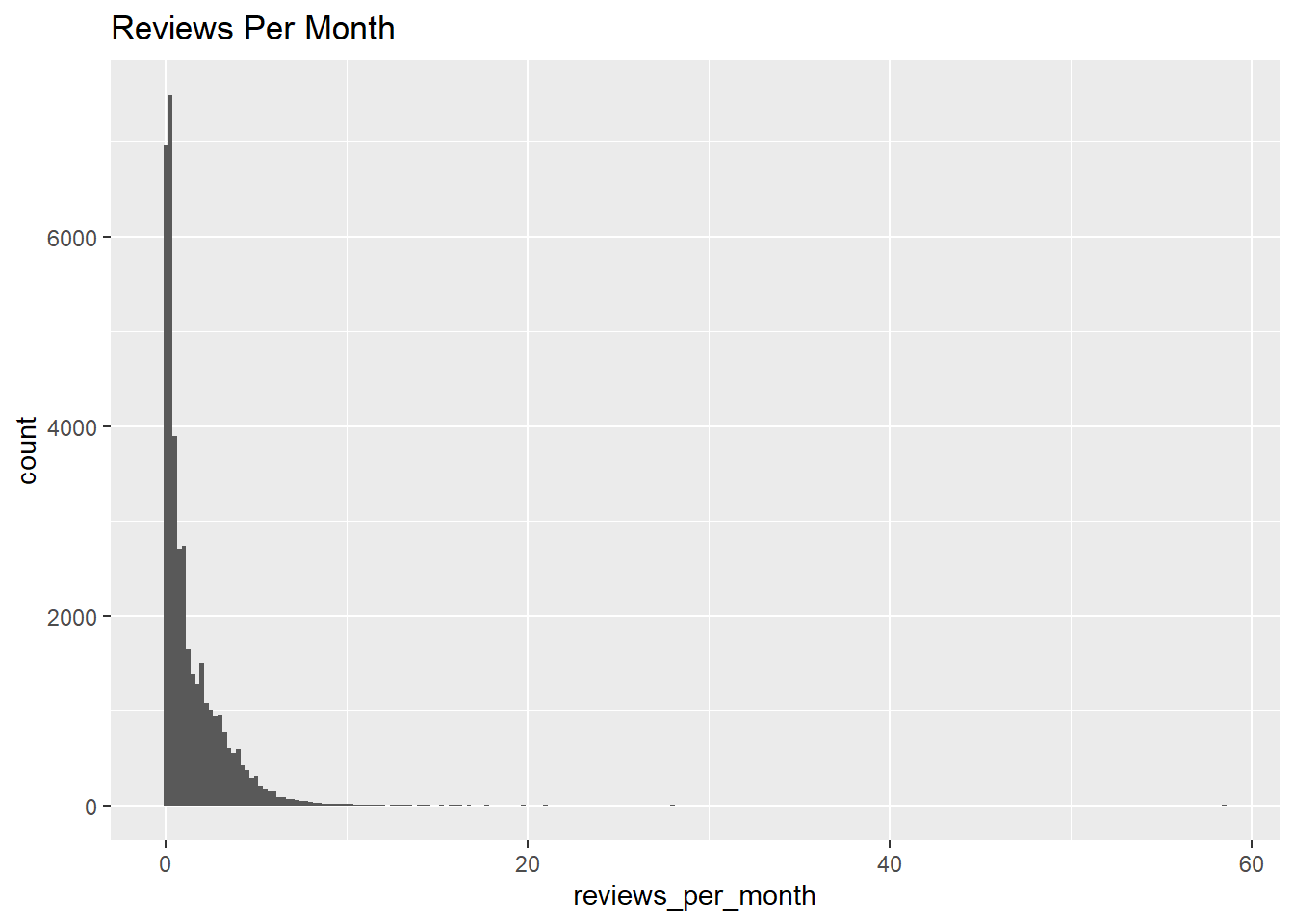
Another plot we might be interested in in reviews per month, which could be a metric of the typical length of stay at different places.
ggplot(data, aes(reviews_per_month), xlim = c(0,10)) +
  geom_histogram(binwidth = .25) +
  labs(title = "Reviews Per Month")
This plot is a histogram showing the distribution of reviews per month. Most listings do not have many per month, but some have upwards of 7 or 8. Most of the listings in NYC are longer term, so this plot makes sense as most won’t be rented out too many times per month.
Bivariate Visualization(s)
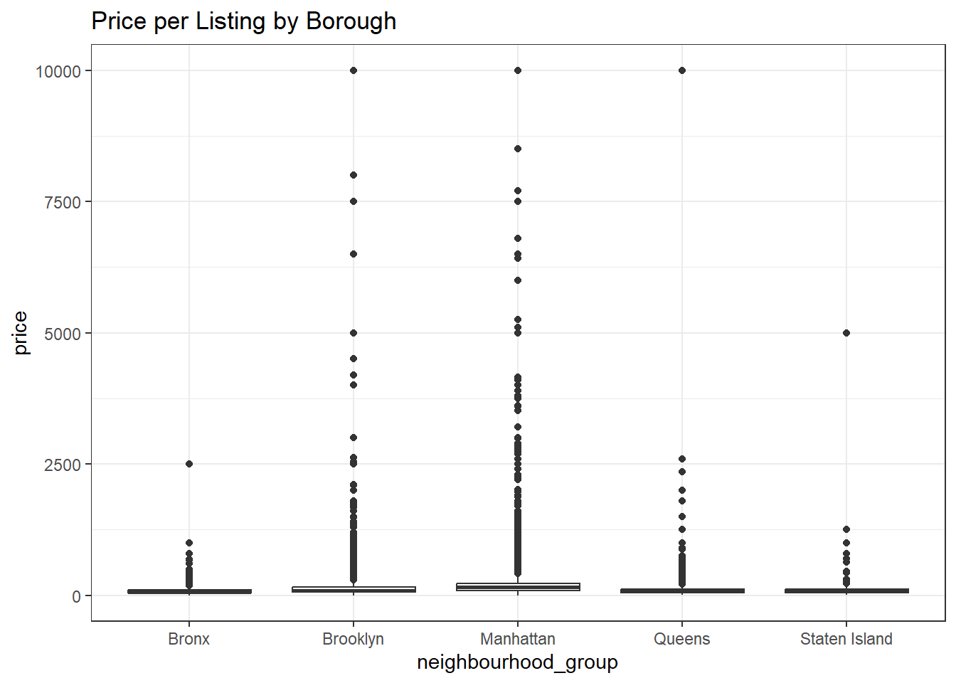
Another metric we might be interested in is the price in different areas. If we were interested in investing in an Air BnB we might be interested in which areas demand the highest price per night of stay.
data %>%
  ggplot(aes(neighbourhood_group, price), fill = neighbourhood) +
  geom_boxplot() +
  labs(title = "Price per Listing by Borough") +
  theme_bw()
The plot above shows how price per night is scattered among listings in different areas. I chose a box plot as it shows the distributed prices in each of the different areas. As we might’ve expected, most of the listing in the Bronx and Staten Island are relatively cheap and collect together in one cluster. Queens appears to be cheap as a whole but does have a handful of expensive outliers. Finally, it’s clear that both Brooklyn and Manhatten are more expensive in general and have make up the vast majority of the most expensive Air BnBs.
This dataset was a good exmaple dataset to work with to get some practice with making visualizations. There are definitely a lot more comparisons we could make, like how reviews relate to price, or how price breaks down by neighborhood.