library(tidyverse)
library(ggplot2)
library(lubridate)

knitr::opts_chunk$set(echo = TRUE, warning=FALSE, message=FALSE)Challenge 6
challenge_6
hotel_bookings
air_bnb
fed_rate
debt
usa_households
abc_poll
Visualizing Time and Relationships
Read in data
data<- read_csv("_data/FedFundsRate.csv",show_col_types = FALSE)colnames(data) [1] "Year" "Month"
[3] "Day" "Federal Funds Target Rate"
[5] "Federal Funds Upper Target" "Federal Funds Lower Target"
[7] "Effective Federal Funds Rate" "Real GDP (Percent Change)"
[9] "Unemployment Rate" "Inflation Rate" dim(data)[1] 904 10data# A tibble: 904 × 10
Year Month Day Federal F…¹ Feder…² Feder…³ Effec…⁴ Real …⁵ Unemp…⁶ Infla…⁷
<dbl> <dbl> <dbl> <dbl> <dbl> <dbl> <dbl> <dbl> <dbl> <dbl>
1 1954 7 1 NA NA NA 0.8 4.6 5.8 NA
2 1954 8 1 NA NA NA 1.22 NA 6 NA
3 1954 9 1 NA NA NA 1.06 NA 6.1 NA
4 1954 10 1 NA NA NA 0.85 8 5.7 NA
5 1954 11 1 NA NA NA 0.83 NA 5.3 NA
6 1954 12 1 NA NA NA 1.28 NA 5 NA
7 1955 1 1 NA NA NA 1.39 11.9 4.9 NA
8 1955 2 1 NA NA NA 1.29 NA 4.7 NA
9 1955 3 1 NA NA NA 1.35 NA 4.6 NA
10 1955 4 1 NA NA NA 1.43 6.7 4.7 NA
# … with 894 more rows, and abbreviated variable names
# ¹`Federal Funds Target Rate`, ²`Federal Funds Upper Target`,
# ³`Federal Funds Lower Target`, ⁴`Effective Federal Funds Rate`,
# ⁵`Real GDP (Percent Change)`, ⁶`Unemployment Rate`, ⁷`Inflation Rate`range(data$Year, na.rm=TRUE)[1] 1954 2017Data Description
The data contains various economic and financial metrics for the United States from 1954 to 2017 including the federal interest rate, GDP, the unemployment rate, and the inflation rate. Most of these metrics are reported monthly but some metrics, like GDP, are reported quarterly. No metrics are reported more often than monthly however. Overall there are 904 months reports in the dataset. The target rate of the federal funds rate is reports in different ways during different time periods, but for the purposes of this assignment, this probably will not matter.
Tidy Data
Since we will be working with our data on a month to month to month basis, it makes sense to combine the month, day, and year values into one data. Further than that, we don’t really need the day value, as we will never have more than one value per month.
data<-data%>%
  mutate(date = str_c(`Year`,`Month`, `Day`, sep="/"),date = ymd(date))

data$Month_Yr <- format(as.Date(data$date), "%Y-%m")

data <- data[-c(1,2,3)]
data <- data[-8]
data <- select(data, Month_Yr, everything())
We could mutate the data to have categories inflation rate to show how it relates to the Federal Funds rate, as right now, the federal funds rate has been increasing due to inflation.
range(data$`Inflation Rate`, na.rm = TRUE)[1] 0.6 13.6range(data$`Effective Federal Funds Rate`, na.rm = TRUE)[1] 0.07 19.10data <- mutate(data, `Inflation Bracket` = case_when(
`Inflation Rate` < 2 ~ "Low Inflation",
`Inflation Rate` < 5 ~ "Normal Inflation",
`Inflation Rate` < 8 ~ "Above Average Inflation",
`Inflation Rate` < 10 ~ "High Inflation",
`Inflation Rate` >= 10 ~ "Hyperinflation"
))
data <- mutate(data, `Interest Rate Bracket` = case_when(
`Effective Federal Funds Rate` < 0.5 ~ "Low Interest",
`Effective Federal Funds Rate` < 3.0 ~ "Normal Interest",
`Effective Federal Funds Rate` < 7.0 ~ "High Interest",
`Effective Federal Funds Rate` < 20.0 ~ "Very High Interest",
))Time Dependent Visualization
ggplot(data, aes(x=`Month_Yr`, y=`Real GDP (Percent Change)`)) +
  geom_point()+
  theme_bw() +
  labs(title ="GDP over time", y = "GDP", x = "Time(months)")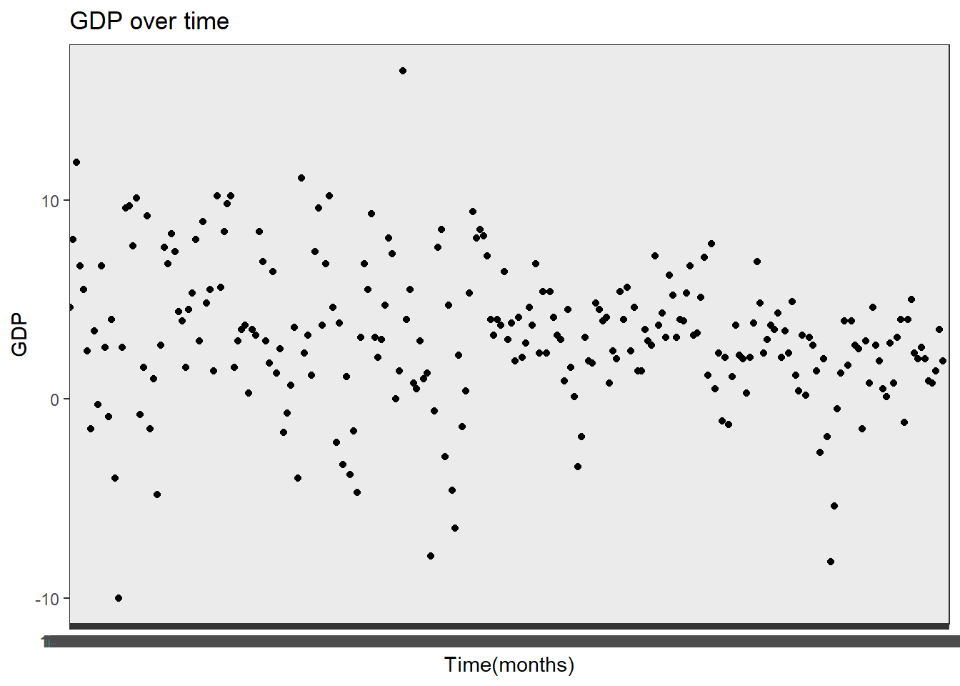
ggplot(data=subset(data,!is.na(`Inflation Rate`)), aes(x=`Month_Yr`, y=`Effective Federal Funds Rate`)) +
  geom_point()+
  theme_bw() +
  labs(title ="Interest Rates over time", y = "Federal Funds Rate", x = "Time(months)")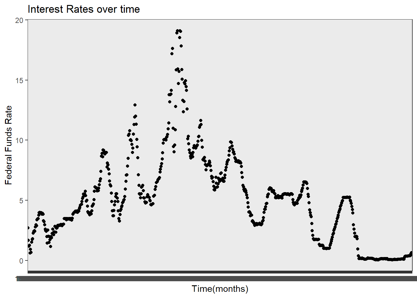
The above two graphs are very basic time series graphs of GDP and Interest Rates.Since GDP is a change relative to a previous quarter, it makes sense that the GDP doesn’t have a clear trend and tends to fluxuate around around 4-5%. The interest rate time series plot is much clearer and easier to understand, as interest rates are not representation of changes.
Visualizing Part-Whole Relationships
Finally we can check the relationship with interest rates and inflation using a part-whole relationship visualization. We can compare the count of months with various levels of inflation during months of various rate rate levels.
rem <- subset(data,!is.na(`Inflation Rate`),!is.na(`Effective Federal Funds Rate`))
rem <- count(rem, `Inflation Bracket`, `Interest Rate Bracket`)

ggplot(rem, aes(fill=rem$`Interest Rate Bracket`, y=rem$n, x=rem$`Inflation Bracket`)) +
    geom_bar(position="dodge", stat="identity")+
  labs(title ="Interest Rates by Inflation", y = "Count", x = "Inflation Rate Bracket")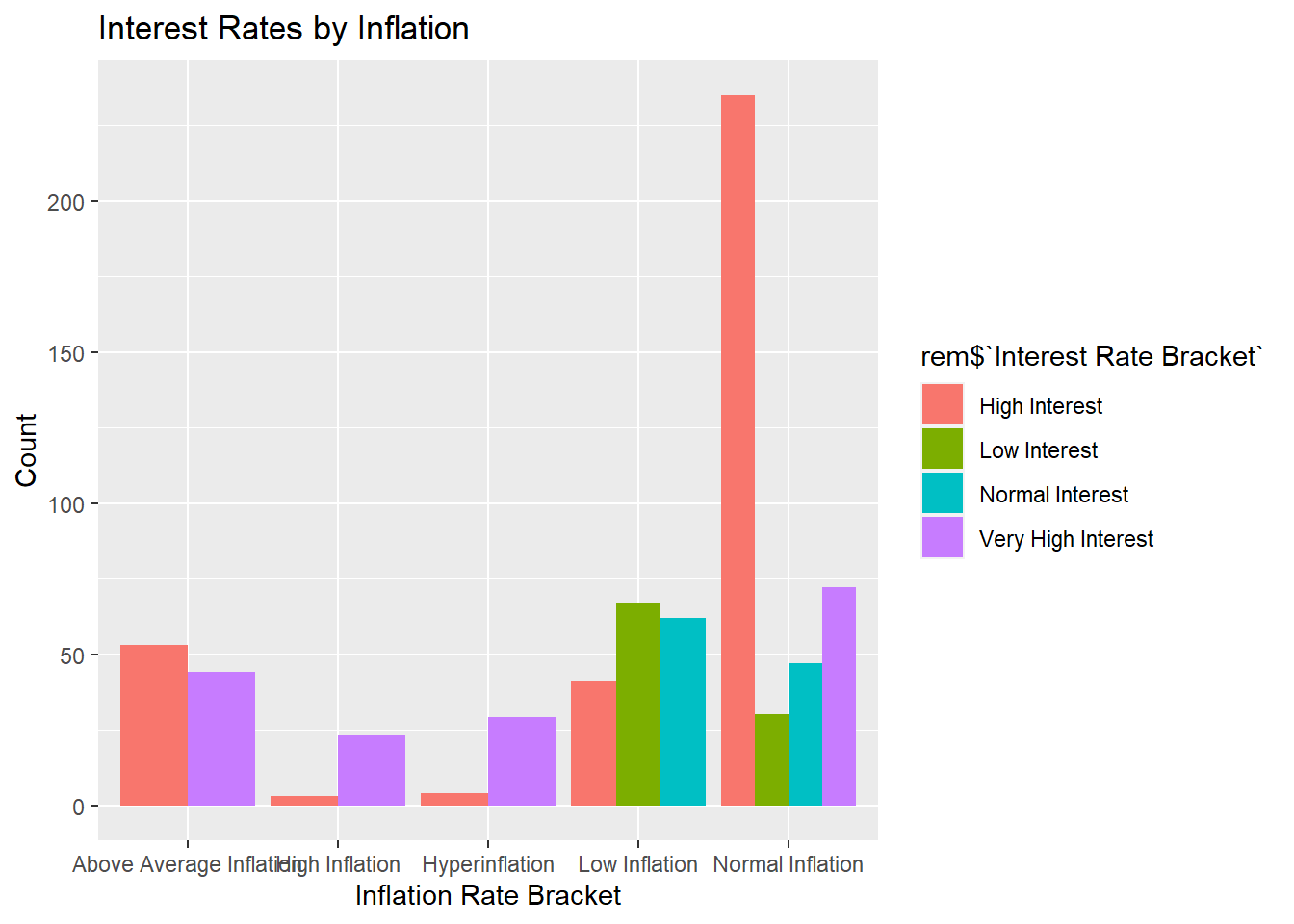
The visualization is consistent with what you might expect. High interest rates leads to less lending, which leads to lower inflation. Periods of low inflation have lower interest rates to pair with it, because there is less worry of inflation. During periods of high inflation, there is almost strictly high interest rates because the economy needs to reduce the money supply.