DACSS 601: Data Science Fundamentals - FALL 2022
  • Fall 2022 Posts
  • Contributors
  • DACSS

Challenge 7

  • Course information
    • Overview
    • Instructional Team
    • Course Schedule
  • Weekly materials
    • Fall 2022 posts
    • final posts

On this page

  • Read in data
    • Data Description
  • Tidy Data
  • Visualization with Multiple Dimensions

Challenge 7

challenge_7
hotel_bookings
australian_marriage
air_bnb
eggs
abc_poll
faostat
usa_households
Visualizing Multiple Dimensions
Author

Matthew O’Neill

Published

August 24, 2022

library(tidyverse)
library(ggplot2)

knitr::opts_chunk$set(echo = TRUE, warning=FALSE, message=FALSE)

Read in data

data<- read_csv("_data/australian_marriage_tidy.csv",show_col_types = FALSE)
colnames(data)
[1] "territory" "resp"      "count"     "percent"  
dim(data)
[1] 16  4
data
# A tibble: 16 × 4
   territory                       resp    count percent
   <chr>                           <chr>   <dbl>   <dbl>
 1 New South Wales                 yes   2374362    57.8
 2 New South Wales                 no    1736838    42.2
 3 Victoria                        yes   2145629    64.9
 4 Victoria                        no    1161098    35.1
 5 Queensland                      yes   1487060    60.7
 6 Queensland                      no     961015    39.3
 7 South Australia                 yes    592528    62.5
 8 South Australia                 no     356247    37.5
 9 Western Australia               yes    801575    63.7
10 Western Australia               no     455924    36.3
11 Tasmania                        yes    191948    63.6
12 Tasmania                        no     109655    36.4
13 Northern Territory(b)           yes     48686    60.6
14 Northern Territory(b)           no      31690    39.4
15 Australian Capital Territory(c) yes    175459    74  
16 Australian Capital Territory(c) no      61520    26  

Data Description

The dataset is fairly simple, showing marraige data for different provinces of Australia. Respondants divulge whether or not they are married and the data comes with a percentage of each province which is married. There are sixteen rows, two for each territory marking yes to being married or no, and there are 4 total columns.

Tidy Data

The data is already tidy, but it would be helpful to have some aggregate data, to see the number of people married in Australia and the percentage of the population that makes up.

We could mutate the data a bit to help create a useful visualization with multiple dimensions. I am interested in seeing how marriage rates differ accross territories with different sizes of population, so having the total population of each territory and the marriage rate will be useful.

married <- aggregate(count ~ territory, data = data, FUN = sum)
married['Married%'] = subset(data, resp =="yes")['percent']

married
                        territory   count Married%
1 Australian Capital Territory(c)  236979     57.8
2                 New South Wales 4111200     64.9
3           Northern Territory(b)   80376     60.7
4                      Queensland 2448075     62.5
5                 South Australia  948775     63.7
6                        Tasmania  301603     63.6
7                        Victoria 3306727     60.6
8               Western Australia 1257499     74.0

Visualization with Multiple Dimensions

ggplot(married, aes(x=`count`, y=`Married%`,color=`territory`)) + geom_point()+
  theme_bw() +
  labs(title ="Married Rate vs Population", y = "Married Rate", x = "Territory Population")

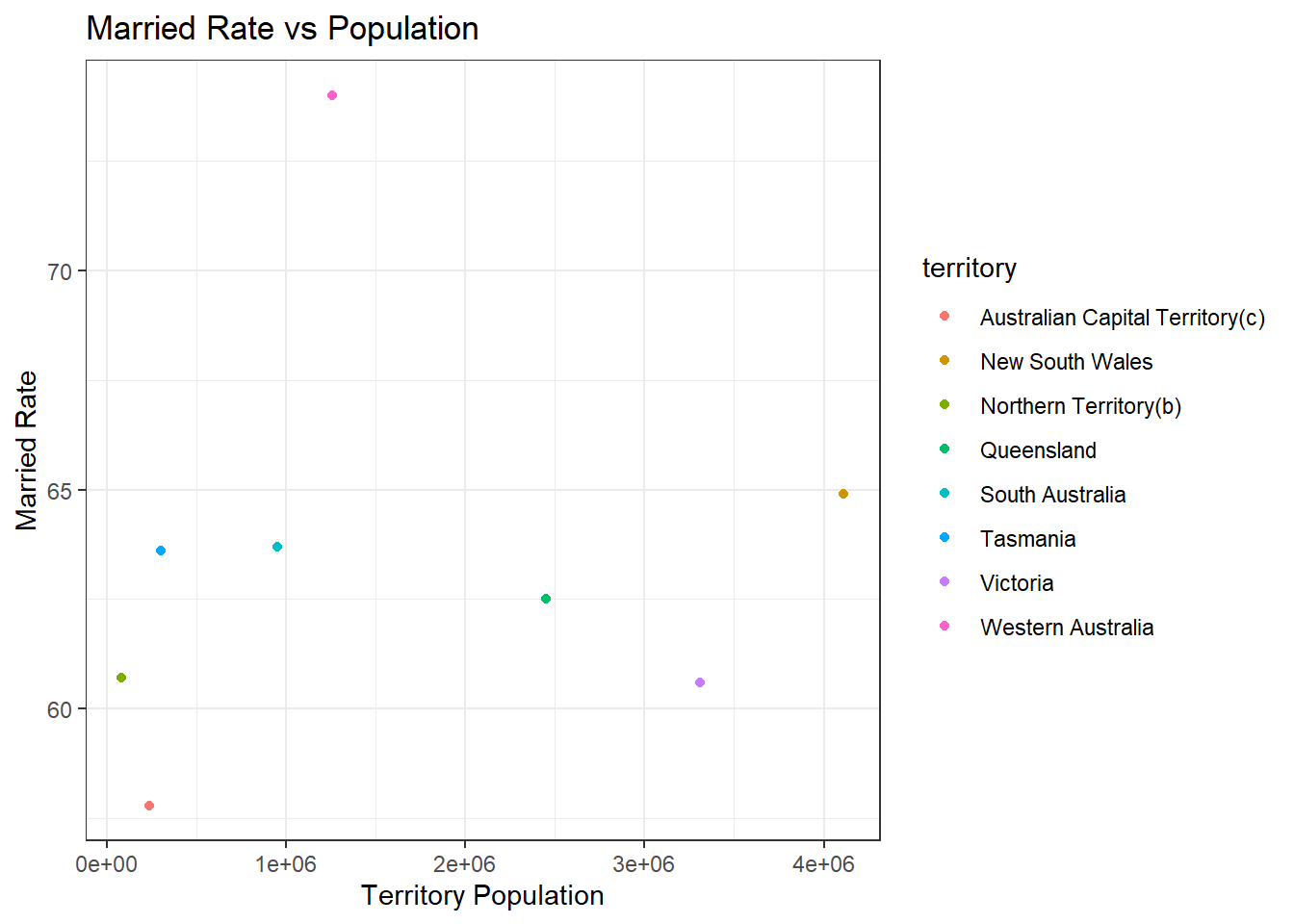
There doesn’t appear to be any clear correlation with population size and most provinces are hovering between 60% and 65%. The Australian Capital Territory is an outlier on the lower end, and the Western Australian is an outlier on the higher end.

Source Code
---
title: "Challenge 7"
author: "Matthew O'Neill"
description: "Visualizing Multiple Dimensions"
date: "08/24/2022"
format:
  html:
    toc: true
    code-copy: true
    code-tools: true
categories:
  - challenge_7
  - hotel_bookings
  - australian_marriage
  - air_bnb
  - eggs
  - abc_poll
  - faostat
  - usa_households
---

```{r}
#| label: setup
#| warning: false
#| message: false

library(tidyverse)
library(ggplot2)

knitr::opts_chunk$set(echo = TRUE, warning=FALSE, message=FALSE)
```


## Read in data

```{r}
data<- read_csv("_data/australian_marriage_tidy.csv",show_col_types = FALSE)
```

```{r}
colnames(data)

dim(data)

data
```

### Data Description

The dataset is fairly simple, showing marraige data for different provinces of Australia. Respondants divulge whether or not they are married and the data comes with a percentage of each province which is married. There are sixteen rows, two for each territory marking yes to being married or no, and there are 4 total columns.

## Tidy Data

The data is already tidy, but it would be helpful to have some aggregate data, to see the number of people married in Australia and the percentage of the population that makes up.

We could mutate the data a bit to help create a useful visualization with multiple dimensions. I am interested in seeing how marriage rates differ accross territories with different sizes of population, so having the total population of each territory and the marriage rate will be useful.

```{r}
married <- aggregate(count ~ territory, data = data, FUN = sum)
married['Married%'] = subset(data, resp =="yes")['percent']

married

```


## Visualization with Multiple Dimensions

```{r}
ggplot(married, aes(x=`count`, y=`Married%`,color=`territory`)) + geom_point()+
  theme_bw() +
  labs(title ="Married Rate vs Population", y = "Married Rate", x = "Territory Population")

```
There doesn't appear to be any clear correlation with population size and most provinces are hovering between 60% and 65%. The Australian Capital Territory is an outlier on the lower end, and the Western Australian is an outlier on the higher end.