library(tidyverse)
library(ggplot2)
library(dplyr)
library(scales)
knitr::opts_chunk$set(echo = TRUE, warning=FALSE, message=FALSE)
Challenge 5 Instructions
challenge_5
railroads
cereal
air_bnb
pathogen_cost
australian_marriage
public_schools
usa_households
Introduction to Visualization
Challenge Overview
Today’s challenge is to:
- read in a data set, and describe the data set using both words and any supporting information (e.g., tables, etc)
- tidy data (as needed, including sanity checks)
- mutate variables as needed (including sanity checks)
- create at least two univariate visualizations
- try to make them “publication” ready
- Explain why you choose the specific graph type
- Create at least one bivariate visualization
- try to make them “publication” ready
- Explain why you choose the specific graph type
R Graph Gallery is a good starting point for thinking about what information is conveyed in standard graph types, and includes example R code.
(be sure to only include the category tags for the data you use!)
Read in data
Read in one (or more) of the following datasets, using the correct R package and command.
- cereal.csv ⭐
- Total_cost_for_top_15_pathogens_2018.xlsx ⭐
- Australian Marriage ⭐⭐
- AB_NYC_2019.csv ⭐⭐⭐
- StateCounty2012.xls ⭐⭐⭐
- Public School Characteristics ⭐⭐⭐⭐
- USA Households ⭐⭐⭐⭐⭐
ABNYC <- read_csv("_data/AB_NYC_2019.csv")
ABNYC
# A tibble: 48,895 × 16
id name host_id host_…¹ neigh…² neigh…³ latit…⁴ longi…⁵ room_…⁶ price
<dbl> <chr> <dbl> <chr> <chr> <chr> <dbl> <dbl> <chr> <dbl>
1 2539 Clean & … 2787 John Brookl… Kensin… 40.6 -74.0 Privat… 149
2 2595 Skylit M… 2845 Jennif… Manhat… Midtown 40.8 -74.0 Entire… 225
3 3647 THE VILL… 4632 Elisab… Manhat… Harlem 40.8 -73.9 Privat… 150
4 3831 Cozy Ent… 4869 LisaRo… Brookl… Clinto… 40.7 -74.0 Entire… 89
5 5022 Entire A… 7192 Laura Manhat… East H… 40.8 -73.9 Entire… 80
6 5099 Large Co… 7322 Chris Manhat… Murray… 40.7 -74.0 Entire… 200
7 5121 BlissArt… 7356 Garon Brookl… Bedfor… 40.7 -74.0 Privat… 60
8 5178 Large Fu… 8967 Shunic… Manhat… Hell's… 40.8 -74.0 Privat… 79
9 5203 Cozy Cle… 7490 MaryEl… Manhat… Upper … 40.8 -74.0 Privat… 79
10 5238 Cute & C… 7549 Ben Manhat… Chinat… 40.7 -74.0 Entire… 150
# … with 48,885 more rows, 6 more variables: minimum_nights <dbl>,
# number_of_reviews <dbl>, last_review <date>, reviews_per_month <dbl>,
# calculated_host_listings_count <dbl>, availability_365 <dbl>, and
# abbreviated variable names ¹host_name, ²neighbourhood_group,
# ³neighbourhood, ⁴latitude, ⁵longitude, ⁶room_typeBriefly describe the data
ABNYC dataset interprets reviews of the place in New york, along with the host details , reviews and information about different different places.
Tidy Data (as needed)
Is your data already tidy, or is there work to be done? Be sure to anticipate your end result to provide a sanity check, and document your work here.
colnames(ABNYC) [1] "id" "name"
[3] "host_id" "host_name"
[5] "neighbourhood_group" "neighbourhood"
[7] "latitude" "longitude"
[9] "room_type" "price"
[11] "minimum_nights" "number_of_reviews"
[13] "last_review" "reviews_per_month"
[15] "calculated_host_listings_count" "availability_365" dim(ABNYC)[1] 48895 16Are there any variables that require mutation to be usable in your analysis stream? For example, do you need to calculate new values in order to graph them? Can string values be represented numerically? Do you need to turn any variables into factors and reorder for ease of graphics and visualization?
Document your work here.
select(ABNYC,neighbourhood_group) %>% table() %>% prop.table() neighbourhood_group
Bronx Brooklyn Manhattan Queens Staten Island
0.022313120 0.411166786 0.443010533 0.115880969 0.007628592 room <- NYC %>% filter(neighbourhood_group == "Manhattan") %>%
select(host_name,price,room_type) %>% group_by(room_type) %>%
summarise(count=n())Error in filter(., neighbourhood_group == "Manhattan"): object 'NYC' not foundroomError in eval(expr, envir, enclos): object 'room' not foundUnivariate Visualizations
Bivariate Visualization(s)
Let’s see some Visualization on ABNYC data set-
ggplot(NYC_Room, aes(x = room_type)) + geom_bar(color = "blue")Error in ggplot(NYC_Room, aes(x = room_type)): object 'NYC_Room' not foundplot <- ABNYC %>%
count(neighbourhood_group) %>%
mutate(percent = n / sum(n), percentlabel = paste0(round(percent*100), "%"))
ggplot(plot, aes(x = reorder(neighbourhood_group, -percent), y = percent)) +
geom_bar(stat = "identity", fill = "indianred3", color = "black") +
geom_text(aes(label = percentlabel), vjust = -0.25) + scale_y_continuous(labels = percent) +
labs(x = "neighbourhood_group", y = "percent")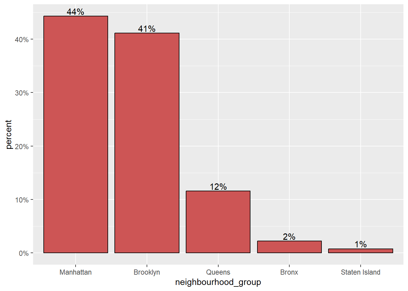
the count function to count the number of observations in each neighbourhood_group. Then, the mutate function is used to create a new variable called percent that represents the percentage of observations in each neighbourhood_group. Finally, a percentlabel variable is created that contains a string representation of the percentage for each neighbourhood_group. Once the data has been processed, the ggplot function is used to create the plot. The aes function is used to define the x and y axes of the plot. The geom_bar and geom_text functions are then used to add a bar chart and labels to the plot, respectively. The scale_y_continuous and labs functions are used to customize the y-axis and add labels to the x and y axes of the plot.
ggplot(ABNYC,
       aes(x = neighbourhood_group, fill = room_type)) + geom_bar(position = "fill", color = "black")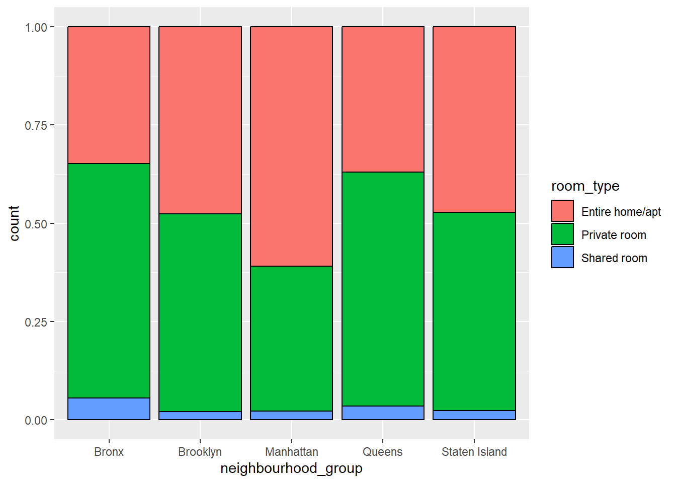
As we can see in the brookyln not that many people are sharing the room but in broonx people sharing the room is highest. On the other hand, in Manhattan most of the people are willing to take the entire apartment rather than sharing it.