Code
library(tidyverse)
library(tibble)
library(dplyr)
library(stringr)
library(ggplot2)
library(lubridate)


knitr::opts_chunk$set(echo = TRUE, warning=FALSE, message=FALSE)library(tidyverse)
library(tibble)
library(dplyr)
library(stringr)
library(ggplot2)
library(lubridate)
knitr::opts_chunk$set(echo = TRUE, warning=FALSE, message=FALSE)This dataset is every reservation at Turnstyle Midwest from November 2020 to October 2022. Each row is an individual sign up for a class, and the columns are Reservation ID, Status (if the client is checked-in, standard cancelled, penalty cancelled, class cancelled, or no show), Class ID, Class Date, Class Time, Class Day, Class Name, Class Public, Class Tags, Capacity, Location (Madison or Chicago), InstructorID, Substitute (true or false), and Customer ID. I then chose to filter only the Madison location and if the class was open to the public and therefore was not cancelled. This gave me 57204 reservations.
My research questions:
which class time to offer during the week? Morning vs evening? Any trends with day of the week/time?
does a substitute instructor affect reservation number? (haven’t attempted this yet)
themes: which are more popular? Is hip hop more popular than EDM or pop or are general themes better?
TS <- read_csv("_data/reservations_Naughton.csv",
               skip=2,
 col_names = c("ReservationID", "del", "Status", rep("del", 12),"ClassID", "ClassDate", "ClassTime", "ClassDay", "ClassName", "ClassPublic", "ClassTags", rep("del", 6), "Capacity", "del", "Location", "del", "InstructorID", "del", "Substitute", "CustomerID", rep("del", 5)))%>%

    select(!starts_with("del"))%>%
  filter(Location == "Madison") %>%
  filter(ClassPublic == TRUE) %>%
filter(Status != "class cancelled")My next step was to take Monday classes in October 2022, try to join them, so that I can then graph the reservations. This would allow me to see which class times had the largest number of reservations.
Monday <- filter(TS, ClassDay== "Monday" ) %>%
  mutate(across(ends_with('ID'), as.character)) %>%
  mutate(across(ends_with('Time'), as.character)) %>%
  filter(Status== "check in") %>%
  filter(str_starts(ClassDate, "2022-10"))
MondayMonday %>% group_by(ClassID) %>% summarize(reservations = n_distinct(ReservationID)) %>% arrange(desc(reservations))From this graph, I can visualize that 4:30s were the most popular time slot. 5:30pm was consistently low. There are not many other unique trends that come from this graph.
# Create a bar graph of room type using neighbourhood_group as fill
ggplot(Monday) +
  geom_bar(mapping = aes(x = ClassDate, fill=ClassTime)) +

  labs(x = "Class Date",
       y = "Number of reservations",
       title = "Class vs Number of Reservations",
       fill = "Class Time",
       )+
  scale_fill_discrete(labels=c('7AM', '8:30AM', '4:30PM', '5:30PM'))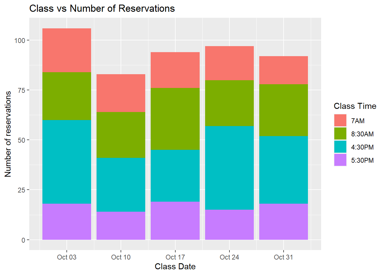
I attempted a larger dataset - I looked at Weekdays in October 2022 with hopes of seeing which class day is most popular.
WeekdayOct <- filter(TS, ClassDay != "Saturday", ClassDay !="Sunday") %>%
  mutate(across(ends_with('ID'), as.character)) %>%
  mutate(across(ends_with('Time'), as.character)) %>%
  filter(Status== "check in") %>%
  filter(str_starts(ClassDate, "2022-10"))
WeekdayOctWeekdayOct %>% group_by(ClassID, ClassName) %>% summarize(reservations = n_distinct(ReservationID)) %>% arrange(desc(reservations))# Create a bar graph
ggplot(WeekdayOct) +
geom_bar(mapping = aes(x = ClassDate, fill=ClassTime)) +
labs(x = "Class Date",
y = "Number of reservations",
title = "Class vs Number of Reservations",
fill = "Class Time",
)+
scale_fill_discrete(labels=c('7AM', '8:30AM', '9:30AM', '12:30PM','3:30PM', '4:00PM', '4:30PM', '5:30PM', '6:30PM')) 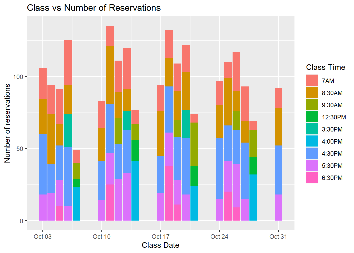
This graph is messy - each day has different time slots so they are hard to compare signups. There is not a clear winner of which day is most popular, but Friday is consistently the least amount of sign-ups. Next thoughts are possibly categorizing the time - should I look at morning sign-ups vs evening?
????? I want to find the daily average per month, but my current code is not working. I was able to graph daily sign-ups across the year, but I want to compare days of the week in each month.
Weekday <- filter(TS, ClassDay != "Saturday", ClassDay !="Sunday") %>%
  mutate(across(ends_with('ID'), as.character)) %>%
  mutate(across(ends_with('Time'), as.character)) %>%
  filter(Status== "check in") %>%
  filter(ClassDate>= '2021-11-01')
Weekday##Weekday %>% group_by(ClassID, ClassDate, Capacity) %>% summarize(reservations = n_distinct(ReservationID)) %>% mutate(percent_Capacity = (reservations/Capacity)*100) %>% arrange(ClassDate)
WeekdayAvg<- Weekday %>% group_by(ClassID, ClassDate, Capacity) %>% summarize(reservations = n_distinct(ReservationID)) %>% mutate(percent_Capacity = (reservations/Capacity)*100) %>% arrange(ClassDate)
WeekdayAvg2 <- WeekdayAvg %>% group_by(ClassDate) %>% summarize(average = mean(percent_Capacity))
ggplot(data= WeekdayAvg2, aes(x=ClassDate, y = average ), group(ClassDay)) +
geom_line(color= "grey") +
geom_point(shape=21, color="black", fill="#69b3a2", size=1) +
ggtitle("Daily class sign-ups")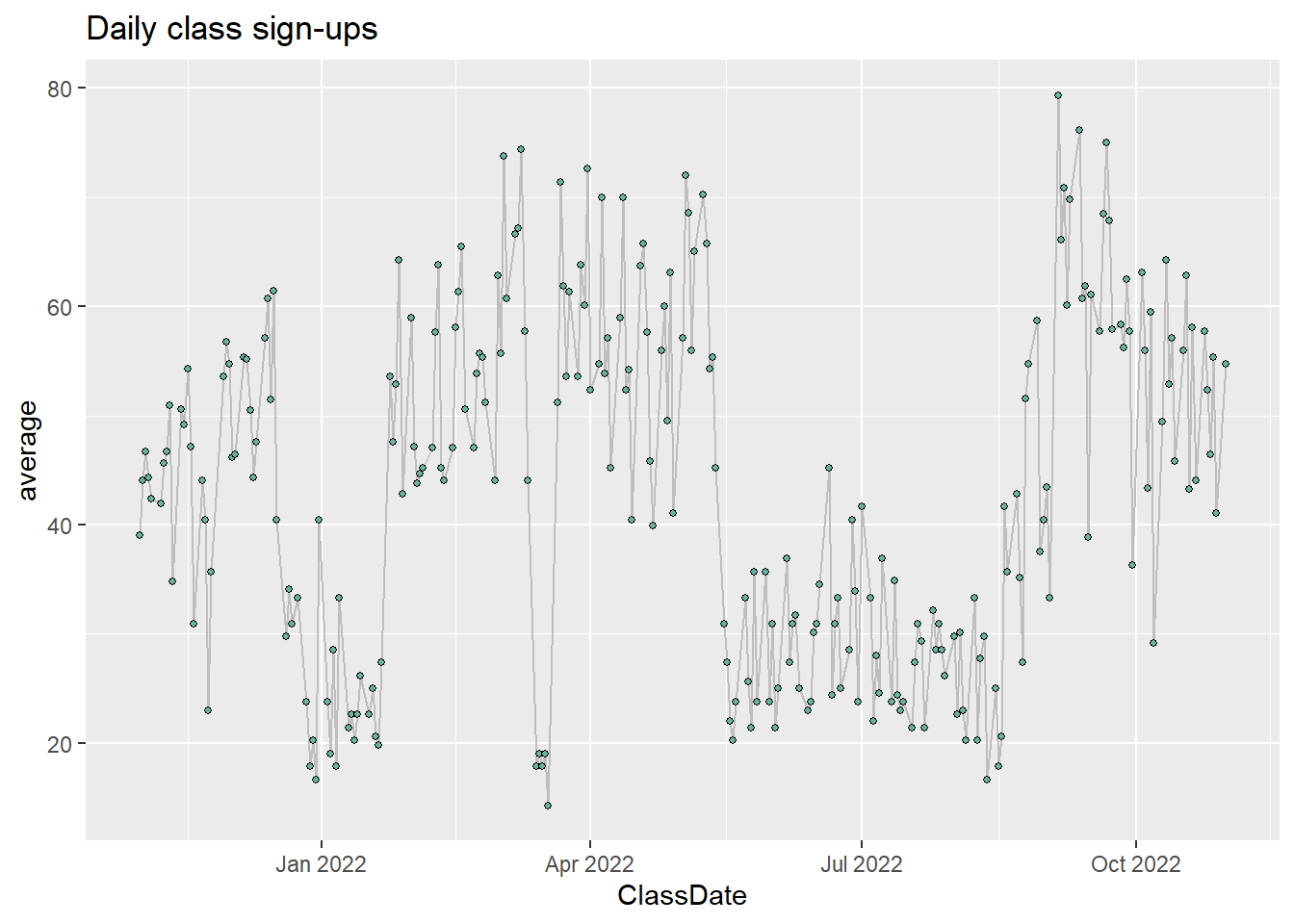
This graph is looking at each day individually throughout the year. It is not telling me much, other than that the summer things die down. This makes sense because it is a college town.
# Using Small multiple
ggplot(data=Weekday, aes(x=ClassDate, group=ClassDay, fill= ClassDay)) +
    geom_histogram(adjust=1.5) +
    facet_wrap(~ClassDay) +
    theme(
      legend.position="none",
      panel.spacing = unit(0.1, "lines")
    ) +
   labs(x = "Class Date",
       y = "Number of reservations",
       title = "Class vs Number of Reservations"
       )  +
  theme(axis.text.x = element_text(angle = 90, vjust = 0.5, hjust=1))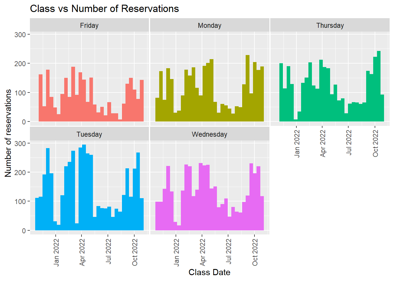
Finally, I want to look at which themes are most popular. This studio chooses themes as their class name. There are 767 unique themes that have been offered. I will have to categorize these!
TS %>%  filter(Status== "check in") %>% group_by(ClassID, ClassDate, ClassName, Capacity) %>%
  summarize(reservations = n_distinct(ReservationID))  %>%
  arrange(desc(reservations)) %>%
mutate(percent_Capacity = (reservations/Capacity)*100)#unique(TS$ClassName)
TS %>% group_by(ClassName) %>%
summarize(
frequencyTheme = n_distinct(ClassID)) %>%
arrange(desc(frequencyTheme)) #%>% #mutate(themeCat = case_when(ClassName == "BEST OF MASHUPS" ~ "general",
# ))