library(tidyverse)
library(ggplot2)
library(readxl)

knitr::opts_chunk$set(echo = TRUE, warning=FALSE, message=FALSE)
Challenge 6
challenge_6
hotel_bookings
air_bnb
fed_rate
debt
usa_households
abc_poll
Visualizing Time and Relationships
Challenge Overview
Today’s challenge is to:
- read in a data set, and describe the data set using both words and any supporting information (e.g., tables, etc)
- tidy data (as needed, including sanity checks)
- mutate variables as needed (including sanity checks)
- create at least one graph including time (evolution)
- try to make them “publication” ready (optional)
- Explain why you choose the specific graph type
- Create at least one graph depicting part-whole or flow relationships
- try to make them “publication” ready (optional)
- Explain why you choose the specific graph type
R Graph Gallery is a good starting point for thinking about what information is conveyed in standard graph types, and includes example R code.
(be sure to only include the category tags for the data you use!)
Read in data
RawData <- read_excel("_data/debt_in_trillions.xlsx")
head(RawData)
# A tibble: 6 × 8
`Year and Quarter` Mortgage `HE Revolving` Auto …¹ Credi…² Stude…³ Other Total
<chr> <dbl> <dbl> <dbl> <dbl> <dbl> <dbl> <dbl>
1 03:Q1 4.94 0.242 0.641 0.688 0.241 0.478 7.23
2 03:Q2 5.08 0.26 0.622 0.693 0.243 0.486 7.38
3 03:Q3 5.18 0.269 0.684 0.693 0.249 0.477 7.56
4 03:Q4 5.66 0.302 0.704 0.698 0.253 0.449 8.07
5 04:Q1 5.84 0.328 0.72 0.695 0.260 0.446 8.29
6 04:Q2 5.97 0.367 0.743 0.697 0.263 0.423 8.46
# … with abbreviated variable names ¹`Auto Loan`, ²`Credit Card`,
# ³`Student Loan`Briefly describe the data
The above dataset is about the cumulative debt which is held by some of the nation citizens which are most likely in the US and the dataset consists of 6 rows and 8 columns which explains the different kinds of debts in different quarters Like the auto loan, credit card, student loan.
Tidy Data (as needed)
I think there is tidying required in the form of separating the combined field of year and the quarter.
split_quarter <- RawData %>%
  separate(`Year and Quarter`,c('Year','Quarter'),sep = ":")

split_quarter
# A tibble: 74 × 9
Year Quarter Mortgage `HE Revolving` `Auto Loan` Credi…¹ Stude…² Other Total
<chr> <chr> <dbl> <dbl> <dbl> <dbl> <dbl> <dbl> <dbl>
1 03 Q1 4.94 0.242 0.641 0.688 0.241 0.478 7.23
2 03 Q2 5.08 0.26 0.622 0.693 0.243 0.486 7.38
3 03 Q3 5.18 0.269 0.684 0.693 0.249 0.477 7.56
4 03 Q4 5.66 0.302 0.704 0.698 0.253 0.449 8.07
5 04 Q1 5.84 0.328 0.72 0.695 0.260 0.446 8.29
6 04 Q2 5.97 0.367 0.743 0.697 0.263 0.423 8.46
7 04 Q3 6.21 0.426 0.751 0.706 0.33 0.41 8.83
8 04 Q4 6.36 0.468 0.728 0.717 0.346 0.423 9.04
9 05 Q1 6.51 0.502 0.725 0.71 0.364 0.394 9.21
10 05 Q2 6.70 0.528 0.774 0.717 0.374 0.402 9.49
# … with 64 more rows, and abbreviated variable names ¹`Credit Card`,
# ²`Student Loan`Time Dependent Visualization
I have performed the time dependent visualization for the auto load debt and then I will help in transforming the data so that I will be able to understand how the auto loan adds up when compared to the others.
scatter_data <- split_quarter %>%
  ggplot(mapping=aes(x = Year, y = `Auto Loan`))+
  geom_point(aes(color=Quarter))
scatter_data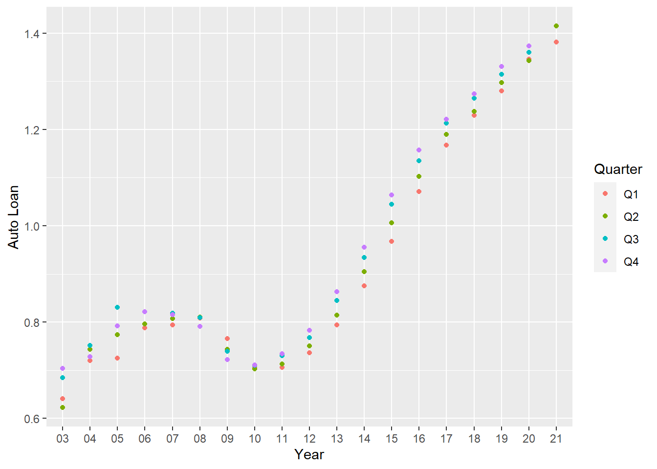
Now I would like to pivot the data which will help me in further analysis
debt_split<- split_quarter%>%
  pivot_longer(!c(Year,Quarter), names_to = "DebtType",values_to = "DebtPercent" )

debt_split
# A tibble: 518 × 4
Year Quarter DebtType DebtPercent
<chr> <chr> <chr> <dbl>
1 03 Q1 Mortgage 4.94
2 03 Q1 HE Revolving 0.242
3 03 Q1 Auto Loan 0.641
4 03 Q1 Credit Card 0.688
5 03 Q1 Student Loan 0.241
6 03 Q1 Other 0.478
7 03 Q1 Total 7.23
8 03 Q2 Mortgage 5.08
9 03 Q2 HE Revolving 0.26
10 03 Q2 Auto Loan 0.622
# … with 508 more rowsVisualizing Part-Whole Relationships
Now as a part of the visualizing by part-whole I have done the following analysis by the debt type.
debt_split_Plot <- debt_split%>%
  ggplot(mapping=aes(x = Year, y = DebtPercent))


debt_split_Plot +
  facet_wrap(~DebtType, scales = "free")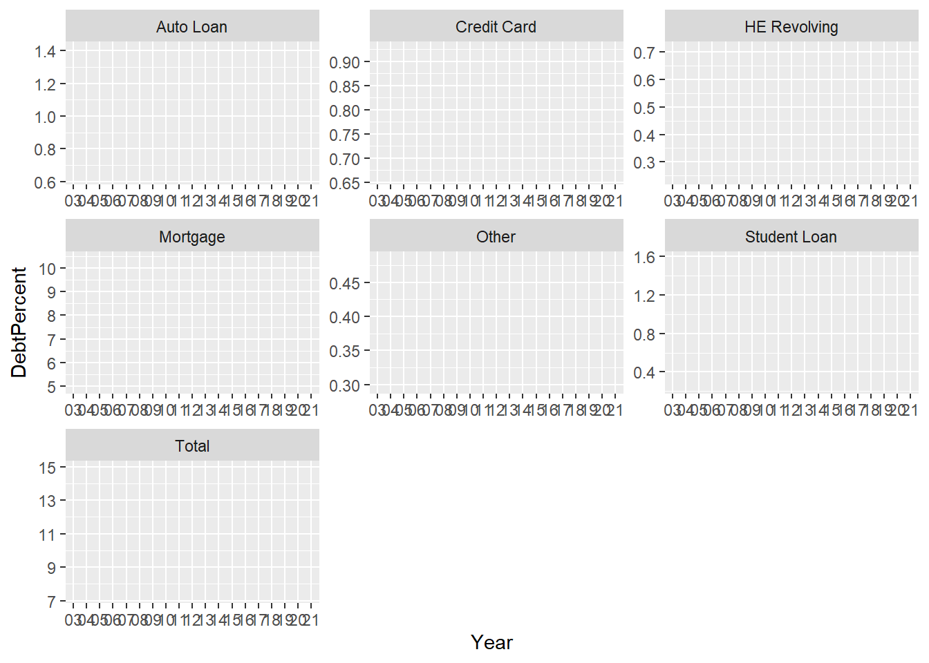
debt_split_Plot +
  geom_point(aes(color = DebtType))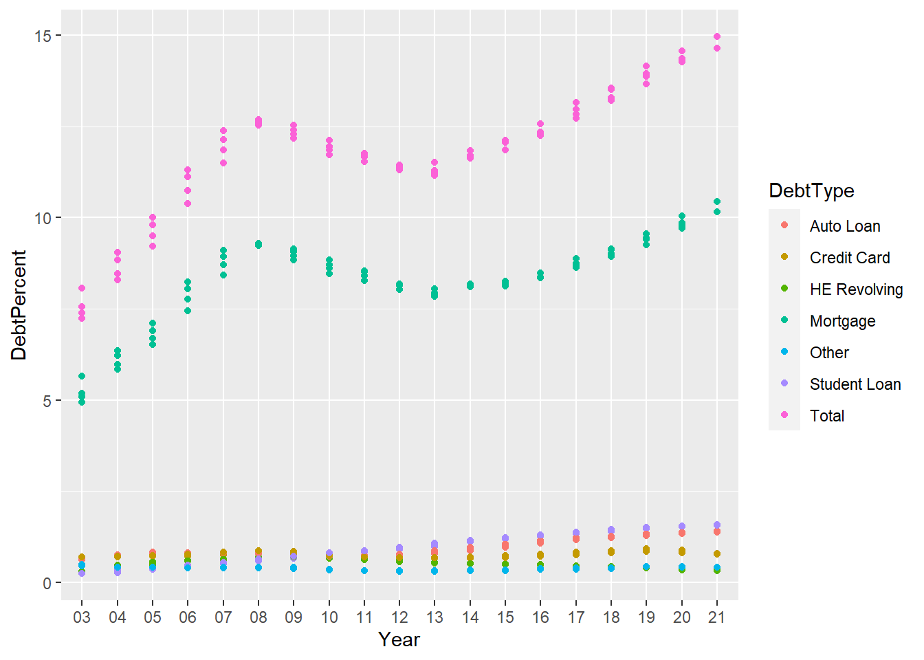
The above graph shows the Mortage debt by influencing the total so I want to visualise how the various different types of the debt sway the total debt for the year therefore, I gace separated out the types of debt.
debt_split_Plot+
  geom_point() +
  facet_wrap(~DebtType) +
  scale_x_discrete(breaks = c('03','06','09',12,15,18,21))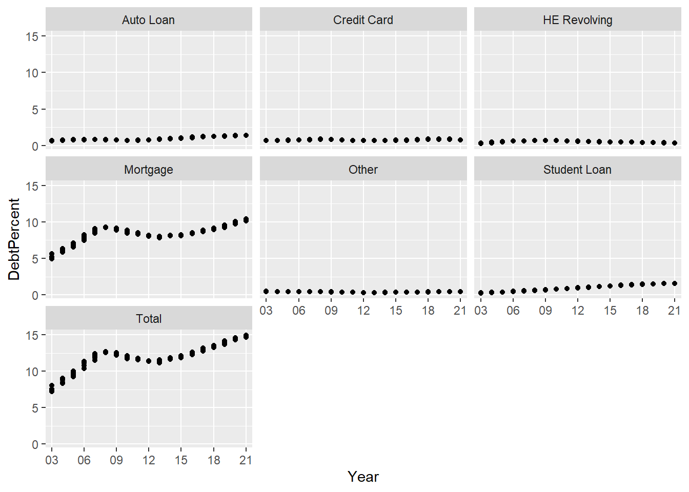
The above graph demonstrates how the different mortgages drove the total debt but what can we do with the trends of the other types of the debts looks like and how does it actually looks like so I am going to get the scaled to free to see this kind of a visualization.
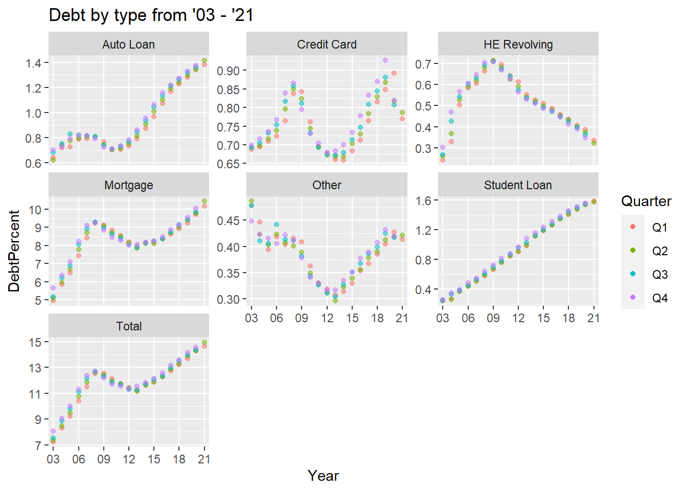
debt_split_Plot+
  geom_point(aes(color = Quarter,alpha=0.9,)) +
  facet_wrap(~DebtType, scales = "free_y") +
  guides(alpha="none") +
  labs(title="Debt by type from '03 - '21")+
  scale_x_discrete(breaks = c('03','06','09',12,15,18,21))