library(tidyverse)
library(ggplot2)
library(ggforce)

library(readxl)

knitr::opts_chunk$set(echo = TRUE, warning=FALSE, message=FALSE)
Challenge 6
challenge_6
hotel_bookings
air_bnb
fed_rate
debt
usa_households
Visualizing Time and Relationships
Challenge Overview
Today’s challenge is to:
- read in a data set, and describe the data set using both words and any supporting information (e.g., tables, etc)
- tidy data (as needed, including sanity checks)
- mutate variables as needed (including sanity checks)
- create at least one graph including time (evolution)
- try to make them “publication” ready (optional)
- Explain why you choose the specific graph type
- Create at least one graph depicting part-whole or flow relationships
- try to make them “publication” ready (optional)
- Explain why you choose the specific graph type
R Graph Gallery is a good starting point for thinking about what information is conveyed in standard graph types, and includes example R code.
(be sure to only include the category tags for the data you use!)
Read in data
Read in one (or more) of the following datasets, using the correct R package and command.
- debt ⭐
- fed_rate ⭐⭐
- abc_poll ⭐⭐⭐
- usa_hh ⭐⭐⭐
- hotel_bookings ⭐⭐⭐⭐
- AB_NYC ⭐⭐⭐⭐⭐
RawData <- read_excel("_data/debt_in_trillions.xlsx")
head(RawData)
# A tibble: 6 × 8
`Year and Quarter` Mortgage `HE Revolving` Auto …¹ Credi…² Stude…³ Other Total
<chr> <dbl> <dbl> <dbl> <dbl> <dbl> <dbl> <dbl>
1 03:Q1 4.94 0.242 0.641 0.688 0.241 0.478 7.23
2 03:Q2 5.08 0.26 0.622 0.693 0.243 0.486 7.38
3 03:Q3 5.18 0.269 0.684 0.693 0.249 0.477 7.56
4 03:Q4 5.66 0.302 0.704 0.698 0.253 0.449 8.07
5 04:Q1 5.84 0.328 0.72 0.695 0.260 0.446 8.29
6 04:Q2 5.97 0.367 0.743 0.697 0.263 0.423 8.46
# … with abbreviated variable names ¹`Auto Loan`, ²`Credit Card`,
# ³`Student Loan`Briefly describe the data
The data appears to be the amount of cumulative debt held by some nations citizens. The columns describe the year and quarter,and different types of loans like auto loan, credit card, student loan and total.
Tidy Data (as needed)
We can seperate out the year and quarter fields.
splitData<- RawData %>%
  separate(`Year and Quarter`,c('Year','Quarter'),sep = ":")
splitData
# A tibble: 74 × 9
Year Quarter Mortgage `HE Revolving` `Auto Loan` Credi…¹ Stude…² Other Total
<chr> <chr> <dbl> <dbl> <dbl> <dbl> <dbl> <dbl> <dbl>
1 03 Q1 4.94 0.242 0.641 0.688 0.241 0.478 7.23
2 03 Q2 5.08 0.26 0.622 0.693 0.243 0.486 7.38
3 03 Q3 5.18 0.269 0.684 0.693 0.249 0.477 7.56
4 03 Q4 5.66 0.302 0.704 0.698 0.253 0.449 8.07
5 04 Q1 5.84 0.328 0.72 0.695 0.260 0.446 8.29
6 04 Q2 5.97 0.367 0.743 0.697 0.263 0.423 8.46
7 04 Q3 6.21 0.426 0.751 0.706 0.33 0.41 8.83
8 04 Q4 6.36 0.468 0.728 0.717 0.346 0.423 9.04
9 05 Q1 6.51 0.502 0.725 0.71 0.364 0.394 9.21
10 05 Q2 6.70 0.528 0.774 0.717 0.374 0.402 9.49
# … with 64 more rows, and abbreviated variable names ¹`Credit Card`,
# ²`Student Loan`Are there any variables that require mutation to be usable in your analysis stream? For example, do you need to calculate new values in order to graph them? Can string values be represented numerically? Do you need to turn any variables into factors and reorder for ease of graphics and visualization?
Time Dependent Visualization
We can visualize the debt over the years as a scatter plot.Later we can transform the debt for comparision between others
scatter <- splitData %>%
  ggplot(mapping=aes(x = Year, y = `Credit Card`))+
  geom_point(aes(color=Quarter))
scatter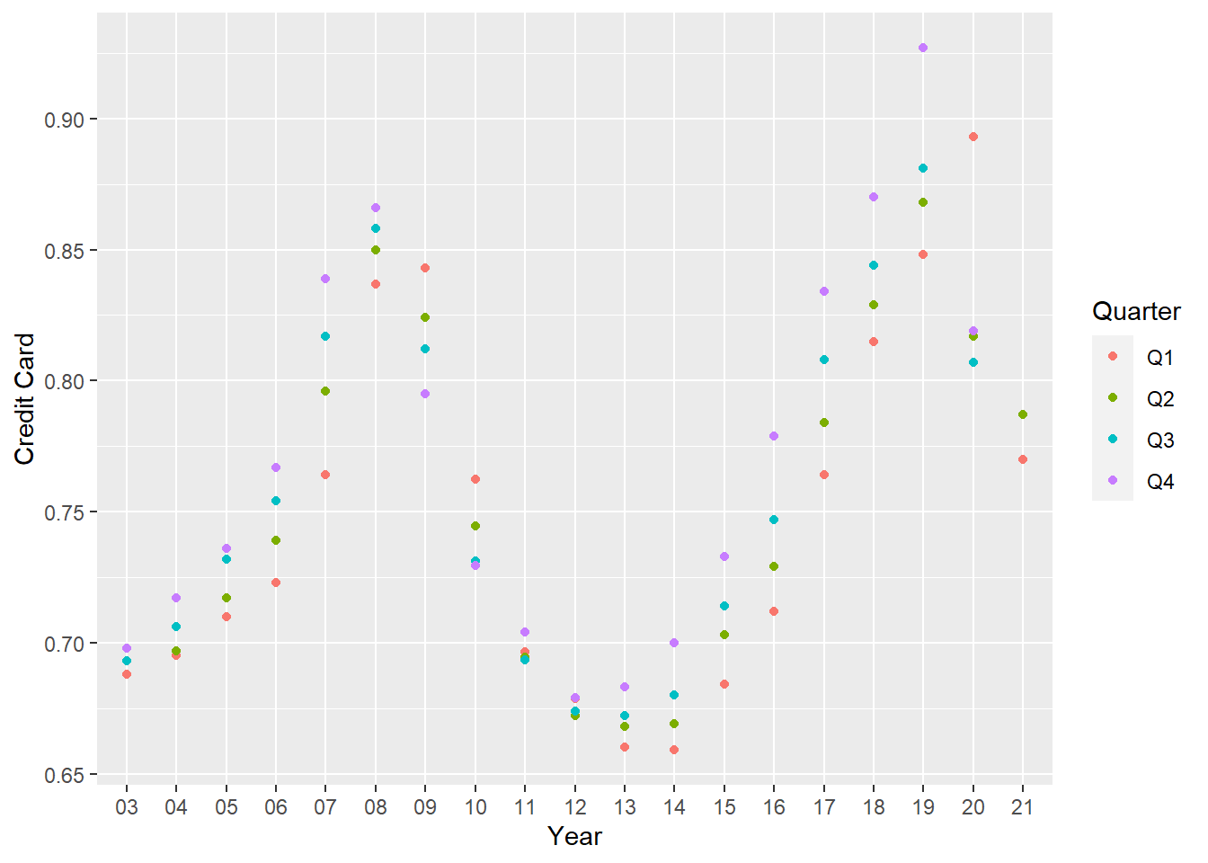
Pivoting the data
longerSplitData<- splitData%>%
  pivot_longer(!c(Year,Quarter), names_to = "DebtType",values_to = "DebtPercent" )

longerSplitData
# A tibble: 518 × 4
Year Quarter DebtType DebtPercent
<chr> <chr> <chr> <dbl>
1 03 Q1 Mortgage 4.94
2 03 Q1 HE Revolving 0.242
3 03 Q1 Auto Loan 0.641
4 03 Q1 Credit Card 0.688
5 03 Q1 Student Loan 0.241
6 03 Q1 Other 0.478
7 03 Q1 Total 7.23
8 03 Q2 Mortgage 5.08
9 03 Q2 HE Revolving 0.26
10 03 Q2 Auto Loan 0.622
# … with 508 more rowsVisualizing Part-Whole Relationships
longerSplitDataPlot <- longerSplitData%>%
  ggplot(mapping=aes(x = Year, y = DebtPercent))


longerSplitDataPlot +
  facet_wrap(~DebtType, scales = "free")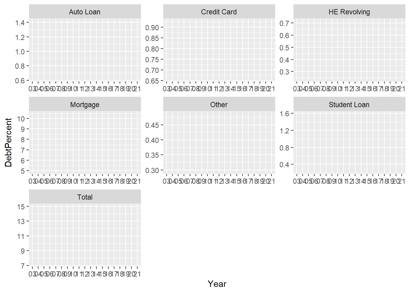
Visualizing the data by debt type
longerSplitDataPlot +
  geom_point(aes(color = DebtType))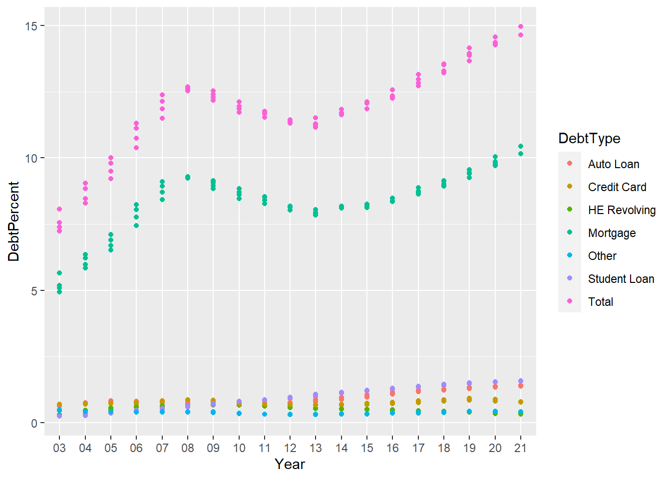
Visualize how different types of debt swayed the total debt for that year
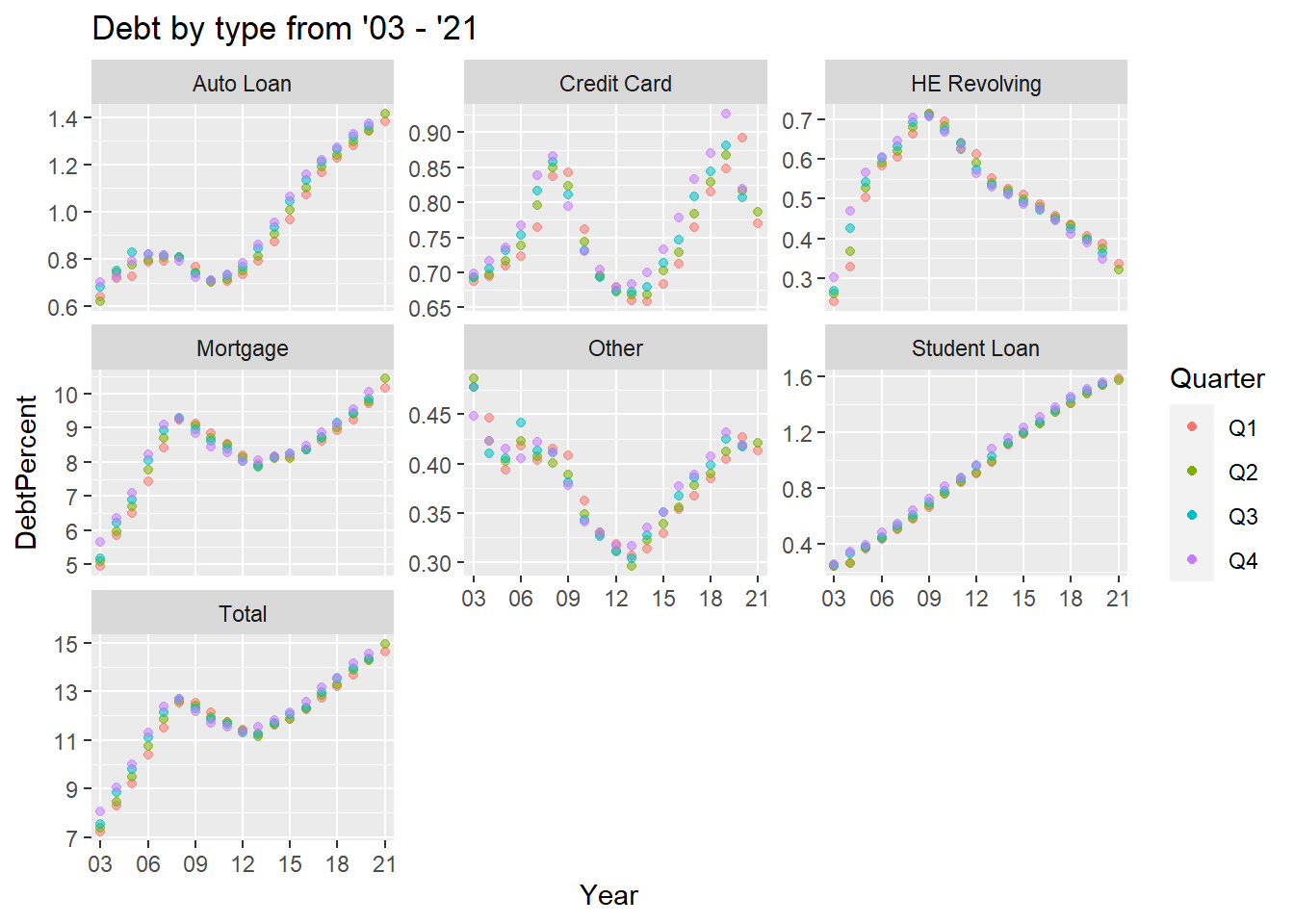
longerSplitDataPlot+
  geom_point() +
  facet_wrap(~DebtType) +
  scale_x_discrete(breaks = c('03','06','09',12,15,18,21))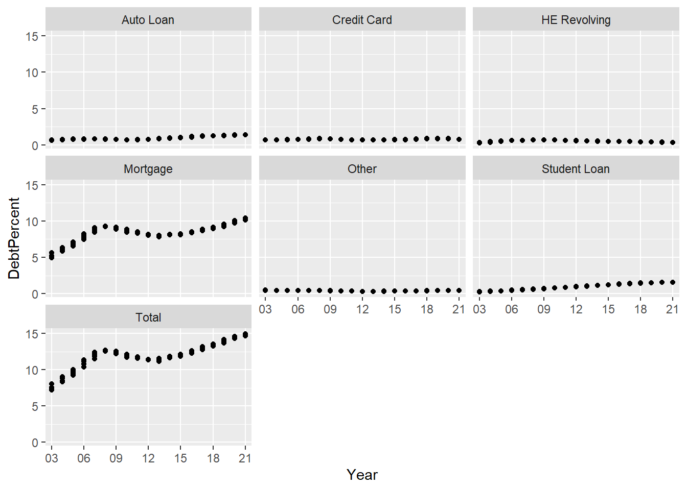
The above clearly demonstrates how mortgages drove the total debt. Setting the scales free to see the other types.
longerSplitDataPlot+
  geom_point(aes(color = Quarter,alpha=0.9,)) +
  facet_wrap(~DebtType, scales = "free_y") +
  guides(alpha="none") +
  labs(title="Debt by type from '03 - '21")+
  scale_x_discrete(breaks = c('03','06','09',12,15,18,21))