library(tidyverse)
library(ggplot2)

knitr::opts_chunk$set(echo = TRUE, warning=FALSE, message=FALSE)
Challenge 7
challenge_7
hotel_bookings
australian_marriage
air_bnb
eggs
abc_poll
faostat
usa_households
Visualizing Multiple Dimensions
Challenge Overview
Today’s challenge is to:
- read in a data set, and describe the data set using both words and any supporting information (e.g., tables, etc)
- tidy data (as needed, including sanity checks)
- mutate variables as needed (including sanity checks)
- Recreate at least two graphs from previous exercises, but introduce at least one additional dimension that you omitted before using ggplot functionality (color, shape, line, facet, etc) The goal is not to create unneeded chart ink (Tufte), but to concisely capture variation in additional dimensions that were collapsed in your earlier 2 or 3 dimensional graphs.
- Explain why you choose the specific graph type
- If you haven’t tried in previous weeks, work this week to make your graphs “publication” ready with titles, captions, and pretty axis labels and other viewer-friendly features
R Graph Gallery is a good starting point for thinking about what information is conveyed in standard graph types, and includes example R code. And anyone not familiar with Edward Tufte should check out his fantastic books and courses on data visualizaton.
(be sure to only include the category tags for the data you use!)
Read in data
Read in one (or more) of the following datasets, using the correct R package and command.
eggs ⭐
abc_poll ⭐⭐
australian_marriage ⭐⭐
hotel_bookings ⭐⭐⭐
air_bnb ⭐⭐⭐
faostat ⭐⭐⭐⭐
faostat <- read_csv("_data/FAOSTAT_livestock.csv",
                          skip = 1,
                          col_names = c("delete", "domain", "delete", "area", "delete", "delete", "animal code", "type", "delete", "year",
"unit", "value", "flag", "delete")) %>%
  select(!starts_with("delete")) %>%
  na_if("Skipped")
Briefly describe the data
Tidy Data (as needed)
Is your data already tidy, or is there work to be done? Be sure to anticipate your end result to provide a sanity check, and document your work here.
I tidied the data by deleting some of the columns that were not needed or I thought wouldn’t be useful in visualizing the data. For example, I deleted the year code column because the values there were the same values as the year column. I deleted the element and element code column because I didn’t see what value those provided in visualizing the data.
  ggplot(faostat, aes(year, value, color = type)) +
  geom_point()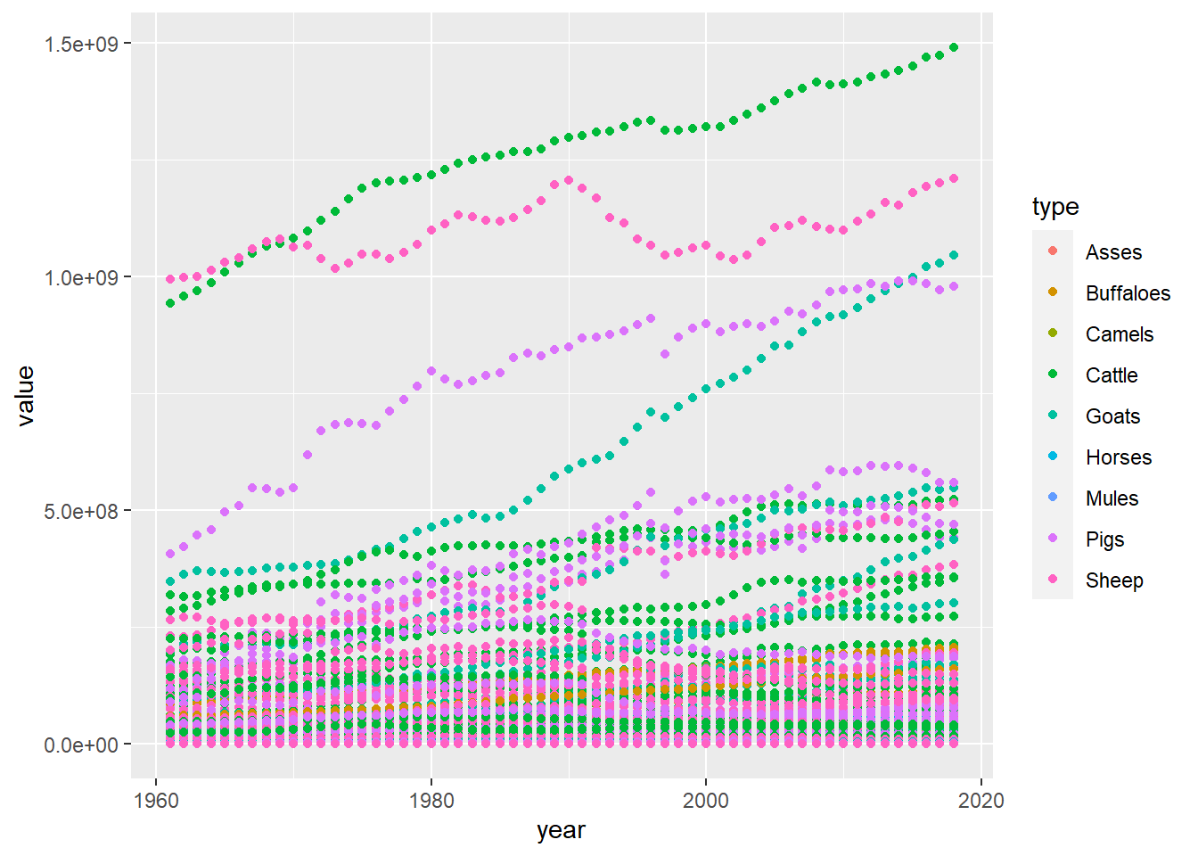
Visualization with Multiple Dimensions
faostat %>%
  filter(year >= 2010) %>%
   ggplot(aes(unit, value, color = type)) +
   geom_point()  +
  facet_wrap("year")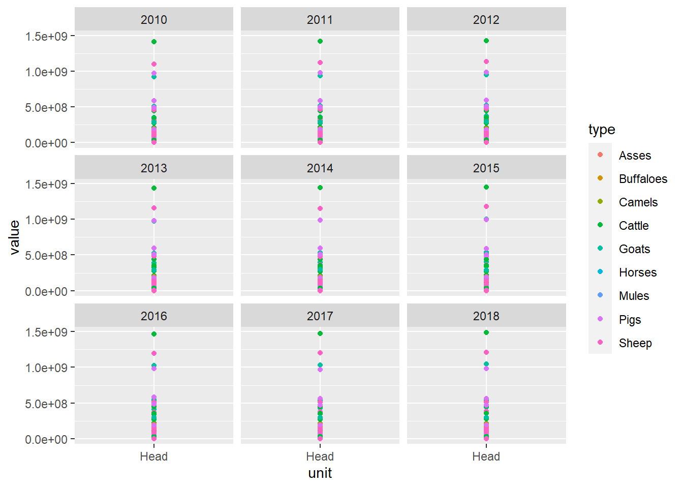
It seems that cattle have the most value for each head in the most recent years. Pigs and goats heads are also listed at a pretty high value. Conversely, sheep’s heads are at the lowest value. Most of the recent years have basically the same data on each animal type’s value.