read in a data set, and describe the data set using both words and any supporting information (e.g., tables, etc)
tidy data (as needed, including sanity checks)
mutate variables as needed (including sanity checks)
create at least one graph including time (evolution)
try to make them “publication” ready (optional)
Explain why you choose the specific graph type
Create at least one graph depicting part-whole or flow relationships
try to make them “publication” ready (optional)
Explain why you choose the specific graph type
R Graph Gallery is a good starting point for thinking about what information is conveyed in standard graph types, and includes example R code.
(be sure to only include the category tags for the data you use!)
Read in data
Read in one (or more) of the following data-sets, using the correct R package and command.
debt ⭐
fed_rate ⭐⭐
abc_poll ⭐⭐⭐
usa_hh ⭐⭐⭐
hotel_bookings ⭐⭐⭐⭐
AB_NYC ⭐⭐⭐⭐⭐
debt<-read_excel("_data/debt_in_trillions.xlsx")
Briefly describe the data
This data-set provides insight into the total household debt (in trillions) in the U.S from 2003 to 2021 published quarterly. The debt is broken down into major loan types: mortgage, revolving home equity line of credit, auto loans, credit cards and student loans.
Tidy Data (as needed)
Is your data already tidy, or is there work to be done? Be sure to anticipate your end result to provide a sanity check, and document your work here.
dim(debt)
[1] 74 8
summary(debt)
 Year and Quarter      Mortgage       HE Revolving      Auto Loan
 Length:74          Min.   : 4.942   Min.   :0.2420   Min.   :0.6220
 Class :character   1st Qu.: 8.036   1st Qu.:0.4275   1st Qu.:0.7430
 Mode  :character   Median : 8.412   Median :0.5165   Median :0.8145
                    Mean   : 8.274   Mean   :0.5161   Mean   :0.9309
                    3rd Qu.: 9.047   3rd Qu.:0.6172   3rd Qu.:1.1515
                    Max.   :10.442   Max.   :0.7140   Max.   :1.4150
  Credit Card      Student Loan        Other            Total
 Min.   :0.6590   Min.   :0.2407   Min.   :0.2960   Min.   : 7.231
 1st Qu.:0.6966   1st Qu.:0.5333   1st Qu.:0.3414   1st Qu.:11.311
 Median :0.7375   Median :0.9088   Median :0.3921   Median :11.852
 Mean   :0.7565   Mean   :0.9189   Mean   :0.3831   Mean   :11.779
 3rd Qu.:0.8165   3rd Qu.:1.3022   3rd Qu.:0.4154   3rd Qu.:12.674
 Max.   :0.9270   Max.   :1.5840   Max.   :0.4860   Max.   :14.957
Are there any variables that require mutation to be usable in your analysis stream? For example, do you need to calculate new values in order to graph them? Can string values be represented numerically? Do you need to turn any variables into factors and reorder for ease of graphics and visualization?
Document your work here.
#Creating a date variabledebt <- debt %>%mutate(Month_day=case_when(str_detect(`Year and Quarter`, "Q1")~"March 31", str_detect(`Year and Quarter`, "Q2")~"June 30", str_detect(`Year and Quarter`, "Q3")~"September 30", str_detect(`Year and Quarter`, "Q4")~"December 31")) %>%mutate(Year_prefix="20")debt<- debt %>%unite(`FullYearQ`, `Year_prefix`, `Year and Quarter`, sep="") %>%separate(FullYearQ,into =c("Year2", "Quarter"), sep =":") %>%mutate(Year=Year2) %>%unite(`Date`, `Month_day`, `Year2`, sep =", ")print(head(debt))
# A tibble: 6 × 10
Date Quarter Mortg…¹ HE Re…² Auto …³ Credi…⁴ Stude…⁵ Other Total Year
<chr> <chr> <dbl> <dbl> <dbl> <dbl> <dbl> <dbl> <dbl> <chr>
1 March 31, 2… Q1 4.94 0.242 0.641 0.688 0.241 0.478 7.23 2003
2 June 30, 20… Q2 5.08 0.26 0.622 0.693 0.243 0.486 7.38 2003
3 September 3… Q3 5.18 0.269 0.684 0.693 0.249 0.477 7.56 2003
4 December 31… Q4 5.66 0.302 0.704 0.698 0.253 0.449 8.07 2003
5 March 31, 2… Q1 5.84 0.328 0.72 0.695 0.260 0.446 8.29 2004
6 June 30, 20… Q2 5.97 0.367 0.743 0.697 0.263 0.423 8.46 2004
# … with abbreviated variable names ¹Mortgage, ²`HE Revolving`, ³`Auto Loan`,
# ⁴`Credit Card`, ⁵`Student Loan`
#Pivoting the data widerdebt_wide <- debt%>%pivot_longer(cols=4:10, names_to ="Debt_Type", values_to="Debt_Amount") %>%group_by(Debt_Type)debt_tidy <- debt_wide
Time Dependent Visualization
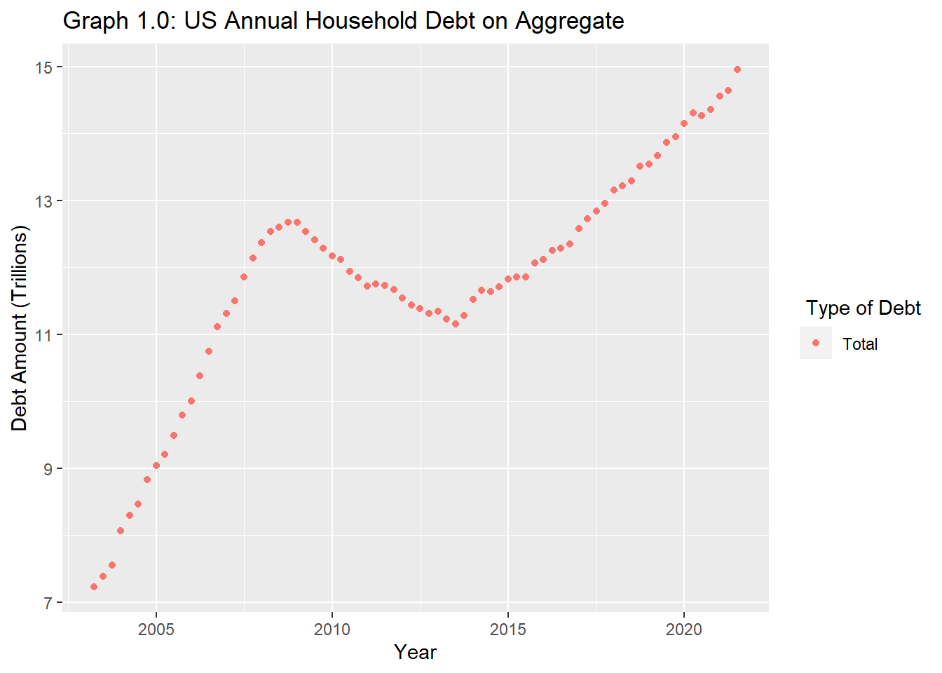
debt_tidy %>%filter(Debt_Type =="Total") %>%ggplot() +aes(x=`Date`,y=(Debt_Amount), color= Debt_Type) +geom_point(stat ="identity")+labs(y="Debt Amount (Trillions)", x="Year", color=" Type of Debt") +ggtitle("Graph 1.0: US Annual Household Debt on Aggregate")
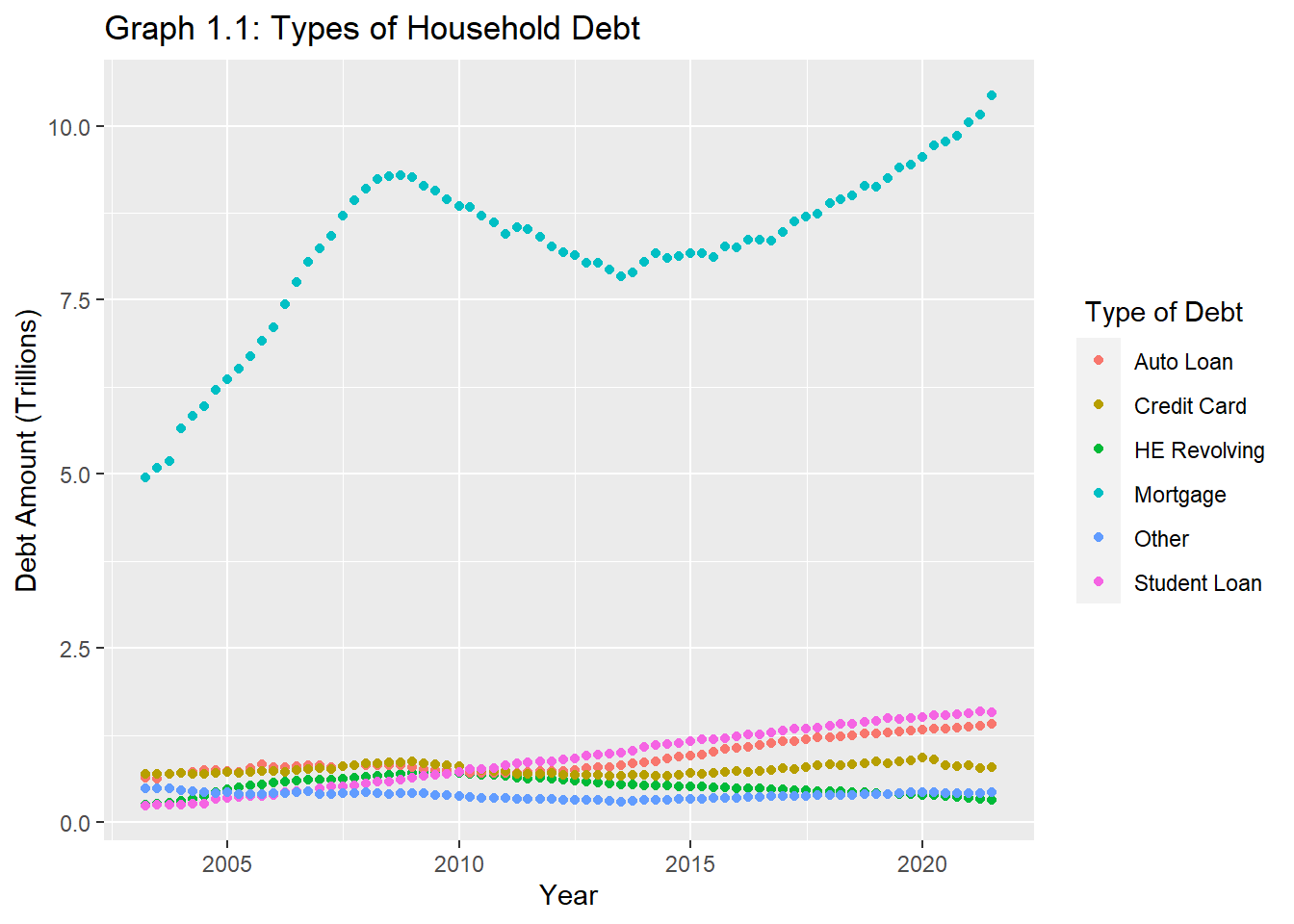
#Vizualizing all types of debtdebt_total <- debt_tidy %>%filter(`Debt_Type`!="Total")debt_total %>%ggplot() +aes(x=`Date`,y=(Debt_Amount), color= Debt_Type) +geom_point(stat ="identity")+labs(y="Debt Amount (Trillions)", x="Year" , color=" Type of Debt") +ggtitle("Graph 1.1: Types of Household Debt")
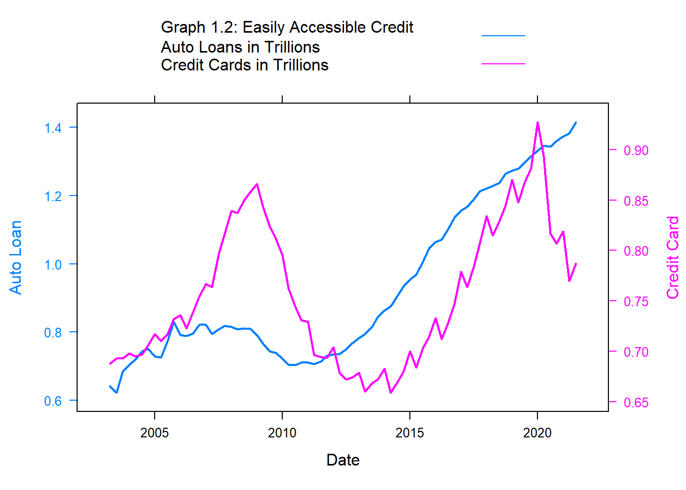
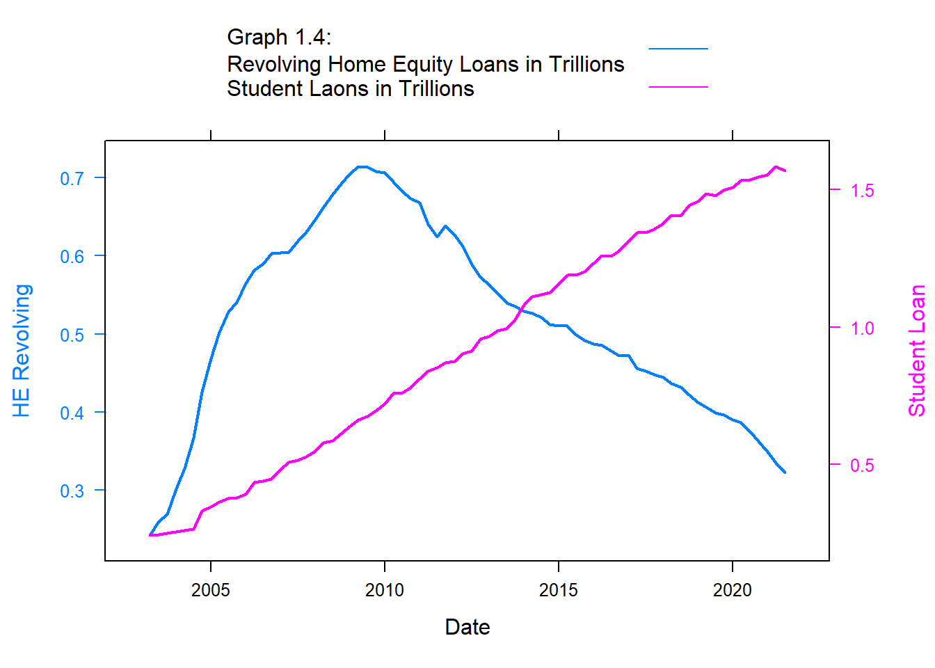
In the series of graphs below, I’ll take a closer look at some useful patterns. The following time series relationships will be visualized using xy plots, chosen for the double-scaled effect when comparing two variables on both sides of the y-axis
In the example below, graph 1.2, I chose to compare auto loans with credit card debt because they are often two of the easiest types of loans to qualify for.
library(latticeExtra)#Comparing Auto and Credit Card debt Auto.Loan <-xyplot(`Auto Loan`~`Date`, debt, type ="l" , lwd=2) Credit.Card <-xyplot(`Credit Card`~`Date`, debt, type ="l", lwd=2)doubleYScale(Auto.Loan, Credit.Card, text =c("Graph 1.2: Easily Accessible Credit Auto Loans in Trillions","Credit Cards in Trillions") , add.ylab2 =TRUE)
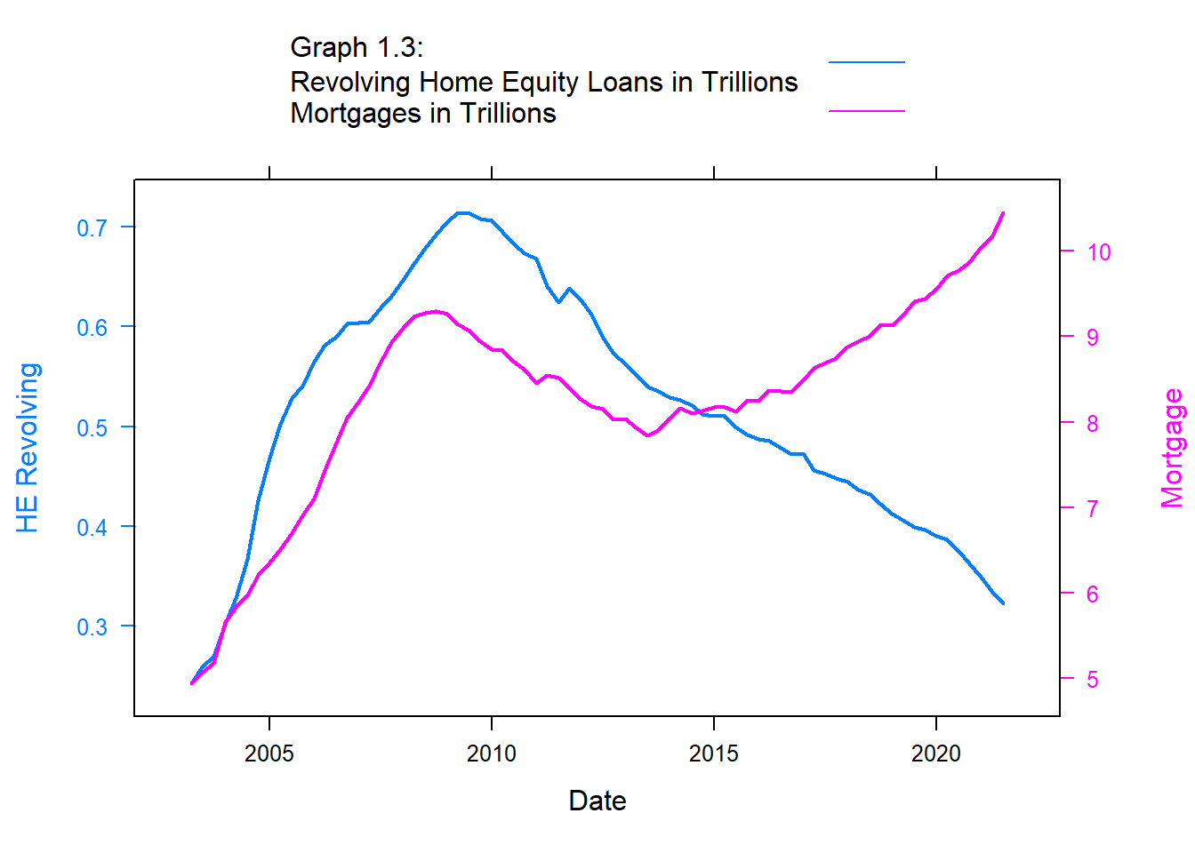
#Comparing HE Revolving and Mortgage LoansHE.Rev <-xyplot(`HE Revolving`~Date, debt, type="l", lwd=2)Mortgage <-xyplot(`Mortgage`~`Date`, debt, type="l", lwd=2)doubleYScale(HE.Rev, Mortgage, text =c("Graph 1.3: Revolving Home Equity Loans in Trillions", "Mortgages in Trillions") , add.ylab2 =TRUE)
#Comparing Auto and Student LoansHE.Rev <-xyplot(`HE Revolving`~Date, debt, type="l", lwd=2)Student <-xyplot(`Student Loan`~`Date`, debt, type="l", lwd=2)doubleYScale(HE.Rev, Student, text =c("Graph 1.4: Revolving Home Equity Loans in Trillions", "Student Laons in Trillions") , add.ylab2 =TRUE)
Visualizing Part-Whole Relationships
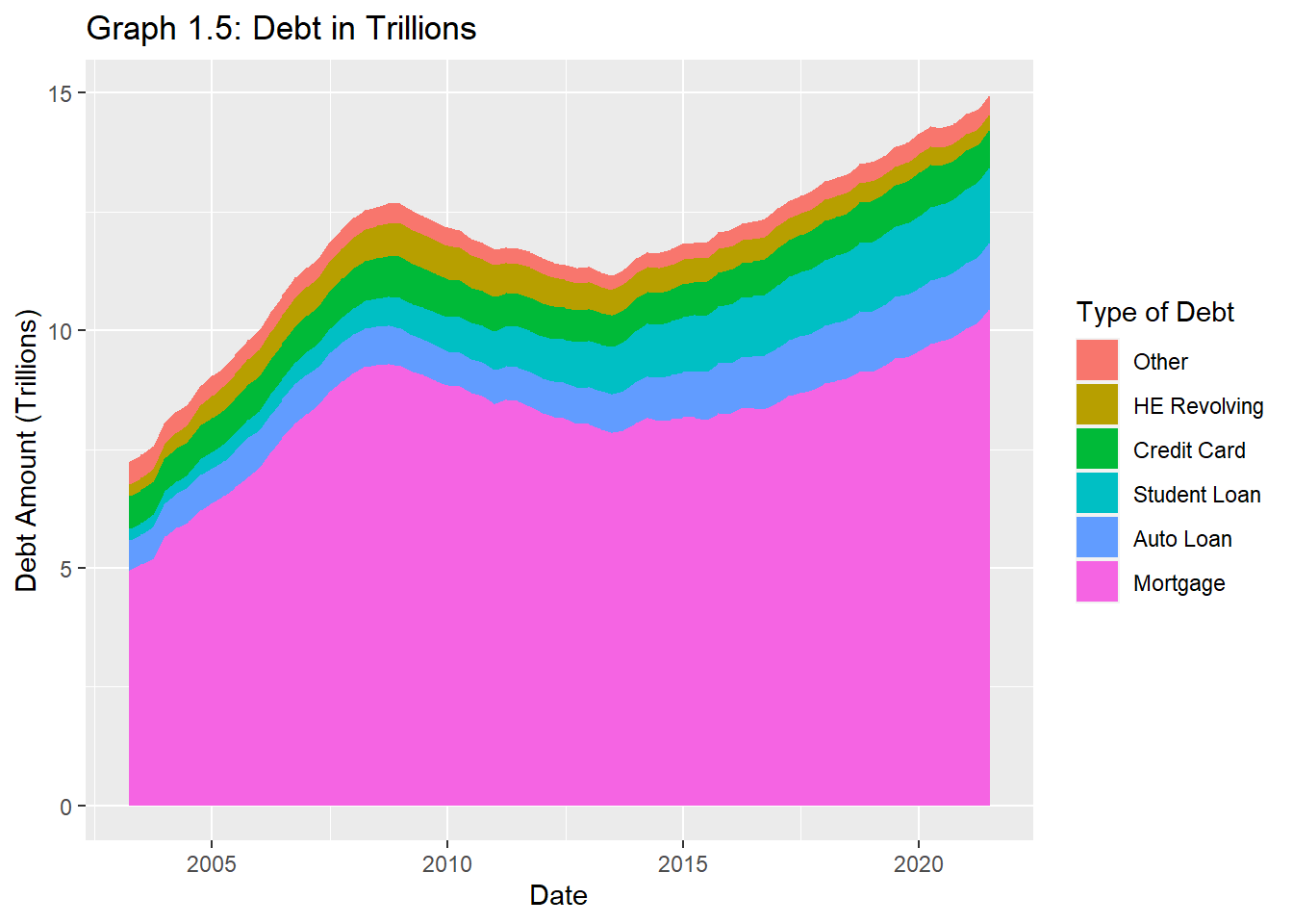
debt_total %>%ggplot() +aes(x=`Date`, y=Debt_Amount, fill=reorder(`Debt_Type`,Debt_Amount)) +geom_area()+ggtitle("Graph 1.5: Debt in Trillions")+labs(y="Debt Amount (Trillions)", x="Date", fill="Type of Debt")
The above graph was chosen to illustrate the aftermath of the US financial cliff of 2012. This stacked area graph helped me to understand the part-whole relationships while keeping time continuous on the x-axis.
Source Code
---title: "Challenge 6"author: "Owen Tibby"description: "Visualizing Time and Relationships"date: "11/23/2022"format: html: toc: true code-copy: true code-tools: truecategories: - challenge_6 - debt---```{r}#| label: setup#| warning: false#| message: falselibrary(tidyverse)library(ggplot2)library(stringr)library(dplyr)library(babynames)library(viridis)library(hrbrthemes)library(plotly)library(readxl)knitr::opts_chunk$set(echo =TRUE, warning=FALSE, message=FALSE)```## Challenge OverviewToday's challenge is to:1) read in a data set, and describe the data set using both words and any supporting information (e.g., tables, etc)2) tidy data (as needed, including sanity checks)3) mutate variables as needed (including sanity checks)4) create at least one graph including time (evolution)- try to make them "publication" ready (optional)- Explain why you choose the specific graph type5) Create at least one graph depicting part-whole or flow relationships- try to make them "publication" ready (optional)- Explain why you choose the specific graph type[R Graph Gallery](https://r-graph-gallery.com/) is a good starting point for thinking about what information is conveyed in standard graph types, and includes example R code.(be sure to only include the category tags for the data you use!)## Read in dataRead in one (or more) of the following data-sets, using the correct R package and command.- debt ⭐- fed_rate ⭐⭐- abc_poll ⭐⭐⭐- usa_hh ⭐⭐⭐- hotel_bookings ⭐⭐⭐⭐- AB_NYC ⭐⭐⭐⭐⭐```{r}debt<-read_excel("_data/debt_in_trillions.xlsx")```### Briefly describe the dataThis data-set provides insight into the total household debt (in trillions) in the U.S from 2003 to 2021 published quarterly. The debt is broken down into major loan types: mortgage, revolving home equity line of credit, auto loans, credit cards and student loans.## Tidy Data (as needed)Is your data already tidy, or is there work to be done? Be sure to anticipate your end result to provide a sanity check, and document your work here.```{r}dim(debt)summary(debt)```Are there any variables that require mutation to be usable in your analysis stream? For example, do you need to calculate new values in order to graph them? Can string values be represented numerically? Do you need to turn any variables into factors and reorder for ease of graphics and visualization?Document your work here.```{r}#Creating a date variabledebt <- debt %>%mutate(Month_day=case_when(str_detect(`Year and Quarter`, "Q1")~"March 31", str_detect(`Year and Quarter`, "Q2")~"June 30", str_detect(`Year and Quarter`, "Q3")~"September 30", str_detect(`Year and Quarter`, "Q4")~"December 31")) %>%mutate(Year_prefix="20")debt<- debt %>%unite(`FullYearQ`, `Year_prefix`, `Year and Quarter`, sep="") %>%separate(FullYearQ,into =c("Year2", "Quarter"), sep =":") %>%mutate(Year=Year2) %>%unite(`Date`, `Month_day`, `Year2`, sep =", ")print(head(debt))library(lubridate)debt$Date <- debt$Date %>%mdy() #Reorganizing columns col_order <-c(10, 2, 1, 3:9)debt<-debt[, col_order]print((debt))``````{r}#Pivoting the data widerdebt_wide <- debt%>%pivot_longer(cols=4:10, names_to ="Debt_Type", values_to="Debt_Amount") %>%group_by(Debt_Type)debt_tidy <- debt_wide```## Time Dependent Visualization```{r Total debt}debt_tidy %>%filter(Debt_Type =="Total") %>%ggplot() +aes(x=`Date`,y=(Debt_Amount), color= Debt_Type) +geom_point(stat ="identity")+labs(y="Debt Amount (Trillions)", x="Year", color=" Type of Debt") +ggtitle("Graph 1.0: US Annual Household Debt on Aggregate")``````{r All types of debt}#Vizualizing all types of debtdebt_total <- debt_tidy %>%filter(`Debt_Type`!="Total")debt_total %>%ggplot() +aes(x=`Date`,y=(Debt_Amount), color= Debt_Type) +geom_point(stat ="identity")+labs(y="Debt Amount (Trillions)", x="Year" , color=" Type of Debt") +ggtitle("Graph 1.1: Types of Household Debt")```In the series of graphs below, I'll take a closer look at some useful patterns. The following time series relationships will be visualized using xy plots, chosen for the double-scaled effect when comparing two variables on both sides of the y-axisIn the example below, graph 1.2, I chose to compare auto loans with credit card debt because they are often two of the easiest types of loans to qualify for.```{r graph 1.2}library(latticeExtra)#Comparing Auto and Credit Card debt Auto.Loan <-xyplot(`Auto Loan`~`Date`, debt, type ="l" , lwd=2) Credit.Card <-xyplot(`Credit Card`~`Date`, debt, type ="l", lwd=2)doubleYScale(Auto.Loan, Credit.Card, text =c("Graph 1.2: Easily Accessible Credit Auto Loans in Trillions","Credit Cards in Trillions") , add.ylab2 =TRUE)``````{r graph 1.3}#Comparing HE Revolving and Mortgage LoansHE.Rev <-xyplot(`HE Revolving`~Date, debt, type="l", lwd=2)Mortgage <-xyplot(`Mortgage`~`Date`, debt, type="l", lwd=2)doubleYScale(HE.Rev, Mortgage, text =c("Graph 1.3: Revolving Home Equity Loans in Trillions", "Mortgages in Trillions") , add.ylab2 =TRUE)``````{r graph 1.4}#Comparing Auto and Student LoansHE.Rev <-xyplot(`HE Revolving`~Date, debt, type="l", lwd=2)Student <-xyplot(`Student Loan`~`Date`, debt, type="l", lwd=2)doubleYScale(HE.Rev, Student, text =c("Graph 1.4: Revolving Home Equity Loans in Trillions", "Student Laons in Trillions") , add.ylab2 =TRUE)```## Visualizing Part-Whole Relationships```{r graph 1.5}debt_total %>%ggplot() +aes(x=`Date`, y=Debt_Amount, fill=reorder(`Debt_Type`,Debt_Amount)) +geom_area()+ggtitle("Graph 1.5: Debt in Trillions")+labs(y="Debt Amount (Trillions)", x="Date", fill="Type of Debt")```The above graph was chosen to illustrate the aftermath of the US financial cliff of 2012. This stacked area graph helped me to understand the part-whole relationships while keeping time continuous on the x-axis.