library(tidyverse)
library(ggplot2)

knitr::opts_chunk$set(echo = TRUE, warning=FALSE, message=FALSE)
Challenge 5
challenge_5
railroads
cereal
air_bnb
pathogen_cost
australian_marriage
public_schools
usa_households
Introduction to Visualization
Challenge Overview
Today’s challenge is to:
- read in a data set, and describe the data set using both words and any supporting information (e.g., tables, etc)
- tidy data (as needed, including sanity checks)
- mutate variables as needed (including sanity checks)
- create at least two univariate visualizations
- try to make them “publication” ready
- Explain why you choose the specific graph type
- Create at least one bivariate visualization
- try to make them “publication” ready
- Explain why you choose the specific graph type
R Graph Gallery is a good starting point for thinking about what information is conveyed in standard graph types, and includes example R code.
(be sure to only include the category tags for the data you use!)
Read in data
Read in one (or more) of the following datasets, using the correct R package and command.
- cereal.csv ⭐
- Total_cost_for_top_15_pathogens_2018.xlsx ⭐
- Australian Marriage ⭐⭐
- AB_NYC_2019.csv ⭐⭐⭐
- StateCounty2012.xls ⭐⭐⭐
- Public School Characteristics ⭐⭐⭐⭐
- USA Households ⭐⭐⭐⭐⭐
Briefly describe the data
This dataset shows all airbnbs in the nyc area. It has the neighborhoods they are located in and what kind of airbnb it is(i.e. private room, private apartment, shared room, etc.). We can also see information like hosts, price, availability for the year, and data about the past reviews they have gotten.
library(readr)
AB_NYC_2019 <- read_csv("_data/AB_NYC_2019.csv",
                        skip = 1,
                          col_names = c("delete", "name", "delete", "host_name", "neighbourhood_group","nieghbourhood","delete", "delete", "room_type", "price", "minimum_nights", "delete", "delete", "delete", "delete", "availability_365")) %>%

   select(!starts_with("delete"))
Tidy Data (as needed)
I tidied my data by removing the longitiude, latitude columns since I didn’t think they would be useful for my analysis on the data or the visualization I will be doing on the data. I also removed the id, host ids and all the information provided about the reviews (number of reviews, last review date and number of reviews per month) since I didn’t deem those important enough to visualize or analyze which neighborhoods have more rentals and which neighborhood have a higher price point.
Are there any variables that require mutation to be usable in your analysis stream? For example, do you need to calculate new values in order to graph them? Can string values be represented numerically? Do you need to turn any variables into factors and reorder for ease of graphics and visualization?
This data is relatively easy to analyze already. All numerical values are represented numerically. I can group the prices together so that are there a little less data points when representing this data visually.
AB_NYC_2019  %>%
  ggplot(aes(`room_type`, fill = `neighbourhood_group`)) +
  geom_bar() +
  labs(title = "Airbnb room types and neighborhoods",x = "Room Type",  y="Number of  Airbnbs") +
  theme_bw() +
  scale_fill_discrete(name= "Neighborhood")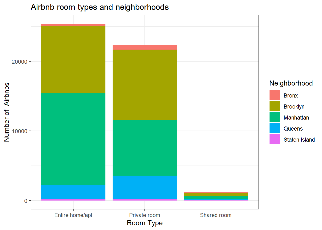
Univariate Visualizations
I analyzed the room type with the neighborhood groups. I wanted to see if there were particular neighborhoods that were more inclined to particular room types. For example, it looks like Manhattan and Brooklyn have an equal number of private rooms available. However, it looks like Manhattan has more entire homes/apartments than Brooklyn does (or any other neighborhood does)
AB_NYC_2019 %>%
  ggplot(aes(x=`minimum_nights`, y=`price`)) +
  geom_smooth() +
  labs(title = "Airbnb price based on Minimum Number of Nights Required", x="Minimum Number of Nights", y="Price") +
  facet_wrap (~`room_type`, nrow=2) +
  xlim(0,18)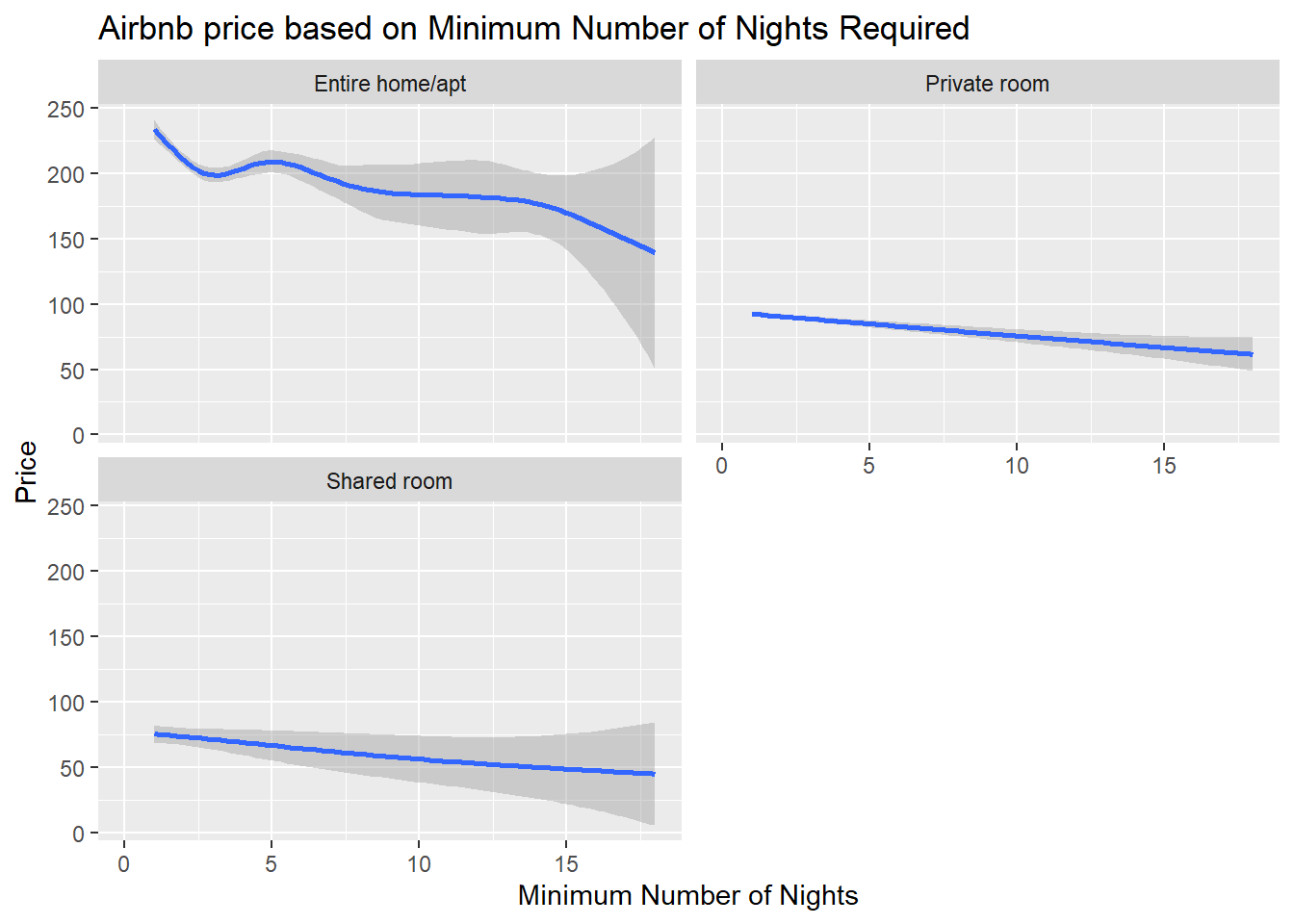
Bivariate Visualization(s)
It looks like like shared room prices and private room prices are relatively similar which is surprising. Also shared room prices are a little more diverse whereas private room prices are all about the same. It looks like no matter what type of room you have (private room, shared room or even entire home/apartment), the price goes down the more nights they have required for a minimum night stay. The prices for entire homes and apartments are more diverse than all other types of rooms for all minimum night stays.