library(tidyverse)
library(ggplot2)

knitr::opts_chunk$set(echo = TRUE, warning=FALSE, message=FALSE)
Challenge 6
challenge_6
hotel_bookings
air_bnb
fed_rate
debt
usa_households
abc_poll
Visualizing Time and Relationships
Challenge Overview
Today’s challenge is to:
- read in a data set, and describe the data set using both words and any supporting information (e.g., tables, etc)
- tidy data (as needed, including sanity checks)
- mutate variables as needed (including sanity checks)
- create at least one graph including time (evolution)
- try to make them “publication” ready (optional)
- Explain why you choose the specific graph type
- Create at least one graph depicting part-whole or flow relationships
- try to make them “publication” ready (optional)
- Explain why you choose the specific graph type
R Graph Gallery is a good starting point for thinking about what information is conveyed in standard graph types, and includes example R code.
(be sure to only include the category tags for the data you use!)
Read in data
Read in one (or more) of the following datasets, using the correct R package and command.
- debt ⭐
- fed_rate ⭐⭐
- abc_poll ⭐⭐⭐
- usa_hh ⭐⭐⭐
- hotel_bookings ⭐⭐⭐⭐
- AB_NYC ⭐⭐⭐⭐⭐
library(readxl)
debt_in_trillions <- read_excel("_data/debt_in_trillions.xlsx")
dim(debt_in_trillions)
[1] 74 8Briefly describe the data
This dataset shows the amount of debt in varying categories by year and quarter ranging from 2003 to 2021. There are 74 rows and 8 columns. The data unit is in trillions so the numbers themselves may look smaller or be in decimal form.
year_quarter <- debt_in_trillions %>%
  separate(`Year and Quarter`,  c("Year", "Quarter"), ":")

year_quarter$Year <- as.integer(year_quarter$Year) + 2000
view(year_quarter)
Tidy Data (as needed)
Is your data already tidy, or is there work to be done? Be sure to anticipate your end result to provide a sanity check, and document your work here.
In order to provide a graph with time, we need to separate the column with the year and the quarter. For year, we need to add 2000 to the value since only the last two digits of the year (ex. ’06 for 2006) and make it a numerical value.
scatter <- year_quarter %>%
  ggplot(mapping = aes(x = Year , y = `Auto Loan`)) +
  geom_point()
scatter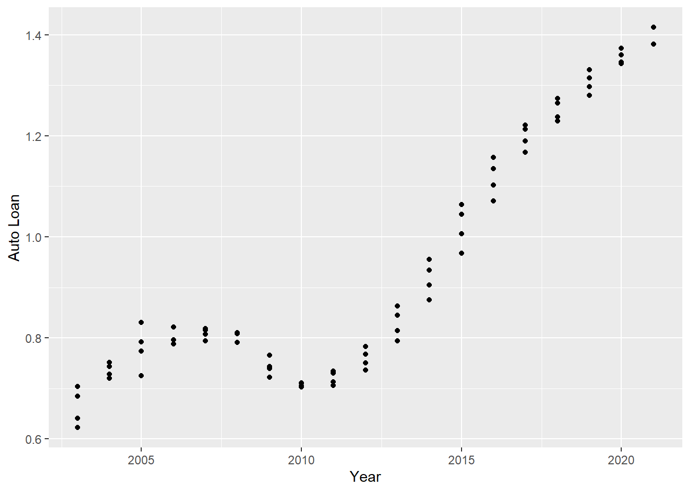
scatter <- year_quarter %>%
  ggplot(mapping = aes(x = Year , y = `Credit Card`)) +
  geom_point()
scatter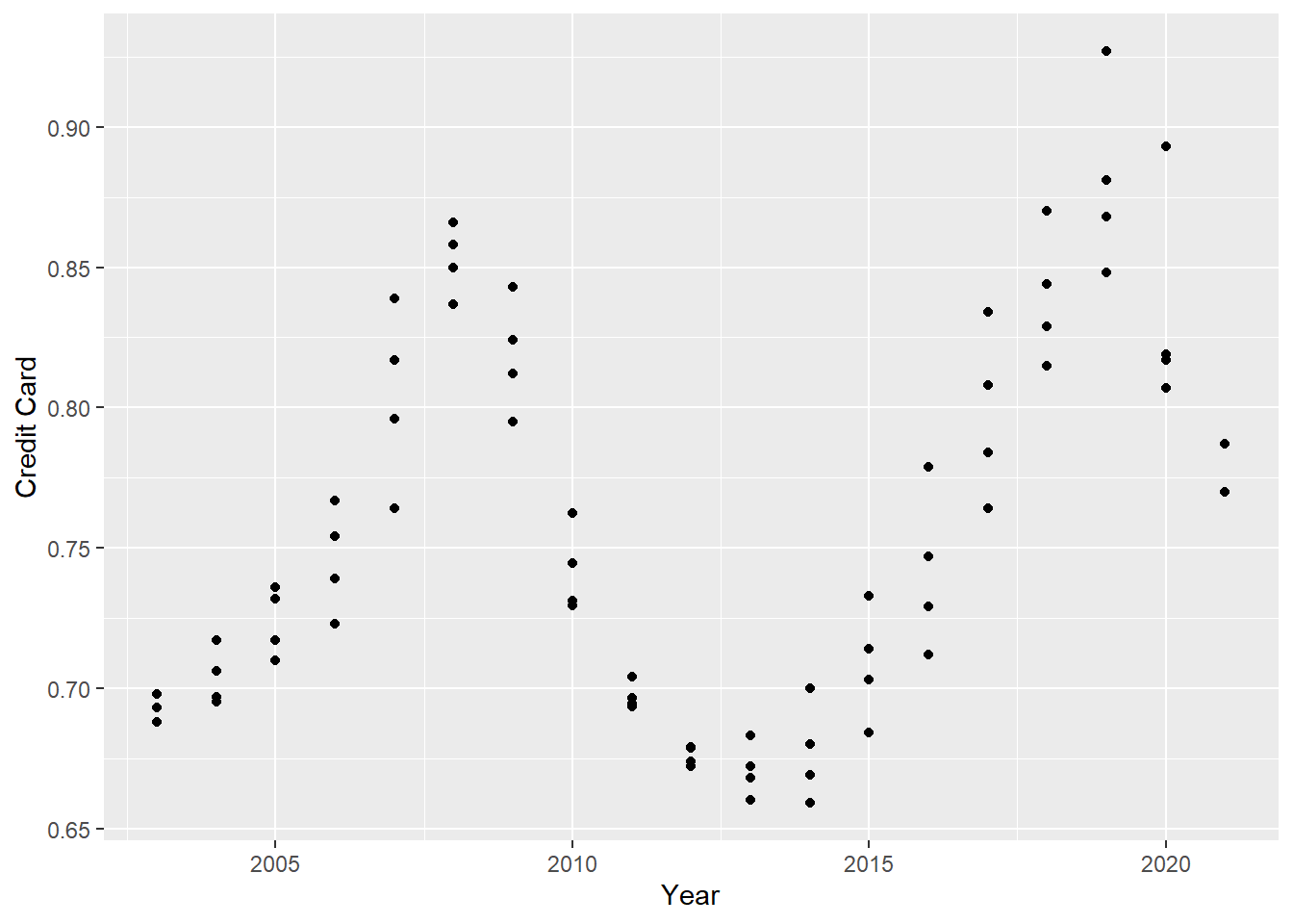
Time Dependent Visualization
We can see that a category like auto loans went up with time consistently but a category such as credit card is fluctuating with time depending on the year and maybe some unknown factors like the economy or inflation.
ggplot(year_quarter, aes(Year)) +
    geom_point(aes(y= `Mortgage`, color="Mortgage")) +
    geom_point(aes(y= `HE Revolving`, color="HE_Revolving")) +
    geom_point(aes(y= `Auto Loan`, color="Auto_Loan")) +
    geom_point(aes(y= `Credit Card`, color="Credit Card")) +
    geom_point(aes(y= `Student Loan`, color="Student Loan"))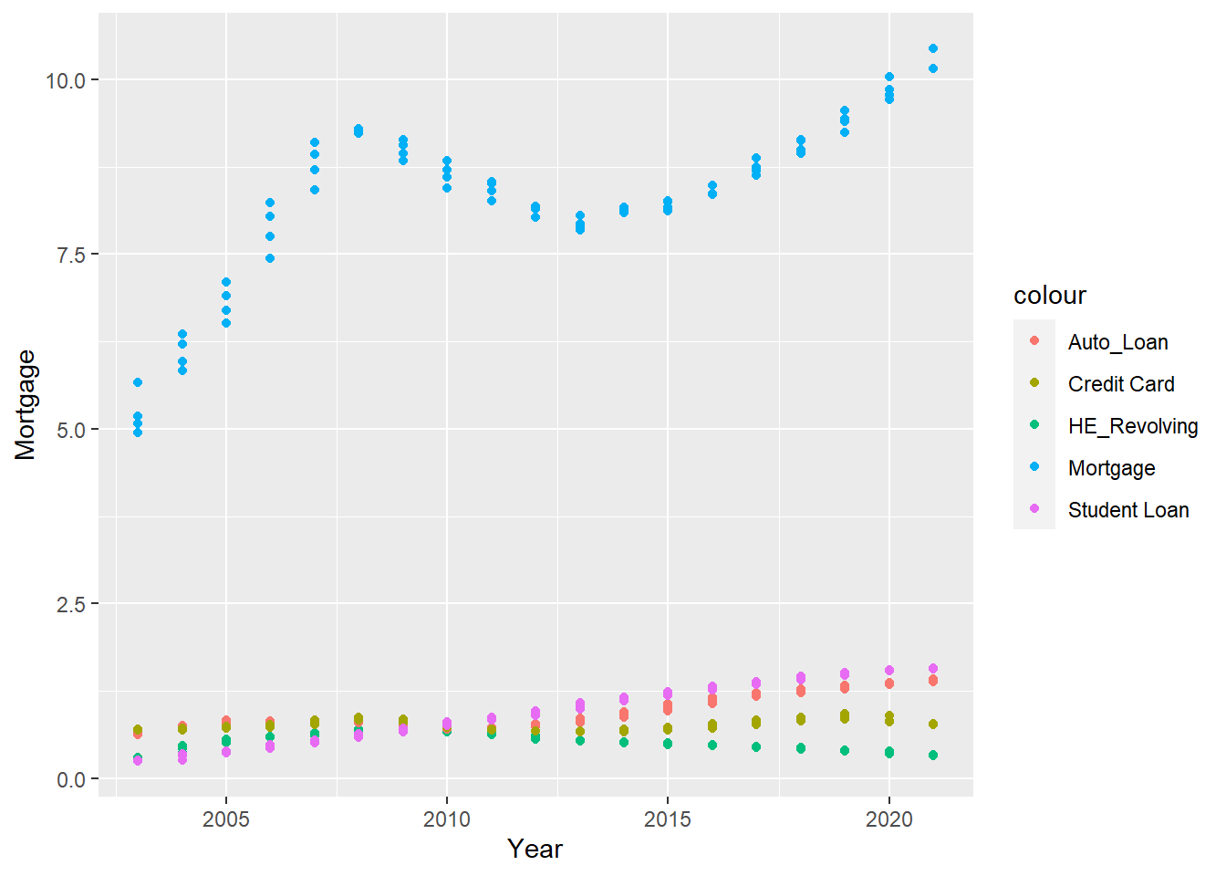
Visualizing Part-Whole Relationships
I expanded on what I saw in the earlier time visualization graph by plotting all the categories against the year. This way we see that mortgage is the highest debt that people have and that even though it dipped a little from 2010-2015, it has gotten steadily higher in the last 5 years. We can also see from this graph that all the other forms of debt may have gotten a little higher throughout the years but has remained pretty steady around the same range.