Code
library(tidyverse)
library(readxl)

knitr::opts_chunk$set(echo = TRUE)library(tidyverse)
library(readxl)
knitr::opts_chunk$set(echo = TRUE)#initial read-in for summary
pathogen_orig <- read_xlsx("_data/Total_cost_for_top_15_pathogens_2018.xlsx",
col_names = c("Pathogen","est_cases","total_cost"),
range = "A6:C20")
head(pathogen_orig)# A tibble: 6 × 3
Pathogen est_cases total_cost
<chr> <dbl> <dbl>
1 Campylobacter spp. (all species) 845024 2181485783.
2 Clostridium perfringens 965958 384277856.
3 Cryptosporidium spp. (all species) 57616 58394152.
4 Cyclospora cayetanensis 11407 2571518.
5 Listeria monocytogenes 1591 3189686110.
6 Norovirus 5461731 2566984191.#tail(pathogen_orig)With this initial read-in, I can see that the data contain 15 pathogen groups, the estimated mean of cases in 2018, and the total cost of those cases, adjusted for inflation per the notes. From what I understand, these 15 groups are distinct, and so I expect I can trust the values without needing to disentangle them from one another (i.e. if all species of Campylobacter and a subspecies were both listed). I will want to mutate the data to find the average cost per case so that I can arrange them in the order of most expensive per case.
pathogen <- read_xlsx("_data/Total_cost_for_top_15_pathogens_2018.xlsx",
                            col_names = c("Pathogen","est_cases","total_cost"),
                           range = "A6:C20") %>%
  # add cost per case variable
  mutate(cost_case = total_cost/est_cases) %>%
  # arrange in descending order
  arrange(desc(cost_case))

path_ranked <- print(pathogen)
# A tibble: 15 × 4
Pathogen est_c…¹ total…² cost_…³
<chr> <dbl> <dbl> <dbl>
1 Vibrio vulnificus 96 3.59e8 3.74e6
2 Listeria monocytogenes 1591 3.19e9 2.00e6
3 Toxoplasma gondii 86686 3.74e9 4.32e4
4 Shiga toxin-producing Escherichia coli O157 (STEC O1… 63153 3.11e8 4.93e3
5 Vibrio non-cholera species other than V. parahaemoly… 17564 8.17e7 4.65e3
6 Salmonella (non-typhoidal species) 1027561 4.14e9 4.03e3
7 Yersinia enterocolitica 97656 3.13e8 3.21e3
8 Campylobacter spp. (all species) 845024 2.18e9 2.58e3
9 Vibrio parahaemolyticus 34664 4.57e7 1.32e3
10 Shigella (all species) 131254 1.59e8 1.21e3
11 Cryptosporidium spp. (all species) 57616 5.84e7 1.01e3
12 Norovirus 5461731 2.57e9 4.70e2
13 Clostridium perfringens 965958 3.84e8 3.98e2
14 non-O157 Shiga toxin-producing Escherichia coli (STE… 112752 3.17e7 2.81e2
15 Cyclospora cayetanensis 11407 2.57e6 2.25e2
# … with abbreviated variable names ¹est_cases, ²total_cost, ³cost_case#plot as bar columns so names read horizontally
ggplot(path_ranked)+
geom_col(aes(cost_case,Pathogen),
fill = "blue",
width = .9) +
scale_x_sqrt()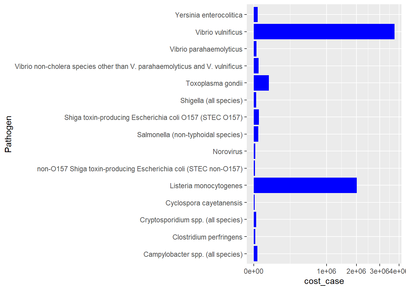
#how do I retain the ranked order from above?This plot shows the average cost per case of the 15 pathogens in the data. I elected to display these as scale_x_sqrt so that the differences among the lower 13 were distinguishable. I am not sure how to preserve the ranked order I got from my clean read-in and mutate chunk.
#try a dot plot
ggplot(path_ranked, aes(x=cost_case, y=est_cases, label=Pathogen))+
geom_point()+
  scale_x_log10() +
  geom_text()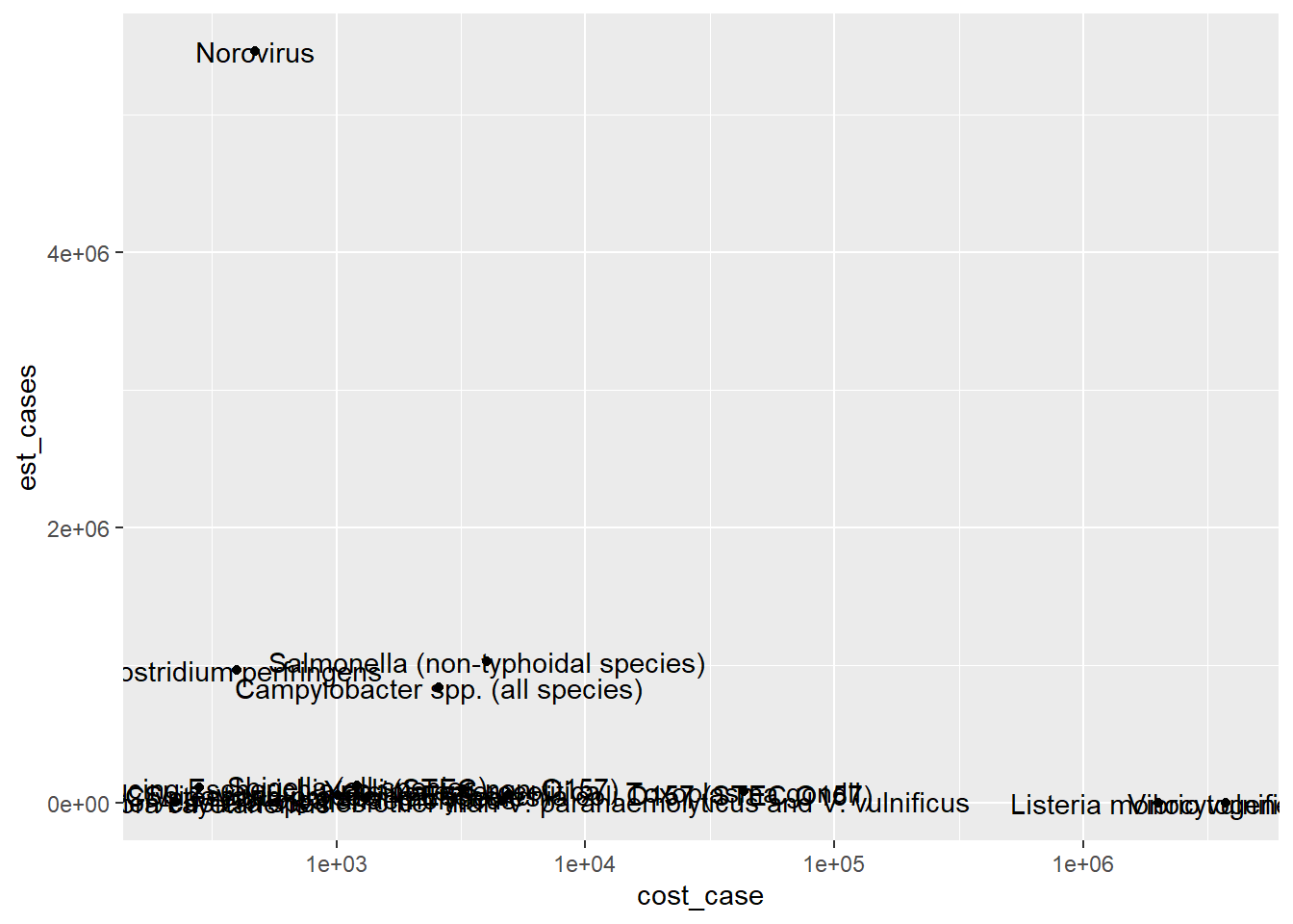
#try a violin plot
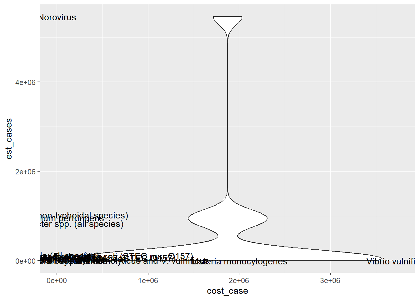
ggplot(path_ranked, aes(x=cost_case, y=est_cases, label=Pathogen))+
geom_violin()+
geom_text()Warning: The following aesthetics were dropped during statistical transformation: label
ℹ This can happen when ggplot fails to infer the correct grouping structure in
the data.
ℹ Did you forget to specify a `group` aesthetic or to convert a numerical
variable into a factor?