Code
library(tidyverse)
library(ggplot2)
library(summarytools)
library(ggridges)
library(treemap)

knitr::opts_chunk$set(echo = TRUE)library(tidyverse)
library(ggplot2)
library(summarytools)
library(ggridges)
library(treemap)
knitr::opts_chunk$set(echo = TRUE)#initial read-in for summary
airbnb_orig <- read_csv("_data/AB_NYC_2019.csv")Rows: 48895 Columns: 16
── Column specification ────────────────────────────────────────────────────────
Delimiter: ","
chr (5): name, host_name, neighbourhood_group, neighbourhood, room_type
dbl (10): id, host_id, latitude, longitude, price, minimum_nights, number_o...
date (1): last_review
ℹ Use `spec()` to retrieve the full column specification for this data.
ℹ Specify the column types or set `show_col_types = FALSE` to quiet this message.# print(dfSummary(airbnb_orig,
# varnumbers = FALSE,
# plain.ascii = FALSE,
# style = "grid",
# graph.magnif = 0.70,
# valid.col = FALSE),
# method = 'render',
# table.classes = 'table-condensed')The original data lists 48,895 distinct Airbnb rentals in New York City, almost 80% of which were reviewed between 2011 to 2019. The data include information that guests would want, such as listing names, host names, location in terms of the neighborhoods as well as latitude and longitude, room types, price, and minimum nights. It also includes the number of reviews, date of the last review, number of reviews per month (possibly calculated from the total months of the review period represented?), calculated host listings, and a count available days of the year.
I am suspicious of some values that will require some investigation: prices range from $0 to $10,000, minimum nights range from 1 to 1250 (nearly 3.5 years), and the dates of the last review span over 8 years, from 2011 to 2019. I could check to see if the calculated host listings count is consistent with what’s here, and therefore exclude it from my read-in. I will also want to address the two neighborhood variables. My data frame summary already confirmed that each ID is distinct.
A few are missing rental names and host names–I wonder if these will align with some of the other errant data such as prices of $0 or minimum nights that don’t make sense in a real world application.
no_name_1 <- airbnb_orig %>%
  filter(is.na(name)) %>%
  arrange(desc(availability_365)) %>%
  select(name, price, minimum_nights, availability_365)


no_name_2 <-airbnb_orig %>%
  filter(is.na(name)) %>%
  arrange(desc(last_review)) %>%
  select(name, last_review, number_of_reviews)

no_name_1
# A tibble: 16 × 4
name price minimum_nights availability_365
<chr> <dbl> <dbl> <dbl>
1 <NA> 130 1 365
2 <NA> 400 1000 362
3 <NA> 50 3 362
4 <NA> 200 1 341
5 <NA> 225 1 0
6 <NA> 215 7 0
7 <NA> 150 1 0
8 <NA> 70 1 0
9 <NA> 40 1 0
10 <NA> 45 1 0
11 <NA> 190 4 0
12 <NA> 300 5 0
13 <NA> 67 4 0
14 <NA> 100 1 0
15 <NA> 70 3 0
16 <NA> 110 4 0no_name_2# A tibble: 16 × 3
name last_review number_of_reviews
<chr> <date> <dbl>
1 <NA> 2018-08-13 5
2 <NA> 2016-08-18 3
3 <NA> 2016-01-05 1
4 <NA> 2016-01-02 5
5 <NA> 2015-06-08 28
6 <NA> 2015-01-01 1
7 <NA> NA 0
8 <NA> NA 0
9 <NA> NA 0
10 <NA> NA 0
11 <NA> NA 0
12 <NA> NA 0
13 <NA> NA 0
14 <NA> NA 0
15 <NA> NA 0
16 <NA> NA 0As expected, the rentals with missing names tend to have availability of 0 or nearly 365, and many have no reviews. I want to know if the ones that have reviews tend to be some of the oldest reviews. (I will test that theory once I graph the reviews on a timeline.) One has a minimum stay of 1000 nights (but I still haven’t found the one requiring 1250 nights!). All of them have prices within a realistic range, generally speaking, so I would guess these were discontinued listings.
In order for this data to be tidy, it needs to represent one case per row with variables that are all independent from one another. Location information seems to be the most duplicative, so I will tidy that now. I will elect to keep the more specific neighborhood names with the borough in parentheses afterward, which will require a unite function. I am not sure if longitude and latitude are redundant locations, but I will keep them in case I want to map these later.
airbnb <- airbnb_orig %>%
  #combine neighbourhood and neighbourhood group
  unite("location",neighbourhood_group:neighbourhood)

airbnb
# A tibble: 48,895 × 15
id name host_id host_…¹ locat…² latit…³ longi…⁴ room_…⁵ price minim…⁶
<dbl> <chr> <dbl> <chr> <chr> <dbl> <dbl> <chr> <dbl> <dbl>
1 2539 Clean & … 2787 John Brookl… 40.6 -74.0 Privat… 149 1
2 2595 Skylit M… 2845 Jennif… Manhat… 40.8 -74.0 Entire… 225 1
3 3647 THE VILL… 4632 Elisab… Manhat… 40.8 -73.9 Privat… 150 3
4 3831 Cozy Ent… 4869 LisaRo… Brookl… 40.7 -74.0 Entire… 89 1
5 5022 Entire A… 7192 Laura Manhat… 40.8 -73.9 Entire… 80 10
6 5099 Large Co… 7322 Chris Manhat… 40.7 -74.0 Entire… 200 3
7 5121 BlissArt… 7356 Garon Brookl… 40.7 -74.0 Privat… 60 45
8 5178 Large Fu… 8967 Shunic… Manhat… 40.8 -74.0 Privat… 79 2
9 5203 Cozy Cle… 7490 MaryEl… Manhat… 40.8 -74.0 Privat… 79 2
10 5238 Cute & C… 7549 Ben Manhat… 40.7 -74.0 Entire… 150 1
# … with 48,885 more rows, 5 more variables: number_of_reviews <dbl>,
# last_review <date>, reviews_per_month <dbl>,
# calculated_host_listings_count <dbl>, availability_365 <dbl>, and
# abbreviated variable names ¹host_name, ²location, ³latitude, ⁴longitude,
# ⁵room_type, ⁶minimum_nightsNow I’m ready to plot the reviews on a timeline.
# set up viz data object
reviews_timing <- airbnb %>%
  #include only the rows with reviews
  filter(number_of_reviews > 0) %>%
    # set up the x
  ggplot(aes(x=last_review)) +
  #select density plot and set airbnb official color
  geom_density(fill="#FF5A5F")+
  #rename x axis
  labs(x="Date of Last Review", title = "Airbnb NYC 2019, Density of Last Review Date")+
  # make it shiny
  theme_gray()

  reviews_timing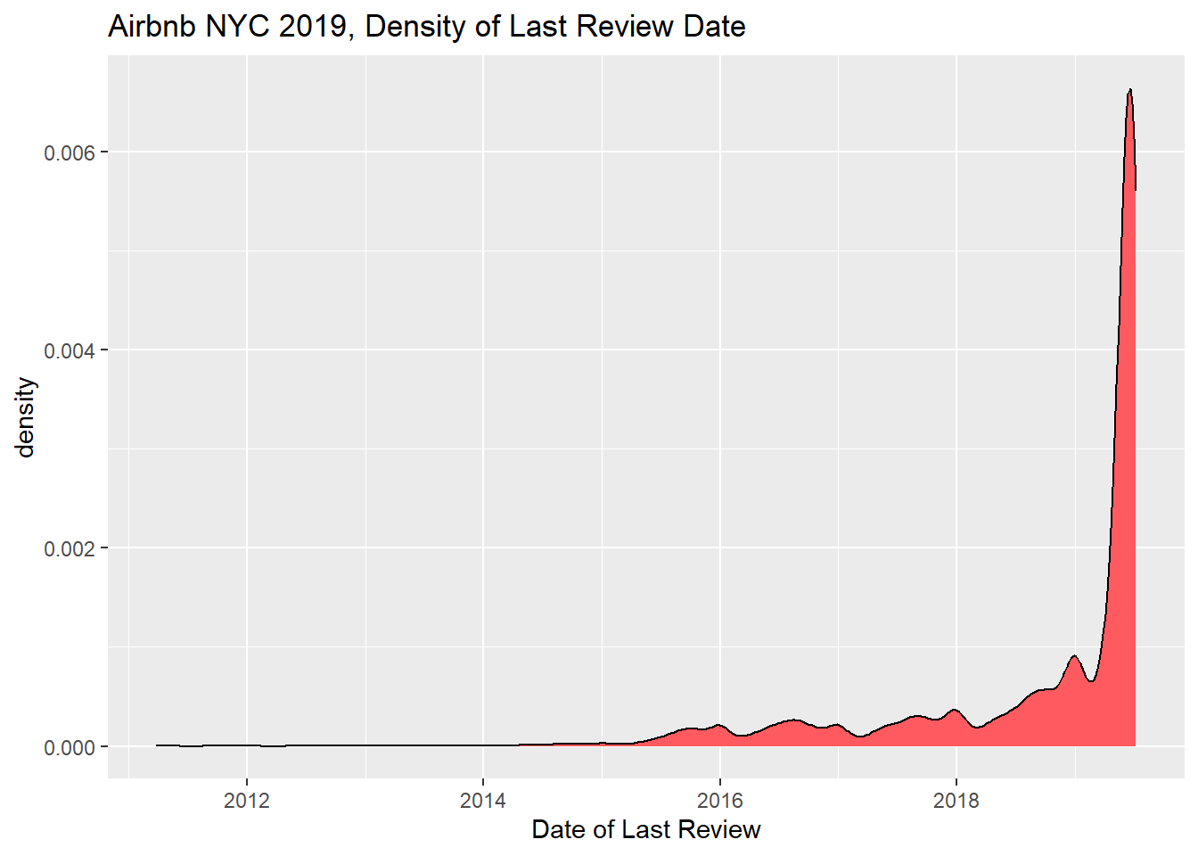
There is a huge uptick in last review dates at the end of timeframe covered. I imagine this is good news for hosts who want up-to-date reviews. I selected the geom_density plot because I couldn’t calculate counts of dates without binning them, which I first tried with geom_line.
To make it interesting, I will plot different lines for each borough.
# set up viz data object
reviews_by_borough <- airbnb_orig %>%
  #include only the rows with reviews
  filter(number_of_reviews > 0) %>%
  filter(last_review > '2019-01-01') %>%
  #create groups by borough
  group_by(neighbourhood_group)

reviews_by_borough %>%
  # set up the x and y and group and color
  ggplot(aes(x=last_review, y=neighbourhood_group, fill= neighbourhood_group)) +
  geom_density_ridges(alpha=0.6, ) +
    theme_ridges() +
    theme(
      legend.position="none",
      panel.spacing = unit(0.1, "lines")) +
  #rename x axis
  labs(x="Date of Last Review", y= "Borough", title = "Date of Last Reviews in 2019, Airbnb Listings NYC")+
  # make it shiny
  theme_gray()
Picking joint bandwidth of 4.43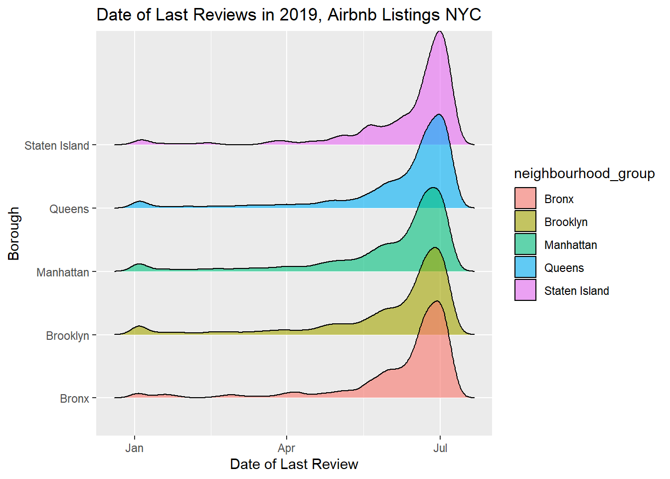
reviews_by_borough# A tibble: 24,811 × 16
# Groups: neighbourhood_group [5]
id name host_id host_…¹ neigh…² neigh…³ latit…⁴ longi…⁵ room_…⁶ price
<dbl> <chr> <dbl> <chr> <chr> <chr> <dbl> <dbl> <chr> <dbl>
1 2595 Skylit M… 2845 Jennif… Manhat… Midtown 40.8 -74.0 Entire… 225
2 3831 Cozy Ent… 4869 LisaRo… Brookl… Clinto… 40.7 -74.0 Entire… 89
3 5099 Large Co… 7322 Chris Manhat… Murray… 40.7 -74.0 Entire… 200
4 5178 Large Fu… 8967 Shunic… Manhat… Hell's… 40.8 -74.0 Privat… 79
5 5238 Cute & C… 7549 Ben Manhat… Chinat… 40.7 -74.0 Entire… 150
6 5295 Beautifu… 7702 Lena Manhat… Upper … 40.8 -74.0 Entire… 135
7 5441 Central … 7989 Kate Manhat… Hell's… 40.8 -74.0 Privat… 85
8 5803 Lovely R… 9744 Laurie Brookl… South … 40.7 -74.0 Privat… 89
9 6021 Wonderfu… 11528 Claudio Manhat… Upper … 40.8 -74.0 Privat… 85
10 6848 Only 2 s… 15991 Allen … Brookl… Willia… 40.7 -74.0 Entire… 140
# … with 24,801 more rows, 6 more variables: minimum_nights <dbl>,
# number_of_reviews <dbl>, last_review <date>, reviews_per_month <dbl>,
# calculated_host_listings_count <dbl>, availability_365 <dbl>, and
# abbreviated variable names ¹host_name, ²neighbourhood_group,
# ³neighbourhood, ⁴latitude, ⁵longitude, ⁶room_typeI first graphed this as another geom_density but couldn’t see everything since it’s all so uniform and stacked together. So I tried a ridgeline plot. I also limited to the year 2019 to see if I could find any remarkable variation, and there doesn’t seem to be any. Another analysis could look at any differences about price bins.
I want to learn more about how neighborhoods make up the NYC boroughs, as they are listed in this data set. I selected treemap because I want to show subgroups within groups, and also to see how each neighborhood and borough are represented in the data by count of listing. This graph will allow me to easily see how much area each covers.
#prep the data frame
boroughs <- airbnb_orig %>%
  # select just the variables I want
  select(neighbourhood, neighbourhood_group) %>%
  count(neighbourhood, neighbourhood_group)
boroughs
# A tibble: 221 × 3
neighbourhood neighbourhood_group n
<chr> <chr> <int>
1 Allerton Bronx 42
2 Arden Heights Staten Island 4
3 Arrochar Staten Island 21
4 Arverne Queens 77
5 Astoria Queens 900
6 Bath Beach Brooklyn 17
7 Battery Park City Manhattan 70
8 Bay Ridge Brooklyn 141
9 Bay Terrace Queens 6
10 Bay Terrace, Staten Island Staten Island 2
# … with 211 more rowsboroughs %>%
treemap(boroughs,
index= c("neighbourhood_group", "neighbourhood"),
vSize = "n",
type = "index",
title = "Count of Listings by Neighborhood, Airbnb NYC 2019"
)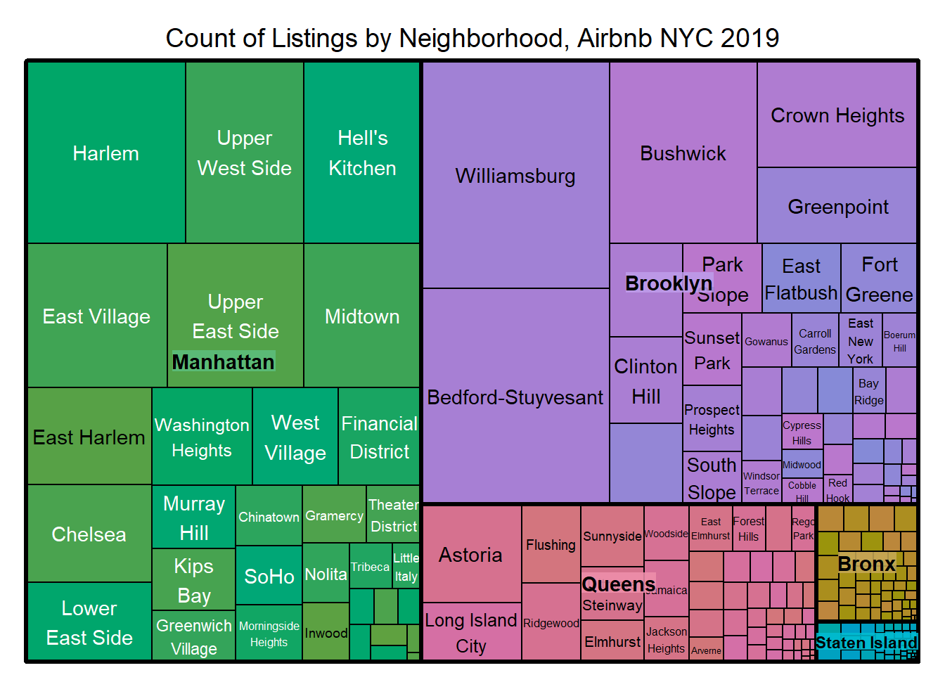
Wow. This really paints a picture regarding where the listings are located. I can easily see that Manhattan and Brooklyn are by far the most popular, with Queens in third, and the Bronx and Staten Island having a very small proportion of rows.
It would be interesting to create another treemap of average prices in each neighborhood.
#prep the data frame
boroughs_price <- airbnb_orig %>%
  select(neighbourhood, neighbourhood_group, price) %>%
  group_by(neighbourhood, neighbourhood_group) %>%
  summarize(median(price))
`summarise()` has grouped output by 'neighbourhood'. You can override using the
`.groups` argument.boroughs_price# A tibble: 221 × 3
# Groups: neighbourhood [221]
neighbourhood neighbourhood_group `median(price)`
<chr> <chr> <dbl>
1 Allerton Bronx 66.5
2 Arden Heights Staten Island 72.5
3 Arrochar Staten Island 65
4 Arverne Queens 125
5 Astoria Queens 85
6 Bath Beach Brooklyn 69
7 Battery Park City Manhattan 195
8 Bay Ridge Brooklyn 85
9 Bay Terrace Queens 142.
10 Bay Terrace, Staten Island Staten Island 102.
# … with 211 more rowsboroughs_price %>%
treemap(boroughs,
index= c("neighbourhood_group", "neighbourhood"),
vSize = "median(price)",
type = "index",
title = "Median Listing Price by Neighborhood, Airbnb NYC 2019"
)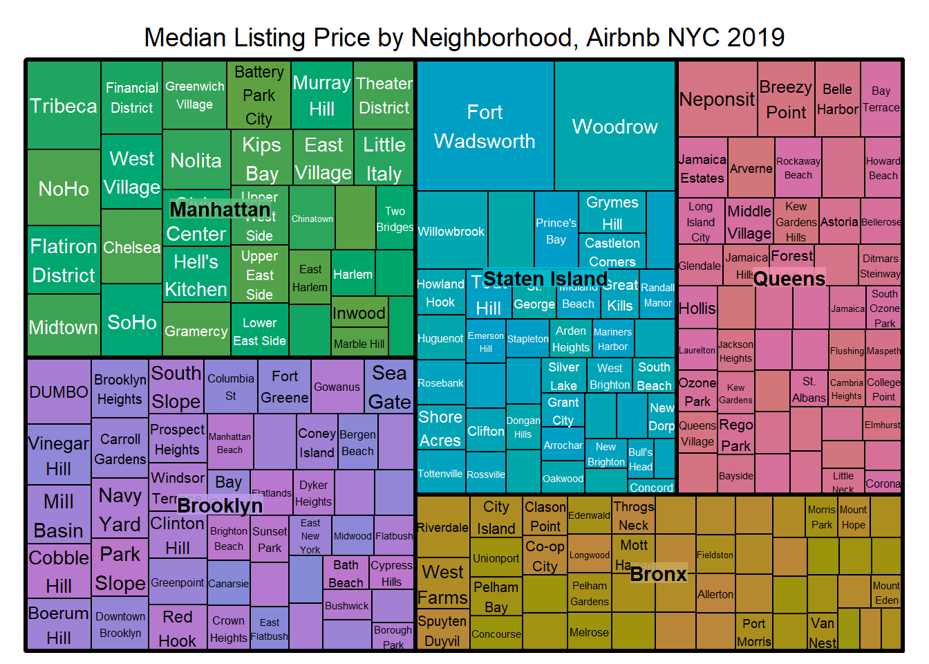
Cool! Fort Wadsworth and then Woodrow are clearly the most expensive. Is that the castle, and/or the outliers I never dealt with?