Code
library(tidyverse)
library(summarytools)
library(treemap)
library(viridis)
library(wesanderson)
Error in library(wesanderson): there is no package called 'wesanderson'Code
knitr::opts_chunk$set(echo = TRUE)Sarah McAlpine
November 2, 2022
Error in library(wesanderson): there is no package called 'wesanderson'Not very interesting with this summary data.
#initial read-in
airbnb_orig <- read_csv("_data/AB_NYC_2019.csv",
                        show_col_types = FALSE)

# prep data for graph
airbnb_medianpriced <- airbnb_orig %>%
  filter(price>0) %>%
  group_by(room_type, neighbourhood_group) %>%
    summarize(median(price))%>%
  mutate(neighbourhood_group = fct_relevel(neighbourhood_group,
                                           "Manhattan",
                                           "Brooklyn",
                                           "Queens",
                                           "Bronx",
                                           "Staten Island"
                                           ))

#how do I do this next bit without starting a new pipe?
airbnb_medianpriced <- airbnb_medianpriced %>%
  rename(median_price = "median(price)")
These treemaps tell a simple, predictable story. The data I’m using is too simple for this graph type. I think I’ll try violin plots to see the range and density of prices. I played around with applying different color palettes.
Error in wes_palette("Zissou1", 5, type = "discrete"): could not find function "wes_palette"Error in wes_palette("Moonrise3", 5, type = "discrete"): could not find function "wes_palette"Error in wes_palette("Royal2", 5, type = "discrete"): could not find function "wes_palette"Error in wes_palette("Darjeeling2", 5, type = "discrete"): could not find function "wes_palette"Error in treemap(., room_type, index = c("neighbourhood_group", "room_type"), : object 'moonrise' not found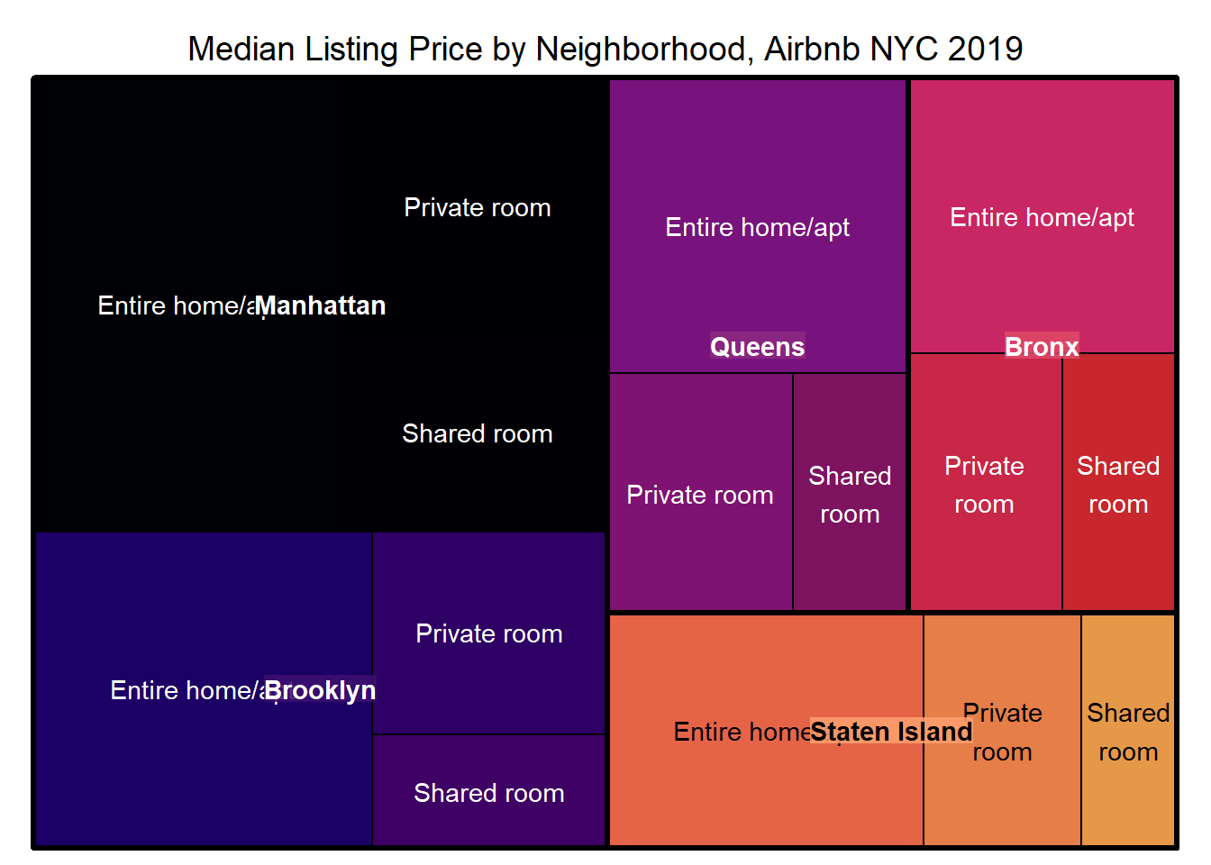
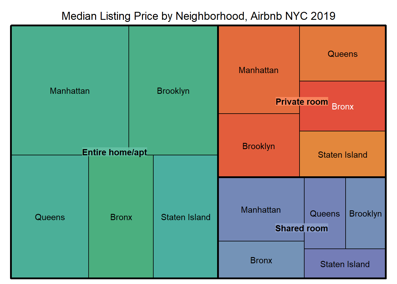
How do I adjust so that the labels don’t overlap? I used overlap.labels = 0 on the first one, but that just suppressed the “Entire home/apt” label instead of moving one or the other.
Warning: Using `size` aesthetic for lines was deprecated in ggplot2 3.4.0.
ℹ Please use `linewidth` instead.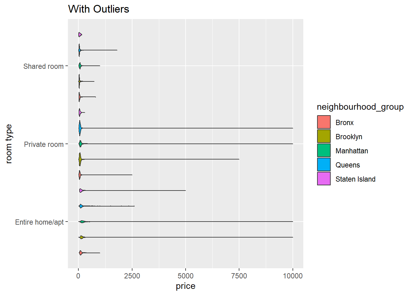
#create is_outlier function
is_outlier <- function(x) {
return(x < quantile(x, 0.25) - 1.5 * IQR(x) | x > quantile(x, 0.75) + 1.5 * IQR(x))
}
#apply the function, removing outliers
airbnb_trim <- airbnb_orig %>%
filter(!is_outlier(price))
#confirm decrease in rows
#airbnb_trim
#set up df for this plot
airbnb_priced <- airbnb_orig %>%
filter(price>0, price<800) %>%
group_by(room_type, neighbourhood_group)
# violin plot without outliers
airbnb_priced %>%
ggplot(aes(x=room_type, y=price, fill=neighbourhood_group)) +
geom_violin(width = 1, size = .5,
scale = "area",
trim = TRUE)+
coord_flip()+
labs(x="room type", title = "Without Outliers")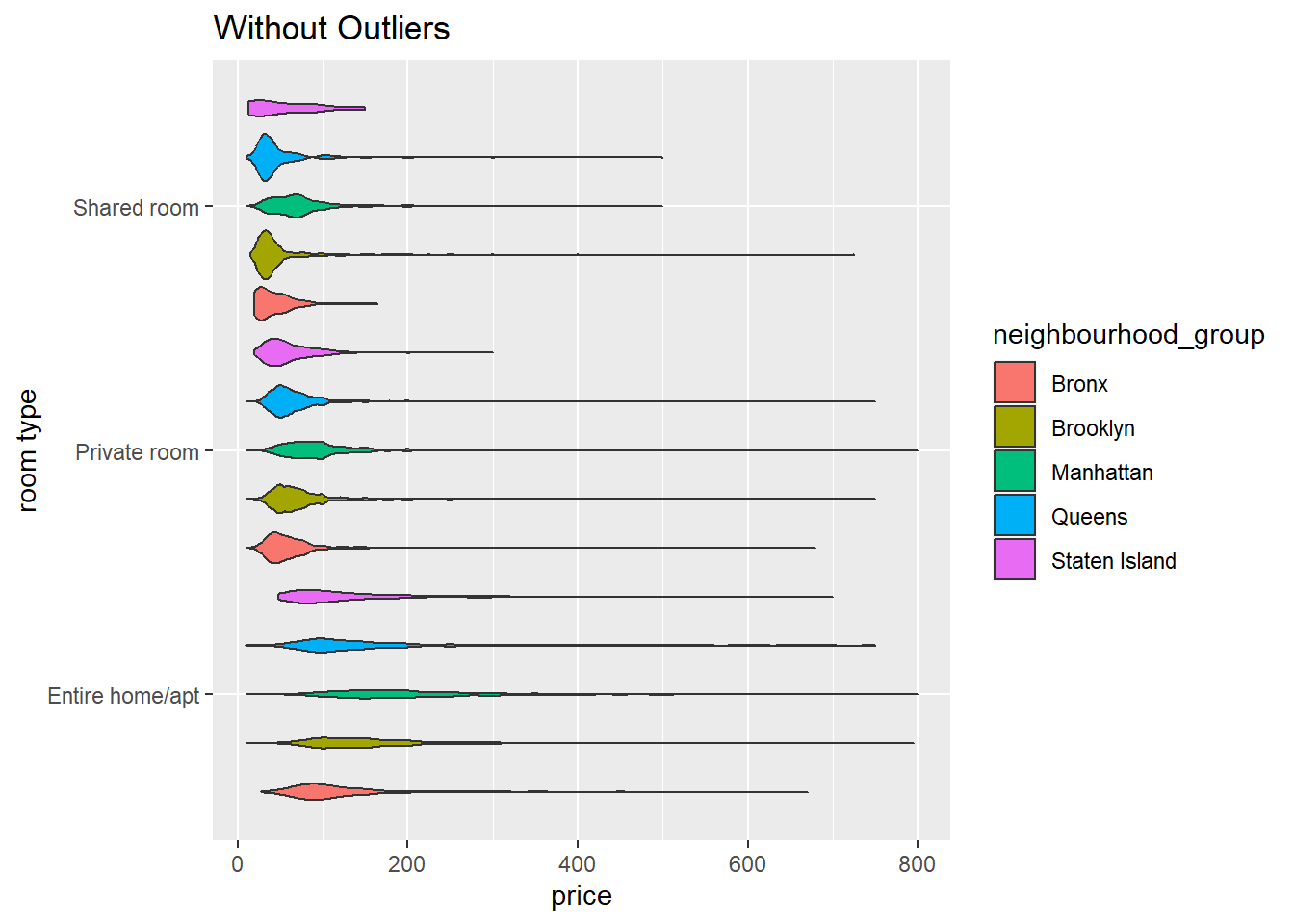
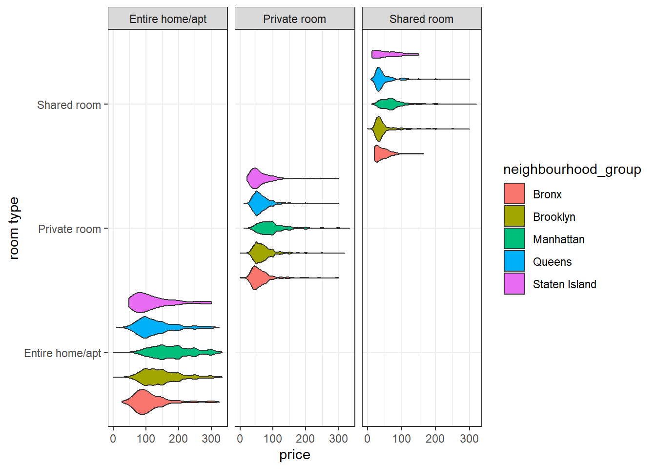
This violin plot shows the density of prices of each rental, by both room type and by borough, but the scale is so various that it’s hard to really compare. Next I will try facet wrap and two rotations of the axes to see which is better to read.
# vertical violin plot
airbnb_trim %>%
ggplot(aes(x=room_type, y=price, fill=neighbourhood_group)) +
geom_violin(width = 1, size = .5,
scale = "area",
trim = TRUE)+
facet_wrap(vars(room_type), scales = "free_x")+
theme_bw()+
labs(x="Room Type", y = "Price", fill= "Borough", title = "NYC Airbnb Prices by Borough and Room Type", subtitle= "2019")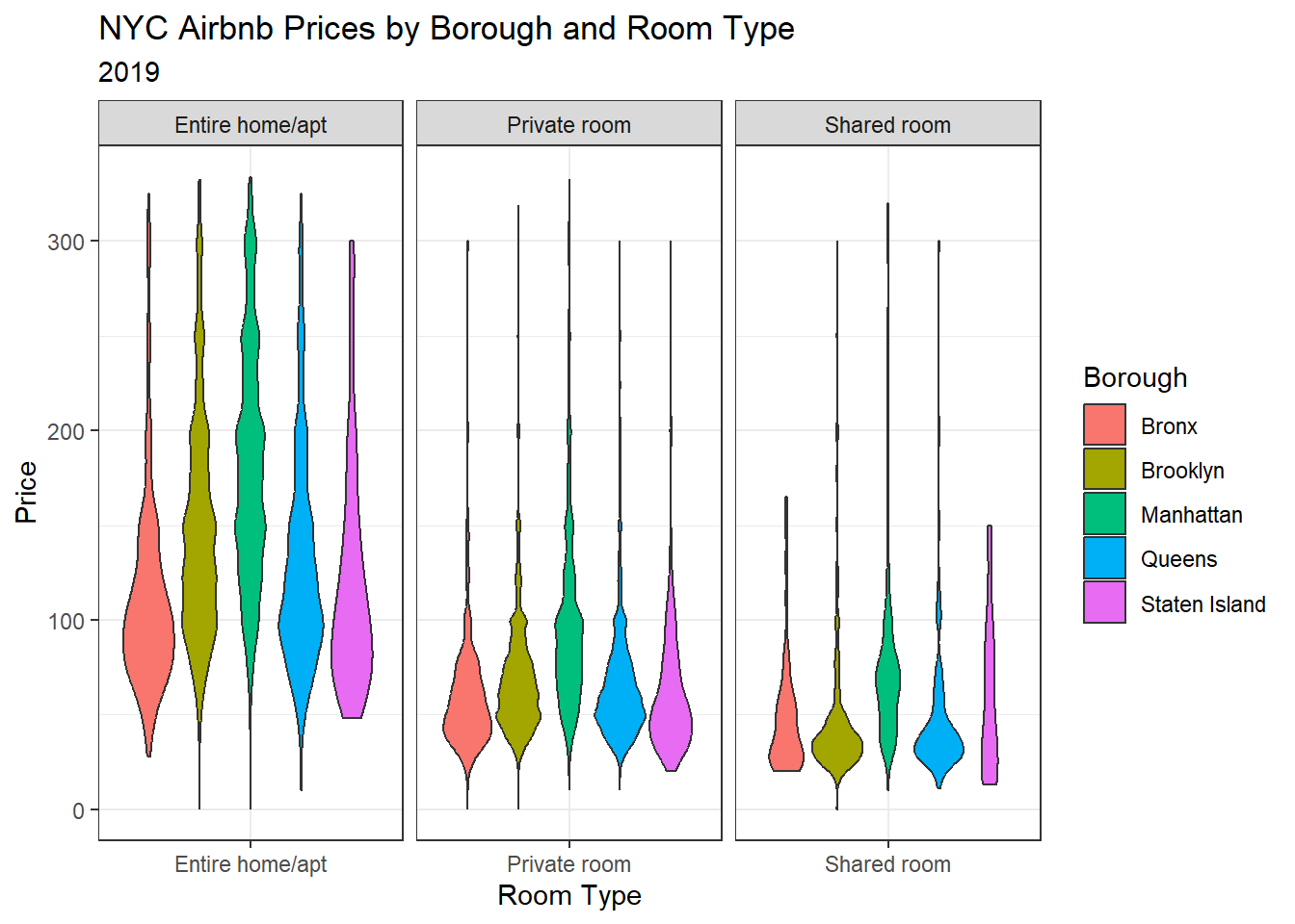
The vertical violin plot tells a clear story. I’ve added a title to make it “publication ready.”
airbnb_medianpriced %>%
ggplot(aes(x = reorder(neighbourhood_group, median_price),
y = median_price,
fill = room_type)) +
geom_bar(
position= "dodge",
stat = "identity")+
labs(x="Borough",
y = "Median Price per Night",
title = "Median NYC Airbnb Prices by Borough and Room Type (2019)",
fill = "Room Type") +
scale_fill_viridis_d()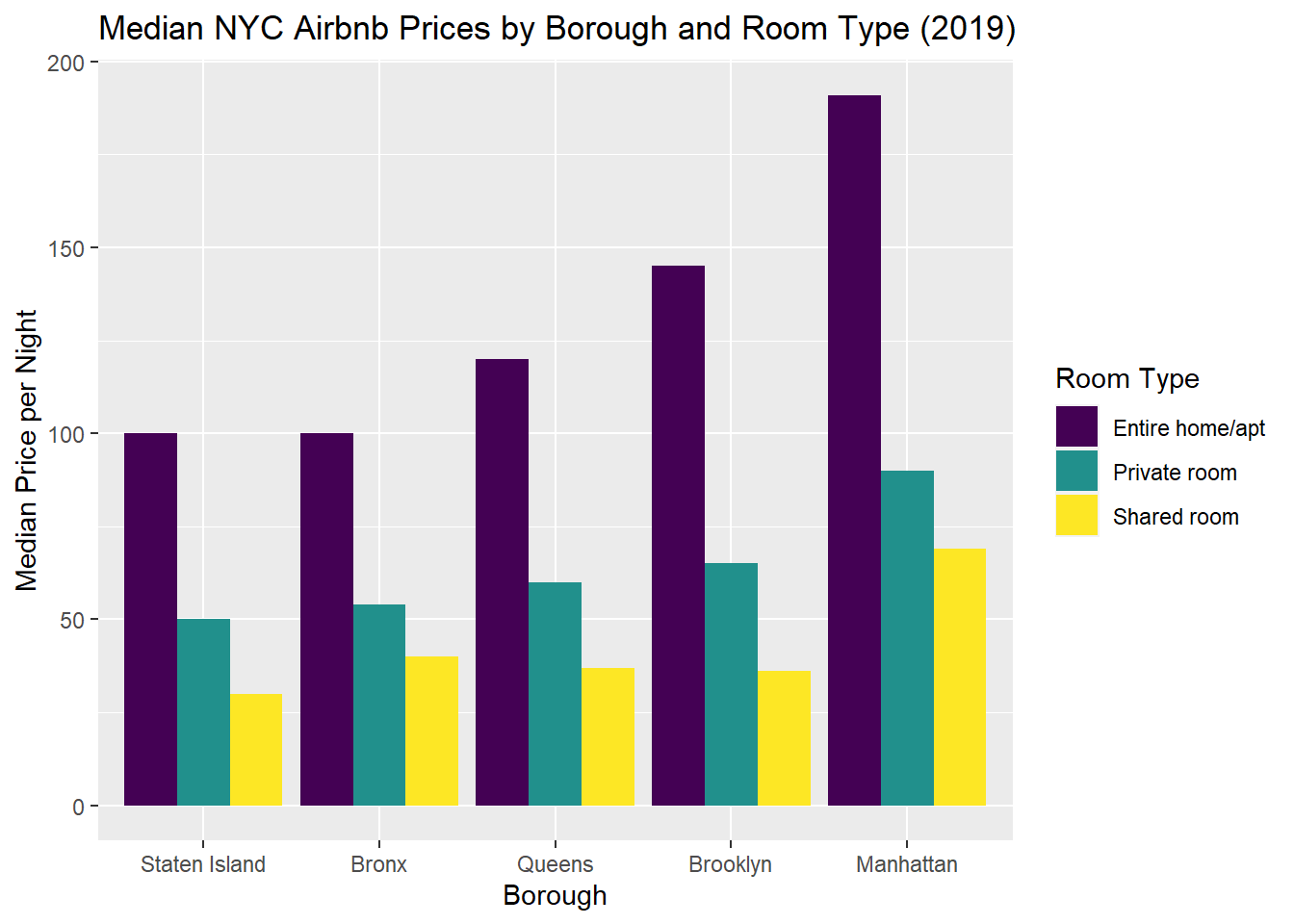
#new copy to try colors
airbnb_medianpriced %>%
ggplot(aes(x = reorder(neighbourhood_group, median_price),
y = median_price,
fill = room_type)) +
geom_bar(position= "dodge", stat = "identity") +
labs(x="Borough", y = "Median Price per Night", title = "Median NYC Airbnb Prices by Borough and Room Type (2019)", fill = "Room Type") +
coord_flip()+
scale_fill_viridis_d()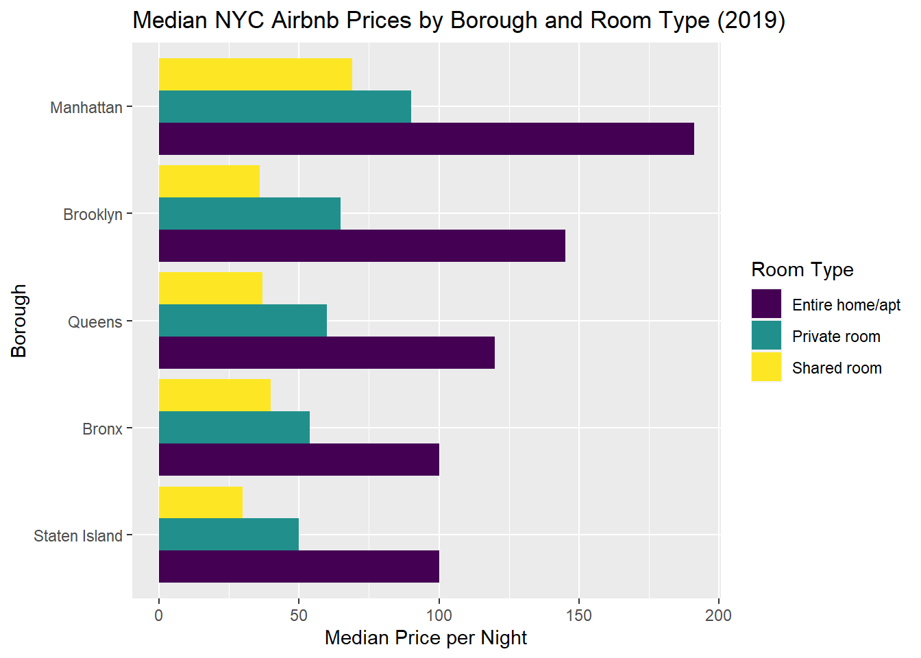
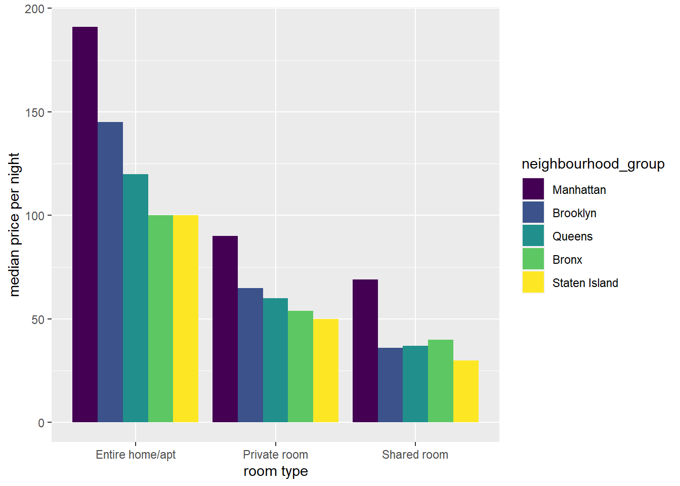
These last two graphs show the clear distinctions among the median prices by room type, and while both show the differences across boroughs, the final graph tells the clearest story. I used fct_level to change the order of boroughs, but now I would like the amounts to go largest to smallest, and so I’d like to reverse the order of room types to mirror how they appear in the legend.
# basic geom_point
airbnb_trim%>%
group_by(room_type, neighbourhood_group)%>%
ggplot(aes(x=neighbourhood_group, y=price)) +
geom_point(alpha=.08, size=5, color = "#00A699")+
facet_wrap("room_type")+
scale_x_discrete(guide = guide_axis(n.dodge=2))+
labs(x="Boroughs",y="price per night", title = "NYC Airbnb Rental Prices 2019 by Borough")+
theme_light()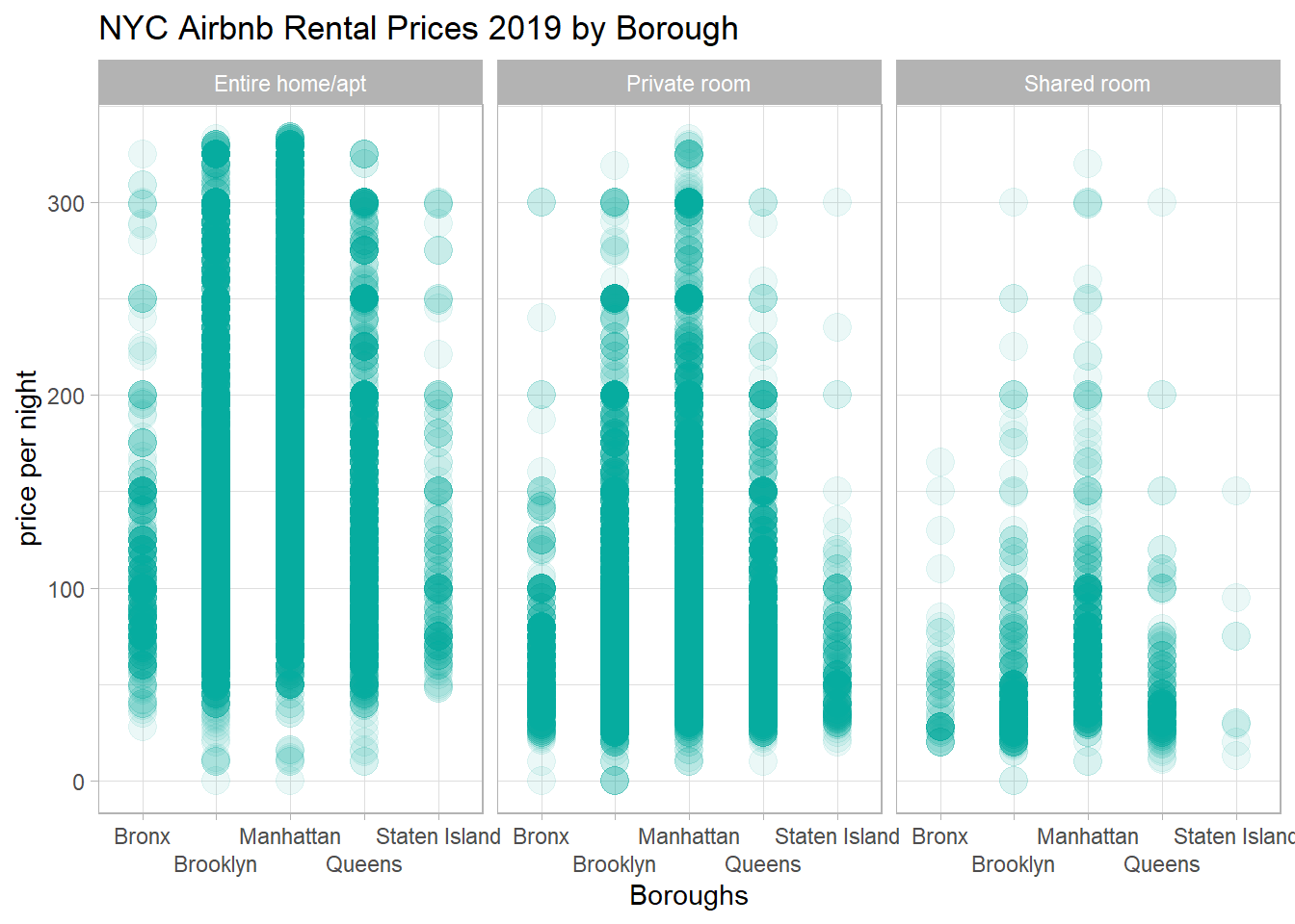
# Add a boxplot on top!
airbnb_trim%>%
group_by(room_type, neighbourhood_group)%>%
ggplot(aes(x=neighbourhood_group, y=price)) +
geom_point(alpha=.08, size=5, color = "#00A699")+
facet_wrap("room_type")+
#scale_x_discrete(guide = guide_axis(n.dodge=2))+
labs(x="Boroughs",y="price per night", title = "NYC Airbnb Rental Prices 2019 by Borough")+
theme_light()+
geom_boxplot()+
theme(axis.text.x = element_text(angle = 30))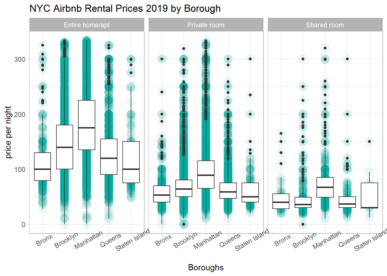
Wow. This is an incredible improvement with the single line: + geom_boxplot(). I now have a very good idea what prices these three types of rentals go for across the boroughs.
---
title: "Sarah McAlpine - Challenge 7"
author: "Sarah McAlpine"
desription: "Homework Challenge 7"
date: "11/2/2022"
format:
html:
toc: true
code-fold: true
code-copy: true
code-tools: true
categories:
- challenge_7
- sarahmcalpine
- airbnb
- ggplot2
- summarytools
- treemap
---
```{r}
#| label: setup
#| warning: false
library(tidyverse)
library(summarytools)
library(treemap)
library(viridis)
library(wesanderson)
knitr::opts_chunk$set(echo = TRUE)
```
## Tree Maps
Not very interesting with this summary data.
```{r}
#| label: read-in
#| warning: false
#initial read-in
airbnb_orig <- read_csv("_data/AB_NYC_2019.csv",
show_col_types = FALSE)
# prep data for graph
airbnb_medianpriced <- airbnb_orig %>%
filter(price>0) %>%
group_by(room_type, neighbourhood_group) %>%
summarize(median(price))%>%
mutate(neighbourhood_group = fct_relevel(neighbourhood_group,
"Manhattan",
"Brooklyn",
"Queens",
"Bronx",
"Staten Island"
))
#how do I do this next bit without starting a new pipe?
airbnb_medianpriced <- airbnb_medianpriced %>%
rename(median_price = "median(price)")
```
These treemaps tell a simple, predictable story. The data I'm using is too simple for this graph type. I think I'll try violin plots to see the range and density of prices. I played around with applying different color palettes.
```{r}
#| label: treemap color play
#| warning: false
zissou <- wes_palette("Zissou1", 5, type = "discrete")
moonrise <- wes_palette("Moonrise3", 5, type = "discrete")
royal2 <- wes_palette("Royal2", 5, type = "discrete")
dar2 <- wes_palette("Darjeeling2", 5, type = "discrete")
airbnb_medianpriced %>%
treemap(room_type,
        index= c("neighbourhood_group", "room_type"),
        vSize = "median_price",
        type = "index",
        title = "Median Listing Price by Neighborhood, Airbnb NYC 2019",
        overlap.labels = 0,
        palette = (moonrise))
airbnb_medianpriced %>%
treemap(room_type,
        index= c("neighbourhood_group", "room_type"),
        vSize = "median_price",
        type = "index",
        title = "Median Listing Price by Neighborhood, Airbnb NYC 2019",
        palette = viridis(n=6, option = "A"))
#try again, swapping room and neighborhood group
airbnb_medianpriced %>%
treemap(room_type,
        index= c("room_type","neighbourhood_group"),
        vSize = "median_price",
        type = "index",
        title = "Median Listing Price by Neighborhood, Airbnb NYC 2019",
        palette = ("Set2")
)
```
How do I adjust so that the labels don't overlap? I used `overlap.labels = 0` on the first one, but that just suppressed the "Entire home/apt" label instead of moving one or the other.
```{r}
#| label: Custom colors
airbnb_medianpriced %>%
treemap(room_type,
        index= c("neighbourhood_group", "room_type"),
        vSize = "median_price",
        type = "index",
        title = "Median Listing Price by Neighborhood, Airbnb NYC 2019",
        overlap.labels = 0,
        palette = c("#FFCE30", "#E83845", "#E389B9", "#746AB0", "#288BA8"))
```
## Violin Plots With and Without Outliers
```{r}
#| label: violins
#initial violin plot
airbnb_orig %>%
  ggplot(aes(x=room_type, y=price, fill=neighbourhood_group)) +
  geom_violin(width = 1, size = .5,
              scale = "area",
              trim = TRUE)+
  coord_flip()+
  labs(x="room type", title = "With Outliers")
#create is_outlier function
is_outlier <- function(x) {
  return(x < quantile(x, 0.25) - 1.5 * IQR(x) | x > quantile(x, 0.75) + 1.5 * IQR(x))
}
#apply the function, removing outliers
airbnb_trim <- airbnb_orig %>%
  filter(!is_outlier(price))

#confirm decrease in rows
#airbnb_trim

#set up df for this plot
airbnb_priced <- airbnb_orig %>%
  filter(price>0, price<800) %>%
  group_by(room_type, neighbourhood_group)

# violin plot without outliers
airbnb_priced %>%
  ggplot(aes(x=room_type, y=price, fill=neighbourhood_group)) +
  geom_violin(width = 1, size = .5,
              scale = "area",
              trim = TRUE)+
  coord_flip()+
  labs(x="room type", title = "Without Outliers")
#
# airbnb_priced %>%
# #  filter(price<300) %>%
#   ggplot(aes(x=room_type, y=price, fill=neighbourhood_group)) +
#   geom_violin(width = 1, size = .5,
#               scale = "area",
#               trim = TRUE)+
#   #coord_flip()+
#   xlab("room type")+
#   facet_wrap(vars(room_type), scales = "free_x")
```
This violin plot shows the density of prices of each rental, by both room type and by borough, but the scale is so various that it's hard to really compare. Next I will try facet wrap and two rotations of the axes to see which is better to read.
## Violin Plots with Facet Wrap
```{r}
#| label: violins facet wrap
#horizontal violin plot
airbnb_trim %>%
  ggplot(aes(x=room_type, y=price, fill=neighbourhood_group)) +
  geom_violin(width = 1, size = .5,
              scale = "area",
              trim = TRUE)+
  coord_flip()+
  xlab("room type")+
  facet_wrap(vars(room_type), scales = "free_x")+
  theme_bw()
# vertical violin plot
airbnb_trim %>%
  ggplot(aes(x=room_type, y=price, fill=neighbourhood_group)) +
  geom_violin(width = 1, size = .5,
              scale = "area",
              trim = TRUE)+
  facet_wrap(vars(room_type), scales = "free_x")+
  theme_bw()+
  labs(x="Room Type", y = "Price", fill= "Borough", title = "NYC Airbnb Prices by Borough and Room Type", subtitle= "2019")
```
The vertical violin plot tells a clear story. I've added a title to make it "publication ready."
## Grouped Bars
```{r}
#| label: grouped bars
airbnb_medianpriced %>%
  ggplot(aes(x = room_type, y = median_price, fill = neighbourhood_group)) +
  geom_bar(position= "dodge", stat = "identity") +
  xlab("room type") +
  ylab("median price per night")+
 # scale_y_reverse() +
  #coord_flip()+
  scale_fill_viridis_d()
airbnb_medianpriced %>%
  ggplot(aes(x = reorder(neighbourhood_group, median_price),
             y = median_price,
             fill = room_type)) +
  geom_bar(
    position= "dodge",
    stat = "identity")+
  labs(x="Borough",
       y = "Median Price per Night",
       title = "Median NYC Airbnb Prices by Borough and Room Type (2019)",
       fill = "Room Type") +
  scale_fill_viridis_d()
#new copy to try colors
airbnb_medianpriced %>%
  ggplot(aes(x = reorder(neighbourhood_group, median_price),
    y = median_price,
    fill = room_type)) +
  geom_bar(position= "dodge", stat = "identity") +
  labs(x="Borough", y = "Median Price per Night", title = "Median NYC Airbnb Prices by Borough and Room Type (2019)", fill = "Room Type") +
  coord_flip()+
  scale_fill_viridis_d()
```
These last two graphs show the clear distinctions among the median prices by room type, and while both show the differences across boroughs, the final graph tells the clearest story. I used fct_level to change the order of boroughs, but now I would like the amounts to go largest to smallest, and so I'd like to reverse the order of room types to mirror how they appear in the legend.
## Experiments with Geom_Point
```{r}
# experiment i coded at 9pm
airbnb_orig %>%
  group_by(room_type)%>%
  #how to rename a column within a pipe? maybe this is why prof Rolfe says to do it while tidying, in the read-in chunk
  ggplot(aes(x=neighbourhood_group, y=price)) +
  geom_point(alpha=.1, size=10)
airbnb_trim%>%
 group_by(room_type, neighbourhood_group)%>%
  ggplot(aes(x=neighbourhood_group, y=price)) +
  geom_point(alpha=.5, size=5)+
 # theme_minimal()+
  facet_wrap("room_type")+
  coord_flip()
 #+ labs(style="dodge")

airbnb_trim%>%
 group_by(room_type, neighbourhood_group)%>%
  ggplot(aes(x=neighbourhood_group, y=price)) +
  geom_point(alpha=.5, size=5)+
 # theme_minimal()+
  facet_wrap("room_type")+
  geom_text(aes("neighbourhood_group", label = price),
            position = position_dodge(width=1))
```
## Box Plot Over Geom_Point: MY BEST SO FAR!
```{r}
# basic geom_point
airbnb_trim%>%
 group_by(room_type, neighbourhood_group)%>%
  ggplot(aes(x=neighbourhood_group, y=price)) +
  geom_point(alpha=.08, size=5, color = "#00A699")+
  facet_wrap("room_type")+
  scale_x_discrete(guide = guide_axis(n.dodge=2))+
  labs(x="Boroughs",y="price per night", title = "NYC Airbnb Rental Prices 2019 by Borough")+
  theme_light()
# Add a boxplot on top!
airbnb_trim%>%
 group_by(room_type, neighbourhood_group)%>%
  ggplot(aes(x=neighbourhood_group, y=price)) +
  geom_point(alpha=.08, size=5, color = "#00A699")+
  facet_wrap("room_type")+
  #scale_x_discrete(guide = guide_axis(n.dodge=2))+
  labs(x="Boroughs",y="price per night", title = "NYC Airbnb Rental Prices 2019 by Borough")+
  theme_light()+
  geom_boxplot()+
  theme(axis.text.x = element_text(angle = 30))
```
Wow. This is an incredible improvement with the single line:
`+ geom_boxplot()`. I now have a very good idea what prices these three types of rentals go for across the boroughs.