library(tidyverse)
library(ggplot2)

knitr::opts_chunk$set(echo = TRUE, warning=FALSE, message=FALSE)
Challenge 5
challenge_5
railroads
cereal
air_bnb
pathogen_cost
australian_marriage
public_schools
usa_households
Introduction to Visualization
Challenge Overview
Today’s challenge is to:
- read in a data set, and describe the data set using both words and any supporting information (e.g., tables, etc)
- tidy data (as needed, including sanity checks)
- mutate variables as needed (including sanity checks)
- create at least two univariate visualizations
- try to make them “publication” ready
- Explain why you choose the specific graph type
- Create at least one bivariate visualization
- try to make them “publication” ready
- Explain why you choose the specific graph type
R Graph Gallery is a good starting point for thinking about what information is conveyed in standard graph types, and includes example R code.
(be sure to only include the category tags for the data you use!)
Read in data
Read in one (or more) of the following datasets, using the correct R package and command.
- cereal.csv ⭐
- Total_cost_for_top_15_pathogens_2018.xlsx ⭐
- Australian Marriage ⭐⭐
- AB_NYC_2019.csv ⭐⭐⭐
- StateCounty2012.xls ⭐⭐⭐
- Public School Characteristics ⭐⭐⭐⭐
- USA Households ⭐⭐⭐⭐⭐
aus_data<- read_csv("_data/australian_marriage_tidy.csv")
aus_data
# A tibble: 16 × 4
territory resp count percent
<chr> <chr> <dbl> <dbl>
1 New South Wales yes 2374362 57.8
2 New South Wales no 1736838 42.2
3 Victoria yes 2145629 64.9
4 Victoria no 1161098 35.1
5 Queensland yes 1487060 60.7
6 Queensland no 961015 39.3
7 South Australia yes 592528 62.5
8 South Australia no 356247 37.5
9 Western Australia yes 801575 63.7
10 Western Australia no 455924 36.3
11 Tasmania yes 191948 63.6
12 Tasmania no 109655 36.4
13 Northern Territory(b) yes 48686 60.6
14 Northern Territory(b) no 31690 39.4
15 Australian Capital Territory(c) yes 175459 74
16 Australian Capital Territory(c) no 61520 26 Briefly describe the data
The Australian marriage dataset is a survey of the public opinion of the people in Australia about the legality of the marriage of the same sex. This hdata has been collected in November 2017 across al 150 Federal Electoral Division in Australia. The public were allowed to answer in either yes, no or not clear.
Tidy Data (as needed)
Is your data already tidy, or is there work to be done? Be sure to anticipate your end result to provide a sanity check, and document your work here.
The data seems pretty tide with 16 observations of 4 variables
summary(aus_data) territory resp count percent
Length:16 Length:16 Min. : 31690 Min. :26.00
Class :character Class :character 1st Qu.: 159008 1st Qu.:37.23
Mode :character Mode :character Median : 524226 Median :50.00
Mean : 793202 Mean :50.00
3rd Qu.:1242589 3rd Qu.:62.77
Max. :2374362 Max. :74.00 Are there any variables that require mutation to be usable in your analysis stream? For example, do you need to calculate new values in order to graph them? Can string values be represented numerically? Do you need to turn any variables into factors and reorder for ease of graphics and visualization?
Document your work here.
#Pivoting the responses to be independed variables.
aus_data <- aus_data%>%
  pivot_wider(names_from = resp, values_from = c(percent,count)) %>%
  mutate(`Total responses`= (`count_yes` + `count_no`))
aus_data
# A tibble: 8 × 6
territory percent_yes percent_no count…¹ count…² Total…³
<chr> <dbl> <dbl> <dbl> <dbl> <dbl>
1 New South Wales 57.8 42.2 2374362 1736838 4111200
2 Victoria 64.9 35.1 2145629 1161098 3306727
3 Queensland 60.7 39.3 1487060 961015 2448075
4 South Australia 62.5 37.5 592528 356247 948775
5 Western Australia 63.7 36.3 801575 455924 1257499
6 Tasmania 63.6 36.4 191948 109655 301603
7 Northern Territory(b) 60.6 39.4 48686 31690 80376
8 Australian Capital Territory(c) 74 26 175459 61520 236979
# … with abbreviated variable names ¹count_yes, ²count_no, ³`Total responses`Univariate Visualizations
#Respondents to postal survey by province
ggplot(aus_data, aes(x =reorder(territory, -`Total responses`), y = `Total responses`)) +
geom_bar(stat = "identity") +
labs(x= " Austrailian Territory", y= "No. of Respondents" )+
ggtitle("Graph 1: Respondents by Territory")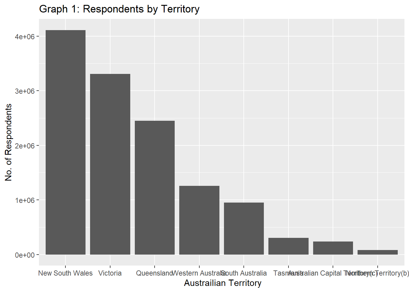
The above graph displays # of respondents from each Australian Territory which gives the idea how many reponses we got from each area.
ggplot(aus_data, aes(x =reorder(territory, -`percent_no`), y =`count_no`)) +
geom_bar(stat = "identity") +
labs(x= " Austrailian Territory", y= "No. of Respondents" )+
ggtitle("Graph 2: Respondents Not in Favour of Same-Sex Marriage")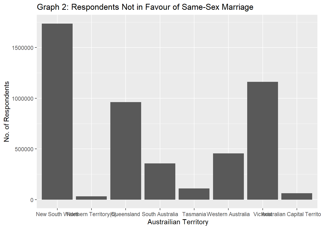
This graph gives information about the respondants with do not support same-sex marriage. It displays the territories by their disapproval percentage and shows any pattern that exists.
Bivariate Visualization(s)
ggplot(aus_data, aes(x =`percent_no`, y= `Total responses`, colour=territory )) +
geom_point() +
geom_smooth(color= 'red',method='lm', formula= y~x)+
labs(x= " Percentage of Disapproval", y= "Total Responses", color= "Territory" )+
ggtitle("Graph 3: Total Respondents vs Disapproval %")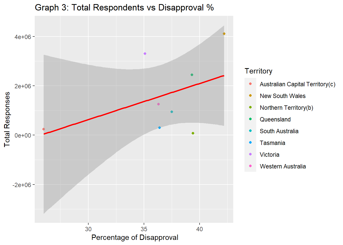
The above graph co-relation between Approval percentage and Number of respondents. As there are only 8 different territories, we has done have enough data to establish a pattern and see if any particular territory favors the legality of the same sex marriage in Australia over the other.
We can conclude that the majority of Australians favor the legality of the marriage in the same sex