library(tidyverse)
library(ggplot2)

knitr::opts_chunk$set(echo = TRUE, warning=FALSE, message=FALSE)
Challenge 5 Solutions
Challenge Overview
Read in data
AB_NYC_2019 <- read_csv("_data/AB_NYC_2019.csv")Briefly describe the data
Tidy Data (as needed)
Is your data already tidy, or is there work to be done? Be sure to anticipate your end result to provide a sanity check, and document your work here.
Initially viewing the data
head(AB_NYC_2019)# A tibble: 6 × 16
id name host_id host_…¹ neigh…² neigh…³ latit…⁴ longi…⁵ room_…⁶ price
<dbl> <chr> <dbl> <chr> <chr> <chr> <dbl> <dbl> <chr> <dbl>
1 2539 Clean & q… 2787 John Brookl… Kensin… 40.6 -74.0 Privat… 149
2 2595 Skylit Mi… 2845 Jennif… Manhat… Midtown 40.8 -74.0 Entire… 225
3 3647 THE VILLA… 4632 Elisab… Manhat… Harlem 40.8 -73.9 Privat… 150
4 3831 Cozy Enti… 4869 LisaRo… Brookl… Clinto… 40.7 -74.0 Entire… 89
5 5022 Entire Ap… 7192 Laura Manhat… East H… 40.8 -73.9 Entire… 80
6 5099 Large Coz… 7322 Chris Manhat… Murray… 40.7 -74.0 Entire… 200
# … with 6 more variables: minimum_nights <dbl>, number_of_reviews <dbl>,
# last_review <date>, reviews_per_month <dbl>,
# calculated_host_listings_count <dbl>, availability_365 <dbl>, and
# abbreviated variable names ¹host_name, ²neighbourhood_group,
# ³neighbourhood, ⁴latitude, ⁵longitude, ⁶room_typecolnames(AB_NYC_2019) [1] "id" "name"
[3] "host_id" "host_name"
[5] "neighbourhood_group" "neighbourhood"
[7] "latitude" "longitude"
[9] "room_type" "price"
[11] "minimum_nights" "number_of_reviews"
[13] "last_review" "reviews_per_month"
[15] "calculated_host_listings_count" "availability_365" nrow(AB_NYC_2019)[1] 48895ncol(AB_NYC_2019)[1] 16dim(AB_NYC_2019)[1] 48895 16The data set contains of 48895 rows and about 16 columns
library(skimr)
library(dplyr)
skim(AB_NYC_2019)| Name | AB_NYC_2019 |
| Number of rows | 48895 |
| Number of columns | 16 |
| _______________________ | |
| Column type frequency: | |
| character | 5 |
| Date | 1 |
| numeric | 10 |
| ________________________ | |
| Group variables | None |
Variable type: character
| skim_variable | n_missing | complete_rate | min | max | empty | n_unique | whitespace |
|---|---|---|---|---|---|---|---|
| name | 16 | 1 | 1 | 179 | 0 | 47894 | 0 |
| host_name | 21 | 1 | 1 | 35 | 0 | 11452 | 0 |
| neighbourhood_group | 0 | 1 | 5 | 13 | 0 | 5 | 0 |
| neighbourhood | 0 | 1 | 4 | 26 | 0 | 221 | 0 |
| room_type | 0 | 1 | 11 | 15 | 0 | 3 | 0 |
Variable type: Date
| skim_variable | n_missing | complete_rate | min | max | median | n_unique |
|---|---|---|---|---|---|---|
| last_review | 10052 | 0.79 | 2011-03-28 | 2019-07-08 | 2019-05-19 | 1764 |
Variable type: numeric
| skim_variable | n_missing | complete_rate | mean | sd | p0 | p25 | p50 | p75 | p100 | hist |
|---|---|---|---|---|---|---|---|---|---|---|
| id | 0 | 1.00 | 19017143.24 | 10983108.39 | 2539.00 | 9471945.00 | 19677284.00 | 29152178.50 | 36487245.00 | ▆▆▆▆▇ |
| host_id | 0 | 1.00 | 67620010.65 | 78610967.03 | 2438.00 | 7822033.00 | 30793816.00 | 107434423.00 | 274321313.00 | ▇▂▁▁▁ |
| latitude | 0 | 1.00 | 40.73 | 0.05 | 40.50 | 40.69 | 40.72 | 40.76 | 40.91 | ▁▁▇▅▁ |
| longitude | 0 | 1.00 | -73.95 | 0.05 | -74.24 | -73.98 | -73.96 | -73.94 | -73.71 | ▁▁▇▂▁ |
| price | 0 | 1.00 | 152.72 | 240.15 | 0.00 | 69.00 | 106.00 | 175.00 | 10000.00 | ▇▁▁▁▁ |
| minimum_nights | 0 | 1.00 | 7.03 | 20.51 | 1.00 | 1.00 | 3.00 | 5.00 | 1250.00 | ▇▁▁▁▁ |
| number_of_reviews | 0 | 1.00 | 23.27 | 44.55 | 0.00 | 1.00 | 5.00 | 24.00 | 629.00 | ▇▁▁▁▁ |
| reviews_per_month | 10052 | 0.79 | 1.37 | 1.68 | 0.01 | 0.19 | 0.72 | 2.02 | 58.50 | ▇▁▁▁▁ |
| calculated_host_listings_count | 0 | 1.00 | 7.14 | 32.95 | 1.00 | 1.00 | 1.00 | 2.00 | 327.00 | ▇▁▁▁▁ |
| availability_365 | 0 | 1.00 | 112.78 | 131.62 | 0.00 | 0.00 | 45.00 | 227.00 | 365.00 | ▇▂▁▁▂ |
We use skimr to understand about the data set- as per the results, we see that there are about 10 columns with numeric type of data, 5 columns which are of character data_type and one date kind of column.we see there are certain missing values in name(16),host_name(21) in character data type; The highest number of missing data is observed in reviews_per_month and last_review.
summary(AB_NYC_2019) id name host_id host_name
Min. : 2539 Length:48895 Min. : 2438 Length:48895
1st Qu.: 9471945 Class :character 1st Qu.: 7822033 Class :character
Median :19677284 Mode :character Median : 30793816 Mode :character
Mean :19017143 Mean : 67620011
3rd Qu.:29152178 3rd Qu.:107434423
Max. :36487245 Max. :274321313
neighbourhood_group neighbourhood latitude longitude
Length:48895 Length:48895 Min. :40.50 Min. :-74.24
Class :character Class :character 1st Qu.:40.69 1st Qu.:-73.98
Mode :character Mode :character Median :40.72 Median :-73.96
Mean :40.73 Mean :-73.95
3rd Qu.:40.76 3rd Qu.:-73.94
Max. :40.91 Max. :-73.71
room_type price minimum_nights number_of_reviews
Length:48895 Min. : 0.0 Min. : 1.00 Min. : 0.00
Class :character 1st Qu.: 69.0 1st Qu.: 1.00 1st Qu.: 1.00
Mode :character Median : 106.0 Median : 3.00 Median : 5.00
Mean : 152.7 Mean : 7.03 Mean : 23.27
3rd Qu.: 175.0 3rd Qu.: 5.00 3rd Qu.: 24.00
Max. :10000.0 Max. :1250.00 Max. :629.00
last_review reviews_per_month calculated_host_listings_count
Min. :2011-03-28 Min. : 0.010 Min. : 1.000
1st Qu.:2018-07-08 1st Qu.: 0.190 1st Qu.: 1.000
Median :2019-05-19 Median : 0.720 Median : 1.000
Mean :2018-10-04 Mean : 1.373 Mean : 7.144
3rd Qu.:2019-06-23 3rd Qu.: 2.020 3rd Qu.: 2.000
Max. :2019-07-08 Max. :58.500 Max. :327.000
NA's :10052 NA's :10052
availability_365
Min. : 0.0
1st Qu.: 0.0
Median : 45.0
Mean :112.8
3rd Qu.:227.0
Max. :365.0
airbnb <- AB_NYC_2019 airbnb %>%
count(`room_type`)# A tibble: 3 × 2
room_type n
<chr> <int>
1 Entire home/apt 25409
2 Private room 22326
3 Shared room 1160airbnb %>%
select(neighbourhood_group,neighbourhood, price) %>%
group_by(neighbourhood_group) %>%
summarize(mean_price = mean(price),max_price = max(price),min_price = min(price),median_price=median(price))# A tibble: 5 × 5
neighbourhood_group mean_price max_price min_price median_price
<chr> <dbl> <dbl> <dbl> <dbl>
1 Bronx 87.5 2500 0 65
2 Brooklyn 124. 10000 0 90
3 Manhattan 197. 10000 0 150
4 Queens 99.5 10000 10 75
5 Staten Island 115. 5000 13 75We now observe that the highest mean_price is the highest in the neighbourhood of Manhattan and lowest in Bronx.
airbnb %>%
  select(neighbourhood_group,neighbourhood, price)  %>%
  group_by(neighbourhood_group) %>%
  summarize(mean_price = mean(price),max_price = max(price),min_price = min(price),median_price=median(price))
# A tibble: 5 × 5
neighbourhood_group mean_price max_price min_price median_price
<chr> <dbl> <dbl> <dbl> <dbl>
1 Bronx 87.5 2500 0 65
2 Brooklyn 124. 10000 0 90
3 Manhattan 197. 10000 0 150
4 Queens 99.5 10000 10 75
5 Staten Island 115. 5000 13 75airbnb %>%
select(neighbourhood_group) %>%
group_by(neighbourhood_group) %>%
count(neighbourhood_group) %>%
slice(which.max(n))# A tibble: 5 × 2
# Groups: neighbourhood_group [5]
neighbourhood_group n
<chr> <int>
1 Bronx 1091
2 Brooklyn 20104
3 Manhattan 21661
4 Queens 5666
5 Staten Island 373we see that there are higher bookings in Manhattan and the lowest in Staten Island
airbnb %>%
  count(`minimum_nights`)
# A tibble: 109 × 2
minimum_nights n
<dbl> <int>
1 1 12720
2 2 11696
3 3 7999
4 4 3303
5 5 3034
6 6 752
7 7 2058
8 8 130
9 9 80
10 10 483
# … with 99 more rowsairbnb %>%
select(neighbourhood_group,minimum_nights) %>%
group_by(neighbourhood_group) %>%
count(minimum_nights) %>%
slice(which.max(n))# A tibble: 5 × 3
# Groups: neighbourhood_group [5]
neighbourhood_group minimum_nights n
<chr> <dbl> <int>
1 Bronx 1 362
2 Brooklyn 2 5321
3 Manhattan 1 5418
4 Queens 1 2178
5 Staten Island 2 122airbnb %>%
select(neighbourhood_group,minimum_nights) %>%
group_by(neighbourhood_group) %>%
count(minimum_nights) %>%
slice(which.min(n))# A tibble: 5 × 3
# Groups: neighbourhood_group [5]
neighbourhood_group minimum_nights n
<chr> <dbl> <int>
1 Bronx 22 1
2 Brooklyn 43 1
3 Manhattan 33 1
4 Queens 17 1
5 Staten Island 6 1We observe that there are more number of bookings for one or two nights in all the neighbourhoods
Univariate Visualizations
In order to understand the count distribution for each of the neighborhood group we use bar graph.
ggplot(airbnb, aes(x = neighbourhood_group)) +
  geom_bar(fill = "lightblue") +
  labs(title = "Neighbourhood Group count", x = "Neighbourhood Group",
     y = "Count") +
  theme_bw()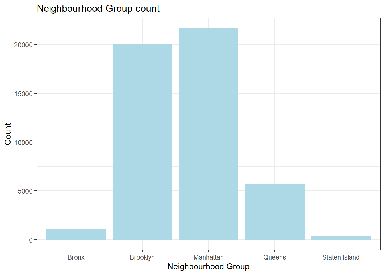
ggplot(airbnb, aes(x = room_type)) +
  geom_bar(fill = "lightpink") +
  labs(title = "Room type and count", x = "Neighborhood Group",
     y = "Count") +
  theme_bw()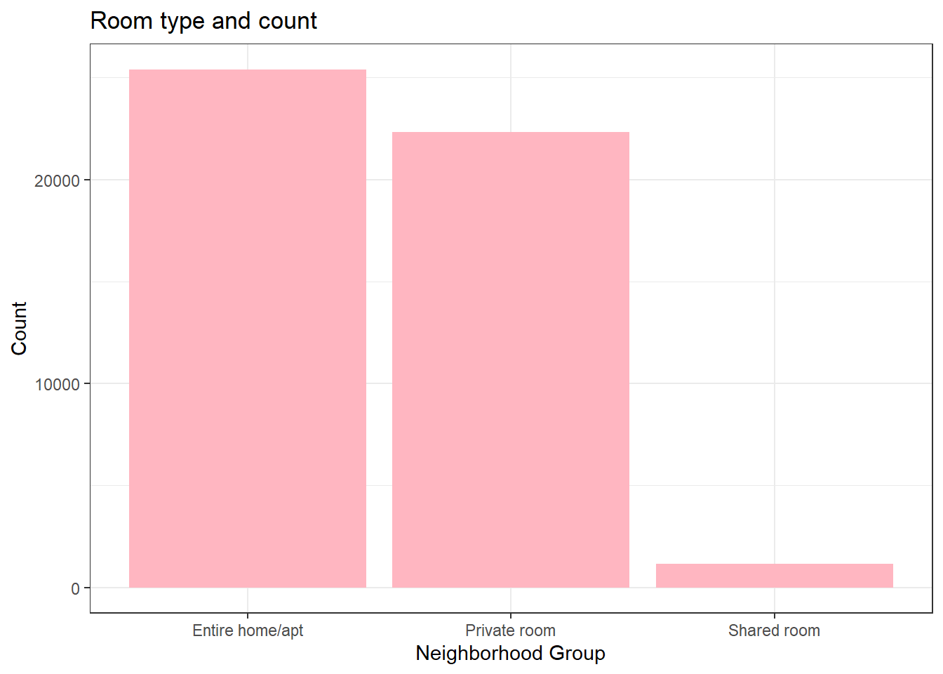
ggplot(airbnb, aes(x = price)) +
  geom_histogram(binwidth=20,alpha=0.6,fill = "purple") +
  labs(title = "Price range and count", x = "Price",
     y = "Count") +
  theme_bw()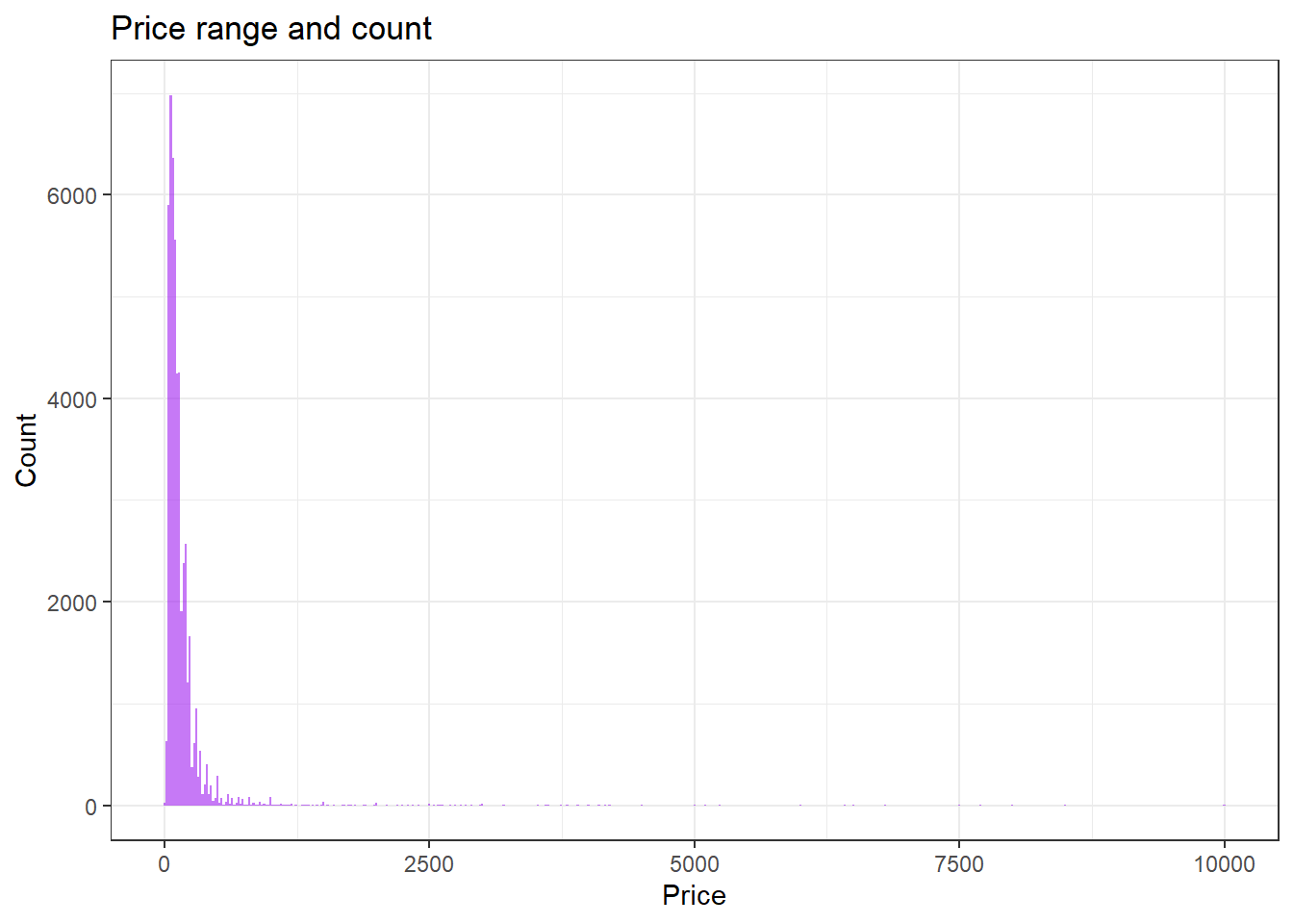
we see that the high distribution is observed for room prices of 500
Bivariate Visualization(s)
ggplot(airbnb, aes(x = neighbourhood_group, fill = room_type)) +
  geom_bar(bins = 25) +
  labs(title = "neighbourhood_group and Room Type", x = "neighbourhood_group", y = "Frequency",
     fill = guide_legend("room_type")) +
  theme_bw()
ggplot(airbnb, aes(x = price, fill = neighbourhood_group)) +
  geom_histogram(bins = 25) + xlim(0,1000)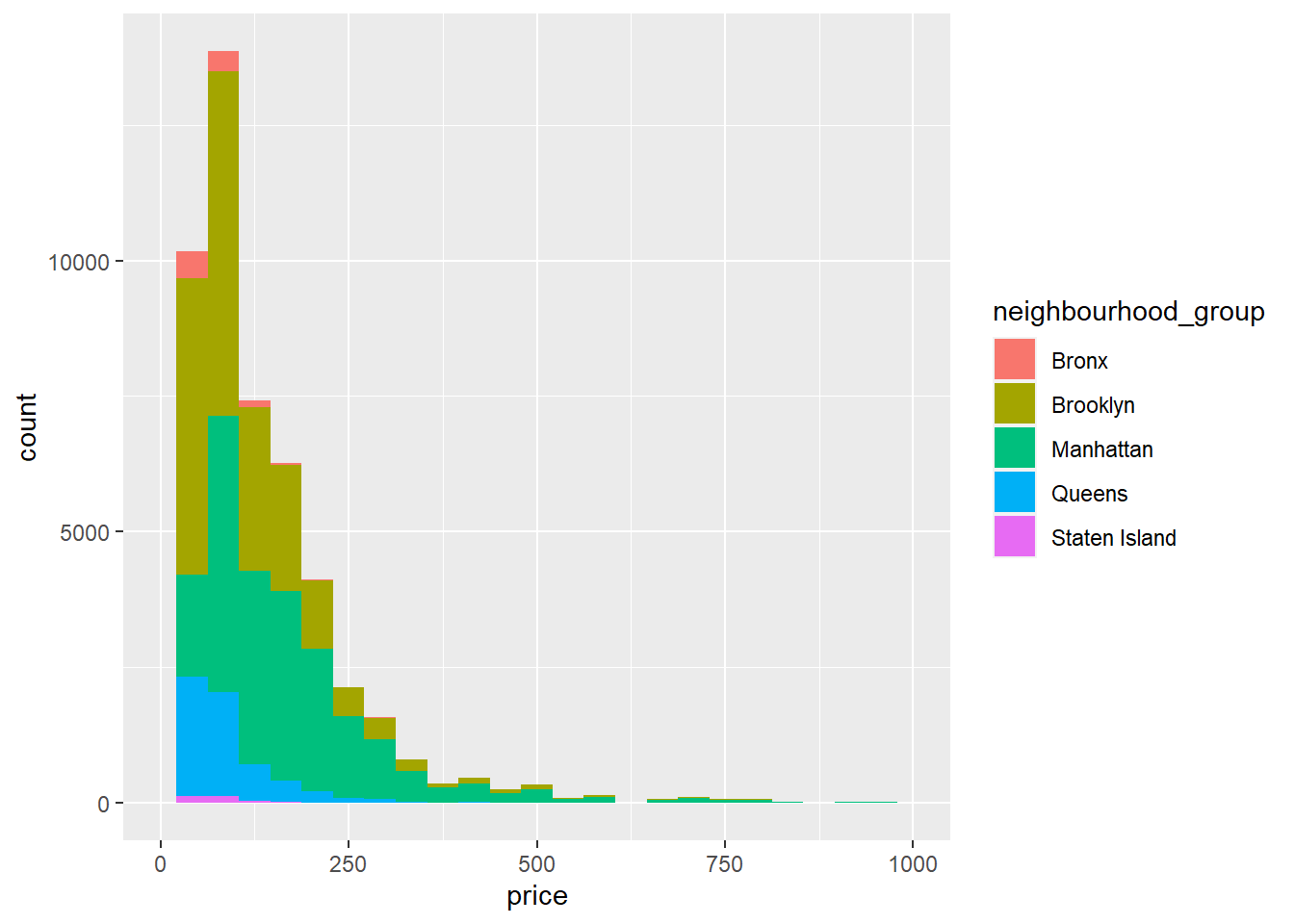
  labs(title = "neighbourhood_group and Price", x = "price", y = "Frequency",
     fill = guide_legend("neighbourhood_group")) +
theme_bw()NULLggplot(airbnb, aes(x = minimum_nights, y = price,na.rm = TRUE)) +
geom_point(color="lightblue") +
scale_y_continuous(label = scales::dollar) +
labs(x = "Minium Nights",
y = "Price Per Night ($)",
title = "Minimum Nights vs Price Per Night ($)")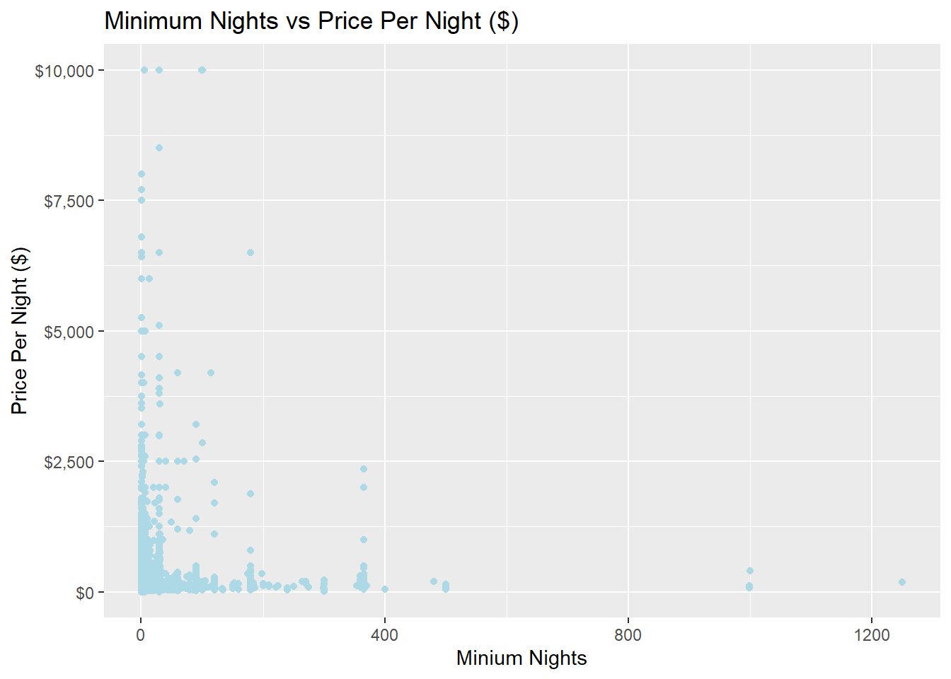
The above graph shows the price entry distribution for the nights of stay.