Challenge 6
#loading all the required libraries
knitr::opts_chunk$set(echo = TRUE, warning=FALSE, message=FALSE)
library(tidyverse)
── Attaching packages ─────────────────────────────────────── tidyverse 1.3.2 ──
✔ ggplot2 3.4.0 ✔ purrr 0.3.5
✔ tibble 3.1.8 ✔ dplyr 1.0.10
✔ tidyr 1.2.1 ✔ stringr 1.5.0
✔ readr 2.1.3 ✔ forcats 0.5.2 Warning: package 'ggplot2' was built under R version 4.2.2Warning: package 'stringr' was built under R version 4.2.2── Conflicts ────────────────────────────────────────── tidyverse_conflicts() ──
✖ dplyr::filter() masks stats::filter()
✖ dplyr::lag() masks stats::lag()library(ggplot2)
library(readxl)
library(lubridate)Warning: package 'lubridate' was built under R version 4.2.2Loading required package: timechangeWarning: package 'timechange' was built under R version 4.2.2
Attaching package: 'lubridate'

The following objects are masked from 'package:base':

date, intersect, setdiff, unionlibrary(summarytools)
Attaching package: 'summarytools'

The following object is masked from 'package:tibble':

viewlibrary(skimr)Challenge Overview
Today’s challenge is to:
- read in a data set, and describe the data set using both words and any supporting information (e.g., tables, etc)
- tidy data (as needed, including sanity checks)
- mutate variables as needed (including sanity checks)
- create at least one graph including time (evolution)
- try to make them “publication” ready (optional)
- Explain why you choose the specific graph type
- Create at least one graph depicting part-whole or flow relationships
- try to make them “publication” ready (optional)
- Explain why you choose the specific graph type
R Graph Gallery is a good starting point for thinking about what information is conveyed in standard graph types, and includes example R code.
(be sure to only include the category tags for the data you use!)
Read in data
Read in one (or more) of the following datasets, using the correct R package and command.
- debt ⭐
- fed_rate ⭐⭐
- abc_poll ⭐⭐⭐
- usa_hh ⭐⭐⭐
- hotel_bookings ⭐⭐⭐⭐
- AB_NYC ⭐⭐⭐⭐⭐
{r}
library(readxl)
debt_in_trillions <- read_excel("_data/debt_in_trillions.xlsx")
Briefly describe the data
#we will use library fun modeling to get variable distribution
library(funModeling)
plot_num(debt_in_trillions)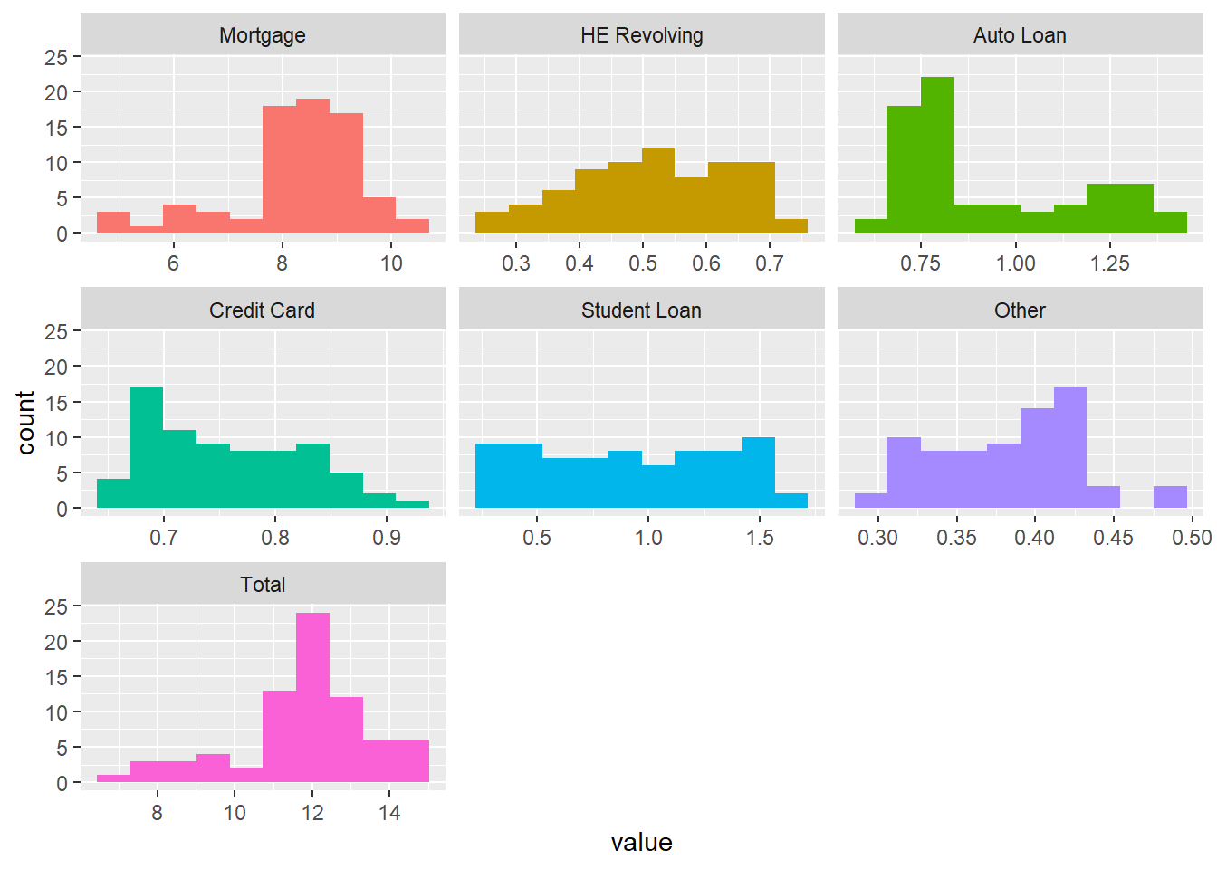
summary(debt_in_trillions) Year and Quarter Mortgage HE Revolving Auto Loan
Length:74 Min. : 4.942 Min. :0.2420 Min. :0.6220
Class :character 1st Qu.: 8.036 1st Qu.:0.4275 1st Qu.:0.7430
Mode :character Median : 8.412 Median :0.5165 Median :0.8145
Mean : 8.274 Mean :0.5161 Mean :0.9309
3rd Qu.: 9.047 3rd Qu.:0.6172 3rd Qu.:1.1515
Max. :10.442 Max. :0.7140 Max. :1.4150
Credit Card Student Loan Other Total
Min. :0.6590 Min. :0.2407 Min. :0.2960 Min. : 7.231
1st Qu.:0.6966 1st Qu.:0.5333 1st Qu.:0.3414 1st Qu.:11.311
Median :0.7375 Median :0.9088 Median :0.3921 Median :11.852
Mean :0.7565 Mean :0.9189 Mean :0.3831 Mean :11.779
3rd Qu.:0.8165 3rd Qu.:1.3022 3rd Qu.:0.4154 3rd Qu.:12.674
Max. :0.9270 Max. :1.5840 Max. :0.4860 Max. :14.957 #The dataset gave us information on different types of loan through different years (2003-2021) and quarters. There are 74 rows and 8 columns, of which 1 is character type(which is Year and Quarter) and rest of the 7 are numeric. There aren’t any missing values in the columns.
#the unit ranges for these values dont look like they are on the same scale
#some are left skewed and some are right skewed except Student Loan and HE RevolvingTidy Data (as needed)
Is your data already tidy, or is there work to be done? Be sure to anticipate your end result to provide a sanity check, and document your work here.
# assigning column names following standard convention
colnames(debt_in_trillions) <- c('year_quarter','mortgage','he_revolving','auto_loan',
'credit_card', 'student_loan','other','total')
Are there any variables that require mutation to be usable in your analysis stream? For example, do you need to calculate new values in order to graph them? Can string values be represented numerically? Do you need to turn any variables into factors and reorder for ease of graphics and visualization?
Document your work here.
# tsibble: tidy temporal data frames and tools
#library(tsibble) --> installed
#all the numerical variables are independent in nature and need no further manipulation
#year_quarter can be further divided into year and quarter columns for ease of visualizations
debt_in_trillions$year = as.integer(substring(debt_in_trillions$year_quarter, first=1, last=2))
debt_in_trillions$quarter = substring(debt_in_trillions$year_quarter, first=4, last=5)
head(debt_in_trillions)# A tibble: 6 × 10
year_quarter mortg…¹ he_re…² auto_…³ credi…⁴ stude…⁵ other total year quarter
<chr> <dbl> <dbl> <dbl> <dbl> <dbl> <dbl> <dbl> <int> <chr>
1 03:Q1 4.94 0.242 0.641 0.688 0.241 0.478 7.23 3 Q1
2 03:Q2 5.08 0.26 0.622 0.693 0.243 0.486 7.38 3 Q2
3 03:Q3 5.18 0.269 0.684 0.693 0.249 0.477 7.56 3 Q3
4 03:Q4 5.66 0.302 0.704 0.698 0.253 0.449 8.07 3 Q4
5 04:Q1 5.84 0.328 0.72 0.695 0.260 0.446 8.29 4 Q1
6 04:Q2 5.97 0.367 0.743 0.697 0.263 0.423 8.46 4 Q2
# … with abbreviated variable names ¹mortgage, ²he_revolving, ³auto_loan,
# ⁴credit_card, ⁵student_loan#we added now two new columns --> year(integer) and quarter Time Dependent Visualization
#lets check how the total loan is spread of the years
ggplot(debt_in_trillions) +
  geom_point(aes(x=year, y=total)) + labs(title = "Debt trend with time", x = "Time", y = "Total Debt") + theme_minimal()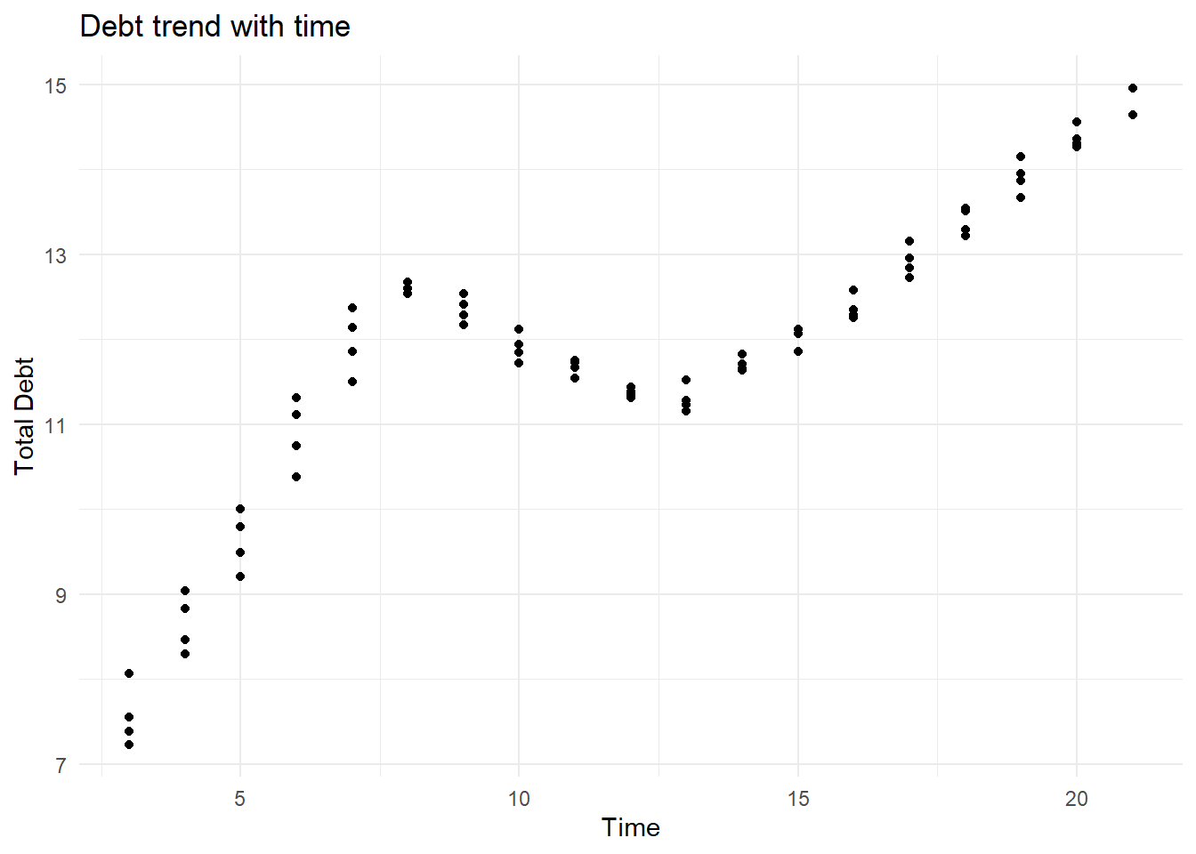
#it increased till 2006 and then dropped(maybe due to 2008 recession? and then increased
#after 2011
Visualizing Part-Whole Relationships
#the dataset is in wide format
#before doing any further visualizations, if we convert into long format, it will be easier

debt_in_trillions_long<-debt_in_trillions%>%pivot_longer(cols = mortgage:other, names_to = "loan_type", values_to = "totals")%>%select(-total)%>%mutate(loan_type = as.factor(loan_type))head(debt_in_trillions_long)# A tibble: 6 × 5
year_quarter year quarter loan_type totals
<chr> <int> <chr> <fct> <dbl>
1 03:Q1 3 Q1 mortgage 4.94
2 03:Q1 3 Q1 he_revolving 0.242
3 03:Q1 3 Q1 auto_loan 0.641
4 03:Q1 3 Q1 credit_card 0.688
5 03:Q1 3 Q1 student_loan 0.241
6 03:Q1 3 Q1 other 0.478color_values = c("aquamarine", "azure", "cornsilk", "coral1", "darkorange",
"darkgoldenrod1")
ggplot(debt_in_trillions_long, aes(x=year, y=totals, fill=loan_type)) +
geom_bar(position="stack", stat="identity") + labs(title = "Distribution of Loan Types")+
scale_y_continuous(labels = scales::label_number(suffix = " Trillion"))+
theme(legend.position = "top") +
guides(fill = guide_legend(nrow = 1)) +
scale_fill_manual(labels=
str_replace(levels(debt_in_trillions_long$loan_type), " ", "\n"),
values=color_values)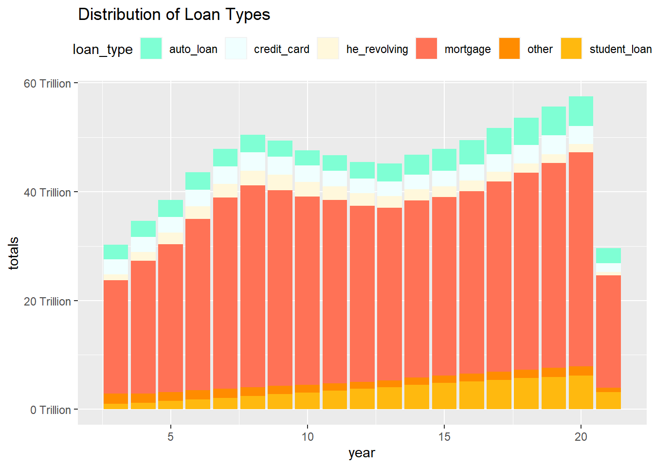
library(dplyr)
df <- debt_in_trillions_long %>%
select(loan_type,totals) %>%
group_by(loan_type) %>%
summarise(loantotal = sum(totals)) %>%
mutate(total_perc = (loantotal/sum(loantotal))*100) %>%
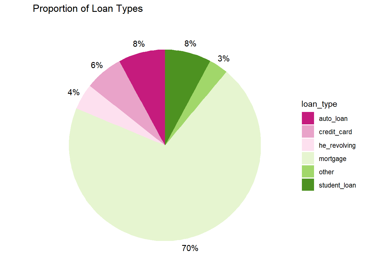
arrange(total_perc)#for the below graph, it totals works, labels can use the value total_perc to display #total percentage
ggplot(df, aes(x="", y=total_perc, fill=loan_type)) +
  geom_bar(stat="identity", width=1) +
  coord_polar("y", start=0) + labs(title = "Proportion of Loan Types") + theme_void() + scale_fill_brewer(palette="PiYG") + geom_text(aes(x = 1.6, label = paste0(round(total_perc), "%")), position = position_stack(vjust = 0.5))