library(tidyverse)
library(ggplot2)
library("readxl")
library(stringr)

knitr::opts_chunk$set(echo = TRUE, warning=FALSE, message=FALSE)
Challenge 5 Solutions
challenge_5
railroads
cereal
air_bnb
pathogen_cost
australian_marriage
public_schools
usa_households
Introduction to Visualization
Challenge Overview
Read in data
Working with the USA Households data set. Had previously read, cleaned and pivoted this dataset from challenge 3. Re-using the same cleaned data here.
# Reading in the USA Households dataset
# Removing the total column as information is redundant
h_income <- read_excel("_data/USA Households by Total Money Income, Race, and Hispanic Origin of Householder 1967 to 2019.xlsx",
         skip=5, n_max = 351, col_names=c("year", "hnumber", "total","level1", "level2",
                                          "level3","level4","level5","level6","level7","level8",
                                          "level9","median_income","median_error",
                                    "mean_income","mean_error") ) %>% select(-total)

income_vals <- c("level1","level2","level3","level4","level5","level6","level7","level8","level9")
income_levels <- c("Under $15000","$15000 to $29000","$25000 to $34999","$35000 to $49999","$50000 to $74999","$75000 to $99999","$100000 to $149999","1500000 to $199999","$200000 and over")
h_income
# A tibble: 351 × 15
year hnumber level1 level2 level3 level4 level5 level6 level7 level8 level9
<chr> <chr> <dbl> <dbl> <dbl> <dbl> <dbl> <dbl> <dbl> <dbl> <dbl>
1 ALL R… <NA> NA NA NA NA NA NA NA NA NA
2 2019 128451 9.1 8 8.3 11.7 16.5 12.3 15.5 8.3 10.3
3 2018 128579 10.1 8.8 8.7 12 17 12.5 15 7.2 8.8
4 2017 2 127669 10 9.1 9.2 12 16.4 12.4 14.7 7.3 8.9
5 2017 127586 10.1 9.1 9.2 11.9 16.3 12.6 14.8 7.5 8.5
6 2016 126224 10.4 9 9.2 12.3 16.7 12.2 15 7.2 8
7 2015 125819 10.6 10 9.6 12.1 16.1 12.4 14.9 7.1 7.2
8 2014 124587 11.4 10.5 9.6 12.6 16.4 12.1 14 6.6 6.8
9 2013 3 123931 11.4 10.3 9.5 12.5 16.8 12 13.9 6.7 6.9
10 2013 4 122952 11.3 10.4 9.7 13.1 17 12.5 13.6 6.3 6
# … with 341 more rows, and 4 more variables: median_income <dbl>,
# median_error <dbl>, mean_income <chr>, mean_error <chr>Briefly describe the data
In the above data, we have the necessary household income values for various throughout different years. The levels of the income range have also been named accordingly and the mapping is found in the vector ‘income_levels’. There is a need to pivot this data in order to get the the races corresponding to each year. Currently, the races are only present atop each section of data. Pivoting will help in grouping the data and making calculations easier against different categories of race.
Tidy Data (as needed)
There is a lot of work that needs to be done to this dataset. Firstly, the data needs to be pivoted such that for each entry we know the corresponding race. Currently, the race category is not directly present. Next, the null values in the dataset have to be looked and replaces as NA. Furthermore, the datatypes of each field have to be checked.
# Creating a new column named race_cat + removing the rows with string only
# race category
h_income_race <- h_income %>% mutate(race_cat = case_when(
  str_detect(year, "[A-Za-z]") ~ year,
  TRUE ~ NA_character_
)) %>% fill(race_cat) %>% filter(!str_detect(year, "[A-Za-z]"))

# Removing the notes number from the year and race_cat columns
h_income_race <- h_income_race %>% separate(year, c("year","notes"), sep = " ") %>% select(-notes)
h_income_race$race_cat <- gsub('[0-9]+', '', h_income_race$race_cat)

# Detected some non numeric characters in the numeric fields. So need to remove them
h_income_race <- h_income_race %>%
    mutate(across(c(hnumber, starts_with("level"), starts_with("me")),~ replace(.,str_detect(., "[A-Za-z]"), NA))) %>% mutate_at(vars(hnumber, starts_with("me"), starts_with("level")), as.numeric)

class(h_income_race$hnumber)
[1] "numeric"There are 12 different categories of races. For easier visualization, categories with overlap can be grouped into a common groups.
clean_h_income <- h_income_race %>% mutate(
  gp_race_cat = case_when(
    grepl("BLACK", race_cat, fixed=TRUE) ~ "grp_black",
    grepl("ASIAN", race_cat, fixed=TRUE) ~ "grp_asian",
    grepl("WHITE", race_cat, fixed=TRUE) ~ "grp_white",
    grepl("HISPANIC", race_cat, fixed=TRUE) & !grepl("NOT", race_cat, fixed=TRUE) ~ "grp_hisp",
    grepl("ALL", race_cat, fixed=TRUE) ~ "grp_all",
  )
) %>% filter(!is.na(gp_race_cat)) %>%
  group_by(year, gp_race_cat) %>%
  summarise(across(c(starts_with("level"),starts_with("me"),
                     "hnumber"),
                   ~sum(.x, na.rm=TRUE)))

head(clean_h_income)
# A tibble: 6 × 16
# Groups: year [2]
year gp_race…¹ level1 level2 level3 level4 level5 level6 level7 level8 level9
<chr> <chr> <dbl> <dbl> <dbl> <dbl> <dbl> <dbl> <dbl> <dbl> <dbl>
1 1967 grp_all 14.8 10.2 10.9 16.8 24.8 11.9 7.7 1.7 1.2
2 1967 grp_black 26.8 17.7 15.2 16.4 14.8 5.5 2.7 0.6 0.3
3 1967 grp_white 13.5 9.4 10.4 16.9 25.8 12.6 8.2 1.8 1.3
4 1968 grp_all 13.4 10.1 10.4 16.5 24.8 13.7 8.2 1.8 1.1
5 1968 grp_black 24.4 17 15.5 16.2 16.6 6.5 3.2 0.4 0.1
6 1968 grp_white 12.3 9.3 9.8 16.5 25.7 14.5 8.8 1.9 1.2
# … with 5 more variables: median_income <dbl>, median_error <dbl>,
# mean_income <dbl>, mean_error <dbl>, hnumber <dbl>, and abbreviated
# variable name ¹gp_race_catUnivariate Visualizations
- To visualize how the Household numbers have changed over the years, I chose one category - Asians and specifically from the years 2000-2019. I made use of a bar plot to do this. From this visualization below we can see that there has been a steady increase in the numbers through the years with values peaking for 2013 and 2017. It’ll be nice to investigate the reason for the same.
# Create data
# Pivot the data only containing household income numbers from 2000 onwards for the group asian
data_uv_plot1 <- clean_h_income %>% select(gp_race_cat, hnumber, year) %>%
  filter(gp_race_cat == "grp_asian") %>%
  dplyr::filter(substr(year,1,1) == "2")

# Barplot
ggplot(data_uv_plot1, aes(x=year, y=hnumber)) + geom_bar(stat = "identity", fill=rgb(0.1,0.4,0.5,0.7), width=0.8) + coord_flip() + ggtitle("Distribution of Household Numbers for Asians from 2000-2019")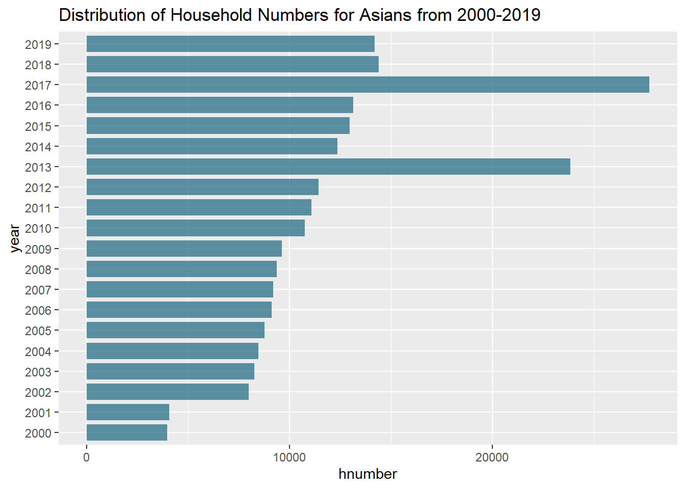
Next, I wanted to visualize the mean income from the years 2000-2019 across all the races. A line graph is the most suitable to show this trend. From the visualization we can see that though the asian group started off only from 1987 with low mean income, they have moved upwards and are currently having the highest income compared to the other races. Furthermore, there are sharp peaks at 2013 and 2017 which need to be investigated further.
data_uv_plot2 <- clean_h_income %>% select(gp_race_cat, mean_income, year)

# Plot
ggplot(data_uv_plot2, aes(x=year , y=mean_income,color=gp_race_cat, group=gp_race_cat)) +
  geom_line() + ggtitle("Mean incomes across races from year 1967-2019") +
  theme(axis.text.x = element_text(angle = 90, vjust = 0.5, hjust=1))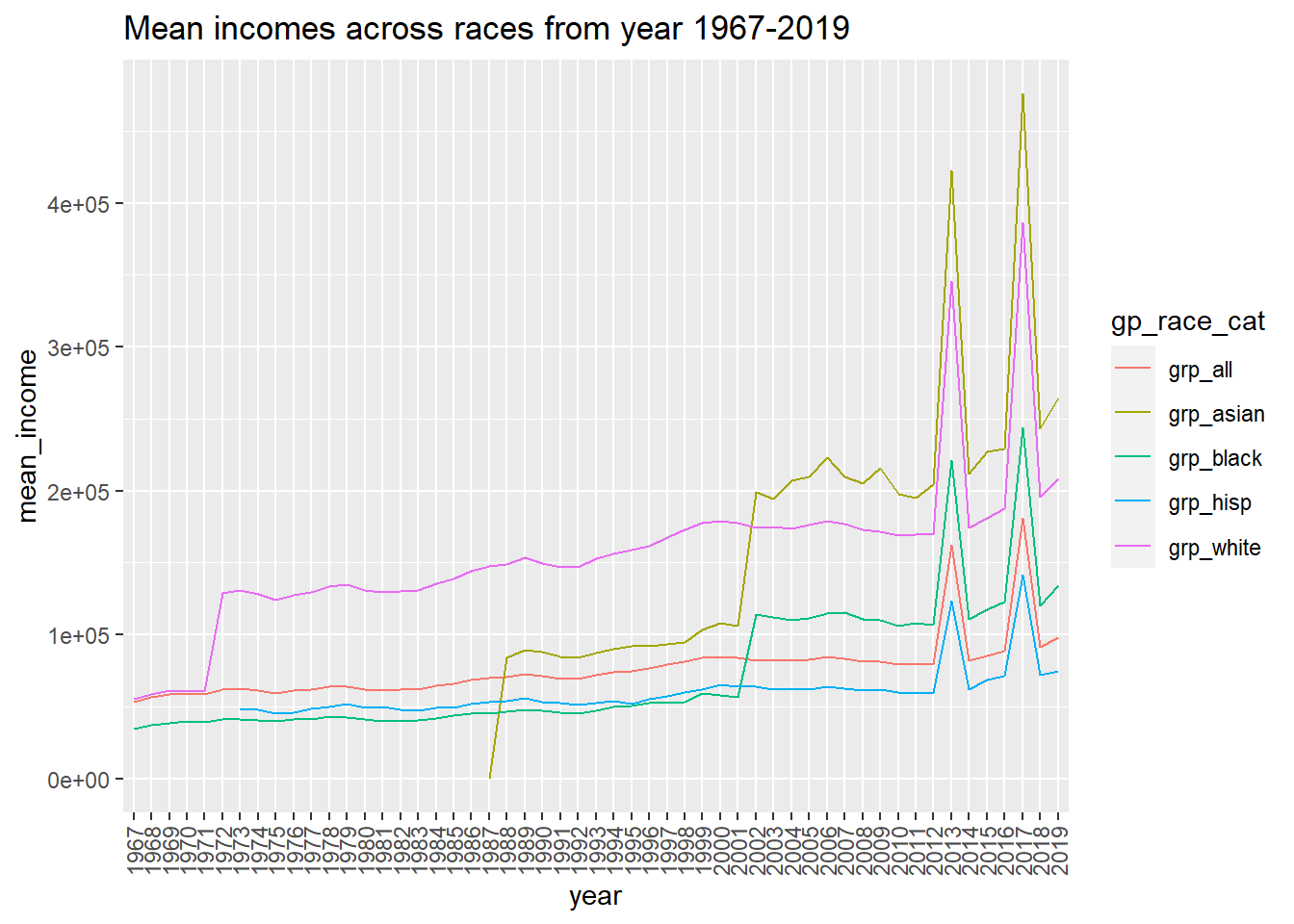
Bivariate Visualization(s)
Here, the data is pivoted such that the income level distribution for each race and for every year can be seen.
# Pivoting the data
pivot_data <- clean_h_income %>% ungroup() %>%
  select(c(year, gp_race_cat, starts_with("level"),hnumber,)) %>%
  pivot_longer(cols=starts_with("level"), names_to="IncomeRange", values_to="percent")

# Replacing the income range levels
pivot_data$IncomeRange <- str_replace_all(pivot_data$IncomeRange, setNames(income_levels,income_vals))

# Calculating the number of household incomes for each income range distribution
pivot_data_longer <- pivot_data %>% mutate(
  range_household_number = round((hnumber*percent)/100)
)

pivot_data_longer
# A tibble: 2,151 × 6
year gp_race_cat hnumber IncomeRange percent range_household_number
<chr> <chr> <dbl> <chr> <dbl> <dbl>
1 1967 grp_all 60813 Under $15000 14.8 9000
2 1967 grp_all 60813 $15000 to $29000 10.2 6203
3 1967 grp_all 60813 $25000 to $34999 10.9 6629
4 1967 grp_all 60813 $35000 to $49999 16.8 10217
5 1967 grp_all 60813 $50000 to $74999 24.8 15082
6 1967 grp_all 60813 $75000 to $99999 11.9 7237
7 1967 grp_all 60813 $100000 to $149999 7.7 4683
8 1967 grp_all 60813 1500000 to $199999 1.7 1034
9 1967 grp_all 60813 $200000 and over 1.2 730
10 1967 grp_black 5728 Under $15000 26.8 1535
# … with 2,141 more rowsWe can visualize by making use of bar plots, how the household numbers are distributed for the different income ranges across the different races.
ggplot(pivot_data_longer, aes(x=range_household_number, y=IncomeRange, fill=gp_race_cat)) +
  geom_bar(stat="identity", position="dodge") +
  scale_fill_brewer(palette = "Set1") +
  ggtitle("Household Income Range from 1967-2019 for all race categories")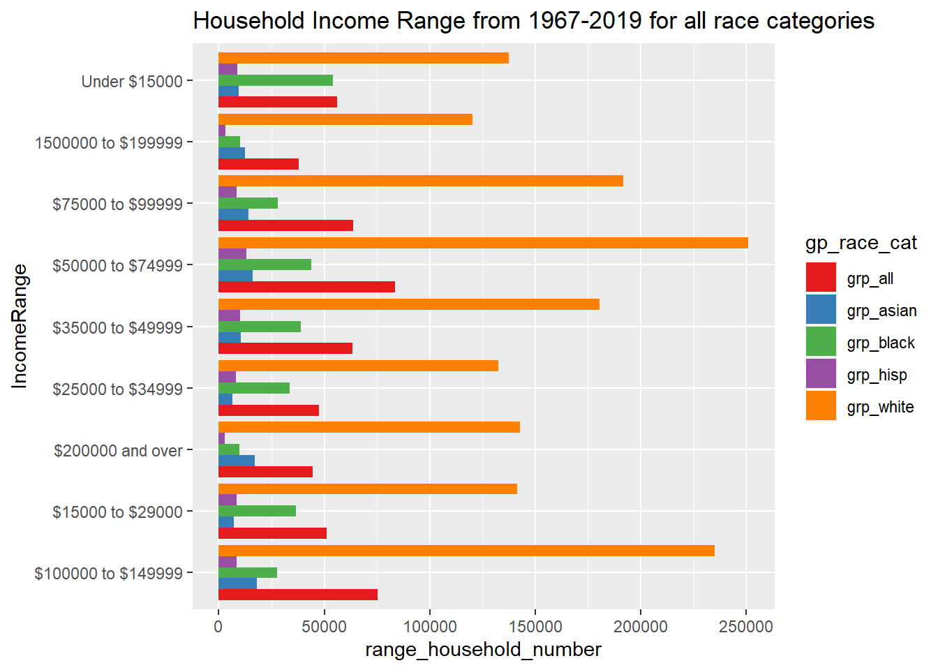
In the above visualization, it is seen that the household number for the white group always seems to be the highest compared to the other races. This is mainly because the population of whites is higher in the US. To get a more accurate analysis, the household numbers can be divided by the net population of each of the categories to easily compare the proportions between different races.