Code
library(tidyverse)

knitr::opts_chunk$set(echo = TRUE, warning=FALSE, message=FALSE)library(tidyverse)
knitr::opts_chunk$set(echo = TRUE, warning=FALSE, message=FALSE)Today’s challenge is to
Read in one (or more) of the following data sets, available in the posts/_data folder, using the correct R package and command.
# Read in the railroad dataset
clean_county_data = read_csv("_data/railroad_2012_clean_county.csv")

# Displaying the top 10 rows
head(clean_county_data, n = 10)
# A tibble: 10 × 3
state county total_employees
<chr> <chr> <dbl>
1 AE APO 2
2 AK ANCHORAGE 7
3 AK FAIRBANKS NORTH STAR 2
4 AK JUNEAU 3
5 AK MATANUSKA-SUSITNA 2
6 AK SITKA 1
7 AK SKAGWAY MUNICIPALITY 88
8 AL AUTAUGA 102
9 AL BALDWIN 143
10 AL BARBOUR 1Add any comments or documentation as needed. More challenging data may require additional code chunks and documentation.
Using a combination of words and results of R commands, can you provide a high level description of the data? Describe as efficiently as possible where/how the data was (likely) gathered, indicate the cases and variables (both the interpretation and any details you deem useful to the reader to fully understand your chosen data).
Conduct some exploratory data analysis, using dplyr commands such as group_by(), select(), filter(), and summarise(). Find the central tendency (mean, median, mode) and dispersion (standard deviation, mix/max/quantile) for different subgroups within the data set.
# Function for computing the mode
mode <- function(group_num){
  which.max(tabulate(group_num))
}
# Getting mean, median and mode of total_employees
grouped_data_stats <- clean_county_data %>%
  group_by(state) %>%
  summarise(total_emp = sum(total_employees),
            avg_emp = mean(total_employees),
            median_emp = median(total_employees),
            mode_emp = mode(total_employees),
            sd_emp = sd(total_employees),
            quant_0.25_emp = quantile(total_employees, 0.25),
            quant_0.75_emp = quantile(total_employees, 0.75),
            quant_0.5_emp = quantile(total_employees, 0.5),
            min_emp = min(total_employees),
            max_emp = max(total_employees)) %>%
  arrange(desc(sd_emp))

head(grouped_data_stats, n=5)
# A tibble: 5 × 11
state total_emp avg_emp media…¹ mode_…² sd_emp quant…³ quant…⁴ quant…⁵ min_emp
<chr> <dbl> <dbl> <dbl> <int> <dbl> <dbl> <dbl> <dbl> <dbl>
1 IL 19131 186. 42 14 829. 14 98 42 1
2 DE 1495 498. 158 62 674. 110 716. 158 62
3 NY 17050 280. 71 11 591. 27 196 71 5
4 CA 13137 239. 61 2 549. 12.5 200. 61 1
5 CT 2592 324 125 26 520. 63.8 231 125 26
# … with 1 more variable: max_emp <dbl>, and abbreviated variable names
# ¹median_emp, ²mode_emp, ³quant_0.25_emp, ⁴quant_0.75_emp, ⁵quant_0.5_emp# Finding county with maximum employees
filter(clean_county_data, total_employees==max(total_employees))# A tibble: 1 × 3
state county total_employees
<chr> <chr> <dbl>
1 IL COOK 8207# Construct boxplot of total employees across all counties
boxplot(grouped_data_stats$total_emp)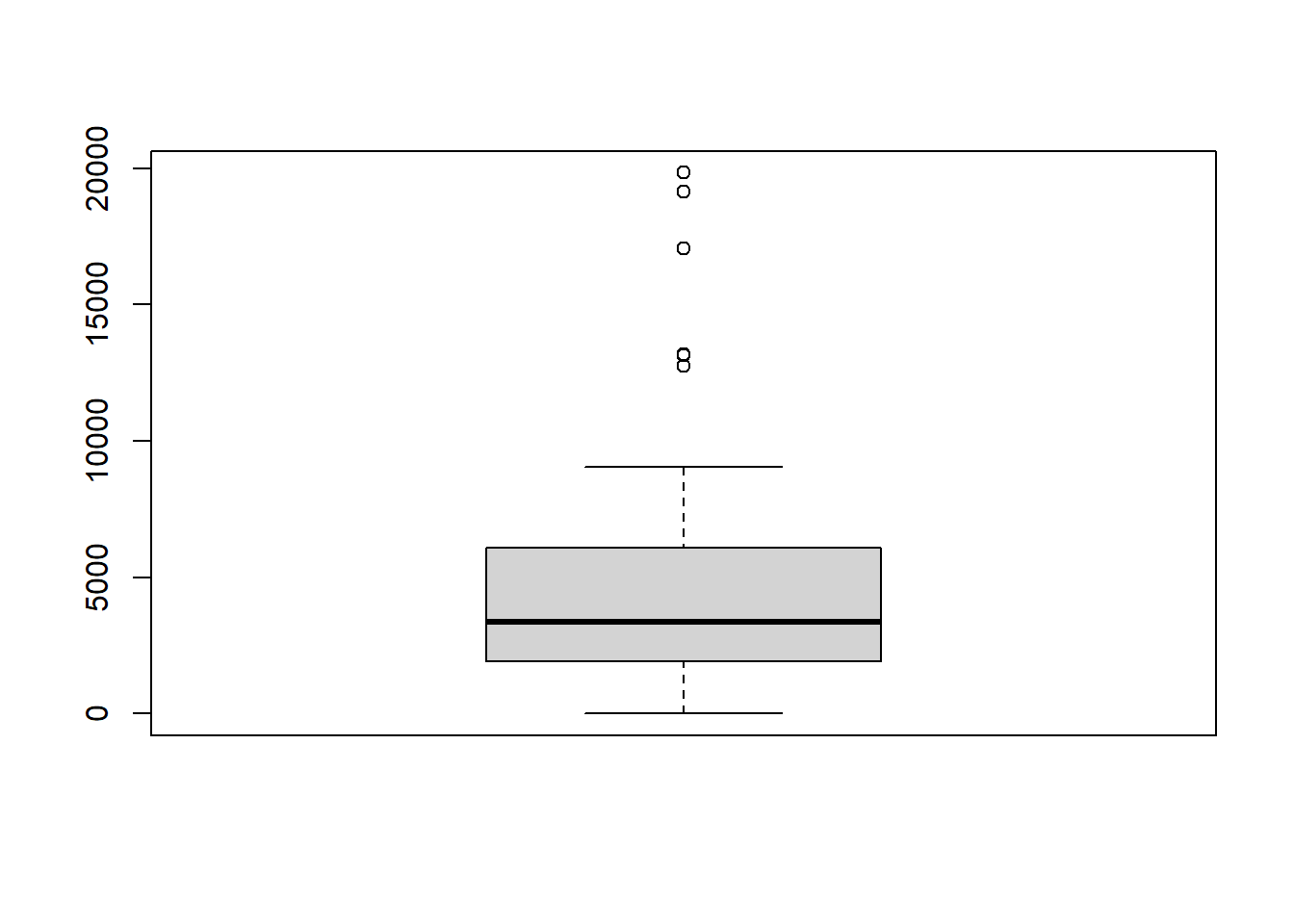
Be sure to explain why you choose a specific group. Comment on the interpretation of any interesting differences between groups that you uncover. This section can be integrated with the exploratory data analysis, just be sure it is included.