Code
library(tidyverse)

knitr::opts_chunk$set(echo = TRUE, warning=FALSE, message=FALSE)library(tidyverse)
knitr::opts_chunk$set(echo = TRUE, warning=FALSE, message=FALSE)Today’s challenge is to:
I read in the FedFundsRate.csv data set.
library(tidyverse)


Fed_Rate_Data <- read_csv("_data/FedFundsRate.csv")

Fed_Rate_Data
# A tibble: 904 × 10
Year Month Day Federal F…¹ Feder…² Feder…³ Effec…⁴ Real …⁵ Unemp…⁶ Infla…⁷
<dbl> <dbl> <dbl> <dbl> <dbl> <dbl> <dbl> <dbl> <dbl> <dbl>
1 1954 7 1 NA NA NA 0.8 4.6 5.8 NA
2 1954 8 1 NA NA NA 1.22 NA 6 NA
3 1954 9 1 NA NA NA 1.06 NA 6.1 NA
4 1954 10 1 NA NA NA 0.85 8 5.7 NA
5 1954 11 1 NA NA NA 0.83 NA 5.3 NA
6 1954 12 1 NA NA NA 1.28 NA 5 NA
7 1955 1 1 NA NA NA 1.39 11.9 4.9 NA
8 1955 2 1 NA NA NA 1.29 NA 4.7 NA
9 1955 3 1 NA NA NA 1.35 NA 4.6 NA
10 1955 4 1 NA NA NA 1.43 6.7 4.7 NA
# … with 894 more rows, and abbreviated variable names
# ¹`Federal Funds Target Rate`, ²`Federal Funds Upper Target`,
# ³`Federal Funds Lower Target`, ⁴`Effective Federal Funds Rate`,
# ⁵`Real GDP (Percent Change)`, ⁶`Unemployment Rate`, ⁷`Inflation Rate`dfSummary(Fed_Rate_Data)Error in dfSummary(Fed_Rate_Data): could not find function "dfSummary"The Fed Rate Data set contains 10 columns and 904 rows. Columns contain the US federal fund rate, unemployment rate, and inflation rate in the US between 1954 and 2017. There are 3 date related columns: “Year”, “Month” and “Day”. There are 4 columns related to the federal fund rates: “Federal Funds Target Rate”, “Federal Funds Upper Target” and “Federal Fund Effective Rate”. The final two columns are “Unemployment Rate” and “Inflation Rate”.
Looking at the dfSummary() of the data set there is a LOT of missing data.This missing data appears to be the the result of different variables being measured at different frequencies, as well as some variables not being measured earlier in the data set. The most missing data is from the “Federal Funds Upper Target” (88.6%), “Federal Funds Lower Target” (88.6%), and “Real GDP (Percent Change)” (72.3%) columns.
To begin, I used make_date() function in the lubridate package to create a column combining year, month, and day into 1 date column. In reviewing my classmates blog posts, I learned the nifty trick of using “.before =” control the placement of this new data column. Shout out to Ryan O’Donnell from whose code I learned this.
Next, I wanted to address some of the missing values using the fill function. I figured that unemployment rates don’t change drastically throughout the year, so I used the fill function to approximate missing values by replacing them with the most recent non-missing value. Looking at the Inflation column there is a large section of missing values at between the years of 1954-1557, during which there was a recession. As inflation likely fluctuated greatly during this period, I did not use fill there.
Then, I decided to push myself by trying to replace missing target rate values with the average of the upper and lower target, whenever there are values for these columns. I accomplished this by mutating using if.else, where the condition was Federal Funds Target Rate = NA (expressed using is.na). When this condition is true (Target Rate = NA), the value is then set to the average of the upper and lower targets. When this condition is false and there is a value for Target Rate, then this value will be shown.
Now that I’ve used the lower and upper targets to fill in missing target rates whenever possible, I no longer want to see these columns. Same goes for the individual year, month, and day columns now that I have the date_YMD column. So I hid them using select, and then starts_with or contains to select the columns I want to get rid of.
#Code, year, month, day into a Date_YMD column

library(lubridate)

Fed_Rate_Data_YMD <-Fed_Rate_Data %>%
  mutate(Date_YMD = make_date(Year, Month, Day), .before = `Federal Funds Target Rate` )


#Use fill for Unemployment rate
Fed_Rate_Data_YMD <- Fed_Rate_Data_YMD %>%
  fill(`Unemployment Rate`)


#Replace target rate = NA with the average of the upper and lower target, when present
Fed_Rate_Data_YMD <- Fed_Rate_Data_YMD %>%
  mutate(`Federal Funds Target Rate` = ifelse(is.na(`Federal Funds Target Rate`), (`Federal Funds Upper Target`+ `Federal Funds Lower Target`)/2, `Federal Funds Target Rate`))


#to hide the redundant Y, M, D and Upper and Lower column
Fed_Rate_Data_YMD <- Fed_Rate_Data_YMD %>%
   select(!starts_with("Year"))%>%
   select(!starts_with("Month")) %>%
   select(!starts_with("Day")) %>%
   select(!contains("Upper")) %>%
   select(!contains("Lower"))

Fed_Rate_Data_YMD
# A tibble: 904 × 6
Date_YMD `Federal Funds Target Rate` Effective Fe…¹ Real …² Unemp…³ Infla…⁴
<date> <dbl> <dbl> <dbl> <dbl> <dbl>
1 1954-07-01 NA 0.8 4.6 5.8 NA
2 1954-08-01 NA 1.22 NA 6 NA
3 1954-09-01 NA 1.06 NA 6.1 NA
4 1954-10-01 NA 0.85 8 5.7 NA
5 1954-11-01 NA 0.83 NA 5.3 NA
6 1954-12-01 NA 1.28 NA 5 NA
7 1955-01-01 NA 1.39 11.9 4.9 NA
8 1955-02-01 NA 1.29 NA 4.7 NA
9 1955-03-01 NA 1.35 NA 4.6 NA
10 1955-04-01 NA 1.43 6.7 4.7 NA
# … with 894 more rows, and abbreviated variable names
# ¹`Effective Federal Funds Rate`, ²`Real GDP (Percent Change)`,
# ³`Unemployment Rate`, ⁴`Inflation Rate`After playing around with the data graphically, it hit me that the rates were each a category and I could pivot longer by rate type! Prior to pivoting I have dimensions of 904x6 and am pivoting 5 columns into rate type: target fed fund rate, effective fed fund rate, real GDP, unemployment rate, and inflation rate.
The pivoted data should have 3 columns, date, rate type, and rate in percentage.
The cases are the dates, which is n = 904 (each row is a date) and there are k=5 types of rates (columns), I expect 904 * 5 = 4,520 rows, and there are!!!
#Pivot longer to a rate column!
Fed_Rate_Tidy <- Fed_Rate_Data_YMD %>%
  pivot_longer(col = c (`Federal Funds Target Rate`, `Effective Federal Funds Rate`, `Real GDP (Percent Change)`, `Unemployment Rate`, `Inflation Rate`),
               names_to = "Rate Type",
               values_to = "Rate in Percentage")

#Check number of rows
Fed_Rate_Tidy
# A tibble: 4,520 × 3
Date_YMD `Rate Type` `Rate in Percentage`
<date> <chr> <dbl>
1 1954-07-01 Federal Funds Target Rate NA
2 1954-07-01 Effective Federal Funds Rate 0.8
3 1954-07-01 Real GDP (Percent Change) 4.6
4 1954-07-01 Unemployment Rate 5.8
5 1954-07-01 Inflation Rate NA
6 1954-08-01 Federal Funds Target Rate NA
7 1954-08-01 Effective Federal Funds Rate 1.22
8 1954-08-01 Real GDP (Percent Change) NA
9 1954-08-01 Unemployment Rate 6
10 1954-08-01 Inflation Rate NA
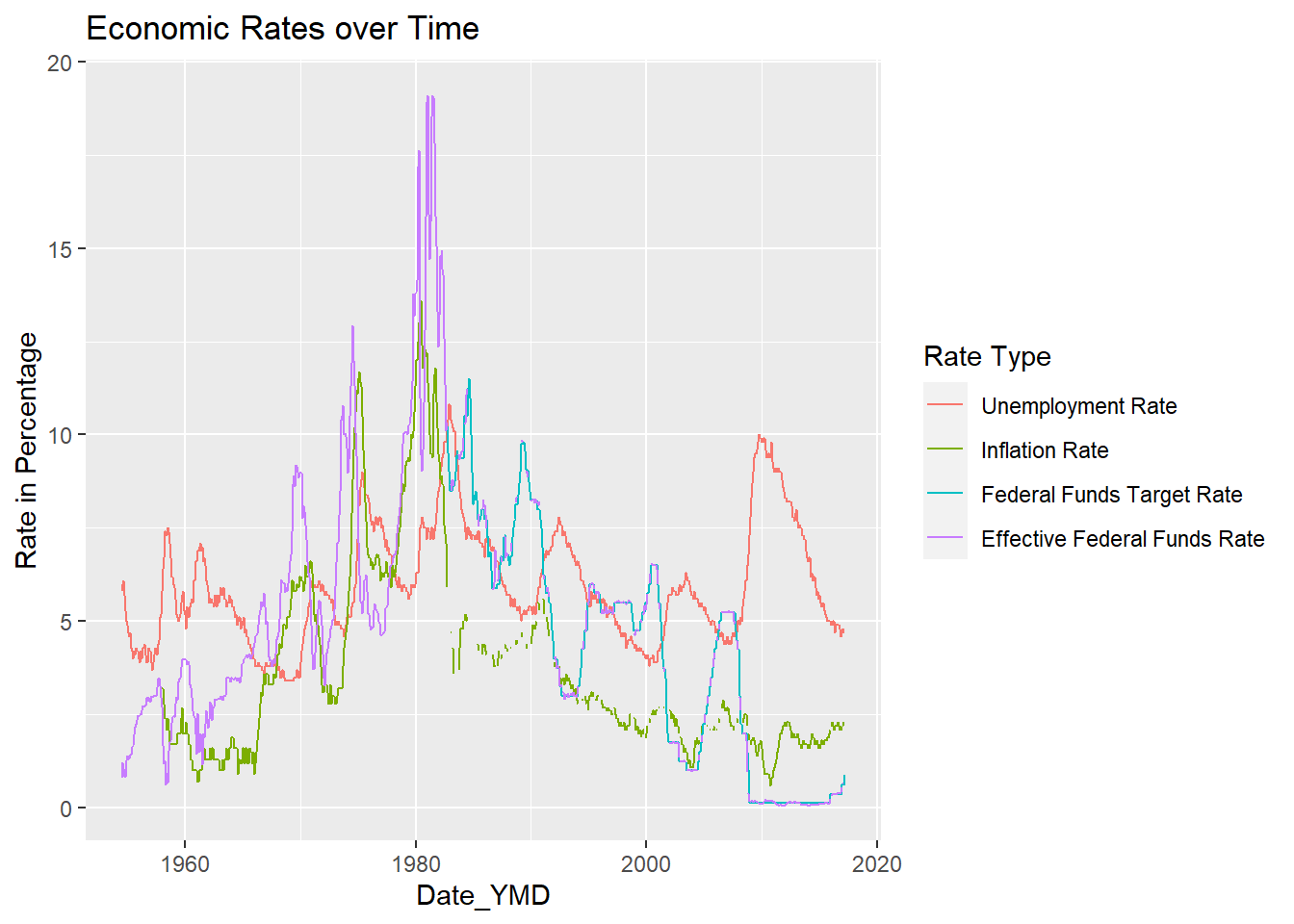
# … with 4,510 more rowsI graphed “Rates in Percentage” vs. “Date_YMD” with a key for rate type. The GDP line made it very difficult to see the other rates, so I created another graph excluding GDP values. This second graph allows for much easier visualization of the relationship between the different rates. For example, the unemployment rate trend-line closely mirrors the effective and federal fund rate trend lines.
I then created a version of the graph sorting the key using factor reorder. I did not find this super helpful personally with visualizing the data, because while Effective Fund Rate is placed at the bottom of the legend due to having the lowest y value at the highest x value (date), for most of the graph the Effective Fund Rate has the highest y values, meaning I’d want it to be at the top of the legend, as in the original graph.
ggplot(Fed_Rate_Tidy, aes(`Date_YMD`, `Rate in Percentage`, color = `Rate Type` )) + geom_line(na.rm = TRUE) + labs(title = "Economic Rates over Time")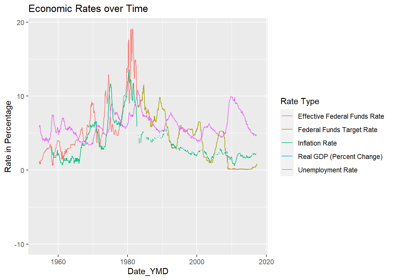
#Graph again without GDP
#De_select GDP
Fed_Rate_YMD_no_GDP <- Fed_Rate_Data_YMD %>%
  select(!contains("GDP"))
#Tidy
Fed_Rate_Tidy_no_GDP <- Fed_Rate_YMD_no_GDP %>%
  pivot_longer(col = c (`Federal Funds Target Rate`, `Effective Federal Funds Rate`, `Unemployment Rate`, `Inflation Rate`),
               names_to = "Rate Type",
               values_to = "Rate in Percentage")
#Graph
ggplot(Fed_Rate_Tidy_no_GDP, aes(`Date_YMD`, `Rate in Percentage`, color = `Rate Type` )) + geom_line(na.rm = TRUE) + labs(title = "Economic Rates over Time (No GDP)")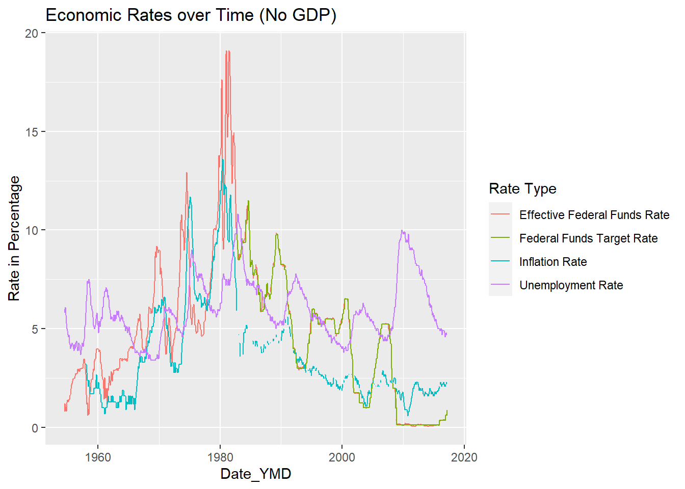
#Factor Reorder
ggplot(Fed_Rate_Tidy_no_GDP, aes(`Date_YMD`, `Rate in Percentage`, color = fct_reorder2(`Rate Type`, `Date_YMD`, `Rate in Percentage` ))) + geom_line(na.rm = TRUE) + labs(title = "Economic Rates over Time", color = "Rate Type")