Code
library(tidyverse)
library(readxl)
library(lubridate)

knitr::opts_chunk$set(echo = TRUE, warning=FALSE, message=FALSE)library(tidyverse)
library(readxl)
library(lubridate)
knitr::opts_chunk$set(echo = TRUE, warning=FALSE, message=FALSE)Today’s challenge is to:
Read in one (or more) of the following datasets, using the correct R package and command.
debt_orig <- read_xlsx("_data/debt_in_trillions.xlsx")

debt_orig
# A tibble: 74 × 8
`Year and Quarter` Mortgage HE Revolvin…¹ Auto …² Credi…³ Stude…⁴ Other Total
<chr> <dbl> <dbl> <dbl> <dbl> <dbl> <dbl> <dbl>
1 03:Q1 4.94 0.242 0.641 0.688 0.241 0.478 7.23
2 03:Q2 5.08 0.26 0.622 0.693 0.243 0.486 7.38
3 03:Q3 5.18 0.269 0.684 0.693 0.249 0.477 7.56
4 03:Q4 5.66 0.302 0.704 0.698 0.253 0.449 8.07
5 04:Q1 5.84 0.328 0.72 0.695 0.260 0.446 8.29
6 04:Q2 5.97 0.367 0.743 0.697 0.263 0.423 8.46
7 04:Q3 6.21 0.426 0.751 0.706 0.33 0.41 8.83
8 04:Q4 6.36 0.468 0.728 0.717 0.346 0.423 9.04
9 05:Q1 6.51 0.502 0.725 0.71 0.364 0.394 9.21
10 05:Q2 6.70 0.528 0.774 0.717 0.374 0.402 9.49
# … with 64 more rows, and abbreviated variable names ¹`HE Revolving`,
# ²`Auto Loan`, ³`Credit Card`, ⁴`Student Loan`“debt_in_trillions” appears to be a table of different types of debt held by year and quarter. The types of debt include Mortgage, HE Revolving, Auto Loan, Credit Card, Student Loan, and Other. Year and quarter is stored in a single column and there is a total column as well.
Is your data already tidy, or is there work to be done? Be sure to anticipate your end result to provide a sanity check, and document your work here.
# Get rid of total row and separate Year & Quarter

debt <- debt_orig %>%
  select(-`Total`) %>%
  separate(`Year and Quarter`, into = c("Year", "Quarter"), convert = TRUE)

# sanity check - expected number of rows

nrow(debt) * (ncol(debt) - 2)
[1] 444# pivot data
debt_pivoted <- debt %>%
pivot_longer(col = c(`Mortgage`, `HE Revolving`, `Auto Loan`, `Credit Card`, `Student Loan`, `Other`),
names_to = "Debt Type",
values_to = "Debt in Trillions")
# Check Expected Number
nrow(debt_pivoted)[1] 444head(debt_pivoted)# A tibble: 6 × 4
Year Quarter `Debt Type` `Debt in Trillions`
<int> <chr> <chr> <dbl>
1 3 Q1 Mortgage 4.94
2 3 Q1 HE Revolving 0.242
3 3 Q1 Auto Loan 0.641
4 3 Q1 Credit Card 0.688
5 3 Q1 Student Loan 0.241
6 3 Q1 Other 0.478Are there any variables that require mutation to be usable in your analysis stream? For example, are all time variables correctly coded as dates? Are all string variables reduced and cleaned to sensible categories? Do you need to turn any variables into factors and reorder for ease of graphics and visualization?
# Fix the year, create a column that is stored as a date
  debt_tidy <- debt_pivoted %>%
  mutate(Year = Year + 2000,
  "Month" = str_replace_all(Quarter, c("Q1" = "1", "Q2" = "4", "Q3" = "6", "Q4" = "10")),
  "Date" = make_date(`Year`, `Month`, "01"),
  .before = `Debt Type`)

debt_tidy
# A tibble: 444 × 6
Year Quarter Month Date `Debt Type` `Debt in Trillions`
<dbl> <chr> <chr> <date> <chr> <dbl>
1 2003 Q1 1 2003-01-01 Mortgage 4.94
2 2003 Q1 1 2003-01-01 HE Revolving 0.242
3 2003 Q1 1 2003-01-01 Auto Loan 0.641
4 2003 Q1 1 2003-01-01 Credit Card 0.688
5 2003 Q1 1 2003-01-01 Student Loan 0.241
6 2003 Q1 1 2003-01-01 Other 0.478
7 2003 Q2 4 2003-04-01 Mortgage 5.08
8 2003 Q2 4 2003-04-01 HE Revolving 0.26
9 2003 Q2 4 2003-04-01 Auto Loan 0.622
10 2003 Q2 4 2003-04-01 Credit Card 0.693
# … with 434 more rowsI had to fix the year column type when I split it from the quarter. In this step, I used mutate to add 2000 to it to make it the correct year. When thinking about visualizing the data, I realized that we might want to convert the Quarter/Year combo into a date so that we could plot it on a timeline. I am assuming that these Quarters represent the calendar year and not a fiscal year so I set the quarters to January, April, July, and October.
ggplot(debt_tidy, aes(`Date`, `Debt in Trillions`, color = fct_reorder2(`Debt Type`, `Date`, `Debt in Trillions`))) +
  geom_line() +
  scale_x_date() +
  scale_y_log10() +
  labs(y = "Debt in Trillions ($USD)", title = "Debt 2003-2021", color = "Debt Type")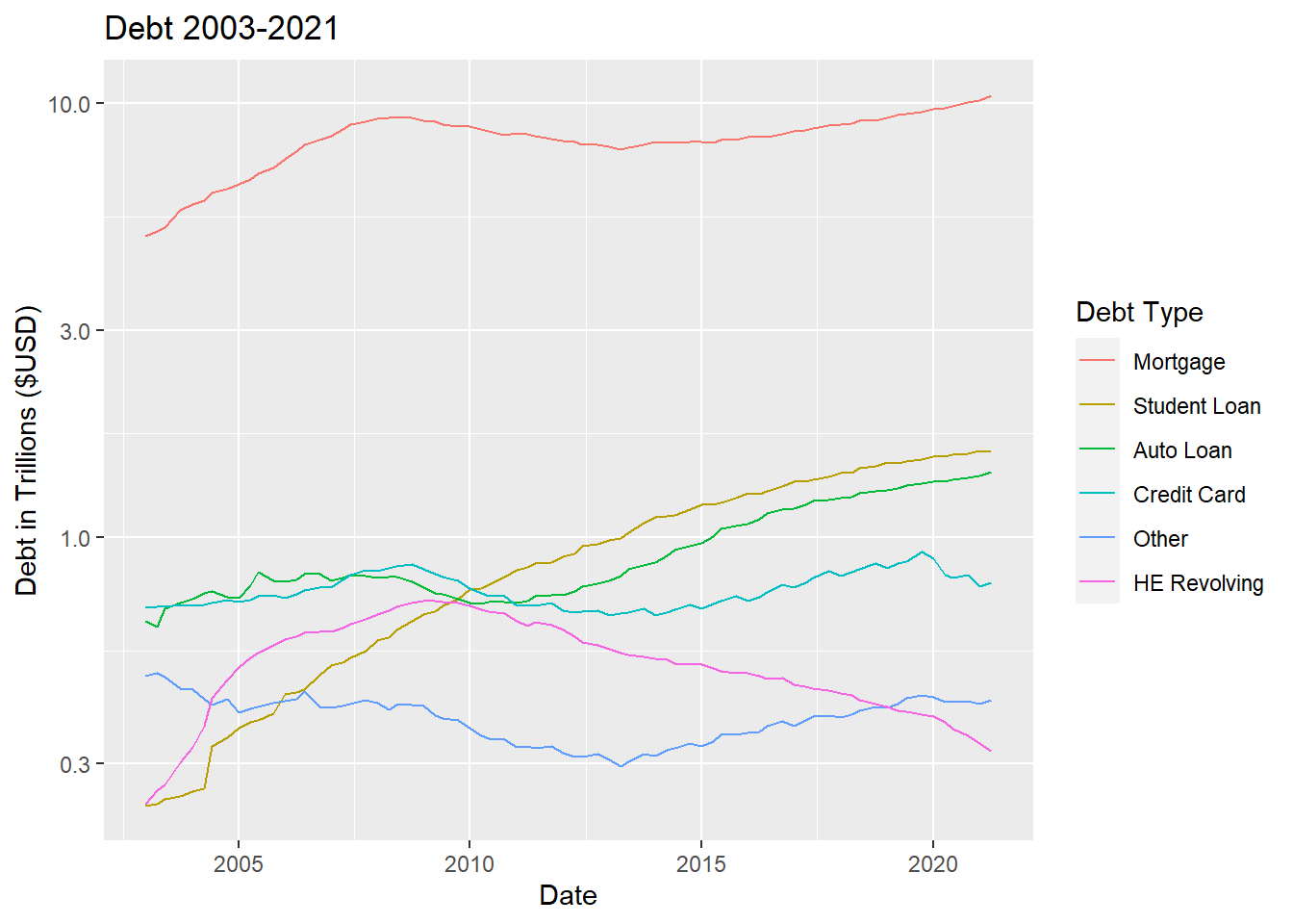
I reordered the Debt Type so that the colors would match the order of the lines. I also set the y axis to logarithmic since there was such a big difference between Mortgage and the rest of the lines. With a logarithmic scale, you can see the variations in the lines that would otherwise be squished at the bottom.
#| label: plotting again

# group by debt type and sum for the year
debt_barplot <- debt_tidy %>%
  group_by(`Year`, `Debt Type`) %>%
  summarize("Debt" = sum(`Debt in Trillions`))

# plot

ggplot(debt_barplot,
       aes(`Year`, `Debt`, fill = fct_rev(
         fct_reorder2(`Debt Type`, `Year`, `Debt`)))) +
  geom_col() +
  labs(y = "Debt in Trillions ($USD)", title = "Type of Debt by Year", fill = "Debt Type")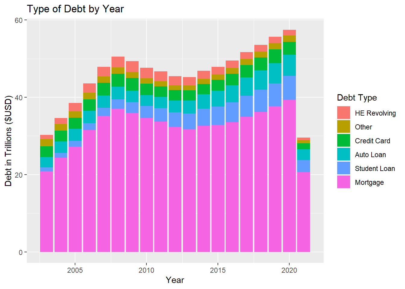
I thought I would try a different visualization type that involved some more factorizing to get the chart to look nice. I summed the debt type by year (using the existing year column, I did not challenge myself to regroup by year using the newly generated date column). I first factored the Debt Type like I did which orders highest to lowest on the final x,y value. This put the largest chunks on top, so I reversed the order since I believe it is generally good practice to put the largest at the bottom.