library(tidyverse)
library(ggplot2)

knitr::opts_chunk$set(echo = TRUE, warning=FALSE, message=FALSE)
Challenge 5
challenge_5
cereal
Introduction to Visualization
Challenge Overview
Today’s challenge is to:
- read in a data set, and describe the data set using both words and any supporting information (e.g., tables, etc)
- tidy data (as needed, including sanity checks)
- mutate variables as needed (including sanity checks)
- create at least two univariate visualizations
- try to make them “publication” ready
- Explain why you choose the specific graph type
- Create at least one bivariate visualization
- try to make them “publication” ready
- Explain why you choose the specific graph type
R Graph Gallery is a good starting point for thinking about what information is conveyed in standard graph types, and includes example R code.
(be sure to only include the category tags for the data you use!)
Read in data
Read in one (or more) of the following datasets, using the correct R package and command.
- cereal.csv ⭐
cereal <- read_csv("_data/cereal.csv")
cereal
# A tibble: 20 × 4
Cereal Sodium Sugar Type
<chr> <dbl> <dbl> <chr>
1 Frosted Mini Wheats 0 11 A
2 Raisin Bran 340 18 A
3 All Bran 70 5 A
4 Apple Jacks 140 14 C
5 Captain Crunch 200 12 C
6 Cheerios 180 1 C
7 Cinnamon Toast Crunch 210 10 C
8 Crackling Oat Bran 150 16 A
9 Fiber One 100 0 A
10 Frosted Flakes 130 12 C
11 Froot Loops 140 14 C
12 Honey Bunches of Oats 180 7 A
13 Honey Nut Cheerios 190 9 C
14 Life 160 6 C
15 Rice Krispies 290 3 C
16 Honey Smacks 50 15 A
17 Special K 220 4 A
18 Wheaties 180 4 A
19 Corn Flakes 200 3 A
20 Honeycomb 210 11 C summary(cereal) Cereal Sodium Sugar Type
Length:20 Min. : 0.0 Min. : 0.00 Length:20
Class :character 1st Qu.:137.5 1st Qu.: 4.00 Class :character
Mode :character Median :180.0 Median : 9.50 Mode :character
Mean :167.0 Mean : 8.75
3rd Qu.:202.5 3rd Qu.:12.50
Max. :340.0 Max. :18.00 Briefly describe the data
The cereal dataset is made up of 4 variables: Cereal, Sodium content, Sugar content, and Type(Adult or Child). There are 20 cereal types.
Tidy Data (as needed)
The data appears to be tidy already, there is no missing data.
Univariate Visualizations
My first visualization is to put the sugar levels of Children’s cereals into a bar graph. I felt like a bar graph was the best way to view which cereals had the most/least sugar as well as which ones were similar.
The second visualization I did was to use a bar graph showing the sodium levels of all cereals. Again, I thought this was the best type of graph to show visually which cereals were similar and different.
cereal %>%
  filter(Type == "C") %>%
  arrange(Sugar) %>%
  mutate(Cereal=factor(Cereal, levels=Cereal)) %>%
ggplot(aes(x=Cereal, y=Sugar)) +
  geom_bar(stat = "identity", fill = "darkorchid") +
  theme_minimal() +
  coord_flip() +
    ggtitle("Sugar Level of Children's Cereals")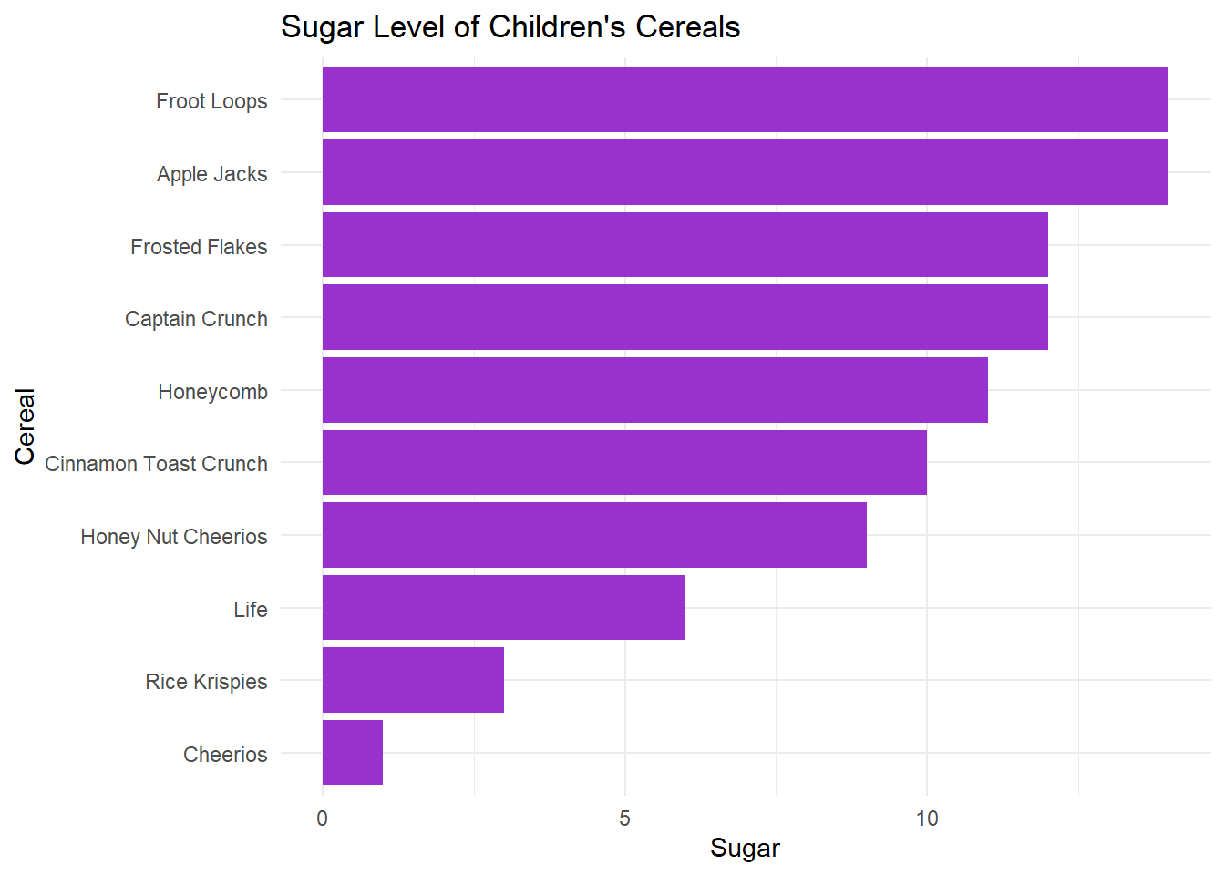
cereal %>%
  mutate(Cereal = factor(Cereal))%>%
  ggplot(aes(x=Cereal, y = Sugar)) +
  geom_bar(stat = "identity", fill = "dodgerblue") +
  theme_light() +
  coord_flip() +
  ggtitle("Sodium Levels of Cereals") +
  labs(y = "Sugar Content", x = "Sodium Content")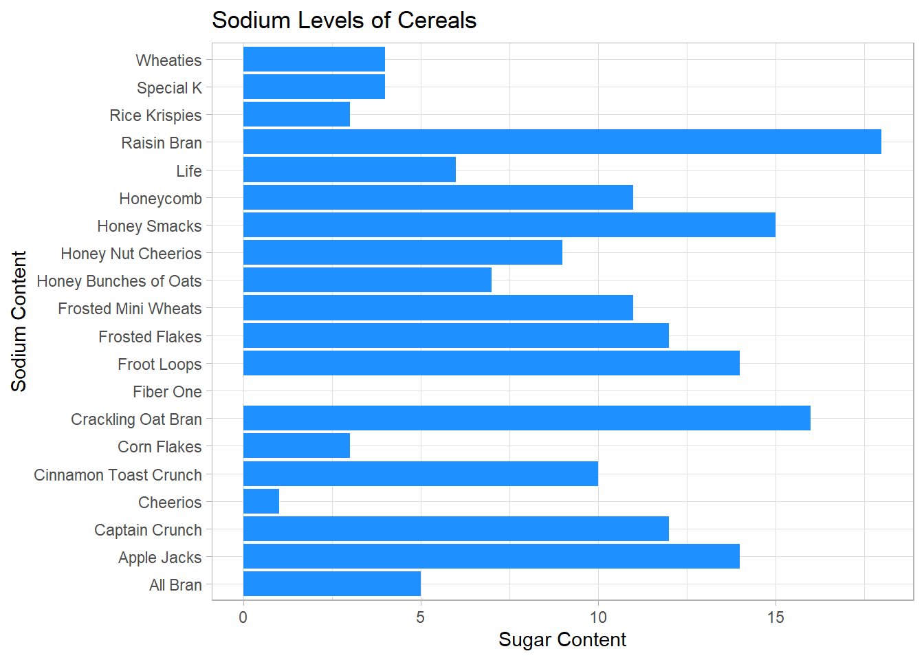
Bivariate Visualization(s)
My Bivariate visualization was comparing the sugar content of cereals to the sodium content of cereals. I did this by using a scatterplot to represent the data points with Sugar as the y axis and Sodium as the x axis. I felt like this was the best way to compare cereals and view the similarities and differences in each cereal.
cereal%>%
  ggplot(aes(x = Sugar,y = Sodium)) +
  geom_point(color = "green") +
  ggtitle("Sugar Compared to Sodium Levels in Cereals") +
  labs(y = "Sugar Content", x = "Sodium Content")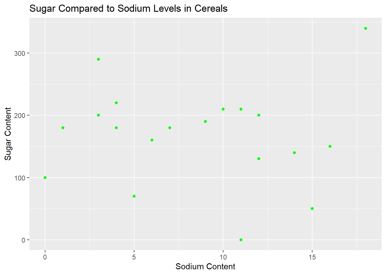
Additional Thoughts:
When I work on the next challenges I want to think about labeling the data within the chart, such as the scatterplot points and maybe even the bars in a bar graph if it is fitting.
I want to think about making data points different colors and adding a legend in the next challenges
Surprised that Raisin Bran is the worst cereal for both categories, its not even a great tasting cereal