library(tidyverse)
library(ggplot2)

knitr::opts_chunk$set(echo = TRUE, warning=FALSE, message=FALSE)
Challenge 5 Instructions
Challenge Overview
Today’s challenge is to:
- read in a data set, and describe the data set using both words and any supporting information (e.g., tables, etc)
- tidy data (as needed, including sanity checks)
- mutate variables as needed (including sanity checks)
- create at least two univariate visualizations
- try to make them “publication” ready
- Explain why you choose the specific graph type
- Create at least one bivariate visualization
- try to make them “publication” ready
- Explain why you choose the specific graph type
R Graph Gallery is a good starting point for thinking about what information is conveyed in standard graph types, and includes example R code.
(be sure to only include the category tags for the data you use!)
Read in data
Read in one (or more) of the following datasets, using the correct R package and command.
- cereal.csv ⭐
- Total_cost_for_top_15_pathogens_2018.xlsx ⭐
- Australian Marriage ⭐⭐
- AB_NYC_2019.csv ⭐⭐⭐
- StateCounty2012.xls ⭐⭐⭐
- Public School Characteristics ⭐⭐⭐⭐
- USA Households ⭐⭐⭐⭐⭐
# Read in the data set and display rows
df <- read_csv('./_data/AB_NYC_2019.csv')
df
# A tibble: 48,895 × 16
id name host_id host_…¹ neigh…² neigh…³ latit…⁴ longi…⁵ room_…⁶ price
<dbl> <chr> <dbl> <chr> <chr> <chr> <dbl> <dbl> <chr> <dbl>
1 2539 Clean & … 2787 John Brookl… Kensin… 40.6 -74.0 Privat… 149
2 2595 Skylit M… 2845 Jennif… Manhat… Midtown 40.8 -74.0 Entire… 225
3 3647 THE VILL… 4632 Elisab… Manhat… Harlem 40.8 -73.9 Privat… 150
4 3831 Cozy Ent… 4869 LisaRo… Brookl… Clinto… 40.7 -74.0 Entire… 89
5 5022 Entire A… 7192 Laura Manhat… East H… 40.8 -73.9 Entire… 80
6 5099 Large Co… 7322 Chris Manhat… Murray… 40.7 -74.0 Entire… 200
7 5121 BlissArt… 7356 Garon Brookl… Bedfor… 40.7 -74.0 Privat… 60
8 5178 Large Fu… 8967 Shunic… Manhat… Hell's… 40.8 -74.0 Privat… 79
9 5203 Cozy Cle… 7490 MaryEl… Manhat… Upper … 40.8 -74.0 Privat… 79
10 5238 Cute & C… 7549 Ben Manhat… Chinat… 40.7 -74.0 Entire… 150
# … with 48,885 more rows, 6 more variables: minimum_nights <dbl>,
# number_of_reviews <dbl>, last_review <date>, reviews_per_month <dbl>,
# calculated_host_listings_count <dbl>, availability_365 <dbl>, and
# abbreviated variable names ¹host_name, ²neighbourhood_group,
# ³neighbourhood, ⁴latitude, ⁵longitude, ⁶room_typeBriefly describe the data
This data set appears to be displaying Airbnb information in New York during 2019. Each row in the data set represents one Airbnb location in New York. Each location is given a unique id which is found in the ‘id’ column of the data set. Additionally, it appears that no two airbnbs have the same id. This is evident by the fact that the tibble has 48,895 rows and there are 48,895 unique values in the ‘id’ column. We can also see that each airbnb has a name to identify the location, however it appears to be possible for two airbnbs to have the same name because there is only 47,884 unique values in the ‘name’ column. We can also see that the data set tracks the host information of each property and that some hosts own more than one property because there are less unique values in the ‘host_id’ column than there are rows in the data set. The data set also tracks the location of the property (both neighborhood and coordinates) as well review and price information.
# Print out the columns in the data set
colnames(df)
[1] "id" "name"
[3] "host_id" "host_name"
[5] "neighbourhood_group" "neighbourhood"
[7] "latitude" "longitude"
[9] "room_type" "price"
[11] "minimum_nights" "number_of_reviews"
[13] "last_review" "reviews_per_month"
[15] "calculated_host_listings_count" "availability_365" Tidy Data (as needed)
Is your data already tidy, or is there work to be done? Be sure to anticipate your end result to provide a sanity check, and document your work here.
The data set is already tidy. Each column in the data set represents a variable and each row in the data set represents a case (an airbnb booking) which is identifiable by its id. Lastly, each value in the data set has it’s own cell (there are no cells which contain more than one value).
It is worth noting that there are missing values in the data set. There are four columns in the data set which are missing values: ‘name’, ‘host_name’, ‘last_review’, and ‘reviews_per_month’. These were found using the query below. The missing values in the ‘name’ and ‘host_name’ columns indicate that is not mandatory for an airbnb to host to indicate the name of their property or themselves in the ad listing. I think it also interesting that the number of missing values in the ‘last_review’ column is the same as the number of missing values in the ‘reviews_per_month’ column. My guess is that these values are missing because the property has never received a month. This would explain why the number of missing values in each column is the same.
df %>% summarise(across(everything(), ~ sum(is.na(.)))) %>%
  select(where(~sum(.) > 0))
# A tibble: 1 × 4
name host_name last_review reviews_per_month
<int> <int> <int> <int>
1 16 21 10052 10052Are there any variables that require mutation to be usable in your analysis stream? For example, do you need to calculate new values in order to graph them? Can string values be represented numerically? Do you need to turn any variables into factors and reorder for ease of graphics and visualization?
Document your work here.
SKIP FOR NOW
Univariate Visualizations
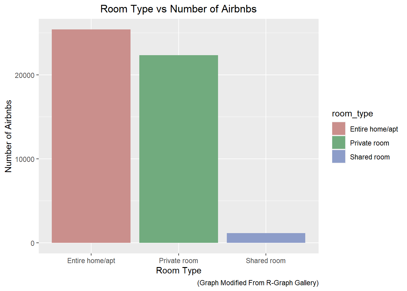
Looking at the data, we can see that the ‘room_type’ variable is categorical. In particular, we can see that there are three categories: ‘Private room’, ‘Entire home/apt’, and ‘Shared room’. We can use a bar chart to display the number of the bookings for each time. Based on the bar chart below, we can see that renting an entire home or apartment is the most popular option. Additionally, booking a shared room seems to be a very unpopular option.
# Create a bar graph of room type
ggplot(df) +
  geom_bar(mapping = aes(x = room_type, fill=room_type)) +
  scale_fill_hue(c = 40) +
  labs(x = "Room Type",
       y = "Number of Airbnbs",
       title = "Room Type vs Number of Airbnbs",
       caption = "(Graph Modified From R-Graph Gallery)") +
  theme(plot.title = element_text(hjust = 0.5))
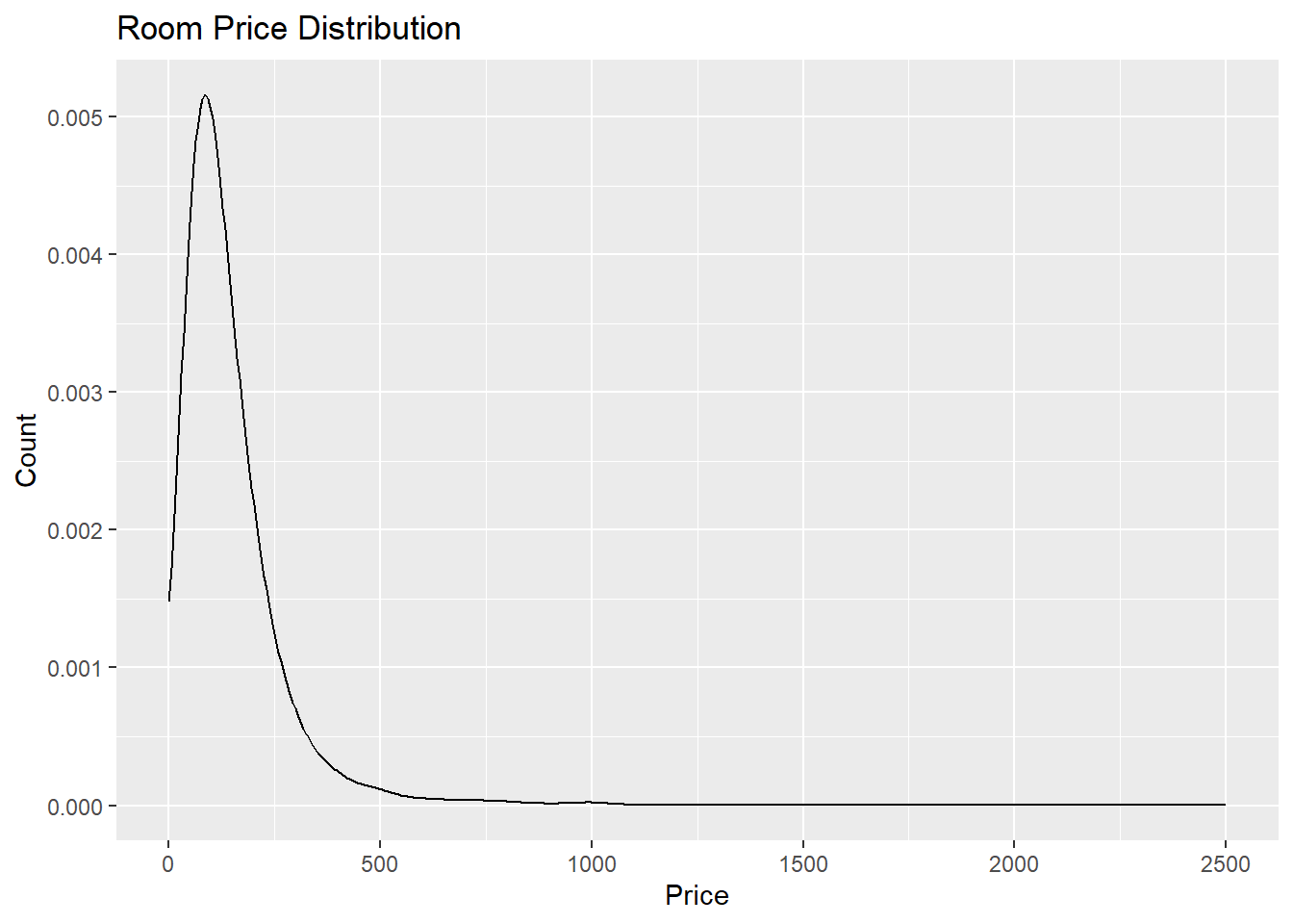
We might be interested in investigating the price per booking. In particular, I am curious to see if the price distribution is normal or skewed. We can use a density plot to help visualize the price variable in the data set. The code below is used to create such a plot.
# Create a density plot for price
ggplot(df) +
  geom_density(mapping = aes(x = price), adjust = 5) +
  xlim(0, 2500) +
  labs(x = "Price",
       y = "Count",
       title = "Room Price Distribution")
Looking at the distribution above, we can see that the price of the rooms is extremely skewed. There are many rooms that are available at affordable prices. However, a few of them are very expensive. In particular, there are several locations that cost more than $9,500 dollars. Those bookings are displayed below
filter(df, price > 9500) %>% select(id, name, neighbourhood_group, price)# A tibble: 6 × 4
id name neighbourh…¹ price
<dbl> <chr> <chr> <dbl>
1 4737930 Spanish Harlem Apt Manhattan 9999
2 7003697 Furnished room in Astoria apartment Queens 10000
3 9528920 Quiet, Clean, Lit @ LES & Chinatown Manhattan 9999
4 13894339 Luxury 1 bedroom apt. -stunning Manhattan views Brooklyn 10000
5 22436899 1-BR Lincoln Center Manhattan 10000
6 31340283 2br - The Heart of NYC: Manhattans Lower East Side Manhattan 9999
# … with abbreviated variable name ¹neighbourhood_groupBivariate Visualization(s)
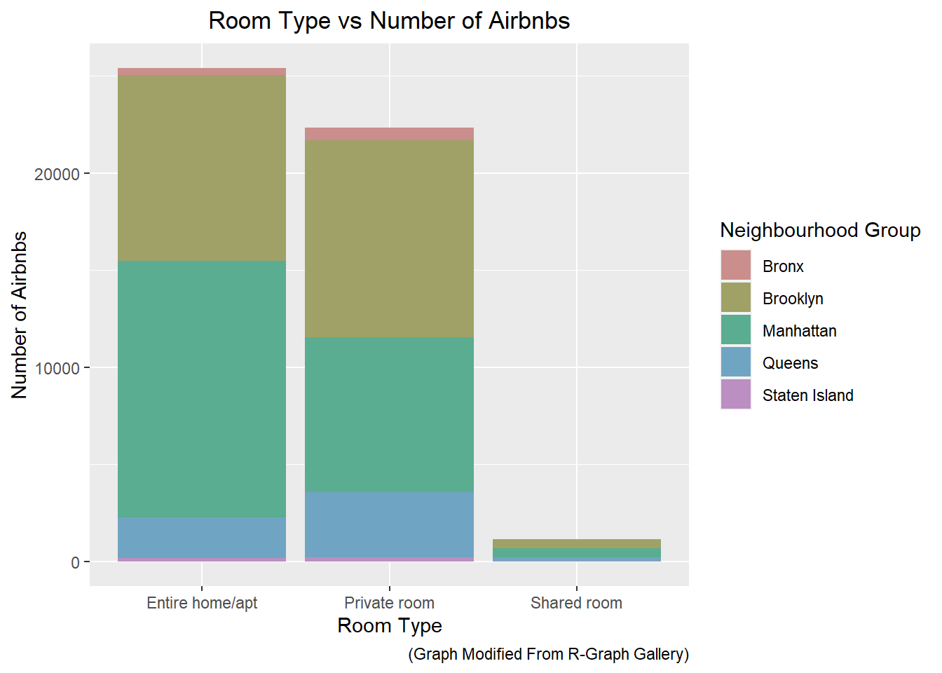
I thought it would be good to take another look at the bar graph that we generated in the previous section. In this example, I filled the bars according to the ‘neighbourhood_group’ variable. Using this visualization, we can see where most of the bookings are comming from.
# Create a bar graph of room type using neighbourhood_group as fill
ggplot(df) +
  geom_bar(mapping = aes(x = room_type, fill=neighbourhood_group)) +
  scale_fill_hue(c = 40) +
  labs(x = "Room Type",
       y = "Number of Airbnbs",
       title = "Room Type vs Number of Airbnbs",
       caption = "(Graph Modified From R-Graph Gallery)",
       fill = "Neighbourhood Group") +
  theme(plot.title = element_text(hjust = 0.5))
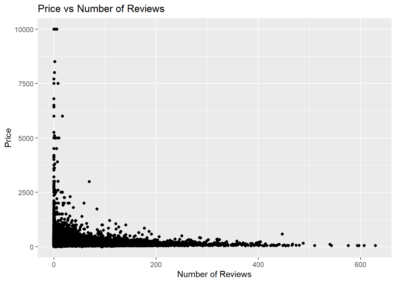
I thought it would also be interesting to look at the Price of the rental versus the number of reviews for the rental. My intuition was that really expensive apartments would not have a lot of reviews because not many people would be able to afford it. Additionally, I thought that really cheap rentals might have a lot of reviews either because a lot of people stayed there or a lot of people disliked it. The graph below shows that my intuition was pretty close to correct. The really expensive apartments have a small number of reviews in contrast to the really cheap apartments.
ggplot(df) +
  geom_point(mapping = aes(x = number_of_reviews, y = price)) +
  geom_jitter(mapping = aes(x = number_of_reviews, y = price), alpha = 0.1) +
  labs(x = "Number of Reviews",
       y = "Price",
       title = "Price vs Number of Reviews")
Any additional comments?