library(tidyverse)
library(ggplot2)
library(lubridate)
library(tidytext)
library(wordcloud2)

knitr::opts_chunk$set(echo = TRUE, warning=FALSE, message=FALSE)
Challenge 5 Solutions
challenge_5
air_bnb
ryan_odonnell
Introduction to Visualization
Challenge Overview
Today’s challenge is to:
- read in a data set, and describe the data set using both words and any supporting information (e.g., tables, etc)
- tidy data (as needed, including sanity checks)
- mutate variables as needed (including sanity checks)
- create at least two univariate visualizations
- try to make them “publication” ready
- Explain why you choose the specific graph type
- Create at least one bivariate visualization
- try to make them “publication” ready
- Explain why you choose the specific graph type
R Graph Gallery is a good starting point for thinking about what information is conveyed in standard graph types, and includes example R code.
(be sure to only include the category tags for the data you use!)
Read in data
abb_orig <- read_csv("_data/AB_NYC_2019.csv")Briefly describe the data
This is csv file of Air B&Bs in New York City from 2019. There are 48,895 Air BnBs, each listed on their own row. Each listing includes an ID, Name of the listing, Host ID, Host Name, Neighborhood Group, Neighborhood, Latitude, Longitude, Room Type, Price, Minimum Nights Required for a stay, number of reviews, date of last review, number of reviews per month, number of listings the host has, and the availability in number of days.
Tidy Data (as needed)
Thee data is already pretty tidy. Each row is a unique case - an Air BnB with its associated information.
Univariate Visualizations
# create a graph of different types of units in each neighborhood group
univariate <- ggplot(abb_orig, aes(`room_type`,)) +
  geom_bar(fill = "purple") +
  guides(x=guide_axis(angle = 30)) +
  labs(
    x = "Unit Type",
    y = "# of Units",
    title = "New York City Air BnBs") +
  facet_wrap(vars(neighbourhood_group))

univariate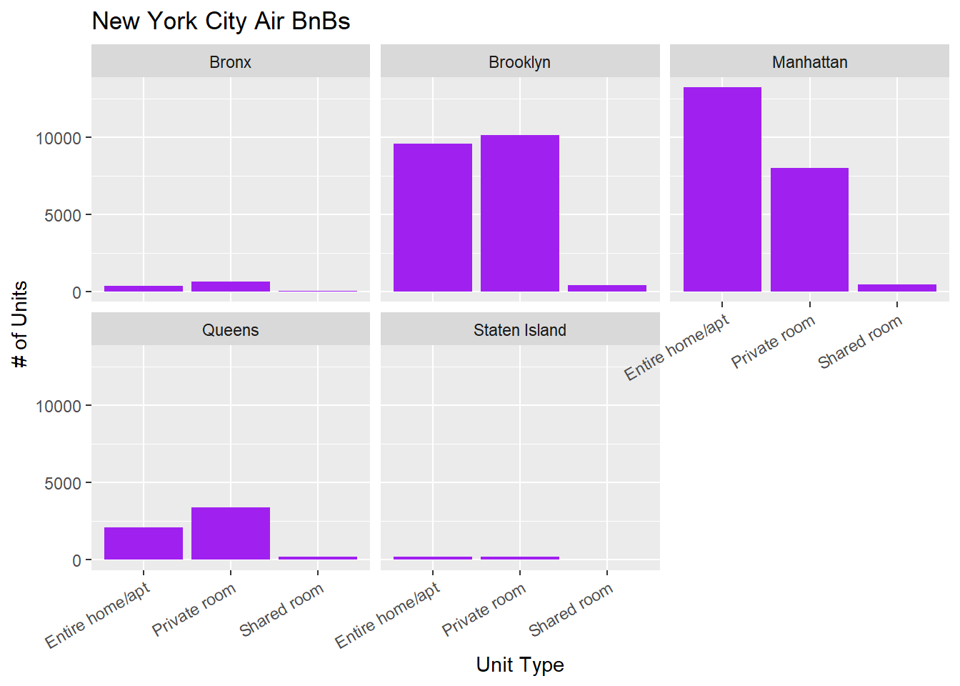
Bivariate Visualization(s)
# create graph of different price distributions in each neighborhood group

bivariate <- filter(abb_orig, `availability_365` != 0 && price != 0) %>%
  ggplot(aes(neighbourhood_group, price)) +
  geom_violin() +
   guides(x=guide_axis(angle = 30)) +
  scale_y_log10() +
  labs(
    x = "Neighbourhood Group",
    y = "Unit Price",
    title = "Air BnB Price by Neighborhood Group") +
  facet_wrap(vars(room_type))

bivariate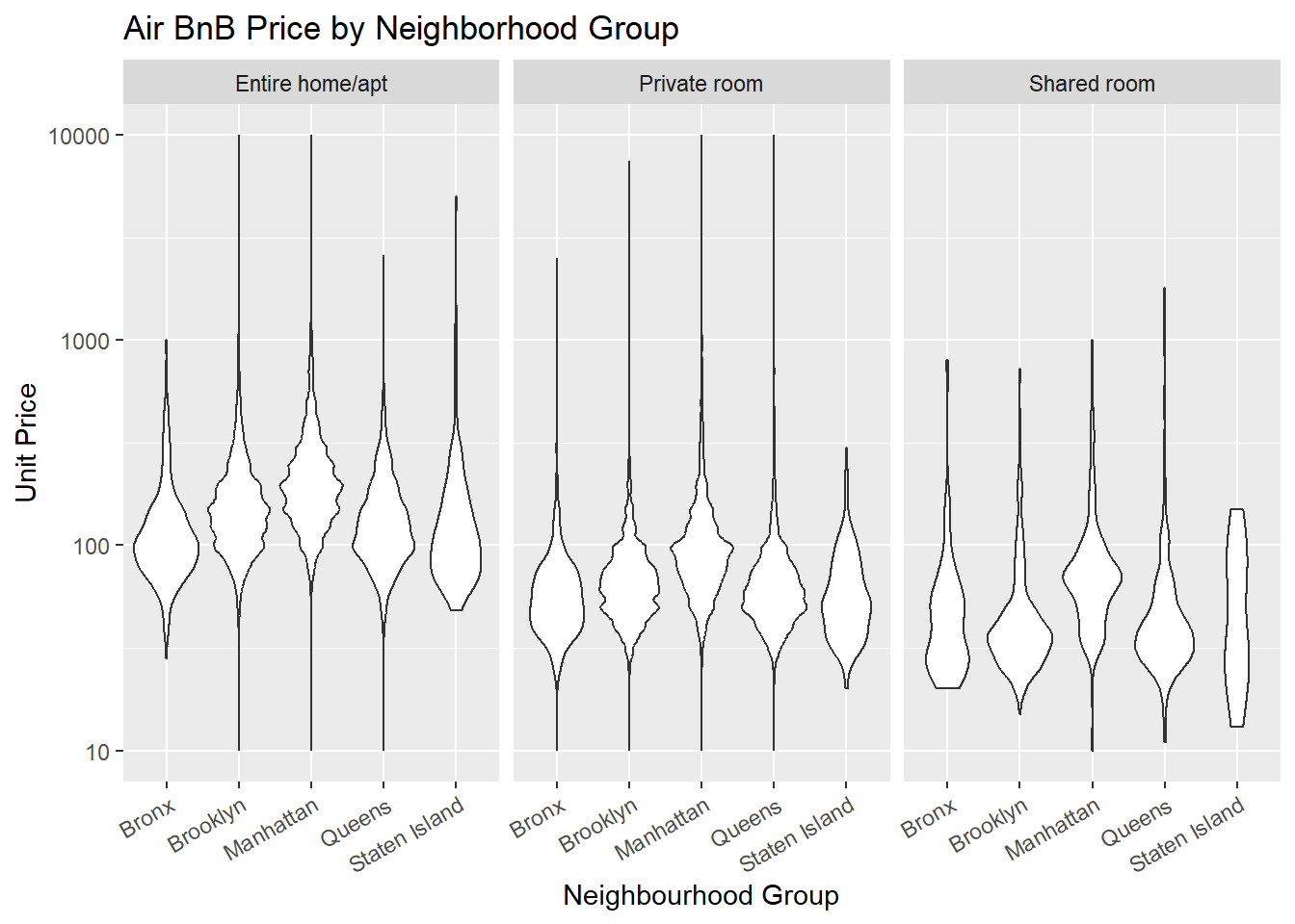
I filtered out units that were either unavailable in 2019 or had a list price of 0. Some of these prices still seem questionable to me but I don’t know enough about the data or AirBnBs to make any judgements of what data is real.
Bonus: Word Cloud Visualization
Something that jumped out to me about this data set was that we had the names of the listings which made me think of looking at a word cloud to visualize the words people use to describe the different units. If this were a longer research project, I would probably work on how to take out all the numbers, merge apt and apartment, etc.
data(stop_words)
abb_words <- abb_orig %>%
  select(name, neighbourhood_group) %>%
  unnest_tokens("word", `name`, to_lower = TRUE) %>%
  anti_join(stop_words) %>%
  count(word, sort = TRUE)
wordcloud2(abb_words, size = 0.6, minSize = 5)