library(tidyverse)
library(ggplot2)

knitr::opts_chunk$set(echo = TRUE, warning=FALSE, message=FALSE)
Challenge 5 Instructions
challenge_5
railroads
cereal
air_bnb
pathogen_cost
australian_marriage
public_schools
usa_households
Introduction to Visualization
Challenge Overview
Today’s challenge is to:
- read in a data set, and describe the data set using both words and any supporting information (e.g., tables, etc)
- tidy data (as needed, including sanity checks)
- mutate variables as needed (including sanity checks)
- create at least two univariate visualizations
- try to make them “publication” ready
- Explain why you choose the specific graph type
- Create at least one bivariate visualization
- try to make them “publication” ready
- Explain why you choose the specific graph type
R Graph Gallery is a good starting point for thinking about what information is conveyed in standard graph types, and includes example R code.
(be sure to only include the category tags for the data you use!)
Read in data
Read in one (or more) of the following datasets, using the correct R package and command.
- cereal.csv ⭐
- Total_cost_for_top_15_pathogens_2018.xlsx ⭐
- Australian Marriage ⭐⭐
- AB_NYC_2019.csv ⭐⭐⭐
- StateCounty2012.xls ⭐⭐⭐
- Public School Characteristics ⭐⭐⭐⭐
- USA Households ⭐⭐⭐⭐⭐
# Read data into dataframe
data <- read_csv("_data/AB_NYC_2019.csv")

head(data, 5)
# A tibble: 5 × 16
id name host_id host_…¹ neigh…² neigh…³ latit…⁴ longi…⁵ room_…⁶ price
<dbl> <chr> <dbl> <chr> <chr> <chr> <dbl> <dbl> <chr> <dbl>
1 2539 Clean & q… 2787 John Brookl… Kensin… 40.6 -74.0 Privat… 149
2 2595 Skylit Mi… 2845 Jennif… Manhat… Midtown 40.8 -74.0 Entire… 225
3 3647 THE VILLA… 4632 Elisab… Manhat… Harlem 40.8 -73.9 Privat… 150
4 3831 Cozy Enti… 4869 LisaRo… Brookl… Clinto… 40.7 -74.0 Entire… 89
5 5022 Entire Ap… 7192 Laura Manhat… East H… 40.8 -73.9 Entire… 80
# … with 6 more variables: minimum_nights <dbl>, number_of_reviews <dbl>,
# last_review <date>, reviews_per_month <dbl>,
# calculated_host_listings_count <dbl>, availability_365 <dbl>, and
# abbreviated variable names ¹host_name, ²neighbourhood_group,
# ³neighbourhood, ⁴latitude, ⁵longitude, ⁶room_type# Get summary statistics of data
summary(data) id name host_id host_name
Min. : 2539 Length:48895 Min. : 2438 Length:48895
1st Qu.: 9471945 Class :character 1st Qu.: 7822033 Class :character
Median :19677284 Mode :character Median : 30793816 Mode :character
Mean :19017143 Mean : 67620011
3rd Qu.:29152178 3rd Qu.:107434423
Max. :36487245 Max. :274321313
neighbourhood_group neighbourhood latitude longitude
Length:48895 Length:48895 Min. :40.50 Min. :-74.24
Class :character Class :character 1st Qu.:40.69 1st Qu.:-73.98
Mode :character Mode :character Median :40.72 Median :-73.96
Mean :40.73 Mean :-73.95
3rd Qu.:40.76 3rd Qu.:-73.94
Max. :40.91 Max. :-73.71
room_type price minimum_nights number_of_reviews
Length:48895 Min. : 0.0 Min. : 1.00 Min. : 0.00
Class :character 1st Qu.: 69.0 1st Qu.: 1.00 1st Qu.: 1.00
Mode :character Median : 106.0 Median : 3.00 Median : 5.00
Mean : 152.7 Mean : 7.03 Mean : 23.27
3rd Qu.: 175.0 3rd Qu.: 5.00 3rd Qu.: 24.00
Max. :10000.0 Max. :1250.00 Max. :629.00
last_review reviews_per_month calculated_host_listings_count
Min. :2011-03-28 Min. : 0.010 Min. : 1.000
1st Qu.:2018-07-08 1st Qu.: 0.190 1st Qu.: 1.000
Median :2019-05-19 Median : 0.720 Median : 1.000
Mean :2018-10-04 Mean : 1.373 Mean : 7.144
3rd Qu.:2019-06-23 3rd Qu.: 2.020 3rd Qu.: 2.000
Max. :2019-07-08 Max. :58.500 Max. :327.000
NA's :10052 NA's :10052
availability_365
Min. : 0.0
1st Qu.: 0.0
Median : 45.0
Mean :112.8
3rd Qu.:227.0
Max. :365.0
Briefly describe the data
The data is composed of different AirBNB properties listed in New York City, in the year 2019. It consists of information such as the host name, the neighborhood and neighborhood group, the geographical locations, as well as the property type and price. It would be interesting to explore the data to identify differnt statistics by property type as well as neighborhood group.
Tidy Data (as needed)
Is your data already tidy, or is there work to be done? Be sure to anticipate your end result to provide a sanity check, and document your work here.
#Get NA columns count
get_na_col_count <-sapply(data, function(col_name) sum(length(which(is.na(col_name)))))
na_col_count <- data.frame(get_na_col_count)
na_col_count
get_na_col_count
id 0
name 16
host_id 0
host_name 21
neighbourhood_group 0
neighbourhood 0
latitude 0
longitude 0
room_type 0
price 0
minimum_nights 0
number_of_reviews 0
last_review 10052
reviews_per_month 10052
calculated_host_listings_count 0
availability_365 0From the analysis, we can see that every row has a unique id associated with it, which means that there are no duplicate listings present in the dataset.
Are there any variables that require mutation to be usable in your analysis stream? For example, do you need to calculate new values in order to graph them? Can string values be represented numerically? Do you need to turn any variables into factors and reorder for ease of graphics and visualization?
Document your work here.
# Get number of unique room types
unique(data$room_type)
[1] "Private room" "Entire home/apt" "Shared room" # Get number of unique neighborhood groups
unique(data$neighbourhood_group)[1] "Brooklyn" "Manhattan" "Queens" "Staten Island"
[5] "Bronx" We can see that room_type and neighborhood_group columns are categorical, with limited unique values.
Univariate Visualizations
data %>%
  dplyr::count(room_type) %>%
  ggplot(aes(x = room_type, y = n, fill = room_type)) +
  geom_bar(stat = "identity") +
  geom_text(aes(label = n), vjust = -0.5) +
  labs(title="Room Types vs Total Bookings", x="Room Types Available", y="Total Booking Count", fill="Room Type")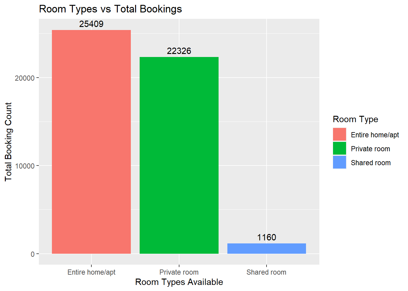
data %>%
  dplyr::count(neighbourhood_group) %>%
  ggplot(aes(x = neighbourhood_group, y = n, fill = neighbourhood_group)) +
  geom_bar(stat = "identity") +
  geom_text(aes(label = n), vjust = -0.5) +
  labs(title="Neighborhood vs Total Bookings", x="Neighborhoods", y="Total Booking Count", fill="Neighborhoods")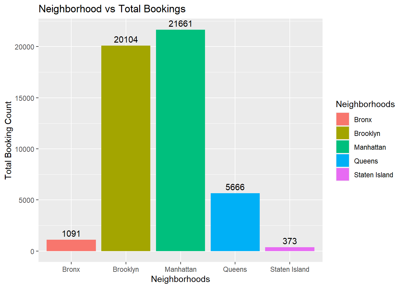
# Get histogram plot to get price density of the properties listed
data %>%
  ggplot(aes(x=price)) +
  geom_histogram() +
  xlim(0, 2100) +
  xlab("Price (in Dollars)") +
  ylab("Number of properties") +
  ggtitle("Histogram of property price distribution in dataset")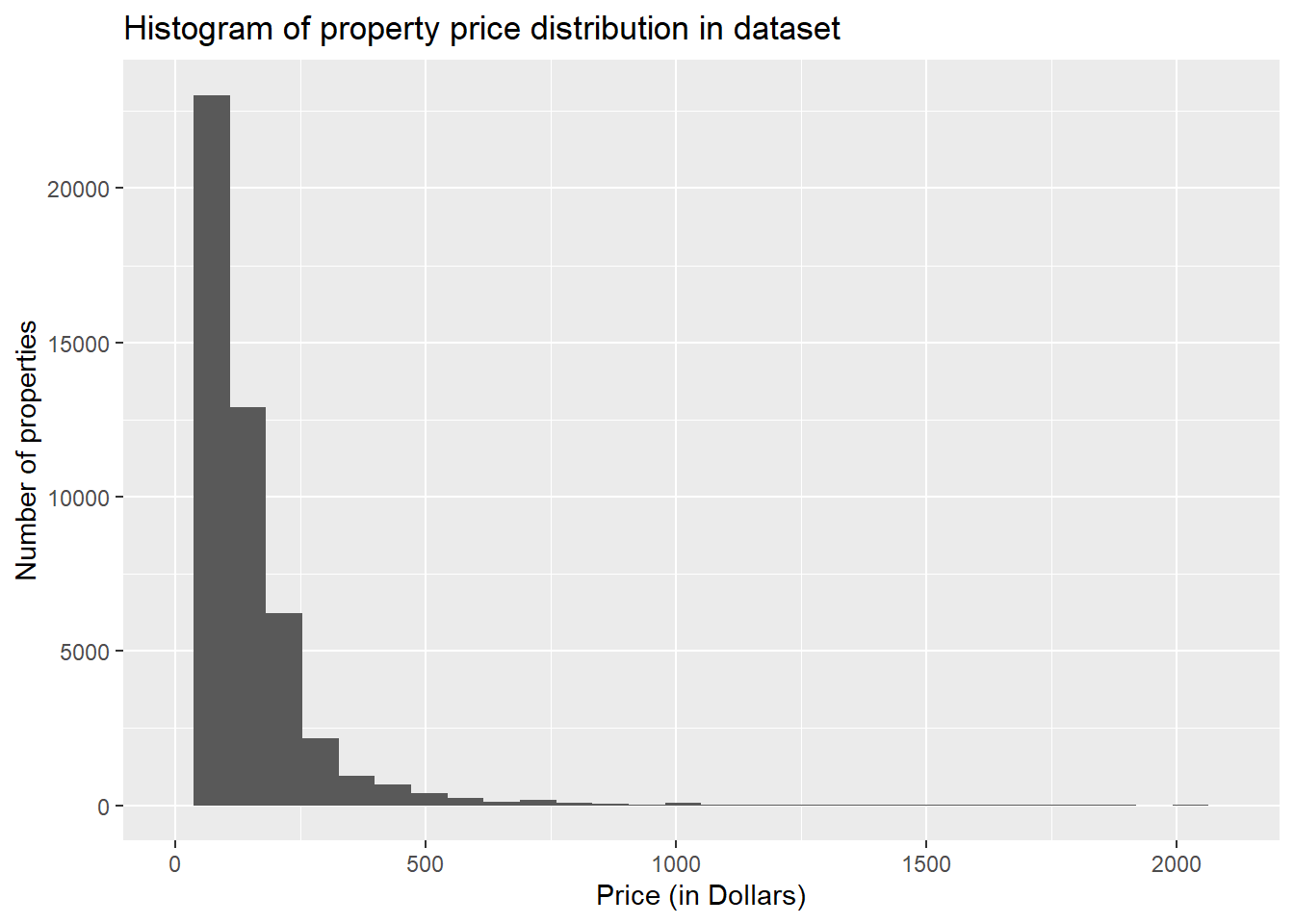
As the histogram is right skewed, we can conclude that most of the properties have price listings less than $500, with very few properties exceeding that value.
Bivariate Visualization(s)
ggplot(data) +
  geom_bar(aes(x = room_type, fill=neighbourhood_group)) +
  labs(x = "Room Type", y = "Number of Airbnbs", title = "Scatterplot of Room Type vs # of Airbnbs",
       fill = "Neighbourhood Group")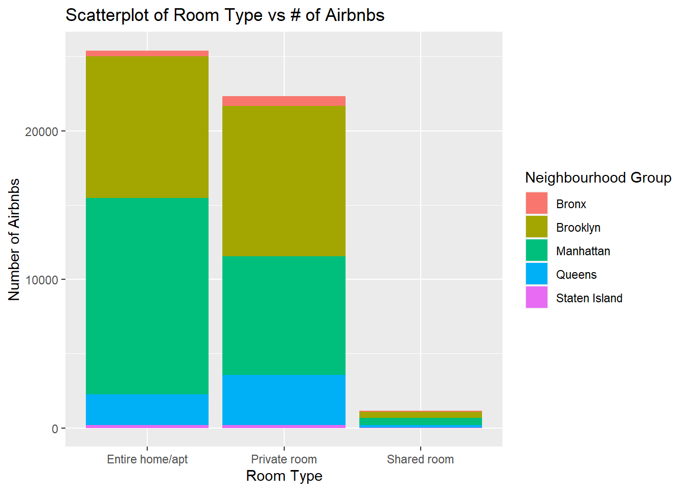
ggplot(data) +
  geom_point(mapping = aes(x = minimum_nights, y = price)) +
  labs(x = "Minimum Nights",
       y = "Price",
       title = "Price vs Minimum Nights")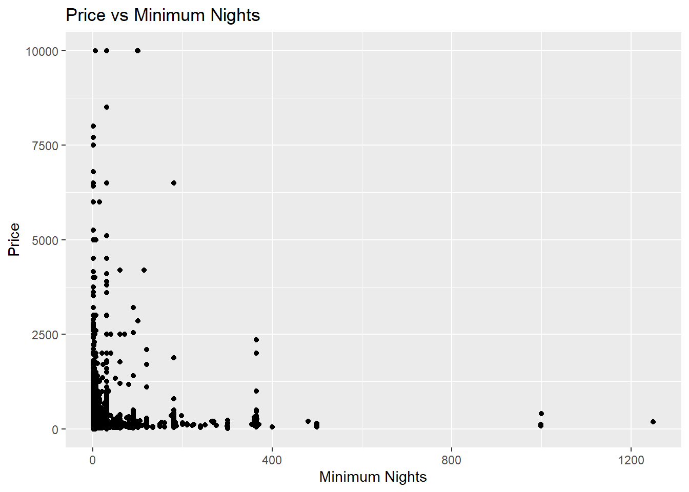
Any additional comments?
From the analysis, we get various visualizations which tell us that entire apartment bookings are most popular, with Manhattan and Brooklyn being the most sought after neighborhood groups. Within the bivariate visualizations we can also see a breakdown of the proportion of neighborhood group bookings for the property types available.