library(tidyverse)
library(ggplot2)

knitr::opts_chunk$set(echo = TRUE, warning=FALSE, message=FALSE)Challenge 5 Abby Balint
Reading in AirBnb dataset -
rentals <- read_csv("_data/AB_NYC_2019.csv")
head(rentals)
# A tibble: 6 × 16
id name host_id host_…¹ neigh…² neigh…³ latit…⁴ longi…⁵ room_…⁶ price
<dbl> <chr> <dbl> <chr> <chr> <chr> <dbl> <dbl> <chr> <dbl>
1 2539 Clean & q… 2787 John Brookl… Kensin… 40.6 -74.0 Privat… 149
2 2595 Skylit Mi… 2845 Jennif… Manhat… Midtown 40.8 -74.0 Entire… 225
3 3647 THE VILLA… 4632 Elisab… Manhat… Harlem 40.8 -73.9 Privat… 150
4 3831 Cozy Enti… 4869 LisaRo… Brookl… Clinto… 40.7 -74.0 Entire… 89
5 5022 Entire Ap… 7192 Laura Manhat… East H… 40.8 -73.9 Entire… 80
6 5099 Large Coz… 7322 Chris Manhat… Murray… 40.7 -74.0 Entire… 200
# … with 6 more variables: minimum_nights <dbl>, number_of_reviews <dbl>,
# last_review <date>, reviews_per_month <dbl>,
# calculated_host_listings_count <dbl>, availability_365 <dbl>, and
# abbreviated variable names ¹host_name, ²neighbourhood_group,
# ³neighbourhood, ⁴latitude, ⁵longitude, ⁶room_typeDescription of data
This data set describes AirBnB rental data for NYC. The dataset contains information about the location of the property (4 different variables), room type, price, minimum nights for a stay, reviews, and availability. It also includes personal data about the name and host ID of the person listing the property. There are a total of 16 variables and over 48,000 individual rows of data, indicating this dataset can tell us about more than 48,000 properties. Given that the reviews variable indicates records of reviews from 2019 all the way back to 2011, it is likely safe to assume that not all of these properties are currently listed on AirBnb today.
Data tidying
This data is actually relatively tidy already. The numerical values we would most be interested in looking at are already in a clean and consistent format, such as Date, Availability, and Minimum number of nights. There is also already a grouping variable that groups up the neighborhoods into the burrows which is a regrouping I would have done for graphing purposes if it didn’t already exist.
The one thing I thought would be helpful to tidy would be to regroup the price column, as the prices vary greatly individually and wouldn’t have much meaning on their own. This way I can use these groups when graphing.
rentalsclean <- rentals %>%
  mutate(`PriceRanges` = dplyr::case_when(
    `price` >= 0 & `price` < 100 ~ "<$100",
    `price` >= 100 & `price` < 250 ~ "$100-$250",
    `price` >= 250 & `price` < 500 ~ "$250-$500",
    `price` >= 500 & `price` < 1000 ~ "$500-$1000",
    `price` >= 1000 ~ "$1000+" ))
head(rentalsclean)
# A tibble: 6 × 17
id name host_id host_…¹ neigh…² neigh…³ latit…⁴ longi…⁵ room_…⁶ price
<dbl> <chr> <dbl> <chr> <chr> <chr> <dbl> <dbl> <chr> <dbl>
1 2539 Clean & q… 2787 John Brookl… Kensin… 40.6 -74.0 Privat… 149
2 2595 Skylit Mi… 2845 Jennif… Manhat… Midtown 40.8 -74.0 Entire… 225
3 3647 THE VILLA… 4632 Elisab… Manhat… Harlem 40.8 -73.9 Privat… 150
4 3831 Cozy Enti… 4869 LisaRo… Brookl… Clinto… 40.7 -74.0 Entire… 89
5 5022 Entire Ap… 7192 Laura Manhat… East H… 40.8 -73.9 Entire… 80
6 5099 Large Coz… 7322 Chris Manhat… Murray… 40.7 -74.0 Entire… 200
# … with 7 more variables: minimum_nights <dbl>, number_of_reviews <dbl>,
# last_review <date>, reviews_per_month <dbl>,
# calculated_host_listings_count <dbl>, availability_365 <dbl>,
# PriceRanges <chr>, and abbreviated variable names ¹host_name,
# ²neighbourhood_group, ³neighbourhood, ⁴latitude, ⁵longitude, ⁶room_typeUnivariate Visualizations
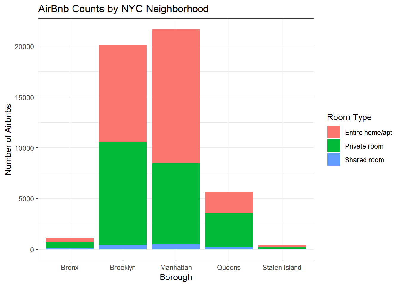
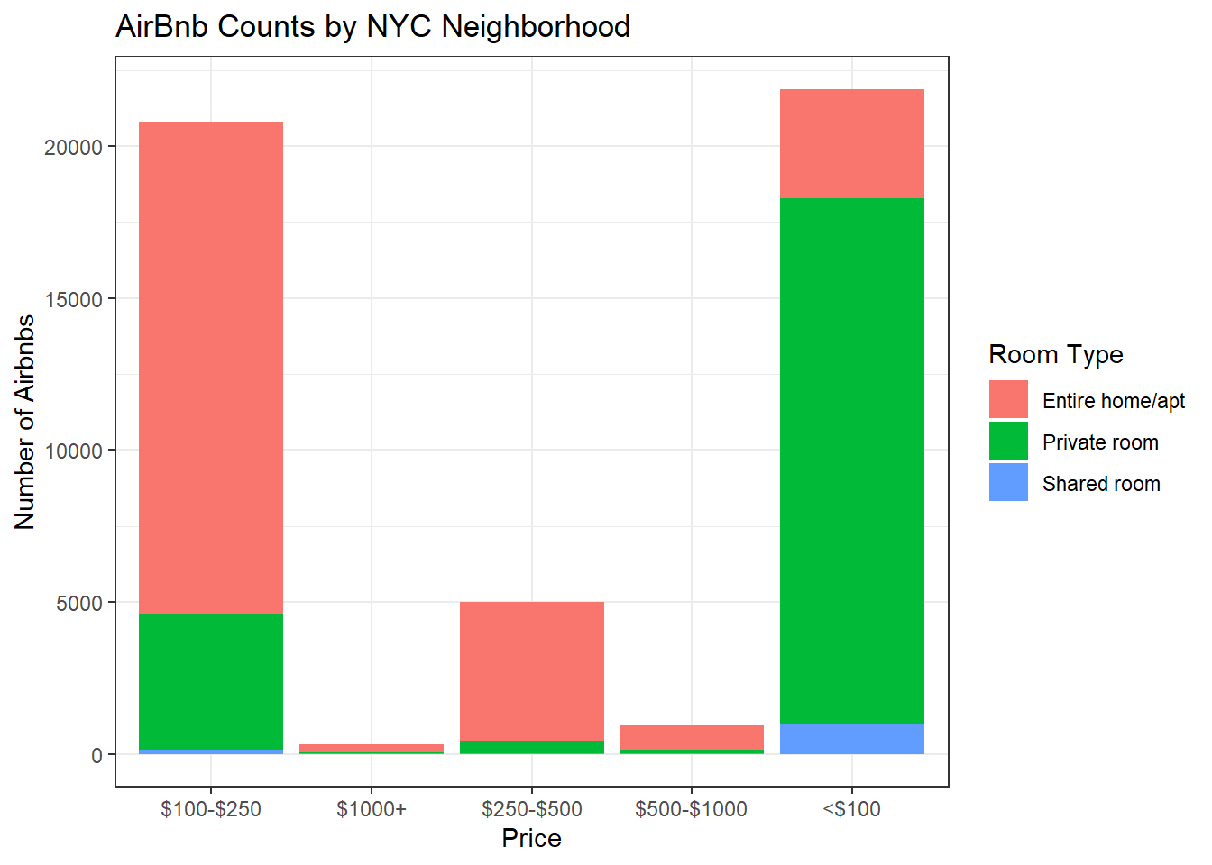
Here I generated a univariate visualization to show the counts of AirBnbs in NYC by both Borough and Price. I broke both of these down by Room Type as well so that I could visualize within the different boroughs and price ranges respectively what the most common room type would be.
rentalsclean %>%
  ggplot(aes(`neighbourhood_group`, fill = `room_type`)) +
  geom_bar() +
  labs(title = "AirBnb Counts by NYC Neighborhood", x="Borough", y="Number of Airbnbs") +
  theme_bw() +
  scale_fill_discrete(name="Room Type")
rentalsclean %>%
  ggplot(aes(`PriceRanges`, fill = `room_type`)) +
  geom_bar() +
  labs(title = "AirBnb Counts by NYC Neighborhood", x="Price", y="Number of Airbnbs") +
  theme_bw() +
  scale_fill_discrete(name="Room Type")
Bivariate Visualization(s)
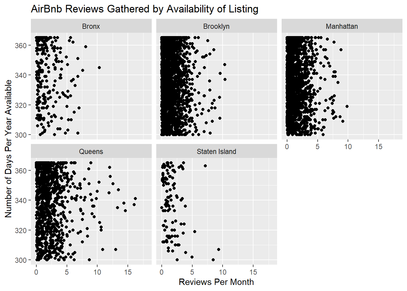
For this first bivariate visualization, I looked at the number of reviews a property got per month in comparison to how many days a year the property is available. I filtered by properties available 300 days a year or more to limit the business of the scatterplot and also to zoom in on properties that operate essentially year round. Surprisingly, I see that most properties still receive a few or less reviews per month.
rentalsclean %>%
  filter(`availability_365` >= 300) %>%
  ggplot(aes(x=`reviews_per_month`, y=`availability_365`)) +
  geom_point() +
  labs(title = "AirBnb Reviews Gathered by Availability of Listing", x="Reviews Per Month", y="Number of Days Per Year Available") +
  facet_wrap (~`neighbourhood_group`, nrow=2) +
  xlim(0,18)
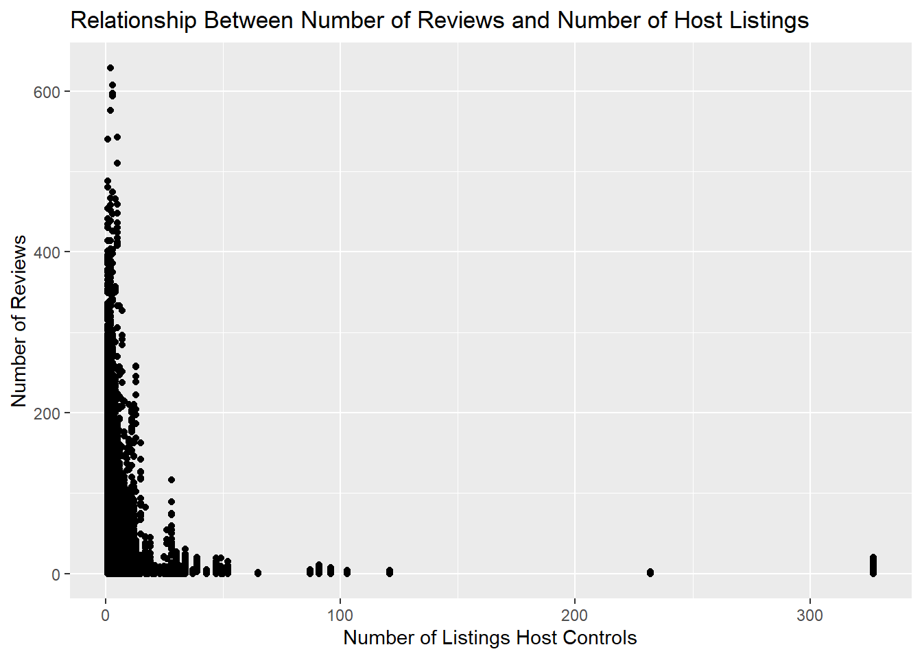
For this bivariate visualization, I looked at the number of reviews a property got per month in comparison to how many properties the property owner lists. I think this makes it clear that 1) the majority of people list a small number of airbnbs, and 2) the number of reviews received (and in turn the amount of business) maybe isn’t impacted by the number of properties that lister holds.
rentalsclean %>%
  ggplot(aes(x=`calculated_host_listings_count`, y=`number_of_reviews`)) +
  geom_point() +
  labs(title = "Relationship Between Number of Reviews and Number of Host Listings ", x="Number of Listings Host Controls", y="Number of Reviews")