library(tidyverse)
library(ggplot2)

knitr::opts_chunk$set(echo = TRUE, warning=FALSE, message=FALSE)
Challenge 5 Instructions
Challenge Overview
Today’s challenge is to:
- read in a data set, and describe the data set using both words and any supporting information (e.g., tables, etc)
- tidy data (as needed, including sanity checks)
- mutate variables as needed (including sanity checks)
- create at least two univariate visualizations
- try to make them “publication” ready
- Explain why you choose the specific graph type
- Create at least one bivariate visualization
- try to make them “publication” ready
- Explain why you choose the specific graph type
R Graph Gallery is a good starting point for thinking about what information is conveyed in standard graph types, and includes example R code.
(be sure to only include the category tags for the data you use!)
Read in data
Read in one (or more) of the following datasets, using the correct R package and command.
- cereal.csv ⭐
- Total_cost_for_top_15_pathogens_2018.xlsx ⭐
- Australian Marriage ⭐⭐
- AB_NYC_2019.csv ⭐⭐⭐
- StateCounty2012.xls ⭐⭐⭐
- Public School Characteristics ⭐⭐⭐⭐
- USA Households ⭐⭐⭐⭐⭐
data<-read_csv("_data/AB_NYC_2019.csv")
data
# A tibble: 48,895 × 16
id name host_id host_…¹ neigh…² neigh…³ latit…⁴ longi…⁵ room_…⁶ price
<dbl> <chr> <dbl> <chr> <chr> <chr> <dbl> <dbl> <chr> <dbl>
1 2539 Clean & … 2787 John Brookl… Kensin… 40.6 -74.0 Privat… 149
2 2595 Skylit M… 2845 Jennif… Manhat… Midtown 40.8 -74.0 Entire… 225
3 3647 THE VILL… 4632 Elisab… Manhat… Harlem 40.8 -73.9 Privat… 150
4 3831 Cozy Ent… 4869 LisaRo… Brookl… Clinto… 40.7 -74.0 Entire… 89
5 5022 Entire A… 7192 Laura Manhat… East H… 40.8 -73.9 Entire… 80
6 5099 Large Co… 7322 Chris Manhat… Murray… 40.7 -74.0 Entire… 200
7 5121 BlissArt… 7356 Garon Brookl… Bedfor… 40.7 -74.0 Privat… 60
8 5178 Large Fu… 8967 Shunic… Manhat… Hell's… 40.8 -74.0 Privat… 79
9 5203 Cozy Cle… 7490 MaryEl… Manhat… Upper … 40.8 -74.0 Privat… 79
10 5238 Cute & C… 7549 Ben Manhat… Chinat… 40.7 -74.0 Entire… 150
# … with 48,885 more rows, 6 more variables: minimum_nights <dbl>,
# number_of_reviews <dbl>, last_review <date>, reviews_per_month <dbl>,
# calculated_host_listings_count <dbl>, availability_365 <dbl>, and
# abbreviated variable names ¹host_name, ²neighbourhood_group,
# ³neighbourhood, ⁴latitude, ⁵longitude, ⁶room_typeBriefly describe the data
The data contains 2019 listings for Air BnB in New York City. Each listing includes a location, a host with an individual ID, a cost, and details about the place.
This information may be used to compare the costs of similar listings and even hosts in case where some hosts have multiple hosts. ## Tidy Data (as needed)
Is your data already tidy, or is there work to be done? Be sure to anticipate your end result to provide a sanity check, and document your work here.
There needs to be some tidying because there are some N/A values in reviews per month. We just replace NA with 0 for reviews_per_month.
replace_na(data, list(reviews_per_month = 0))# A tibble: 48,895 × 16
id name host_id host_…¹ neigh…² neigh…³ latit…⁴ longi…⁵ room_…⁶ price
<dbl> <chr> <dbl> <chr> <chr> <chr> <dbl> <dbl> <chr> <dbl>
1 2539 Clean & … 2787 John Brookl… Kensin… 40.6 -74.0 Privat… 149
2 2595 Skylit M… 2845 Jennif… Manhat… Midtown 40.8 -74.0 Entire… 225
3 3647 THE VILL… 4632 Elisab… Manhat… Harlem 40.8 -73.9 Privat… 150
4 3831 Cozy Ent… 4869 LisaRo… Brookl… Clinto… 40.7 -74.0 Entire… 89
5 5022 Entire A… 7192 Laura Manhat… East H… 40.8 -73.9 Entire… 80
6 5099 Large Co… 7322 Chris Manhat… Murray… 40.7 -74.0 Entire… 200
7 5121 BlissArt… 7356 Garon Brookl… Bedfor… 40.7 -74.0 Privat… 60
8 5178 Large Fu… 8967 Shunic… Manhat… Hell's… 40.8 -74.0 Privat… 79
9 5203 Cozy Cle… 7490 MaryEl… Manhat… Upper … 40.8 -74.0 Privat… 79
10 5238 Cute & C… 7549 Ben Manhat… Chinat… 40.7 -74.0 Entire… 150
# … with 48,885 more rows, 6 more variables: minimum_nights <dbl>,
# number_of_reviews <dbl>, last_review <date>, reviews_per_month <dbl>,
# calculated_host_listings_count <dbl>, availability_365 <dbl>, and
# abbreviated variable names ¹host_name, ²neighbourhood_group,
# ³neighbourhood, ⁴latitude, ⁵longitude, ⁶room_typeAre there any variables that require mutation to be usable in your analysis stream? For example, do you need to calculate new values in order to graph them? Can string values be represented numerically? Do you need to turn any variables into factors and reorder for ease of graphics and visualization?
There’s no need of mutation. Because all the attributes that are required for our analysis are in good shape.
Univariate Visualizations
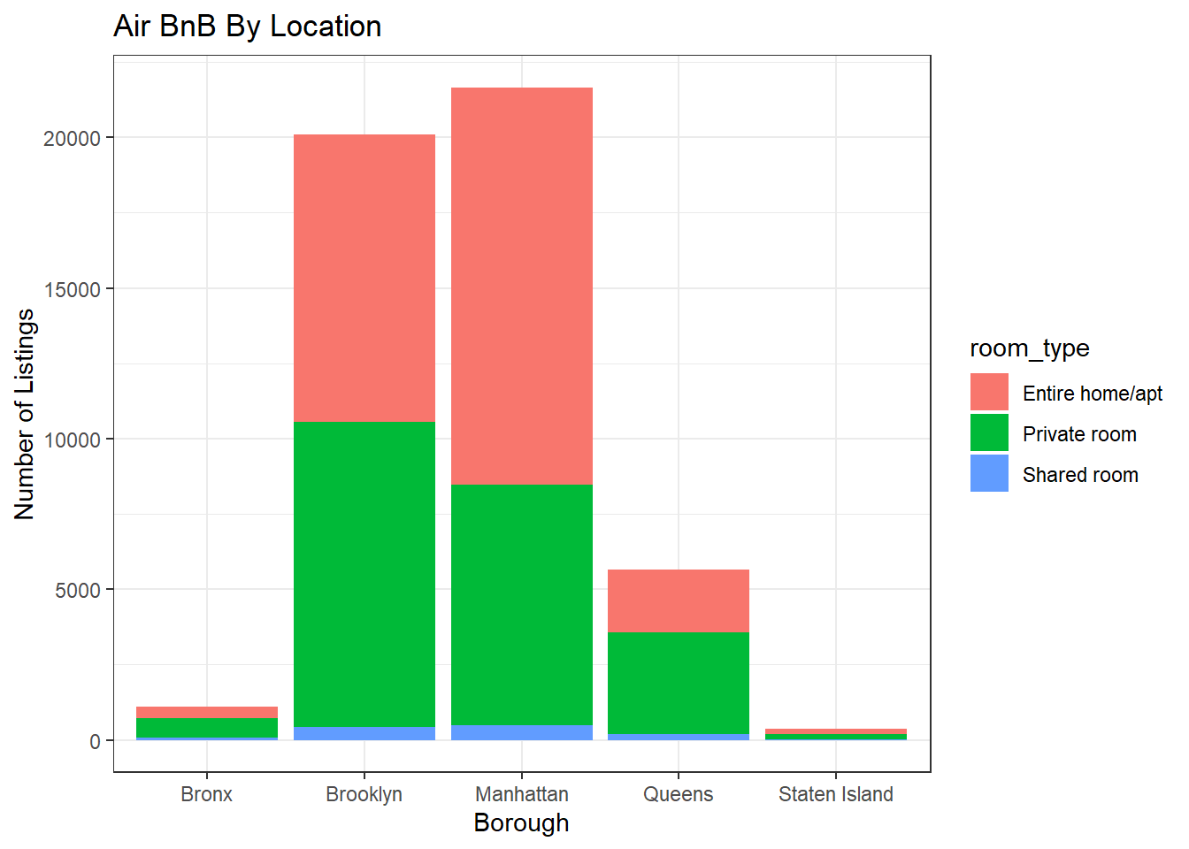
A breakdown of the listings by borough is one area of investigation about which I’m interested. Since it draws the most tourists, you may anticipate Manhattan to have the most, but as someone who doesn’t reside in New York City, I’m not sure what to anticipate for the other boroughs.
ggplot(data, aes(neighbourhood_group, fill = room_type)) + geom_bar() +
  theme_bw() +
  labs(title = "Air BnB By Location ", y = "Number of Listings", x = "Borough")
Brooklyn is a very close second to Manhatten in terms of the number of Air BnB listings, as might be expected. The Bronx and Staten Island have extremely few, but Queens has a few.
This graph also breaks down the number of listings by room type. Visually, we can see that the Entire Homes / Apartments, but there is another interesting takeaway in that Manhattan appears to have a higher percentage of postings of this type than other places.
In order to produce counts for this data and make it simple to incorporate the colored sub neighborhoods, I used a bar graph.
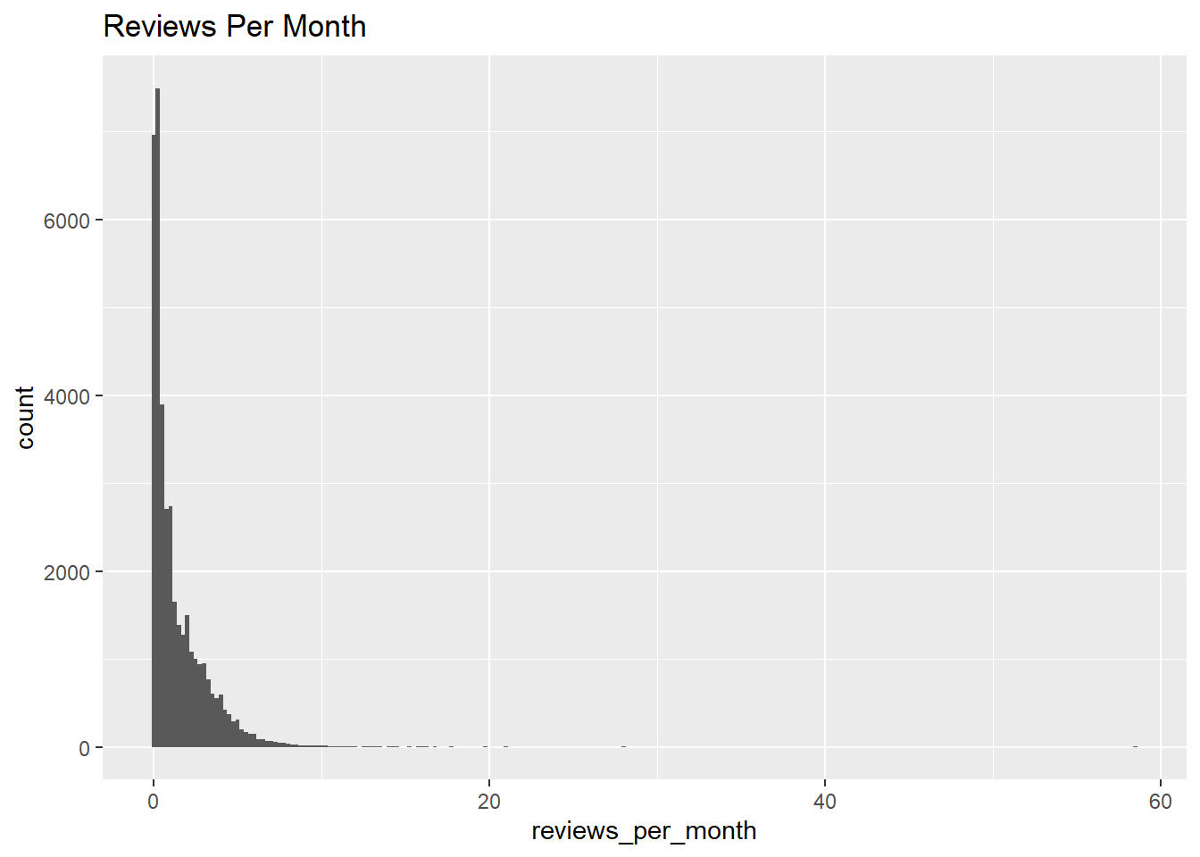
Another plot that may be of interest to us is the reviews per month, which may serve as a metric for the average length of stay at different places.
ggplot(data, aes(reviews_per_month), xlim = c(0,10)) +
  geom_histogram(binwidth = .25) +
  labs(title = "Reviews Per Month")
This graph is a histogram that displays the monthly review distribution. Most listings have fewer than seven or eight per month, although some do. Since most postings in NYC are for longer periods of time, this plot makes sense because most won’t be rented out frequently enough to be a problem.
Bivariate Visualization(s)
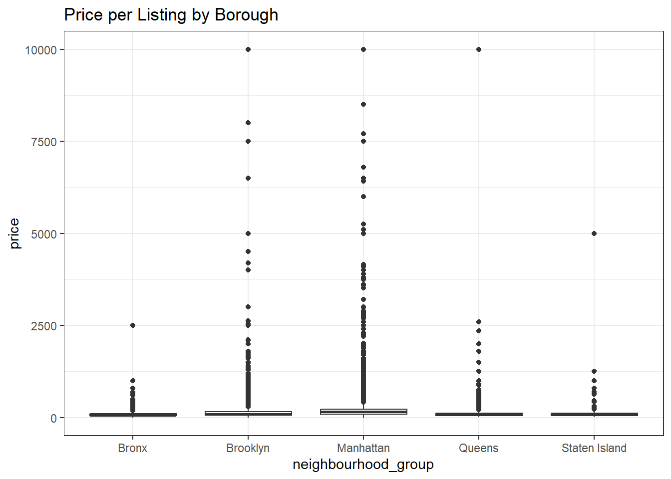
The pricing in various locations is another metric that we might be interested in. Which places demand the highest price per night of stay may be of interest to us if we were interested in investing in an Air BnB.
data %>%
  ggplot(aes(neighbourhood_group, price), fill = neighbourhood) +
  geom_boxplot() +
  labs(title = "Price per Listing by Borough") +
  theme_bw()
The above plot shows how listings in various places are scattered in terms of price per night. I chose a box plot since it displays how prices are spread throughout the various areas. Most listings in the Bronx and Staten Island are reasonably priced and congregate in one area, as might be predicted. Although there are a few pricey outliers, Queens tends to be inexpensive overall. Finally, it is evident that Brooklyn and Manhattan, which account for the vast bulk of the most expensive Air BnBs, are both more expensive in general.This dataset served as an useful example for practice in creating visualizations.