library(tidyverse)
library(ggplot2)

knitr::opts_chunk$set(echo = TRUE, warning=FALSE, message=FALSE)
Challenge 6
challenge_6
debt
Visualizing Time and Relationships
Challenge Overview
Today’s challenge is to:
- read in a data set, and describe the data set using both words and any supporting information (e.g., tables, etc)
- tidy data (as needed, including sanity checks)
- mutate variables as needed (including sanity checks)
- create at least one graph including time (evolution)
- try to make them “publication” ready (optional)
- Explain why you choose the specific graph type
- Create at least one graph depicting part-whole or flow relationships
- try to make them “publication” ready (optional)
- Explain why you choose the specific graph type
R Graph Gallery is a good starting point for thinking about what information is conveyed in standard graph types, and includes example R code.
(be sure to only include the category tags for the data you use!)
Read in data
Read in one (or more) of the following datasets, using the correct R package and command.
- debt ⭐
Debt_orig <- readxl::read_xlsx("_data/debt_in_trillions.xlsx")Briefly describe the data
The dataset gives information about the amount of different types of dept from 2001 to 2021. We have information for each quarter for these years. We can see such types as Mortgage, HE Revolving, Auto Loan, Credit Card, Student Loan and other. Table also shows total amount. The dataset contains 74 cases and 8 variables.
summary(Debt_orig) Year and Quarter Mortgage HE Revolving Auto Loan
Length:74 Min. : 4.942 Min. :0.2420 Min. :0.6220
Class :character 1st Qu.: 8.036 1st Qu.:0.4275 1st Qu.:0.7430
Mode :character Median : 8.412 Median :0.5165 Median :0.8145
Mean : 8.274 Mean :0.5161 Mean :0.9309
3rd Qu.: 9.047 3rd Qu.:0.6172 3rd Qu.:1.1515
Max. :10.442 Max. :0.7140 Max. :1.4150
Credit Card Student Loan Other Total
Min. :0.6590 Min. :0.2407 Min. :0.2960 Min. : 7.231
1st Qu.:0.6966 1st Qu.:0.5333 1st Qu.:0.3414 1st Qu.:11.311
Median :0.7375 Median :0.9088 Median :0.3921 Median :11.852
Mean :0.7565 Mean :0.9189 Mean :0.3831 Mean :11.779
3rd Qu.:0.8165 3rd Qu.:1.3022 3rd Qu.:0.4154 3rd Qu.:12.674
Max. :0.9270 Max. :1.5840 Max. :0.4860 Max. :14.957 Tidy Data (as needed)
We need to remove column “Total”, pivot the data and change variable with information about the date.
debt <- select(Debt_orig, !contains("Total"))
debt <- debt %>%
  pivot_longer(cols = Mortgage:Other, names_to = "debt type", values_to = "amount")
debt <- debt %>%
  mutate(`Year and Quarter` = str_replace_all(`Year and Quarter`, c("20" = "2020", "21" = "2021", "03" = "2003", "04" = "2004", "05" = "2005", "06" = "2006", "07" = "2007", "08" = "2008", "09" = "2009", "10" = "2010", "11" = "2011", "12" = "2012", "13" = "2013", "14" = "2014", "15" = "2015", "16" = "2016", "17" = "2017", "18" = "2018", "19" = "2019")))
debt <- debt %>%
  mutate(`Year and Quarter` = str_replace_all(`Year and Quarter`, c("Q1" = "1", "Q2" = "2", "Q3" = "3", "Q4" = "4")))
debt <- debt %>%
  mutate(`Year and Quarter` = str_replace_all(`Year and Quarter`, c(":" = "-")))

library(date)
Error in library(date): there is no package called 'date'library(zoo)
debt$`Year and Quarter` <- as.yearqtr(debt$`Year and Quarter`, format = "%Y-%q")
class(debt$`Year and Quarter`)[1] "yearqtr"Time Dependent Visualization
- As first visualization I chose line graph. We can see difference between debt types and changes from 2003 to 2021. It is very common choice for time dependent visualization. I think it is very easy to perceive information about dynamic in time.
ggplot(debt, aes(x = `Year and Quarter`, y = `amount`, color = `debt type`)) +
  geom_line() +
  labs(title = "Debt amount 2003-2021",
       x = "Year and Quarter",
       y = "Amount in trillions") + theme_minimal()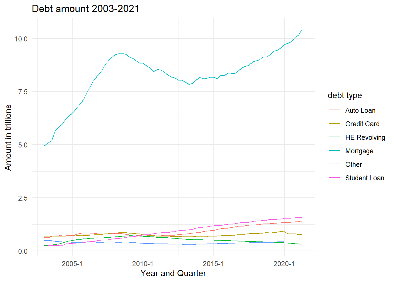
Visualizing Part-Whole Relationships
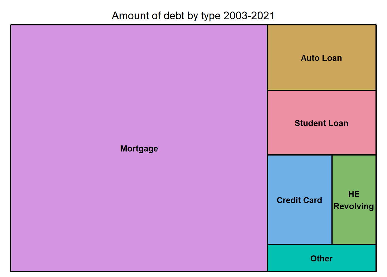
- I chose treemap chart to visualize comparison between the amount of debt types. I visualize mean for each type for 2001-2021. I am not sure that this is the proper way to work with such data. My aim was to show the difference between all types for these years.
debt <- debt %>%
  group_by(`debt type`) %>%
  select(amount, `debt type` ) %>%
  summarize_all(mean, na.rm = TRUE)
library(treemap)
treemap(debt, index="debt type", vSize="amount", type="index", title="Amount of debt by type 2003-2021")