library(tidyverse)
library(ggplot2)
library(ggforce)

library(readxl)

knitr::opts_chunk$set(echo = TRUE, warning=FALSE, message=FALSE)
Challenge 6 Submission
challenge_6
debt
Julian Castoro
Visualizing Time and Relationships
Challenge Overview
Today’s challenge is to:
- read in a data set, and describe the data set using both words and any supporting information (e.g., tables, etc)
- tidy data (as needed, including sanity checks)
- mutate variables as needed (including sanity checks)
- create at least one graph including time (evolution)
- try to make them “publication” ready (optional)
- Explain why you choose the specific graph type
- Create at least one graph depicting part-whole or flow relationships
- try to make them “publication” ready (optional)
- Explain why you choose the specific graph type
R Graph Gallery is a good starting point for thinking about what information is conveyed in standard graph types, and includes example R code.
(be sure to only include the category tags for the data you use!)
Read in data
Read in one (or more) of the following datasets, using the correct R package and command.
- debt ⭐
- fed_rate ⭐⭐
- abc_poll ⭐⭐⭐
- usa_hh ⭐⭐⭐
- hotel_bookings ⭐⭐⭐⭐
- AB_NYC ⭐⭐⭐⭐⭐
RawData <- read_excel("_data/debt_in_trillions.xlsx")
head(RawData)
# A tibble: 6 × 8
`Year and Quarter` Mortgage `HE Revolving` Auto …¹ Credi…² Stude…³ Other Total
<chr> <dbl> <dbl> <dbl> <dbl> <dbl> <dbl> <dbl>
1 03:Q1 4.94 0.242 0.641 0.688 0.241 0.478 7.23
2 03:Q2 5.08 0.26 0.622 0.693 0.243 0.486 7.38
3 03:Q3 5.18 0.269 0.684 0.693 0.249 0.477 7.56
4 03:Q4 5.66 0.302 0.704 0.698 0.253 0.449 8.07
5 04:Q1 5.84 0.328 0.72 0.695 0.260 0.446 8.29
6 04:Q2 5.97 0.367 0.743 0.697 0.263 0.423 8.46
# … with abbreviated variable names ¹`Auto Loan`, ²`Credit Card`,
# ³`Student Loan`Briefly describe the data
The data appears to be the amount of cumulative debt held by some nations citizens, most likely the US.
Are there any variables that require mutation to be usable in your analysis stream? For example, do you need to calculate new values in order to graph them? Can string values be represented numerically? Do you need to turn any variables into factors and reorder for ease of graphics and visualization?
Document your work here.
All that is needed here is separating out the quarter and date fields.
splitData<- RawData %>%
  separate(`Year and Quarter`,c('Year','Quarter'),sep = ":")
view(splitData)
Time Dependent Visualization
Below is a time dependent visualization for credit card debt, I later transform the data so that I can see how this type of debt stacks up to the others
scatter <- splitData %>%
  ggplot(mapping=aes(x = Year, y = `Credit Card`))+
  geom_point(aes(color=Quarter))
scatter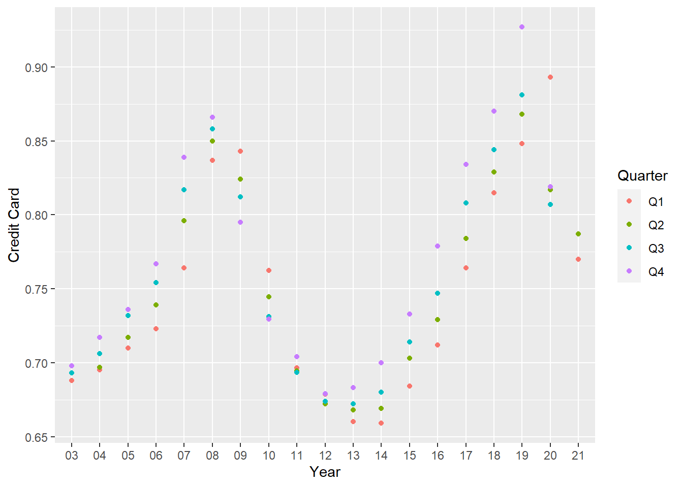
pivoting data again
longerSplitData<- splitData%>%
  pivot_longer(!c(Year,Quarter), names_to = "DebtType",values_to = "DebtPercent" )

longerSplitData
# A tibble: 518 × 4
Year Quarter DebtType DebtPercent
<chr> <chr> <chr> <dbl>
1 03 Q1 Mortgage 4.94
2 03 Q1 HE Revolving 0.242
3 03 Q1 Auto Loan 0.641
4 03 Q1 Credit Card 0.688
5 03 Q1 Student Loan 0.241
6 03 Q1 Other 0.478
7 03 Q1 Total 7.23
8 03 Q2 Mortgage 5.08
9 03 Q2 HE Revolving 0.26
10 03 Q2 Auto Loan 0.622
# … with 508 more rowsVisualizing Part-Whole Relationships
longerSplitDataPlot <- longerSplitData%>%
  ggplot(mapping=aes(x = Year, y = DebtPercent))


longerSplitDataPlot +
  facet_wrap(~DebtType, scales = "free")
Now I wanted to visualize the data by debt type
longerSplitDataPlot +
  geom_point(aes(color = DebtType))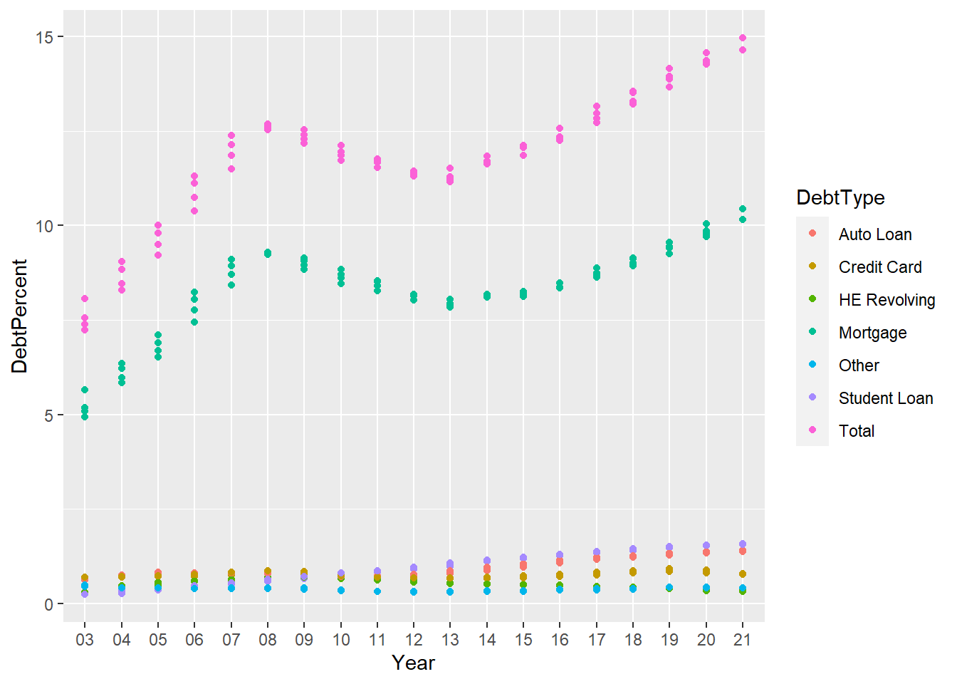
Now, this seemed to show the Mortgage debt influencing the total the most, I wanted to visualize how different types of debt swayed the total debt for that year so i seperated out the types of debt.
longerSplitDataPlot+
  geom_point() +
  facet_wrap(~DebtType) +
  scale_x_discrete(breaks = c('03','06','09',12,15,18,21))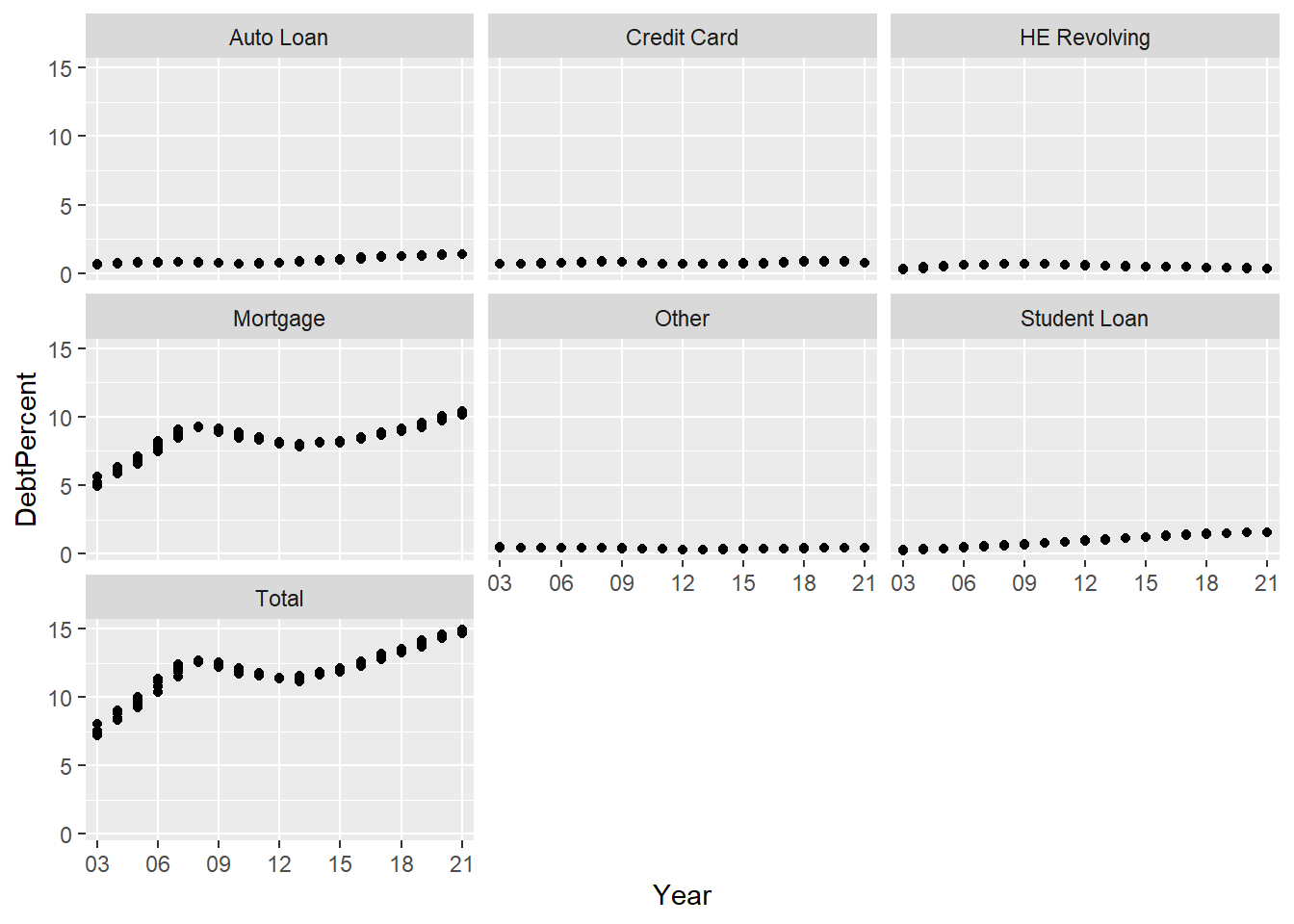
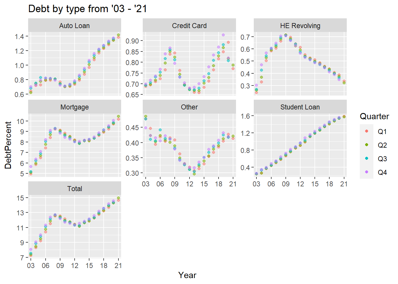
The above clearly demonstrates how mortgages drove the total debt but what do the trends of the other types of debt look like? Do they have the same shape? I had to set scales to free in order to see this.
longerSplitDataPlot+
  geom_point(aes(color = Quarter,alpha=0.9,)) +
  facet_wrap(~DebtType, scales = "free_y") +
  guides(alpha="none") +
  labs(title="Debt by type from '03 - '21")+
  scale_x_discrete(breaks = c('03','06','09',12,15,18,21))