library(tidyverse)
library(ggplot2)
library(readxl)
library(lubridate)
knitr::opts_chunk$set(echo = TRUE, warning=FALSE, message=FALSE)
Challenge 6
challenge_6
hotel_bookings
air_bnb
fed_rate
debt
usa_households
abc_poll
Visualizing Time and Relationships
Challenge Overview
Today’s challenge is to:
- read in a data set, and describe the data set using both words and any supporting information (e.g., tables, etc)
- tidy data (as needed, including sanity checks)
- mutate variables as needed (including sanity checks)
- create at least one graph including time (evolution)
- try to make them “publication” ready (optional)
- Explain why you choose the specific graph type
- Create at least one graph depicting part-whole or flow relationships
- try to make them “publication” ready (optional)
- Explain why you choose the specific graph type
R Graph Gallery is a good starting point for thinking about what information is conveyed in standard graph types, and includes example R code.
(be sure to only include the category tags for the data you use!)
Read in data
- abc_poll ⭐⭐⭐
rate <- read_csv("_data/abc_poll_2021.csv")
rate
# A tibble: 527 × 31
id xspanish comple…¹ ppage ppeduc5 ppedu…² ppgen…³ ppethm pphhs…⁴ ppinc7
<dbl> <chr> <chr> <dbl> <chr> <chr> <chr> <chr> <chr> <chr>
1 7230001 English qualifi… 68 "High … High s… Female White… 2 $25,0…
2 7230002 English qualifi… 85 "Bache… Bachel… Male White… 2 $150,…
3 7230003 English qualifi… 69 "High … High s… Male White… 2 $100,…
4 7230004 English qualifi… 74 "Bache… Bachel… Female White… 1 $25,0…
5 7230005 English qualifi… 77 "High … High s… Male White… 3 $10,0…
6 7230006 English qualifi… 70 "Bache… Bachel… Male White… 2 $75,0…
7 7230007 English qualifi… 26 "Maste… Bachel… Male Other… 3 $150,…
8 7230008 English qualifi… 76 "Bache… Bachel… Male Black… 2 $50,0…
9 7230009 English qualifi… 78 "Bache… Bachel… Female White… 2 $150,…
10 7230010 English qualifi… 47 "Maste… Bachel… Male Other… 4 $150,…
# … with 517 more rows, 21 more variables: ppmarit5 <chr>, ppmsacat <chr>,
# ppreg4 <chr>, pprent <chr>, ppstaten <chr>, PPWORKA <chr>, ppemploy <chr>,
# Q1_a <chr>, Q1_b <chr>, Q1_c <chr>, Q1_d <chr>, Q1_e <chr>, Q1_f <chr>,
# Q2 <chr>, Q3 <chr>, Q4 <chr>, Q5 <chr>, QPID <chr>, ABCAGE <chr>,
# Contact <chr>, weights_pid <dbl>, and abbreviated variable names
# ¹complete_status, ²ppeducat, ³ppgender, ⁴pphhsizeBriefly describe the data
Tidy Data (as needed)
Get the colnums name.
colnames(rate) [1] "id" "xspanish" "complete_status" "ppage"
[5] "ppeduc5" "ppeducat" "ppgender" "ppethm"
[9] "pphhsize" "ppinc7" "ppmarit5" "ppmsacat"
[13] "ppreg4" "pprent" "ppstaten" "PPWORKA"
[17] "ppemploy" "Q1_a" "Q1_b" "Q1_c"
[21] "Q1_d" "Q1_e" "Q1_f" "Q2"
[25] "Q3" "Q4" "Q5" "QPID"
[29] "ABCAGE" "Contact" "weights_pid" From this section, I made a new proportion table to show the demographic information, races percentage in this survey. Obviously, the White, non-Hispanic is the largest group.
rate_1 <- rate %>%
  select(xspanish, starts_with("pp"))
prop.table(table(rate_1$ppethm))
2+ Races, Non-Hispanic    Black, Non-Hispanic               Hispanic
            0.03984820             0.05123340             0.09677419
   Other, Non-Hispanic    White, Non-Hispanic
            0.04554080             0.76660342
rate_ethm <- rate %>%
mutate(Ethm = ifelse(ppethm == "White, Non-Hispanic", "non-ethnic minorities", "ethnic minorities"))
rate_ethm# A tibble: 527 × 32
id xspanish comple…¹ ppage ppeduc5 ppedu…² ppgen…³ ppethm pphhs…⁴ ppinc7
<dbl> <chr> <chr> <dbl> <chr> <chr> <chr> <chr> <chr> <chr>
1 7230001 English qualifi… 68 "High … High s… Female White… 2 $25,0…
2 7230002 English qualifi… 85 "Bache… Bachel… Male White… 2 $150,…
3 7230003 English qualifi… 69 "High … High s… Male White… 2 $100,…
4 7230004 English qualifi… 74 "Bache… Bachel… Female White… 1 $25,0…
5 7230005 English qualifi… 77 "High … High s… Male White… 3 $10,0…
6 7230006 English qualifi… 70 "Bache… Bachel… Male White… 2 $75,0…
7 7230007 English qualifi… 26 "Maste… Bachel… Male Other… 3 $150,…
8 7230008 English qualifi… 76 "Bache… Bachel… Male Black… 2 $50,0…
9 7230009 English qualifi… 78 "Bache… Bachel… Female White… 2 $150,…
10 7230010 English qualifi… 47 "Maste… Bachel… Male Other… 4 $150,…
# … with 517 more rows, 22 more variables: ppmarit5 <chr>, ppmsacat <chr>,
# ppreg4 <chr>, pprent <chr>, ppstaten <chr>, PPWORKA <chr>, ppemploy <chr>,
# Q1_a <chr>, Q1_b <chr>, Q1_c <chr>, Q1_d <chr>, Q1_e <chr>, Q1_f <chr>,
# Q2 <chr>, Q3 <chr>, Q4 <chr>, Q5 <chr>, QPID <chr>, ABCAGE <chr>,
# Contact <chr>, weights_pid <dbl>, Ethm <chr>, and abbreviated variable
# names ¹complete_status, ²ppeducat, ³ppgender, ⁴pphhsizeTime Dependent Visualization
In this section, I made a graphs by ggplot in different ages group. And we can see even though the age range is wide, the data distribution is quite similar. People’s opinion do not change too much as time going by.
rate %>%
  ggplot(aes(Q2)) + geom_bar() + theme_bw() +
  facet_wrap(vars(ABCAGE), scales = "free")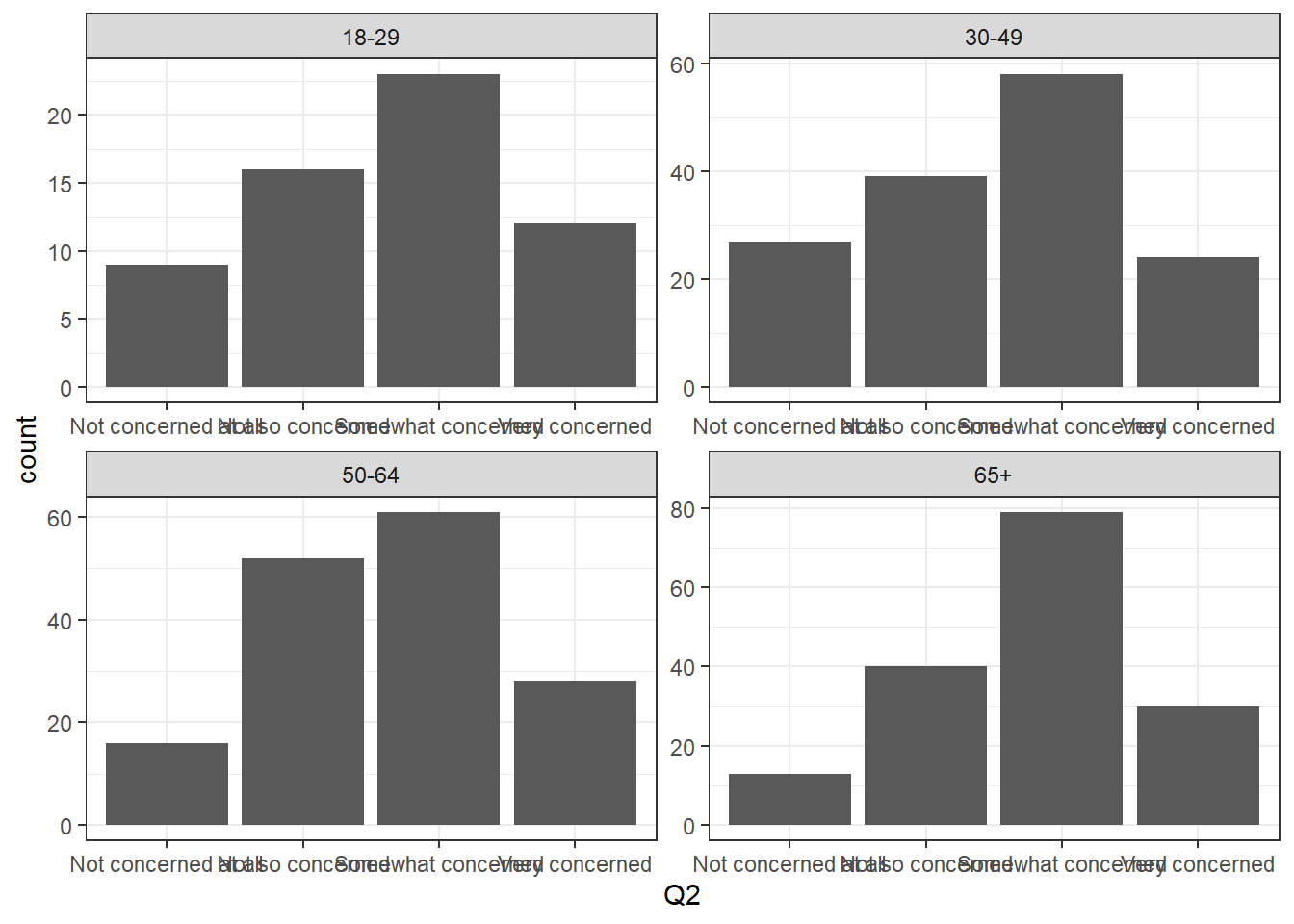
Visualizing Part-Whole Relationships
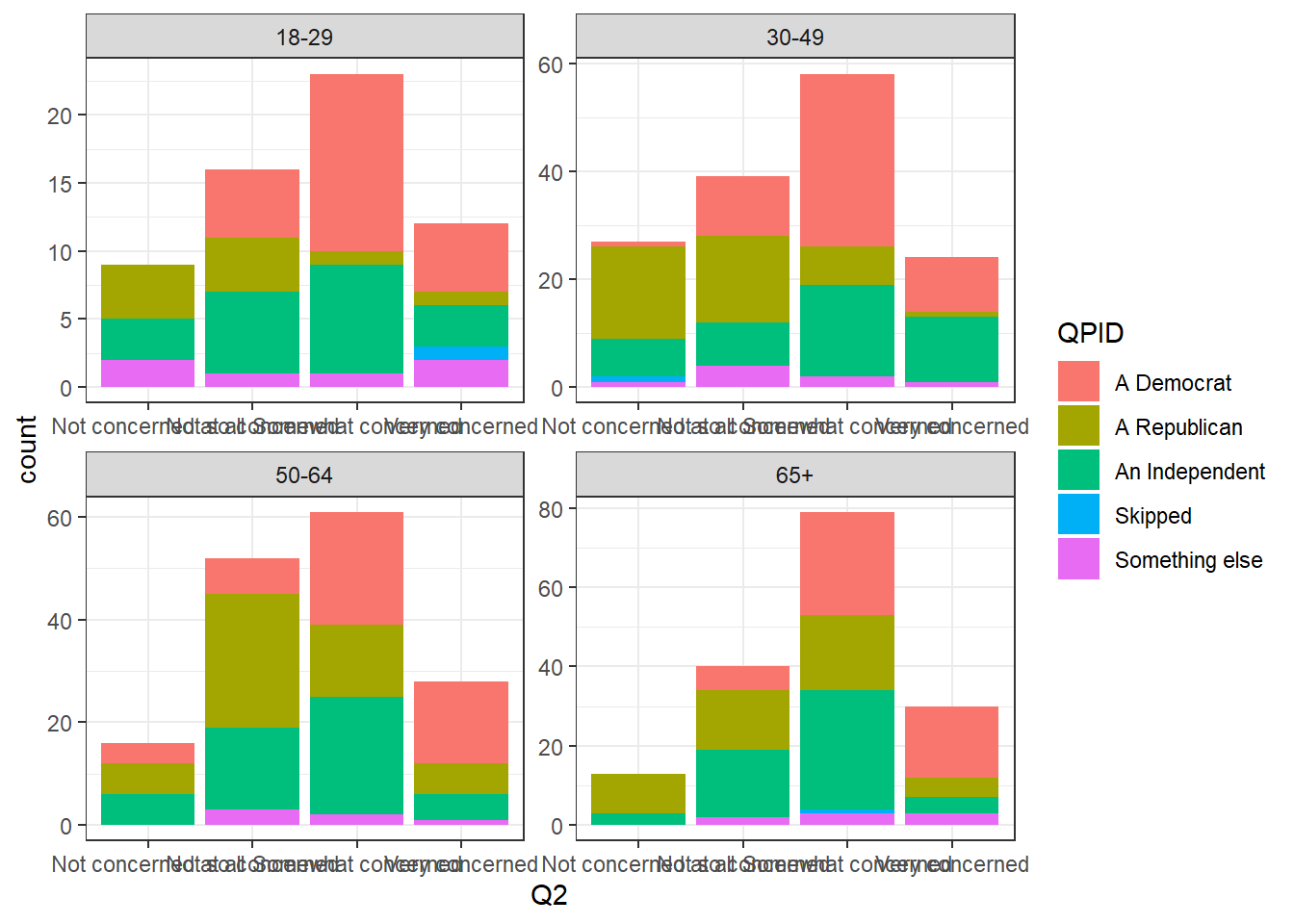
After adding fill section in ggplot, it shows different colors on every bar based on respondents’ political tendency.
rate %>%
  ggplot(aes(Q2, fill = QPID)) + geom_bar() + theme_bw() +
  facet_wrap(vars(ABCAGE), scales = "free")