library(tidyverse)
library(ggplot2)
library(lubridate)
library(countrycode)
library(treemap)

knitr::opts_chunk$set(echo = TRUE, warning=FALSE, message=FALSE)Challenge 6 Solution
challenge_6
hotel_bookings
ryan_odonnell
Visualizing Time and Relationships
Read in data
hb_orig <- read_csv("_data/hotel_bookings.csv")Briefly describe the data
This is a listing of 119390 bookings at two hotels, a city hotel and resort hotel. It contains lots of information on each booking including the hotel, whether or not it was canceled (stored in two separate columns), lead time between booking and arrival, the arrival date in year, month, week number, and day of the month each in its own column, stay in weekend/weekday nights, number of adults, children and babies, type of meal, country of oirigin, market information, whether they were a repeat guest, had canceled before, room type reserved and assigned, number of booking changes, deposit type, travel agent id, company, days on waiting list, customer type, and number of parking spaces needed.
Tidy Data (as needed)
# consolidate date, add a column for total length of stay, departure date, total guests, and filter out canceled bookings, select columns of interest

hb_tidy <- hb_orig %>%
  mutate("date_arrival" = str_c(arrival_date_day_of_month,
                              arrival_date_month,
                              arrival_date_year, sep="/"),
         date_arrival = dmy(date_arrival),
         "total_stay" = stays_in_week_nights + stays_in_weekend_nights,
         "date_departure" = date_arrival + total_stay,
         "total_guests" = adults + children + babies) %>%
  filter(is_canceled == 0) %>%
  select(hotel, date_arrival, date_departure, total_stay, stays_in_weekend_nights, stays_in_week_nights, total_guests, adults, children, babies, meal, country, reserved_room_type, assigned_room_type)
This data set is stored with each booking as a unique case. I mutated the date to be in one column, calculated the total stay, and created a departure date. I also created a new column with the total number of guests and filtered out the canceled bookings.
Time Dependent Visualization
# pivot to get a variable that captures both incoming and outgoing guests

in_n_out <- hb_tidy %>%
  select(hotel, date_arrival, date_departure, total_guests) %>%
  pivot_longer(cols = starts_with("date"),
               names_to = "in_or_out",
               names_prefix = "date_",
               values_to = "date") %>%
  mutate("guests" = case_when(
    in_or_out == "arrival" ~ total_guests,
    in_or_out == "departure" ~ -total_guests
  )) %>%
  group_by(hotel, date) %>%
  summarize("daily_net_guests" = sum(guests))

ggplot(in_n_out,
  aes(x = date, y = cumsum(daily_net_guests), group = hotel, color = hotel)) +
  geom_step() +
  scale_color_discrete(name = "") +
  scale_x_date(date_labels = "%b %Y", date_break = "4 months", minor_breaks = "1 month") +
  labs(x = NULL,
       y = "Active Guests",
    title = "Hotel Occupancy (July 2015 - September 2017)"
       ) +
  theme(legend.position = "bottom")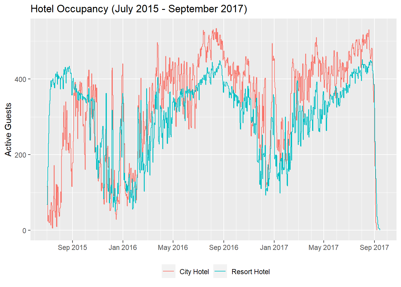
For my time series graph, I wanted to look at how many guests were in each hotel over time. In order to do this, I needed to figure out how many guests checked in and checked out each day. I pivoted the data longer so that I had a single date column with whether the guests were checking in or out. I mutated a column to have a positive value when guests were checking in and a negative value when checking out. I then grouped by hotel and date and summarized to get a daily net guest value.
When I plotted the lines, I plotted these as cumulative sum to get the total number of guests in each hotel. I went with a stepwise line because it was a little neater when presenting the data.
Looking at this graph, we can see that hotel occupancy is higher in the summer and also spikes each year around new year.
Visualizing Part-Whole Relationships
guest_origins <- hb_tidy %>%
  mutate("country_full" = countrycode(country, origin = "iso3c", destination = "country.name"),
         "region" = countrycode(country, origin = "iso3c", destination = "un.region.name")) %>%
  drop_na(country_full)

treemap(guest_origins,
  index = c("hotel", "region", "country_full"),
  vSize = "total_guests",
  type = "index",
  title = "Hotel Guests' Country of Origin",
  palette = "Dark2",
  border.col = c("black", "black", "gray"),
  bg.labels = 50,
  align.labels = list(c("left", "top"), c("center", "center"), c("center", "center")),
  fontface.labels = c("bold", "italic", "plain")
                        )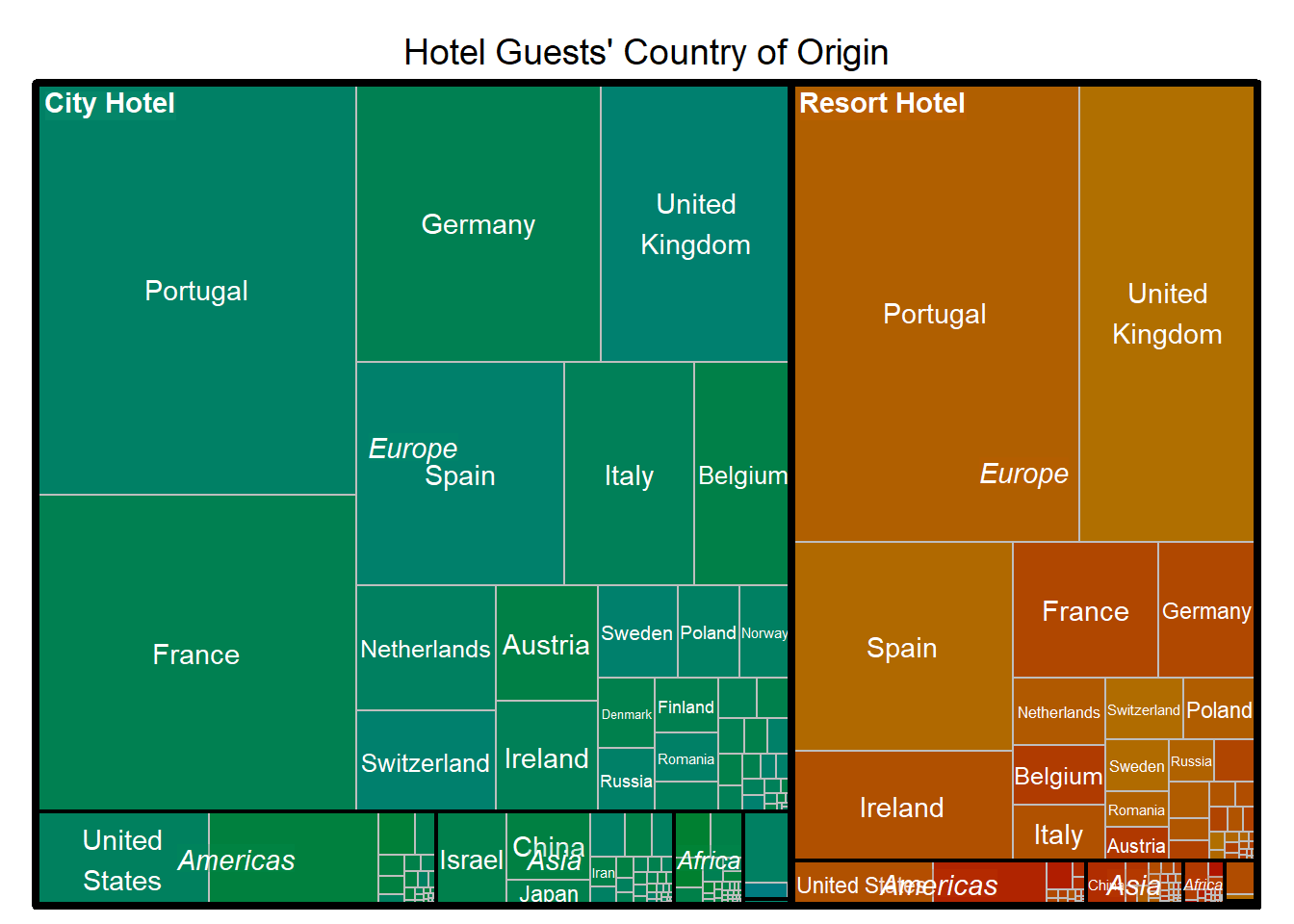
For this graphic, I wanted to look at the countries that different guests were coming from. I saw that there were a lot of different countries which seemed like too many for a pie chart or bar graph. I decided to go with a treemap. I used a package called “countrycode” to translate the three letter code in the country column from the original dataset into a full country name and also a region to help break up the data into bigger levels that would be better for visualization. There were a number of NAs and I couldn’t easily figure out what the code itself might have indicated, so I decided to remove the NAs for this exercise. I tweaked many of the visualization parameters to make it as easy to interpret as possible. It looks like these hotels are probably in Portugal since that is the largest group for both.