library(tidyverse)
library(ggplot2)
library(lubridate)
library(hrbrthemes)
library(treemap)

knitr::opts_chunk$set(echo = TRUE, warning=FALSE, message=FALSE)Challenge 6 - Abby Balint
challenge_6
abby_balint
fed_rate
Visualizing Time and Relationships
Briefly describe the data
Reading in the Fed Fund Rate dataset.
This data is likely government data for the federal funds rate which determines the rate that banks borrow money from each other at. This data set contains to variables ranging from date, target/upper target/lower target rates, actual rates, as well as GDP, unemployment, and inflation rates. The dataset contains 904 rows initially, beginning in July of 1954 and ending in March of 2017. The dataset is not complete as several of the target rates and upper/lower target rates are not included. This may be because they were not reported during earlier years, or standardly reported every month in general.
My goal here is to look at factors like unemployment and inflation since the year 2000 as well as generate some charts for analysis.
rates <- read_csv("_data/FedFundsRate.csv")
head(rates,2)
# A tibble: 2 × 10
Year Month Day Federal Fu…¹ Feder…² Feder…³ Effec…⁴ Real …⁵ Unemp…⁶ Infla…⁷
<dbl> <dbl> <dbl> <dbl> <dbl> <dbl> <dbl> <dbl> <dbl> <dbl>
1 1954 7 1 NA NA NA 0.8 4.6 5.8 NA
2 1954 8 1 NA NA NA 1.22 NA 6 NA
# … with abbreviated variable names ¹`Federal Funds Target Rate`,
# ²`Federal Funds Upper Target`, ³`Federal Funds Lower Target`,
# ⁴`Effective Federal Funds Rate`, ⁵`Real GDP (Percent Change)`,
# ⁶`Unemployment Rate`, ⁷`Inflation Rate`Tidying the Data
This data set is already pretty tidy since the rates are in a reportable format, however I wanted to use this opportunity to practice mutating month/day/year columns into a date. I used the make_date lubridate function to create a new variable called Date. I filtered to the year 2000 or later for my graphing purposes. I also filtered out some blank values from some of the values I was using to chart so that my line graphs wouldn’t have any breaks. There isn’t much to pivot/mutate/recode here as most of these variables are just straightforward numerical.
rates_tidy <- rates %>%
  mutate(Date = make_date(`Year`, `Month`, `Day`)) %>%
  mutate(`Employment Rate` = (100 - `Unemployment Rate`)) %>%
  filter(`Year` >= 2000) %>%
    drop_na(`Inflation Rate`) %>%
  drop_na(`Unemployment Rate`) %>%
  drop_na(`Real GDP (Percent Change)`)
summary(rates_tidy)
Year Month Day Federal Funds Target Rate
Min. :2000 Min. : 1.00 Min. :1 Min. :1.000
1st Qu.:2004 1st Qu.: 3.25 1st Qu.:1 1st Qu.:1.750
Median :2008 Median : 5.50 Median :1 Median :3.125
Mean :2008 Mean : 5.50 Mean :1 Mean :3.382
3rd Qu.:2012 3rd Qu.: 7.75 3rd Qu.:1 3rd Qu.:5.250
Max. :2016 Max. :10.00 Max. :1 Max. :6.500
NA's :32
Federal Funds Upper Target Federal Funds Lower Target
Min. :0.2500 Min. :0.00000
1st Qu.:0.2500 1st Qu.:0.00000
Median :0.2500 Median :0.00000
Mean :0.2812 Mean :0.03125
3rd Qu.:0.2500 3rd Qu.:0.00000
Max. :0.5000 Max. :0.25000
NA's :36 NA's :36
Effective Federal Funds Rate Real GDP (Percent Change) Unemployment Rate
Min. :0.070 Min. :-8.200 Min. : 3.800
1st Qu.:0.140 1st Qu.: 0.800 1st Qu.: 4.900
Median :1.000 Median : 2.100 Median : 5.700
Mean :1.830 Mean : 1.872 Mean : 6.212
3rd Qu.:3.388 3rd Qu.: 3.250 3rd Qu.: 7.650
Max. :6.540 Max. : 7.800 Max. :10.000
Inflation Rate Date Employment Rate
Min. :0.600 Min. :2000-01-01 Min. :90.00
1st Qu.:1.700 1st Qu.:2004-03-09 1st Qu.:92.35
Median :2.100 Median :2008-05-16 Median :94.30
Mean :1.987 Mean :2008-05-16 Mean :93.79
3rd Qu.:2.300 3rd Qu.:2012-07-24 3rd Qu.:95.10
Max. :2.700 Max. :2016-10-01 Max. :96.20
Time Dependent Visualization
In this visualization, I generated a line graph for the inflation rate since 2000. I used the date variable I generated above to create this chart. I also implemented a color scheme and played around with the line thickness and type.
rates_tidy %>%
  ggplot(aes(x=`Date`, y=`Inflation Rate`)) +
  geom_line(color="#00658E", size=1, alpha=6, linetype=1) +
  ggtitle("Change in Inflation Rate Since Year 2000") +
  theme(panel.background = element_rect(fill="lightblue"))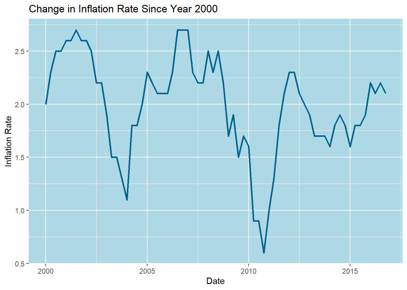
Visualizing Part-Whole Relationships
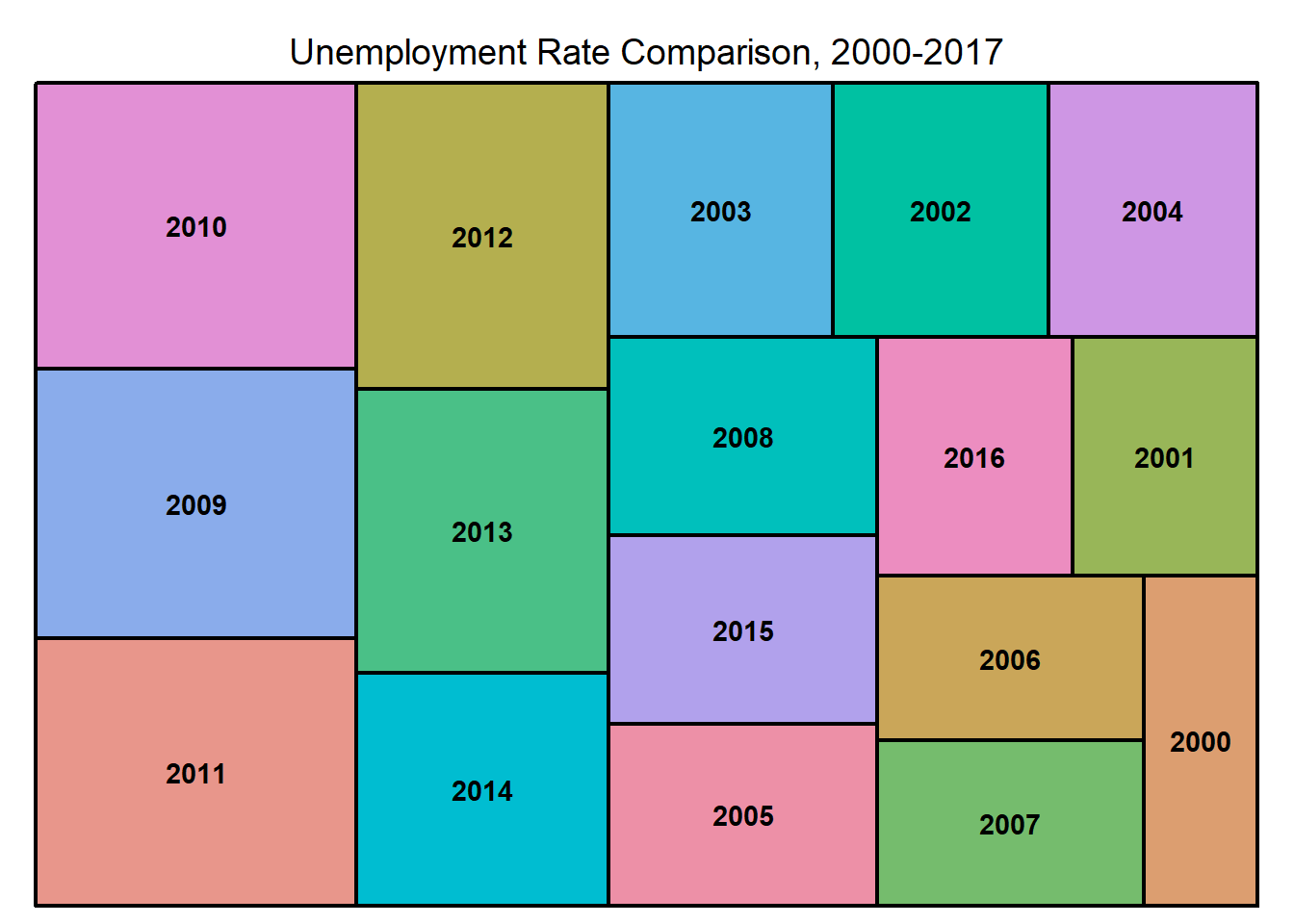
In this visualization, I was looking for something that I could create a part-whole chart for. Since there is not many categorical variables in this dataset, I used year. The below tree map makes it easy to see which years had some of the highest unemployment rates since the year 2000.
rates_tidy %>%
  treemap(index=c("Year"), vSize="Unemployment Rate", title="Unemployment Rate Comparison, 2000-2017")