library(tidyverse)
library(ggplot2)
library(ggforce)
library(readxl)
knitr::opts_chunk$set(echo = TRUE, warning=FALSE, message=FALSE)
Challenge 6
challenge_6
hotel_bookings
air_bnb
fed_rate
debt
usa_households
abc_poll
Visualizing Time and Relationships
Challenge Overview
Today’s challenge is to:
- read in a data set, and describe the data set using both words and any supporting information (e.g., tables, etc)
- tidy data (as needed, including sanity checks)
- mutate variables as needed (including sanity checks)
- create at least one graph including time (evolution)
- try to make them “publication” ready (optional)
- Explain why you choose the specific graph type
- Create at least one graph depicting part-whole or flow relationships
- try to make them “publication” ready (optional)
- Explain why you choose the specific graph type
R Graph Gallery is a good starting point for thinking about what information is conveyed in standard graph types, and includes example R code.
(be sure to only include the category tags for the data you use!)
Read in data
Read in one (or more) of the following datasets, using the correct R package and command.
- debt ⭐
- fed_rate ⭐⭐
- abc_poll ⭐⭐⭐
- usa_hh ⭐⭐⭐
- hotel_bookings ⭐⭐⭐⭐
- AB_NYC ⭐⭐⭐⭐⭐
RawData <- read_excel("_data/debt_in_trillions.xlsx")
head(RawData)
# A tibble: 6 × 8
`Year and Quarter` Mortgage `HE Revolving` Auto …¹ Credi…² Stude…³ Other Total
<chr> <dbl> <dbl> <dbl> <dbl> <dbl> <dbl> <dbl>
1 03:Q1 4.94 0.242 0.641 0.688 0.241 0.478 7.23
2 03:Q2 5.08 0.26 0.622 0.693 0.243 0.486 7.38
3 03:Q3 5.18 0.269 0.684 0.693 0.249 0.477 7.56
4 03:Q4 5.66 0.302 0.704 0.698 0.253 0.449 8.07
5 04:Q1 5.84 0.328 0.72 0.695 0.260 0.446 8.29
6 04:Q2 5.97 0.367 0.743 0.697 0.263 0.423 8.46
# … with abbreviated variable names ¹`Auto Loan`, ²`Credit Card`,
# ³`Student Loan`Briefly describe the data
The information appears to be the total amount of debt that some countries’ residents, most likely those of the US have.
splitData<- RawData %>%
  separate(`Year and Quarter`,c('Year','Quarter'),sep = ":")
splitData
# A tibble: 74 × 9
Year Quarter Mortgage `HE Revolving` `Auto Loan` Credi…¹ Stude…² Other Total
<chr> <chr> <dbl> <dbl> <dbl> <dbl> <dbl> <dbl> <dbl>
1 03 Q1 4.94 0.242 0.641 0.688 0.241 0.478 7.23
2 03 Q2 5.08 0.26 0.622 0.693 0.243 0.486 7.38
3 03 Q3 5.18 0.269 0.684 0.693 0.249 0.477 7.56
4 03 Q4 5.66 0.302 0.704 0.698 0.253 0.449 8.07
5 04 Q1 5.84 0.328 0.72 0.695 0.260 0.446 8.29
6 04 Q2 5.97 0.367 0.743 0.697 0.263 0.423 8.46
7 04 Q3 6.21 0.426 0.751 0.706 0.33 0.41 8.83
8 04 Q4 6.36 0.468 0.728 0.717 0.346 0.423 9.04
9 05 Q1 6.51 0.502 0.725 0.71 0.364 0.394 9.21
10 05 Q2 6.70 0.528 0.774 0.717 0.374 0.402 9.49
# … with 64 more rows, and abbreviated variable names ¹`Credit Card`,
# ²`Student Loan`Time Dependent Visualization
Below is a time-dependent graphic of credit card debt; I later alter the data to compare it to other types of debt.
scatter <- splitData %>%
  ggplot(mapping=aes(x = Year, y = `Credit Card`))+
  geom_point(aes(color=Quarter))
scatter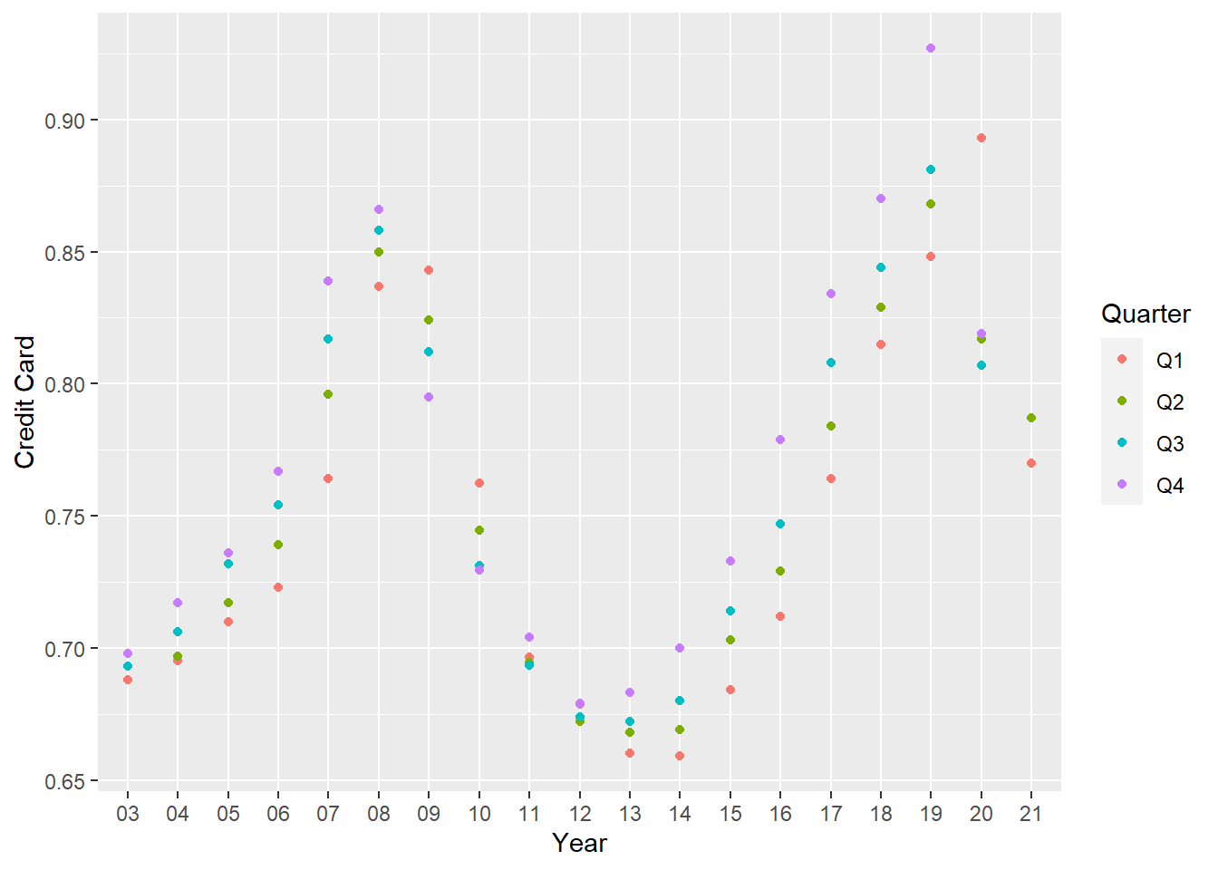
pivoting data again
longerSplitData<- splitData%>%
  pivot_longer(!c(Year,Quarter), names_to = "DebtType",values_to = "DebtPercent" )

longerSplitData
# A tibble: 518 × 4
Year Quarter DebtType DebtPercent
<chr> <chr> <chr> <dbl>
1 03 Q1 Mortgage 4.94
2 03 Q1 HE Revolving 0.242
3 03 Q1 Auto Loan 0.641
4 03 Q1 Credit Card 0.688
5 03 Q1 Student Loan 0.241
6 03 Q1 Other 0.478
7 03 Q1 Total 7.23
8 03 Q2 Mortgage 5.08
9 03 Q2 HE Revolving 0.26
10 03 Q2 Auto Loan 0.622
# … with 508 more rowsVisualizing Part-Whole Relationships
longerSplitDataPlot <- longerSplitData%>%
  ggplot(mapping=aes(x = Year, y = DebtPercent))


longerSplitDataPlot +
  facet_wrap(~DebtType, scales = "free")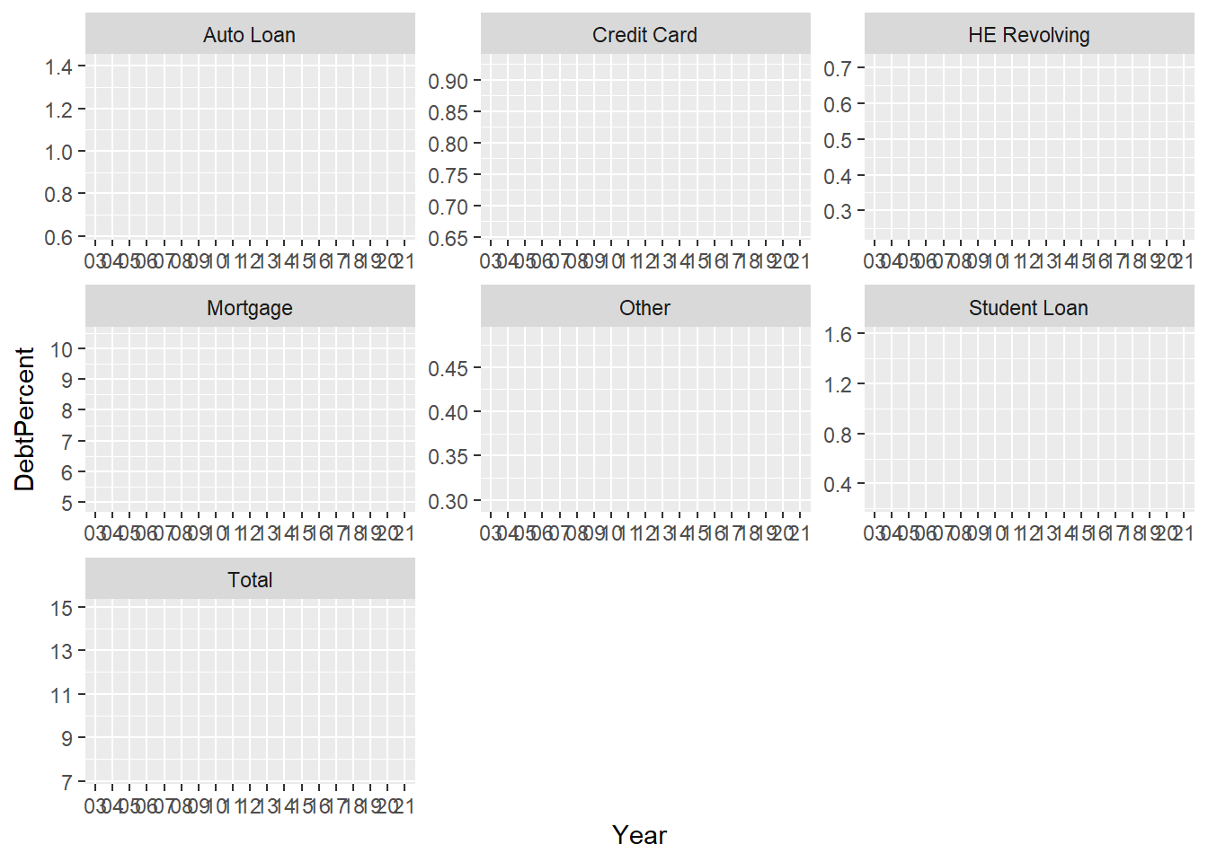
#visualize the data by debt type

longerSplitDataPlot +
  geom_point(aes(color = DebtType))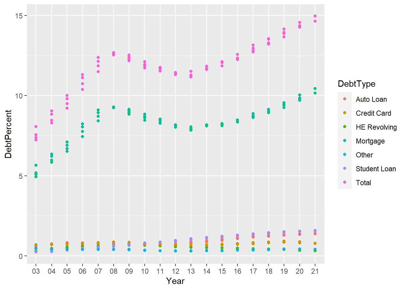
I wanted to analyze how different sorts of debt affected the total debt for that year, so I separated out the types of debt. As you can see, the mortgage debt seems to have the biggest impact on the total.
longerSplitDataPlot+
  geom_point() +
  facet_wrap(~DebtType) +
  scale_x_discrete(breaks = c('03','06','09',12,15,18,21))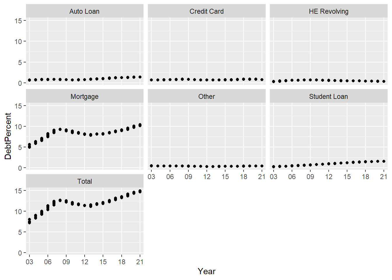
The information above shows how mortgages contributed to the total debt, but what about the trends of the other types of debt? Are they similar in shape? To view this, I had to turn the scales to the free position.
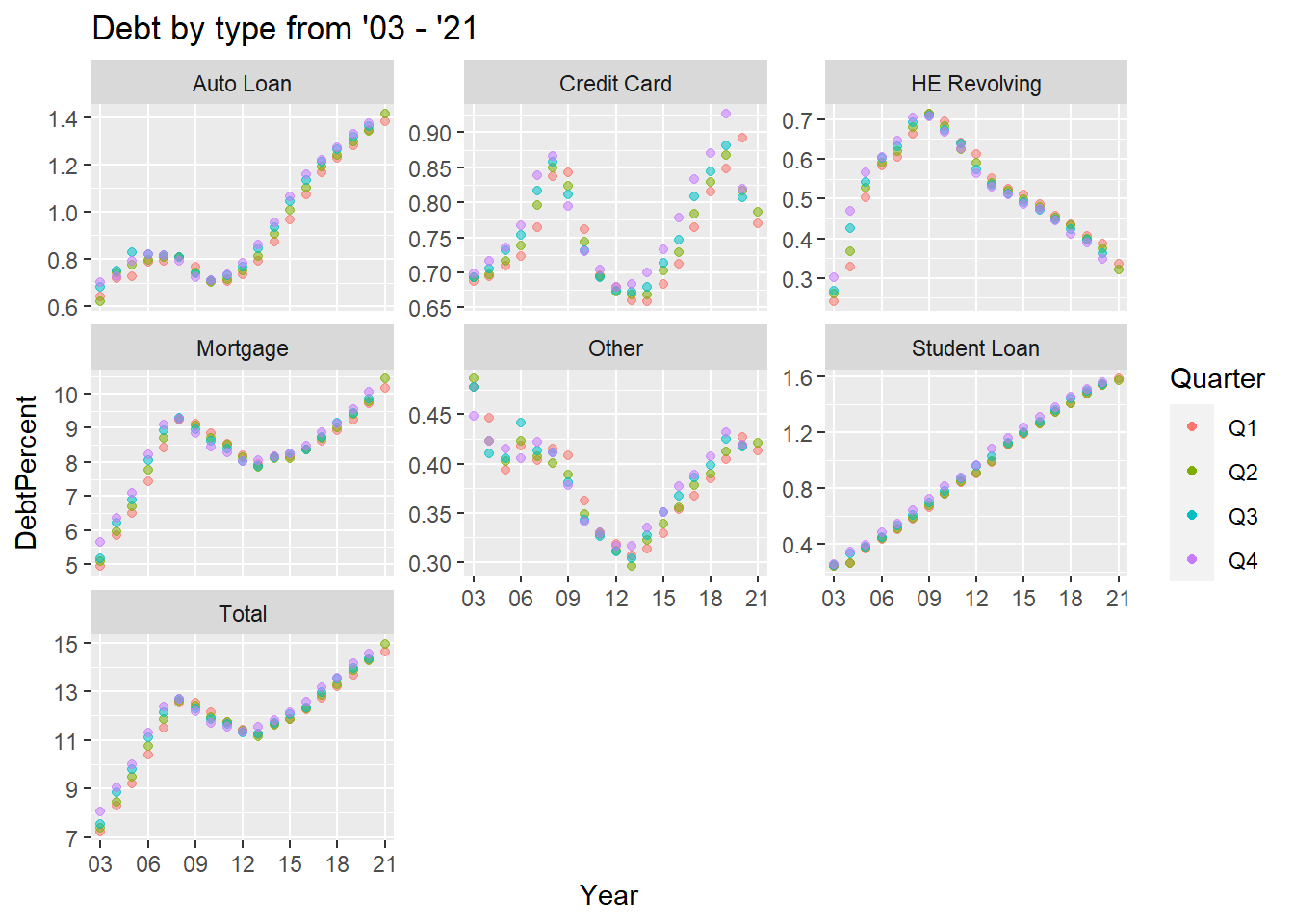
longerSplitDataPlot+
  geom_point(aes(color = Quarter,alpha=0.9,)) +
  facet_wrap(~DebtType, scales = "free_y") +
  guides(alpha="none") +
  labs(title="Debt by type from '03 - '21")+
  scale_x_discrete(breaks = c('03','06','09',12,15,18,21))