library(tidyverse)
library(ggplot2)

knitr::opts_chunk$set(echo = TRUE, warning=FALSE, message=FALSE)
Challenge 7 Guanhua Tan
Challenge Overview
Today’s challenge is to:
- read in a data set, and describe the data set using both words and any supporting information (e.g., tables, etc)
- tidy data (as needed, including sanity checks)
- mutate variables as needed (including sanity checks)
- Recreate at least two graphs from previous exercises, but introduce at least one additional dimension that you omitted before using ggplot functionality (color, shape, line, facet, etc) The goal is not to create unneeded chart ink (Tufte), but to concisely capture variation in additional dimensions that were collapsed in your earlier 2 or 3 dimensional graphs.
- Explain why you choose the specific graph type
- If you haven’t tried in previous weeks, work this week to make your graphs “publication” ready with titles, captions, and pretty axis labels and other viewer-friendly features
R Graph Gallery is a good starting point for thinking about what information is conveyed in standard graph types, and includes example R code. And anyone not familiar with Edward Tufte should check out his fantastic books and courses on data visualizaton.
(be sure to only include the category tags for the data you use!)
Read in data
Read in one (or more) of the following datasets, using the correct R package and command.
- Pisa2018
#read in data
pisa <- read_csv('_data/CY07_MSU_SCH_QQQ.csv')
dim(pisa)
[1] 21903 198length(unique(pisa$CNT))[1] 80pisa2018 <- pisa %>%
select(starts_with("SC155"))
dim(pisa2018)[1] 21903 11Briefly describe the data
This dataset is one part of PISA 2018 dataset with a focus on schools. It covers 80 countries and different regions within each country. The dataset documents 21,903 schools’ responses regarding 187 questions. Some key identifiers include CNT (Country Name), STRATUM (Region Name) and OECD (belongs to or not OECD)
Tidy Data (as needed)
Is your data already tidy, or is there work to be done? Be sure to anticipate your end result to provide a sanity check, and document your work here.
#tidy data

pisa2018_joint <- cbind(pisa[,1:12], pisa2018) %>%
  select(CNT, STRATUM, OECD, SC155Q01HA,SC155Q02HA, SC155Q03HA, SC155Q04HA, SC155Q05HA,
         SC155Q06HA, SC155Q07HA, SC155Q08HA, SC155Q09HA, SC155Q10HA, SC155Q11HA)
pisa2018_joint$Accessibility=rowMeans(pisa2018_joint[,c("SC155Q01HA","SC155Q02HA", "SC155Q03HA","SC155Q04HA")])
pisa2018_joint$Human_Resource_Support=rowMeans(pisa2018_joint[,c("SC155Q05HA","SC155Q06HA", "SC155Q07HA","SC155Q08HA","SC155Q09HA", "SC155Q10HA", "SC155Q11HA")])
pisa2018_joint_clean <-pisa2018_joint %>%
  select(CNT, STRATUM, OECD, Accessibility, Human_Resource_Support) %>%
  group_by(CNT) %>%
  mutate(Accessibility_Country_Ave=mean(Accessibility, na.rm=T)) %>%
  mutate(Human_Resource_ave=mean(Human_Resource_Support, na.rm=T)) %>%
  select(CNT,OECD, Accessibility_Country_Ave, Human_Resource_ave) %>%
  distinct() %>%
  arrange(desc(Accessibility_Country_Ave))%>%
  mutate(OECD_or_Non_OECD =case_when(
    OECD==0~"Non-OECD",
    OECD==1~"OECD")) %>%
  select(-OECD)
pisa2018_joint_clean
# A tibble: 80 × 4
# Groups: CNT [80]
CNT Accessibility_Country_Ave Human_Resource_ave OECD_or_Non_OECD
<chr> <dbl> <dbl> <chr>
1 SGP 3.43 3.11 Non-OECD
2 SWE 3.36 3.06 OECD
3 QCI 3.35 3.23 Non-OECD
4 QAT 3.27 3.16 Non-OECD
5 DNK 3.16 2.97 OECD
6 USA 3.16 2.87 OECD
7 LTU 3.15 3.04 OECD
8 ARE 3.15 3.11 Non-OECD
9 TAP 3.14 2.98 Non-OECD
10 SVN 3.12 2.96 OECD
# … with 70 more rowsAre there any variables that require mutation to be usable in your analysis stream? For example, do you need to calculate new values in order to graph them? Can string values be represented numerically? Do you need to turn any variables into factors and reorder for ease of graphics and visualization?
Document your work here.
The dataset covers 80 countries and regions including 21903 schools’ responses regrading 187 questions. So I decided to narrow my reach here to five countries. I’d like to look at schools responses regarding a set of questions “SC155”. SC155 surveys the accessibility to digital devices and its related training as well as assistance. I clean the data and group_by data as regional code. So I make two different datasets at first. One includes all identifier information. The other covers the columns that contains “SC155Q”. Then, I use function “cbind” to combine these two into a new dataset (pisa2018_joint). Furthermore, I found that the questions from SC155Q01HA to SC155Q01HA focus on the accessibility to digital devices while the questions from SC155Q05HA to SC155Q11HA stress on if the schools offer enough traibing, support, and incentives. I mutate two new variables–“Accessibility” and “Human_Resource_Support that respectively calculate the average of the former and the latter. Besides, I calculate every country average for”Accessibility” and “Human_Resource_Support.” After tidying data, the dataset has four columns and 80 rows.
Visualization with Multiple Dimensions
Painting World
# further tidy data and pivot_longer
# world difference in general

pisa2018_clean_pivot<-pisa2018_joint_clean %>%
  pivot_longer(cols=c(Accessibility_Country_Ave, Human_Resource_ave),
               names_to = "Group", values_to = "Evaluation")
pisa2018_clean_pivot %>%
   ggplot(aes(Evaluation, fill=Group))+
  stat_boxplot(geom = "errorbar", # Error bars
               width = 0.1)+
  geom_boxplot()+
  facet_wrap(~Group+OECD_or_Non_OECD)+
  labs(title="Pisa2018 Digital Divce Evaluation")+
  coord_flip()
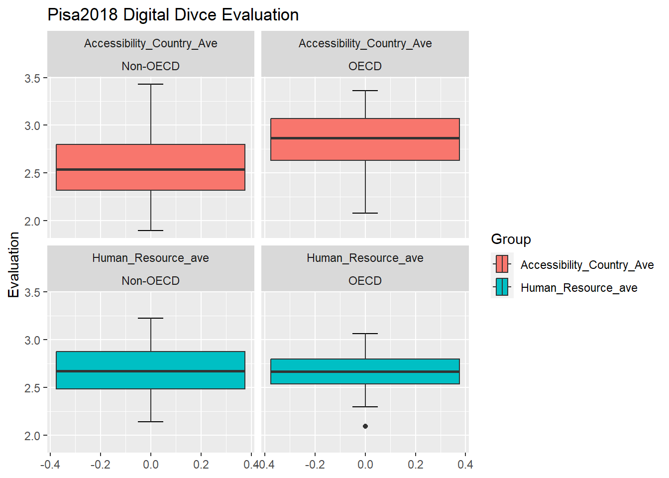
In order to further tidy data, I first used pivot_longer to create two new variables “Group” and “Evaluation”.I put the original variables–“Accessibility_Country_Ave” and “Human_Resource_ave” names to the “Group” and values to “Evaluation.” After cleaning and rearranging the dataset, I create four graphics. The box plot enjoys the reputation for clearly showing the distribution of a group of numbers, which allows me to disclose the distribution and general situation of every country’s evaluation on digital devices.The boxplot graphics reveal that the OECD countries enjoy the higher access to digital devices than non-OECD countries. But these two groups have reported that their human resource evaluations are in the similar range. The latter reflects the limits to this survey’s methodology. Because this survey is reliance on schools’ self-report. There is no any objective measurements for them to measure their access to and human resources support on digital devices. Therefore, instead of reflecting that OECD countries lack human resources support, the data may show OECD and non-OECD countries have distinct expectations on human resources support. So self-report can only demonstrate the gap between their expectations and current situations.
A Case Study of Six Countires
# tidy data about the case study
# choose five countries to look at regional difference within the countries
# United Kingdom (GBR), Hong Kong (HKG), Philippines (PHL), Argentina (ARG), Brazil(BRA), France(FRA)
pisa2018_joint_case_study <- pisa2018_joint  %>%
  select(CNT, STRATUM, OECD, SC155Q01HA,SC155Q02HA, SC155Q03HA, SC155Q04HA, SC155Q05HA,
         SC155Q06HA, SC155Q07HA, SC155Q08HA, SC155Q09HA, SC155Q10HA, SC155Q11HA) %>%
  group_by(STRATUM) %>%
  arrange(STRATUM) %>%
  filter(CNT== "GBR" | CNT== "HKG" | CNT=="PHL"| CNT=="ARG" | CNT=="BRA" |CNT=="FRA" )
pisa2018_joint_case_study
# A tibble: 2,114 × 14
# Groups: STRATUM [129]
CNT STRATUM OECD SC155Q0…¹ SC155…² SC155…³ SC155…⁴ SC155…⁵ SC155…⁶ SC155…⁷
<chr> <chr> <dbl> <dbl> <dbl> <dbl> <dbl> <dbl> <dbl> <dbl>
1 ARG ARG0101 0 1 1 1 1 1 2 2
2 ARG ARG0101 0 NA NA NA NA NA NA NA
3 ARG ARG0101 0 2 1 2 2 2 2 2
4 ARG ARG0101 0 2 1 2 3 2 2 1
5 ARG ARG0101 0 1 1 2 2 2 2 2
6 ARG ARG0101 0 3 2 3 2 2 2 1
7 ARG ARG0101 0 1 1 1 1 1 3 1
8 ARG ARG0101 0 1 1 1 1 1 1 1
9 ARG ARG0101 0 NA NA NA NA NA NA NA
10 ARG ARG0101 0 1 1 1 1 2 2 2
# … with 2,104 more rows, 4 more variables: SC155Q08HA <dbl>, SC155Q09HA <dbl>,
# SC155Q10HA <dbl>, SC155Q11HA <dbl>, and abbreviated variable names
# ¹SC155Q01HA, ²SC155Q02HA, ³SC155Q03HA, ⁴SC155Q04HA, ⁵SC155Q05HA,
# ⁶SC155Q06HA, ⁷SC155Q07HA#further tidy data
pisa2018_joint_case_study$Accessibility=rowMeans(pisa2018_joint_case_study[,c("SC155Q01HA","SC155Q02HA", "SC155Q03HA","SC155Q04HA")])
pisa2018_joint_case_study$Human_Resource_Support=rowMeans(pisa2018_joint_case_study[,c("SC155Q05HA","SC155Q06HA", "SC155Q07HA","SC155Q08HA","SC155Q09HA", "SC155Q10HA", "SC155Q11HA")])
pisa2018_case_study_clean <- pisa2018_joint_case_study %>%
select(CNT,STRATUM,OECD, Accessibility, Human_Resource_Support) %>%
pivot_longer(cols=c(Accessibility, Human_Resource_Support), names_to = "Group", values_to = "Evaluation")%>%
mutate(OECD_or_Non_OECD =case_when(
OECD==0~"Non-OECD",
OECD==1~"OECD")) %>%
select(-OECD)
pisa2018_case_study_clean# A tibble: 4,228 × 5
# Groups: STRATUM [129]
CNT STRATUM Group Evaluation OECD_or_Non_OECD
<chr> <chr> <chr> <dbl> <chr>
1 ARG ARG0101 Accessibility 1 Non-OECD
2 ARG ARG0101 Human_Resource_Support 1.57 Non-OECD
3 ARG ARG0101 Accessibility NA Non-OECD
4 ARG ARG0101 Human_Resource_Support NA Non-OECD
5 ARG ARG0101 Accessibility 1.75 Non-OECD
6 ARG ARG0101 Human_Resource_Support 2.29 Non-OECD
7 ARG ARG0101 Accessibility 2 Non-OECD
8 ARG ARG0101 Human_Resource_Support 1.43 Non-OECD
9 ARG ARG0101 Accessibility 1.5 Non-OECD
10 ARG ARG0101 Human_Resource_Support 1.86 Non-OECD
# … with 4,218 more rowsBesides the general situation around the world. I’d like to dig into 6 countries ( Hong Kong, Philippines, Argentina and Brazil belong to non-OECD, Britain and France belong to non-OECD). Furthermore, following the above-mentioned finding that the questions from SC155Q01HA to SC155Q01HA focus on the accessibility to digital devices while the questions from SC155Q05HA to SC155Q11HA stress on if the schools offer enough training, support, and incentives. I mutate two new variables–“Accessibility” and “Human_Resource_Support that respectively calculate the average of the former and the latter. I just calcaultue the averages of these two groups of every school. I use povit_longer to rearrange the dataset in order to show these two categories in one graphic. I The result is the dataset”pisa2018_case_study_clean.”
# violin graphic
pisa2018_case_study_clean %>%
  ggplot(aes(CNT,Evaluation, fill=CNT), na.rm=T) +
  geom_violin()+
  facet_wrap(~Group)+
  xlab("Country")+
  ylab("Evaluation")+
ggtitle("Schools' Evaluation on Digtial Device") 
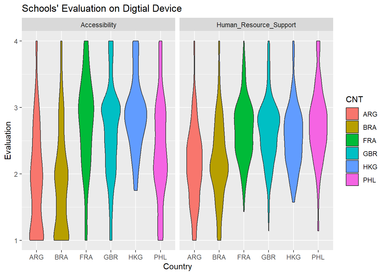
The violin graphic shares similar reputation for uncovering the distribution within a collection of data.I use the violin graphics to disclose the evaluation of digital devices in six countries with the dimension of “Accessibility” and “Human Resource Support”. The graphic has shows, whatever accessibility and human resource support, Hong Kong, France and Brain report higher grades than Argentina, Brazil, and the Philippines. most schools’ in Hong Kong, France and Brain response are around the range of “agree” while most schools’ in Argentina, Brazil, the Philippines replies are around the range of “disagree”, which reflects that schools in Argentina, Brazil, the Philippines are not satisfied by their current situation.
pisa2018_case_study_clean %>%
  ggplot(aes(CNT, Evaluation,fill=CNT), na.rm=T)+
  geom_violin()+
  xlab("Country")+
  ylab("Evaluaiton")+
  ggtitle("Schools' Evaluation on Digtial Device")+
  facet_wrap(~Group+OECD_or_Non_OECD)
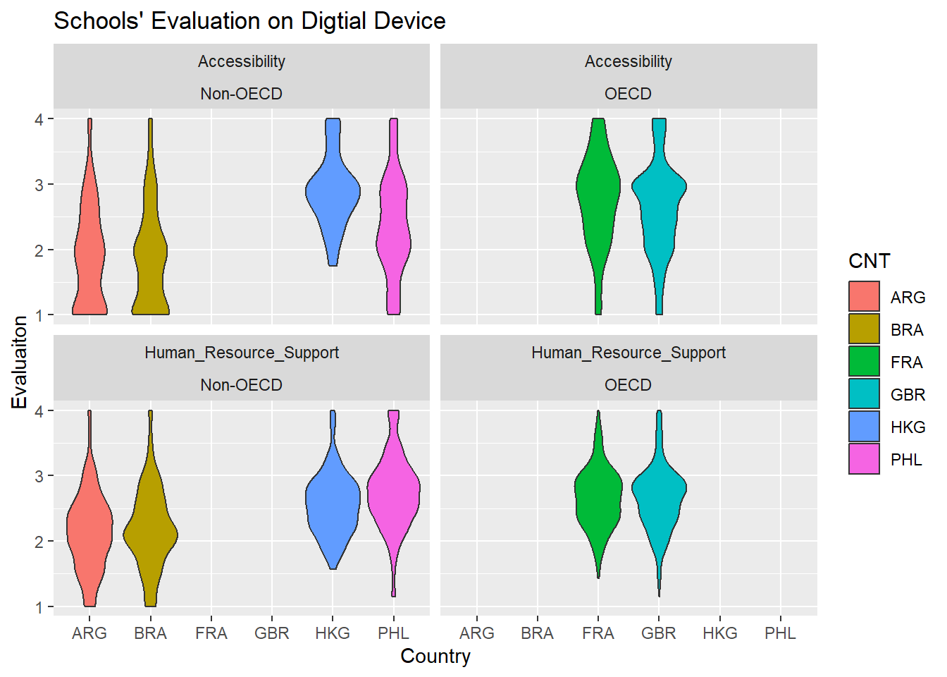
I add one more dimension–OECD or Non-OECD to this violin plot. In terms of “Accessibility,” Hong Kong has a better access to digital devices than Argentina, Brazil, the Philippines. the similar situation happens to the evaluation of “Human Resources Support.” The fact may be interpreted that Hong Kong has more enough fiscal resources to support their schools. In fact, the plot demonstrates the variation of the evaluation on digital devices in non-OECD countries. By contrast, two OECD countries–France and Brain share the similar shape in terms of accessibility and human resource support, which reflects that most schools in these two countries believe that they enjoy an good access to digital device and receive enough human resources support.