library(tidyverse)
library(ggplot2)
library(ggforce)
library(plotly)
library(readxl)

knitr::opts_chunk$set(echo = TRUE, warning=FALSE, message=FALSE)
Challenge 7 Instructions
challenge_7
debt
Julian Castoro
Visualizing Multiple Dimensions
Challenge Overview
Today’s challenge is to:
- read in a data set, and describe the data set using both words and any supporting information (e.g., tables, etc)
- tidy data (as needed, including sanity checks)
- mutate variables as needed (including sanity checks)
- Recreate at least two graphs from previous exercises, but introduce at least one additional dimension that you omitted before using ggplot functionality (color, shape, line, facet, etc) The goal is not to create unneeded chart ink (Tufte), but to concisely capture variation in additional dimensions that were collapsed in your earlier 2 or 3 dimensional graphs.
- Explain why you choose the specific graph type
- If you haven’t tried in previous weeks, work this week to make your graphs “publication” ready with titles, captions, and pretty axis labels and other viewer-friendly features
Read in data
I chose to use the debt dataset from last weeks challenge, it was not listed as a dataset in the template but the challenge says to rework a previous exercise so I am assuming this is ok.
RawData <- read_excel("_data/debt_in_trillions.xlsx")
head(RawData)
# A tibble: 6 × 8
`Year and Quarter` Mortgage `HE Revolving` Auto …¹ Credi…² Stude…³ Other Total
<chr> <dbl> <dbl> <dbl> <dbl> <dbl> <dbl> <dbl>
1 03:Q1 4.94 0.242 0.641 0.688 0.241 0.478 7.23
2 03:Q2 5.08 0.26 0.622 0.693 0.243 0.486 7.38
3 03:Q3 5.18 0.269 0.684 0.693 0.249 0.477 7.56
4 03:Q4 5.66 0.302 0.704 0.698 0.253 0.449 8.07
5 04:Q1 5.84 0.328 0.72 0.695 0.260 0.446 8.29
6 04:Q2 5.97 0.367 0.743 0.697 0.263 0.423 8.46
# … with abbreviated variable names ¹`Auto Loan`, ²`Credit Card`,
# ³`Student Loan`Briefly describe the data
The data represents the year and quarter in the US and the associated debt spread of its citizens during that time period.
splitData<- RawData %>%
  separate(`Year and Quarter`,c('Year','Quarter'),sep = ":")
head(splitData)
# A tibble: 6 × 9
Year Quarter Mortgage `HE Revolving` `Auto Loan` Credit…¹ Stude…² Other Total
<chr> <chr> <dbl> <dbl> <dbl> <dbl> <dbl> <dbl> <dbl>
1 03 Q1 4.94 0.242 0.641 0.688 0.241 0.478 7.23
2 03 Q2 5.08 0.26 0.622 0.693 0.243 0.486 7.38
3 03 Q3 5.18 0.269 0.684 0.693 0.249 0.477 7.56
4 03 Q4 5.66 0.302 0.704 0.698 0.253 0.449 8.07
5 04 Q1 5.84 0.328 0.72 0.695 0.260 0.446 8.29
6 04 Q2 5.97 0.367 0.743 0.697 0.263 0.423 8.46
# … with abbreviated variable names ¹`Credit Card`, ²`Student Loan`I pivot the data here so that I could filter by debt type.
longerSplitData<- splitData%>%
  pivot_longer(!c(Year,Quarter), names_to = "DebtType",values_to = "DebtPercent" )

longerSplitData
# A tibble: 518 × 4
Year Quarter DebtType DebtPercent
<chr> <chr> <chr> <dbl>
1 03 Q1 Mortgage 4.94
2 03 Q1 HE Revolving 0.242
3 03 Q1 Auto Loan 0.641
4 03 Q1 Credit Card 0.688
5 03 Q1 Student Loan 0.241
6 03 Q1 Other 0.478
7 03 Q1 Total 7.23
8 03 Q2 Mortgage 5.08
9 03 Q2 HE Revolving 0.26
10 03 Q2 Auto Loan 0.622
# … with 508 more rowsVisualization with Multiple Dimensions
I wanted to rework my second and third from the last exercise, I feel like looking back on them now I am realizing they are more of exploratory graphs and not necessarily “report ready” so I wanted to revisit them and spruce them up a bit.
Below I will show what they originally looked like and discuss what I want to change.
Second Chart original:
longerSplitDataPlot <- longerSplitData%>%
  ggplot(mapping=aes(x = Year, y = DebtPercent))


longerSplitDataPlot +
  geom_point(aes(color = DebtType))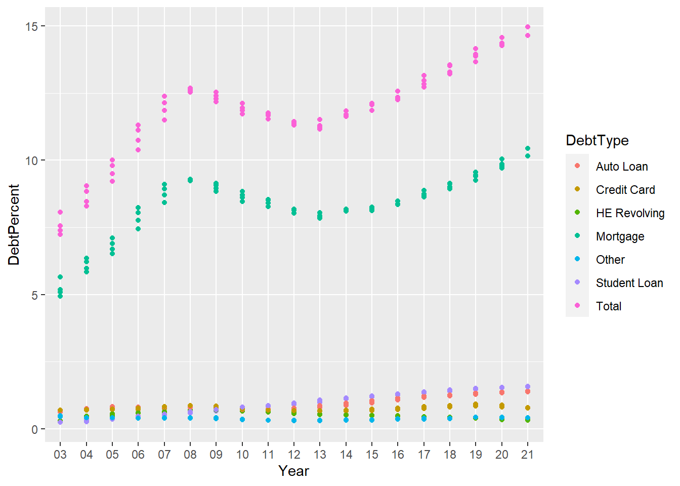
The objective of this chart was to show the different debt types and how they fluctuated throughout the years. While I had a legend, some color and axis titles I feel like the value of anything other than total and Mortgages are lost.
In order to improve this chart I will add a title and think of a way to shine some more light on the other debt types.
longerSplitDataPlot +
  geom_point(aes(color = DebtType))+
  labs(title = "Total National Debt most closely follows Mortgages",subtitle="Student and Auto drive the secondary category" ,caption = "data from posts/_data")+
  theme(legend.position = "bottom")+
  facet_zoom(y = DebtType == !c("Mortgage","Total"),ylim = c(0,2))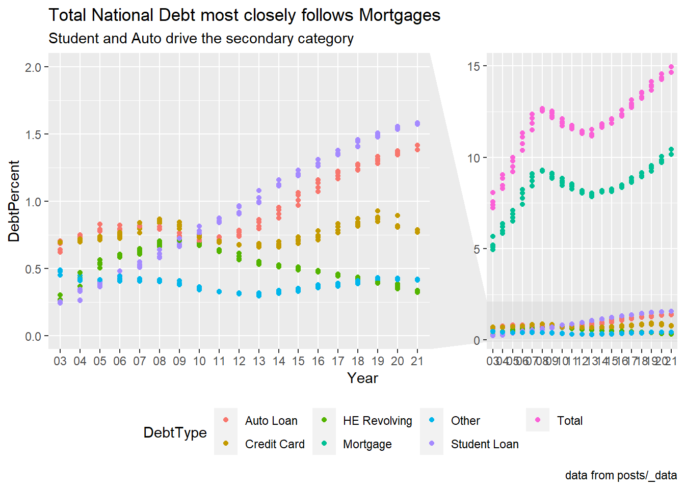
Third chart: This chart really doesn’t show anything and without the free scale on each axis it is tough to see any patterns. I wanted to experiment with some themese here and give this chart a title as well as adjust the axis so you can see how each type of debt flwos throughout the year.
longerSplitDataPlot+
  geom_point() +
  facet_wrap(~DebtType) +
  scale_x_discrete(breaks = c('03','06','09',12,15,18,21))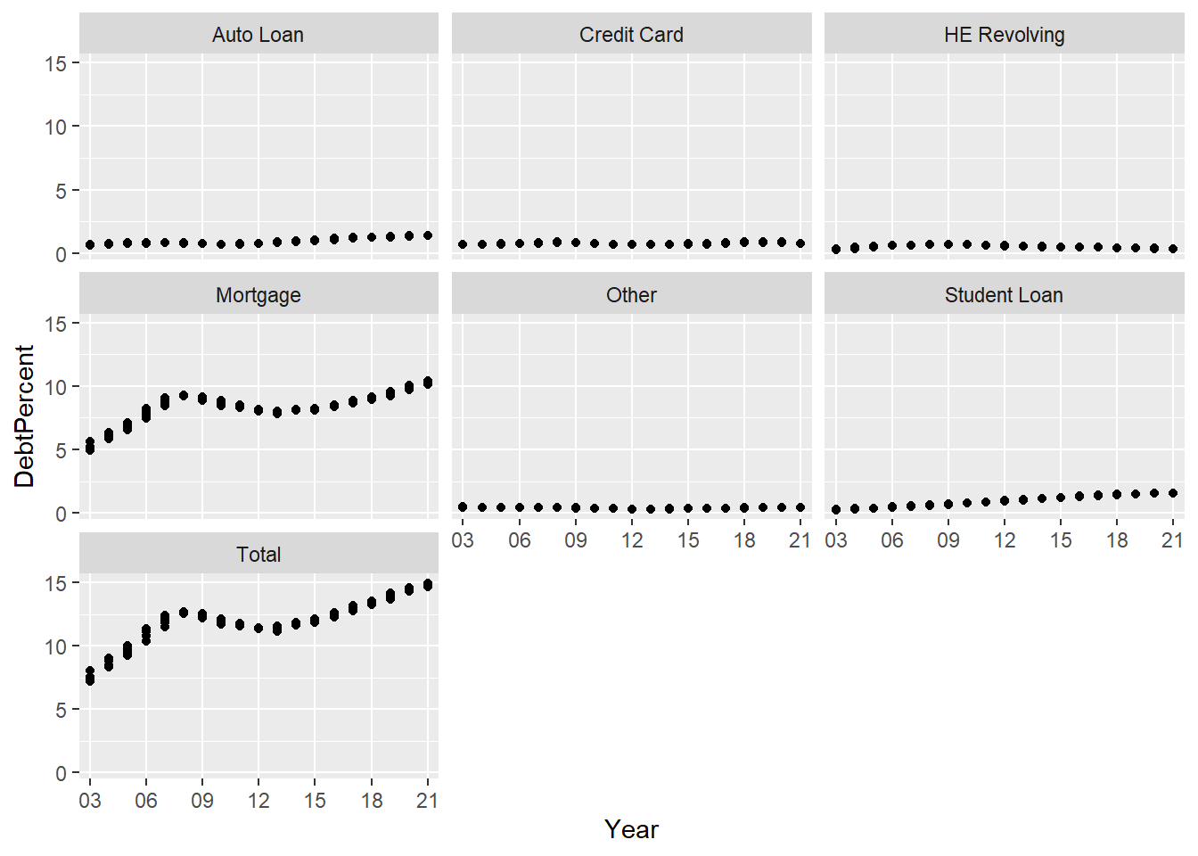
longerSplitDataPlot+
  geom_point(aes(color = Quarter,alpha=0.9,)) +
  facet_wrap(~DebtType,scales = "free_y") +
  scale_x_discrete(breaks = c('03','06','09',12,15,18,21))+
  theme_light() +
  guides(alpha="none") +
  labs(title = "Debt Types per year" ,caption = "data from posts/_data")