Challenge 7 Instructions
Challenge Overview
Today’s challenge is to:
- read in a data set, and describe the data set using both words and any supporting information (e.g., tables, etc)
- tidy data (as needed, including sanity checks)
- mutate variables as needed (including sanity checks)
- Recreate at least two graphs from previous exercises, but introduce at least one additional dimension that you omitted before using ggplot functionality (color, shape, line, facet, etc) The goal is not to create unneeded chart ink (Tufte), but to concisely capture variation in additional dimensions that were collapsed in your earlier 2 or 3 dimensional graphs.
- Explain why you choose the specific graph type
- If you haven’t tried in previous weeks, work this week to make your graphs “publication” ready with titles, captions, and pretty axis labels and other viewer-friendly features
R Graph Gallery is a good starting point for thinking about what information is conveyed in standard graph types, and includes example R code. And anyone not familiar with Edward Tufte should check out his fantastic books and courses on data visualizaton.
(be sure to only include the category tags for the data you use!)
Read in data
Briefly describe the data
The data seems to be describing egg sales for a given month and year. In this dataset, the month and year columns describe a case. In other words, each month and year combination are unique and thus form a primary key. Subsequent columns describe the number of sales for each egg and carton size category. The possible egg and carton size categories are listed below:
- large half dozen
- large dozen
- extra large half dozen
- extra large dozen
Upon inspection of the data set, it appears that the number of sales in each category are relatively small. In fact, the most amount of sales for a given egg and carton size was 290. This indicates that the data could be coming from a small grocery store or perhaps a small chain of stores. It seems unlikely that the data is from a large chain of stores.
Visualization with Multiple Dimensions
Investigating Egg Sales Versus Time
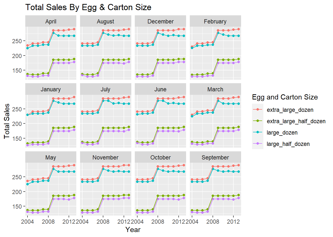
One way to visualize the data would be to look at the number of sales of each category across each year in the data set. Additionally, we can take this graph and use the facet wrap functionality to look at the number of sales in each month.
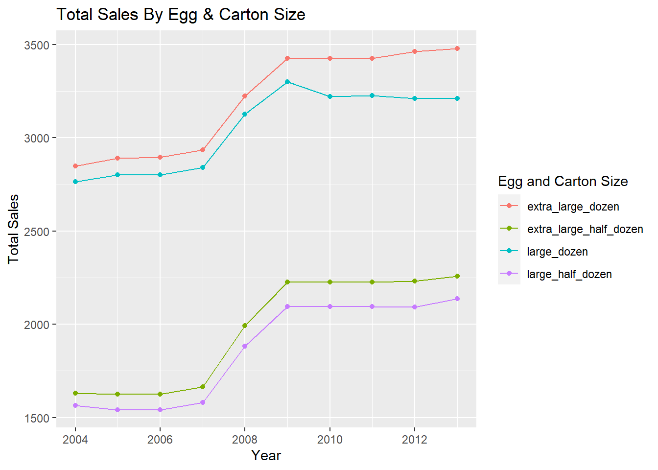
Although the data set is tidy, we will need to perform some transformations on it in order to make it easier to create the visualizations. First, we need to make the data set longer by collecting egg and carton size options into one column. From there, we can apply the necessary summary operations to create the plot. After the data has been summarized, it is just a matter of creating the correct ggplot command to make an organized visual of the data. I have performed these steps below and created two visuals that display the number of sales for each egg and carton category.
# Create column for egg carton type
df <- df %>%
      pivot_longer(cols = c(large_half_dozen,
                            large_dozen,
                            extra_large_half_dozen,
                            extra_large_dozen),
                   names_to = "type",
                   values_to = "sales")

# Display data to help show data transformation process
df
# Create a temp tibble that groups information by year, type, and month
# Summarize the number of sales and display new tibble
# Note: this will be used for the first visual
temp <- df %>%
group_by(year, type, month) %>%
summarise(total = sum(sales), .groups = "keep")
temp# Create another temp tibble that groups information by year and type
# Summarize the number of sales and display new tibble
# Note: this will be used for the second visual
tempPrime <- df %>%
group_by(year, type) %>%
summarise(total = sum(sales), .groups = "keep")
tempPrime# Create the first plot which shows total sales of each category across each month
ggplot(data = temp,
mapping = aes(x = year, y = total, color = type)) +
geom_point() +
geom_line() +
facet_wrap(vars(month)) +
labs(
x = "Year",
y = "Total Sales",
color = "Egg and Carton Size",
title = "Total Sales By Egg & Carton Size"
) +
scale_x_continuous(breaks = c(2004, 2008, 2012))
# Create the second plot which shows total sales of each category across each year
ggplot(data = tempPrime,
       mapping = aes(x = year, y = total, color = type)) +
  geom_point() +
  geom_line() +
  labs(
    x = "Year",
    y = "Total Sales",
    color = "Egg and Carton Size",
    title = "Total Sales By Egg & Carton Size"
  )
Investigating Total Egg Sales With Bar Charts
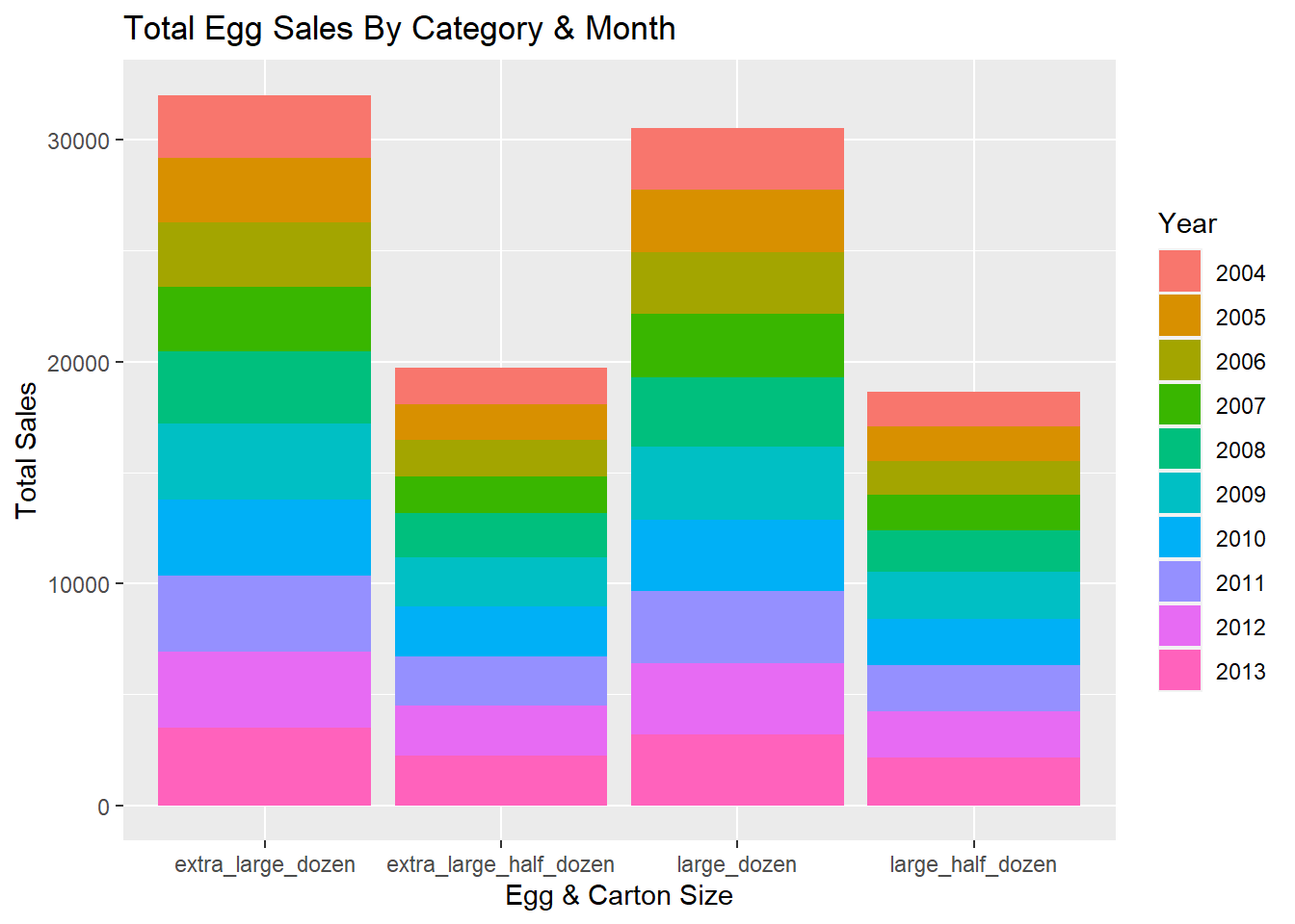
Another way we can visualize the data is with a bar graph. We can create a bar graph to display the total number of sales in each category throughout the data set. The bar graph has been generated below and the fill option has been specified so we can see how much each year contributes to the total.
# Group the type of carton and egg size by type, year and compute the total
categoryYear <- df %>%
  group_by(type, year) %>%
  summarise(total = sum(sales), .groups = "keep") %>%
  mutate(year = as.character(year))
categoryYear
# Generate the bar graph
ggplot(data = categoryYear, mapping = aes(x = type, y = total, fill = year)) +
geom_bar(stat = "identity", position = "stack") +
labs(
x = "Egg & Carton Size",
y = "Total Sales",
fill = "Year",
title = "Total Egg Sales By Category & Month"
)
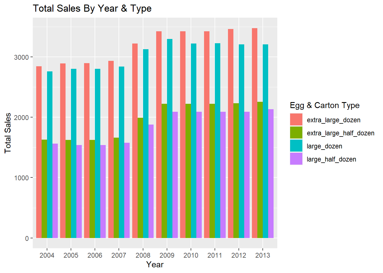
We might also be interested in the inverse of sorts. Suppose the x axis of the bar chart displayed the year and the y axis displayed the total number of sales. Additionally, suppose we had a bar for each egg and carton size option for each year. Such a graph would look like this.
# Convert year to character so it is treated as discrete variable
tempPrime <- tempPrime %>%
             mutate(year = as.character(year))

# Generate bar plot
ggplot(tempPrime, mapping = aes(x = year, y = total, fill = type)) +
  geom_bar(position = "dodge", stat = "identity") +
  labs(
    x = "Year",
    y = "Total Sales",
    fill = "Egg & Carton Type",
    title = "Total Sales By Year & Type"
  )