library(tidyverse)
library(ggplot2)
library(readxl)
library(lubridate)

knitr::opts_chunk$set(echo = TRUE, warning=FALSE, message=FALSE)
Challenge 7
Challenge Overview
Today’s challenge is to:
- read in a data set, and describe the data set using both words and any supporting information (e.g., tables, etc)
- tidy data (as needed, including sanity checks)
- mutate variables as needed (including sanity checks)
- Recreate at least two graphs from previous exercises, but introduce at least one additional dimension that you omitted before using ggplot functionality (color, shape, line, facet, etc) The goal is not to create unneeded chart ink (Tufte), but to concisely capture variation in additional dimensions that were collapsed in your earlier 2 or 3 dimensional graphs.
- Explain why you choose the specific graph type
- If you haven’t tried in previous weeks, work this week to make your graphs “publication” ready with titles, captions, and pretty axis labels and other viewer-friendly features
R Graph Gallery is a good starting point for thinking about what information is conveyed in standard graph types, and includes example R code. And anyone not familiar with Edward Tufte should check out his fantastic books and courses on data visualizaton.
(be sure to only include the category tags for the data you use!)
Read in data
Read in one (or more) of the following datasets, using the correct R package and command.
- eggs ⭐
- abc_poll ⭐⭐
- australian_marriage ⭐⭐
- hotel_bookings ⭐⭐⭐
- air_bnb ⭐⭐⭐
- us_hh ⭐⭐⭐⭐
- faostat ⭐⭐⭐⭐⭐
eggs_orig <- read_xls("_data/organiceggpoultry.xls",
                 skip = 5,
                 col_names = c("month_year", "egg-xl_12", "egg-xl_6", "egg-lg_12", "egg-lg_6", "delete", "chicken-whole", "chicken-boneless_breast",  "chicken-bone_in_breast", "chicken-legs", "chicken-thighs"),
                 na = c("too few")) %>%
  mutate(delete = NULL,
         month_year = str_remove(month_year, " /1")) %>%
  separate(col = month_year,
           into = c("month", "year")) %>%
  fill(year)
Briefly describe the data
I went pretty in depth with my visualizations from the first two weeks so I wanted to see what I could do with a different dataset and practice generating new charts.
This is data about egg and chicken prices. The column names were stored across multiple rows and so I renamed them upon import and deleted the empty column between the egg prices and the chicken prices. I also set the NA variable which was stored in this data as “too few.”
I also had to split the Month_Year column into two and fill the year down so that there is a year in every row. There were actually some “/1” after the months so I removed those from the data to fill the year down accurately. If the unique case is the “price”, I will have to pivot the data to be much longer with the new variables being the product. Since there are two major categories of project, I will split this into columns, product category (egg, chicken) and product type (size eggs, dozen or half dozen, parts of the chicken).
Tidy Data (as needed)
Is your data already tidy, or is there work to be done? Be sure to anticipate your end result to provide a sanity check, and document your work here.
eggs_longer <- eggs_orig %>%
  pivot_longer(cols = c(`egg-xl_12`:`chicken-thighs`),
               names_to = c("product_type","product_size"),
               names_sep = "-",
               values_to = "price",
               values_drop_na = TRUE) %>%
  mutate("price_unit" = case_when(product_type == "egg" ~ "per egg",
                                  product_type == "chicken" ~ "per oz"),
         price = case_when(product_type == "chicken" ~ (price/16/100),
                           str_detect(product_size, "6") ~ (price/100/6),
                           str_detect(product_size, "12") ~ (price/100/12)),
         "date" = my(paste(`month`,`year`,sep = " ")))
I pivoted the data longer to differentiate between product type and product size, dropping the NA rows. I also designated a unit for the price and calculated chicken price by the ounce and egg prices by the egg. I also made the month and year into a date column.
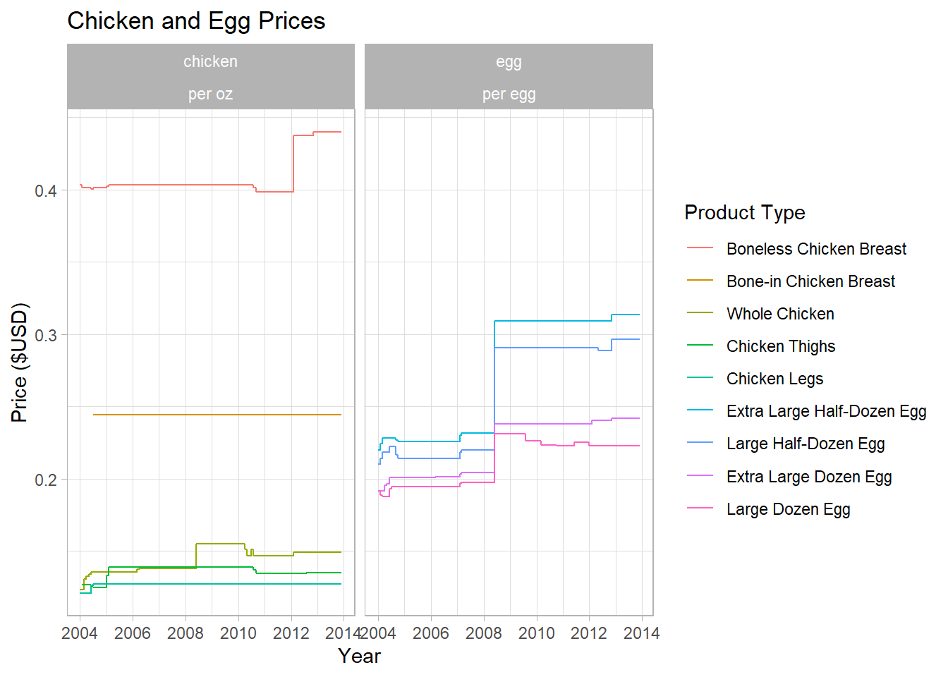
graph1 <- eggs_longer %>%
  mutate(product_size = as_factor(product_size),
         product_size = fct_relevel(product_size, levels = c("boneless_breast", "bone_in_breast", "whole", "thighs", "legs", "xl_6", "lg_6", "xl_12", "lg_12"))) %>%
  ggplot(., aes(x = date, y = price, color = product_size)) +
  geom_step() +
  theme_light() +
  facet_wrap(vars(product_type, price_unit)) +
  scale_color_discrete(name="Product Type", labels=c("Boneless Chicken Breast", "Bone-in Chicken Breast", "Whole Chicken", "Chicken Thighs", "Chicken Legs", "Extra Large Half-Dozen Egg", "Large Half-Dozen Egg", "Extra Large Dozen Egg", "Large Dozen Egg")) +
  labs(title = "Chicken and Egg Prices", x = "Year", y = "Price ($USD)")


graph1
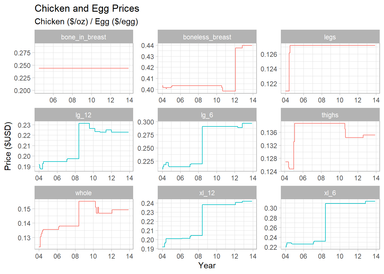
I wanted to look at a comparison of chicken and egg prices over the same time period. They are different units so they need to be on different graphs here. Some of the variations are pretty small so perhaps I would want to look at the trends of each product:
ggplot(eggs_longer, aes(x = date, y = price, color = product_type)) +
  geom_step() +
  theme_light() +
  guides(color = "none") +
  facet_wrap(vars(product_size), scales = "free") +
  labs(title = "Chicken and Egg Prices", subtitle = "Chicken ($/oz) / Egg ($/egg)", x= "Year", y = "Price ($USD)") +
  scale_x_date(date_labels = "%y")
This shows that there is some larger relative variation. It is weird how the boneless chicken price hasn’t changed at all!
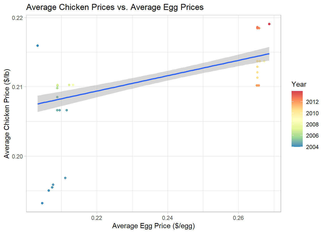
eggs_v_chicken <- eggs_longer %>%
  group_by(product_type, date) %>%
  summarize("avg_price" = mean(price)) %>%
  pivot_wider(names_from = product_type,
              values_from = avg_price)

ggplot(eggs_v_chicken, aes(x = egg, y = chicken, color = `date`)) +
  geom_point() +
  geom_smooth(method=lm) +
  labs(title = "Average Chicken Prices vs. Average Egg Prices",
       x = "Average Egg Price ($/egg)",
       y = "Average Chicken Price ($/lb)") +
  theme_light() +
  scale_color_distiller(palette = "Spectral", name = "Year", trans = "date")
I was trying to see if I could graph the average price of eggs vs the average price of chicken over time. I grouped by product type (chicken or egg) and date, took the mean of the prices of these groups, then pivoted wider to get a related chicken and egg price. Based on the previous graphs, I was unsurprised there was a weak relationship at best, but it is surprising to think that there is such little relationship between the price of eggs and of chicken since they probably have many overlapping price factors. It’s kind of a weird graph but I learned a lot!