library(tidyverse)
library(ggplot2)

knitr::opts_chunk$set(echo = TRUE, warning=FALSE, message=FALSE)
Challenge 7 Instructions
challenge_7
hotel_bookings
australian_marriage
air_bnb
eggs
abc_poll
faostat
usa_households
Visualizing Multiple Dimensions
Challenge Overview
Today’s challenge is to:
- read in a data set, and describe the data set using both words and any supporting information (e.g., tables, etc)
- tidy data (as needed, including sanity checks)
- mutate variables as needed (including sanity checks)
- Recreate at least two graphs from previous exercises, but introduce at least one additional dimension that you omitted before using ggplot functionality (color, shape, line, facet, etc) The goal is not to create unneeded chart ink (Tufte), but to concisely capture variation in additional dimensions that were collapsed in your earlier 2 or 3 dimensional graphs.
- Explain why you choose the specific graph type
- If you haven’t tried in previous weeks, work this week to make your graphs “publication” ready with titles, captions, and pretty axis labels and other viewer-friendly features
R Graph Gallery is a good starting point for thinking about what information is conveyed in standard graph types, and includes example R code. And anyone not familiar with Edward Tufte should check out his fantastic books and courses on data visualizaton.
(be sure to only include the category tags for the data you use!)
Read in data
Read in one (or more) of the following datasets, using the correct R package and command.
- eggs ⭐
- abc_poll ⭐⭐
- australian_marriage ⭐⭐
- hotel_bookings ⭐⭐⭐
- air_bnb ⭐⭐⭐
- us_hh ⭐⭐⭐⭐
- faostat ⭐⭐⭐⭐⭐
# Read data into a dataframe
data <- read_csv("_data/eggs_tidy.csv")

head(data)
# A tibble: 6 × 6
month year large_half_dozen large_dozen extra_large_half_dozen extra_lar…¹
<chr> <dbl> <dbl> <dbl> <dbl> <dbl>
1 January 2004 126 230 132 230
2 February 2004 128. 226. 134. 230
3 March 2004 131 225 137 230
4 April 2004 131 225 137 234.
5 May 2004 131 225 137 236
6 June 2004 134. 231. 137 241
# … with abbreviated variable name ¹extra_large_dozenBriefly describe the data
The data looks to be describing the sales of different egg carton types for each month and year. Every case is uniquely identified by a year and month combination.
Tidy Data (as needed)
Is your data already tidy, or is there work to be done? Be sure to anticipate your end result to provide a sanity check, and document your work here.
col_names = names(data)
col_names <- col_names[!col_names %in% c("year","month")]
col_names
[1] "large_half_dozen" "large_dozen" "extra_large_half_dozen"
[4] "extra_large_dozen" # Group the data by year to get total sales per year
data <- data %>%
pivot_longer(data, cols=col_names,
names_to = "carton_type",
values_to = "sales")
head(data)# A tibble: 6 × 4
month year carton_type sales
<chr> <dbl> <chr> <dbl>
1 January 2004 large_half_dozen 126
2 January 2004 large_dozen 230
3 January 2004 extra_large_half_dozen 132
4 January 2004 extra_large_dozen 230
5 February 2004 large_half_dozen 128.
6 February 2004 large_dozen 226.grouped_data <- data %>%
group_by(year) %>%
summarise(
total_sales = sum(sales)
)
grouped_data# A tibble: 10 × 2
year total_sales
<dbl> <dbl>
1 2004 8805.
2 2005 8862
3 2006 8867.
4 2007 9018.
5 2008 10226
6 2009 11046
7 2010 10968.
8 2011 10974.
9 2012 10997.
10 2013 11084.I pivoted the data, so that each case represents the month, year, egg carton type and the corresponding sales of that carton type. This representation would make further analysis and groupings much easier.
Are there any variables that require mutation to be usable in your analysis stream? For example, do you need to calculate new values in order to graph them? Can string values be represented numerically? Do you need to turn any variables into factors and reorder for ease of graphics and visualization?
Document your work here.
Visualization with Multiple Dimensions
# Simple line plot of sales made across the years
ggplot(grouped_data, aes(x=year, y=total_sales)) +
  geom_line()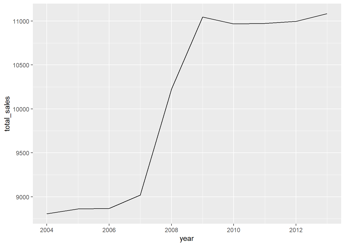
# Group the data by year and carton type, to get total sales
grouped_data_by_y <- data %>%
  group_by(year, carton_type) %>%
  summarise(
    total_sales = sum(sales)
  )

grouped_data_by_y
# A tibble: 40 × 3
# Groups: year [10]
year carton_type total_sales
<dbl> <chr> <dbl>
1 2004 extra_large_dozen 2848.
2 2004 extra_large_half_dozen 1631.
3 2004 large_dozen 2764.
4 2004 large_half_dozen 1563.
5 2005 extra_large_dozen 2892
6 2005 extra_large_half_dozen 1626
7 2005 large_dozen 2802
8 2005 large_half_dozen 1542
9 2006 extra_large_dozen 2897.
10 2006 extra_large_half_dozen 1626
# … with 30 more rows# Graph of data grouped by year and carton type, for total sales
ggplot(data=grouped_data_by_y,
aes(x=year, y=total_sales, color= carton_type)) +
geom_line() +
geom_point() +
labs(
x = "Year",
y = "Total Sales",
color = "Carton Type",
title = "Total Sales By Carton Type Across Years"
) +
guides(color = guide_legend(title="Carton Type"))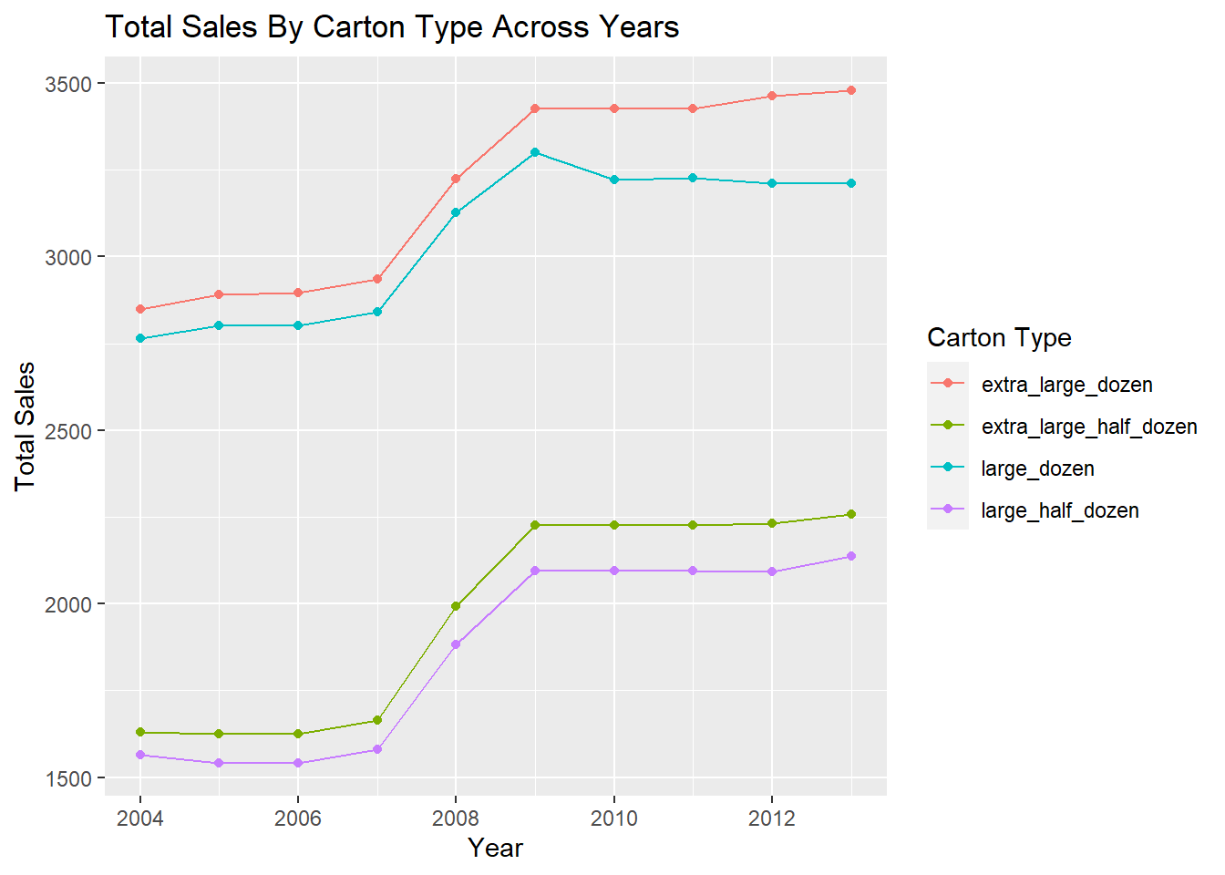
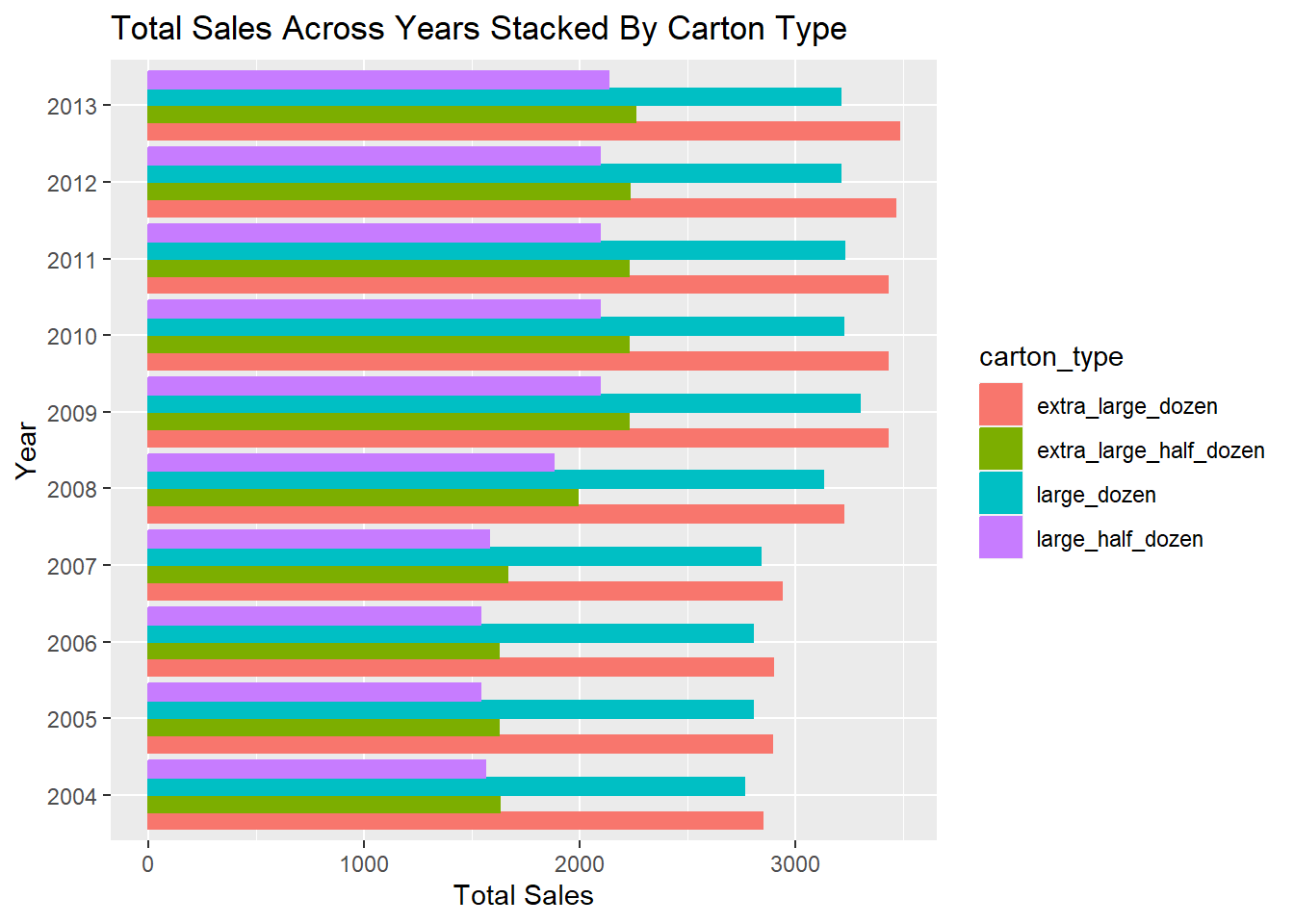
# Convert year to category type to create a horizontal stacked bar chart
year_to_cat <- grouped_data_by_y %>%
  mutate(year=as.character(year))

ggplot(year_to_cat, aes(x = total_sales, y = year)) +
  geom_bar(
    aes(color = carton_type, fill = carton_type),
    stat = "identity", position = "dodge"
    ) +
  labs(
    x = "Total Sales",
    y = "Year",
    title = "Total Sales Across Years Stacked By Carton Type"
  )