library(tidyverse)
library(ggplot2)
library(ggforce)
library(plotly)
library(readxl)

knitr::opts_chunk$set(echo = TRUE, warning=FALSE, message=FALSE)
Challenge 7
Challenge Overview
Today’s challenge is to:
- read in a data set, and describe the data set using both words and any supporting information (e.g., tables, etc)
- tidy data (as needed, including sanity checks)
- mutate variables as needed (including sanity checks)
- Recreate at least two graphs from previous exercises, but introduce at least one additional dimension that you omitted before using ggplot functionality (color, shape, line, facet, etc) The goal is not to create unneeded chart ink (Tufte), but to concisely capture variation in additional dimensions that were collapsed in your earlier 2 or 3 dimensional graphs.
- Explain why you choose the specific graph type
- If you haven’t tried in previous weeks, work this week to make your graphs “publication” ready with titles, captions, and pretty axis labels and other viewer-friendly features
R Graph Gallery is a good starting point for thinking about what information is conveyed in standard graph types, and includes example R code. And anyone not familiar with Edward Tufte should check out his fantastic books and courses on data visualizaton.
(be sure to only include the category tags for the data you use!)
Read in data
Read in one (or more) of the following datasets, using the correct R package and command.
- eggs ⭐
- abc_poll ⭐⭐
- australian_marriage ⭐⭐
- hotel_bookings ⭐⭐⭐
- air_bnb ⭐⭐⭐
- us_hh ⭐⭐⭐⭐
- faostat ⭐⭐⭐⭐⭐
I’m using the debt dataset. It is not listed in the above but I used it for the last excercise, since I need to recreate atleast two of the graphs I’m using the same dataset.
data <- read_excel("_data/debt_in_trillions.xlsx")
head(data)
# A tibble: 6 × 8
`Year and Quarter` Mortgage `HE Revolving` Auto …¹ Credi…² Stude…³ Other Total
<chr> <dbl> <dbl> <dbl> <dbl> <dbl> <dbl> <dbl>
1 03:Q1 4.94 0.242 0.641 0.688 0.241 0.478 7.23
2 03:Q2 5.08 0.26 0.622 0.693 0.243 0.486 7.38
3 03:Q3 5.18 0.269 0.684 0.693 0.249 0.477 7.56
4 03:Q4 5.66 0.302 0.704 0.698 0.253 0.449 8.07
5 04:Q1 5.84 0.328 0.72 0.695 0.260 0.446 8.29
6 04:Q2 5.97 0.367 0.743 0.697 0.263 0.423 8.46
# … with abbreviated variable names ¹`Auto Loan`, ²`Credit Card`,
# ³`Student Loan`Briefly describe the data
The information appears to be the total amount of debt that some countries’ residents, most likely those of the US have.
splitData<- data %>%
  separate(`Year and Quarter`,c('Year','Quarter'),sep = ":")
splitData
# A tibble: 74 × 9
Year Quarter Mortgage `HE Revolving` `Auto Loan` Credi…¹ Stude…² Other Total
<chr> <chr> <dbl> <dbl> <dbl> <dbl> <dbl> <dbl> <dbl>
1 03 Q1 4.94 0.242 0.641 0.688 0.241 0.478 7.23
2 03 Q2 5.08 0.26 0.622 0.693 0.243 0.486 7.38
3 03 Q3 5.18 0.269 0.684 0.693 0.249 0.477 7.56
4 03 Q4 5.66 0.302 0.704 0.698 0.253 0.449 8.07
5 04 Q1 5.84 0.328 0.72 0.695 0.260 0.446 8.29
6 04 Q2 5.97 0.367 0.743 0.697 0.263 0.423 8.46
7 04 Q3 6.21 0.426 0.751 0.706 0.33 0.41 8.83
8 04 Q4 6.36 0.468 0.728 0.717 0.346 0.423 9.04
9 05 Q1 6.51 0.502 0.725 0.71 0.364 0.394 9.21
10 05 Q2 6.70 0.528 0.774 0.717 0.374 0.402 9.49
# … with 64 more rows, and abbreviated variable names ¹`Credit Card`,
# ²`Student Loan`#pivoting the data
longerSplitData<- splitData%>%
pivot_longer(!c(Year,Quarter), names_to = "DebtType",values_to = "DebtPercent" )
longerSplitData# A tibble: 518 × 4
Year Quarter DebtType DebtPercent
<chr> <chr> <chr> <dbl>
1 03 Q1 Mortgage 4.94
2 03 Q1 HE Revolving 0.242
3 03 Q1 Auto Loan 0.641
4 03 Q1 Credit Card 0.688
5 03 Q1 Student Loan 0.241
6 03 Q1 Other 0.478
7 03 Q1 Total 7.23
8 03 Q2 Mortgage 5.08
9 03 Q2 HE Revolving 0.26
10 03 Q2 Auto Loan 0.622
# … with 508 more rowsVisualization with Multiple Dimensions
I wanted to work again on my second and third graphs from the previous assignment because, when I look back on them, I see that they are more exploratory graphs rather than necessarily “report ready” ones.
The below ones are the graphs generated in the last excercise.
longerSplitDataPlot <- longerSplitData%>%
  ggplot(mapping=aes(x = Year, y = DebtPercent))


longerSplitDataPlot +
  geom_point(aes(color = DebtType))
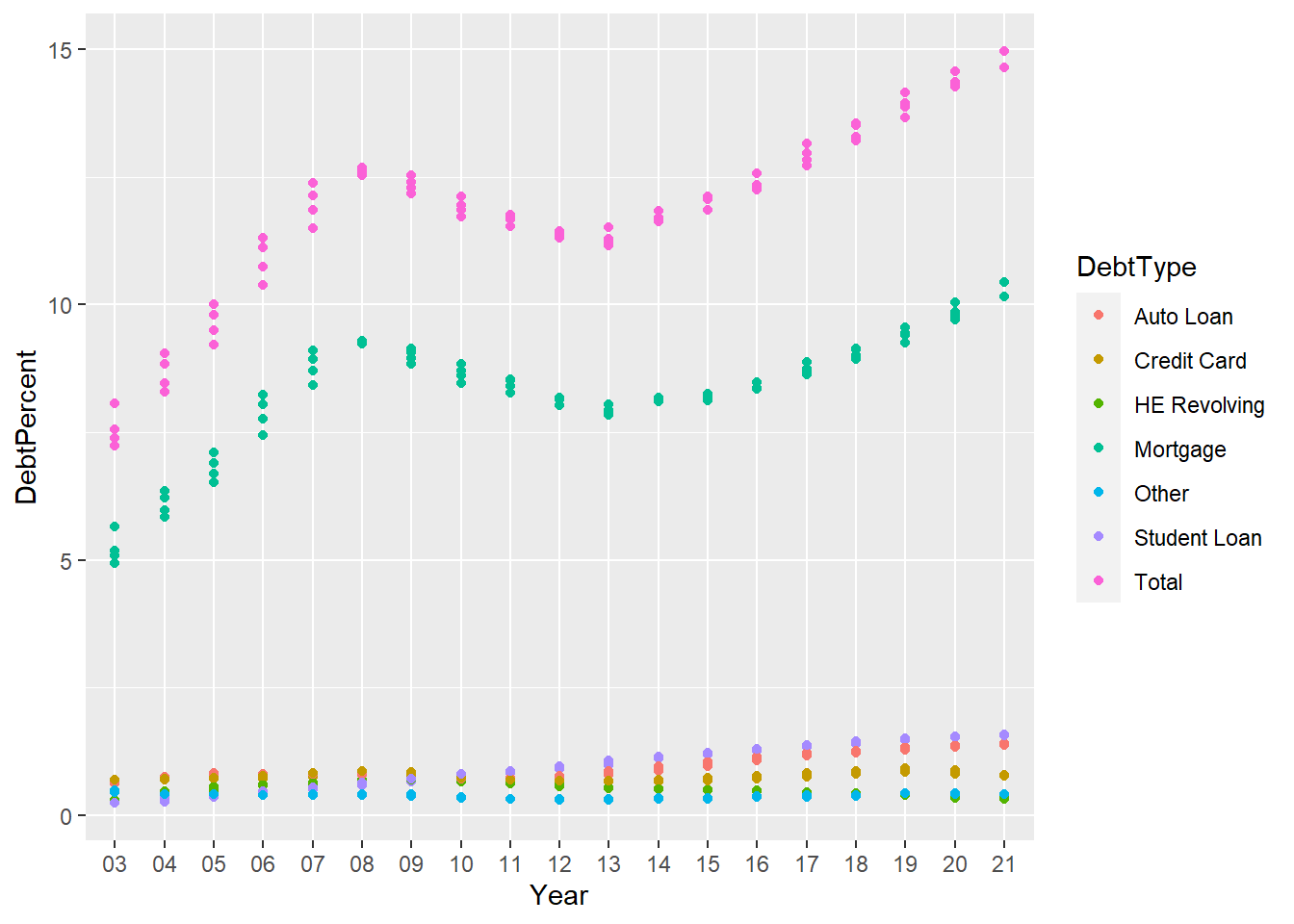
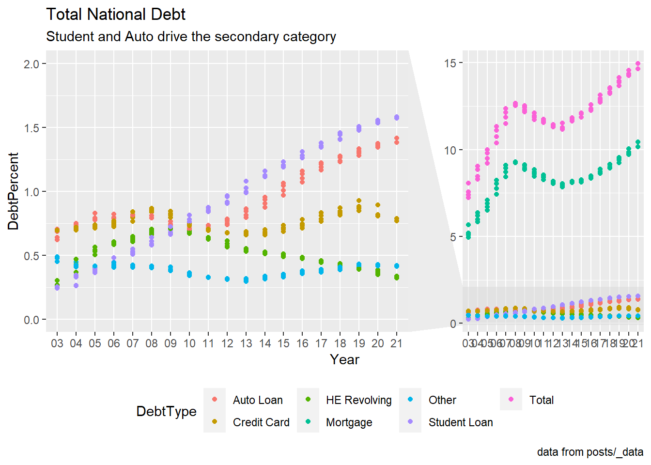
This graph’s goal was to display the various debt categories and how they changed over time. Though I had legend and some color most of the values are getting mixed. So I’m trying to improve this below.
longerSplitDataPlot +
  geom_point(aes(color = DebtType))+
  labs(title = "Total National Debt ",subtitle="Student and Auto drive the secondary category" ,caption = "data from posts/_data")+
  theme(legend.position = "bottom")+
  facet_zoom(y = DebtType == !c("Mortgage","Total"),ylim = c(0,2))
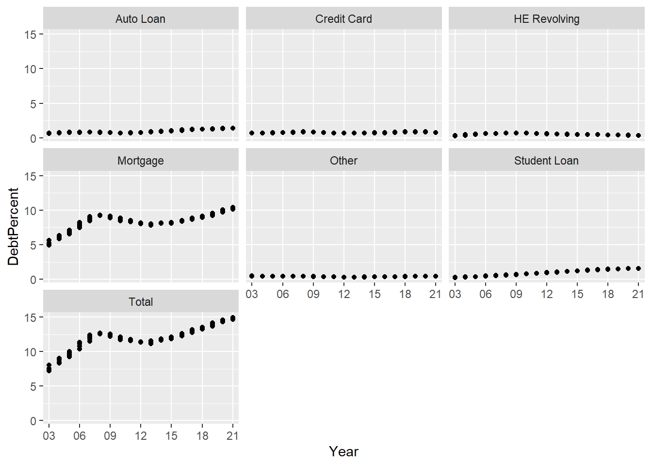
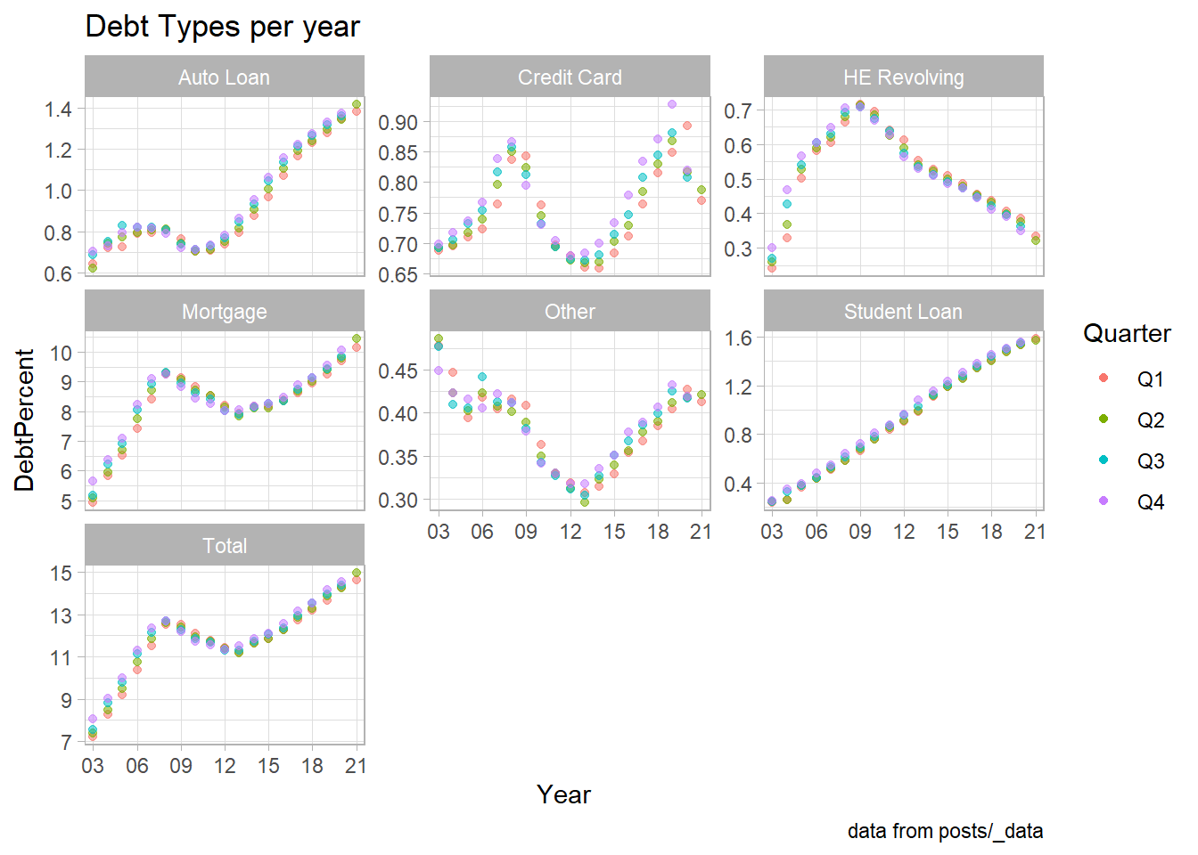
Without the free scale on each axis, this chart actually doesn’t reveal anything, and it is difficult to spot any trends. To observe how each form of debt changed throughout the course of the year, I wanted to try out some new themes here, give this chart a title, and change the axis.
longerSplitDataPlot+
  geom_point() +
  facet_wrap(~DebtType) +
  scale_x_discrete(breaks = c('03','06','09',12,15,18,21))
longerSplitDataPlot+
  geom_point(aes(color = Quarter,alpha=0.9,)) +
  facet_wrap(~DebtType,scales = "free_y") +
  scale_x_discrete(breaks = c('03','06','09',12,15,18,21))+
  theme_light() +
  guides(alpha="none") +
  labs(title = "Debt Types per year" ,caption = "data from posts/_data")