library(tidyverse)
library(ggplot2)

knitr::opts_chunk$set(echo = TRUE, warning=FALSE, message=FALSE)Challenge 8 - Abby Balint
challenge_8
abby_balint
faostat
Joining Data
Reading in the FAO data sets -
codes <- read_csv("_data/FAOSTAT_country_groups.csv")
cattle <- read_csv("_data/FAOSTAT_cattle_dairy.csv")
Briefly describe the data
The main dataset I am working with here is the FAO Stat Cattle dataset. This is publicly available food and agriculture data for over 245 countries in the world. This file in particular contains information about cow milk, with variables units sold and value of the product. The data begins in the 1960s and goes through 2018. This file contains over 36,000 rows of information.
The second file I will be joining in is a codebook that groups up the countries so that we don’t have to look at the data at such a granular, individual country level. My goal is to join in the country group variable to be able to perform analysis on these groups within the cattle/dairy dataset.
Tidy Data (as needed)
All rows have an “Area code” assigned to the country, and that is what I will be using to join in the country group variable. However, it is called “Country Code” in the country file, so I am renaming the variable to “Country Code” here as well.
cattlenew <- rename (cattle, "Country Code"= "Area Code" )
head(cattlenew)
# A tibble: 6 × 14
Domai…¹ Domain Count…² Area Eleme…³ Element Item …⁴ Item Year …⁵ Year Unit
<chr> <chr> <dbl> <chr> <dbl> <chr> <dbl> <chr> <dbl> <dbl> <chr>
1 QL Lives… 2 Afgh… 5318 Milk A… 882 Milk… 1961 1961 Head
2 QL Lives… 2 Afgh… 5420 Yield 882 Milk… 1961 1961 hg/An
3 QL Lives… 2 Afgh… 5510 Produc… 882 Milk… 1961 1961 tonn…
4 QL Lives… 2 Afgh… 5318 Milk A… 882 Milk… 1962 1962 Head
5 QL Lives… 2 Afgh… 5420 Yield 882 Milk… 1962 1962 hg/An
6 QL Lives… 2 Afgh… 5510 Produc… 882 Milk… 1962 1962 tonn…
# … with 3 more variables: Value <dbl>, Flag <chr>, `Flag Description` <chr>,
# and abbreviated variable names ¹`Domain Code`, ²`Country Code`,
# ³`Element Code`, ⁴`Item Code`, ⁵`Year Code`Join Data
Here I am joining the two files with a left join based on Country Code.
cattlefinal <- left_join(cattlenew, codes, by = "Country Code" )
head(cattlefinal)
# A tibble: 6 × 20
Domai…¹ Domain Count…² Area Eleme…³ Element Item …⁴ Item Year …⁵ Year Unit
<chr> <chr> <dbl> <chr> <dbl> <chr> <dbl> <chr> <dbl> <dbl> <chr>
1 QL Lives… 2 Afgh… 5318 Milk A… 882 Milk… 1961 1961 Head
2 QL Lives… 2 Afgh… 5318 Milk A… 882 Milk… 1961 1961 Head
3 QL Lives… 2 Afgh… 5318 Milk A… 882 Milk… 1961 1961 Head
4 QL Lives… 2 Afgh… 5318 Milk A… 882 Milk… 1961 1961 Head
5 QL Lives… 2 Afgh… 5318 Milk A… 882 Milk… 1961 1961 Head
6 QL Lives… 2 Afgh… 5318 Milk A… 882 Milk… 1961 1961 Head
# … with 9 more variables: Value <dbl>, Flag <chr>, `Flag Description` <chr>,
# `Country Group Code` <dbl>, `Country Group` <chr>, Country <chr>,
# `M49 Code` <chr>, `ISO2 Code` <chr>, `ISO3 Code` <chr>, and abbreviated
# variable names ¹`Domain Code`, ²`Country Code`, ³`Element Code`,
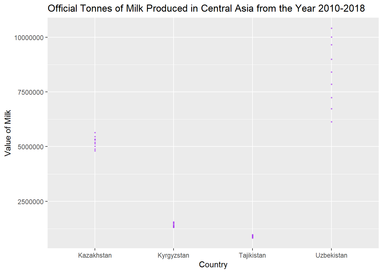
# ⁴`Item Code`, ⁵`Year Code`Now that my data is joined, if I wanted to graph certain country groups I would now be able to, like in the below.
cattlefinal %>%
  filter(Year >= 2010) %>%
  filter(`Flag Description` == "Official data") %>%
  filter(`Country Group`=="Central Asia") %>%
  filter(`Unit` == "tonnes") %>%
  ggplot(aes(x=`Area`, y=`Value`)) +
  geom_point(
    color="purple",
    fill="#69b3a2",
    size=.5,
    alpha=.5
  )+
  labs(title = "Official Tonnes of Milk Produced in Central Asia from the Year 2010-2018", x="Country", y="Value of Milk") +
  scale_y_continuous(labels = function(x) format(x, scientific = FALSE))