Code
# Import important libraries needed for functions
library(tidyverse)
library(rmarkdown)
library(summarytools)
library(dplyr)
library(formattable)

knitr::opts_chunk$set(echo = TRUE, warning=FALSE, message=FALSE)# Import important libraries needed for functions
library(tidyverse)
library(rmarkdown)
library(summarytools)
library(dplyr)
library(formattable)
knitr::opts_chunk$set(echo = TRUE, warning=FALSE, message=FALSE)One of the biggest challenges faced by people today are the layoffs going on across the globe. The layoffs are affecting not just a single country or industry but almost all of them. The dataset used here contains almost 1700 rows detailing the layoffs with the following columns of note :-
Some of the possible research questions that come up when we look at this dataset are :-
We are going to read the csv and put it into a dataframe. There are two columns that are there in the dataset we do not need for our analysis. These are Source (the source of the lay off information) and List_of_Employees_Laid_Off. Hence, after reading in the data, we ignore these two columns from our dataframe before continuing analysis on it.
# Read data from the csv file
data <- read.csv('_data/Dataset_detailing_layoffs.csv')

# Remove unnecessary columns
data <- subset(data, select = -c(Source, List_of_Employees_Laid_Off))

# Printing the read data as a paged table
paged_table(data)
We can see all the data in the paged table above. We are going to group this data by certain column values to give us better insight on the layoff patterns that are currently trending.
First step is going to be printing and anlyzing the summary of the complete dataset to give us an idea how to approach it.
# Get and print summary of the dataset to help us analyze it.
print(dfSummary(data))
Data Frame Summary
data
Dimensions: 1696 x 10
Duplicates: 0
-------------------------------------------------------------------------------------------------------------------
No Variable Stats / Values Freqs (% of Valid) Graph Valid Missing
---- ---------------- ---------------------------- --------------------- --------------------- ---------- ---------
1 Company 1. Uber 5 ( 0.3%) 1696 0
[character] 2. Better.com 4 ( 0.2%) (100.0%) (0.0%)
3. DataRobot 4 ( 0.2%)
4. Gopuff 4 ( 0.2%)
5. Latch 4 ( 0.2%)
6. Loft 4 ( 0.2%)
7. Netflix 4 ( 0.2%)
8. OYO 4 ( 0.2%)
9. Patreon 4 ( 0.2%)
10. Shopify 4 ( 0.2%)
[ 1411 others ] 1655 (97.6%) IIIIIIIIIIIIIIIIIII
2 Location 1. SF Bay Area 452 (26.7%) IIIII 1696 0
[character] 2. New York City 193 (11.4%) II (100.0%) (0.0%)
3. Boston 74 ( 4.4%)
4. Los Angeles 72 ( 4.2%)
5. Seattle 60 ( 3.5%)
6. Bengaluru 54 ( 3.2%)
7. London 51 ( 3.0%)
8. Toronto 46 ( 2.7%)
9. Sao Paulo 42 ( 2.5%)
10. Berlin 41 ( 2.4%)
[ 151 others ] 611 (36.0%) IIIIIII
3 Industry 1. Finance 208 (12.3%) II 1696 0
[character] 2. Retail 141 ( 8.3%) I (100.0%) (0.0%)
3. Healthcare 122 ( 7.2%) I
4. Transportation 108 ( 6.4%) I
5. Food 107 ( 6.3%) I
6. Marketing 106 ( 6.2%) I
7. Real Estate 99 ( 5.8%) I
8. Consumer 81 ( 4.8%)
9. Media 75 ( 4.4%)
10. Other 74 ( 4.4%)
[ 18 others ] 575 (33.9%) IIIIII
4 Laid_Off_Count Mean (sd) : 197.2 (572.9) 229 distinct values : 1197 499
[integer] min < med < max: : (70.6%) (29.4%)
3 < 70 < 11000 :
IQR (CV) : 119 (2.9) :
:
5 Percentage Mean (sd) : 0.3 (0.3) 69 distinct values : : 1137 559
[numeric] min < med < max: : : (67.0%) (33.0%)
0 < 0.2 < 1 : : .
IQR (CV) : 0.2 (1) : : : . .
: : : : : :
6 Date 1. 2020-04-02 27 ( 1.6%) 1696 0
[character] 2. 2020-04-03 25 ( 1.5%) (100.0%) (0.0%)
3. 2020-03-27 23 ( 1.4%)
4. 2020-04-01 21 ( 1.2%)
5. 2020-04-08 21 ( 1.2%)
6. 2022-11-15 20 ( 1.2%)
7. 2022-08-09 17 ( 1.0%)
8. 2020-03-31 16 ( 0.9%)
9. 2022-06-29 16 ( 0.9%)
10. 2020-04-07 15 ( 0.9%)
[ 390 others ] 1495 (88.1%) IIIIIIIIIIIIIIIII
7 Funds_Raised Mean (sd) : 877.5 (6450.5) 549 distinct values : 1575 121
[numeric] min < med < max: : (92.9%) (7.1%)
0 < 132 < 121900 :
IQR (CV) : 336.5 (7.4) :
:
8 Stage 1. Unknown 292 (17.2%) III 1696 0
[character] 2. Series B 239 (14.1%) II (100.0%) (0.0%)
3. Series C 235 (13.9%) II
4. IPO 232 (13.7%) II
5. Series D 180 (10.6%) II
6. Series A 141 ( 8.3%) I
7. Acquired 117 ( 6.9%) I
8. Series E 90 ( 5.3%) I
9. Seed 58 ( 3.4%)
10. Series F 41 ( 2.4%)
[ 5 others ] 71 ( 4.2%)
9 Date_Added 1. 2020-03-28 20:52:49 40 ( 2.4%) 1696 0
[character] 2. 2020-03-29 22:30:11 1 ( 0.1%) (100.0%) (0.0%)
3. 2020-03-29 22:30:34 1 ( 0.1%)
4. 2020-03-29 22:31:11 1 ( 0.1%)
5. 2020-03-29 22:31:33 1 ( 0.1%)
6. 2020-03-29 22:31:57 1 ( 0.1%)
7. 2020-03-29 22:32:22 1 ( 0.1%)
8. 2020-03-29 23:31:27 1 ( 0.1%)
9. 2020-03-30 13:58:13 1 ( 0.1%)
10. 2020-03-30 13:59:33 1 ( 0.1%)
[ 1647 others ] 1647 (97.1%) IIIIIIIIIIIIIIIIIII
10 Country 1. United States 1119 (66.0%) IIIIIIIIIIIII 1696 0
[character] 2. India 104 ( 6.1%) I (100.0%) (0.0%)
3. Canada 77 ( 4.5%)
4. Brazil 54 ( 3.2%)
5. United Kingdom 52 ( 3.1%)
6. Germany 48 ( 2.8%)
7. Israel 37 ( 2.2%)
8. Australia 32 ( 1.9%)
9. Singapore 24 ( 1.4%)
10. Indonesia 20 ( 1.2%)
[ 45 others ] 129 ( 7.6%) I
-------------------------------------------------------------------------------------------------------------------We can see that there are more than 1400 companies data, 161 cities in 55 countries and affecting 28 industries. Thus we cannot analyze each and every value of each and every column since the dataset is quite large. We will only be analyzing the ones that have been impacted the most since it would not give us in-depth insight we need if we consider all the values of such a large datasets. Reducing the number of values also produce better and more insightful visualizations.
Let us start with the most critical analysis, which countries have been impacted the most by this layoff trend.
# Group dataset by Country, ignoring values that have country as NA
dataGroupedByCountry <- data %>%
  group_by(Country) %>%
  filter(!is.na(Country))

# Analyze the grouped data by finding the total laid off count per country
dataGroupedByCountry <- dataGroupedByCountry %>%
  summarise(
    Total_Laid_Off = sum(Laid_Off_Count, na.rm = TRUE)
  ) %>%
  arrange(Country)
paged_table(dataGroupedByCountry)
Though we get an idea on the number of layoffs in each country, we do not get any real comparison just from the table. We need visualizations to be able to better compare and analyze the data we see in this table.
dataGroupedByCountry %>%
  top_n(20) %>%
  ggplot(aes(y=Country, x=Total_Laid_Off, fill = Country)) +
      geom_col() +
      theme(axis.text.x=element_text(size=20, angle=30, hjust=1),
            axis.title.x = element_text(size=20),
            axis.text.y=element_text(size=20),
            axis.title.y = element_text(size=20)) +
       labs(title = "Layoffs by Country 2022",
            x = "Country",
            y = "Laid off count")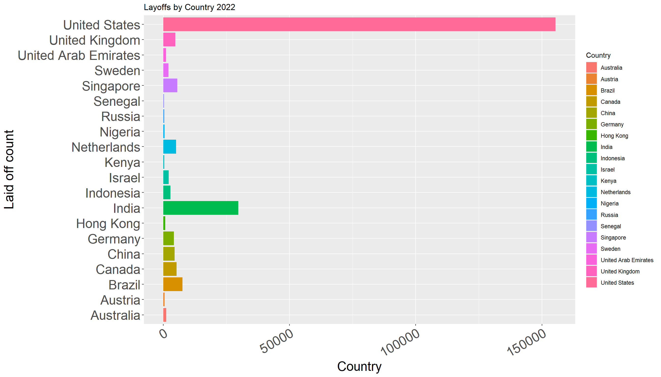
This graph helps us gain perspective of layoffs in the highest 20 countries. As can be seen from the bar chart, the United States has the highest layoff count with more than 150000 layoffs. None of the other countries has such a significant number of layoffs. The second highest is India with around 30000 layoffs.
The above visualization gives us an idea in count, now we should consider percentages and composition.
dataGroupedByCountryPercentage <- dataGroupedByCountry %>%
  mutate(across(where(is.numeric), ~ formattable::percent(./sum(.)))) %>%
  arrange(desc(Total_Laid_Off)) %>%
  top_n(20)

ggplot(dataGroupedByCountryPercentage, aes(x="", y=Total_Laid_Off, fill=Country)) +
  geom_bar(stat="identity", width=1, color="white") +
  coord_polar("y", start=0)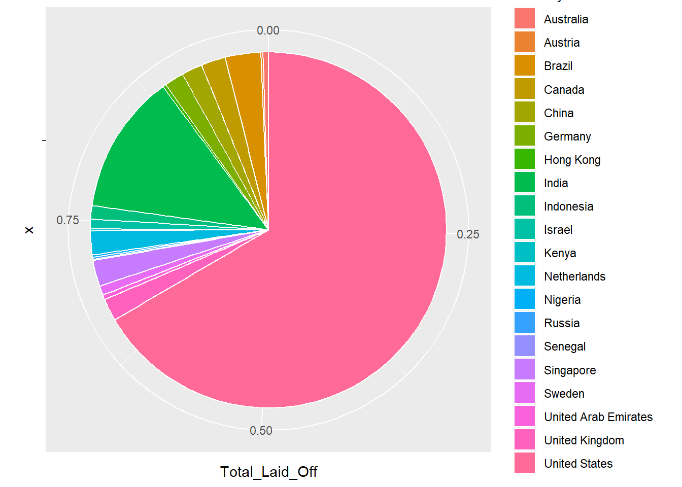
The above pie chart gives us the distribution of layoffs taking place across the top 20 countries. United States constitutes almost 65% of the total layoffs all across the world.
Now we look at the distribution of layoffs among the funding stage in each of the top 20 countries.
dataTop20Countries <- data[data$Country %in% dataGroupedByCountryPercentage$Country,]

dataTop20Countries %>%
  ggplot(aes(fill=Stage, y=Country, x=Laid_Off_Count)) +
      geom_bar(position="stack", stat="identity")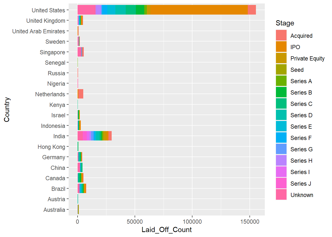
As can be seen from the graph, companies at the funding stage of IPO have one of the highest layoffs count.
I believe the current analysis and visualizations have the following limitations :-