DACSS 601: Data Science Fundamentals - FALL 2022
  • Fall 2022 Posts
  • Contributors
  • DACSS

Homework 3 - Samplepalooza

  • Course information
    • Overview
    • Instructional Team
    • Course Schedule
  • Weekly materials
    • Fall 2022 posts
    • final posts

On this page

  • Reading in the Data & Narrative
  • Tidying the data
  • Exploratory Analysis
    • Removing Outliers
  • Data Visualization
  • Mapping Practice
  • Limitations
  • Full Dataset

Homework 3 - Samplepalooza

  • Show All Code
  • Hide All Code

  • View Source
hw3
ryan_odonnell
waterquality
samplepalooza
Author

Ryan O’Donnell

Published

November 16, 2022

Code
library(tidyverse)
library(readxl)
library(lubridate)
library(maps)

knitr::opts_chunk$set(echo = TRUE)

Reading in the Data & Narrative

Code
splza_orig <- read_xlsx("_data/14_21SamplepaloozaResults.xlsx",
                        skip = 2,
                        col_names = c("SiteName", "SiteID", "SiteType", "State", "EcoRegion", "2014-TN", "2015-TN", "2018-TN", "2019-TN", "2020-TN", "2021-TN", "2014-TP", "2015-TP", "2018-TP", "2019-TP", "2020-TP", "2021-TP", "2014-Cl", "2015-Cl", "2020-Cl", "2021-Cl", "Date2021","Lat", "Lon"))

This data is from my work in water quality monitoring. Samplepalooza is an annual-ish, one-day monitoring event where both volunteers and professionals collect water samples throughout the Connecticut River watershed, which encompasses parts of Vermont, New Hampshire, Massachusetts, and Connecticut, from the Canadian border down to Long Island Sound. It has occurred in 2014-2015 and 2018-2021. It is typically done on a single day, but in 2021, severe weather caused some sites to be sampled on one day and the rest on another day. Not all sites were sampled for all years. Sites were always sampled for two parameters: total nitrogen (TN) and total phosphorus (TP); some years they were also sampled for chloride (Cl).

Tidying the data

Code
# step 1 - recode chloride data 
# step 2 - convert column types
# step 3 - pivot data and relocate new columns
# step 4 - add sample date and result unit columns
# step 5 - remove 2021Date column

splza_tidy <- splza_orig %>%
  mutate(`2014-Cl` = recode(`2014-Cl`, "<3" = "1.5", "< 3" = "1.5"),
         `2015-Cl` = recode(`2015-Cl`, "<3" = "1.5", "< 3" = "1.5"),
         `2021-Cl` = recode(`2021-Cl`, "<3" = "1.5", "< 3" = "1.5"),
         .keep = "all") %>%
  type_convert() %>%
  pivot_longer(col = starts_with("20"),
               names_to = c("Year", "Parameter"),
               names_sep = "-",
               values_to = "ResultValue",
               values_drop_na = TRUE,
               ) %>%
  relocate(Year:ResultValue, .before = SiteType) %>%
  mutate("SampleDate" = case_when(
    Year == 2014 ~ ymd("2014-08-06"),
    Year == 2015 ~ ymd("2015-09-10"),
    Year == 2018 ~ ymd("2018-09-20"),
    Year == 2019 ~ ymd("2019-09-12"),
    Year == 2020 ~ ymd("2020-09-17"),
    Year == 2021 ~ ymd(paste(`Date2021`))), 
    .after = `Year`) %>%
  mutate("ResultUnit" = case_when(
    Parameter == "TN" ~ "mg-N/L",
    Parameter == "TP" ~ "\U03BCg-P/L",
    Parameter == "Cl" ~ "mg-Cl/L"),
    .after = `ResultValue`) %>%
  select(-`Date2021`)

The data is now tidied to the point it was from Homework 2. I recoded how I selected the columns to use starts_with() instead of typing out all the names.

Exploratory Analysis

Code
splza_stats <- splza_tidy %>%
  group_by(SiteName, Parameter, SiteType, State) %>%
  summarize("Mean" = mean(ResultValue),
            "Median" = median(ResultValue))

splza_stats
Code
ggplot(splza_stats, aes(x = Mean, y = Median, color = State)) +
  geom_point() +
  facet_wrap(vars(Parameter), scales = "free") +
  labs(title = "Median vs Mean")

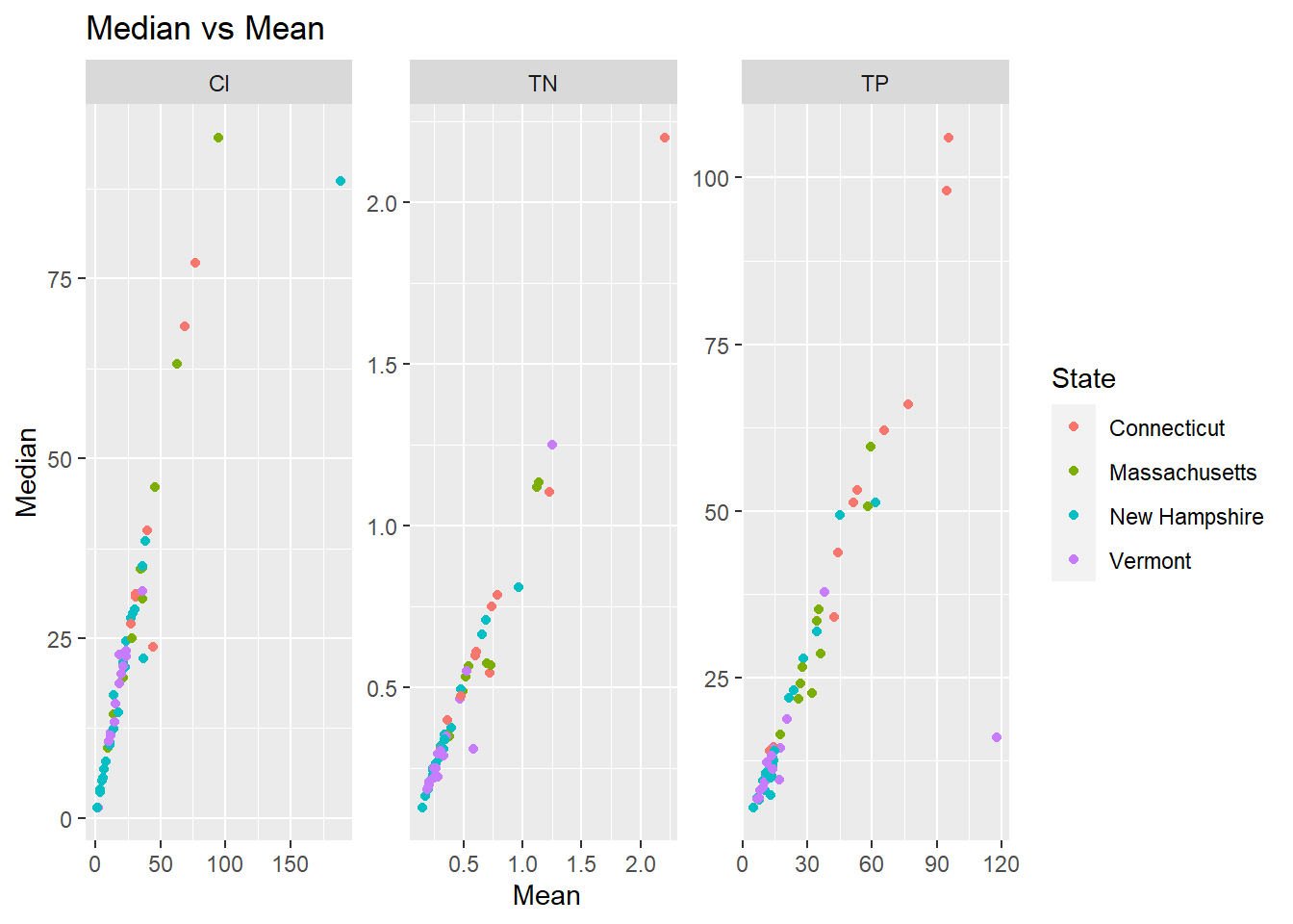
I’m fairly familiar with this dataset so I have some ideas of the challenges in the data. The first is that one year there was a really heavy rainstorm in the southern half of the watershed which made the results for that portion of the watershed not truly comparable to the rest of the measurements; You can see that most of the points off the correlation on skewed towards the mean, probably from those single high values pulling the mean higher. There is also the single chloride value that is orders of magnitude higher because it was collected from a saltwater location instead of freshwater; this value should also be discarded.

Removing Outliers

Code
splza_sds <- splza_tidy %>%
  select(c("SiteName", "Year", "Parameter", "ResultValue")) %>%
  group_by(Parameter) %>%
  mutate("StdDev" = abs(ResultValue/sd(ResultValue))) %>%
  arrange(desc(StdDev))

splza_sds

This is a relatively small dataset so the standard deviation is probably not actually that useful. For example, the Scantic River shows up 3 times in the top 10 but I know those are accurate values that should not be discarded, the Scantic River just has a lot of nitrogen in it! I do have one other piece of data which is the EcoRegion. Sites within different EcoRegions have different acceptable levels. I’ll try regrouping using that to see if it helps.

Code
splza_sds2 <- splza_tidy %>%
  select(c("SiteName", "Year", "Parameter", "ResultValue", "EcoRegion")) %>%
  group_by(Parameter, EcoRegion) %>%
  mutate("StdDev" = abs(ResultValue/sd(ResultValue))) %>%
  arrange(desc(StdDev))

splza_sds2

I don’t think that actually helped. I will not be using standard deviations to remove outliers. For the final project, I plan on bringing streamflow data into the picture and I will be able to use streamflow to decide which results to use. There may continue to be some outliers, but for the rest of this homework I will just use the median.

Data Visualization

Code
splza_wider <- splza_stats %>%
  select(-Mean) %>%
  filter(!Median > 1000) %>%
  pivot_wider(names_from = Parameter,
              values_from = Median)

ggplot(splza_wider, aes(x = TN, y = TP, color = State, shape = SiteType, label = SiteName)) +
  geom_point() +
  geom_text(show.legend = FALSE, check_overlap = TRUE, hjust = 0, nudge_x = 0.02) + 
  scale_color_brewer(palette = "Set2") +
  labs(title = "Total Phosphorus vs Total Nitrogen", x = "Total Nitrogen (mg-N/L)", y = "Total Phosphorus (\U03BCg-P/L)")

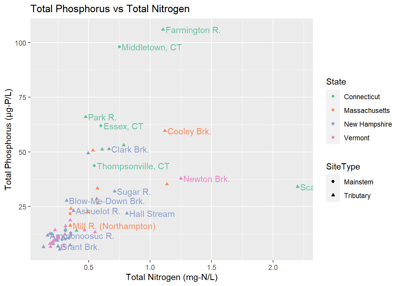
Something we might want to know is does a site’s phosphorus and nitrogen seem to be related. Some of the sites, particlarly Cooley Brook, Newton Brook, and Scantic River (the one that gets cut off) seem to have higher nitrogen. We can also see that Vermont and New Hampshire tend to have lower results than Massachusetts and Connecticut.

Mapping Practice

Code
map_data <- splza_tidy %>%
  filter(!ResultValue > 1000) %>%
  group_by(SiteName, Parameter, Lat, Lon, SiteType, State) %>%
  summarize("MedianResult" = median(ResultValue))
`summarise()` has grouped output by 'SiteName', 'Parameter', 'Lat', 'Lon',
'SiteType'. You can override using the `.groups` argument.
Code
map_data_tn <- map_data %>%
  filter(Parameter == "TN")

map_data_tp <- map_data %>%
  filter(Parameter == "TP")

map_data_cl <- map_data %>%
  filter(Parameter == "Cl")

watershed_states <- map_data("state") %>% 
  filter(region %in% c("connecticut", "massachusetts", "vermont", "new hampshire")) %>% 
           filter(!subregion %in% c("martha's vineyard", "nantucket"))

ggplot() +
  geom_polygon(data = watershed_states, aes(x=long, y = lat, group = region), color = "dark green", linetype = "dotted", fill="green", alpha=0.3) +
  expand_limits(x = watershed_states$long, y = watershed_states$lat) +
  geom_point(data=map_data_tn, color = "black", shape = 21, size = 2, alpha = 0.8, aes(x=Lon, y=Lat, fill = MedianResult)) +
  scale_shape_identity() +
  coord_map() +
  theme_void() +
  scale_fill_distiller(palette = "Oranges", direction = 1, name = "Total Nitrogen\n(mg-N/L)") +
  labs(title = "Samplepalooza", subtitle = "Median Total Nitrogen") +
  facet_grid(cols = vars(SiteType))
Error in `mproject()`:
! The package `mapproj` is required for `coord_map()`
Code
ggplot() +
  geom_polygon(data = watershed_states, aes(x=long, y = lat, group = region), color = "dark green", linetype = "dotted", fill="green", alpha=0.3) +
  expand_limits(x = watershed_states$long, y = watershed_states$lat) +
  geom_point(data=map_data_tp, color = "black", shape = 21, size = 2, alpha = 0.8, aes(x=Lon, y=Lat, fill = MedianResult)) +
  scale_shape_identity() +
  coord_map() +
  theme_void() +
  scale_fill_distiller(palette = "Purples", direction = 1, name = "Total Phosphorus\n(\U03BCg-P/L)") +
  labs(title = "Samplepalooza", subtitle = "Median Total Phosphorus") +
  facet_grid(cols = vars(SiteType))
Error in `mproject()`:
! The package `mapproj` is required for `coord_map()`
Code
ggplot() +
  geom_polygon(data = watershed_states, aes(x=long, y = lat, group = region), color = "dark green", linetype = "dotted", fill="green", alpha=0.3) +
  expand_limits(x = watershed_states$long, y = watershed_states$lat) +
  geom_point(data=map_data_cl, color = "black", shape = 21, size = 2, alpha = 0.8, aes(x=Lon, y=Lat, fill = MedianResult)) +
  scale_shape_identity() +
  coord_map() +
  theme_void() +
  scale_fill_distiller(palette = "Blues", direction = 1, name = "Chloride\n(mg-Cl/L)") +
  labs(title = "Samplepalooza", subtitle = "Median Chloride") +
  facet_grid(cols = vars(SiteType))
Error in `mproject()`:
! The package `mapproj` is required for `coord_map()`

I wanted to really nail down how to do a map before I went on to the final project. Because the scales for each parameter are different, made three different plots. I couldn’t figure out how to have a free color scale on the facet wrap. Also you end up with very tiny maps if you have 6 facets!

Limitations

Most people can’t just interpret what levels of nitrogen, phosphorus, or chloride are “good” or “bad.” I prefer to present the data in a way that compares it to that threshold so that any viewer can see what is good or bad at a glance.

As mentioned previously, I would like to incorporate loading and yield. Loading is concentration * time and yield is loading / area. As part of the final project, I plan to revisit the R code my volunteer wrote so that I can add in the loading calculations and yield as well.

Finally, with the maps, the points are too close together and overlap. I would like to bring in the polyogns for watersheds into the map and learn how to color code those instead of using points. This will give a clearer picture of the impact each point is having on the watershed as a whole.

Full Dataset

Code
splza_tidy
Source Code
---
title: "Homework 3 - Samplepalooza"
author: "Ryan O'Donnell"
desription: "Exploratory Data Analysis and Visualization"
date: "11/16/2022"
format:
  html:
    df-print: paged
    toc: true
    code-fold: true
    code-copy: true
    code-tools: true
categories:
  - hw3
  - ryan_odonnell
  - waterquality
  - samplepalooza
---

```{r}
#| label: setup
#| warning: false

library(tidyverse)
library(readxl)
library(lubridate)
library(maps)

knitr::opts_chunk$set(echo = TRUE)
```

# Reading in the Data & Narrative
```{R}
#| label: read-in

splza_orig <- read_xlsx("_data/14_21SamplepaloozaResults.xlsx",
                        skip = 2,
                        col_names = c("SiteName", "SiteID", "SiteType", "State", "EcoRegion", "2014-TN", "2015-TN", "2018-TN", "2019-TN", "2020-TN", "2021-TN", "2014-TP", "2015-TP", "2018-TP", "2019-TP", "2020-TP", "2021-TP", "2014-Cl", "2015-Cl", "2020-Cl", "2021-Cl", "Date2021","Lat", "Lon"))

```

This data is from my work in water quality monitoring. *Samplepalooza* is an annual-ish, one-day monitoring event where both volunteers and professionals collect water samples throughout the Connecticut River watershed, which encompasses parts of Vermont, New Hampshire, Massachusetts, and Connecticut, from the Canadian border down to Long Island Sound. It has occurred in 2014-2015 and 2018-2021. It is typically done on a single day, but in 2021, severe weather caused some sites to be sampled on one day and the rest on another day. Not all sites were sampled for all years. Sites were always sampled for two parameters: total nitrogen (TN) and total phosphorus (TP); some years they were also sampled for chloride (Cl).

# Tidying the data
```{R}
#| label: cleaning
#| output: false
#| warning: false

# step 1 - recode chloride data 
# step 2 - convert column types
# step 3 - pivot data and relocate new columns
# step 4 - add sample date and result unit columns
# step 5 - remove 2021Date column

splza_tidy <- splza_orig %>%
  mutate(`2014-Cl` = recode(`2014-Cl`, "<3" = "1.5", "< 3" = "1.5"),
         `2015-Cl` = recode(`2015-Cl`, "<3" = "1.5", "< 3" = "1.5"),
         `2021-Cl` = recode(`2021-Cl`, "<3" = "1.5", "< 3" = "1.5"),
         .keep = "all") %>%
  type_convert() %>%
  pivot_longer(col = starts_with("20"),
               names_to = c("Year", "Parameter"),
               names_sep = "-",
               values_to = "ResultValue",
               values_drop_na = TRUE,
               ) %>%
  relocate(Year:ResultValue, .before = SiteType) %>%
  mutate("SampleDate" = case_when(
    Year == 2014 ~ ymd("2014-08-06"),
    Year == 2015 ~ ymd("2015-09-10"),
    Year == 2018 ~ ymd("2018-09-20"),
    Year == 2019 ~ ymd("2019-09-12"),
    Year == 2020 ~ ymd("2020-09-17"),
    Year == 2021 ~ ymd(paste(`Date2021`))), 
    .after = `Year`) %>%
  mutate("ResultUnit" = case_when(
    Parameter == "TN" ~ "mg-N/L",
    Parameter == "TP" ~ "\U03BCg-P/L",
    Parameter == "Cl" ~ "mg-Cl/L"),
    .after = `ResultValue`) %>%
  select(-`Date2021`)

```
The data is now tidied to the point it was from Homework 2. I recoded how I selected the columns to use `starts_with()` instead of typing out all the names. 

# Exploratory Analysis
```{R}
#| label: analysis
#| warning: false

splza_stats <- splza_tidy %>%
  group_by(SiteName, Parameter, SiteType, State) %>%
  summarize("Mean" = mean(ResultValue),
            "Median" = median(ResultValue))

splza_stats

ggplot(splza_stats, aes(x = Mean, y = Median, color = State)) +
  geom_point() +
  facet_wrap(vars(Parameter), scales = "free") +
  labs(title = "Median vs Mean")

```

I'm fairly familiar with this dataset so I have some ideas of the challenges in the data. The first is that one year there was a really heavy rainstorm in the southern half of the watershed which made the results for that portion of the watershed not truly comparable to the rest of the measurements; You can see that most of the points off the correlation on skewed towards the mean, probably from those single high values pulling the mean higher. There is also the single chloride value that is orders of magnitude higher because it was collected from a saltwater location instead of freshwater; this value should also be discarded.


## Removing Outliers

```{R}
#| label: understanding outliers 1

splza_sds <- splza_tidy %>%
  select(c("SiteName", "Year", "Parameter", "ResultValue")) %>%
  group_by(Parameter) %>%
  mutate("StdDev" = abs(ResultValue/sd(ResultValue))) %>%
  arrange(desc(StdDev))

splza_sds
```
This is a relatively small dataset so the standard deviation is probably not actually that useful. For example, the Scantic River shows up 3 times in the top 10 but I know those are accurate values that should not be discarded, the Scantic River just has a lot of nitrogen in it! I do have one other piece of data which is the EcoRegion. Sites within different EcoRegions have different acceptable levels. I'll try regrouping using that to see if it helps.

```{R}
#| label: understanding outliers 2

splza_sds2 <- splza_tidy %>%
  select(c("SiteName", "Year", "Parameter", "ResultValue", "EcoRegion")) %>%
  group_by(Parameter, EcoRegion) %>%
  mutate("StdDev" = abs(ResultValue/sd(ResultValue))) %>%
  arrange(desc(StdDev))

splza_sds2


```
I don't think that actually helped. I will not be using standard deviations to remove outliers. For the final project, I plan on bringing streamflow data into the picture and I will be able to use streamflow to decide which results to use. There may continue to be some outliers, but for the rest of this homework I will just use the median.


# Data Visualization

```{R}
#| label: nutrients

splza_wider <- splza_stats %>%
  select(-Mean) %>%
  filter(!Median > 1000) %>%
  pivot_wider(names_from = Parameter,
              values_from = Median)

ggplot(splza_wider, aes(x = TN, y = TP, color = State, shape = SiteType, label = SiteName)) +
  geom_point() +
  geom_text(show.legend = FALSE, check_overlap = TRUE, hjust = 0, nudge_x = 0.02) + 
  scale_color_brewer(palette = "Set2") +
  labs(title = "Total Phosphorus vs Total Nitrogen", x = "Total Nitrogen (mg-N/L)", y = "Total Phosphorus (\U03BCg-P/L)")
```
Something we might want to know is does a site's phosphorus and nitrogen seem to be related. Some of the sites, particlarly Cooley Brook, Newton Brook, and Scantic River (the one that gets cut off) seem to have higher nitrogen. We can also see that Vermont and New Hampshire tend to have lower results than Massachusetts and Connecticut. 

# Mapping Practice
```{R}
#| label: map of sites

map_data <- splza_tidy %>%
  filter(!ResultValue > 1000) %>%
  group_by(SiteName, Parameter, Lat, Lon, SiteType, State) %>%
  summarize("MedianResult" = median(ResultValue))

map_data_tn <- map_data %>%
  filter(Parameter == "TN")

map_data_tp <- map_data %>%
  filter(Parameter == "TP")

map_data_cl <- map_data %>%
  filter(Parameter == "Cl")

watershed_states <- map_data("state") %>% 
  filter(region %in% c("connecticut", "massachusetts", "vermont", "new hampshire")) %>% 
           filter(!subregion %in% c("martha's vineyard", "nantucket"))

ggplot() +
  geom_polygon(data = watershed_states, aes(x=long, y = lat, group = region), color = "dark green", linetype = "dotted", fill="green", alpha=0.3) +
  expand_limits(x = watershed_states$long, y = watershed_states$lat) +
  geom_point(data=map_data_tn, color = "black", shape = 21, size = 2, alpha = 0.8, aes(x=Lon, y=Lat, fill = MedianResult)) +
  scale_shape_identity() +
  coord_map() +
  theme_void() +
  scale_fill_distiller(palette = "Oranges", direction = 1, name = "Total Nitrogen\n(mg-N/L)") +
  labs(title = "Samplepalooza", subtitle = "Median Total Nitrogen") +
  facet_grid(cols = vars(SiteType))

ggplot() +
  geom_polygon(data = watershed_states, aes(x=long, y = lat, group = region), color = "dark green", linetype = "dotted", fill="green", alpha=0.3) +
  expand_limits(x = watershed_states$long, y = watershed_states$lat) +
  geom_point(data=map_data_tp, color = "black", shape = 21, size = 2, alpha = 0.8, aes(x=Lon, y=Lat, fill = MedianResult)) +
  scale_shape_identity() +
  coord_map() +
  theme_void() +
  scale_fill_distiller(palette = "Purples", direction = 1, name = "Total Phosphorus\n(\U03BCg-P/L)") +
  labs(title = "Samplepalooza", subtitle = "Median Total Phosphorus") +
  facet_grid(cols = vars(SiteType))

ggplot() +
  geom_polygon(data = watershed_states, aes(x=long, y = lat, group = region), color = "dark green", linetype = "dotted", fill="green", alpha=0.3) +
  expand_limits(x = watershed_states$long, y = watershed_states$lat) +
  geom_point(data=map_data_cl, color = "black", shape = 21, size = 2, alpha = 0.8, aes(x=Lon, y=Lat, fill = MedianResult)) +
  scale_shape_identity() +
  coord_map() +
  theme_void() +
  scale_fill_distiller(palette = "Blues", direction = 1, name = "Chloride\n(mg-Cl/L)") +
  labs(title = "Samplepalooza", subtitle = "Median Chloride") +
  facet_grid(cols = vars(SiteType))
```

I wanted to really nail down how to do a map before I went on to the final project. Because the scales for each parameter are different, made three different plots. I couldn't figure out how to have a free color scale on the facet wrap. Also you end up with very tiny maps if you have 6 facets!

# Limitations

Most people can't just interpret what levels of nitrogen, phosphorus, or chloride are "good" or "bad." I prefer to present the data in a way that compares it to that threshold so that any viewer can see what is good or bad at a glance.

As mentioned previously, I would like to incorporate loading and yield. Loading is `concentration * time` and yield is `loading / area`. As part of the final project, I plan to revisit the R code my volunteer wrote so that I can add in the loading calculations and yield as well. 

Finally, with the maps, the points are too close together and overlap. I would like to bring in the polyogns for watersheds into the map and learn how to color code those instead of using points. This will give a clearer picture of the impact each point is having on the watershed as a whole.


# Full Dataset

```{R}
#| label: the data

splza_tidy

```