The data provides information about New York City Airbnb listings for the year 2019. From a single observation we find a description and location of the unit, price, minimum nights, name of the host, host listings count, review info, and availability throughout the year.
To touch up the data before any other transformations, I renamed/reordered the columns appropriately and removed any observations of units that were available for less than 3 days out of the year.
Is your data already tidy, or is there work to be done? Be sure to anticipate your end result to provide a sanity check, and document your work here.
In order to draw better visualizations from the variables, I mutated Availability and Host Listings to list them as unranked categorical variables with four levels rather than an integer variable. This will allow us to use aesthetic options like color, shape, or fill to visualize the differences between levels.
After the initial removals on the read-in, the data was nearly tidy; there were only 4 missing values, all within Description. Because it wouldn’t be reasonable to plot all the distinct descriptions, I decided to remove this variable from the plotting data, bnb_plot.
Our tidied data has an observation as one rental unit with 8 variables. bnb_plot has 30644 observations.
Let’s use bnb_plot with ggplot2 to produce visuals
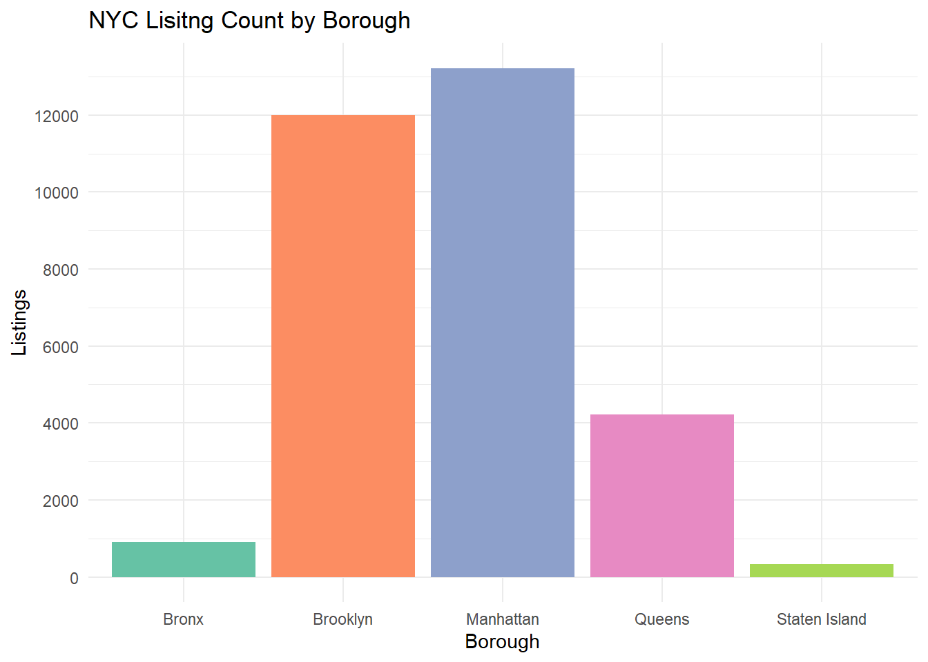
Univariate Visualization 1: Listing Count by Borough
When plotting a bar graph for variable Borough, we can see where in the city our observations are located. The largest bar is Manhattan, indicating that this borough is a popular choice for owners looking to rent out property for travelers. Manhattan makes sense, it is the quintessential NYC borough despite being the smallest by land. It is also the most densely populated area of the city, of course there would be a larger market for short-term rental properties!
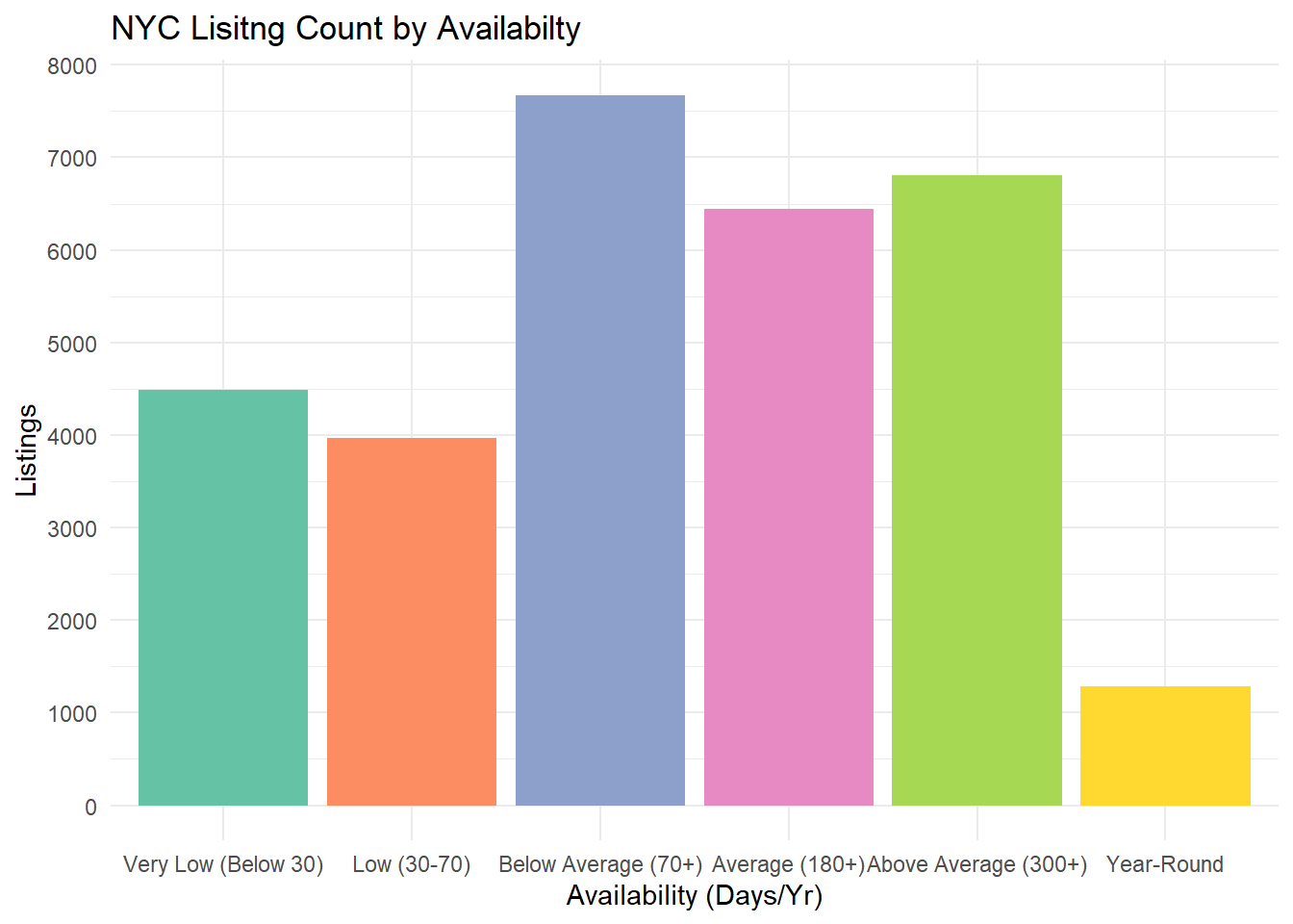
Univariate Visualization 2: Listing Count by Availability
Using another bar-plot to view Availability, I was initially surprised to see how many properties on Air Bnb were listed for less than a month out of the year. However, in cities with high movement like NYC, many residents will sublet their private properties even for days at a time to combat the high cost of rent.
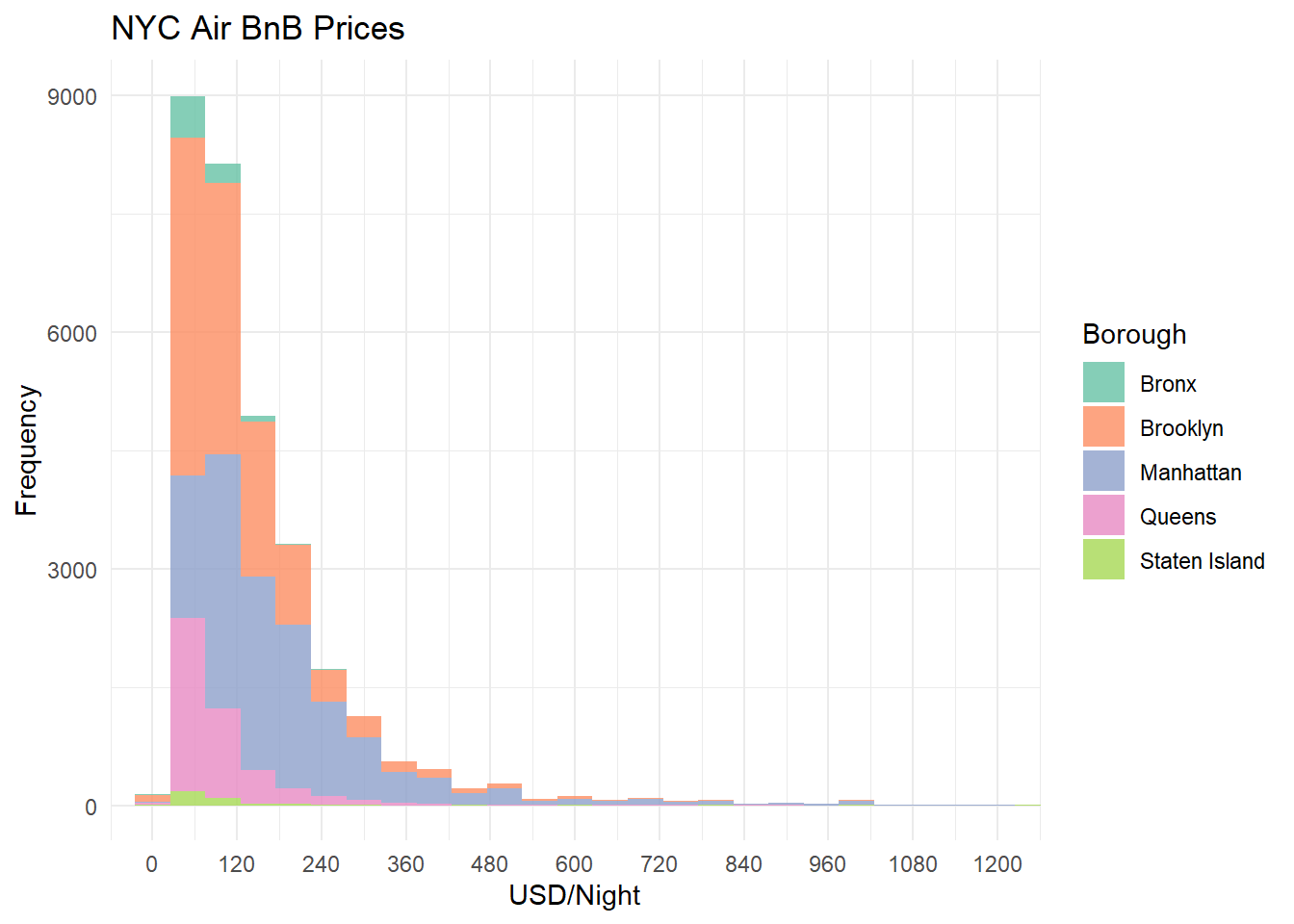
Bivariate Visualization 1: Histogram of Price By Borough
Using geom_histogram to produce a distribution of Price, a fill aesthetic was used to visualize the distribution by Borough. We can see that the Bronx has the bulk of observations at cheaper nightly price points, but as price increases, Brooklyn and Manhattan take over the distribution.
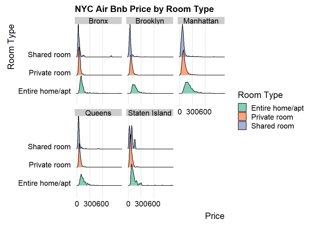
Bivariate Visualization 2: Price by Room Type
Creating a Ridge plot of Price by Room Type with package ggridges, I then used a facet_wrap to visualize this relationship by Borough. In a trend consistent with our histogram, we see the Bronx, Queens, and Staten Island having lower price points on all three room types, with Manhattan as the most expensive Borough.
Source Code
---title: "Challenge 5 Solution"author: "Dane Shelton"description: "Introduction to Visualization"date: "10/24/2022"format: html: callout-appearance: simple df-print: paged callout-icon: false toc: true code-copy: true code-tools: truecategories: - challenge_5 - air_bnb - shelton---```{r}#| label: setup#| include: false#| warning: false#| message: falselibrary(tidyverse)library(ggplot2)library(ggridges)knitr::opts_chunk$set(echo =FALSE, warning=FALSE, message=FALSE)```## Challenge Tasks:Today's challenge:1. read in a data set, and describe the data set using both words and any supporting information 2. tidy data (as needed, including sanity checks)3. mutate variables as needed (including sanity checks)4. create at least two univariate visualizations - try to make them "publication" ready - Explain why you choose the specific graph type5. Create at least one bivariate visualization - try to make them "publication" ready - Explain why you choose the specific graph type[R Graph Gallery](https://r-graph-gallery.com/) is a good starting point for thinking about what information is conveyed in standard graph types, and includes example R code.::: panel-tabset## Task 1. Read in dataRead in the following dataset:- AB_NYC_2019.csv ⭐⭐⭐```{r}#| label: loading data#| echo: false# read inbnb_og <- readr::read_csv('_data/AB_NYC_2019.csv', show_col_types =FALSE)# removing clutter and observations of residences with less than a week of availability per yearbnb_og <- bnb_og %>%select(-c('id','host_id','host_name','latitude','longitude','last_review','reviews_per_month'))%>%filter(availability_365 >=3)# rename and relocatebnb_og <- bnb_og %>%rename("Description"=name, "Borough"= neighbourhood_group, "Neighbourhood"= neighbourhood,"Room Type"= room_type,"Price"=price,"Min Nights"=minimum_nights,"Review Count"=number_of_reviews,"Host Listings"=calculated_host_listings_count,"Availability per Year"=availability_365) %>%relocate("Availability per Year", .before =contains("Review Count"))```### Briefly describe the dataThe data provides information about New York City Airbnb listings for the year 2019. From a single observation we find a description and location of the unit, price, minimum nights, name of the host, host listings count, review info, and availability throughout the year.To touch up the data before any other transformations, I renamed/reordered the columns appropriately and removed any observations of units that were available for less than 3 days out of the year.## 2. Tidy Data and 3. MutateIs your data already tidy, or is there work to be done? Be sure to anticipate your end result to provide a sanity check, and document your work here.```{r}#| label: tidy and format#| include: true# Getting Rid of any duplicate listingsbnb_og <-distinct(bnb_og)# Mutating Availability and Host Listings to plot as a 'class' varbnb_2 <- bnb_og %>%mutate("Availability"=case_when(`Availability per Year`==365~"Year-Round",`Availability per Year`>300~"Above Average (300+)",`Availability per Year`>=180~"Average (180+)",`Availability per Year`<180&`Availability per Year`>=70~"Below Average (70+)",`Availability per Year`<70&`Availability per Year`>=30~"Low (30-70)",`Availability per Year`<30~"Very Low (Below 30)"),"Host List Count"=case_when(`Host Listings`>10~"Very Frequent",`Host Listings`>=3~"Frequent",`Host Listings`<3~"Low",`Host Listings`==1~"One"))bnb_plot <- bnb_2 %>%select(!contains(c('per Year', 'Host Listings', 'Description')))head(bnb_2)```In order to draw better visualizations from the variables, I mutated `Availability` and `Host Listings` to list them as unranked categorical variables with four levels rather than an integer variable. This will allow us to use aesthetic options like `color`, `shape`, or `fill` to visualize the differences between levels.After the initial removals on the read-in, the data was nearly tidy; there were only 4 missing values, all within `Description`. Because it wouldn't be reasonable to plot all the distinct descriptions, I decided to remove this variable from the plotting data, `bnb_plot`. Our tidied data has an observation as one rental unit with 8 variables. `bnb_plot` has 30644 observations.```{r}#| label: bnb_plot head#| output: truehead(bnb_plot, n=5)```## 4. and 5. VisualizationsLet's use `bnb_plot` with `ggplot2` to produce visuals::: {.callout-note collapse="true"}## Univariate Visualization 1: Listing Count by `Borough````{r}#| label: Univariate Visualization#| include: true# Boxplot of Airbnb listings by Boroughbar_boro <-ggplot(bnb_plot, aes(x=Borough, fill=Borough))+geom_bar()+scale_fill_brewer(palette ='Set2')+scale_y_continuous(breaks=seq(0,15000,by=2000))+theme_minimal()+theme(legend.position='none')+labs(title ='NYC Lisitng Count by Borough', x ='Borough', y='Listings')bar_boro```When plotting a bar graph for variable `Borough`, we can see where in the city our observations are located. The largest bar is Manhattan, indicating that this borough is a popular choice for owners looking to rent out property for travelers. Manhattan makes sense, it is the quintessential NYC borough despite being the smallest by land. It is also the most densely populated area of the city, of course there would be a larger market for short-term rental properties!::::::{.callout-note collapse=true}## Univariate Visualization 2: Listing Count by `Availability````{r}#| label: Histogram Availability#| include: true# Histogram Availabilitybar_avail <- bnb_plot %>%mutate(Availability_fct=factor(Availability, levels=c('Very Low (Below 30)', 'Low (30-70)', 'Below Average (70+)','Average (180+)','Above Average (300+)','Year-Round')))%>%ggplot(aes(x=Availability_fct, fill=Availability_fct))+geom_bar()+scale_fill_brewer(palette='Set2')+scale_y_continuous(breaks=seq(0,8000,by=1000))+theme_minimal()+theme(legend.position='none')+labs(title ='NYC Lisitng Count by Availabilty', x ='Availability (Days/Yr)', y='Listings')bar_avail```Using another bar-plot to view `Availability`, I was initially surprised to see how many properties on Air Bnb were listed for less than a month out of the year. However, in cities with high movement like NYC, many residents will sublet their private properties even for days at a time to combat the high cost of rent.::::::{.callout-note collapse=true}## Bivariate Visualization 1: Histogram of `Price` By `Borough````{r}#| label: Price by Borough Hist#| include: true# Histogram of Pricehist_price_boro <-ggplot(bnb_plot,aes(x=Price, fill=Borough)) +geom_histogram(binwidth =50, position ='stack', alpha=.8) +coord_cartesian(xlim =c(0,1200), ylim=c(0,9000)) +scale_y_continuous(breaks=seq(0,9000,by=3000)) +scale_x_continuous(breaks=seq(0,1250,by=120))+scale_fill_brewer(palette='Set2')+theme_minimal()+labs(title ='NYC Air BnB Prices', x ='USD/Night', y='Frequency') hist_price_boro```Using `geom_histogram` to produce a distribution of `Price`, a `fill` aesthetic was used to visualize the distribution by `Borough`. We can see that the Bronx has the bulk of observations at cheaper nightly price points, but as price increases, Brooklyn and Manhattan take over the distribution.::::::{.callout-note collapse="true"}## Bivariate Visualization 2: `Price` by `Room Type` ```{r}#| label: Ridgeline- Price x Room X Boro#| include: trueridge_room_price <-ggplot(bnb_plot, aes(x=Price, y=`Room Type`, fill=`Room Type`))+geom_density_ridges(position='identity', alpha=0.8, bandwidth=8.5) +theme_ridges() +scale_fill_brewer(palette='Set2')+scale_x_continuous(breaks=seq(0,600,by=300))+coord_cartesian(xlim =c(0,1000)) +labs(title ='NYC Air Bnb Price by Room Type', x ='Price', y='Room Type')+facet_wrap('Borough')ridge_room_price```Creating a Ridge plot of `Price` by `Room Type` with package `ggridges`, I then used a `facet_wrap` to visualize this relationship by `Borough`. In a trend consistent with our histogram, we see the Bronx, Queens, and Staten Island having lower price points on all three room types, with Manhattan as the most expensive Borough.::::::