R Graph Gallery is a good starting point for thinking about what information is conveyed in standard graph types, and includes example R code. And anyone not familiar with Edward Tufte should check out his fantastic books and courses on data visualizaton.
duplicates of the latitute/longitudinal coordinates X, Y
SURVYEAR since we are only examining 2017-2018 survey
I thought I should delete: aggregate information that could be replicated: TOTFRL, TOTMENRTOTFENR, TOTAL, Member; HOWEVER, inspection of the median, range, and distribution of numeric variables in the summary indicates there are possibly several mis-entries, (for example: student to teacher ratio: STUTERATIO has a min = 0, med = 15.3, and max=22350. There are some instances where the STUTERATIO exceeds the total number of students.
Some of the aggregate categories might help me check for mis-entries.
On the read in, I factored the ordinal variables:
GSHI, GSLO, SCHOOL_LEVEL, and ULOCALE
Code
#Work done to determine what to filter/recode on read in# PublicSchools_2017<-read_csv("_data/Public_School_Characteristics_2017-18.csv")%>%# select(-c("X", "Y","OBJECTID" ,"SURVYEAR"))#Aggregate variables I would have filtered if I wasn't concerned about mis-entries:#"TOTFRL", "TOTMENROL", "TOTFENROL", "MEMBER", "TOTAL"# Identify Levels for Factoring Ordinal Variables# #ULOCALE# PublicSchools_2017%>%# select(ULOCALE)%>%# unique()# #GSLO# PublicSchools_2017%>%# select(GSLO)%>%# unique()# #GSLHI# PublicSchools_2017%>%# select(GSHI)%>%# unique()# #SCHOOL_LEVEL# PublicSchools_2017%>%# select(SCHOOL_LEVEL)%>%# unique()#Recode all ordinal variable as factorsPublicSchools_2017<-read_csv("_data/Public_School_Characteristics_2017-18.csv")%>%select(-c("X", "Y","OBJECTID" ,"SURVYEAR")) %>%mutate(ULOCALE =recode_factor(ULOCALE,"11-City: Large"="City: Large","12-City: Mid-size"="City: Mid-size","13-City: Small"="City: Small","21-Suburb: Large"="Suburb: Large","22-Suburb: Mid-size"="Suburb: Mid-size","23-Suburb: Small"="Suburb: Small","31-Town: Fringe"="Town: Fringe","32-Town: Distant"="Town: Distant","33-Town: Remote"="Town: Remote","41-Rural: Fringe"="Rural: Fringe","42-Rural: Distant"="Rural: Distant","43-Rural: Remote"="Rural: Remote",.ordered =TRUE))%>%mutate(SCHOOL_LEVEL =recode_factor(SCHOOL_LEVEL,"Prekindergarten"="Prekindergarten","Elementary"="Elementary","Middle"="Middle","Secondary"="Secondary","High"="High","Ungraded"="Ungraded","Other"="Other","Not Applicable"="Not Applicable","Not Reported"="Not Reported",.ordered =TRUE))%>%mutate(GSLO =recode_factor(GSLO,"PK"="PK","KG"="KG","01"="01","02"="02","03"="03","04"="04","05"="05","M"="M","06"="06","07"="07","08"="08","09"="09","10"="10","11"="11","12"="12","AE"="AE","UG"="UG","N"="N",.ordered =TRUE))%>%mutate(GSHI =recode_factor(GSHI,"PK"="PK","KG"="KG","01"="01","02"="02","03"="03","04"="04","05"="05","M"="M","06"="06","07"="07","08"="08","09"="09","10"="10","11"="11","12"="12","13"="13","AE"="AE","UG"="UG","N"="N",.ordered =TRUE)) PublicSchools_2017
The PublicSchools_2017 data frame consists of data from selected questions from the 2017-208 National Teachers and Principals Survey conducted by the United States Census Board and is “a system of related questionnaires that provide descriptive data on the context of public and private elementary and secondary education in addition to giving local, state, and national policymakers a variety of statistics on the condition of education in the United States.”
Our data frame consists of a subset of the items surveyed from 100729 schools across the United States. The 75 variables contain information from the following categories:
Geographic Location of the School
State, town, and address
Level of Urbanization (rural, town, city, etc.)
Characteristics of the School design:
Charter, Magnet, Traditional Public,
Virtual/non
Highest and Lowest Grade levels served and number of students per grade level.
Level of School: Elementary, Middle, Secondary, Adult Ed., etc.
Type of School: Alternative, Regular school, Special education school, or Vocational school
Status of the school when surveyed (new, change of leadership, operational, etc.)
Student to Teacher Ratio
If the school has Title 1 status
Demographic Characteristics of the student body:
Number of students of given ethnic backgrounds by gender (M/F only)
Socioeconomic Characteristics of the student body:
Number of students qualifying for free or reduced lunch.
Questions for Further Review
What are the following variables?
G13
AS
UG: Ungraded (School level)
AE: Adult Education (School level)
FTE
STATUS
Why did the original Member have 2944 distinct values while total had 2944?
Code
# examine the summary to decide how to best set up our data frameprint(summarytools::dfSummary(PublicSchools_2017,varnumbers =FALSE,plain.ascii =FALSE,style ="grid",graph.magnif =0.70,valid.col =FALSE),method ='render',table.classes ='table-condensed')
Data Frame Summary
PublicSchools_2017
Dimensions: 100729 x 75
Duplicates: 0
Variable
Stats / Values
Freqs (% of Valid)
Graph
Missing
NCESSCH
[character]
1. 010000500870
2. 010000500871
3. 010000500879
4. 010000500889
5. 010000501616
6. 010000502150
7. 010000600193
8. 010000600872
9. 010000600876
10. 010000600877
[ 100719 others ]
1
(
0.0%
)
1
(
0.0%
)
1
(
0.0%
)
1
(
0.0%
)
1
(
0.0%
)
1
(
0.0%
)
1
(
0.0%
)
1
(
0.0%
)
1
(
0.0%
)
1
(
0.0%
)
100719
(
100.0%
)
0
(0.0%)
NMCNTY
[character]
1. Los Angeles County
2. Cook County
3. Maricopa County
4. Harris County
5. Orange County
6. Jefferson County
7. Montgomery County
8. Washington County
9. Wayne County
10. Dallas County
[ 1949 others ]
2264
(
2.2%
)
1388
(
1.4%
)
1256
(
1.2%
)
1142
(
1.1%
)
1074
(
1.1%
)
980
(
1.0%
)
888
(
0.9%
)
848
(
0.8%
)
817
(
0.8%
)
814
(
0.8%
)
89258
(
88.6%
)
0
(0.0%)
STABR
[character]
1. CA
2. TX
3. NY
4. FL
5. IL
6. MI
7. OH
8. PA
9. NC
10. NJ
[ 46 others ]
10323
(
10.2%
)
9320
(
9.3%
)
4808
(
4.8%
)
4375
(
4.3%
)
4245
(
4.2%
)
3734
(
3.7%
)
3610
(
3.6%
)
2990
(
3.0%
)
2691
(
2.7%
)
2595
(
2.6%
)
52038
(
51.7%
)
0
(0.0%)
LEAID
[character]
1. 7200030
2. 0622710
3. 1709930
4. 1200390
5. 3200060
6. 1200180
7. 1200870
8. 1500030
9. 4823640
10. 1201500
[ 17451 others ]
1121
(
1.1%
)
1009
(
1.0%
)
655
(
0.7%
)
537
(
0.5%
)
381
(
0.4%
)
336
(
0.3%
)
320
(
0.3%
)
294
(
0.3%
)
284
(
0.3%
)
268
(
0.3%
)
95524
(
94.8%
)
0
(0.0%)
ST_LEAID
[character]
1. PR-01
2. CA-1964733
3. IL-15-016-2990-25
4. FL-13
5. NV-02
6. FL-06
7. FL-29
8. HI-001
9. TX-101912
10. FL-50
[ 17451 others ]
1121
(
1.1%
)
1009
(
1.0%
)
655
(
0.7%
)
537
(
0.5%
)
381
(
0.4%
)
336
(
0.3%
)
320
(
0.3%
)
294
(
0.3%
)
284
(
0.3%
)
268
(
0.3%
)
95524
(
94.8%
)
0
(0.0%)
LEA_NAME
[character]
1. PUERTO RICO DEPARTMENT OF
2. Los Angeles Unified
3. City of Chicago SD 299
4. DADE
5. CLARK COUNTY SCHOOL DISTR
6. BROWARD
7. HILLSBOROUGH
8. Hawaii Department of Educ
9. HOUSTON ISD
10. PALM BEACH
[ 17147 others ]
1121
(
1.1%
)
1009
(
1.0%
)
655
(
0.7%
)
537
(
0.5%
)
381
(
0.4%
)
336
(
0.3%
)
320
(
0.3%
)
294
(
0.3%
)
284
(
0.3%
)
268
(
0.3%
)
95524
(
94.8%
)
0
(0.0%)
SCH_NAME
[character]
1. Lincoln Elementary School
2. Lincoln Elementary
3. Jefferson Elementary
4. Washington Elementary
5. Washington Elementary Sch
6. Central Elementary School
7. Jefferson Elementary Scho
8. Lincoln Elem School
9. Central High School
10. Roosevelt Elementary
[ 88366 others ]
64
(
0.1%
)
61
(
0.1%
)
53
(
0.1%
)
49
(
0.0%
)
46
(
0.0%
)
42
(
0.0%
)
33
(
0.0%
)
33
(
0.0%
)
32
(
0.0%
)
32
(
0.0%
)
100284
(
99.6%
)
0
(0.0%)
LSTREET1
[character]
1. 6420 E. Broadway Blvd. Su
2. Box DOE
3. 2405 FAIRVIEW SCHOOL RD
4. 1820 XENIUM LN N
5. Main St
6. 335 ALTERNATIVE LN
7. 2101 N TWYMAN RD
8. 720 9TH AVE
9. 50 Moreland Rd.
10. 951 W Snowflake Blvd
[ 92384 others ]
33
(
0.0%
)
28
(
0.0%
)
22
(
0.0%
)
19
(
0.0%
)
13
(
0.0%
)
12
(
0.0%
)
11
(
0.0%
)
11
(
0.0%
)
10
(
0.0%
)
10
(
0.0%
)
100560
(
99.8%
)
0
(0.0%)
LSTREET2
[character]
1. Suite B
2. Ste. 100
3. P.O. Box 1497
4. Suite A
5. Suite 200
6. Building B
7. Ste. 102
8. Ste. A
9. Suite 1
10. SUITE 111 HART
[ 482 others ]
8
(
1.4%
)
7
(
1.2%
)
6
(
1.0%
)
6
(
1.0%
)
5
(
0.8%
)
4
(
0.7%
)
4
(
0.7%
)
4
(
0.7%
)
4
(
0.7%
)
4
(
0.7%
)
540
(
91.2%
)
100137
(99.4%)
LSTREET3
[logical]
All NA's
100729
(100.0%)
LCITY
[character]
1. HOUSTON
2. Chicago
3. Los Angeles
4. BROOKLYN
5. SAN ANTONIO
6. Phoenix
7. BRONX
8. DALLAS
9. NEW YORK
10. Tucson
[ 14624 others ]
783
(
0.8%
)
664
(
0.7%
)
577
(
0.6%
)
569
(
0.6%
)
520
(
0.5%
)
446
(
0.4%
)
441
(
0.4%
)
378
(
0.4%
)
359
(
0.4%
)
330
(
0.3%
)
95662
(
95.0%
)
0
(0.0%)
LSTATE
[character]
1. CA
2. TX
3. NY
4. FL
5. IL
6. MI
7. OH
8. PA
9. NC
10. NJ
[ 45 others ]
10325
(
10.3%
)
9320
(
9.3%
)
4808
(
4.8%
)
4377
(
4.3%
)
4245
(
4.2%
)
3736
(
3.7%
)
3610
(
3.6%
)
2990
(
3.0%
)
2693
(
2.7%
)
2595
(
2.6%
)
52030
(
51.7%
)
0
(0.0%)
LZIP
[character]
1. 85710
2. 10456
3. 85364
4. 78521
5. 78572
6. 78577
7. 00731
8. 10457
9. 78539
10. 60623
[ 22526 others ]
53
(
0.1%
)
45
(
0.0%
)
44
(
0.0%
)
43
(
0.0%
)
42
(
0.0%
)
41
(
0.0%
)
39
(
0.0%
)
37
(
0.0%
)
37
(
0.0%
)
36
(
0.0%
)
100312
(
99.6%
)
0
(0.0%)
LZIP4
[character]
1. 8888
2. 1199
3. 1299
4. 9801
5. 2099
6. 1399
7. 1699
8. 1599
9. 1499
10. 1899
[ 8615 others ]
899
(
1.5%
)
113
(
0.2%
)
111
(
0.2%
)
106
(
0.2%
)
104
(
0.2%
)
101
(
0.2%
)
100
(
0.2%
)
99
(
0.2%
)
94
(
0.2%
)
89
(
0.2%
)
57411
(
96.9%
)
41502
(41.2%)
PHONE
[character]
1. (505)880-3744
2. (520)225-6060
3. (505)721-1051
4. (480)461-4000
5. (972)316-3663
6. (505)527-5800
7. (520)745-4588
8. (480)497-3300
9. (623)445-5000
10. (480)484-6100
[ 91818 others ]
141
(
0.1%
)
63
(
0.1%
)
36
(
0.0%
)
35
(
0.0%
)
34
(
0.0%
)
33
(
0.0%
)
33
(
0.0%
)
29
(
0.0%
)
28
(
0.0%
)
27
(
0.0%
)
100270
(
99.5%
)
0
(0.0%)
GSLO
[ordered, factor]
1. PK
2. KG
3. 01
4. 02
5. 03
6. 04
7. 05
8. M
9. 06
10. 07
[ 8 others ]
31179
(
31.0%
)
23839
(
23.7%
)
964
(
1.0%
)
606
(
0.6%
)
1581
(
1.6%
)
1165
(
1.2%
)
2578
(
2.6%
)
1113
(
1.1%
)
12912
(
12.8%
)
5441
(
5.4%
)
19351
(
19.2%
)
0
(0.0%)
GSHI
[ordered, factor]
1. PK
2. KG
3. 01
4. 02
5. 03
6. 04
7. 05
8. M
9. 06
10. 07
[ 9 others ]
1430
(
1.4%
)
526
(
0.5%
)
538
(
0.5%
)
1591
(
1.6%
)
1446
(
1.4%
)
3938
(
3.9%
)
28039
(
27.8%
)
1113
(
1.1%
)
10873
(
10.8%
)
499
(
0.5%
)
50736
(
50.4%
)
0
(0.0%)
VIRTUAL
[character]
1. A virtual school
2. Missing
3. Not a virtual school
4. Not Applicable
656
(
0.7%
)
183
(
0.2%
)
99049
(
98.3%
)
841
(
0.8%
)
0
(0.0%)
TOTFRL
[numeric]
Mean (sd) : 249.4 (275.2)
min ≤ med ≤ max:
-9 ≤ 178 ≤ 9626
IQR (CV) : 297 (1.1)
1906 distinct values
0
(0.0%)
FRELCH
[numeric]
Mean (sd) : 221.6 (253.9)
min ≤ med ≤ max:
-9 ≤ 149 ≤ 7581
IQR (CV) : 272 (1.1)
1765 distinct values
0
(0.0%)
REDLCH
[numeric]
Mean (sd) : 26 (36.9)
min ≤ med ≤ max:
-9 ≤ 16 ≤ 2045
IQR (CV) : 37 (1.4)
399 distinct values
0
(0.0%)
PK
[numeric]
Mean (sd) : 34.8 (53.5)
min ≤ med ≤ max:
0 ≤ 22 ≤ 1912
IQR (CV) : 43 (1.5)
468 distinct values
64621
(64.2%)
KG
[numeric]
Mean (sd) : 65 (46.9)
min ≤ med ≤ max:
0 ≤ 62 ≤ 948
IQR (CV) : 57 (0.7)
393 distinct values
43684
(43.4%)
G01
[numeric]
Mean (sd) : 64.4 (44.8)
min ≤ med ≤ max:
0 ≤ 62 ≤ 1408
IQR (CV) : 56 (0.7)
353 distinct values
43333
(43.0%)
G02
[numeric]
Mean (sd) : 64.6 (44.4)
min ≤ med ≤ max:
0 ≤ 63 ≤ 688
IQR (CV) : 56 (0.7)
345 distinct values
43268
(43.0%)
G03
[numeric]
Mean (sd) : 66.4 (46.3)
min ≤ med ≤ max:
0 ≤ 64 ≤ 783
IQR (CV) : 59 (0.7)
358 distinct values
43253
(42.9%)
G04
[numeric]
Mean (sd) : 67.9 (48.7)
min ≤ med ≤ max:
0 ≤ 65 ≤ 877
IQR (CV) : 61 (0.7)
382 distinct values
43470
(43.2%)
G05
[numeric]
Mean (sd) : 69.7 (56.7)
min ≤ med ≤ max:
0 ≤ 64 ≤ 985
IQR (CV) : 65 (0.8)
494 distinct values
44673
(44.3%)
G06
[numeric]
Mean (sd) : 91.5 (108.4)
min ≤ med ≤ max:
0 ≤ 56 ≤ 1155
IQR (CV) : 111 (1.2)
641 distinct values
58585
(58.2%)
G07
[numeric]
Mean (sd) : 102.7 (126.2)
min ≤ med ≤ max:
0 ≤ 52 ≤ 1439
IQR (CV) : 153 (1.2)
687 distinct values
63682
(63.2%)
G08
[numeric]
Mean (sd) : 101.9 (127.1)
min ≤ med ≤ max:
0 ≤ 50 ≤ 1608
IQR (CV) : 152 (1.2)
700 distinct values
63449
(63.0%)
G09
[numeric]
Mean (sd) : 124.7 (185.8)
min ≤ med ≤ max:
0 ≤ 40 ≤ 2799
IQR (CV) : 166 (1.5)
987 distinct values
68499
(68.0%)
G10
[numeric]
Mean (sd) : 120.4 (178.1)
min ≤ med ≤ max:
0 ≤ 39 ≤ 1837
IQR (CV) : 157 (1.5)
945 distinct values
68706
(68.2%)
G11
[numeric]
Mean (sd) : 115.4 (170.1)
min ≤ med ≤ max:
0 ≤ 40 ≤ 1719
IQR (CV) : 149 (1.5)
914 distinct values
68720
(68.2%)
G12
[numeric]
Mean (sd) : 114.1 (165.5)
min ≤ med ≤ max:
0 ≤ 43 ≤ 2580
IQR (CV) : 150 (1.5)
891 distinct values
68814
(68.3%)
G13
[logical]
1. FALSE
2. TRUE
36
(
97.3%
)
1
(
2.7%
)
100692
(100.0%)
TOTAL
[numeric]
Mean (sd) : 515.7 (450.2)
min ≤ med ≤ max:
0 ≤ 434 ≤ 14286
IQR (CV) : 408 (0.9)
2945 distinct values
2229
(2.2%)
MEMBER
[numeric]
Mean (sd) : 515.6 (449.9)
min ≤ med ≤ max:
0 ≤ 434 ≤ 14286
IQR (CV) : 408 (0.9)
2944 distinct values
2229
(2.2%)
AM
[numeric]
Mean (sd) : 6.7 (30.3)
min ≤ med ≤ max:
0 ≤ 1 ≤ 1395
IQR (CV) : 4 (4.5)
424 distinct values
20609
(20.5%)
HI
[numeric]
Mean (sd) : 142.5 (240.6)
min ≤ med ≤ max:
0 ≤ 49 ≤ 4677
IQR (CV) : 160 (1.7)
1745 distinct values
3852
(3.8%)
BL
[numeric]
Mean (sd) : 83 (151.4)
min ≤ med ≤ max:
0 ≤ 19 ≤ 5088
IQR (CV) : 90 (1.8)
1166 distinct values
8325
(8.3%)
WH
[numeric]
Mean (sd) : 247.9 (275.1)
min ≤ med ≤ max:
0 ≤ 182 ≤ 8146
IQR (CV) : 312 (1.1)
1839 distinct values
3993
(4.0%)
HP
[numeric]
Mean (sd) : 3.1 (24.7)
min ≤ med ≤ max:
0 ≤ 0 ≤ 1394
IQR (CV) : 2 (8)
305 distinct values
30008
(29.8%)
TR
[numeric]
Mean (sd) : 20.7 (27.3)
min ≤ med ≤ max:
0 ≤ 12 ≤ 1228
IQR (CV) : 24 (1.3)
307 distinct values
7137
(7.1%)
FTE
[numeric]
Mean (sd) : 32.6 (25.6)
min ≤ med ≤ max:
0 ≤ 27.6 ≤ 1419
IQR (CV) : 24 (0.8)
10066 distinct values
5233
(5.2%)
LATCOD
[numeric]
Mean (sd) : 37.8 (5.8)
min ≤ med ≤ max:
-14.3 ≤ 38.8 ≤ 71.3
IQR (CV) : 7.7 (0.2)
96746 distinct values
0
(0.0%)
LONCOD
[numeric]
Mean (sd) : -92.9 (16.9)
min ≤ med ≤ max:
-176.6 ≤ -89.3 ≤ 144.9
IQR (CV) : 20.2 (-0.2)
96911 distinct values
0
(0.0%)
ULOCALE
[ordered, factor]
1. City: Large
2. City: Mid-size
3. City: Small
4. Suburb: Large
5. Suburb: Mid-size
6. Suburb: Small
7. Town: Fringe
8. Town: Distant
9. Town: Remote
10. Rural: Fringe
[ 2 others ]
14851
(
14.7%
)
5876
(
5.8%
)
6635
(
6.6%
)
26772
(
26.6%
)
3305
(
3.3%
)
2053
(
2.0%
)
2963
(
2.9%
)
6266
(
6.2%
)
4138
(
4.1%
)
11179
(
11.1%
)
16691
(
16.6%
)
0
(0.0%)
STUTERATIO
[numeric]
Mean (sd) : 16.9 (85.7)
min ≤ med ≤ max:
0 ≤ 15.3 ≤ 22350
IQR (CV) : 5.3 (5.1)
3854 distinct values
6835
(6.8%)
STITLEI
[character]
1. Missing
2. No
3. Not Applicable
4. Yes
864
(
0.9%
)
14596
(
14.5%
)
29199
(
29.0%
)
56070
(
55.7%
)
0
(0.0%)
AMALM
[numeric]
Mean (sd) : 3.7 (16.1)
min ≤ med ≤ max:
0 ≤ 1 ≤ 743
IQR (CV) : 2 (4.4)
268 distinct values
26365
(26.2%)
AMALF
[numeric]
Mean (sd) : 3.6 (15.5)
min ≤ med ≤ max:
0 ≤ 1 ≤ 652
IQR (CV) : 2 (4.4)
263 distinct values
26708
(26.5%)
ASALM
[numeric]
Mean (sd) : 15.9 (45.2)
min ≤ med ≤ max:
0 ≤ 3 ≤ 1997
IQR (CV) : 11 (2.8)
522 distinct values
16162
(16.0%)
ASALF
[numeric]
Mean (sd) : 15.1 (42.5)
min ≤ med ≤ max:
0 ≤ 3 ≤ 1532
IQR (CV) : 11 (2.8)
495 distinct values
16080
(16.0%)
HIALM
[numeric]
Mean (sd) : 73.7 (123.5)
min ≤ med ≤ max:
0 ≤ 25 ≤ 2292
IQR (CV) : 83 (1.7)
1073 distinct values
4774
(4.7%)
HIALF
[numeric]
Mean (sd) : 70.5 (118.7)
min ≤ med ≤ max:
0 ≤ 24 ≤ 2461
IQR (CV) : 79 (1.7)
1047 distinct values
5121
(5.1%)
BLALM
[numeric]
Mean (sd) : 43.5 (77.3)
min ≤ med ≤ max:
0 ≤ 11 ≤ 2473
IQR (CV) : 48 (1.8)
687 distinct values
10801
(10.7%)
BLALF
[numeric]
Mean (sd) : 42.1 (76.8)
min ≤ med ≤ max:
0 ≤ 10 ≤ 2615
IQR (CV) : 46 (1.8)
693 distinct values
11485
(11.4%)
WHALM
[numeric]
Mean (sd) : 128.6 (140.5)
min ≤ med ≤ max:
0 ≤ 95 ≤ 3854
IQR (CV) : 160 (1.1)
1046 distinct values
4502
(4.5%)
WHALF
[numeric]
Mean (sd) : 120.8 (135.6)
min ≤ med ≤ max:
0 ≤ 88 ≤ 4292
IQR (CV) : 152 (1.1)
1030 distinct values
4682
(4.6%)
HPALM
[numeric]
Mean (sd) : 1.7 (13.4)
min ≤ med ≤ max:
0 ≤ 0 ≤ 751
IQR (CV) : 1 (7.9)
210 distinct values
34182
(33.9%)
HPALF
[numeric]
Mean (sd) : 1.6 (12.2)
min ≤ med ≤ max:
0 ≤ 0 ≤ 643
IQR (CV) : 1 (7.7)
212 distinct values
34563
(34.3%)
TRALM
[numeric]
Mean (sd) : 10.8 (13.9)
min ≤ med ≤ max:
0 ≤ 6 ≤ 512
IQR (CV) : 13 (1.3)
174 distinct values
9200
(9.1%)
TRALF
[numeric]
Mean (sd) : 10.5 (14)
min ≤ med ≤ max:
0 ≤ 6 ≤ 716
IQR (CV) : 12 (1.3)
183 distinct values
9477
(9.4%)
TOTMENROL
[numeric]
Mean (sd) : 264.9 (229)
min ≤ med ≤ max:
0 ≤ 224 ≤ 6890
IQR (CV) : 210 (0.9)
1691 distinct values
2296
(2.3%)
TOTFENROL
[numeric]
Mean (sd) : 251.1 (222.8)
min ≤ med ≤ max:
0 ≤ 211 ≤ 7396
IQR (CV) : 200 (0.9)
1646 distinct values
2362
(2.3%)
STATUS
[numeric]
Mean (sd) : 1.1 (0.6)
min ≤ med ≤ max:
1 ≤ 1 ≤ 8
IQR (CV) : 0 (0.5)
1
:
98557
(
97.8%
)
3
:
1103
(
1.1%
)
4
:
77
(
0.1%
)
5
:
110
(
0.1%
)
6
:
500
(
0.5%
)
7
:
341
(
0.3%
)
8
:
41
(
0.0%
)
0
(0.0%)
UG
[numeric]
Mean (sd) : 11.2 (33.6)
min ≤ med ≤ max:
0 ≤ 2 ≤ 1017
IQR (CV) : 10 (3)
217 distinct values
88689
(88.0%)
AE
[logical]
1. FALSE
2. TRUE
60
(
93.8%
)
4
(
6.2%
)
100665
(99.9%)
SCHOOL_TYPE_TEXT
[character]
1. Alternative/other school
2. Regular school
3. Special education school
4. Vocational school
5531
(
5.5%
)
91737
(
91.1%
)
1948
(
1.9%
)
1513
(
1.5%
)
0
(0.0%)
SY_STATUS_TEXT
[character]
1. Currently operational
2. New school
3. School has changed agency
4. School has reopened
5. School temporarily closed
6. School to be operational
7. School was operational bu
98557
(
97.8%
)
1103
(
1.1%
)
110
(
0.1%
)
41
(
0.0%
)
500
(
0.5%
)
341
(
0.3%
)
77
(
0.1%
)
0
(0.0%)
SCHOOL_LEVEL
[ordered, factor]
1. Prekindergarten
2. Elementary
3. Middle
4. Secondary
5. High
6. Ungraded
7. Other
8. Not Applicable
9. Not Reported
10. Adult Education
1430
(
1.4%
)
53287
(
52.9%
)
16506
(
16.4%
)
602
(
0.6%
)
22977
(
22.8%
)
166
(
0.2%
)
3824
(
3.8%
)
796
(
0.8%
)
1113
(
1.1%
)
28
(
0.0%
)
0
(0.0%)
AS
[numeric]
Mean (sd) : 29.8 (85.8)
min ≤ med ≤ max:
0 ≤ 5 ≤ 3529
IQR (CV) : 21 (2.9)
850 distinct values
12717
(12.6%)
CHARTER_TEXT
[character]
1. No
2. Not Applicable
3. Yes
87007
(
86.4%
)
6387
(
6.3%
)
7335
(
7.3%
)
0
(0.0%)
MAGNET_TEXT
[character]
1. Missing
2. No
3. Not Applicable
4. Yes
6256
(
6.2%
)
77531
(
77.0%
)
13520
(
13.4%
)
3422
(
3.4%
)
0
(0.0%)
Generated by summarytools 1.0.1 (R version 4.2.1) 2022-12-21
Because we have survey data, we will have a relatively wide data frame, and will have to make use of select and group by when making summaries or visualizations.
The ULOCALE variable needed to be recoded as an ordinal variable with levels in order to have the bars appear in the appropriate order for our visualization.
Upon closer inspection, it turns out that there are several numeric variables with data mis-entered:
The number of students with Free or Reduced lunch cannot be negative
Student to Teacher Ratio cannot exceed the number os students in a school (yet there entries that do)
How should these values be recoded, so we can still use the information for a given school but not throw off our summary statistics or visual representations?
The min, median, max values are suspicious for several of the numeric entries. If I had more time, I would consider each variable, what I know about it in context, and take advantage of mean/sd or median and IQR to replace likely mis-entries with N/A
I used the code below to remove the most extreme cases from our calculations based on the logical bounds of a ratio and count of students.
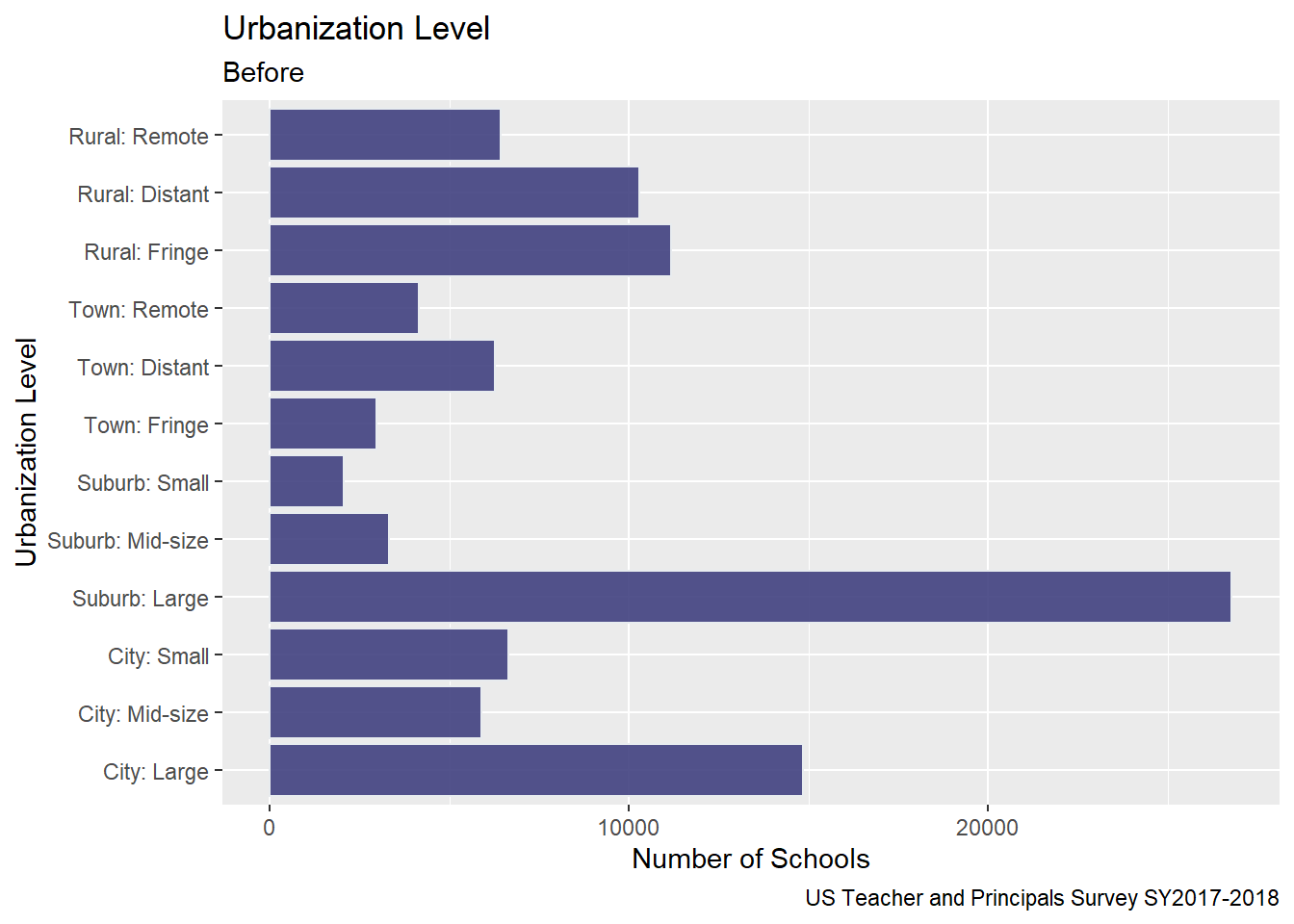
I chose to visualize the ULOCALE using a geom_bar since it was an ordinal variable. Before, creating the bar chart, I factored and ordered the values for each of the urbanization classifications from the survey. Because the variable names were rather long, I “flipped” the orientation of the chart to horizontal in order to make the names easier to read.
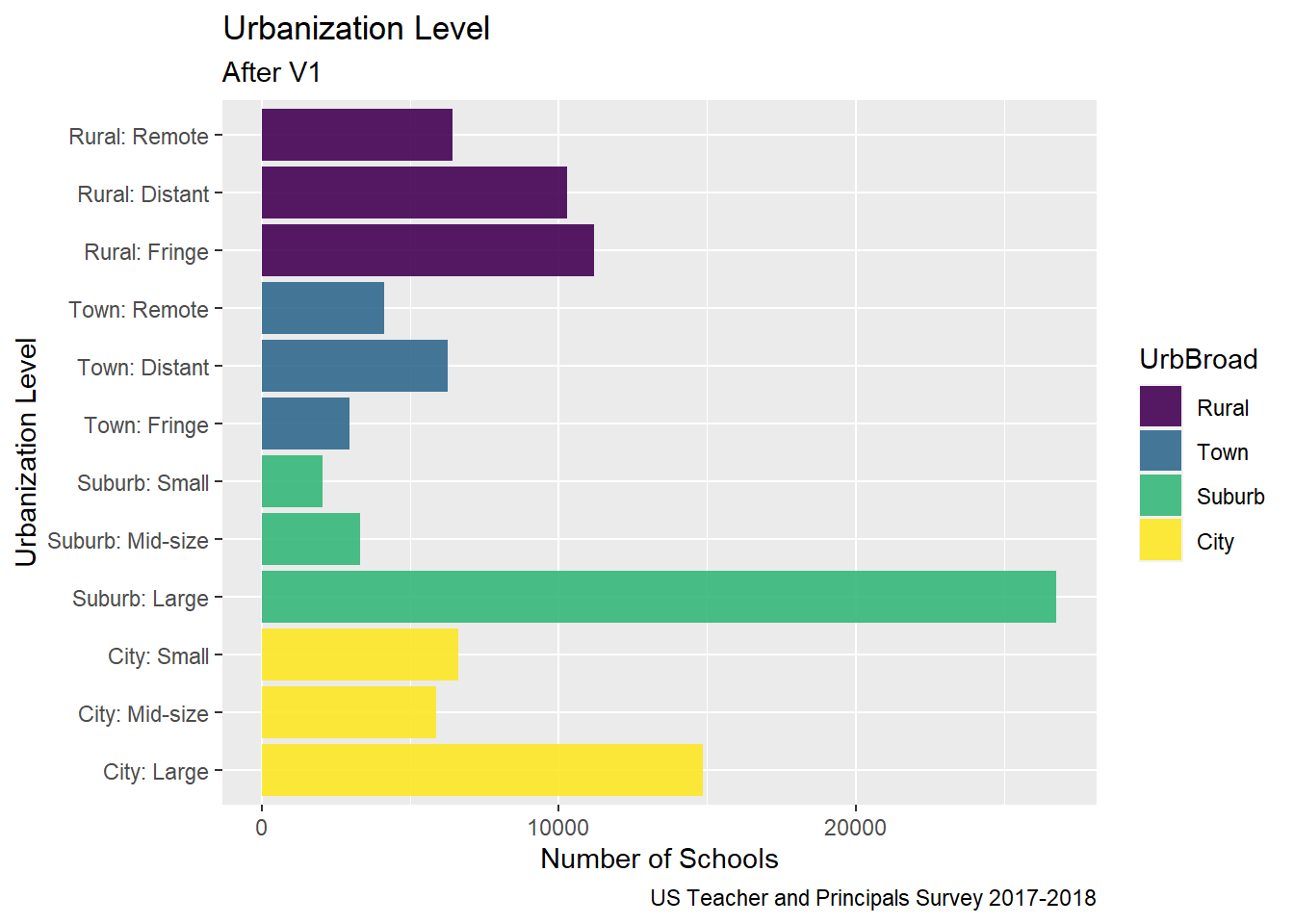
To improve on last time, I used color to group all of the bars from the same broad urbanization level, and mutated the variable names.
Here is my bar chart from Challenge 5
Code
# Bar Chart School LevelUrbanization <-PublicSchools_2017%>%select(ULOCALE)%>%mutate(UrbBroad =case_when(str_detect(ULOCALE,"Rural") ~"Rural",str_detect(ULOCALE, "Town") ~"Town",str_detect(ULOCALE, "Suburb")~"Suburb", str_detect(ULOCALE, "City") ~"City", ))%>%mutate(UrbBroad =recode_factor(UrbBroad,"Rural"="Rural","Town"="Town","Suburb"="Suburb","City"="City",.ordered =TRUE))#%>%# Urbanizationggplot(Urbanization, aes(ULOCALE)) +geom_bar(fill="#404080", color="#e8ecef", alpha=0.9) +#geom_bar(stat="identity", width=2) + scale_fill_manual("legend", values =c("City: Large"="blue", "City: Mid-Size"="blue", "City: Small"="blue")) +#theme_minimal() +labs(title ="Urbanization Level",subtitle ="Before",caption ="US Teacher and Principals Survey SY2017-2018", y ="Number of Schools", x ="Urbanization Level") +coord_flip()
Edits made for Challenge 7
Coloring by UrbBroad
Include Legend
BUT Y-axis is still pretty cluttered…
Code
# Bar Broader Urbanization Levelggplot(Urbanization, aes(x =`ULOCALE`, fill = UrbBroad)) +geom_bar(alpha=0.9) +#geom_text(stat='count', aes(label=..count..), vjust=-1)+labs(title ="Urbanization Level",subtitle ="After V1",caption ="US Teacher and Principals Survey 2017-2018",#fill = "Urbanization Level"y ="Number of Schools", x ="Urbanization Level") +coord_flip()
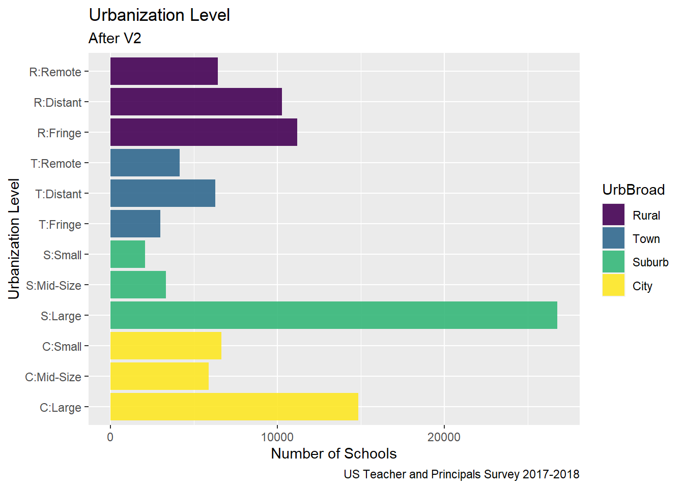
Some more tweaks for Challenge 7
Still color by UrbBroad
Mutate values of ULOCALE to declutter y-axis labels
Code
Urbanization2 <-PublicSchools_2017%>%select(ULOCALE)Urbanization2[c('UrbBroad', 'Urbanization Level')] <-str_split_fixed(Urbanization$ULOCALE, ":", 2)Urbanization2<-mutate(Urbanization2, UrbBroad =recode_factor(UrbBroad,"Rural"="Rural","Town"="Town","Suburb"="Suburb","City"="City",.ordered =TRUE))%>%mutate(ULOCALE =recode_factor(ULOCALE,"City: Large"="C:Large","City: Mid-size"="C:Mid-Size","City: Small"="C:Small","Suburb: Large"="S:Large","Suburb: Mid-size"="S:Mid-Size","Suburb: Small"="S:Small","Town: Fringe"="T:Fringe","Town: Distant"="T:Distant","Town: Remote"="T:Remote","Rural: Fringe"="R:Fringe","Rural: Distant"="R:Distant","Rural: Remote"="R:Remote",.ordered =TRUE))#Urbanization2# Color by Broader Urbanization Levelggplot(Urbanization2, aes(x =`ULOCALE`, fill = UrbBroad)) +geom_bar(alpha=0.9) +labs(title ="Urbanization Level",subtitle ="After V2",caption ="US Teacher and Principals Survey 2017-2018",color ="Urbanization Level",y ="Number of Schools", x ="Urbanization Level") +coord_flip()
Code
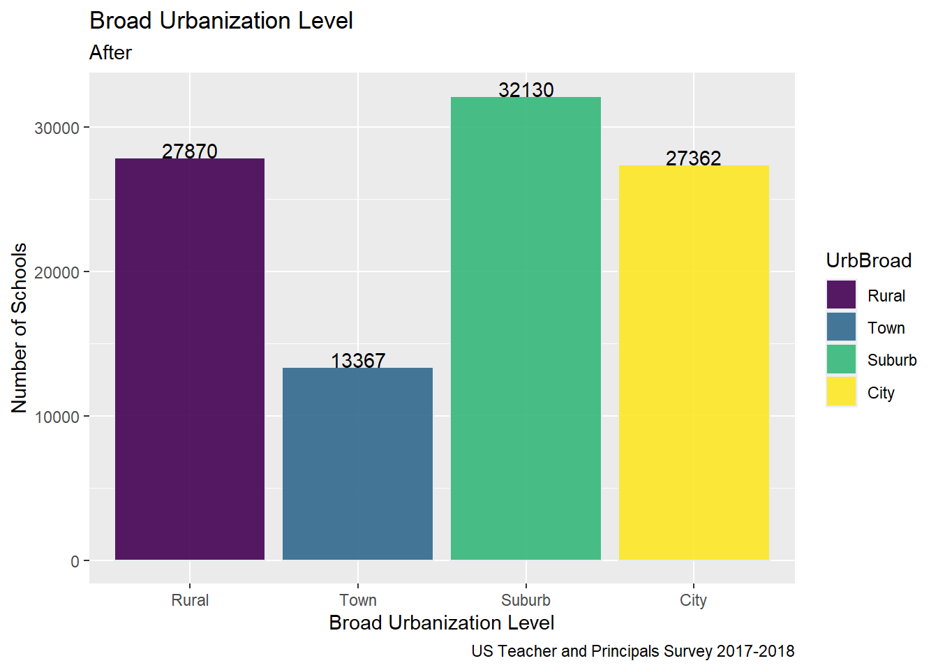
# Bar Broader Urbanization Level
Tweaked Broader Urbanization Level Chart from Challenge 5 to add Labels on the Bars and make the legend visible
Code
#Collapsed by UrbBroadggplot(Urbanization, aes(UrbBroad, fill = UrbBroad)) +geom_bar( color="#e8ecef", alpha=0.9) +geom_text(stat='count', aes(label=..count..), vjust=0)+labs(title ="Broad Urbanization Level",subtitle ="After",caption ="US Teacher and Principals Survey 2017-2018",y ="Number of Schools", x ="Broad Urbanization Level")
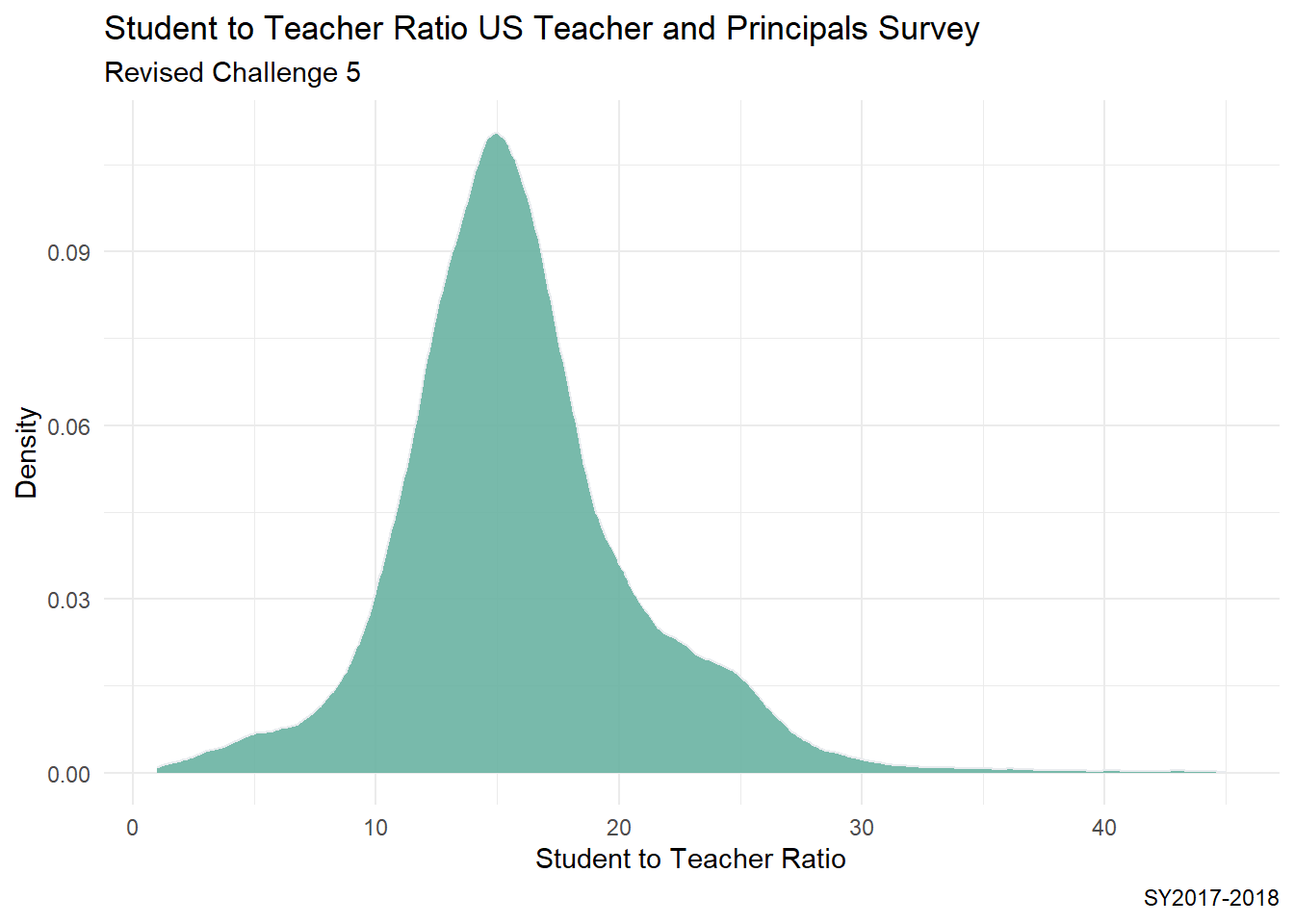
I decided to revise my histograms from Challenge 5 to to visualize the distribution of the student to teacher ratio in schools across the country. - I switched to density plots based on feedback from the instructor. - From the summary, I can see that even after removing implausible STUTERATIO values that there are still some values that are well above the upper fence.
Generated by summarytools 1.0.1 (R version 4.2.1) 2022-12-21
Code
ggplot(PublicSchools_2017, aes(x = STUTERATIO)) +geom_density(fill="#69b3a2", color="#e9ecef", alpha=0.9) +theme_minimal() +labs(title ="Student to Teacher Ratio US Teacher and Principals Survey",subtitle ="Revised Challenge 5",caption ="SY2017-2018",y ="Density",x ="Student to Teacher Ratio")
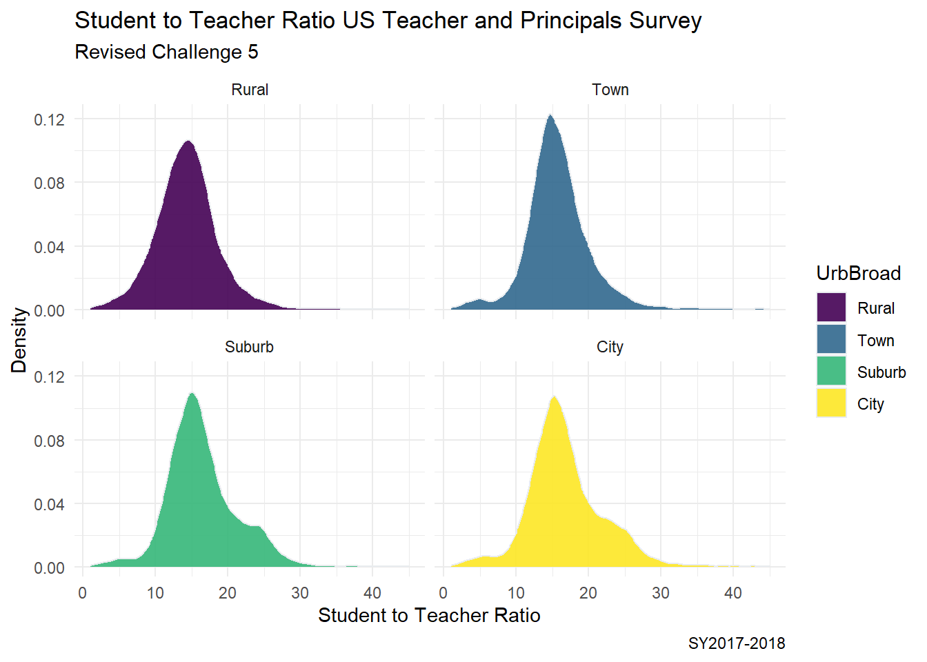
One might consider if the distribution of the student to teacher ratio is different based on the urbanization level of a school. I would like to produce a more advanced plot, where I see 4 density side by side where I group this data by Rural/Town/Suburban/City Urban level.
Code
Urban_Ratio <-PublicSchools_2017%>%select(ULOCALE, STUTERATIO)%>%mutate(UrbBroad =ifelse(str_detect(ULOCALE,"Rural"), "Rural", ifelse(str_detect(ULOCALE, "Town"),"Town", ifelse(str_detect(ULOCALE, "Suburb"),"Suburb", ifelse(str_detect(ULOCALE, "City"),"City", ULOCALE)))))%>%mutate(UrbBroad =recode_factor(UrbBroad,"Rural"="Rural","Town"="Town","Suburb"="Suburb","City"="City",.ordered =TRUE))#Urban_Ratioggplot(Urban_Ratio, aes(x = STUTERATIO, color = UrbBroad, fill = UrbBroad)) +geom_density( color="#e9ecef", alpha=0.9) +labs(title ="Student to Teacher Ratio US Teacher and Principals Survey",subtitle ="Revised Challenge 5",y ="Density",x ="Student to Teacher Ratio",caption ="SY2017-2018") +theme_minimal() +facet_wrap(vars(UrbBroad))
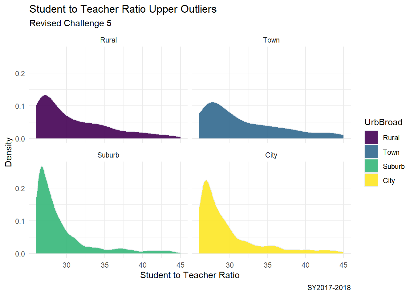
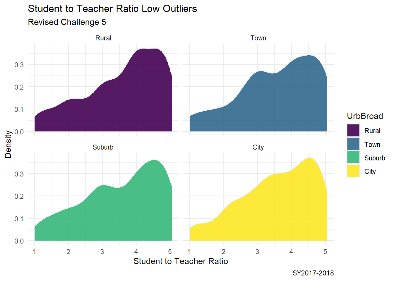
Selecting a new data set with just the outliers using Upper Fence and Lower Fence.
From our abc_poll data frame summary, we can see that this data set contains polling results from 527 respondents to an ABC news political poll. The results consist of information for two broad categories
Demographic characteristics of the respondents themselves (e.g., language of the poll given to the respondent (Spanish or English), age, educational attainment, ethnicity, household size, ethnic make up, gender, income range, Marital status, Metro category, Geographic region, Rental status, State, Employment status, Working characteristics, Willingness to have a follow up interview)
The responses that the individuals gave to 11 questions (there are 5 broad questions Q1-Q5, but Q1 consists of 6 sub questions, a-f).
Code
#Filter, rename variables, and mutate values of variables on read-inabc_poll<-read_csv("_data/abc_poll_2021.csv", skip =1, col_names=c("pp_id", "pp_Language_2", "delete","pp_age", "pp_educ_5", "delete", "pp_gender_2", "pp_ethnicity_5", "pp_hhsize_6", "pp_inc_7", "pp_marital_5", "pp_metro_cat_2", "pp_region_4","pp_housing_3", "pp_state", "pp_working_arrangement_9", "pp_employment_status_3", "Q1a_3", "Q1b_3", "Q1c_3", "Q1d_3","Q1e_3", "Q1f_3","Q2ConcernLevel_4","Q3_3", "Q4_5", "Q5Optimism_3", "pp_political_id_5", "delete", "pp_contact_2", "weights_pid"))%>%select(!contains("delete"))%>%#replace "6 or more" in pp_hhsize_6 to the value of 6 so that the column can be# of double data type.mutate(pp_hhsize_6 =ifelse(pp_hhsize_6 =="6 or more", "6", pp_hhsize_6)) %>%transform( pp_hhsize_6 =as.numeric(pp_hhsize_6))%>%#fix the issue with apostrophes in pp_educ_5 values on read inmutate(pp_educ_5 =ifelse(str_starts(pp_educ_5,"Bachelor"), "Bachelor", pp_educ_5))%>%mutate(pp_educ_5 =ifelse(str_starts(pp_educ_5, "Master"), "Master", pp_educ_5))# reduce lengthy responses to necessary info in nominal variables abc_poll$pp_Language_2 =substr(abc_poll$pp_Language_2,1,2) abc_poll$pp_gender_2 =substr(abc_poll$pp_gender_2,1,1) abc_poll$pp_contact_2 =substr(abc_poll$pp_contact_2,1,1)#reduce lengthy responses of nominal variables using Case When#pp_political_id_5 abc_poll<-mutate(abc_poll, pp_political_id_5 =case_when( pp_political_id_5 =="A Democrat"~"Dem", pp_political_id_5 =="A Republican"~"Rep", pp_political_id_5 =="An Independent"~"Ind", pp_political_id_5 =="Something else"~"Other", pp_political_id_5 =="Skipped"~"Skipped"))%>%#pp_housing_3mutate(pp_housing_3 =case_when( pp_housing_3 =="Occupied without payment of cash rent"~"NonPayment_Occupied", pp_housing_3 =="Rented for cash"~"Payment_Rent", pp_housing_3 =="Owned or being bought by you or someone in your household"~"Payment_Own"))%>%# pp_working_arrangement_9mutate(pp_working_arrangement_9 =case_when( pp_working_arrangement_9 =="Other"~"Other", pp_working_arrangement_9 =="Retired"~"Retired", pp_working_arrangement_9 =="Homemaker"~"Homemaker", pp_working_arrangement_9 =="Student"~"Student", pp_working_arrangement_9 =="Currently laid off"~"Laid Off", pp_working_arrangement_9 =="On furlough"~"Furlough", pp_working_arrangement_9 =="Employed part-time (by someone else)"~"Employed_PT", pp_working_arrangement_9 =="Self-employed"~"Emp_Self", pp_working_arrangement_9 =="Employed full-time (by someone else)"~"Employed_FT"))%>%#pp_ethnicity_5mutate( pp_ethnicity_5 =case_when( pp_ethnicity_5 =="2+ Races, Non-Hispanic"~"2+ \n NH", pp_ethnicity_5 =="Black, Non-Hispanic"~"Bl \n NH", pp_ethnicity_5 =="Hispanic"~"Hisp", pp_ethnicity_5 =="Other, Non-Hispanic"~"Ot \n NH", pp_ethnicity_5 =="White, Non-Hispanic"~"Wh \n NH")) abc_poll
Generated by summarytools 1.0.1 (R version 4.2.1) 2022-12-21
On the read in, I chose to
Filter:
complete_status: everyone was qualified
ppeducat: this categorizing of ppeduc5 can be done in the data frame using a case_when() and factoring
ABCAGE: this qualitative age range variable can be replicated by using the data in the ppage variable and a case_when; one might want to examine different ranges of ages.
Rename
I renamed all of the variables corresponding to demographic characteristics of the poll participant to begin with pp_.
I renamed all of the variables corresponding to survey question responses from the participants to begin with Q
If a variable had a fixed number of possible responses (which I could see from the summary), e.g., pp_marital had 5 possible responses, I included the number of “categories” or possible responses in the variable name preceded by an underscore, pp_marital_5
Mutate
I replaced the pp_hhsize_6 value of “6 or more” with 6, so that it could be of double data type
I mutated the pp_educ5 column to remove the apostrophes from “Bachelor’s” and “Master’s” that were producing the “\x92”’s in the values on read in.
If a nominal variable had lengthy values, I reduced them to the key info using mutate, str_sub, and case_when
Because our data frame is poll data, our frame will stay relatively wide. Each polled person pp_id represents a unique case and the values for the case are
the demographic characteristics of the polled person and
the individual’s responses to a given survey question
To tidy our data, I factored the following ordinal variables:
pp_inc_7: The income level of the polled person
pp_educ_5: The educational attainment level of the polled person
pp_employment_status_3: The employment status of the polled person (not working, working part time, working full time)
Code
abc_poll <-mutate(abc_poll, pp_inc_7 =recode_factor(pp_inc_7, "Less than $10,000"="<10,000", "$10,000 to $24,999"="10,000-\n 24,999", "$25,000 to $49,999"="25,000- \n 49,999", "$50,000 to $74,999"="50,00- \n 74,999", "$75,000 to $99,999"="75,000- \n 99,999", "$100,000 to $149,999"="100,000- \n 149,999","$150,000 or more"="$150,000 +",.ordered =TRUE))#pp_educ_5 abc_poll <-mutate(abc_poll, pp_educ_5 =recode_factor( pp_educ_5,"No high school diploma or GED"="No HS","High school graduate (high school diploma or the equivalent GED)"="HS/GED","Some college or Associate degree"="Some College","Bachelor"="Bachelor","Master"="Master+",.ordered =TRUE))##pp_political_id_5 abc_poll <-mutate(abc_poll, pp_political_id_5 =recode_factor( pp_political_id_5,"Dem"="Dem","Rep"="Rep","Ind"="Ind","Other"="Other","Skipped"="Skipped",.ordered =TRUE))#pp_employment_status_3 abc_poll <-mutate(abc_poll, pp_employment_status_3 =recode_factor( pp_employment_status_3,"Not working"="Not working","Working part-time"="Working part-time","Working full-time"="Working full-time",.ordered =TRUE)) abc_poll <-mutate(abc_poll, Q2ConcernLevel_4 =recode_factor( Q2ConcernLevel_4 ,"Not concerned at all"="Not at all","Not so concerned"="Not so concerned","Somewhat concerned"="Somewhat","Very concerned"="Very concerned",.ordered =TRUE))#Q4_5abc_poll <-mutate(abc_poll, Q4_5 =recode_factor( Q4_5 ,"Poor"="Poor","Not so good"="Not so good","Good"="Good","Excellent"="Excellent","Skipped"="Skipped",.ordered =TRUE)) abc_poll
Code
##Is the data frame arranged "alphabetically" or "ordinally?" abc_poll%>%arrange(desc(pp_educ_5))
Generated by summarytools 1.0.1 (R version 4.2.1) 2022-12-21
There were many variables from the abc_poll that I could imagine visualizing proportional relationships and proportional relationships by groups.
I explored multiple versions of bar charts to visualize the part-whole relationship of a respondents political identification and stated level of concern in poll question 2.
Edits from Challenge 6 (I had copied over a pivot_longer from Tidying in challenge 4, that threw off my counts; so I commented out the Q1 pivot)
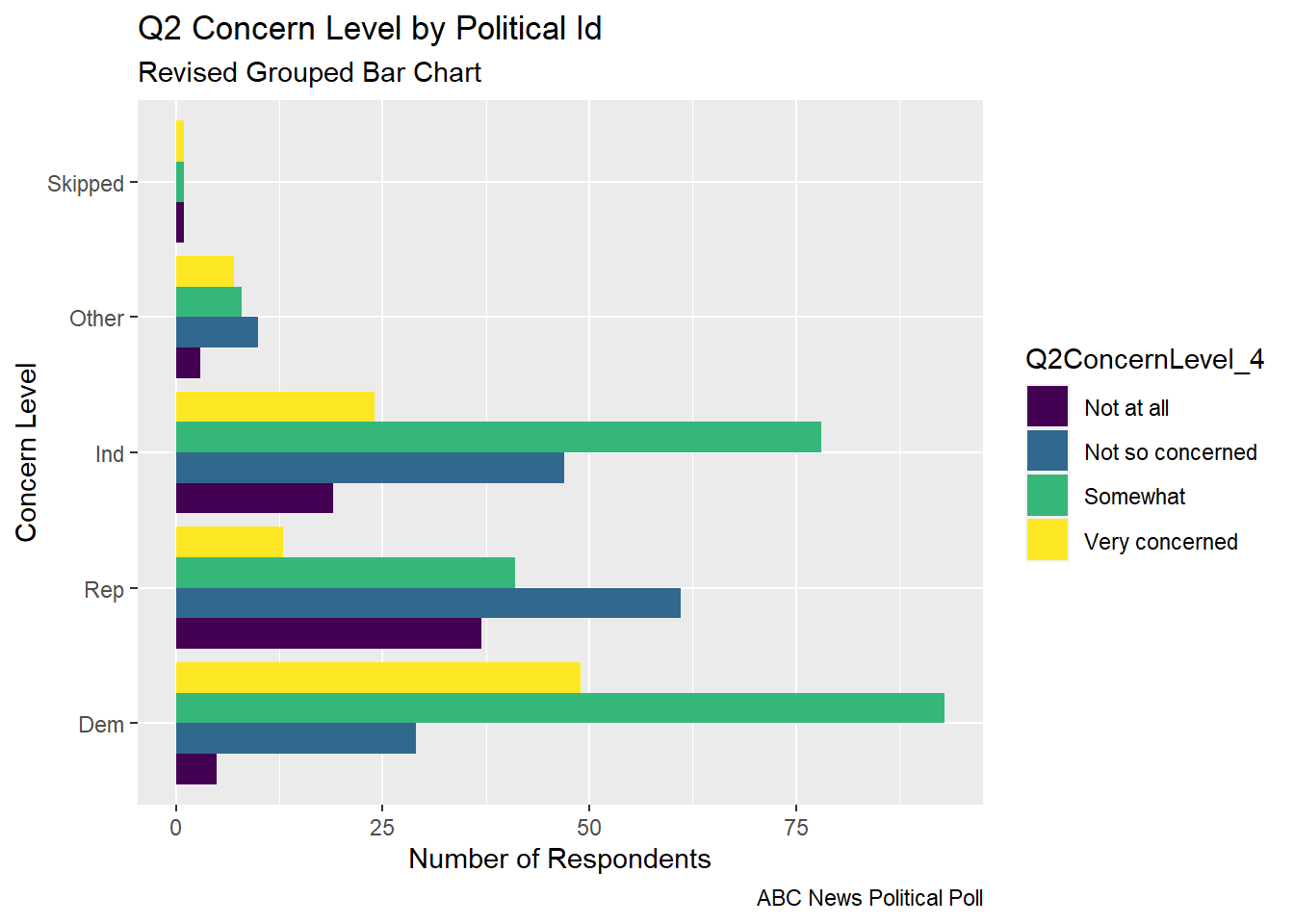
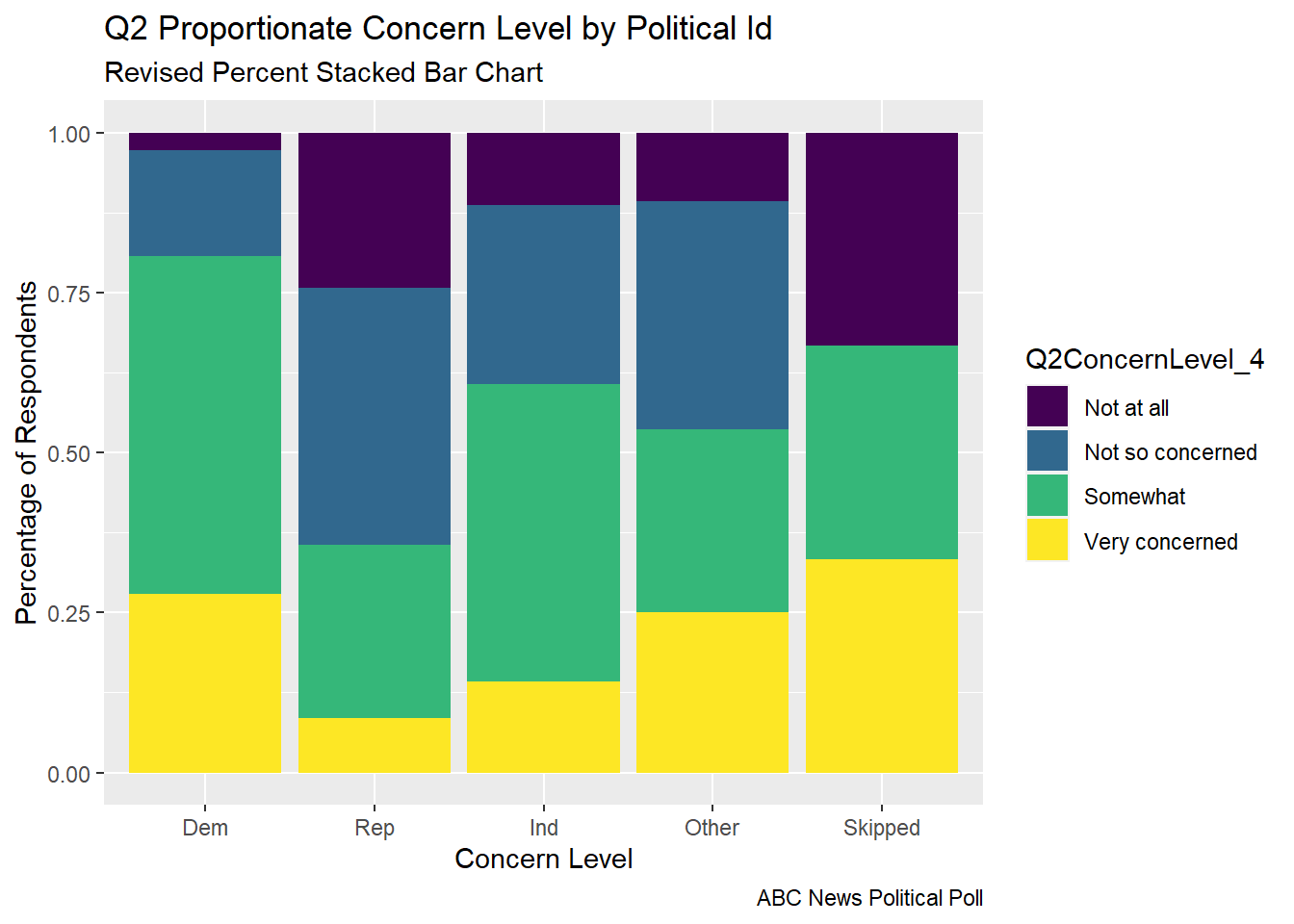
From feedback, I learned that a Social Scientist would rather fill by Political Id, so I made versions of the same graphs where I switched the fill.
Code
#Gather/Group the values of the Categorical Variables (pp_political_id_5 and#Q2ConcernLevel_4abc_poll_pp_id_q2 <- abc_poll %>%group_by(pp_political_id_5, Q2ConcernLevel_4) %>%#mutate(pp_political_id_5 = na_if(pp_political_id_5, "Skipped"))%>%summarise(count =n()) abc_poll_pp_id_q2
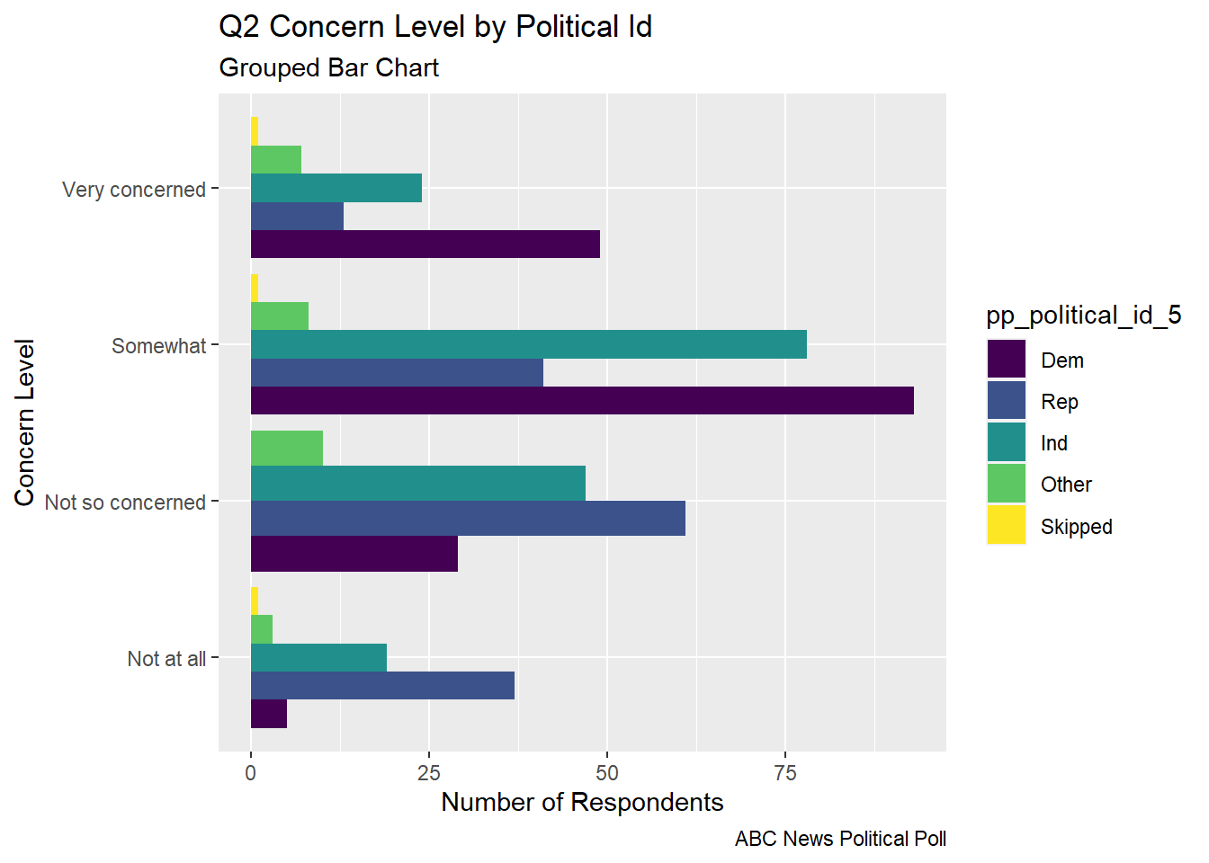
The grouped bar chart shows each of the concern levels broken down by the respondent’s political id. You can see that many respondents are somewhat concerned
Code
##Grouped Bar Chart political id and concern levelabc_poll_pp_id_q2%>%ggplot(aes(fill=pp_political_id_5, y=count, x=Q2ConcernLevel_4)) +geom_bar(position="dodge", stat="identity") +labs(subtitle ="Grouped Bar Chart" ,y ="Number of Respondents",x="Concern Level",title ="Q2 Concern Level by Political Id",caption ="ABC News Political Poll")+coord_flip()
Code
## Grouped Bar Chart Flipped Political IDabc_poll_pp_id_q2%>%ggplot(aes(fill=Q2ConcernLevel_4, y=count, x=pp_political_id_5)) +geom_bar(position="dodge", stat="identity") +labs(subtitle ="Revised Grouped Bar Chart" ,y ="Number of Respondents",x="Concern Level",title ="Q2 Concern Level by Political Id",caption ="ABC News Political Poll")+coord_flip()
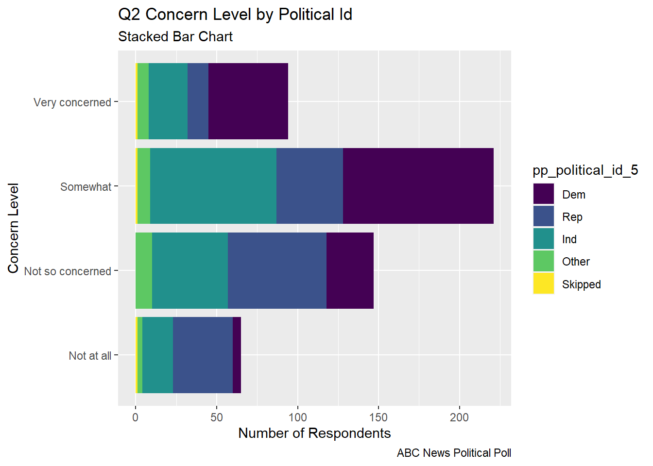
The stacked bar chart gives an easier to digest view of the comparative level of concern and the part of each concern level that comes from respondents from each political party.
Code
## Stacked bar abc_poll_pp_id_q2%>%ggplot(aes(fill=pp_political_id_5, y = count, x=Q2ConcernLevel_4)) +geom_bar(position="stack", stat="identity")+labs(subtitle ="Stacked Bar Chart",y ="Number of Respondents",x="Concern Level",title ="Q2 Concern Level by Political Id",caption ="ABC News Political Poll") +coord_flip()
Code
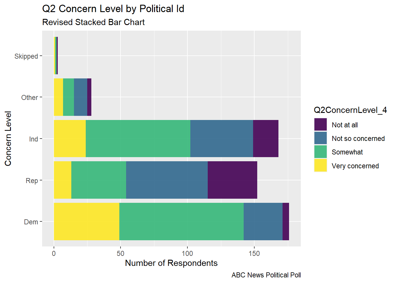
## Revised Stacked barggplot(abc_poll, aes(x =`pp_political_id_5`, fill = Q2ConcernLevel_4)) +geom_bar(alpha=0.9)+labs(subtitle ="Revised Stacked Bar Chart",y ="Number of Respondents",x="Concern Level",title ="Q2 Concern Level by Political Id",caption ="ABC News Political Poll") +coord_flip()
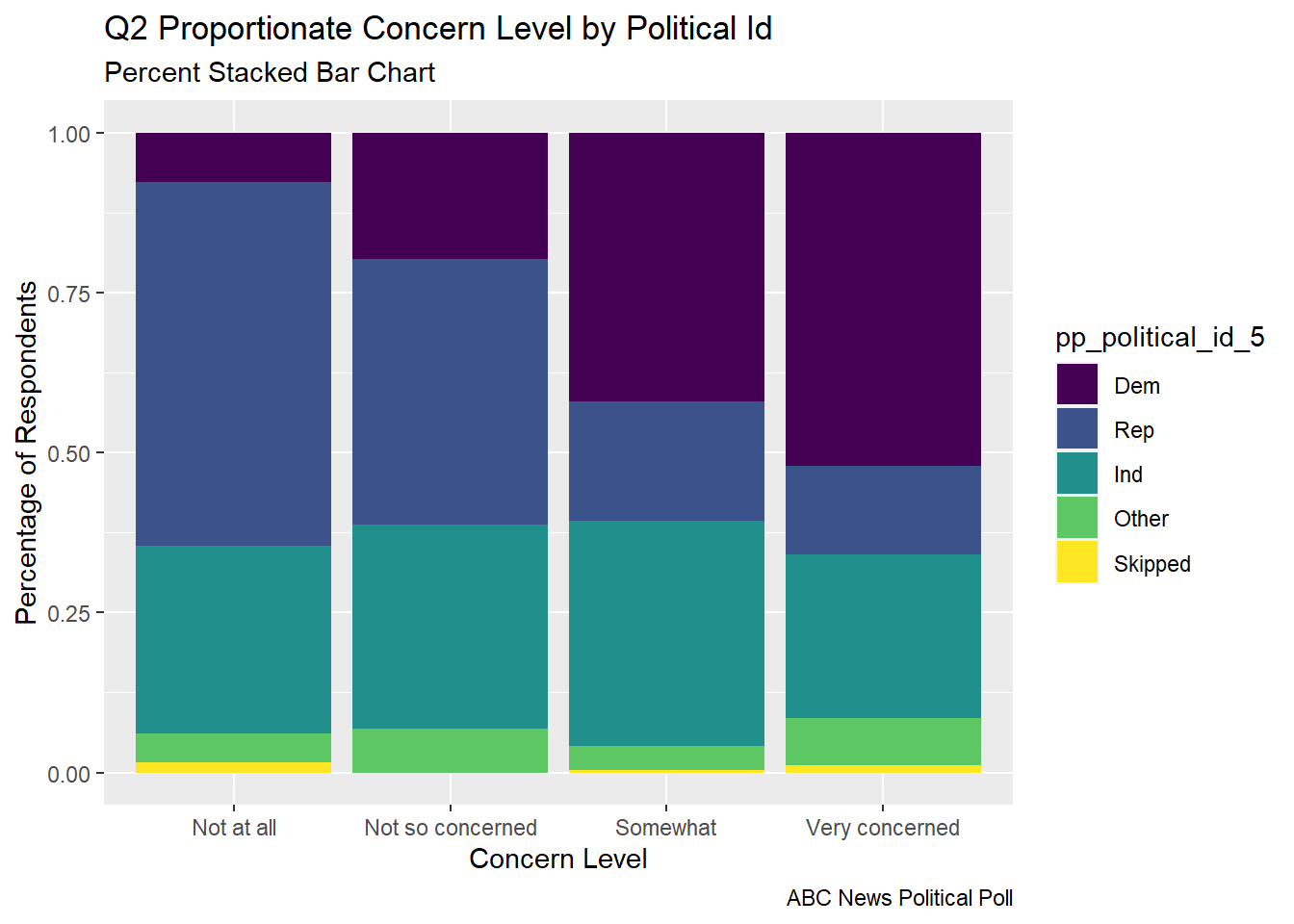
The percent stacked bar chart allows us to very quickly see the proportion of respondents from each political party that make up a given concern level. This allows us to see how strongly the level of concern seems to relate to political party.
Code
# Percent Stacked barabc_poll_pp_id_q2%>%ggplot(aes(fill=pp_political_id_5, y=count, x=Q2ConcernLevel_4)) +geom_bar(position="fill", stat="identity")+labs(subtitle ="Percent Stacked Bar Chart" ,y ="Percentage of Respondents",x="Concern Level",title ="Q2 Proportionate Concern Level by Political Id",caption ="ABC News Political Poll",color ="Political ID")
Code
# Revised Percent Stacked barabc_poll_pp_id_q2%>%ggplot(aes(fill=Q2ConcernLevel_4, y=count, x=pp_political_id_5)) +geom_bar(position="fill", stat="identity")+labs(subtitle ="Revised Percent Stacked Bar Chart" ,y ="Percentage of Respondents",x="Concern Level",title ="Q2 Proportionate Concern Level by Political Id",caption ="ABC News Political Poll",color ="Political ID")
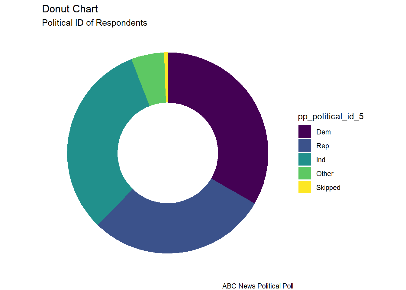
The donut chart is a visual of the distribution of political identification of the poll respondents. I read that donut charts and pie charts are not recommended. In something with only 3 groups, I thought it could be ok, although it doesn’t allow one to see subtle differences between the size of groups like one would see in a “lollipop” or a “bar chart”.
Code
# Facet Wrap with Doughnut (Facet wrap didn't work...would have to fix this)# Compute percentagesabc_poll_pp_id_q2$fraction = abc_poll_pp_id_q2$count /sum(abc_poll_pp_id_q2$count)# Compute the cumulative percentages (top of each rectangle)abc_poll_pp_id_q2$ymax =cumsum(abc_poll_pp_id_q2$fraction)# Compute the bottom of each rectangleabc_poll_pp_id_q2$ymin =c(0, head(abc_poll_pp_id_q2$ymax, n=-1))# Compute label positionabc_poll_pp_id_q2$labelPosition <- (abc_poll_pp_id_q2$ymax + abc_poll_pp_id_q2$ymin) /2# Compute a good labelabc_poll_pp_id_q2$label <-paste0(abc_poll_pp_id_q2$pp_political_id_5, "\n value: ", abc_poll_pp_id_q2$count)# Make the plotggplot(abc_poll_pp_id_q2, aes(ymax=ymax, ymin=ymin, xmax=4, xmin=3, fill=pp_political_id_5)) +geom_rect() +# geom_label( x=3.5, aes(y=labelPosition, label=label), size=6) +coord_polar(theta="y") +# Try to remove that to understand how the chart is built initiallyxlim(c(2, 4)) +theme_void() +theme(legend.position ="right") +labs(subtitle ="Political ID of Respondents",title ="Donut Chart",caption ="ABC News Political Poll", )
Code
#facet_wrap(vars(Q2ConcernLevel_4))
Questions
How do I change the label of the legend from the name of the “fill” variable?
In what situations, if any, is a pie/donut chart appropriate?
I chose to visualize a “flow relationship”, between a respondent’s reported level of optimism reported in question 5 and several other demographic variables. I found the “skipped” responses to Question 5 to be difficult to read in a flow chart in a way that they weren’t with stacked bar charts or pie charts, so I removed them from these visualizations.
I revised my previous chord diagram by fixing the error in the pivot longer. Now the values of my origin and destination variables are accurate
Code
# Chord Diagrams # Charge the circlize librarylibrary(circlize)
Error in library(circlize): there is no package called 'circlize'
Political ID to Q5 Optimism Level showed a clear “flow” of Republican and Other party to pessimistic responses and a strong “flow” of Democratic party ID to optimistic responses.
Code
#Q5 Optimism Status vs Political ID# Gather the "edges" for our flow: origin: Political ID, destination: Q5 Optimism levelflow_pol_id_optimism <- abc_poll %>%select(pp_political_id_5, Q5Optimism_3)%>%mutate(Q5Optimism_3 =na_if(Q5Optimism_3, "Skipped"))%>%mutate(pp_political_id_5 =na_if(pp_political_id_5, "Skipped"))%>%with(table(pp_political_id_5, Q5Optimism_3))%>%# Make the circular plotchordDiagram(transparency =0.5)
Error in chordDiagram(., transparency = 0.5): could not find function "chordDiagram"
Code
title(main ="Revised Political ID to Q5 Optimism Level", sub ="ABC News Political Poll")
Error in title(main = "Revised Political ID to Q5 Optimism Level", sub = "ABC News Political Poll"): plot.new has not been called yet
Geographic Region to Q5 Optimism Level showed a simple “flow” however it was not so easy to discern a distinction in the proportion of optimismtic and pessimistic responses by region.
Code
#Q5 Optimism Status vs Geographic Region# Gather the "edges" for our flow: origin: Q5 Optimism, destination: Geographic Regionflow_region_educ <- abc_poll %>%select(pp_region_4, Q5Optimism_3)%>%mutate(Q5Optimism_3 =na_if(Q5Optimism_3, "Skipped"))%>%with(table(Q5Optimism_3, pp_region_4))%>%# Make the circular plotchordDiagram(transparency =0.5)
Error in chordDiagram(., transparency = 0.5): could not find function "chordDiagram"
Code
title(main ="Revised Q5 Optimism Level to Geographic Region", sub ="ABC News Political Poll")
Error in title(main = "Revised Q5 Optimism Level to Geographic Region", : plot.new has not been called yet
Questions/ Future To-Do’s
I would like to explicitly specify colorings
Why do the colors of my chord diagram change each time I run the chunk?
How do I fix the labels around the circle (other than using “newline”)?
Other than traffic/shipping/migration patterns, what are examples of ideas that are well represented by chord charts?
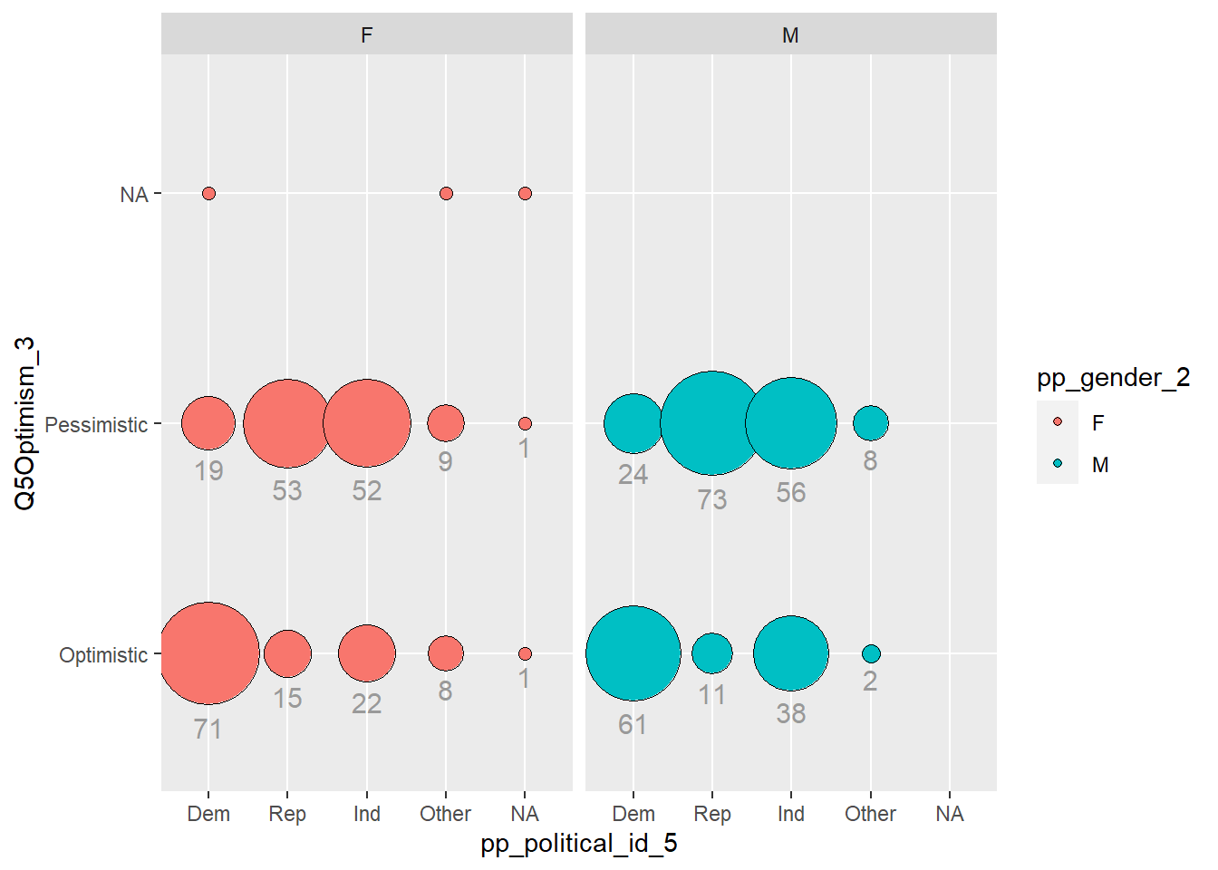
I noticed balloon plots as a way to have multidimensional, qualitative variables. So I tried to produce one. The story here, doesn’t seem to be to interesting though.
---title: "Challenge 7"author: "Theresa Szczepanski"description: "Visualizing Multiple Dimensions"date: "10/31/2022"format: html: toc: true code-copy: true code-tools: true df-print: paged code-fold: truecategories: - challenge_7 # - hotel_bookings #- air_bnb #- fed_rate #- debt #- usa_households - abc_poll - public_schools - Theresa_Szczepanski---```{r}#| label: setup#| warning: false#| message: falselibrary(tidyverse)library(ggplot2)knitr::opts_chunk$set(echo =TRUE, warning=FALSE, message=FALSE)```## Challenge Overview[R Graph Gallery](https://r-graph-gallery.com/) is a good starting point for thinking about what information is conveyed in standard graph types, and includes example R code. And anyone not familiar with Edward Tufte should check out his [fantastic books](https://www.edwardtufte.com/tufte/books_vdqi) and [courses on data visualizaton.](https://www.edwardtufte.com/tufte/courses)::: panel-tabset## Public School Characteristics ⭐⭐⭐⭐ ::: panel-tabset### Read in the DataOn the read in, I deleted: - duplicates of the latitute/longitudinal coordinates `X`, `Y` - `SURVYEAR` since we are only examining 2017-2018 survey - __I thought I should delete__: aggregate information that could be replicated: `TOTFRL`, `TOTMENR``TOTFENR`, `TOTAL`, `Member`; __HOWEVER__, inspection of the median, range, and distribution of numeric variables in the summary indicates there are possibly several mis-entries, (for example: student to teacher ratio: `STUTERATIO` has a min = 0, med = 15.3, and max=22350. There are some instances where the `STUTERATIO` exceeds the total number of students.- Some of the aggregate categories might help me check for mis-entries.On the read in, I factored the ordinal variables: - `GSHI`, `GSLO`, `SCHOOL_LEVEL`, and `ULOCALE````{r}#Work done to determine what to filter/recode on read in# PublicSchools_2017<-read_csv("_data/Public_School_Characteristics_2017-18.csv")%>%# select(-c("X", "Y","OBJECTID" ,"SURVYEAR"))#Aggregate variables I would have filtered if I wasn't concerned about mis-entries:#"TOTFRL", "TOTMENROL", "TOTFENROL", "MEMBER", "TOTAL"# Identify Levels for Factoring Ordinal Variables# #ULOCALE# PublicSchools_2017%>%# select(ULOCALE)%>%# unique()# #GSLO# PublicSchools_2017%>%# select(GSLO)%>%# unique()# #GSLHI# PublicSchools_2017%>%# select(GSHI)%>%# unique()# #SCHOOL_LEVEL# PublicSchools_2017%>%# select(SCHOOL_LEVEL)%>%# unique()#Recode all ordinal variable as factorsPublicSchools_2017<-read_csv("_data/Public_School_Characteristics_2017-18.csv")%>%select(-c("X", "Y","OBJECTID" ,"SURVYEAR")) %>%mutate(ULOCALE =recode_factor(ULOCALE,"11-City: Large"="City: Large","12-City: Mid-size"="City: Mid-size","13-City: Small"="City: Small","21-Suburb: Large"="Suburb: Large","22-Suburb: Mid-size"="Suburb: Mid-size","23-Suburb: Small"="Suburb: Small","31-Town: Fringe"="Town: Fringe","32-Town: Distant"="Town: Distant","33-Town: Remote"="Town: Remote","41-Rural: Fringe"="Rural: Fringe","42-Rural: Distant"="Rural: Distant","43-Rural: Remote"="Rural: Remote",.ordered =TRUE))%>%mutate(SCHOOL_LEVEL =recode_factor(SCHOOL_LEVEL,"Prekindergarten"="Prekindergarten","Elementary"="Elementary","Middle"="Middle","Secondary"="Secondary","High"="High","Ungraded"="Ungraded","Other"="Other","Not Applicable"="Not Applicable","Not Reported"="Not Reported",.ordered =TRUE))%>%mutate(GSLO =recode_factor(GSLO,"PK"="PK","KG"="KG","01"="01","02"="02","03"="03","04"="04","05"="05","M"="M","06"="06","07"="07","08"="08","09"="09","10"="10","11"="11","12"="12","AE"="AE","UG"="UG","N"="N",.ordered =TRUE))%>%mutate(GSHI =recode_factor(GSHI,"PK"="PK","KG"="KG","01"="01","02"="02","03"="03","04"="04","05"="05","M"="M","06"="06","07"="07","08"="08","09"="09","10"="10","11"="11","12"="12","13"="13","AE"="AE","UG"="UG","N"="N",.ordered =TRUE)) PublicSchools_2017```::: panel-tabset### Briefly describe the dataThe `PublicSchools_2017` data frame consists of data from selected questions from the [2017-208 National Teachers and Principals Survey](https://nces.ed.gov/surveys/ntps/question1718.asp)conducted by the United States Census Board and is "a system of related questionnaires that provide descriptive data on the context of public and private elementary and secondary education in addition to giving local, state, and national policymakers a variety of statistics on the condition of education in the United States."Our data frame consists of a subset of the items surveyed from 100729 schools across the United States. The 75 variables contain information from the following categories:Geographic Location of the School- State, town, and address- Level of Urbanization (rural, town, city, etc.)Characteristics of the School design:- Charter, Magnet, Traditional Public, - Virtual/non- Highest and Lowest Grade levels served and number of students per grade level.- Level of School: Elementary, Middle, Secondary, Adult Ed., etc.- Type of School: Alternative, Regular school, Special education school, or Vocational school - Status of the school when surveyed (new, change of leadership, operational, etc.)- Student to Teacher Ratio- If the school has Title 1 statusDemographic Characteristics of the student body:- Number of students of given ethnic backgrounds by gender (M/F only)Socioeconomic Characteristics of the student body:- Number of students qualifying for free or reduced lunch.## Questions for Further ReviewWhat are the following variables? - `G13` - `AS` - `UG`: Ungraded (School level) - `AE`: Adult Education (School level) - `FTE` - `STATUS`Why did the original `Member` have 2944 distinct values while `total` had 2944?### Data Summary```{r}# examine the summary to decide how to best set up our data frameprint(summarytools::dfSummary(PublicSchools_2017,varnumbers =FALSE,plain.ascii =FALSE,style ="grid",graph.magnif =0.70,valid.col =FALSE),method ='render',table.classes ='table-condensed')```:::### Tidy Data (MUCH WORK LEFT HERE for Other Variables)Because we have survey data, we will have a relatively wide data frame, and will have to make use of `select` and `group by` when making summaries or visualizations.The `ULOCALE` variable needed to be recoded as an ordinal variable with levels in order to have the bars appear in the appropriate order for our visualization.Upon closer inspection, it turns out that there are several numeric variables withdata mis-entered:- The number of students with Free or Reduced lunch cannot be negative- Student to Teacher Ratio cannot exceed the number os students in a school (yet there entries that do)- How should these values be recoded, so we can still use the information for a given school but not throw off our summary statistics or visual representations?- The min, median, max values are suspicious for several of the numeric entries. If I had more time, I would consider each variable, what I know about it in context, and take advantage of mean/sd or median and IQR to replace likely mis-entries with N/A- I used the code below to remove the most extreme cases from our calculations based on the logical bounds of a ratio and count of students.```{r}PublicSchools_2017<-PublicSchools_2017%>%mutate(FRELCH =replace(FRELCH, which(FRELCH<0), NA))%>%mutate(REDLCH =replace(REDLCH, which(REDLCH<0), NA))%>%mutate(STUTERATIO =replace(STUTERATIO, which(STUTERATIO>45), NA))%>%mutate(STUTERATIO =replace(STUTERATIO, which(STUTERATIO<1), NA))```### Revised Univariate VisualizationsI chose to visualize the `ULOCALE` using a `geom_bar` since it was an ordinal variable. Before, creating the bar chart, I factored and ordered the values for each of the urbanization classifications from the survey. Because the variablenames were rather long, I "flipped" the orientation of the chart to horizontal in order to make the names easier to read.- To improve on last time, I used color to group all of the bars from the same broadurbanization level, and mutated the variable names.- Here is my bar chart from Challenge 5```{r}# Bar Chart School LevelUrbanization <-PublicSchools_2017%>%select(ULOCALE)%>%mutate(UrbBroad =case_when(str_detect(ULOCALE,"Rural") ~"Rural",str_detect(ULOCALE, "Town") ~"Town",str_detect(ULOCALE, "Suburb")~"Suburb", str_detect(ULOCALE, "City") ~"City", ))%>%mutate(UrbBroad =recode_factor(UrbBroad,"Rural"="Rural","Town"="Town","Suburb"="Suburb","City"="City",.ordered =TRUE))#%>%# Urbanizationggplot(Urbanization, aes(ULOCALE)) +geom_bar(fill="#404080", color="#e8ecef", alpha=0.9) +#geom_bar(stat="identity", width=2) + scale_fill_manual("legend", values =c("City: Large"="blue", "City: Mid-Size"="blue", "City: Small"="blue")) +#theme_minimal() +labs(title ="Urbanization Level",subtitle ="Before",caption ="US Teacher and Principals Survey SY2017-2018", y ="Number of Schools", x ="Urbanization Level") +coord_flip()```Edits made for Challenge 7- Coloring by `UrbBroad`- Include Legend- BUT Y-axis is still pretty cluttered...```{r}# Bar Broader Urbanization Levelggplot(Urbanization, aes(x =`ULOCALE`, fill = UrbBroad)) +geom_bar(alpha=0.9) +#geom_text(stat='count', aes(label=..count..), vjust=-1)+labs(title ="Urbanization Level",subtitle ="After V1",caption ="US Teacher and Principals Survey 2017-2018",#fill = "Urbanization Level"y ="Number of Schools", x ="Urbanization Level") +coord_flip()```Some more tweaks for Challenge 7- Still color by `UrbBroad`- Mutate values of ULOCALE to declutter y-axis labels```{r}Urbanization2 <-PublicSchools_2017%>%select(ULOCALE)Urbanization2[c('UrbBroad', 'Urbanization Level')] <-str_split_fixed(Urbanization$ULOCALE, ":", 2)Urbanization2<-mutate(Urbanization2, UrbBroad =recode_factor(UrbBroad,"Rural"="Rural","Town"="Town","Suburb"="Suburb","City"="City",.ordered =TRUE))%>%mutate(ULOCALE =recode_factor(ULOCALE,"City: Large"="C:Large","City: Mid-size"="C:Mid-Size","City: Small"="C:Small","Suburb: Large"="S:Large","Suburb: Mid-size"="S:Mid-Size","Suburb: Small"="S:Small","Town: Fringe"="T:Fringe","Town: Distant"="T:Distant","Town: Remote"="T:Remote","Rural: Fringe"="R:Fringe","Rural: Distant"="R:Distant","Rural: Remote"="R:Remote",.ordered =TRUE))#Urbanization2# Color by Broader Urbanization Levelggplot(Urbanization2, aes(x =`ULOCALE`, fill = UrbBroad)) +geom_bar(alpha=0.9) +labs(title ="Urbanization Level",subtitle ="After V2",caption ="US Teacher and Principals Survey 2017-2018",color ="Urbanization Level",y ="Number of Schools", x ="Urbanization Level") +coord_flip()# Bar Broader Urbanization Level``` - Tweaked Broader Urbanization Level Chart from Challenge 5 to add Labels on the Bars and make the legend visible```{r}#Collapsed by UrbBroadggplot(Urbanization, aes(UrbBroad, fill = UrbBroad)) +geom_bar( color="#e8ecef", alpha=0.9) +geom_text(stat='count', aes(label=..count..), vjust=0)+labs(title ="Broad Urbanization Level",subtitle ="After",caption ="US Teacher and Principals Survey 2017-2018",y ="Number of Schools", x ="Broad Urbanization Level") ```I decided to revise my histograms from Challenge 5 to to visualize the distribution of the student to teacher ratio in schools across the country. - I switched to density plots based on feedback from the instructor. - From the summary, I can see that even after removing implausible STUTERATIO values that there are still some values that are well above the upper fence.```{r}print(summarytools::dfSummary(select(PublicSchools_2017, STUTERATIO),varnumbers =FALSE,plain.ascii =FALSE,style ="grid",graph.magnif =0.70,valid.col =FALSE),method ='render',table.classes ='table-condensed')``````{r}ggplot(PublicSchools_2017, aes(x = STUTERATIO)) +geom_density(fill="#69b3a2", color="#e9ecef", alpha=0.9) +theme_minimal() +labs(title ="Student to Teacher Ratio US Teacher and Principals Survey",subtitle ="Revised Challenge 5",caption ="SY2017-2018",y ="Density",x ="Student to Teacher Ratio")``` One might consider if the distribution of the student to teacher ratio is different based on the urbanization level of a school. I would like to produce a more advanced plot, where I see 4 density side by side where I group this data by Rural/Town/Suburban/City Urban level.```{r}Urban_Ratio <-PublicSchools_2017%>%select(ULOCALE, STUTERATIO)%>%mutate(UrbBroad =ifelse(str_detect(ULOCALE,"Rural"), "Rural", ifelse(str_detect(ULOCALE, "Town"),"Town", ifelse(str_detect(ULOCALE, "Suburb"),"Suburb", ifelse(str_detect(ULOCALE, "City"),"City", ULOCALE)))))%>%mutate(UrbBroad =recode_factor(UrbBroad,"Rural"="Rural","Town"="Town","Suburb"="Suburb","City"="City",.ordered =TRUE))#Urban_Ratioggplot(Urban_Ratio, aes(x = STUTERATIO, color = UrbBroad, fill = UrbBroad)) +geom_density( color="#e9ecef", alpha=0.9) +labs(title ="Student to Teacher Ratio US Teacher and Principals Survey",subtitle ="Revised Challenge 5",y ="Density",x ="Student to Teacher Ratio",caption ="SY2017-2018") +theme_minimal() +facet_wrap(vars(UrbBroad))```Selecting a new data set with just the outliers using Upper Fence and Lower Fence.```{r} medianUR <-median(Urban_Ratio$STUTERATIO,na.rm=TRUE) medianUR IQRUR <-IQR(Urban_Ratio$STUTERATIO, na.rm=TRUE) IQRUR q1 <-quantile(Urban_Ratio$STUTERATIO, 0.25, na.rm=TRUE) q1 q3 <-quantile(Urban_Ratio$STUTERATIO, 0.75, na.rm=TRUE)q3 Upper_Fence = q3+1.5*IQRUR Upper_Fence Lower_Fence = q1-1.5*IQRUR Lower_Fence Urban_Ratio_HighOutlier <- Urban_Ratio%>%mutate(STUTERATIO_OutH =case_when( STUTERATIO >Upper_Fence ~ STUTERATIO#STUTERATIO < Lower_Fence ~ STUTERATIO )) Urban_Ratio_HighOutlierggplot(Urban_Ratio_HighOutlier, aes(x = STUTERATIO_OutH, color = UrbBroad, fill = UrbBroad)) +geom_density( color="#e9ecef", alpha=0.9) +labs(title ="Student to Teacher Ratio Upper Outliers",subtitle ="Revised Challenge 5",y ="Density",x ="Student to Teacher Ratio",caption ="SY2017-2018") +theme_minimal() +facet_wrap(vars(UrbBroad)) Urban_Ratio_LowOutlier <- Urban_Ratio%>%mutate(STUTERATIO_OutL =case_when(#STUTERATIO >Upper_Fence ~ STUTERATIO STUTERATIO < Lower_Fence ~ STUTERATIO )) Urban_Ratio_LowOutlierggplot(Urban_Ratio_LowOutlier, aes(x = STUTERATIO_OutL, color = UrbBroad, fill = UrbBroad)) +geom_density( color="#e9ecef", alpha=0.9) +labs(title ="Student to Teacher Ratio Low Outliers",subtitle ="Revised Challenge 5",y ="Density",x ="Student to Teacher Ratio",caption ="SY2017-2018") +theme_minimal() +facet_wrap(vars(UrbBroad))```## Questions- Is there a way to make the "legend label" be different from the name of the "fill variable"?- What variables are better visualized with a density plot vs. as histogram?:::## abc_poll ⭐⭐⭐::: panel-tabset### Read in the data::: panel-tabset### Briefly describe the dataFrom our `abc_poll` data frame summary, we can see that this data setcontains polling results from 527 respondents to an ABC news political poll. The results consist of information for two broad categories- *Demographic characteristics* of the respondents themselves (e.g., language of the poll given to the respondent(Spanish or English), age, educational attainment, ethnicity, household size,ethnic make up, gender, income range, Marital status, Metro category, Geographic region, Rental status, State, Employment status, Working characteristics, Willingness to have a follow up interview)- *The responses that the individuals gave* to 11questions (there are 5 broad questions Q1-Q5, but Q1 consists of 6 sub questions, a-f).```{r}#Filter, rename variables, and mutate values of variables on read-inabc_poll<-read_csv("_data/abc_poll_2021.csv", skip =1, col_names=c("pp_id", "pp_Language_2", "delete","pp_age", "pp_educ_5", "delete", "pp_gender_2", "pp_ethnicity_5", "pp_hhsize_6", "pp_inc_7", "pp_marital_5", "pp_metro_cat_2", "pp_region_4","pp_housing_3", "pp_state", "pp_working_arrangement_9", "pp_employment_status_3", "Q1a_3", "Q1b_3", "Q1c_3", "Q1d_3","Q1e_3", "Q1f_3","Q2ConcernLevel_4","Q3_3", "Q4_5", "Q5Optimism_3", "pp_political_id_5", "delete", "pp_contact_2", "weights_pid"))%>%select(!contains("delete"))%>%#replace "6 or more" in pp_hhsize_6 to the value of 6 so that the column can be# of double data type.mutate(pp_hhsize_6 =ifelse(pp_hhsize_6 =="6 or more", "6", pp_hhsize_6)) %>%transform( pp_hhsize_6 =as.numeric(pp_hhsize_6))%>%#fix the issue with apostrophes in pp_educ_5 values on read inmutate(pp_educ_5 =ifelse(str_starts(pp_educ_5,"Bachelor"), "Bachelor", pp_educ_5))%>%mutate(pp_educ_5 =ifelse(str_starts(pp_educ_5, "Master"), "Master", pp_educ_5))# reduce lengthy responses to necessary info in nominal variables abc_poll$pp_Language_2 =substr(abc_poll$pp_Language_2,1,2) abc_poll$pp_gender_2 =substr(abc_poll$pp_gender_2,1,1) abc_poll$pp_contact_2 =substr(abc_poll$pp_contact_2,1,1)#reduce lengthy responses of nominal variables using Case When#pp_political_id_5 abc_poll<-mutate(abc_poll, pp_political_id_5 =case_when( pp_political_id_5 =="A Democrat"~"Dem", pp_political_id_5 =="A Republican"~"Rep", pp_political_id_5 =="An Independent"~"Ind", pp_political_id_5 =="Something else"~"Other", pp_political_id_5 =="Skipped"~"Skipped"))%>%#pp_housing_3mutate(pp_housing_3 =case_when( pp_housing_3 =="Occupied without payment of cash rent"~"NonPayment_Occupied", pp_housing_3 =="Rented for cash"~"Payment_Rent", pp_housing_3 =="Owned or being bought by you or someone in your household"~"Payment_Own"))%>%# pp_working_arrangement_9mutate(pp_working_arrangement_9 =case_when( pp_working_arrangement_9 =="Other"~"Other", pp_working_arrangement_9 =="Retired"~"Retired", pp_working_arrangement_9 =="Homemaker"~"Homemaker", pp_working_arrangement_9 =="Student"~"Student", pp_working_arrangement_9 =="Currently laid off"~"Laid Off", pp_working_arrangement_9 =="On furlough"~"Furlough", pp_working_arrangement_9 =="Employed part-time (by someone else)"~"Employed_PT", pp_working_arrangement_9 =="Self-employed"~"Emp_Self", pp_working_arrangement_9 =="Employed full-time (by someone else)"~"Employed_FT"))%>%#pp_ethnicity_5mutate( pp_ethnicity_5 =case_when( pp_ethnicity_5 =="2+ Races, Non-Hispanic"~"2+ \n NH", pp_ethnicity_5 =="Black, Non-Hispanic"~"Bl \n NH", pp_ethnicity_5 =="Hispanic"~"Hisp", pp_ethnicity_5 =="Other, Non-Hispanic"~"Ot \n NH", pp_ethnicity_5 =="White, Non-Hispanic"~"Wh \n NH")) abc_pollView(abc_poll)```### Post Read in Data Summary```{r}print(summarytools::dfSummary(abc_poll,varnumbers =FALSE,plain.ascii =FALSE,style ="grid",graph.magnif =0.70,valid.col =FALSE),method ='render',table.classes ='table-condensed')```:::On the read in, I chose to **Filter**:- `complete_status`: everyone was qualified- `ppeducat`: this categorizing of `ppeduc5` can be done in the data frameusing a `case_when()` and factoring- `ABCAGE`: this qualitative age range variable can be replicated by using thedata in the `ppage` variable and a `case_when`; one might want to examine different ranges of ages.__Rename__- I renamed all of the variables corresponding to _demographic characteristics of the poll participant_ to begin with `pp_`.- I renamed all of the variables corresponding to _survey question responses_from the participants to begin with `Q`- If a variable had a fixed number of possible responses (which I could see fromthe summary), e.g., `pp_marital` had 5 possible responses, I included the number of "categories" or possible responsesin the variable name preceded by an underscore, `pp_marital_5`__Mutate__ - I replaced the `pp_hhsize_6` value of "6 or more" with 6, so that it could be of double data type - I mutated the `pp_educ5` column to remove the apostrophes from "Bachelor's" and "Master's" that were producing the "\\x92"'s in the values on read in. - If a _nominal_ variable had lengthy values, I reduced them to the key info using `mutate`, `str_sub`, and `case_when`### Tidy/Mutate Data (as needed)Because our data frame is poll data, our frame will stay relatively wide. Eachpolled person `pp_id` represents a unique case and the values for the case are- the demographic characteristics of the polled person and- the individual's responses to a given survey questionTo tidy our data, I factored the following ordinal variables:- `pp_inc_7`: The income level of the polled person- `pp_educ_5`: The educational attainment level of the polled person- `pp_employment_status_3`: The employment status of the polled person (not working, working part time, working full time)```{r}abc_poll <-mutate(abc_poll, pp_inc_7 =recode_factor(pp_inc_7, "Less than $10,000"="<10,000", "$10,000 to $24,999"="10,000-\n 24,999", "$25,000 to $49,999"="25,000- \n 49,999", "$50,000 to $74,999"="50,00- \n 74,999", "$75,000 to $99,999"="75,000- \n 99,999", "$100,000 to $149,999"="100,000- \n 149,999","$150,000 or more"="$150,000 +",.ordered =TRUE))#pp_educ_5 abc_poll <-mutate(abc_poll, pp_educ_5 =recode_factor( pp_educ_5,"No high school diploma or GED"="No HS","High school graduate (high school diploma or the equivalent GED)"="HS/GED","Some college or Associate degree"="Some College","Bachelor"="Bachelor","Master"="Master+",.ordered =TRUE))##pp_political_id_5 abc_poll <-mutate(abc_poll, pp_political_id_5 =recode_factor( pp_political_id_5,"Dem"="Dem","Rep"="Rep","Ind"="Ind","Other"="Other","Skipped"="Skipped",.ordered =TRUE))#pp_employment_status_3 abc_poll <-mutate(abc_poll, pp_employment_status_3 =recode_factor( pp_employment_status_3,"Not working"="Not working","Working part-time"="Working part-time","Working full-time"="Working full-time",.ordered =TRUE)) abc_poll <-mutate(abc_poll, Q2ConcernLevel_4 =recode_factor( Q2ConcernLevel_4 ,"Not concerned at all"="Not at all","Not so concerned"="Not so concerned","Somewhat concerned"="Somewhat","Very concerned"="Very concerned",.ordered =TRUE))#Q4_5abc_poll <-mutate(abc_poll, Q4_5 =recode_factor( Q4_5 ,"Poor"="Poor","Not so good"="Not so good","Good"="Good","Excellent"="Excellent","Skipped"="Skipped",.ordered =TRUE)) abc_poll##Is the data frame arranged "alphabetically" or "ordinally?" abc_poll%>%arrange(desc(pp_educ_5))```### Mutated Summary```{r}print(summarytools::dfSummary(abc_poll,varnumbers =FALSE,plain.ascii =FALSE,style ="grid",graph.magnif =0.70,valid.col =FALSE),method ='render',table.classes ='table-condensed')```### Revised Visualizing Part-Whole RelationshipsThere were many variables from the `abc_poll` that I could imagine visualizing proportional relationships and proportional relationships by groups.I explored multiple versions of bar charts to visualize the part-whole relationshipof a respondents political identification and stated level of concern in poll question 2.- Edits from Challenge 6 (I had copied over a `pivot_longer` from Tidying in challenge 4, that threw off my counts; so I commented out the Q1 pivot)- From feedback, I learned that a Social Scientist would rather `fill` by `Political Id`, so I made versions of the same graphs where I switched the `fill`.```{r}#Gather/Group the values of the Categorical Variables (pp_political_id_5 and#Q2ConcernLevel_4abc_poll_pp_id_q2 <- abc_poll %>%group_by(pp_political_id_5, Q2ConcernLevel_4) %>%#mutate(pp_political_id_5 = na_if(pp_political_id_5, "Skipped"))%>%summarise(count =n()) abc_poll_pp_id_q2```- The __grouped bar chart__ shows each of the concern levels broken down by the respondent's political id. You can see that many respondents are `somewhat concerned````{r}##Grouped Bar Chart political id and concern levelabc_poll_pp_id_q2%>%ggplot(aes(fill=pp_political_id_5, y=count, x=Q2ConcernLevel_4)) +geom_bar(position="dodge", stat="identity") +labs(subtitle ="Grouped Bar Chart" ,y ="Number of Respondents",x="Concern Level",title ="Q2 Concern Level by Political Id",caption ="ABC News Political Poll")+coord_flip()## Grouped Bar Chart Flipped Political IDabc_poll_pp_id_q2%>%ggplot(aes(fill=Q2ConcernLevel_4, y=count, x=pp_political_id_5)) +geom_bar(position="dodge", stat="identity") +labs(subtitle ="Revised Grouped Bar Chart" ,y ="Number of Respondents",x="Concern Level",title ="Q2 Concern Level by Political Id",caption ="ABC News Political Poll")+coord_flip()```- The __stacked bar chart__ gives an easier to digest view of the comparative level of concern and the part of each concern level that comes from respondents from each political party.```{r}## Stacked bar abc_poll_pp_id_q2%>%ggplot(aes(fill=pp_political_id_5, y = count, x=Q2ConcernLevel_4)) +geom_bar(position="stack", stat="identity")+labs(subtitle ="Stacked Bar Chart",y ="Number of Respondents",x="Concern Level",title ="Q2 Concern Level by Political Id",caption ="ABC News Political Poll") +coord_flip()## Revised Stacked barggplot(abc_poll, aes(x =`pp_political_id_5`, fill = Q2ConcernLevel_4)) +geom_bar(alpha=0.9)+labs(subtitle ="Revised Stacked Bar Chart",y ="Number of Respondents",x="Concern Level",title ="Q2 Concern Level by Political Id",caption ="ABC News Political Poll") +coord_flip()```- The __percent stacked bar chart__ allows us to very quickly see the proportion of respondents from each political party that make up a given concern level. This allowsus to see how strongly the level of concern seems to relate to political party.```{r}# Percent Stacked barabc_poll_pp_id_q2%>%ggplot(aes(fill=pp_political_id_5, y=count, x=Q2ConcernLevel_4)) +geom_bar(position="fill", stat="identity")+labs(subtitle ="Percent Stacked Bar Chart" ,y ="Percentage of Respondents",x="Concern Level",title ="Q2 Proportionate Concern Level by Political Id",caption ="ABC News Political Poll",color ="Political ID") # Revised Percent Stacked barabc_poll_pp_id_q2%>%ggplot(aes(fill=Q2ConcernLevel_4, y=count, x=pp_political_id_5)) +geom_bar(position="fill", stat="identity")+labs(subtitle ="Revised Percent Stacked Bar Chart" ,y ="Percentage of Respondents",x="Concern Level",title ="Q2 Proportionate Concern Level by Political Id",caption ="ABC News Political Poll",color ="Political ID") ```- The __donut chart__ is a visual of the distribution of political identification of thepoll respondents. I read that donut charts and pie charts are not recommended. In something with only 3 groups, I thought it could be ok, although it doesn't allow one to see subtle differences between the size of groups like one would see in a "lollipop" or a "bar chart".```{r}# Facet Wrap with Doughnut (Facet wrap didn't work...would have to fix this)# Compute percentagesabc_poll_pp_id_q2$fraction = abc_poll_pp_id_q2$count /sum(abc_poll_pp_id_q2$count)# Compute the cumulative percentages (top of each rectangle)abc_poll_pp_id_q2$ymax =cumsum(abc_poll_pp_id_q2$fraction)# Compute the bottom of each rectangleabc_poll_pp_id_q2$ymin =c(0, head(abc_poll_pp_id_q2$ymax, n=-1))# Compute label positionabc_poll_pp_id_q2$labelPosition <- (abc_poll_pp_id_q2$ymax + abc_poll_pp_id_q2$ymin) /2# Compute a good labelabc_poll_pp_id_q2$label <-paste0(abc_poll_pp_id_q2$pp_political_id_5, "\n value: ", abc_poll_pp_id_q2$count)# Make the plotggplot(abc_poll_pp_id_q2, aes(ymax=ymax, ymin=ymin, xmax=4, xmin=3, fill=pp_political_id_5)) +geom_rect() +# geom_label( x=3.5, aes(y=labelPosition, label=label), size=6) +coord_polar(theta="y") +# Try to remove that to understand how the chart is built initiallyxlim(c(2, 4)) +theme_void() +theme(legend.position ="right") +labs(subtitle ="Political ID of Respondents",title ="Donut Chart",caption ="ABC News Political Poll", ) #facet_wrap(vars(Q2ConcernLevel_4))```## Questions- How do I change the label of the legend from the name of the "fill" variable?- In what situations, if any, is a pie/donut chart appropriate?### Revised Visualizing Flow RelationshipI chose to visualize a "flow relationship", between a respondent's reported level of optimism reported in question 5 and several other demographic variables. I found the "skipped" responses to Question 5 to be difficult to read in a flow chart in a way that they weren't with stacked bar charts or pie charts, so I removed them from these visualizations.```{r}flow_region_educ <- abc_poll %>%select(pp_region_4, Q5Optimism_3)%>%mutate(Q5Optimism_3 =na_if(Q5Optimism_3, "Skipped"))#flow_region_educ```I revised my previous __chord diagram__ by fixing the error in the pivot longer. Now the values of my __origin__ and __destination__ variables are accurate```{r}# Chord Diagrams # Charge the circlize librarylibrary(circlize)```- Political ID to Q5 Optimism Level showed a clear "flow" of Republican and Other party to pessimistic responses and a strong "flow" of Democratic party ID to optimisticresponses.```{r}#Q5 Optimism Status vs Political ID# Gather the "edges" for our flow: origin: Political ID, destination: Q5 Optimism levelflow_pol_id_optimism <- abc_poll %>%select(pp_political_id_5, Q5Optimism_3)%>%mutate(Q5Optimism_3 =na_if(Q5Optimism_3, "Skipped"))%>%mutate(pp_political_id_5 =na_if(pp_political_id_5, "Skipped"))%>%with(table(pp_political_id_5, Q5Optimism_3))%>%# Make the circular plotchordDiagram(transparency =0.5)title(main ="Revised Political ID to Q5 Optimism Level", sub ="ABC News Political Poll")```- Geographic Region to Q5 Optimism Level showed a simple "flow" however it was not so easy to discern a distinction in the proportion of optimismtic and pessimistic responses by region.```{r}#Q5 Optimism Status vs Geographic Region# Gather the "edges" for our flow: origin: Q5 Optimism, destination: Geographic Regionflow_region_educ <- abc_poll %>%select(pp_region_4, Q5Optimism_3)%>%mutate(Q5Optimism_3 =na_if(Q5Optimism_3, "Skipped"))%>%with(table(Q5Optimism_3, pp_region_4))%>%# Make the circular plotchordDiagram(transparency =0.5)title(main ="Revised Q5 Optimism Level to Geographic Region", sub ="ABC News Political Poll")```## Questions/ Future To-Do's- I would like to explicitly specify colorings- Why do the colors of my chord diagram change each time I run the chunk?- How do I fix the labels around the circle (other than using "newline")?- Other than traffic/shipping/migration patterns, what are examples of ideas that are well represented by chord charts?### Attempt at a Multidimensional Balloon Plot with FacetingI noticed balloon plots as a way to have multidimensional, qualitative variables. So I tried to produce one. The story here, doesn't seem to be to interesting though.Source: [R graphics Cookbook](https://r-graphics.org/recipe-scatter-balloon)```{r}balloon_pol_id_optimism_gender <- abc_poll %>%select(pp_political_id_5, Q5Optimism_3, pp_gender_2)%>%mutate(Q5Optimism_3 =na_if(Q5Optimism_3, "Skipped"))%>%mutate(pp_political_id_5 =na_if(pp_political_id_5, "Skipped"))%>%group_by(pp_political_id_5, Q5Optimism_3, pp_gender_2)%>%summarise(count =n())ggplot(balloon_pol_id_optimism_gender, aes(x = pp_political_id_5, y = Q5Optimism_3, color = pp_gender_2)) +geom_point(aes(size = count, fill = pp_gender_2), shape =21, colour ="black") +scale_size_area(max_size =20, guide =FALSE) +geom_text(aes(y =as.numeric(as.factor(Q5Optimism_3)) -sqrt(count)/34, label = count),vjust =1.3,colour ="grey60",size =4 ) +facet_wrap(vars(pp_gender_2))balloon_pol_id_optimism_gender````::::::