library(tidyverse)
library(gridExtra)
library(grid)
library(ggpubr)

knitr::opts_chunk$set(echo = TRUE, warning=FALSE, message=FALSE)Olympic Analysis
Introduction
The Olympic Games are a tradition dating all the way back to Ancient Greece. Today, the Games are held every two years by the International Olympic Committee (IOC). The first set of modern Olympic games were held by the IOC and took place in Athens in 1896. In 1924, the first edition of Winter Olympic Games was held in France2. During the games, athletes compete for the right to be dubbed the best in the world. At the same time, each country is competing each other to win the largest number of medals.
Olympic Success
For most of us, competing in the Olympic Games is nothing more than a fantasy. It would be quite an accomplishment to represent your country in the Games, let alone earn a medal. However, for many of the athletes competing in the Games, the goal is to earn a gold medal, rather than just competing. So what does it mean to be a “successful” athlete in the Olympic Games? Are you successful if you make it to the Games or are you only successful if you earn a medal? For the purposes of this paper, I am going to define Olympic success as having earned a medal in the Olympic Games.
What do the most successful athletes in the Olympic Games have in common? Do athletes who win a lot of medals have similar physical characteristics in common that could explain why they have been so successful? In this paper, I analyzed results the results from each Olympic Games dating back to the first modern games in 1896 up to the Olympic Games in held in 2016 to answer these questions.
Data
The results of the Olympic Games1 results have been scraped and made publicly available on Kaggle. The data set is read in and displayed using the code below.
# Read in the data set
athletes <- read_csv('Data/athlete_events.csv')
noc <- read_csv('Data/noc_regions.csv')

# Join the tables together
athletes <- inner_join(athletes, noc, by = "NOC")
Data Description
The dataset comes as a set of two csv files: ‘athlete_events’ and ‘noc_regions’ where each file represents a table in a relational database. Each row in this table contains information about an athlete who competed in an Olympic event. Note that athletes can occur in the table more than once if they competed in multiple events or games. A good example of an athlete who appears many times in the dataset is Michael Phelps. Consequently, a case should be treated as the combination of the athlete name, year, and event.
# Find all the rows containing information about Michael Phelps
filter(athletes, str_detect(Name, "Michael") & str_detect(Name, "Phelps")) %>%
  select(-c(ID, NOC, Sex, Height, Weight, Season))
Basic Information About The Data
Each athlete in the dataset is given a unique id to identify them. This is useful in cases where two athletes have the same name, but are different people. In total, there are 135,404 distinct id’s in the dataset indicating that the total number of athletes in the dataset is 135,404. The following tibble lists the number of athletes who compete for each region in the dataset. Additionally, the graph proceeding the tibble illustrates how the number of athletes competing in the games has grown over time.
athletes %>%
  group_by(region) %>%
  summarise(num_athletes = n_distinct(ID)) %>%
  arrange(region)

athletes %>%
  group_by(Year, Season) %>%
  summarise(n = n_distinct(ID), .groups = "keep") %>%
  ggplot(mapping = aes(x = Year, y = n, color = Season)) +
  geom_point() +
  geom_line() +
  labs(y = "Numbr of Athletes", title = "Number of Athletes Competing In Games Over Time")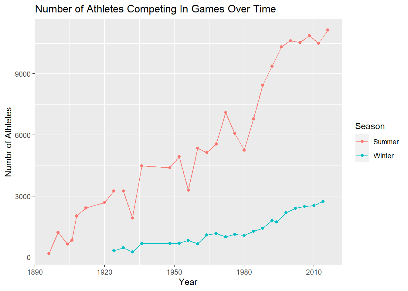
The dataset covers Olympic data from 1896 to 2016. Throughout this time span, there was 29 occurrences of the Summer Games and 22 occurrences of the Winter Games which is verified with the query below. I found it surprising that there were 29 occurrences of the Summer Games instead of 31. If we use the common knowledge that the games are held every four years and we assume that none of the years are missing, then 29 occurrences of the Summer Games would indicate that the last year in the dataset is 2008 (4 * (29 - 1) + 1896 = 2008), not 2016. There are two reasons which explain why there are only 29 occurrences instead of 31:
The Games were cancelled4 in 1916, 1940, and 1944.
The Games were held in 1906 even though they were held in 1904 and 1908 which means there was period in time when the Games were not held every four years.
athletes %>%
  group_by(Season) %>%
  summarise(Num_Games = n_distinct(Year))
In total there are 66 sports included in the dataset. Each sport includes some number of events for athletes to compete in. There are 765 events in the dataset of which 554 are male events and the remaining 269 are female. The following graph illustrates how the number of events in each game has grown over time.
athletes %>%
  group_by(Year, Season) %>%
  summarise(n = n_distinct(Event), .groups = "keep") %>%
  ggplot(mapping = aes(x = Year, y = n, color = Season)) +
  geom_point() +
  geom_line() +
  labs(y = "Numbr of Events", title = "Number of Events Included In The Games Over Time")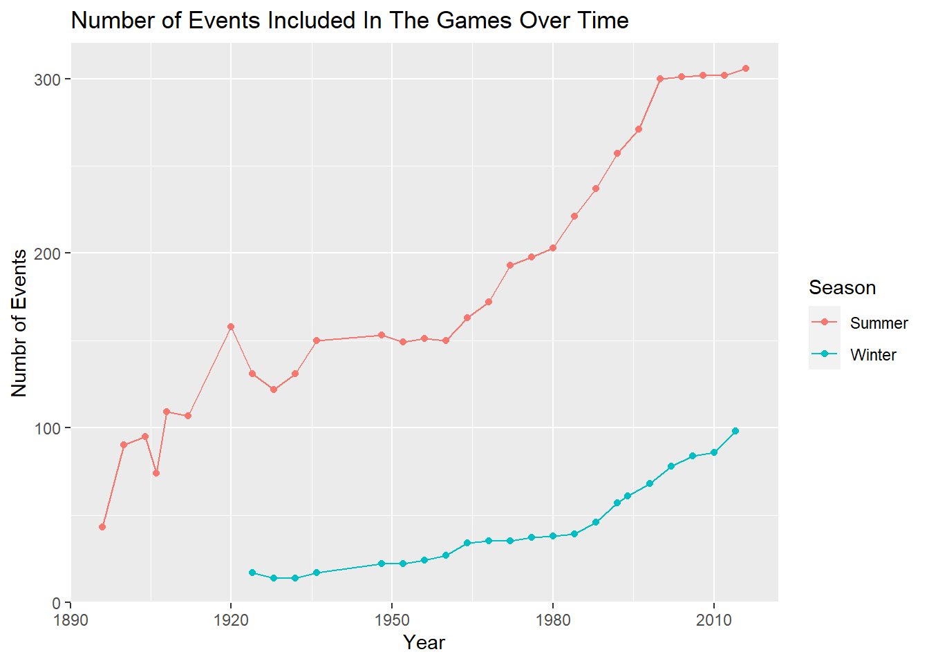
Cleaning The Data
Initial Transformations
We can start by dropping the ‘Games’ column because each entry in the column is a combination of the ‘Year’ and ‘Season’ columns. Additionally, we can drop the ‘notes’ column which comes from the ‘noc’ file because most of the values are not available and the values which are available are not relevant to this analysis.
We can clean up the ‘Medal’ column by replacing the values that are not available with the string “None”. Based on the context of the data set, we can assume that a NA in this column means that the athlete did not win a Medal in that event. Therefore, replacing these values with “None” seems logical.
# Get rid of games and notes columns
athletes <- select(athletes, -c(Games, notes))

# Switch NA in Medal to None
athletes <- athletes %>% replace_na(list(Medal = "None"))
Handling Missing Values
There are four columns in the data set which contain missing values: ‘Region’, ‘Age’, ‘Height’, and ‘Weight’. I started by handling the missing values in the ‘region’ column first. We can find the ‘NOC’ associated with unknown regions by querying the ‘noc_regions’ data set.
# Display NA in region
filter(noc, is.na(region))
We know that any row in the ‘athletes’ tibble that has an ‘NOC’ value of ‘ROT’, ‘TUV’, or ‘UNK’ will have a value in the ‘Region’ column that is NA. I think it would be sensible to replace the NA values according to the table below. The chunk of code below was used to replace the missing values according to the mapping in the table.
| NOC | Region | Notes |
|---|---|---|
| ROT | None | Refugee Olympic Team |
| TUV | Tuvala | Tuvala |
| UNK | Unknown | Unknown |
# Fill in missing values in Region column
athletes <- athletes %>%
            mutate(Temp = case_when(NOC == "ROT" ~ "None",
                                      NOC == "TUV" ~ "Tuvala",
                                      NOC == "UNK" ~ "Unknown")) %>%
            mutate(Region = case_when(is.na(region) ~ Temp,
                                      !is.na(region) ~ region)) %>%
            select(-c(region, Temp))
Let’s handle the missing values in the ‘Age’, ‘Height’, and ‘Weight’ columns next. Here’s a simple algorithm that we can use to replace all the values in those columns. I will use the ‘Age’ column to describe the algorithm but the steps are the same for the other columns.
Suppose we find a row in the data set which has a missing value in the ‘Age’ column. We know that the value in the ‘Year’ column of that row is not missing because the ‘Year’ column does not contain any missing values. The same is true for the ‘Sex’ and ‘Sport’ columns. Therefore, we can compute the average athlete age during the given year, sex, and event (ignoring other missing values) and replace the missing value with the average value.
First, let’s calculate the average age, height, and weight for each year, sex, and event grouping in the data set. This is calculated and stored in the tibble using the code chunk below.
# Compute average age, height, and weight by years
AverageValues <- athletes %>%
                 group_by(Year, Sex, Event) %>%
                 summarise(AverageAge = round(mean(Age, na.rm = TRUE), digits = 0),
                           AverageHeight = round(mean(Height, na.rm = TRUE), digits = 0),
                           AverageWeight = round(mean(Weight, na.rm = TRUE), digits = 1),
                           .groups = "keep")
# Display the results
AverageValues
We can see that many of the values in the tibble displayed above are not a number (‘NaN’). The ‘Nan’ values in the tibble occur when every athlete that is included in the average calculation for a group has a missing value. For example, the first ‘Nan’ value in the tibble occurs for the (1896, ‘M’, ‘Athletics Men’s 800 metres’) grouping in the ‘AverageHeight’ and ‘AverageWeight’ column. This is due to the fact that every male athlete in the dataset who competed in the ‘Athletics Men’s 800 metres’ event has a missing age and weight as confirmed by the query below.
athletes %>%
  filter(Year == 1896 & Sex == 'M' & Event == 'Athletics Men\'s 800 metres') %>%
  select(Name, Height, Weight)
Due to the presence of the ‘NaN’ values in the tibble, we will not be able to replace all of the NA values in the tibble. However, using this approach we will be able to replace many of them. In the case that we can not resolve a missing value, we will simply leave it is NaN and exclude it from further calculations.
athletes <- inner_join(athletes, AverageValues, by = c('Year', 'Sex', 'Event')) %>%
            mutate(Age = case_when(!is.na(Age) ~ Age,
                                    is.na(Age) & !is.nan(AverageAge) ~ AverageAge)) %>%
            mutate(Height = case_when(!is.na(Height) ~ Height,
                                       is.na(Height) & !is.nan(AverageHeight) ~ AverageHeight)) %>%
            mutate(Weight = case_when(!is.na(Weight) ~ Weight,
                                       is.na(Weight) & !is.nan(AverageWeight) ~ AverageWeight)) %>%
            select(-c(AverageAge, AverageHeight, AverageWeight))
Cleaning Sport & Event
There is another transformation I would like to perform to make the data set a bit cleaner. Take a look at the first few values in the ‘Sport’ and ‘Event’ columns presented below.
# Display first few rows of Sport and Event columns
athletes %>%
  select(Sport, Event, Sex) %>%
  head()
Notice how the first word or set of words in the ‘Event’ column is the same exact string in the ‘Sport’ column. If this pattern is true for the entire dataset, then we can remove the ‘Sport’ portion of the event column to make it look nicer. The code chunk below was used to test whether or not this pattern is true throughout the entire dataset. I used the testCols function to confirm the pattern in the ‘Sport’ and ‘Event’ column was true for the entire dataset. After I confirmed that the property was true, I ran the cleanEvent function to clean the columns.
testCols <- function() {
  # Iterate along sport column
  for (i in seq_along(athletes$Sport)) {
    # Get the sport and event string at row i
    # Split each string on space character
    sport <- str_split(athletes$Sport[[i]], " ")[[1]]
    event <- str_split(athletes$Event[[i]], " ")[[1]]
    # Iterate over items in sport list
    for (j in seq_along(sport)) {
      # Check to see if each item in sport is equivalent to corresponding item in event
      if (sport[[j]] != event[[j]]) {
        # If it is not equivalent -> stop and display sport and event which breaks pattern
        cat("BREAK\n", sport, " ", event, "\nPattern does not hold")
        return(FALSE)
      }
    }
  }
  # If we get here, then the property holds for the entire data set
  cat("Pattern holds for entire data set\n")
  return(TRUE)
}

# Test Columns
testCols()

# Function to clean event column
cleanEvent <- function() {
  # Iterate along and event columns
  for (i in seq_along(athletes$Sport)) {
    # Split sport and event string at row i on space character
    sport <- str_split(athletes$Sport[[i]], " ")[[1]]
    event <- str_split(athletes$Event[[i]], " ")[[1]]
    # Empty string to store new event
    newEvent <- ""

    # Iterate along event list
    for (j in seq_along(event)) {
      # Once we get past the length of sport, start piecing together newEvent
      if (j > length(sport)) {
        newEvent = str_c(newEvent, event[[j]], " ")
      }
    }

    # Reset newEvent string at position i
    athletes$Event[[i]] <- newEvent
  }

  # Return cleaned column to save changes
  return(athletes$Event)
}

# Perform event column cleaning
athletes$Event <- cleanEvent()
It may be tempting to remove the ‘Sex’ portion of the ‘Event’ column as well. For instance, in the tibble shown above, the first row is (‘Basketball’, ‘Basketball Men’s Basketball’, ‘M’). We could technically change the value in the ‘Event’ column to just ‘Basketball’. In doing so, we would not lose any information as we know the athlete is a male by looking at the sex column. However, the pattern that is present in the output above where the sex of the athlete follows the value in the ‘Sport’ column is not true for every row in the dataset. Therefore, we would be losing information by removing the term following the value in the ‘Sport’ column.
Reordering, Sorting, & Saving
Lastly, let’s finish the cleaning process by reordering the columns and sorting them to make the data set easier to look at. Afterwards, I saved the clean dataset so I would not need to repeat the cleaning operations perfomed above.
# Change column order and sort by year
athletes <- athletes %>%
  relocate(Team, .after = Name) %>%
  relocate(NOC, .after = Team) %>%
  relocate(Region, .after = NOC) %>%
  arrange(Year)

# Save cleaned data set
write_csv(athletes, './Data/athletes_clean.csv')
Visualizations
Comparing Medalists Vs Non-Medalists
Let’s start by investigating the age, height, and weight columns of the data set for the set of medalists and non-medalists. This was a tricky calculation to perform because athletes can occur in the dataset more than once and we need to be careful not to double count anyone.
I started by computing a tibble which contains the unique ID’s of all the athletes who have won an at least one event. Then I created another tibble which contains all the athletes who never won an event. Note that these tibbles are disjoint and the union of the two tibbles gives us the set of all athletes in the dataset. After I had the computed both sets of ids, I was able to make use of the inner_join operation to create two new tibbles. The first tibble contains the information about athletes who have won at least one medal over the span of their career. The second tibble contains information about athletes who never won an event in their career. Note that these tibbles can not be constructed using the dplyr filter function alone. In doing so, we would end up with athletes who appear in both the medalist tibble and the non medalist tibble. Using the approach I described, it is impossible for an athlete to be placed in both tibbles.
At this point, we have separated the data into two groups, but an athlete can still appear in each group more than once. To solve this, I computed the average age, height, and weight for each athlete in both groups. This operation resulted in two tibbles where each athlete is only recorded once in each tibble. Finally, I could use this information to compute the average age, height, and weight for each group.
# Read in the clean dataset
df <- read_csv('./Data/athletes_clean.csv')

# Helper function to compute average age, height, and weight for each athlete in a tibble
getBasicStats <- function(dfView) {
  toReturn <- dfView %>%
              group_by(ID, Sex) %>%
              summarise(Count = n(),
                        AverageAge = mean(Age, na.rm = TRUE),
                        AverageHeight = mean(Height, na.rm = TRUE),
                        AverageWeight = mean(Weight, na.rm = TRUE),
                        .groups = "keep")
  return(toReturn)
}

# Helper function to compute average age, height, and weight for a set of athletes in a tibble
analyseBasicStats <- function(dfView) {
  toReturn <- dfView %>%
              group_by(Sex) %>%
              summarise(Count = n(),
                        AvAge = mean(AverageAge, na.rm = TRUE),
                        SDAge = sd(AverageAge, na.rm = TRUE),
                        AvHeight = mean(AverageHeight, na.rm = TRUE),
                        SDHeight = sd(AverageHeight, na.rm = TRUE),
                        AvWeight = mean(AverageWeight, na.rm = TRUE),
                        SDWeight = sd(AverageWeight, na.rm = TRUE))
  return(toReturn)
}

# Find the ids of all the medalists
medalistIDs <- df %>%
               filter(Medal != "None") %>%
               distinct(ID)

# Find the ids of people who have not won a medal
nonMedalistIDs <- setdiff(df %>% distinct(ID), medalistIDs)

# Get the statistics for the medalist group
medals <- getBasicStats(inner_join(df, medalistIDs, by = "ID")) %>%
          analyseBasicStats(.) %>%
          mutate(Sex = case_when(Sex == 'F' ~ 'Female Medalist',
                 Sex == 'M' ~ 'Male Medalist')) %>%
          rename('Gender/Medal Status' = Sex)

# Get the statistics for the non medalist group
nonMedals <- getBasicStats(inner_join(df, nonMedalistIDs, by = "ID")) %>%
             analyseBasicStats(.) %>%
             mutate(Sex = case_when(Sex == 'F' ~ 'Female Non-Medalist',
                    Sex == 'M' ~ 'Male Non-Medalist')) %>%
             rename('Gender/Medal Status' = Sex)

# Combine results
bind_rows(medals, nonMedals) %>% arrange('Gender/Medal Status')
Notice that sum of the values in the ‘Count’ column above is 135,404 which is the same as the number of athletes in the dataset. This indicates that we have avoided double counting athletes.
The tibble displayed above is interesting, but it’s not easy to tell if there are any differences between normal athletes and medalists based solely on the output. Let’s create density plots of the age, height, and weight variables for the athletes and the medalists to get a better view of the data.
medalsData <- df %>% inner_join(medalistIDs, by = "ID") %>%
              getBasicStats(.) %>%
              rename(Age = AverageAge) %>%
              rename(Height = AverageHeight) %>%
              rename(Weight = AverageWeight) %>%
              filter(!is.na(Age)) %>%
              filter(!is.na(Height)) %>%
              filter(!is.na(Weight)) %>%
              mutate(Sex = case_when(Sex == 'F' ~ 'Female Medalist',
                                     Sex == 'M' ~ 'Male Medalist'))

nonMedalsData <- df %>% inner_join(nonMedalistIDs, by = "ID") %>%
                 getBasicStats(.) %>%
                 rename(Age = AverageAge) %>%
                 rename(Height = AverageHeight) %>%
                 rename(Weight = AverageWeight) %>%
                 filter(!is.na(Age)) %>%
                 filter(!is.na(Height)) %>%
                 filter(!is.na(Weight)) %>%
                 mutate(Sex = case_when(Sex == 'F' ~ 'Female Non-Medalist',
                                        Sex == 'M' ~ 'Male Non-Medalist'))

ggplot() +
geom_density(mapping = aes(x = Age, colour = Sex),
             adjust = 2,
             alpha = 0.1,
             data = medalsData) +
geom_density(mapping = aes(x = Age, colour = Sex),
             adjust = 2,
             alpha = 0.1,
             data = nonMedalsData) +
labs(title = "Age & Sex vs Olympic Outcomes")

ggplot() +
geom_density(mapping = aes(x = Height, colour = Sex),
             adjust = 2,
             alpha = 0.1,
             data = medalsData) +
geom_density(mapping = aes(x = Height, colour = Sex),
             adjust = 2,
             alpha = 0.1,
             data = nonMedalsData) +
labs(title = "Height & Sex vs Olympic Outcomes")

ggplot() +
geom_density(mapping = aes(x = Weight, colour = Sex),
             adjust = 2,
             alpha = 0.1,
             data = medalsData) +
geom_density(mapping = aes(x = Weight, colour = Sex),
             adjust = 2,
             alpha = 0.1,
             data = nonMedalsData) +
labs(title = "Weight & Sex vs Olympic Outcomes")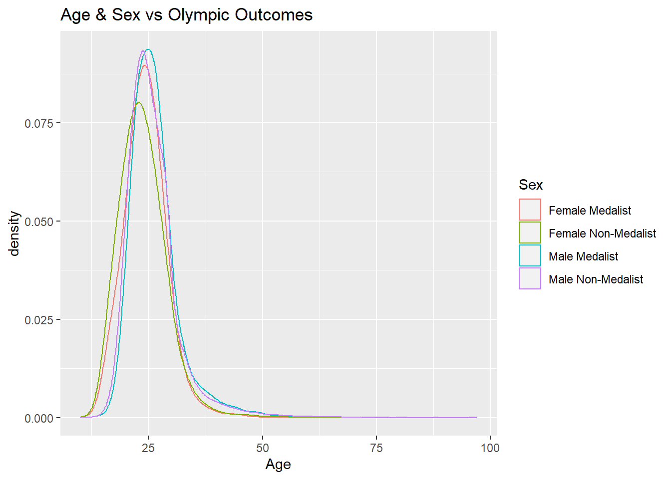
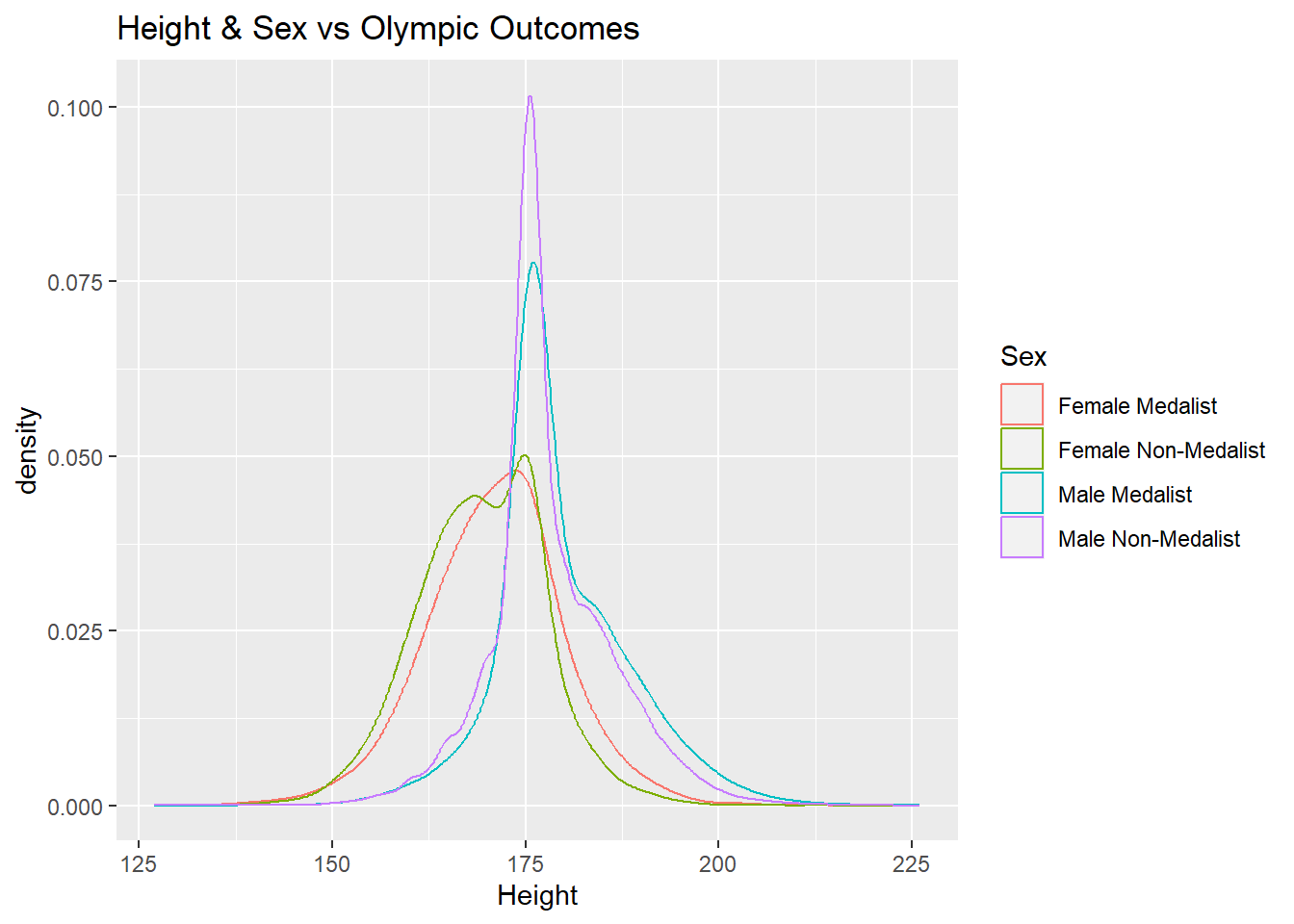
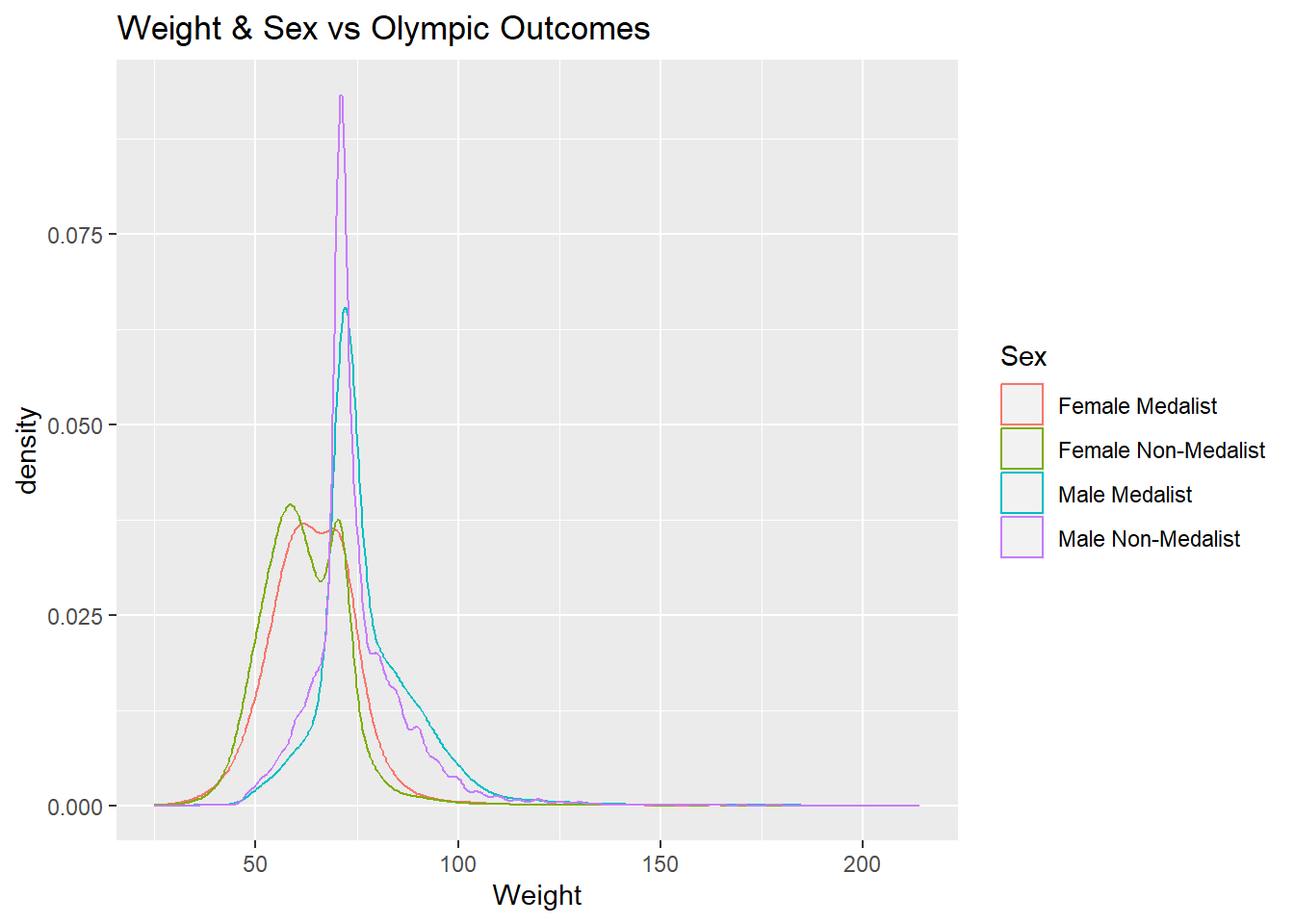
The density plots generated above for the medalists and non-medalists groups of athletes are very similar to each other. However, it is interesting that the peaks for the non-medalist group are taller than the medalist group for each gender in both the ‘Height’ and ‘Weight’ diagrams. This indicates that a larger proportion of non-medalists are centered around the average value than medalists in both the height and weight category.
Based on the plots generated in the previous code block, it appears that it would be difficult to predict whether or not an athlete would win a medal based solely on their physical characteristics such as age, height, and weight due to the fact that the density plots are very similar. This means that we need to look at the data in some other ways to gain insight on Olympic status.
Comparing Top Athletes Against Thier Competitors
The previous section showed that it is hard to find differences between medalists and non-medalists based off their physical characteristics. Instead, let’s compare the most successful Olympians who have won the most medals to everyone else. Hopefully, we will see a difference between the physical characteristics of the most successful athletes and their competitors. The following chunk of R code find the athletes that have won the most medals and shows the number of each type of medal earned by the athlete.
# Medal count by athlete
bestAthletes <- df %>%
                filter(Medal != "None") %>%
                group_by(ID, Name, Sport, Sex) %>%
                count(Medal) %>%
                pivot_wider(names_from = Medal, values_from = n) %>%
                mutate(TotalMedals = Bronze + Silver + Gold) %>%
                relocate(Bronze, .after = Sport) %>%
                relocate(Silver, .after = Bronze) %>%
                relocate(Sex, .after = Name) %>%
                ungroup() %>%
                arrange(desc(TotalMedals))

# Display the top athletes
bestAthletes
Let’s see how some of the top athletes who earned the most medals compare to the rest of the athletes in their sport. The following chunk of code generates height and weight histograms for the top three athletes which show where they stand in relation to their competitors.
top3 <- bestAthletes %>%
        head(n = 3)

compAverages <- function() {
  averages <- tibble(Name = character(), AverageHeight = numeric(), AverageWeight = numeric(), AverageAge = numeric())
  for (i in seq_along(top3$Name)) {
    id <- top3$ID[[i]]
    name <- top3$Name[[i]]
    averages <- bind_rows(averages, df %>%
                          filter(ID == id & Name == name) %>%
                          group_by(ID, Name) %>%
                          summarise(AverageHeight = mean(Height, na.rm = TRUE),
                                    AverageWeight = mean(Weight, na.rm = TRUE),
                                    AverageAge = mean(Age, na.rm = TRUE),
                                    .groups = "keep"))
  }
  return (averages)
}

compAthletes <- function() {

  # Compute average height and weight for each athlete
  averages <- compAverages()

  for (i in seq_along(top3$Name)) {
    # Collect name, sport, event, and gender
    name <- top3$Name[[i]]
    sport <- top3$Sport[[i]]
    gender <- top3$Sex[[i]]

    # Get height and weight for current athlete from averages
    cHeight <- (averages %>% filter(Name == name))$AverageHeight[[1]]
    cWeight <- (averages %>% filter(Name == name))$AverageWeight[[1]]
    cAge <- (averages %>% filter(Name == name))$AverageAge[[1]]

    # Get height and weight for all athletes
    others <- df %>%
              filter(Sport == sport & Sex == gender) %>%
              group_by(ID) %>%
              summarise(Height = mean(Height, na.rm = TRUE),
                        Weight = mean(Weight, na.rm = TRUE),
                        Age = mean(Age, na.rm = TRUE),
                        .groups = "keep")
    mHeight <- (others %>% filter(!is.nan(Height)) %>% summarise(mean = mean(Height), na.rm = TRUE, .groups = "keep"))$mean[[1]]
    mWeight <- (others %>% filter(!is.nan(Weight)) %>% summarise(mean = mean(Weight), na.rm = TRUE, .groups = "keep"))$mean[[1]]
    mAge <- (others %>% filter(!is.nan(Age)) %>% summarise(mean = mean(Age), na.rm = TRUE, .groups = "keep"))$mean[[1]]

    # Reset gender variable for graph aesthetics
    gender <- if (gender == "M") "Male" else "Female"

    # Graph For Height Information
    l <- others %>%
         filter(!is.nan(Height)) %>%
         ggplot() +
         geom_density(mapping = aes(x = Height),
                      adjust = 2,
                      alpha = 0.1) +
         geom_vline(xintercept = cHeight, color="red") +
         geom_vline(xintercept = mHeight, color="blue") +
         labs(y = "")

    # Graph For Weight Information
    m <- others %>%
         filter(!is.nan(Weight)) %>%
         ggplot() +
         geom_density(mapping = aes(x = Weight),
                      adjust = 2,
                      alpha = 0.1) +
         geom_vline(xintercept = cWeight, color="red") +
         geom_vline(xintercept = mWeight, color="blue") +
         labs(y = "")

    # Graph For Weight Information
    r <- others %>%
         filter(!is.nan(Age)) %>%
         ggplot() +
         geom_density(mapping = aes(x = Age),
                      adjust = 2,
                      alpha = 0.1) +
         geom_vline(xintercept = cAge, color="red") +
         geom_vline(xintercept = mAge, color="blue") +
         labs(y = "")

    # Display Graphs
    grid.arrange(top = str_c(name, " vs All Athletes In ", gender, " ", sport),
                 bottom = str_c("Red -> ", name, "; Blue -> mean"),
                 left = "density",
                 l, m, r, ncol = 3)
  }

}

compAthletes()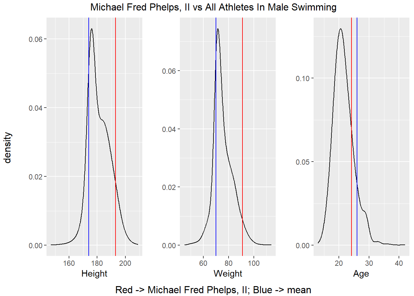
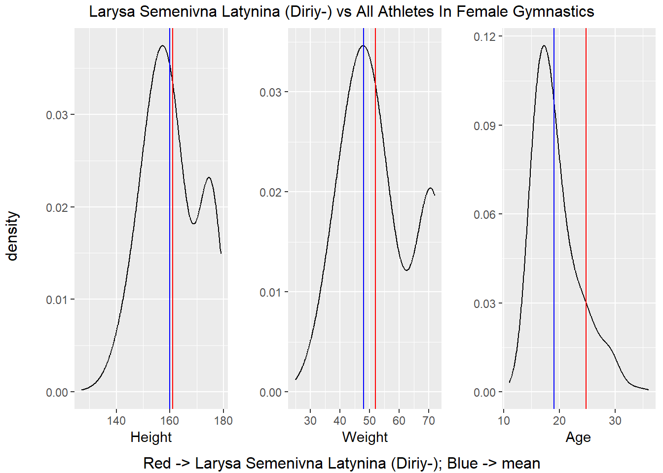
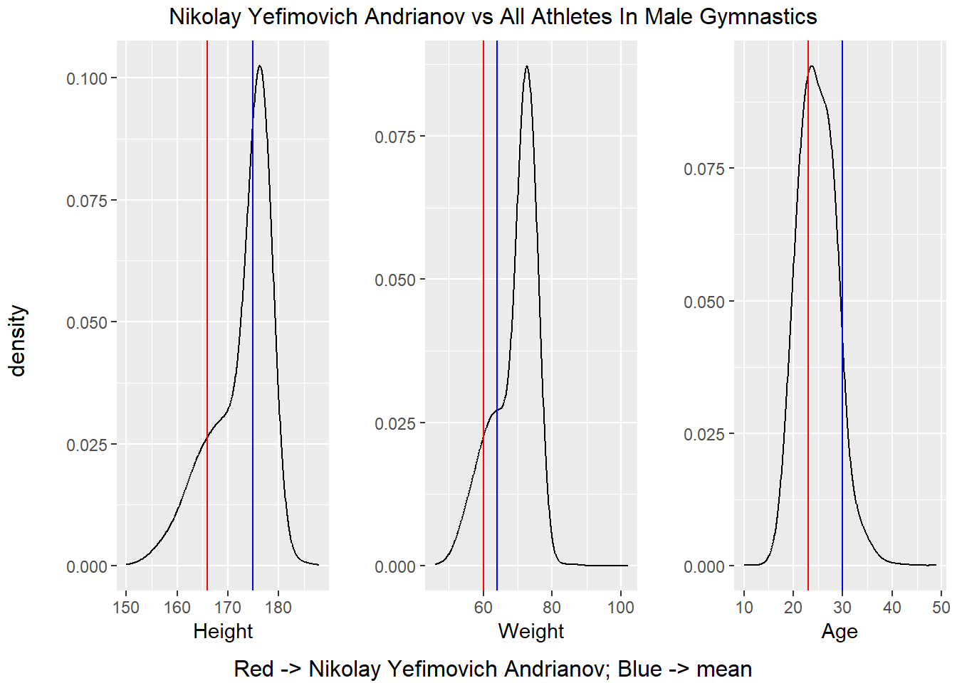
It is hard to see a consistent pattern in the charts above in the statistics displayed above. For example, Michael Phelps was taller than the average competitors, but Nikolay Yefimovich as quite a bit smaller the average competitor. Based on what we have seen in the previous two subsections, it appears that way need to restrict our analysis to a singular sport and possibly to even a single event within a sport in order to uncover characteristics which separate medalists from non-medalists. For instance, when we compared medalists to non-medalists, we were comparing the two groups across every sport in the dataset which explains why there was no major difference in the density plots. In the previous section, we compared the most successful athletes to their competitors. There were categories where these athletes were indeed outliers, but there is no pattern linking all these athletes together which is likely caused by the fact that they compete in different sports.
Comparing Countries By Number of Medals
In the previous section, we compared the most successful athletes to their competitors. In this section, we will switch focus and investigate whether an athletes country has an impact on their success. To start investigating how medals relates to country, let’s find out how many medals of each type each country has and how many total medals each country has. This has been done with the following chunk of R code.
countryMedal <- df %>%
                group_by(Region) %>%
                count(Medal) %>%
                pivot_wider(names_from = Medal, values_from = n) %>%
                relocate(Bronze, .after = None) %>%
                relocate(Silver, .after = Bronze) %>%
                arrange(desc(Gold)) %>%
                mutate(TotalMedals = sum(Bronze,Silver,Gold, na.rm = TRUE))
countryMedal

# Display Information
countryMedal %>%
  head(n = 25) %>%
  ggplot(aes(x = fct_reorder(Region, TotalMedals), y = TotalMedals)) +
    geom_bar(stat = "identity", fill="#f68060", alpha=.6, width=.4) +
    coord_flip() +
    theme_bw() +
    labs(x = "Country", title = "Number of Medals Per Country")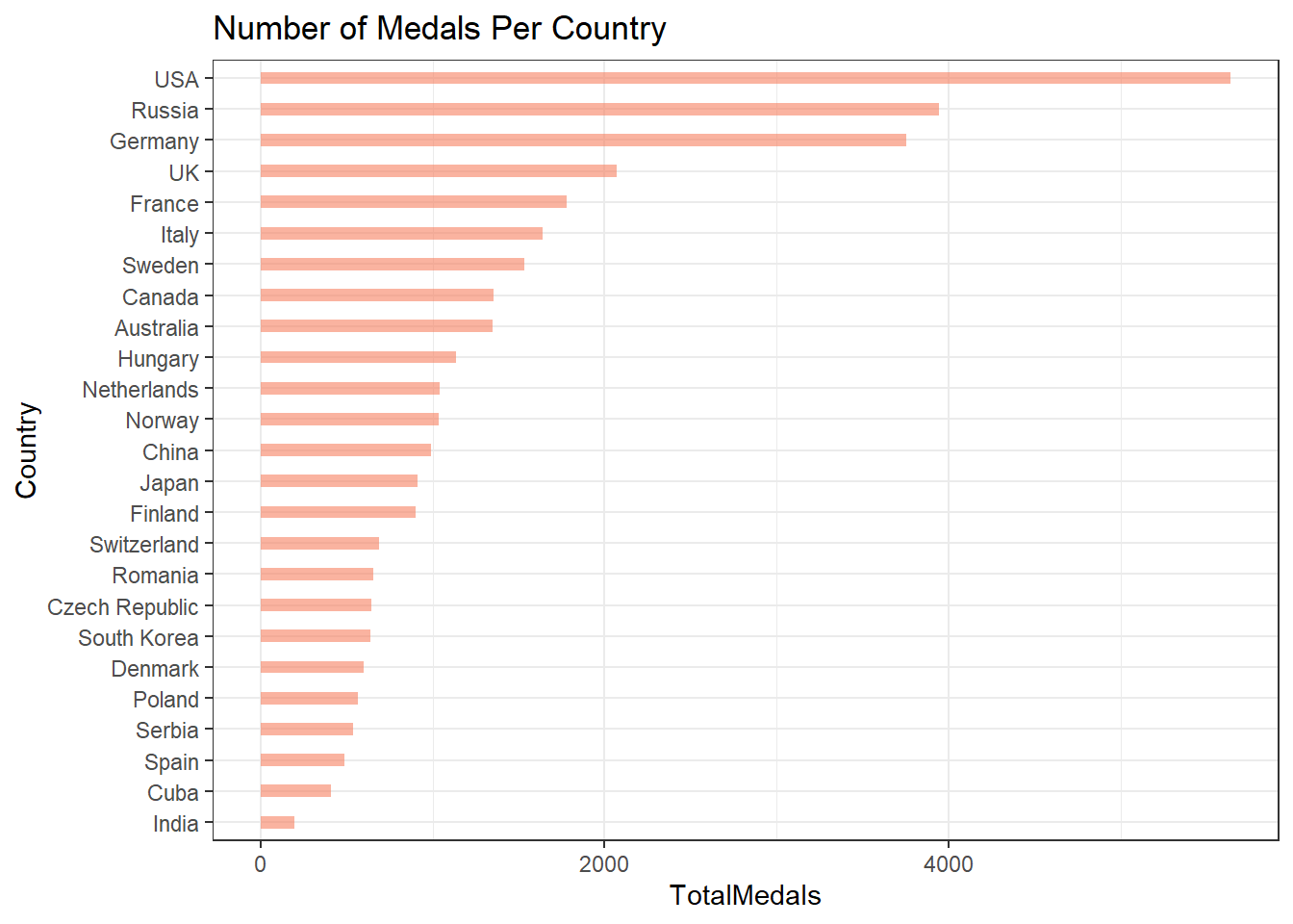
The skewness seen in the medal count could be explained by some countries having more athletes competing in the games than others. Let’s map each country to the number of athletes that have competed for them. Note that in the calculation below, each athlete is counted only once, even if they competed in multiple events or Olympic games.
athleteCount <- df %>%
                group_by(Region, Name) %>%
                group_by(Region) %>%
                count() %>%
                rename(Athletes = n) %>%
                arrange(desc(Athletes))
athleteCount
Not surprisingly, many of the counties that have won a lot of medals also have the most athletes. This could explain the skewness that is seen Number of Countries vs Number of Medals plot above. The chart below show the statistics for the number of medals earned by each country normalized by the total number of athletes that competed for the country.
normed <- inner_join(countryMedal, athleteCount, by = "Region") %>%
          mutate(MedalsPerAthlete = TotalMedals / Athletes) %>%
          arrange(desc(MedalsPerAthlete))

normed

normed %>%
  head(n = 125) %>%
  ggplot(aes(x = fct_reorder(Region, MedalsPerAthlete), y = MedalsPerAthlete)) +
    geom_bar(stat = "identity", fill="#f68060", alpha=.6, width=.4) +
    coord_flip() +
    theme_bw() +
    theme(axis.text.y = element_blank(),
          axis.ticks.y = element_blank()) +
    labs(x = "Country", title = "Number of Medals Per Athlete Per Country")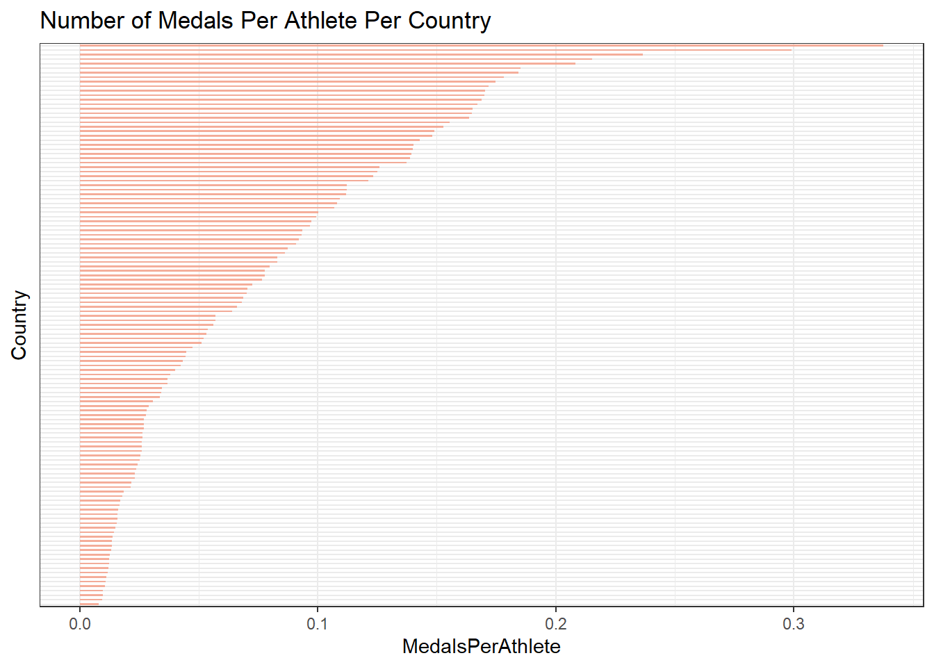
In the chart above, I removed the country labels so we could display the number of medals per athlete for many countries in the chart. You can figure out which countries correspond to the top bars by looking at the tibble above it. The chart reveals that the distribution is still very skewed even if we normalize the number of medals per country by the number of athletes who have competed.
One last way that we can visualize the number of medals earned by with each country is with an evolution graph. The visual below shows the medal progression for the top 15 medal earning countries in the data set.
df %>%
  filter(Region %in% (countryMedal %>% head(15))$Region) %>%
  group_by(Region, Year) %>%
  count(Medal) %>%
  pivot_wider(names_from = Medal, values_from = n) %>%
  mutate(TotalMedals = sum(Bronze,Silver,Gold, na.rm = TRUE)) %>%
  group_by(Region) %>%
  mutate(CumulativeMedals = cumsum(TotalMedals)) %>%
  ggplot(mapping = aes(x = Year, y = CumulativeMedals, color = Region)) +
  geom_point() +
  geom_line() +
  labs(x = "Year",
       y = "Total Number of Medals Earned At Time Period X",
       title = "Region Medal Accumulation Over Time")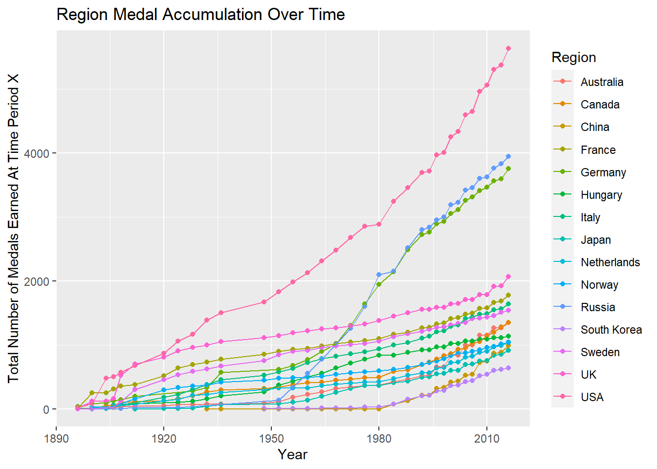
The results shown above seem to indicate that athletes from some countries may be more likely to win Olympic medals than others. Additionally, the likelihood that an athlete would win a medal based on their country changes over time as indicated by the chart above. For example the likelihood that an athlete from the United States wins a medal in 2010 appears to be more likely than in 1896 due to the fact that the United States has accumulated many more medals in 2010.
Reflection
Process
I started the analysis by cleaning the data set and handling the missing values. Doing so made it much easier to generate the figures and perform calculations. After cleaning the data, I analyzed the athletes by generating histograms for the medalist athletes and the non-medalist athletes to compare them. I was hoping there would be noticeable differences between the groups which could explain why one group won Olympic medals and the other group did not. Unfortunately, there was not any substantial noticeable differences that could be observed in the graphs. My next idea was to compare the most successful athletes to the rest of the athletes in their respective sports. This approach provided some insight as to why these athletes were successful, but there was no pattern which could be observed across the ones which were analyzed. At this point, it became clear that in order to uncover the characteristics of successful athletes, the scope of the analysis needs to be narrowed down to a particular sport of interest. My last idea was to analyze the amount of medals earned by each country. This analysis showed that some countries have earned many more medals than others and that an athlete’s country may be an indicator of Olympic success. That is, athletes from some countries are more likely to win medals than athletes than from others.
Next Steps
If I were to continue investigating the dataset, I would narrow down my analysis to a single sport. The analysis above did not reveal many observable differences between medalists and non-medalists. As I alluded to previously, I think this is due to the fact that I was searching for patterns that differentiated the two groups across each sport in the dataset. However, I now believe that this approach is too broad which made it difficult to find substantial results. In addition to narrowing down analysis to one sport, I would also look to see if combinations of variables can be used to predict Olympic success. Previously, I was looking at singular variables and comparing them to Olympic success. However, we may see more interesting results if we compare pairs of variables to Olympic success. For example, the graph below shows the outcomes of male Olympic swimmers based on their height and weight. In the graph, it appears as though most of the gold medalists appear in the upper right hand corner indicating that the combination of an athletes height and weight are important in male swimming.
df %>%
  filter(Sex == "M" &
         Sport == "Swimming" &
         Medal != "None" &
         !is.na(Height) &
         !is.na(Weight)) %>%
  ggplot() +
  geom_point(aes(x = Height, y = Weight, color = Medal)) +
  labs(title = "Height Weight & Outcome For Male Olympic Swimmers",
       caption = "*Non-medalists ommitted")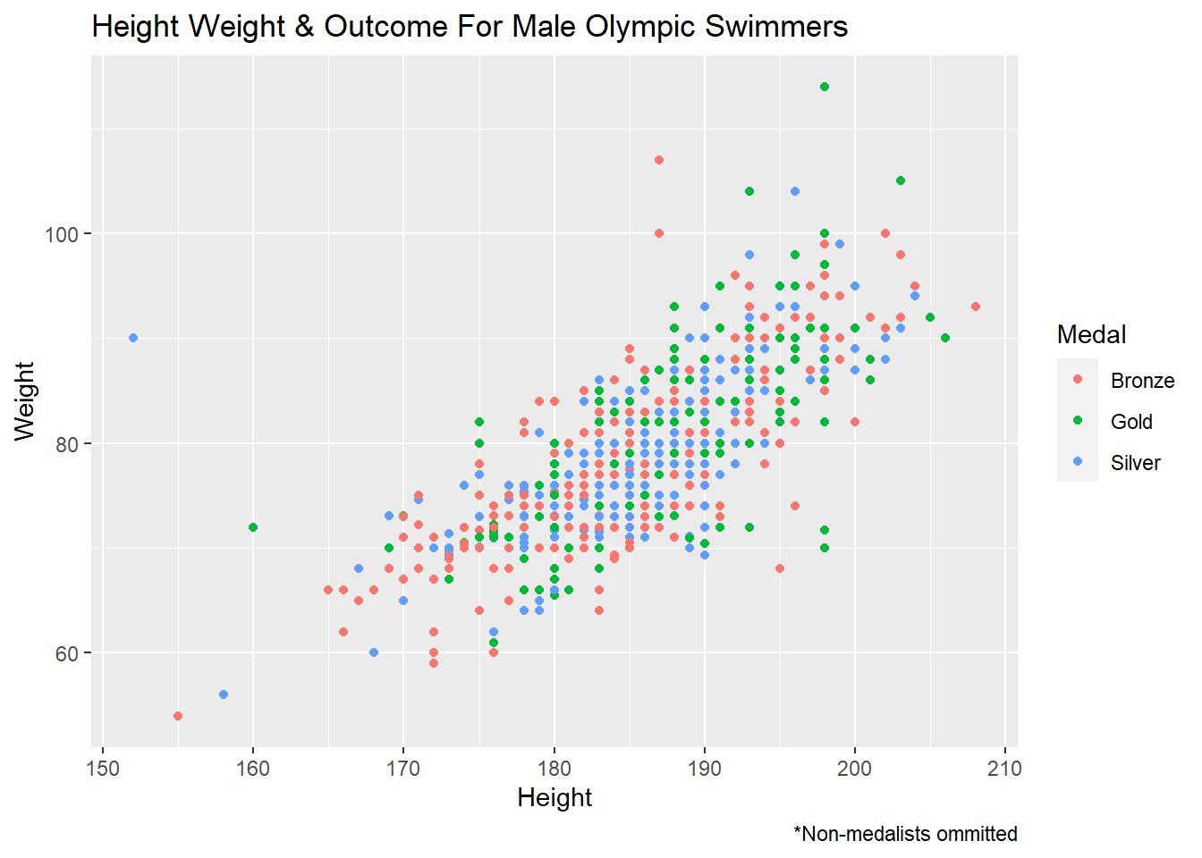
In addition to investigating how multiple variables could impact medal status, I would also continue to look into the effect that an athlete’s country has on performance. However, in the future, I would compare countries against each other for one specific sport rather than comparing them across every sport. I doing so, I would hope to get a better idea of whether an athlete would win a medal or not by looking at their country and their sport. For instance, we can look at how well each country has done in the male swimming event. Looking at the chart below, I would predict that athletes from the United States are much more likely to earn a medal than athletes from Cuba.
df %>%
  filter(Sex == "M" & Sport == "Swimming") %>%
  group_by(Region) %>%
  count(Medal) %>%
  pivot_wider(names_from = Medal, values_from = n) %>%
  mutate(TotalMedals = sum(Bronze,Silver,Gold, na.rm = TRUE)) %>%
  arrange(desc(TotalMedals)) %>%
  head(n = 25) %>%
  ggplot(aes(x = fct_reorder(Region, TotalMedals), y = TotalMedals)) +
    geom_bar(stat = "identity", fill="#f68060", alpha=.6, width=.4) +
    coord_flip() +
    theme_bw() +
    labs(x = "Country", y = "Total Medals", title = "Number of Medals Per Country In Men's Swimming")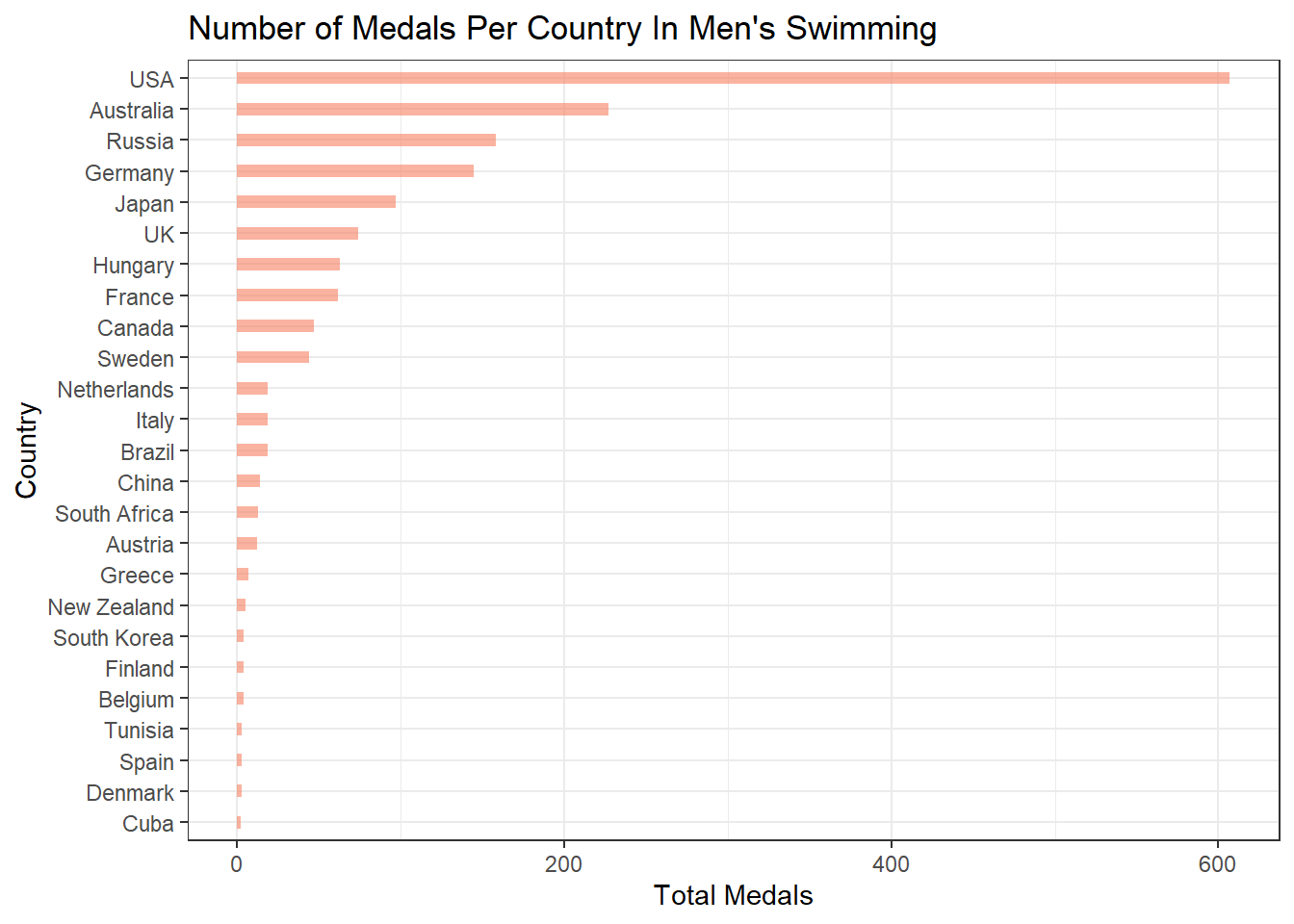
Conclusion
The results from the analysis above have not shown that there is not any substantial correlation between an athletes physical characteristics such as age, height, and weight and Olympic Success when we do the comparison across many sports. However, we have found that there is a connection between an athletes country and sport and their odds of success. Additionally, we have theorized that there is likely a correlation between an athletes physical characteristics and their Olympic outcomes for individual sports.
Before starting this analysis, I had hoped to find a connection between an athletes physical characteristics and their success across many sports. Such a correlation could be useful for athletes because it would give them insight on what they might need to do to improve their odds of winning a medal. For example, suppose we found out that athletes who win medals all have these characteristics in common. If that were the case, then an athlete who aspires to win a medal might look at the data and try to copy those characteristics to better their odds. Although we did not find such characteristics, I believe they likely exist and I would be curious to figure out what they are. For instance perhaps there is a correlation between an athletes maximum lung capacity and gold medals, but we could not see it because maximum lung capacity is not a stat that is included in the dataset. It would be interesting to see if future data about the Olympics will record more complex statistics like these and thus allow for a more rigorous analysis on the athletes to find common characteristics of medalists.