Code
library(tidyverse)
library(tibble)
library(dplyr)
library(stringr)
library(ggplot2)
library(lubridate)
library(plotly)
library(hrbrthemes)


knitr::opts_chunk$set(echo = TRUE, warning=FALSE, message=FALSE)Courtney Naughton
December 18, 2022
Background and Context for this Dataset:
I am a technology high school teacher in Boston, and I chose to enroll in the DACSS certificate program because I wanted to learn new skills in a growing field. This is my first time working with R, and although there were times I was very frustrated, I learned so much in this semester through problem solving, trying things out, and working through the frustration! In addition to teaching, I also teach spin in Boston, MA. The studio that I teach for, Turnstyle, also has a sister studio in the Midwest. I asked the owners if I could analyze their data for this final because I am familiar with the company, but I am not directly reflected in the data! So this work is for fun but is real data from the company. I’m am also interested in learning about trends within the fitness industry post 2020. This project has been exciting for me to try new things and practice the new skills I have learned this semester.
This dataset is from Turnstyle Cycle Midwest, a spin studio with locations in Chicago, Illinois, and Madison, Wisconsin. The dataset is every reservation at Turnstyle Midwest from November 2020 to October 2022. Each case is an individual sign up for a single class, and the columns are Reservation ID, Status (if the client is checked-in, standard cancelled, penalty cancelled, class cancelled, or no show), Class ID, Class Date, Class Time, Class Day, Class Name, Class Public, Class Tags, Capacity, Location (Madison or Chicago), Instructor ID, Substitute (true or false), and Customer ID. I then chose to filter only the Madison location and if the class was open to the public and therefore was not cancelled. This gave me 57,204 reservations.
My research questions:
Which class time and day are most popular? Any trends with day of the week/time?
Does a substitute instructor affect reservation counts?
Themes: which are more popular? Is hip hop more popular than EDM or pop or are general themes better?
#read in the data, filtering out unnecessary columns
TS <- read_csv("_data/reservations_Naughton.csv",
               skip=2,
 col_names = c("ReservationID", "del", "Status", rep("del", 12),"ClassID", "ClassDate", "ClassTime", "ClassDay", "ClassName", "ClassPublic", "ClassTags", rep("del", 6), "Capacity", "del", "Location", "del", "InstructorID", "del", "Substitute", "CustomerID", rep("del", 5)))%>%

    select(!starts_with("del"))%>%
  filter(Location == "Madison") %>%
  filter(ClassPublic == TRUE) %>%
filter(Status != "class cancelled")The first part of the data I wanted to look at was the utilization of the space. I took the count of each checked-in client for a unique class and calculated the percent usage of the space given the capacity of the room. The capacity changes throughout the 2 years because of different Covid restrictions. The red line in the graphs below denotes when capacity was less than 42 bikes - when the studio opened, Covid restrictions limited capacity to 14 bikes. Throughout November and the winter, capacity was 14 and increased to 23. On July 19, 2021, capacity increased and remained at 42 bikes. The first graph shows the daily average utilization, so for every class on that day, how many bikes were booked out of the possible bikes, and the second graph shows the total number of checked-in reservations each day.
On both graphs, it is evident summer is especially low. The Madison location is located near University of Wisconsin, so there are a lot of student riders. Therefore, when students are home, like during summer and holiday breaks, sign-ups are less, which is also evident in both graphs. These graphs use plotly so you can highlight each individual data point or zoom in to a particular range of dates. **Note, these graphs no longer have plotly for the final project to appear on the blog.
I was surprised to see that May 4, 2021, which is a date with capacity restrictions, had similar total bike counts to the maximum bike count for after restrictions were lifted. On May 4, there were 7 classes offered, which was the most classes Midwest has had in a day. Their next highest day with most reservations was December 14, 2021. I can assume that both of these days are at the end of the semester. Thus, students want to workout before they leave for the semester. Offering more classes at the end of the semester and before breaks would be a smart business move.
# Weekday reservations
Weekday <- filter(TS, ClassDay != "Saturday", ClassDay !="Sunday") %>%
  mutate(across(ends_with('ID'), as.character)) %>%
  mutate(across(ends_with('Time'), as.character)) %>%
  filter(Status== "check in") %>%
  filter(ClassDate>= '2020-11-01')


## each class's average capacity
ReservationsbyClassID<- Weekday %>%
  group_by(ClassID, ClassDate, Capacity)  %>%
  summarize(reservations = n_distinct(ReservationID)) %>%
  mutate(percent_Capacity = (reservations/Capacity)*100) %>%
  arrange(ClassDate)

## each day's average capacity
WeekdayDailyCapacityAvg <- ReservationsbyClassID %>%
  group_by(ClassDate)  %>%
  summarize(average = mean(percent_Capacity))

#Graph of weekday daily capacity average with plotly
p <- WeekdayDailyCapacityAvg %>%
  ggplot( aes(x=ClassDate, y = average ), group(ClassDate)) +
  geom_line(color= "grey") +
     geom_point(shape=21, color="black", fill="#69b3a2", size=1) +
   labs(x = "Class Date",
       y = "Average Utilization",
       title = "Daily Average Utilization"
       ) +
  geom_vline(xintercept = as.numeric(as.Date("2021-07-19")), linetype=4, colour="red")

#p <- ggplotly(p)
p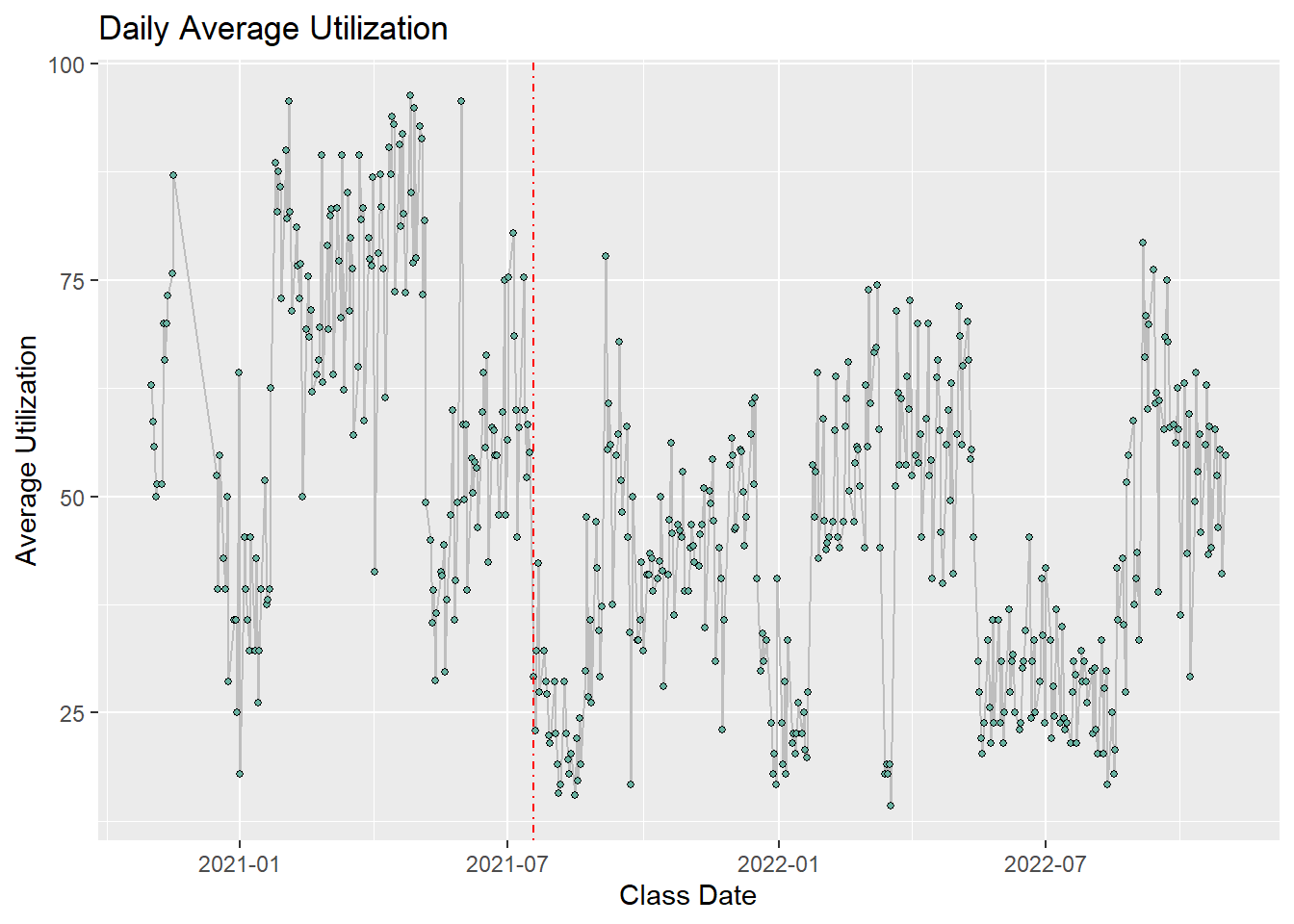
## each day's total bike reservation
WeekdayDailyReservationCount <- ReservationsbyClassID %>%
  group_by(ClassDate)  %>%
  summarize(sum = sum(reservations))

#Graph of weekday total bike count with plotly
b <- WeekdayDailyReservationCount %>%
  ggplot( aes(x=ClassDate, y = sum ), group(ClassDate)) +
  geom_line(color= "grey") +
     geom_point(shape=21, color="black", fill="#69b3a2", size=1) +
   labs(x = "Class Date",
       y = "Bike Count",
       title = "Daily Reservation Count"
       ) +
  geom_vline(xintercept = as.numeric(as.Date("2021-07-19")), linetype=4, colour="red")

#b <- ggplotly(b)
b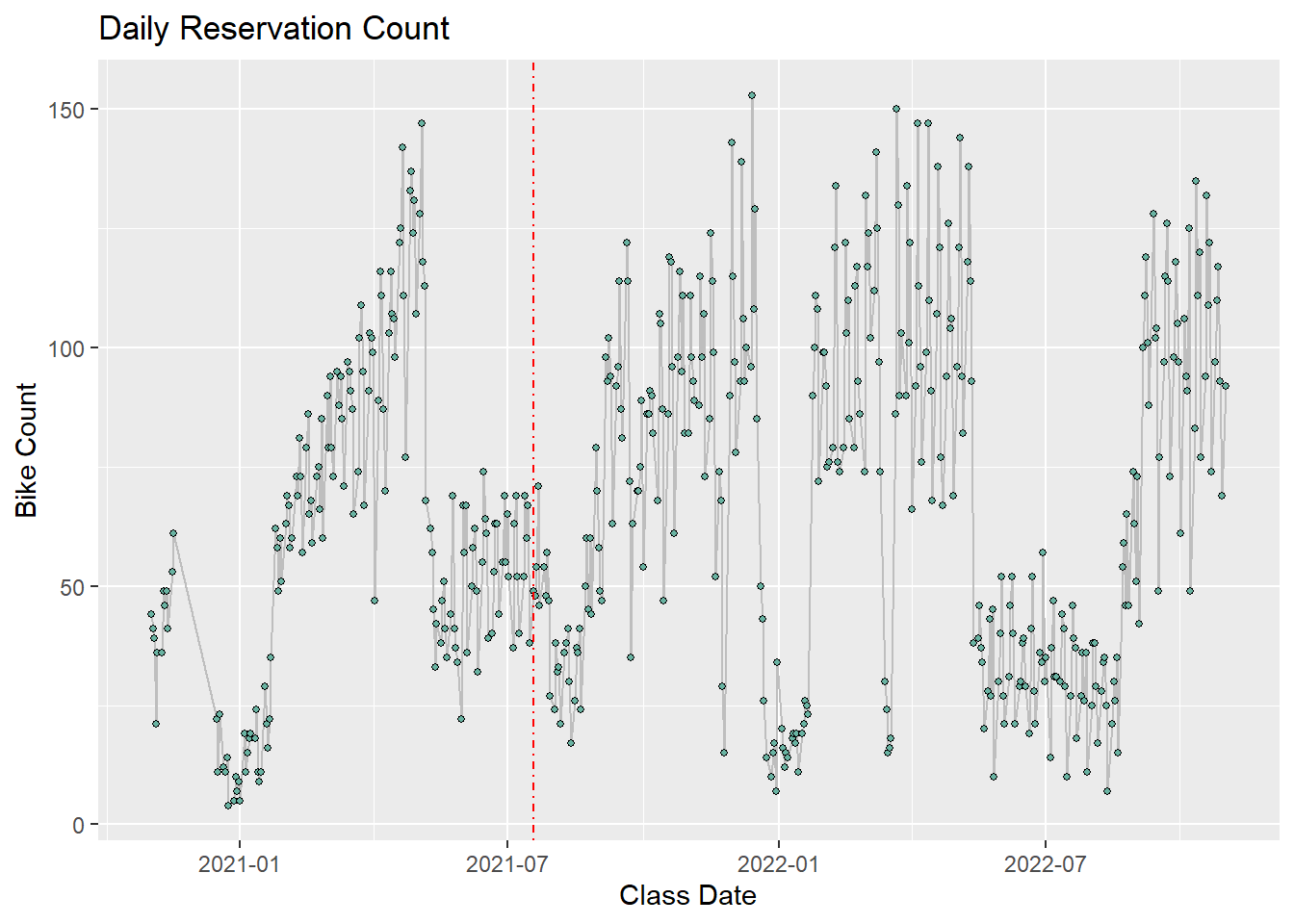
Next, I wanted to zoom in on each month and see if there are any trends that emerge for weekdays. Using lubridate, I converted the date into days and month so that I could average the days. Within each month, I averaged the capacity of each day with the average utilization and found the total number of bikes booked each day.
With the graph of average utilization, everything is pretty even, with Friday having lowest utilization. By looking at number of bikes, we can parse out more information. Tuesdays and Wednesdays have the most bookings. Again, months where students are likely gone from campus (December, July and August) are especially low in both sign-ups and utilization.
#graph of average utilization broken up by month and grouped by day
WeekdayDailyCapacityAvg %>%
  mutate(day = wday(ClassDate, label = TRUE, abbr = TRUE), month = month(ClassDate, label = TRUE, abbr = FALSE))%>%
  group_by(day, month)  %>%
  summarise(DailyAvgCap = mean(average)) %>%
  arrange(month) %>%
ggplot(aes(fill=day, y=DailyAvgCap, x=day)) +
    geom_bar( stat="identity") +
    facet_wrap(~month) +
    theme_ipsum() +
    labs(x = "Class Day",
       y = "Average Utilization",
       title = "Average Utilization per Month by Day"
       ) +
  theme(legend.position="none") +
  theme(panel.spacing = unit(.5, "mm")) +
theme(axis.text.x = element_text(angle = 90, vjust = 0.5, hjust=1)) 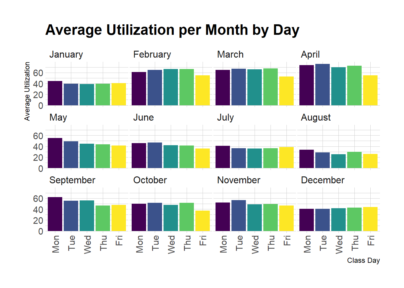
#graph of total bikes broken up by month and grouped by day
ReservationsbyClassID %>%
  mutate(day = wday(ClassDate, label = TRUE, abbr = TRUE), month = month(ClassDate, label = TRUE, abbr = FALSE))%>%
  group_by(day, month)  %>%
  summarise(DailyReservations = sum(reservations)) %>%
  arrange(month) %>%
ggplot(aes(fill=day, y=DailyReservations, x=day)) +
    geom_col() +
    facet_wrap(~month) +
    theme_ipsum() +
    labs(x = "Class Day",
       y = "Total Reservations",
       title = "Total Reservations per Month by Day"
       ) +
  theme(legend.position="none") +
  theme(panel.spacing = unit(.5, "mm")) +
    theme(axis.text.x = element_text(angle = 90, vjust = 0.5, hjust=1))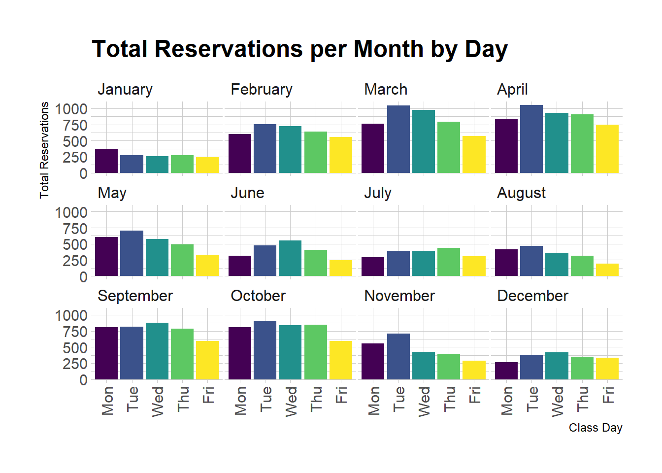
Next, I wanted to look at a specific month and see if there are any trends for class times. I chose to look at October 2022 because it is the most recent month of data that I have, and there are limited holidays. Also the studio will be celebrating their 2 year anniversary at the end of the month so they have had almost two years to grow and expand their business and footprint in the Madison area.
## weekday in Oct 2022, checked in reservations
WeekdayOct <- filter(TS, ClassDay != "Saturday", ClassDay !="Sunday") %>%
  mutate(across(ends_with('ID'), as.character)) %>%
  mutate(across(ends_with('Time'), as.character)) %>%
  filter(Status== "check in") %>%
  filter(str_starts(ClassDate, "2022-10"))

## total number of reservations by ClassID for weekday classes in Oct 2022, checked in reservations
WeekdayOctTotalReservation<- WeekdayOct %>%
  group_by(ClassID, ClassName, ClassDate, ClassTime) %>%
  summarize(reservations = n_distinct(ReservationID),
            avgCap = (reservations/42)*100) %>%
  arrange(desc(reservations))
These graphs are messy - each weekday has different time slots so the days are hard to compare signups. For example, Monday offers a 4:30pn, but Friday does not. Each day can also vary - on three out of the four Thursdays in October, there is a 3:30pm class. There is not a clear winner of which day has the most reservations, but Friday consistently has the least amount of sign-ups. In general, Tuesdays and Wednesdays seem to usually have the most reservations, but these are also the days when they typically offer 5 classes (6:30pm). Proportionally, Monday 4:30pm does the best with highest utilization.
# bar graph for number of reservations in October separated by day and time
#c <-
  ggplot(WeekdayOct) +
  geom_bar(mapping = aes(x = ClassDate, fill=ClassTime)) +
  labs(x = "Class Date",
       y = "Number of reservations",
       title = "Class Day vs Number of Reservations",
       fill = "Class Time",
       )+
scale_fill_discrete(labels=c('7AM', '8:30AM', '9:30AM', '12:30PM','3:30PM', '4:00PM', '4:30PM', '5:30PM', '6:30PM')) 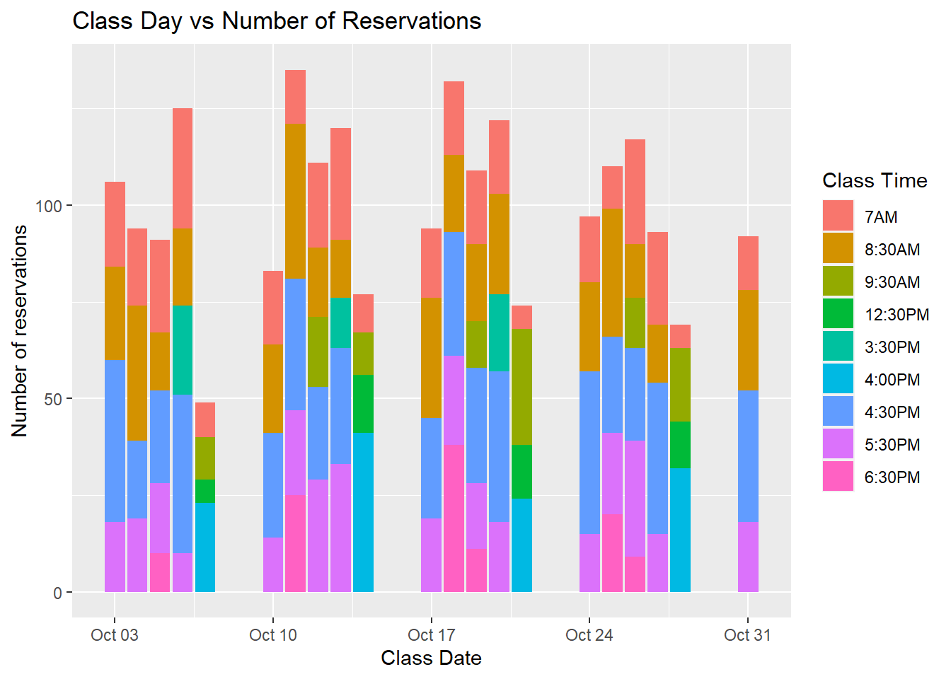
#plotly::ggplotly(c)

##proportion of class times offered on each day
 ggplot(data=WeekdayOctTotalReservation, aes(x=ClassDate, y = reservations, fill=ClassTime)) +
    geom_bar(position="fill", stat="identity") +
  labs(x = "Class Date",
       y = "Proportion of Total Classes",
       title = "Proportion of Class Times",
       fill = "Class Time",
       )+
scale_fill_discrete(labels=c('7AM', '8:30AM', '9:30AM', '12:30PM','3:30PM', '4:00PM', '4:30PM', '5:30PM', '6:30PM')) 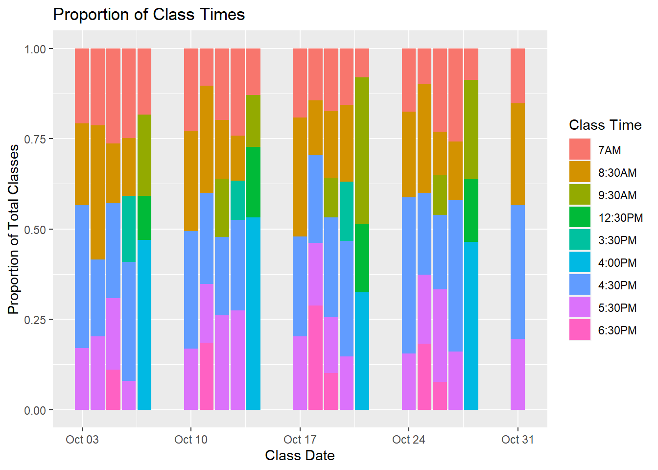
My take-aways for this section is that Fridays are the least attended day of the week, so Turnstyle should offer fewer classes on these days. Tuesday and Wednesday consistently do well so keeping the 6:30pm would be smart. Turnstyle might want to consider adding this for Mondays as well to increase reservations. Another take-away is to consult with the University of Wisconsin’s academic schedule. It is evident that right before break, reservations increase. At those times, Turnstyle should offer an abundance of classes to meet the demand. Over the summer and breaks, Turnstyle can lessen the amount of classes. They might also want to offer incentives or sales to ride during this time.
The next question I have from this dataset is does a substitute teacher affect class sign-ups? Instructors will have a set schedule, and they might need to request a class off. I am curious if having a substitute impacts the overall signup. Sometimes the client knows well in advance if there will be a substitute. Other times, the instructor changes can happen last minute. It is likely, however, that the client will be notified of the switch prior to taking class.
This first graph is looking at checked-in reservations for classes between November 1, 2021, and November 1, 2022. This is a full year of data. I chose to not include 2020 because the studio had just opened in 2020, and there were still Covid restrictions. Because it just opened, the schedule was still being finalized and every instructor was seen as “new.” The longer you teach, the more of a following you can develop.
On the graphs below, the false column is classes that are taught by the original instructor, the true column is if the class was taught by a substitute. Each point on the graph is percent utilization of each class. As you can see, the utilization of classes taught by the original instructor is slightly higher than if it was taught by a substitute. This was really surprising to me - I assumed that the difference would be much larger. I assumed that there would be fewer sign-ups for a substitute.
# reservations between Nov 2021 and Nov 2022, utilization of each class, graph of it taught by subsitute (TRUE) or by scheduled instructor (FALSE)
TS %>% filter(Status== "check in") %>%
  filter(ClassDate>= '2021-11-01')%>%
  filter(ClassDate<= '2022-11-01') %>%
  group_by(ClassID, ClassDate, ClassName, Capacity, Substitute, InstructorID) %>%
  summarize(reservations = n_distinct(ReservationID))  %>%
  arrange(desc(reservations)) %>%
  mutate(percent_Utilization = (reservations/Capacity)*100)  %>%
ggplot( aes(x=Substitute, y=percent_Utilization, fill=Substitute)) +
    geom_boxplot() +
    geom_jitter(color="black", size=0.4, alpha=0.9) +
    theme_ipsum() +
    theme(
      legend.position="none",
      plot.title = element_text(size=11)
    ) +
    ggtitle("Class Taught by Scheduled Instructor vs Substitute") +
    xlab("Substitute?") +
    ylab("Percent Untilization")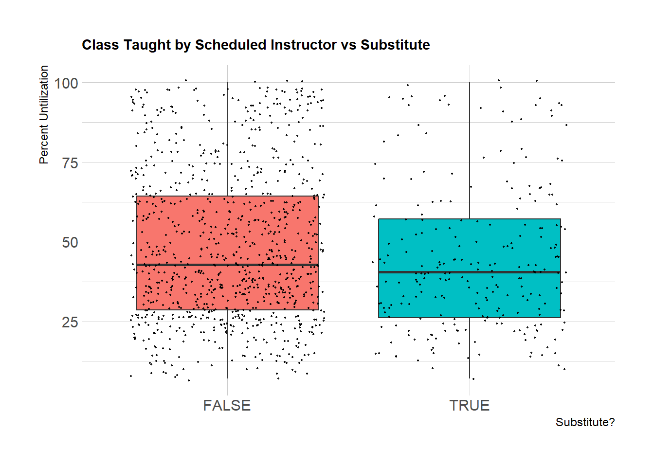
I then wanted to look at reservations that were standard cancelled in the last year. This means that the rider cancelled a class greater than 12 hours before the class started. If there is a last-minute change, the client is emailed and notified about the new instructor. The amount of cancellations per class is pretty similar, which was surprising. I thought it would be more for classes taught by a substitute.
I also wanted to compare number of late cancellations. The second graph below shows number of reservations per class that were not checked in and not standard cancelled. According to the graph, the number of late cancellations is fewer for classes taught by a substitute. I wonder if this is because a client will rearrange their schedule earlier if they know it is a substitute, therefore they will not need to make changes within the 12 hour penalty period. Also, I know the company often does not penalize clients for cancelling within the penalty window if the instructor is changed close to the start of class. Therefore, this data might not be entirely accurate.
## number of standard cancellations grouped by Class ID
TSnotInClass <- TS %>%
  filter(Status== "standard cancel") %>%
  filter(ClassDate>= '2021-11-01')%>%
  select(ClassID, ClassDate, ReservationID, ClassName, Capacity, Substitute, InstructorID) %>%
  group_by(ClassID, Substitute)  %>%
  summarise(count = n_distinct(ReservationID)) %>%
  ggplot( aes(x=Substitute, y=count, fill=Substitute)) +
    geom_boxplot() +
    geom_jitter(color="black", size=0.4, alpha=0.9) +
    theme_ipsum() +
    theme(
      legend.position="none",
      plot.title = element_text(size=11)
    ) +
    ggtitle("Number of Early Cancellations in a Class") +
    xlab("Substitute?")
TSnotInClass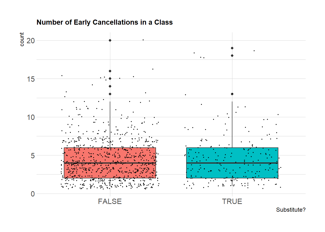
## number of late cancellations grouped by Class ID
TSnotInClassLateCancel <- TS %>%
  filter(Status!= "standard cancel") %>%
  filter(ClassDate>= '2021-11-01')%>%
  filter(Status!= "check in") %>%
  select(ClassID, ClassDate, ReservationID, ClassName, Capacity, Substitute, InstructorID) %>%
  group_by(ClassID, Substitute)  %>%
  summarise(count = n_distinct(ReservationID)) %>%
  ggplot( aes(x=Substitute, y=count, fill=Substitute)) +
    geom_boxplot() +
    geom_jitter(color="black", size=0.4, alpha=0.9) +
    theme_ipsum() +
    theme(
      legend.position="none",
      plot.title = element_text(size=11)
    ) +
    ggtitle("Number of Late Cancellations in a Class") +
    xlab("Substitute?")
TSnotInClassLateCancel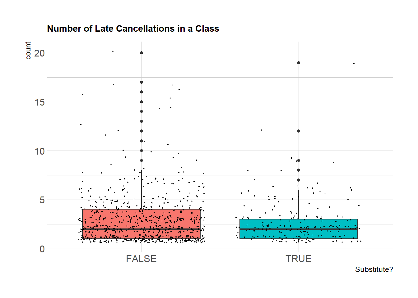
Finally, I picked specific class times to examine substitutes - 4:30pm, 5:30pm, and 6:30pm from January 1, 2022 to present and 8:00am, 9:00am, and 10:00am from January 21, 2022. I chose these times because they are the most popular class times and they are all consistently offered. I chose after January 21, 2022, because it was when students would be back on campus and when Turnstyle’s numbers started to rebound from break. As you can see from the weekday graphs, for the 4:30 class, the scheduled instructor has a much higher utilization than a substitute. The 5:30 also has a higher utilization for the scheduled instructor, but the difference is smaller. The upper quartile has more dispersion as well. For the 6:30, the opposite is true - the substitute has a higher utilization. The average for the 6:30pm class is the lowest out of the 3 - in order to increase sign-ups, Turnstyle should consider having a different regular instructor teach this class. They could also run a special for 6:30pm classes.
For the weekend morning classes, the 8am doesn’t have much data to analyze. However, the 8am does well with the scheduled instructor and has the highest utilization! Turnstyle might want to consider adding this class more consistently. The 9am class does best with the regularly scheduled instructor, however there is a large dispersion for the upper quartile for the substitute. Although the mean is less, there are quite a few data points that have a high utilization with the substitute. Finally, the 10am, which has been the most consistently offered weekend class, has a higher utilization with the substitute. This shows that weekends at 10am will be popular no matter who is teaching. They also offer limited classes on weekends so having higher numbers on these days compared to weekdays makes sense.
# Weeknights reservations for 4:30pm, 5:30pm, and 6:30pm, graphs the average utilization for a substitute vs scheduled instructor
TS %>% filter(Status== "check in") %>%
  filter(ClassDate>= '2022-01-21')%>%
  filter(ClassDay != "Saturday" | ClassDay != "Sunday") %>%
  filter(ClassTime == hms("17:30:00") | ClassTime == hms("16:30:00") | ClassTime == hms("18:30:00")) %>%
  group_by(ClassID, ClassDate, ClassTime, ClassName, Capacity, Substitute, InstructorID) %>%
  summarize(reservations = n_distinct(ReservationID))  %>%
  arrange(ClassDate) %>%
  mutate(percent_Utilization = (reservations/Capacity)*100) %>%
ggplot( aes(x=Substitute, y=percent_Utilization, fill=Substitute)) +
    geom_boxplot() +
  facet_wrap(~ClassTime, scale="free") +
    geom_jitter(color="black", size=0.4, alpha=0.9) +
    theme_ipsum() +
    theme(
      legend.position="none",
      plot.title = element_text(size=11)
    ) +
    ggtitle("Class Taught by Scheduled Instructor vs Substitute for Weeknight Classes") +
    xlab("Substitute?") +
    ylab("Percent Untilization")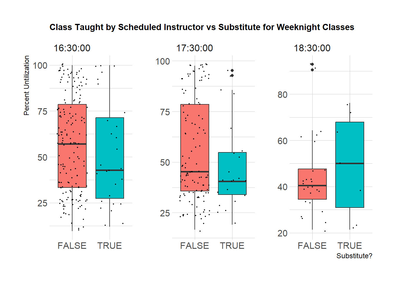
# Weekend reservations from 10:00am and earlier, graphs the average utilization for a substitute vs scheduled instructor
WeekendReservations <- TS %>% filter(Status== "check in") %>%
  filter(ClassDate>= '2022-01-22')%>%
  filter(ClassDay== "Saturday" | ClassDay=="Sunday") %>%
  filter(ClassTime<= hms("10:00:00")) %>%
  group_by(ClassID, ClassDate, ClassTime, ClassName, Capacity, Substitute, InstructorID) %>%
  summarize(reservations = n_distinct(ReservationID))  %>%
  arrange(ClassDate) %>%
  mutate(percent_Utilization = (reservations/Capacity)*100) %>%
ggplot( aes(x=Substitute, y=percent_Utilization, fill=Substitute)) +
    geom_boxplot() +
  facet_wrap(~ClassTime, scale="free") +
    geom_jitter(color="black", size=0.4, alpha=0.9) +
    theme_ipsum() +
    theme(
      legend.position="none",
      plot.title = element_text(size=11)
    ) +
    ggtitle("Class Taught by Scheduled Instructor vs Substitute for Weekend Morning Classes") +
    xlab("Substitute?") +
    ylab("Percent Untilization")
WeekendReservations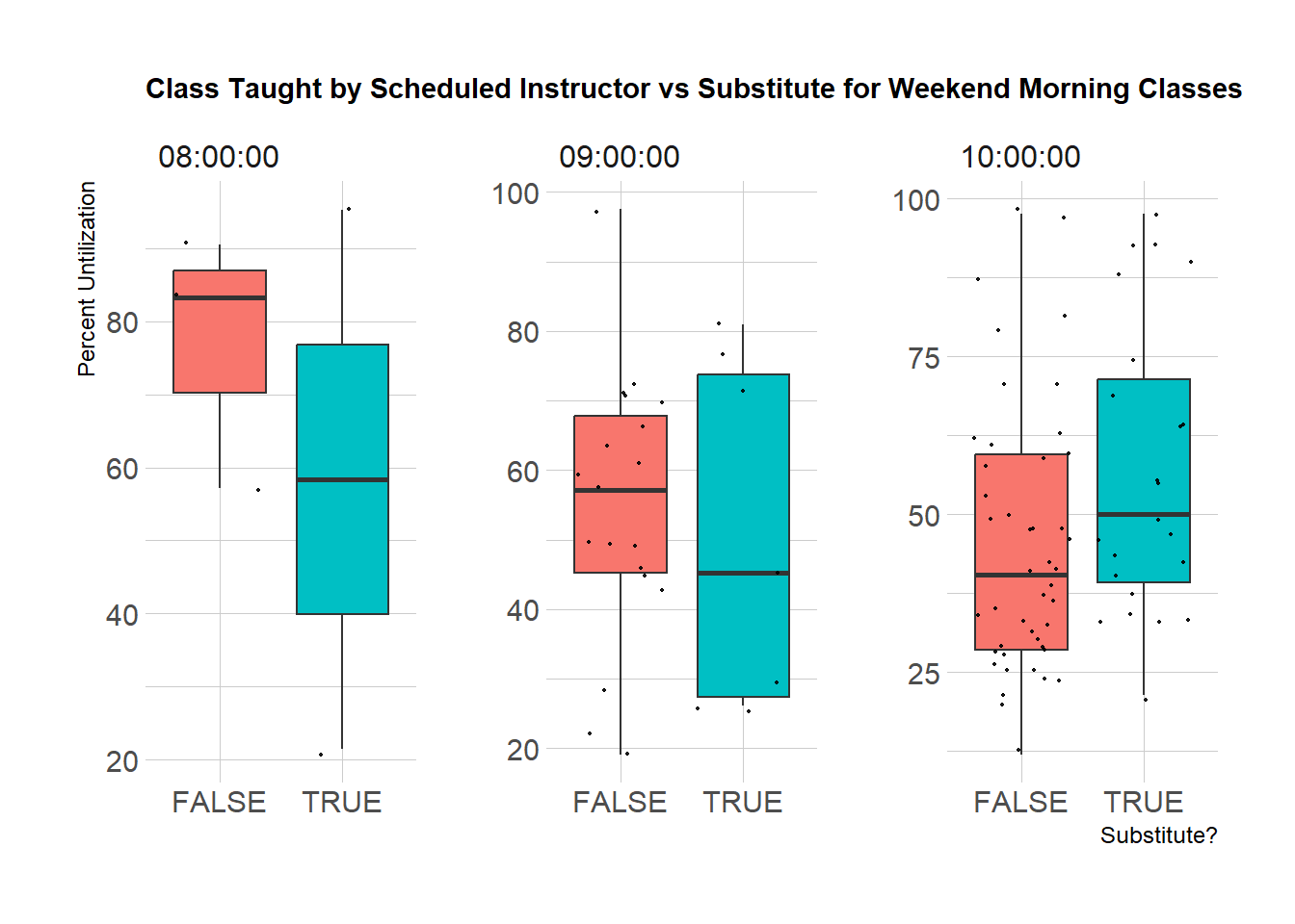
There is not a distinct trend for if a class is taught by an originally planned instructor vs a substitute. There are a couple of reasons why this might be. For one, the instructor might be changed last minute, and a rider didn’t have enough time to cancel. The data doesn’t tell me when a class instructor was changed. This also could be affected by who is the substitute - if it is an instructor with a large following or who is more tenured, they are likely to sway the data.
When looking at the time of classes with substitutes, utilization of weekend morning classes are less dependent on if there is a substitute compared to weekday evening classes. This shows me that the business should try to limit substitutes during the week and be strategic about who is covering the classes. They also can be more relaxed on having instructors here on the weekend. They also might want to consider having a popular instructor teach during the 6:30 time slot to increase reservations during this time.
Finally, I want to look at which themes are most popular. This studio chooses themes as their class name. Each instructor curates their own theme. There are 767 unique themes that have been taught over the last 2 years. Some themes are verses (VS) so there are two artists, others have 3 artists, and others are more generic.
I separated the Class Name into 2 new columns - one called Primary Artist and second called other. I separated by , or VS. We are told to name themes with the most popular and most used artists first so I knew I could use that primary artist as my baseline. I then categorized the themes into POP, HIP HOP, PUNK ROCK, EDM, GENERAL, and OTHER. For pop, hip hop, punk rock, and EDM, I took the primary artist and used case_when looking for specific artists and organizing them appropriately. Then, GENERAL were themes that did not have an artist and were generic, such as BEST OF 2000s. OTHER was reserved for event type rides such as birthdays, charities, or anniversaries. I also took out 60 minute classes and classes taught by New Instructors.
My next step is to find the average capacity for the themed classes and then find the which ones are most popular. I added two more columns: 1 that categorized the season and the other that categorized the utilization range (0 - 20%, 21 - 40%, 41-60%, 61 - 80%, >=81%).
##Theme names, filtered by Checked in, not 60 min OR taught by a new instuctor, created 2 new columns for if it is a VS or multiple artists
TSThemesNames <- TS %>%  filter(Status== "check in") %>%
  filter(!(str_starts(ClassName, "60 MIN"))) %>%
  filter(!(str_starts(ClassName, "NEW INSTRUCTOR"))) %>%
  group_by(ClassID, ClassName, ClassDate, ClassTime) %>%
  summarize(reservations = n_distinct(ReservationID))  %>%
  arrange(desc(reservations))  %>%
  mutate(themeVS = case_when(str_detect(ClassName,"VS") ~ "TRUE",
         TRUE ~ "FALSE"),
         themeMultipleArtists = case_when(str_detect(ClassName,", | . ") ~ "TRUE",
         TRUE ~ "FALSE"))

##separating Classname by VS or , into primary artist and other
TSThemesNameFinal <- TSThemesNames %>%
  separate(ClassName, into = c("PrimaryArtist", "other"), sep = " VS|,",
           remove = FALSE,
           convert = TRUE,
           extra = "merge",
           fill = "warn")
TSThemesNameFinal## categorizing by primary artist into pop, hip hop, general, other, and EDM. Also adding another column to note time of year (summer 2021, fall 2021, winter 2022, spring 2022, summer 2022, fall 2022)
TSThemesFinal <- TSThemesNameFinal %>%
mutate(percent_Capacity = (reservations/42)*100,
themeCategory = case_when(str_detect(PrimaryArtist, "BEST OF MASHUPS") ~ "general",
str_detect(PrimaryArtist, "GIRL GROUPS") ~ "general",
str_detect(PrimaryArtist, "BOY BANDS") ~ "general",
str_detect(PrimaryArtist, "THROWBACK") ~ "general",
str_detect(PrimaryArtist, "KINGS OF POP") ~ "general",
str_detect(PrimaryArtist, "QUEENS OF POP") ~ "general",
str_starts(PrimaryArtist, "TAYLOR") ~ "pop",
str_detect(PrimaryArtist, "BEYONC(É|E)") ~ "pop",
str_detect(PrimaryArtist, "RIHANNA") ~ "pop",
str_starts(PrimaryArtist, "JAY") ~ "hip hop",
str_starts(PrimaryArtist, "TRAVIS SCOTT") ~ "hip hop",
str_starts(PrimaryArtist, "CARDI") ~ "hip hop",
str_starts(PrimaryArtist, "KANYE") ~ "hip hop",
str_starts(PrimaryArtist, "MISSY") ~ "hip hop",
str_starts(PrimaryArtist, "NICKI MINAJ") ~ "hip hop",
str_starts(PrimaryArtist, "DRAKE") ~ "hip hop",
str_starts(PrimaryArtist, "DUA LIPA") ~ "pop",
str_starts(PrimaryArtist, "JUSTIN") ~ "pop",
str_detect(PrimaryArtist, "BIEBER") ~ "pop",
str_starts(PrimaryArtist, "BRITNEY") ~ "pop",
str_detect(PrimaryArtist, "DISNEY") ~ "other",
str_detect(PrimaryArtist, "BROADWAY") ~ "other",
str_starts(PrimaryArtist, "LIL") ~ "hip hop",
str_detect(PrimaryArtist, "TIKTOK") ~ "general",
str_starts(PrimaryArtist, "THE WEEKND") ~ "hip hop",
str_detect(PrimaryArtist, "POST MALONE") ~ "hip hop",
str_starts(PrimaryArtist, "ILLENIUM") ~ "EDM",
str_detect(PrimaryArtist, "ED SHEERAN") ~ "pop",
str_detect(PrimaryArtist, "SIA") ~ "pop",
str_starts(PrimaryArtist, "ONE DIRECTION") ~ "pop",
str_detect(PrimaryArtist, "PRIDE") ~ "general",
str_starts(PrimaryArtist, "THE CHAINSMOKERS") ~ "EDM",
str_detect(PrimaryArtist, "HIP HOP MUSIC VS EDM") ~ "general",
str_detect(PrimaryArtist, "EDM") ~ "EDM",
str_starts(PrimaryArtist, "FIERCE FEMALE") ~ "general",
str_detect(PrimaryArtist, "HIP HOP REMIXED") ~ "general",
str_starts(PrimaryArtist, "ODESZA") ~ "EDM",
str_starts(PrimaryArtist, "AVA MAX") ~ "pop",
str_detect(PrimaryArtist, "ARIANA") ~ "pop",
str_starts(PrimaryArtist, "JUICE") ~ "hip hop",
str_starts(PrimaryArtist, "KENDRICK") ~ "hip hop",
str_starts(PrimaryArtist, "50") ~ "hip hop",
str_starts(PrimaryArtist, "LIZZO") ~ "pop",
str_starts(PrimaryArtist, "LOUIS THE CHILD") ~ "EDM",
str_detect(PrimaryArtist, "BADGER") ~ "general",
str_starts(PrimaryArtist, "BIG SEAN") ~ "hip hop",
str_starts(PrimaryArtist, "BILLIE") ~ "pop",
str_starts(PrimaryArtist, "DOJA") ~ "hip hop",
str_starts(PrimaryArtist, "CHANCE") ~ "hip hop",
str_starts(PrimaryArtist, "ELLIE") ~ "EDM",
str_starts(PrimaryArtist, "HALSEY") ~ "EDM",
str_starts(PrimaryArtist, "HARRY STYLES") ~ "pop",
str_starts(PrimaryArtist, "JACK HARLOW") ~ "hip hop",
str_starts(PrimaryArtist, "KHALID") ~ "EDM",
str_starts(PrimaryArtist, "LADY") ~ "pop",
str_starts(PrimaryArtist, "MAC MILLER") ~ "hip hop",
str_starts(PrimaryArtist, "MAINSTAGE") ~ "general",
str_starts(PrimaryArtist, "MEGAN THEE STALLION") ~ "hip hop",
str_starts(PrimaryArtist, "MIGOS") ~ "hip hop",
str_starts(PrimaryArtist, "MILEY") ~ "pop",
str_starts(PrimaryArtist, "QUINN XCII") ~ "EDM",
str_starts(PrimaryArtist, "STEVE A") ~ "EDM",
str_detect(PrimaryArtist, "USHER") ~ "hip hop",
str_detect(PrimaryArtist, "BEST OF POP") ~ "general",
str_starts(PrimaryArtist, "BACKSTREET") ~ "pop",
str_detect(PrimaryArtist, "AWARENESS") ~ "other",
str_starts(PrimaryArtist, "CALVIN") ~ "EDM",
str_starts(PrimaryArtist, "DESTINY'S") ~ "pop",
str_starts(PrimaryArtist, "DEMI") ~ "pop",
str_starts(PrimaryArtist, "DJ") ~ "EDM",
str_starts(PrimaryArtist, "EMINEM") ~ "hip hop",
str_starts(PrimaryArtist, "FERGIE") ~ "pop",
str_starts(PrimaryArtist, "GALANTIS") ~ "EDM",
str_starts(PrimaryArtist, "GRYFFIN") ~ "EDM",
str_detect(PrimaryArtist, "GREEN DAY") ~ "punk rock",
str_starts(PrimaryArtist, "KYGO") ~ "EDM",
str_detect(PrimaryArtist, "KESHA") ~ "pop",
str_detect(PrimaryArtist, "KE[$]HA") ~ "pop",
str_starts(PrimaryArtist, "OLIVIA R") ~ "pop",
str_detect(PrimaryArtist, "PANIC!") ~ "punk rock",
str_starts(PrimaryArtist, "SAM SMITH") ~ "pop",
str_starts(PrimaryArtist, "SHAWN M") ~ "pop",
str_starts(PrimaryArtist, "TIËSTO") ~ "EDM",
str_starts(PrimaryArtist, "WHITNEY") ~ "pop",
str_starts(PrimaryArtist, "WIZ") ~ "hip hop",
str_starts(PrimaryArtist, "G-EAZY") ~ "hip hop",
str_starts(PrimaryArtist, "AVICII") ~ "EDM",
str_starts(PrimaryArtist, "BEST OF SUPER") ~ "other",
str_starts(PrimaryArtist, "CHARLI XCX") ~ "EDM",
str_starts(PrimaryArtist, "DISCLOSURE") ~ "EDM",
str_detect(PrimaryArtist, "IMAGINE DRAGONS") ~ "punk rock",
str_detect(PrimaryArtist, "P!NK") ~ "punk rock",
str_detect(PrimaryArtist, "RAP") ~ "hip hop",
str_starts(PrimaryArtist, "NELLY") ~ "hip hop",
str_detect(PrimaryArtist, "HIP HOP") ~ "hip hop",
str_starts(PrimaryArtist, "RITA ORA") ~ "EDM",
str_starts(PrimaryArtist, "SELENA") ~ "pop",
str_detect(PrimaryArtist, "ILLENIUM") ~ "EDM",
str_detect(PrimaryArtist, "FISHER") ~ "EDM",
str_detect(PrimaryArtist, "HIP HOP REMIXED") ~ "hip hop",
str_detect(PrimaryArtist, "BEST OF TURNSTYLE") ~ "general",
str_detect(PrimaryArtist, "THE WEEKND") ~ "hip hop",
str_detect(PrimaryArtist, "HIP HOP MUSIC VS") ~ "general",
str_detect(PrimaryArtist, "HOLIDAY HITS") ~ "general",
str_detect(PrimaryArtist, "KINGS OF HIP HOP MUSIC") ~ "hip hop",
str_detect(PrimaryArtist, "NEW YEARS PREGAME") ~ "general",
str_detect(PrimaryArtist, "PRIVATE") ~ "other",
str_starts(PrimaryArtist, "TROYE") ~ "pop",
str_starts(PrimaryArtist, "KATY") ~ "pop",
str_starts(PrimaryArtist, "TURNSTYLE 101") ~ "other",
str_detect(PrimaryArtist, "BEST OF 2021") ~ "general",
TRUE ~ "other"
),
season = case_when(
(ClassDate>=ymd('2021-06-01') & ClassDate<ymd('2021-09-01')) ~ "Summer 2021",
(ClassDate>=ymd('2021-09-01') & ClassDate<ymd('2021-12-01')) ~ "Fall 2021",
(ClassDate>=ymd('2021-12-01') & ClassDate<ymd('2022-03-01')) ~ "Winter 2021",
(ClassDate>=ymd('2022-03-01') & ClassDate<ymd('2022-06-01')) ~ "Spring 2022",
(ClassDate>=ymd('2022-06-01') & ClassDate<ymd('2022-09-01')) ~ "Summer 2022",
(ClassDate>=ymd('2022-09-01') & ClassDate<ymd('2022-12-01')) ~ "Fall 2022",
TRUE ~ "other")) %>%
mutate(percentageGrouping = case_when(
(percent_Capacity<21) ~ "0 - 20%",
(percent_Capacity<41) ~ "21 - 40%",
(percent_Capacity<61) ~ "41 - 60%",
(percent_Capacity<71) ~ "61 - 80%",
(percent_Capacity<101) ~ "81 - 100%"
))%>%
select(ClassID, ClassName, PrimaryArtist, other, reservations, percent_Capacity, themeCategory, ClassDate, ClassTime, season, percentageGrouping) %>%
arrange(themeCategory)
## frequency of the theme by category and the average capacity
ThemesFrequency <- TSThemesFinal %>%
group_by(ClassName, themeCategory) %>%
summarize(
frequencyTheme = n_distinct(ClassID),
averageCapacity = mean(percent_Capacity)) %>%
arrange(desc(averageCapacity),desc(frequencyTheme))
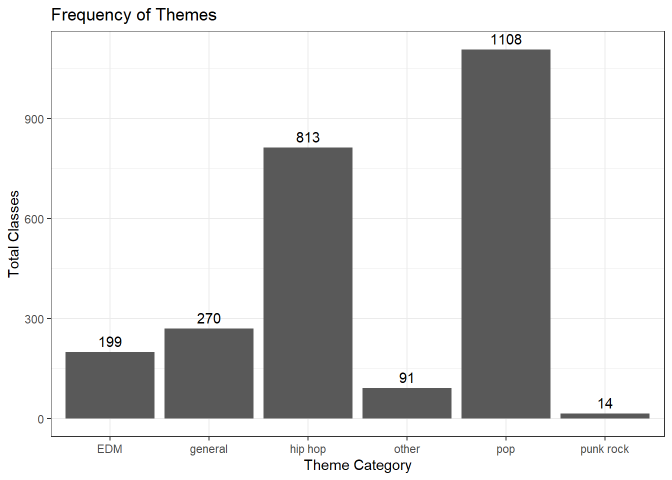
ThemesFrequencyI started by graphing how many classes were taught for each theme category and what the average utilization was for each category. I found that pop is the most often used theme that instructors choose for their classes, then hip hop and next general. For utilization, general and other have the highest average with about 43% utilization. Next is hip hop with 41%. Punk Rock and EDM have the lowest with about 25% and 30% respectively.
# Average Utilization for Theme Category from Nov 2020 to current
ThemesTotalCategory %>%
ggplot(aes(x=themeCategory, y = avgCapPercentage)) +
geom_bar(stat="identity") +
theme_bw() +
labs(title = "Average Utilization for Theme Category",
y = "Average Utilization",
x = "Theme Category") +
geom_text(aes(label = paste(format(round(avgCapPercentage)), " %")), vjust=-.5)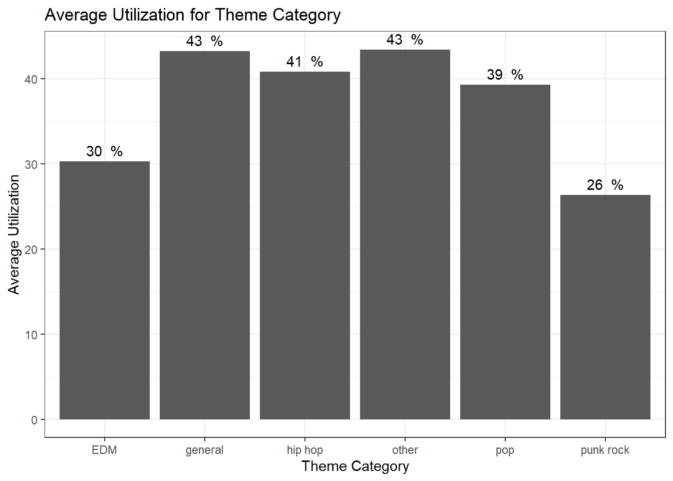
Next, I wanted to break down themes even more. The first graph is a violin plot. This shows that every theme category, except for punk rock, was able to have a class with close to 100% utilization. However, EDM’s distribution is more evenly distributed between 20 and 50%. “Other themes have the most evenly distributed across all utilization.
The second graph looks at the total number of themes offered broken down by utilization percentage grouping by theme category. You can see that most classes are in the 21-40% category. Punk rock and EDM have the lowest utilization.
##this graph shows the average capacity for each theme category from Nov 2020 to Oct 2022
TSThemesFinal %>%
ggplot(aes(x=themeCategory, y=percent_Capacity, fill=themeCategory)) +
geom_violin() +
labs(title = "Percent Utilization of Themes, Nov 2020 - Oct 2022",
y = "Percent Capacity",
x = "Theme Category")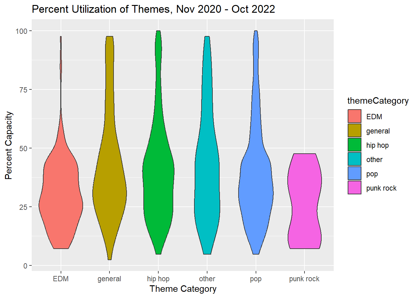
## Themes the total number of themes offered broken down by utilization percentage groupings
#e <-
TSThemesFinal %>%
ggplot(aes(x=percentageGrouping, fill=themeCategory)) +
geom_histogram(stat="count") +
labs(title = "Number of Classes By Utilization, Nov 2020 - Oct 2022",
y = "Count of Classes",
x = "Average Utilization Group") 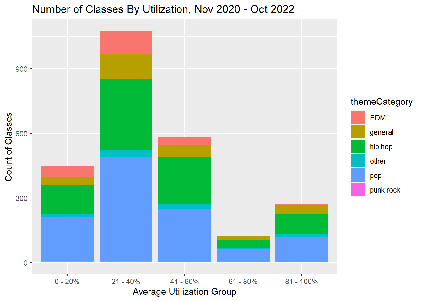
Finally, I wanted to look at theme categories after July 19, 2021, which is when Covid restrictions are lifted and there are now 42 bikes to fill.
I was then curious about if the seasons and themes affect reservations. The first graph shows what theme categories are offered from Summer 2021 to Fall 2022. As you can see, instructors proportionally offer the same variety across all seasons.
The second graph below shows the total number of classes by theme in each utilization group. As a business, you want utilization to be in the 81-100% group. This graph shows that EDM and punk rock are not very popular and are unlikely to sell the most classes. Pop and hip hop are relatively similar. However a lot of pop classes are in the 21-40% utilization group
My final graph is from 10am, 4:30pm, and 5:30pm classes after July 17, 2021. I chose these 3 class times because they are the most popular and I was curious to see if there are any different trends that emerge. Even at the most popular time slot, EDM and punk rock do not do well. Another takeaway is that general themes also well at this time slot. Other themes offered at 4:30 or 5:30 are also always about 21% utilization.
## Themes from Summer 2021 to current, the total number of themes offered during the seasons
#a<-
TSThemesFinal %>% filter(ClassDate>= '2021-07-19') %>%
mutate(season = factor(season, levels=c("Summer 2021", "Fall 2021", "Winter 2021", "Spring 2022", "Summer 2022", "Fall 2022"))) %>%
ggplot(aes(x=season, fill=themeCategory)) +
geom_histogram(stat="count") +
labs(title = "Number of Classes By Theme from July 17, 2021 to Current, Broken Down by Season",
y = "Count of Classes",
x = "Theme Category") 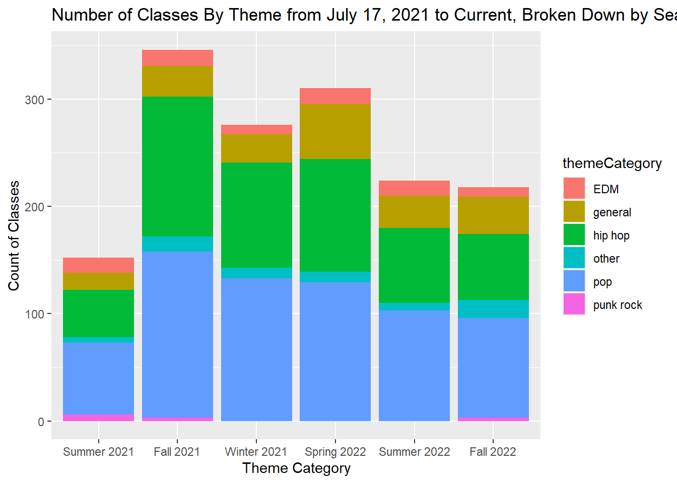
#plotly::ggplotly(a)
## Theme categories from Summer 2021 to current, the total classes in each utilization group
#x<-
TSThemesFinal %>% filter(ClassDate>= '2021-07-19') %>%
ggplot(aes(x=percentageGrouping, fill=themeCategory)) +
geom_histogram(stat="count") +
labs(title = "Number of Classes in Utilization Group, July 19, 2021 to Current",
y = "Count of Classes",
x = "Average Utilization Group") 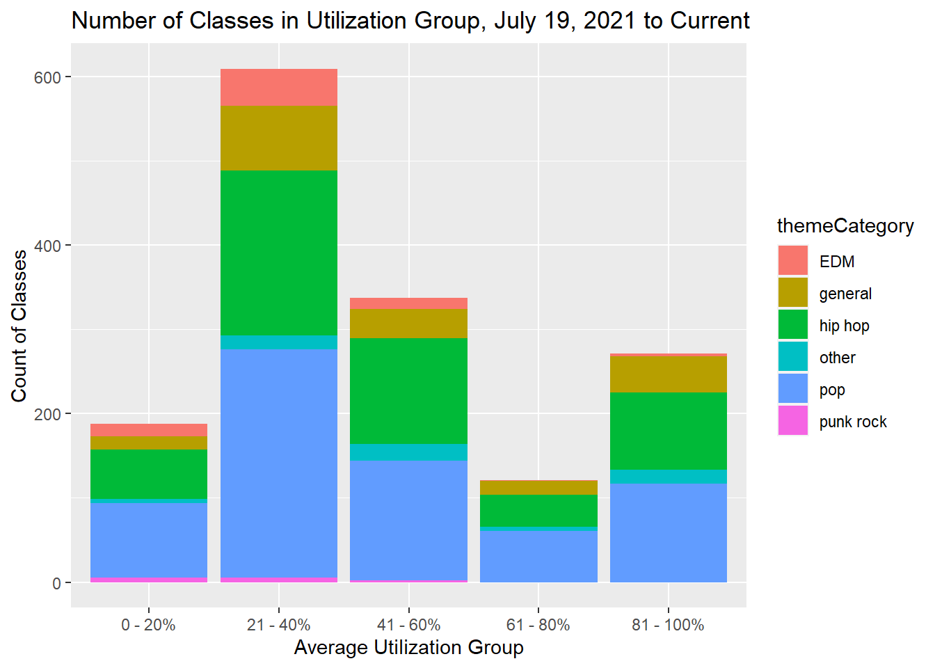
#plotly::ggplotly(x)
#y<-
TSThemesFinal %>% filter(ClassDate>= '2021-07-19') %>%
filter(ClassTime== hms("17:30:00") | ClassTime == hms("16:30:00")| ClassTime == hms("10:00:00")) %>%
ggplot(aes(x=percentageGrouping, fill=themeCategory)) +
geom_histogram(stat="count") +
labs(title = "Number of 10am, 4:30pm & 5:30pm Classes By Utilization, July 19, 2021 to Current",
y = "Count of Classes",
x = "Average Utilization by Theme") 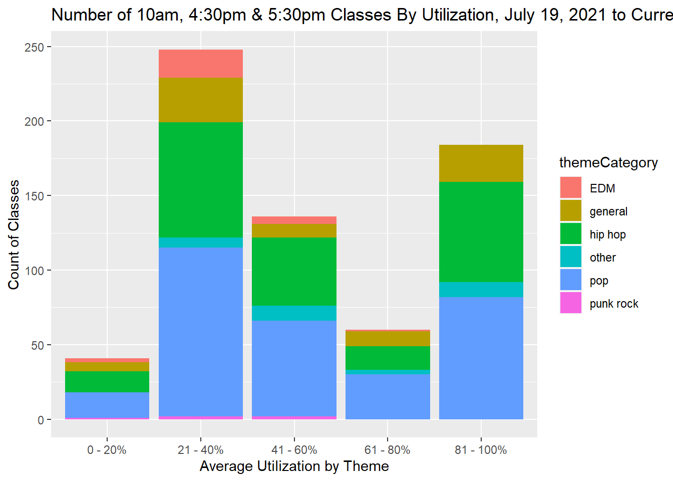
My overall takeaway for themes is that punk rock and EDM are not the best themes to offer. Including a pop or a hip hop artists with EDM artists could be a better solution. Pop and hip hop are equally popular so it will be important to continue to offer music in both genres. General themes are also popular which tells me that clients might not just be signing up for the music.
My final takeaways from the three areas I looked at is that Turnstyle should consult with University of Wisconsin’s academic schedule and map their classes to fit their breaks. Turnstyle should emphasize instructors keeping a consistent schedule during the week but allowing instructors on the weekend to take off classes as needed. Additionally, Turnstyle should continue offering a wide offering of themes, focusing on pop and hip hop. This also showed me that there are many reasons why a client signs up and shows up for a class - this includes class time, price point, instructor, and theme. Isolating each part took away the whole story.
I was very surprised with my findings. I thought themes would show me more information. I was surprised that EDM and punk rock were so low comparatively. I also thought “other” would have been higher for utilization because these are unique, celebration rides. I was also surprised by substitutes. I definitely thought having a sub would majorly affect sign-ups. I know I am not seeing the whole story, but this was still surprising. It was also really interesting to see how the calendar affects sign-ups. With this studio being in a college town, which is different from Boston, it is majorly affected when students are off campus. Although summer is slow for most fitness studios, this was especially evident in this dataset.
With more time and more skills developed using R, there is a lot more I would like to be able to do with this dataset. Some next steps include:
Themes: categorize using a function instead of my way of hard-coding. I would love to look at 2 artist themes vs multiple themes and really compare that with the general ones. I’m also interested in seeing trends of which artists are most popular.
Specific Instructors: Why are some instructors more popular than others? How can the business support instructors? Analyze what goes well for the instructors (is it theme, class time, class day, number of classes taught in total, number of class offerings in one week) I also wanted to compare this to the substitute data.
Time of sign-up: look at how early a client signs up - does the theme affect that? Class time? Instructor?
Sales: there is so much I can look at with sales! I didn’t even try looking at this yet, but I could always look at what packages people get, when do they purchase, do discounts affect number of sales, etc.
This class was so challenging yet very rewarding. Any time I would work through something, experience a challenge, and then figure it out, it felt satisfying because I knew I spent so much time tinkering and exploring. I really enjoyed learning this content, and I feel like I have just scratched the surface. I am excited to learn more and practice my skills on new datasets and see where these skills take me.
Thank you for this opportunity to learn and experience with trying something new - it was humbling yet soul satisfying being a student again! I also want to give a shout out to Maddi Hertz for her patience and willingness to support me throughout this term.
Grolemund, G., & Wickham, H. (2016). R for Data Science: Import, Tidy, Transform, Visualize, and Model Data. O’Reilly Media.
H. Wickham. ggplot2: Elegant Graphics for Data Analysis. Springer-Verlag New York, 2009.
R Core Team (2022). R: A language and environment for statistical computing. R Foundation for Statistical Computing, Vienna, Austria. URL https://www.R-project.org/.
---
title: "Naughton Final Project"
author: "Courtney Naughton"
desription: "Naughton Final Project"
date: "12/18/2022"
format:
html:
toc: true
code-fold: true
code-copy: true
code-tools: true
df-print: paged
categories:
- Courtney Naughton
- Final Project
---
```{r}
#| label: setup
#| warning: false
#| message: false
library(tidyverse)
library(tibble)
library(dplyr)
library(stringr)
library(ggplot2)
library(lubridate)
library(plotly)
library(hrbrthemes)
knitr::opts_chunk$set(echo = TRUE, warning=FALSE, message=FALSE)
```
## Final Project: Turnstyle Midwest
### Introduction
Background and Context for this Dataset:
I am a technology high school teacher in Boston, and I chose to enroll in the DACSS certificate program because I wanted to learn new skills in a growing field. This is my first time working with R, and although there were times I was very frustrated, I learned so much in this semester through problem solving, trying things out, and working through the frustration! In addition to teaching, I also teach spin in Boston, MA. The studio that I teach for, Turnstyle, also has a sister studio in the Midwest. I asked the owners if I could analyze their data for this final because I am familiar with the company, but I am not directly reflected in the data! So this work is for fun but is real data from the company. I'm am also interested in learning about trends within the fitness industry post 2020. This project has been exciting for me to try new things and practice the new skills I have learned this semester.
### Description of the Data
This dataset is from Turnstyle Cycle Midwest, a spin studio with locations in Chicago, Illinois, and Madison, Wisconsin. The dataset is every reservation at Turnstyle Midwest from November 2020 to October 2022. Each case is an individual sign up for a single class, and the columns are Reservation ID, Status (if the client is checked-in, standard cancelled, penalty cancelled, class cancelled, or no show), Class ID, Class Date, Class Time, Class Day, Class Name, Class Public, Class Tags, Capacity, Location (Madison or Chicago), Instructor ID, Substitute (true or false), and Customer ID. I then chose to filter only the Madison location and if the class was open to the public and therefore was not cancelled. This gave me 57,204 reservations.
My research questions:
- Which class time and day are most popular? Any trends with day of the week/time?
- Does a substitute instructor affect reservation counts?
- Themes: which are more popular? Is hip hop more popular than EDM or pop or are general themes better?
```{r}
#read in the data, filtering out unnecessary columns
TS <- read_csv("_data/reservations_Naughton.csv",
skip=2,
col_names = c("ReservationID", "del", "Status", rep("del", 12),"ClassID", "ClassDate", "ClassTime", "ClassDay", "ClassName", "ClassPublic", "ClassTags", rep("del", 6), "Capacity", "del", "Location", "del", "InstructorID", "del", "Substitute", "CustomerID", rep("del", 5)))%>%
select(!starts_with("del"))%>%
filter(Location == "Madison") %>%
filter(ClassPublic == TRUE) %>%
filter(Status != "class cancelled")
```
::: panel-tabset
## Weekday Classes
### Weekdays from Novemebr 2020 to October 2022
The first part of the data I wanted to look at was the utilization of the space. I took the count of each checked-in client for a unique class and calculated the percent usage of the space given the capacity of the room. The capacity changes throughout the 2 years because of different Covid restrictions. The red line in the graphs below denotes when capacity was less than 42 bikes - when the studio opened, Covid restrictions limited capacity to 14 bikes. Throughout November and the winter, capacity was 14 and increased to 23. On July 19, 2021, capacity increased and remained at 42 bikes. The first graph shows the daily average utilization, so for every class on that day, how many bikes were booked out of the possible bikes, and the second graph shows the total number of checked-in reservations each day.
On both graphs, it is evident summer is especially low. The Madison location is located near University of Wisconsin, so there are a lot of student riders. Therefore, when students are home, like during summer and holiday breaks, sign-ups are less, which is also evident in both graphs. These graphs use plotly so you can highlight each individual data point or zoom in to a particular range of dates. **Note, these graphs no longer have plotly for the final project to appear on the blog.
I was surprised to see that May 4, 2021, which is a date with capacity restrictions, had similar total bike counts to the maximum bike count for after restrictions were lifted. On May 4, there were 7 classes offered, which was the most classes Midwest has had in a day. Their next highest day with most reservations was December 14, 2021. I can assume that both of these days are at the end of the semester. Thus, students want to workout before they leave for the semester. Offering more classes at the end of the semester and before breaks would be a smart business move.
```{r}
# Weekday reservations
Weekday <- filter(TS, ClassDay != "Saturday", ClassDay !="Sunday") %>%
mutate(across(ends_with('ID'), as.character)) %>%
mutate(across(ends_with('Time'), as.character)) %>%
filter(Status== "check in") %>%
filter(ClassDate>= '2020-11-01')
## each class's average capacity
ReservationsbyClassID<- Weekday %>%
group_by(ClassID, ClassDate, Capacity) %>%
summarize(reservations = n_distinct(ReservationID)) %>%
mutate(percent_Capacity = (reservations/Capacity)*100) %>%
arrange(ClassDate)
## each day's average capacity
WeekdayDailyCapacityAvg <- ReservationsbyClassID %>%
group_by(ClassDate) %>%
summarize(average = mean(percent_Capacity))
#Graph of weekday daily capacity average with plotly
p <- WeekdayDailyCapacityAvg %>%
ggplot( aes(x=ClassDate, y = average ), group(ClassDate)) +
geom_line(color= "grey") +
geom_point(shape=21, color="black", fill="#69b3a2", size=1) +
labs(x = "Class Date",
y = "Average Utilization",
title = "Daily Average Utilization"
) +
geom_vline(xintercept = as.numeric(as.Date("2021-07-19")), linetype=4, colour="red")
#p <- ggplotly(p)
p
## each day's total bike reservation
WeekdayDailyReservationCount <- ReservationsbyClassID %>%
group_by(ClassDate) %>%
summarize(sum = sum(reservations))
#Graph of weekday total bike count with plotly
b <- WeekdayDailyReservationCount %>%
ggplot( aes(x=ClassDate, y = sum ), group(ClassDate)) +
geom_line(color= "grey") +
geom_point(shape=21, color="black", fill="#69b3a2", size=1) +
labs(x = "Class Date",
y = "Bike Count",
title = "Daily Reservation Count"
) +
geom_vline(xintercept = as.numeric(as.Date("2021-07-19")), linetype=4, colour="red")
#b <- ggplotly(b)
b
```
### Average Weekday Booking by Month
Next, I wanted to zoom in on each month and see if there are any trends that emerge for weekdays. Using lubridate, I converted the date into days and month so that I could average the days. Within each month, I averaged the capacity of each day with the average utilization and found the total number of bikes booked each day.
With the graph of average utilization, everything is pretty even, with Friday having lowest utilization. By looking at number of bikes, we can parse out more information. Tuesdays and Wednesdays have the most bookings. Again, months where students are likely gone from campus (December, July and August) are especially low in both sign-ups and utilization.
```{r}
#graph of average utilization broken up by month and grouped by day
WeekdayDailyCapacityAvg %>%
mutate(day = wday(ClassDate, label = TRUE, abbr = TRUE), month = month(ClassDate, label = TRUE, abbr = FALSE))%>%
group_by(day, month) %>%
summarise(DailyAvgCap = mean(average)) %>%
arrange(month) %>%
ggplot(aes(fill=day, y=DailyAvgCap, x=day)) +
geom_bar( stat="identity") +
facet_wrap(~month) +
theme_ipsum() +
labs(x = "Class Day",
y = "Average Utilization",
title = "Average Utilization per Month by Day"
) +
theme(legend.position="none") +
theme(panel.spacing = unit(.5, "mm")) +
theme(axis.text.x = element_text(angle = 90, vjust = 0.5, hjust=1))
#graph of total bikes broken up by month and grouped by day
ReservationsbyClassID %>%
mutate(day = wday(ClassDate, label = TRUE, abbr = TRUE), month = month(ClassDate, label = TRUE, abbr = FALSE))%>%
group_by(day, month) %>%
summarise(DailyReservations = sum(reservations)) %>%
arrange(month) %>%
ggplot(aes(fill=day, y=DailyReservations, x=day)) +
geom_col() +
facet_wrap(~month) +
theme_ipsum() +
labs(x = "Class Day",
y = "Total Reservations",
title = "Total Reservations per Month by Day"
) +
theme(legend.position="none") +
theme(panel.spacing = unit(.5, "mm")) +
theme(axis.text.x = element_text(angle = 90, vjust = 0.5, hjust=1))
```
### Weekdays in October 2022
Next, I wanted to look at a specific month and see if there are any trends for class times. I chose to look at October 2022 because it is the most recent month of data that I have, and there are limited holidays. Also the studio will be celebrating their 2 year anniversary at the end of the month so they have had almost two years to grow and expand their business and footprint in the Madison area.
```{r}
## weekday in Oct 2022, checked in reservations
WeekdayOct <- filter(TS, ClassDay != "Saturday", ClassDay !="Sunday") %>%
mutate(across(ends_with('ID'), as.character)) %>%
mutate(across(ends_with('Time'), as.character)) %>%
filter(Status== "check in") %>%
filter(str_starts(ClassDate, "2022-10"))
## total number of reservations by ClassID for weekday classes in Oct 2022, checked in reservations
WeekdayOctTotalReservation<- WeekdayOct %>%
group_by(ClassID, ClassName, ClassDate, ClassTime) %>%
summarize(reservations = n_distinct(ReservationID),
avgCap = (reservations/42)*100) %>%
arrange(desc(reservations))
```
These graphs are messy - each weekday has different time slots so the days are hard to compare signups. For example, Monday offers a 4:30pn, but Friday does not. Each day can also vary - on three out of the four Thursdays in October, there is a 3:30pm class. There is not a clear winner of which day has the most reservations, but Friday consistently has the least amount of sign-ups. In general, Tuesdays and Wednesdays seem to usually have the most reservations, but these are also the days when they typically offer 5 classes (6:30pm). Proportionally, Monday 4:30pm does the best with highest utilization.
```{r}
# bar graph for number of reservations in October separated by day and time
#c <-
ggplot(WeekdayOct) +
geom_bar(mapping = aes(x = ClassDate, fill=ClassTime)) +
labs(x = "Class Date",
y = "Number of reservations",
title = "Class Day vs Number of Reservations",
fill = "Class Time",
)+
scale_fill_discrete(labels=c('7AM', '8:30AM', '9:30AM', '12:30PM','3:30PM', '4:00PM', '4:30PM', '5:30PM', '6:30PM'))
#plotly::ggplotly(c)
##proportion of class times offered on each day
ggplot(data=WeekdayOctTotalReservation, aes(x=ClassDate, y = reservations, fill=ClassTime)) +
geom_bar(position="fill", stat="identity") +
labs(x = "Class Date",
y = "Proportion of Total Classes",
title = "Proportion of Class Times",
fill = "Class Time",
)+
scale_fill_discrete(labels=c('7AM', '8:30AM', '9:30AM', '12:30PM','3:30PM', '4:00PM', '4:30PM', '5:30PM', '6:30PM'))
```
### Conclusion for Weekday Offerings
My take-aways for this section is that Fridays are the least attended day of the week, so Turnstyle should offer fewer classes on these days. Tuesday and Wednesday consistently do well so keeping the 6:30pm would be smart. Turnstyle might want to consider adding this for Mondays as well to increase reservations. Another take-away is to consult with the University of Wisconsin's academic schedule. It is evident that right before break, reservations increase. At those times, Turnstyle should offer an abundance of classes to meet the demand. Over the summer and breaks, Turnstyle can lessen the amount of classes. They might also want to offer incentives or sales to ride during this time.
## Substitute Instructors
### Substitute Instructors and the Effect on Sign-ups
The next question I have from this dataset is does a substitute teacher affect class sign-ups? Instructors will have a set schedule, and they might need to request a class off. I am curious if having a substitute impacts the overall signup. Sometimes the client knows well in advance if there will be a substitute. Other times, the instructor changes can happen last minute. It is likely, however, that the client will be notified of the switch prior to taking class.
### Substitute Instructors from November 2021 to Current
This first graph is looking at checked-in reservations for classes between November 1, 2021, and November 1, 2022. This is a full year of data. I chose to not include 2020 because the studio had just opened in 2020, and there were still Covid restrictions. Because it just opened, the schedule was still being finalized and every instructor was seen as "new." The longer you teach, the more of a following you can develop.
On the graphs below, the false column is classes that are taught by the original instructor, the true column is if the class was taught by a substitute. Each point on the graph is percent utilization of each class. As you can see, the utilization of classes taught by the original instructor is slightly higher than if it was taught by a substitute. This was really surprising to me - I assumed that the difference would be much larger. I assumed that there would be fewer sign-ups for a substitute.
```{r}
# reservations between Nov 2021 and Nov 2022, utilization of each class, graph of it taught by subsitute (TRUE) or by scheduled instructor (FALSE)
TS %>% filter(Status== "check in") %>%
filter(ClassDate>= '2021-11-01')%>%
filter(ClassDate<= '2022-11-01') %>%
group_by(ClassID, ClassDate, ClassName, Capacity, Substitute, InstructorID) %>%
summarize(reservations = n_distinct(ReservationID)) %>%
arrange(desc(reservations)) %>%
mutate(percent_Utilization = (reservations/Capacity)*100) %>%
ggplot( aes(x=Substitute, y=percent_Utilization, fill=Substitute)) +
geom_boxplot() +
geom_jitter(color="black", size=0.4, alpha=0.9) +
theme_ipsum() +
theme(
legend.position="none",
plot.title = element_text(size=11)
) +
ggtitle("Class Taught by Scheduled Instructor vs Substitute") +
xlab("Substitute?") +
ylab("Percent Untilization")
```
### Standard Cancellations with Substitutes from November 2021 to Current
I then wanted to look at reservations that were standard cancelled in the last year. This means that the rider cancelled a class greater than 12 hours before the class started. If there is a last-minute change, the client is emailed and notified about the new instructor. The amount of cancellations per class is pretty similar, which was surprising. I thought it would be more for classes taught by a substitute.
I also wanted to compare number of late cancellations. The second graph below shows number of reservations per class that were not checked in and not standard cancelled. According to the graph, the number of late cancellations is fewer for classes taught by a substitute. I wonder if this is because a client will rearrange their schedule earlier if they know it is a substitute, therefore they will not need to make changes within the 12 hour penalty period. Also, I know the company often does not penalize clients for cancelling within the penalty window if the instructor is changed close to the start of class. Therefore, this data might not be entirely accurate.
```{r}
## number of standard cancellations grouped by Class ID
TSnotInClass <- TS %>%
filter(Status== "standard cancel") %>%
filter(ClassDate>= '2021-11-01')%>%
select(ClassID, ClassDate, ReservationID, ClassName, Capacity, Substitute, InstructorID) %>%
group_by(ClassID, Substitute) %>%
summarise(count = n_distinct(ReservationID)) %>%
ggplot( aes(x=Substitute, y=count, fill=Substitute)) +
geom_boxplot() +
geom_jitter(color="black", size=0.4, alpha=0.9) +
theme_ipsum() +
theme(
legend.position="none",
plot.title = element_text(size=11)
) +
ggtitle("Number of Early Cancellations in a Class") +
xlab("Substitute?")
TSnotInClass
## number of late cancellations grouped by Class ID
TSnotInClassLateCancel <- TS %>%
filter(Status!= "standard cancel") %>%
filter(ClassDate>= '2021-11-01')%>%
filter(Status!= "check in") %>%
select(ClassID, ClassDate, ReservationID, ClassName, Capacity, Substitute, InstructorID) %>%
group_by(ClassID, Substitute) %>%
summarise(count = n_distinct(ReservationID)) %>%
ggplot( aes(x=Substitute, y=count, fill=Substitute)) +
geom_boxplot() +
geom_jitter(color="black", size=0.4, alpha=0.9) +
theme_ipsum() +
theme(
legend.position="none",
plot.title = element_text(size=11)
) +
ggtitle("Number of Late Cancellations in a Class") +
xlab("Substitute?")
TSnotInClassLateCancel
```
### Primetime Weekday & Weekend Classes with Substitutes
Finally, I picked specific class times to examine substitutes - 4:30pm, 5:30pm, and 6:30pm from January 1, 2022 to present and 8:00am, 9:00am, and 10:00am from January 21, 2022. I chose these times because they are the most popular class times and they are all consistently offered. I chose after January 21, 2022, because it was when students would be back on campus and when Turnstyle's numbers started to rebound from break.
As you can see from the weekday graphs, for the 4:30 class, the scheduled instructor has a much higher utilization than a substitute. The 5:30 also has a higher utilization for the scheduled instructor, but the difference is smaller. The upper quartile has more dispersion as well. For the 6:30, the opposite is true - the substitute has a higher utilization. The average for the 6:30pm class is the lowest out of the 3 - in order to increase sign-ups, Turnstyle should consider having a different regular instructor teach this class. They could also run a special for 6:30pm classes.
For the weekend morning classes, the 8am doesn't have much data to analyze. However, the 8am does well with the scheduled instructor and has the highest utilization! Turnstyle might want to consider adding this class more consistently. The 9am class does best with the regularly scheduled instructor, however there is a large dispersion for the upper quartile for the substitute. Although the mean is less, there are quite a few data points that have a high utilization with the substitute. Finally, the 10am, which has been the most consistently offered weekend class, has a higher utilization with the substitute. This shows that weekends at 10am will be popular no matter who is teaching. They also offer limited classes on weekends so having higher numbers on these days compared to weekdays makes sense.
```{r}
# Weeknights reservations for 4:30pm, 5:30pm, and 6:30pm, graphs the average utilization for a substitute vs scheduled instructor
TS %>% filter(Status== "check in") %>%
filter(ClassDate>= '2022-01-21')%>%
filter(ClassDay != "Saturday" | ClassDay != "Sunday") %>%
filter(ClassTime == hms("17:30:00") | ClassTime == hms("16:30:00") | ClassTime == hms("18:30:00")) %>%
group_by(ClassID, ClassDate, ClassTime, ClassName, Capacity, Substitute, InstructorID) %>%
summarize(reservations = n_distinct(ReservationID)) %>%
arrange(ClassDate) %>%
mutate(percent_Utilization = (reservations/Capacity)*100) %>%
ggplot( aes(x=Substitute, y=percent_Utilization, fill=Substitute)) +
geom_boxplot() +
facet_wrap(~ClassTime, scale="free") +
geom_jitter(color="black", size=0.4, alpha=0.9) +
theme_ipsum() +
theme(
legend.position="none",
plot.title = element_text(size=11)
) +
ggtitle("Class Taught by Scheduled Instructor vs Substitute for Weeknight Classes") +
xlab("Substitute?") +
ylab("Percent Untilization")
# Weekend reservations from 10:00am and earlier, graphs the average utilization for a substitute vs scheduled instructor
WeekendReservations <- TS %>% filter(Status== "check in") %>%
filter(ClassDate>= '2022-01-22')%>%
filter(ClassDay== "Saturday" | ClassDay=="Sunday") %>%
filter(ClassTime<= hms("10:00:00")) %>%
group_by(ClassID, ClassDate, ClassTime, ClassName, Capacity, Substitute, InstructorID) %>%
summarize(reservations = n_distinct(ReservationID)) %>%
arrange(ClassDate) %>%
mutate(percent_Utilization = (reservations/Capacity)*100) %>%
ggplot( aes(x=Substitute, y=percent_Utilization, fill=Substitute)) +
geom_boxplot() +
facet_wrap(~ClassTime, scale="free") +
geom_jitter(color="black", size=0.4, alpha=0.9) +
theme_ipsum() +
theme(
legend.position="none",
plot.title = element_text(size=11)
) +
ggtitle("Class Taught by Scheduled Instructor vs Substitute for Weekend Morning Classes") +
xlab("Substitute?") +
ylab("Percent Untilization")
WeekendReservations
```
### Conclusions for Substitutes:
There is not a distinct trend for if a class is taught by an originally planned instructor vs a substitute. There are a couple of reasons why this might be. For one, the instructor might be changed last minute, and a rider didn't have enough time to cancel. The data doesn't tell me when a class instructor was changed. This also could be affected by who is the substitute - if it is an instructor with a large following or who is more tenured, they are likely to sway the data.
When looking at the time of classes with substitutes, utilization of weekend morning classes are less dependent on if there is a substitute compared to weekday evening classes. This shows me that the business should try to limit substitutes during the week and be strategic about who is covering the classes. They also can be more relaxed on having instructors here on the weekend. They also might want to consider having a popular instructor teach during the 6:30 time slot to increase reservations during this time.
## Themes
### Themes and the Effect on Signups
Finally, I want to look at which themes are most popular. This studio chooses themes as their class name. Each instructor curates their own theme. There are 767 unique themes that have been taught over the last 2 years. Some themes are verses (VS) so there are two artists, others have 3 artists, and others are more generic.
I separated the Class Name into 2 new columns - one called Primary Artist and second called other. I separated by , or VS. We are told to name themes with the most popular and most used artists first so I knew I could use that primary artist as my baseline. I then categorized the themes into POP, HIP HOP, PUNK ROCK, EDM, GENERAL, and OTHER. For pop, hip hop, punk rock, and EDM, I took the primary artist and used case_when looking for specific artists and organizing them appropriately. Then, GENERAL were themes that did not have an artist and were generic, such as BEST OF 2000s. OTHER was reserved for event type rides such as birthdays, charities, or anniversaries. I also took out 60 minute classes and classes taught by New Instructors.
My next step is to find the average capacity for the themed classes and then find the which ones are most popular. I added two more columns: 1 that categorized the season and the other that categorized the utilization range (0 - 20%, 21 - 40%, 41-60%, 61 - 80%, >=81%).
```{r}
##Theme names, filtered by Checked in, not 60 min OR taught by a new instuctor, created 2 new columns for if it is a VS or multiple artists
TSThemesNames <- TS %>% filter(Status== "check in") %>%
filter(!(str_starts(ClassName, "60 MIN"))) %>%
filter(!(str_starts(ClassName, "NEW INSTRUCTOR"))) %>%
group_by(ClassID, ClassName, ClassDate, ClassTime) %>%
summarize(reservations = n_distinct(ReservationID)) %>%
arrange(desc(reservations)) %>%
mutate(themeVS = case_when(str_detect(ClassName,"VS") ~ "TRUE",
TRUE ~ "FALSE"),
themeMultipleArtists = case_when(str_detect(ClassName,", | . ") ~ "TRUE",
TRUE ~ "FALSE"))
##separating Classname by VS or , into primary artist and other
TSThemesNameFinal <- TSThemesNames %>%
separate(ClassName, into = c("PrimaryArtist", "other"), sep = " VS|,",
remove = FALSE,
convert = TRUE,
extra = "merge",
fill = "warn")
TSThemesNameFinal
```
```{r}
## categorizing by primary artist into pop, hip hop, general, other, and EDM. Also adding another column to note time of year (summer 2021, fall 2021, winter 2022, spring 2022, summer 2022, fall 2022)
TSThemesFinal <- TSThemesNameFinal %>%
  mutate(percent_Capacity = (reservations/42)*100,
    themeCategory = case_when(str_detect(PrimaryArtist, "BEST OF MASHUPS") ~ "general",
                              str_detect(PrimaryArtist, "GIRL GROUPS") ~ "general",
                              str_detect(PrimaryArtist, "BOY BANDS") ~ "general",
                              str_detect(PrimaryArtist, "THROWBACK") ~ "general",
                              str_detect(PrimaryArtist, "KINGS OF POP") ~ "general",
                              str_detect(PrimaryArtist, "QUEENS OF POP") ~ "general",
                              str_starts(PrimaryArtist, "TAYLOR") ~ "pop",
                              str_detect(PrimaryArtist, "BEYONC(É|E)") ~ "pop",
                              str_detect(PrimaryArtist, "RIHANNA") ~ "pop",
                              str_starts(PrimaryArtist, "JAY") ~ "hip hop",
                              str_starts(PrimaryArtist, "TRAVIS SCOTT") ~ "hip hop",
                              str_starts(PrimaryArtist, "CARDI") ~ "hip hop",
                              str_starts(PrimaryArtist, "KANYE") ~ "hip hop",
                              str_starts(PrimaryArtist, "MISSY") ~ "hip hop",
                              str_starts(PrimaryArtist, "NICKI MINAJ") ~ "hip hop",
                              str_starts(PrimaryArtist, "DRAKE") ~ "hip hop",
                              str_starts(PrimaryArtist, "DUA LIPA") ~ "pop",
                              str_starts(PrimaryArtist, "JUSTIN") ~ "pop",
                              str_detect(PrimaryArtist, "BIEBER") ~ "pop",
                              str_starts(PrimaryArtist, "BRITNEY") ~ "pop",
                              str_detect(PrimaryArtist, "DISNEY") ~ "other",
                              str_detect(PrimaryArtist, "BROADWAY") ~ "other",
                              str_starts(PrimaryArtist, "LIL") ~ "hip hop",
                              str_detect(PrimaryArtist, "TIKTOK") ~ "general",
                              str_starts(PrimaryArtist, "THE WEEKND") ~ "hip hop",
                              str_detect(PrimaryArtist, "POST MALONE") ~ "hip hop",
                              str_starts(PrimaryArtist, "ILLENIUM") ~ "EDM",
                              str_detect(PrimaryArtist, "ED SHEERAN") ~ "pop",
                              str_detect(PrimaryArtist, "SIA") ~ "pop",
                              str_starts(PrimaryArtist, "ONE DIRECTION") ~ "pop",
                              str_detect(PrimaryArtist, "PRIDE") ~ "general",
                              str_starts(PrimaryArtist, "THE CHAINSMOKERS") ~ "EDM",
                              str_detect(PrimaryArtist, "HIP HOP MUSIC VS EDM") ~ "general",
                              str_detect(PrimaryArtist, "EDM") ~ "EDM",
                              str_starts(PrimaryArtist, "FIERCE FEMALE") ~ "general",
                              str_detect(PrimaryArtist, "HIP HOP REMIXED") ~ "general",
                              str_starts(PrimaryArtist, "ODESZA") ~ "EDM",
                              str_starts(PrimaryArtist, "AVA MAX") ~ "pop",
                              str_detect(PrimaryArtist, "ARIANA") ~ "pop",
                              str_starts(PrimaryArtist, "JUICE") ~ "hip hop",
                              str_starts(PrimaryArtist, "KENDRICK") ~ "hip hop",
                              str_starts(PrimaryArtist, "50") ~ "hip hop",
                              str_starts(PrimaryArtist, "LIZZO") ~ "pop",
                              str_starts(PrimaryArtist, "LOUIS THE CHILD") ~ "EDM",
                              str_detect(PrimaryArtist, "BADGER") ~ "general",
                              str_starts(PrimaryArtist, "BIG SEAN") ~ "hip hop",
                              str_starts(PrimaryArtist, "BILLIE") ~ "pop",
                              str_starts(PrimaryArtist, "DOJA") ~ "hip hop",
                              str_starts(PrimaryArtist, "CHANCE") ~ "hip hop",
                              str_starts(PrimaryArtist, "ELLIE") ~ "EDM",
                              str_starts(PrimaryArtist, "HALSEY") ~ "EDM",
                              str_starts(PrimaryArtist, "HARRY STYLES") ~ "pop",
                              str_starts(PrimaryArtist, "JACK HARLOW") ~ "hip hop",
                              str_starts(PrimaryArtist, "KHALID") ~ "EDM",
                              str_starts(PrimaryArtist, "LADY") ~ "pop",
                              str_starts(PrimaryArtist, "MAC MILLER") ~ "hip hop",
                              str_starts(PrimaryArtist, "MAINSTAGE") ~ "general",
                              str_starts(PrimaryArtist, "MEGAN THEE STALLION") ~ "hip hop",
                              str_starts(PrimaryArtist, "MIGOS") ~ "hip hop",
                              str_starts(PrimaryArtist, "MILEY") ~ "pop",
                              str_starts(PrimaryArtist, "QUINN XCII") ~ "EDM",
                              str_starts(PrimaryArtist, "STEVE A") ~ "EDM",
                              str_detect(PrimaryArtist, "USHER") ~ "hip hop",
                              str_detect(PrimaryArtist, "BEST OF POP") ~ "general",
                              str_starts(PrimaryArtist, "BACKSTREET") ~ "pop",
                              str_detect(PrimaryArtist, "AWARENESS") ~ "other",
                              str_starts(PrimaryArtist, "CALVIN") ~ "EDM",
                              str_starts(PrimaryArtist, "DESTINY'S") ~ "pop",
                              str_starts(PrimaryArtist, "DEMI") ~ "pop",
                              str_starts(PrimaryArtist, "DJ") ~ "EDM",
                              str_starts(PrimaryArtist, "EMINEM") ~ "hip hop",
                              str_starts(PrimaryArtist, "FERGIE") ~ "pop",
                              str_starts(PrimaryArtist, "GALANTIS") ~ "EDM",
                              str_starts(PrimaryArtist, "GRYFFIN") ~ "EDM",
                              str_detect(PrimaryArtist, "GREEN DAY") ~ "punk rock",
                              str_starts(PrimaryArtist, "KYGO") ~ "EDM",
                              str_detect(PrimaryArtist, "KESHA") ~ "pop",
                              str_detect(PrimaryArtist, "KE[$]HA") ~ "pop",
                              str_starts(PrimaryArtist, "OLIVIA R") ~ "pop",
                              str_detect(PrimaryArtist, "PANIC!") ~ "punk rock",
                              str_starts(PrimaryArtist, "SAM SMITH") ~ "pop",
                              str_starts(PrimaryArtist, "SHAWN M") ~ "pop",
                              str_starts(PrimaryArtist, "TIËSTO") ~ "EDM",
                              str_starts(PrimaryArtist, "WHITNEY") ~ "pop",
                              str_starts(PrimaryArtist, "WIZ") ~ "hip hop",
                              str_starts(PrimaryArtist, "G-EAZY") ~ "hip hop",
                              str_starts(PrimaryArtist, "AVICII") ~ "EDM",
                              str_starts(PrimaryArtist, "BEST OF SUPER") ~ "other",
                              str_starts(PrimaryArtist, "CHARLI XCX") ~ "EDM",
                              str_starts(PrimaryArtist, "DISCLOSURE") ~ "EDM",
                              str_detect(PrimaryArtist, "IMAGINE DRAGONS") ~ "punk rock",
                              str_detect(PrimaryArtist, "P!NK") ~ "punk rock",
                              str_detect(PrimaryArtist, "RAP") ~ "hip hop",
                              str_starts(PrimaryArtist, "NELLY") ~ "hip hop",
                              str_detect(PrimaryArtist, "HIP HOP") ~ "hip hop",
                              str_starts(PrimaryArtist, "RITA ORA") ~ "EDM",
                              str_starts(PrimaryArtist, "SELENA") ~ "pop",
                              str_detect(PrimaryArtist, "ILLENIUM") ~ "EDM",
                              str_detect(PrimaryArtist, "FISHER") ~ "EDM",
                              str_detect(PrimaryArtist, "HIP HOP REMIXED") ~ "hip hop",
                              str_detect(PrimaryArtist, "BEST OF TURNSTYLE") ~ "general",
                              str_detect(PrimaryArtist, "THE WEEKND") ~ "hip hop",
                              str_detect(PrimaryArtist, "HIP HOP MUSIC VS") ~ "general",
                              str_detect(PrimaryArtist, "HOLIDAY HITS") ~ "general",
                              str_detect(PrimaryArtist, "KINGS OF HIP HOP MUSIC") ~ "hip hop",
                              str_detect(PrimaryArtist, "NEW YEARS PREGAME") ~ "general",
                              str_detect(PrimaryArtist, "PRIVATE") ~ "other",
                              str_starts(PrimaryArtist, "TROYE") ~ "pop",
                              str_starts(PrimaryArtist, "KATY") ~ "pop",
                              str_starts(PrimaryArtist, "TURNSTYLE 101") ~ "other",
                              str_detect(PrimaryArtist, "BEST OF 2021") ~ "general",
                              TRUE ~ "other"

      ),
    season = case_when(
           (ClassDate>=ymd('2021-06-01') & ClassDate<ymd('2021-09-01')) ~ "Summer 2021",
           (ClassDate>=ymd('2021-09-01') & ClassDate<ymd('2021-12-01')) ~ "Fall 2021",
           (ClassDate>=ymd('2021-12-01') & ClassDate<ymd('2022-03-01')) ~ "Winter 2021",
           (ClassDate>=ymd('2022-03-01') & ClassDate<ymd('2022-06-01')) ~ "Spring 2022",
           (ClassDate>=ymd('2022-06-01') & ClassDate<ymd('2022-09-01')) ~ "Summer 2022",
           (ClassDate>=ymd('2022-09-01') & ClassDate<ymd('2022-12-01')) ~ "Fall 2022",
         TRUE ~ "other"))  %>%
  mutate(percentageGrouping =  case_when(
      (percent_Capacity<21) ~ "0 - 20%",
      (percent_Capacity<41) ~ "21 - 40%",
      (percent_Capacity<61) ~ "41 - 60%",
      (percent_Capacity<71) ~ "61 - 80%",
      (percent_Capacity<101) ~ "81 - 100%"
    ))%>%
  select(ClassID, ClassName, PrimaryArtist, other, reservations, percent_Capacity, themeCategory, ClassDate, ClassTime, season, percentageGrouping) %>%
  arrange(themeCategory)

## frequency of the theme by category and the average capacity
ThemesFrequency <- TSThemesFinal %>%
  group_by(ClassName, themeCategory) %>%
  summarize(
    frequencyTheme = n_distinct(ClassID),
    averageCapacity = mean(percent_Capacity)) %>%
  arrange(desc(averageCapacity),desc(frequencyTheme))
ThemesFrequency
## total number of classes for every theme category and average capacity of every theme
ThemesTotalCategory<- TSThemesFinal %>%
    group_by(themeCategory) %>%
    summarize(
        avgCapPercentage = mean(percent_Capacity),
        sum = n_distinct(ClassID)
    )


#unique(TS$ClassName)
```
### Classes Taught by Theme, November 2020 to Current
I started by graphing how many classes were taught for each theme category and what the average utilization was for each category. I found that pop is the most often used theme that instructors choose for their classes, then hip hop and next general. For utilization, general and other have the highest average with about 43% utilization. Next is hip hop with 41%. Punk Rock and EDM have the lowest with about 25% and 30% respectively.
``` {r}
##total number of classes taught under each theme from Nov 2020 to Current
ThemesTotalCategory %>%
ggplot(aes(x=themeCategory, y = sum)) +
  geom_bar(stat="identity") +
    theme_bw() +
    labs(title = "Frequency of Themes",
         y = "Total Classes",
         x = "Theme Category") +
    geom_text(aes(label =  sum), vjust=-.5)
# Average Utilization for Theme Category from Nov 2020 to current
ThemesTotalCategory %>%
ggplot(aes(x=themeCategory, y = avgCapPercentage)) +
  geom_bar(stat="identity") +
    theme_bw() +
    labs(title = "Average Utilization for Theme Category",
         y = "Average Utilization",
         x = "Theme Category") +
    geom_text(aes(label = paste(format(round(avgCapPercentage)), " %")), vjust=-.5)
```
### Utilization of Theme Categories, November 2020 to Current
Next, I wanted to break down themes even more. The first graph is a violin plot. This shows that every theme category, except for punk rock, was able to have a class with close to 100% utilization. However, EDM's distribution is more evenly distributed between 20 and 50%. "Other themes have the most evenly distributed across all utilization.
The second graph looks at the total number of themes offered broken down by utilization percentage grouping by theme category. You can see that most classes are in the 21-40% category. Punk rock and EDM have the lowest utilization.
```{r}
##this graph shows the average capacity for each theme category from Nov 2020 to Oct 2022
TSThemesFinal %>%
    ggplot(aes(x=themeCategory, y=percent_Capacity, fill=themeCategory)) +
    geom_violin() +
    labs(title = "Percent Utilization of Themes, Nov 2020 - Oct 2022",
         y = "Percent Capacity",
         x = "Theme Category")
## Themes the total number of themes offered broken down by utilization percentage groupings
#e <-
TSThemesFinal %>%
    ggplot(aes(x=percentageGrouping, fill=themeCategory)) +
    geom_histogram(stat="count") +
    labs(title = "Number of Classes By Utilization, Nov 2020 - Oct 2022",
         y = "Count of Classes",
         x = "Average Utilization Group")
#plotly::ggplotly(e)
```
### Utilization for Theme Categories, After Capacity Restrictions are Lifted (July 19, 2021)
Finally, I wanted to look at theme categories after July 19, 2021, which is when Covid restrictions are lifted and there are now 42 bikes to fill.
I was then curious about if the seasons and themes affect reservations. The first graph shows what theme categories are offered from Summer 2021 to Fall 2022. As you can see, instructors proportionally offer the same variety across all seasons.
The second graph below shows the total number of classes by theme in each utilization group. As a business, you want utilization to be in the 81-100% group. This graph shows that EDM and punk rock are not very popular and are unlikely to sell the most classes. Pop and hip hop are relatively similar. However a lot of pop classes are in the 21-40% utilization group
My final graph is from 10am, 4:30pm, and 5:30pm classes after July 17, 2021. I chose these 3 class times because they are the most popular and I was curious to see if there are any different trends that emerge. Even at the most popular time slot, EDM and punk rock do not do well. Another takeaway is that general themes also well at this time slot. Other themes offered at 4:30 or 5:30 are also always about 21% utilization.
``` {r}
## Themes from Summer 2021 to current, the total number of themes offered during the seasons
#a<-
TSThemesFinal %>% filter(ClassDate>= '2021-07-19') %>%
  mutate(season = factor(season, levels=c("Summer 2021", "Fall 2021", "Winter 2021", "Spring 2022", "Summer 2022", "Fall 2022"))) %>%
    ggplot(aes(x=season, fill=themeCategory)) +
    geom_histogram(stat="count") +
    labs(title = "Number of Classes By Theme from July 17, 2021 to Current, Broken Down by Season",
         y = "Count of Classes",
         x = "Theme Category")
#plotly::ggplotly(a)

## Theme categories from Summer 2021 to current, the total classes in each utilization group
#x<-
TSThemesFinal %>% filter(ClassDate>= '2021-07-19') %>%
   ggplot(aes(x=percentageGrouping, fill=themeCategory)) +
    geom_histogram(stat="count") +
    labs(title = "Number of Classes in Utilization Group, July 19, 2021 to Current",
         y = "Count of Classes",
         x = "Average Utilization Group")
#plotly::ggplotly(x)


#y<-
TSThemesFinal %>% filter(ClassDate>= '2021-07-19') %>%
  filter(ClassTime== hms("17:30:00") | ClassTime == hms("16:30:00")| ClassTime == hms("10:00:00")) %>%
   ggplot(aes(x=percentageGrouping, fill=themeCategory)) +
    geom_histogram(stat="count") +
    labs(title = "Number of 10am, 4:30pm & 5:30pm Classes By Utilization, July 19, 2021 to Current",
         y = "Count of Classes",
         x = "Average Utilization by Theme")
#plotly::ggplotly(y)
```
### Conclustions for Themes:
My overall takeaway for themes is that punk rock and EDM are not the best themes to offer. Including a pop or a hip hop artists with EDM artists could be a better solution. Pop and hip hop are equally popular so it will be important to continue to offer music in both genres. General themes are also popular which tells me that clients might not just be signing up for the music.
:::
## Final Conclusion and Takeaways
My final takeaways from the three areas I looked at is that Turnstyle should consult with University of Wisconsin's academic schedule and map their classes to fit their breaks. Turnstyle should emphasize instructors keeping a consistent schedule during the week but allowing instructors on the weekend to take off classes as needed. Additionally, Turnstyle should continue offering a wide offering of themes, focusing on pop and hip hop. This also showed me that there are many reasons why a client signs up and shows up for a class - this includes class time, price point, instructor, and theme. Isolating each part took away the whole story.
I was very surprised with my findings. I thought themes would show me more information. I was surprised that EDM and punk rock were so low comparatively. I also thought "other" would have been higher for utilization because these are unique, celebration rides. I was also surprised by substitutes. I definitely thought having a sub would majorly affect sign-ups. I know I am not seeing the whole story, but this was still surprising. It was also really interesting to see how the calendar affects sign-ups. With this studio being in a college town, which is different from Boston, it is majorly affected when students are off campus. Although summer is slow for most fitness studios, this was especially evident in this dataset.
### Next steps
With more time and more skills developed using R, there is a lot more I would like to be able to do with this dataset. Some next steps include:
- Themes: categorize using a function instead of my way of hard-coding. I would love to look at 2 artist themes vs multiple themes and really compare that with the general ones. I'm also interested in seeing trends of which artists are most popular.
- Specific Instructors: Why are some instructors more popular than others? How can the business support instructors? Analyze what goes well for the instructors (is it theme, class time, class day, number of classes taught in total, number of class offerings in one week) I also wanted to compare this to the substitute data.
- Time of sign-up: look at how early a client signs up - does the theme affect that? Class time? Instructor?
- Sales: there is so much I can look at with sales! I didn't even try looking at this yet, but I could always look at what packages people get, when do they purchase, do discounts affect number of sales, etc.
### Reflection
This class was so challenging yet very rewarding. Any time I would work through something, experience a challenge, and then figure it out, it felt satisfying because I knew I spent so much time tinkering and exploring. I really enjoyed learning this content, and I feel like I have just scratched the surface. I am excited to learn more and practice my skills on new datasets and see where these skills take me.
Thank you for this opportunity to learn and experience with trying something new - it was humbling yet soul satisfying being a student again! I also want to give a shout out to Maddi Hertz for her patience and willingness to support me throughout this term.
### References
Grolemund, G., & Wickham, H. (2016). R for Data Science: Import, Tidy, Transform, Visualize, and Model Data. O’Reilly Media.
H. Wickham. ggplot2: Elegant Graphics for Data Analysis. Springer-Verlag New York, 2009.
R Core Team (2022). R: A language and environment for statistical computing. R Foundation for Statistical Computing, Vienna, Austria. URL https://www.R-project.org/.