Warning: package 'readxl' was built under R version 4.2.2
library(ggplot2)
library(usmap)
Warning: package 'usmap' was built under R version 4.2.2
knitr::opts_chunk$set(echo =TRUE)
Introduction
Elections in recent history have been controversial and contentious. Are people in the United States really satisfied with our electoral system, not in the sense of the electoral college, but in the candidates that are available to them? Along with this, which electorate, in terms of states, are the most dissatisfied with elections, and do these dissatisfied electorates have the most impact on elections in general. The hope is that with the analysis of this data set, the answers to these questions can begin to be answered.
Data
The data set being used in this study has been sourced from the MIT Election Data and Science Lab. This data set was created in 2017, and contains presidential election data for all 50 states for the 1976 - 2020 election years. The data set includes 15 distinct variables. Not all of these variable will be necessary in our analysis, and will be cleaned in order to make the analysis more streamlined. the summary of the original data set is included below.
#Read in of election Dataset election_orig <-read.csv("_data/1976-2020-president.csv")#Summarize Dataset election_origsummary(election_orig)
      year         state             state_po           state_fips
 Min.   :1976   Length:4287        Length:4287        Min.   : 1.00
 1st Qu.:1988   Class :character   Class :character   1st Qu.:16.00
 Median :2000   Mode  :character   Mode  :character   Median :28.00
 Mean   :1999                                         Mean   :28.62
 3rd Qu.:2012                                         3rd Qu.:41.00
 Max.   :2020                                         Max.   :56.00
   state_cen        state_ic        office           candidate
 Min.   :11.00   Min.   : 1.00   Length:4287        Length:4287
 1st Qu.:33.00   1st Qu.:22.00   Class :character   Class :character
 Median :53.00   Median :42.00   Mode  :character   Mode  :character
 Mean   :53.67   Mean   :39.75
 3rd Qu.:81.00   3rd Qu.:61.00
 Max.   :95.00   Max.   :82.00
 party_detailed      writein        candidatevotes       totalvotes
 Length:4287        Mode :logical   Min.   :       0   Min.   :  123574
 Class :character   FALSE:3807      1st Qu.:    1177   1st Qu.:  652274
 Mode  :character   TRUE :477       Median :    7499   Median : 1569180
                    NA's :3         Mean   :  311908   Mean   : 2366924
                                    3rd Qu.:  199242   3rd Qu.: 3033118
                                    Max.   :11110250   Max.   :17500881
    version          notes         party_simplified
 Min.   :20210113   Mode:logical   Length:4287
 1st Qu.:20210113   NA's:4287      Class :character
 Median :20210113                  Mode  :character
 Mean   :20210113
 3rd Qu.:20210113
 Max.   :20210113
Data Wrangling & Mutation
In order to begin the analysis, we must create a data frame that contains only crucial data from the original data set. In this case, we only needed to select the data that describes the outcome of each election cycle for each state. After this is completed, a new variable, percentvotes, was created to better represent the candidate with the highest percent of the votes for any election cycle. Finally, it was crucial to better format how write-in votes were represented. First for all rows that had writein == TRUE , “Write-In Votes” was replaced into the candidate column as well as the party_detailed column for the same row would be replaced with “Other”. finally, the writein column was removed since its data was now represented in the candidate and party_detailed columns.
This election1 data frame will be where all other data frames needed for the following visualizations will be derived from.
Step #3: Join mapdata and election_participation data frames by state & pivot_longer the newly joined data frame in order for data to be organized by year. This new data frame is called mapdata_totalvotes.
This new data frame, mapdata_totalvotes, will be what is used to create the visualization.
mapdata_totalvotes <-left_join(mapdata, election_participation, by ="state") %>%pivot_longer(cols =c("1976":"2020"),names_to ="year",values_to ="total_votes")
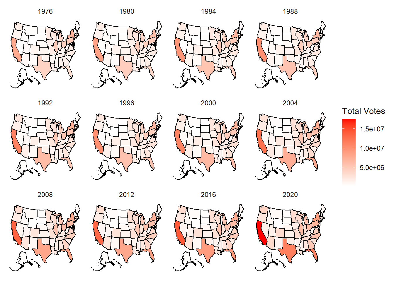
Step #4: Create visualization of data, map_totalvotes, using ggplot2. The visualization will create 12 distinct heat maps for each election year using facet.
Step #2: Join mapdata and election_winners data frames by state & pivto_longer in order for data to be organized by year and party in a new data frame, mapdata_winners.
mapdata_winners <-left_join(mapdata, election_winners, by ="state") %>%pivot_longer(cols =c("1976":"2020"),names_to ="year",values_to ="Party")
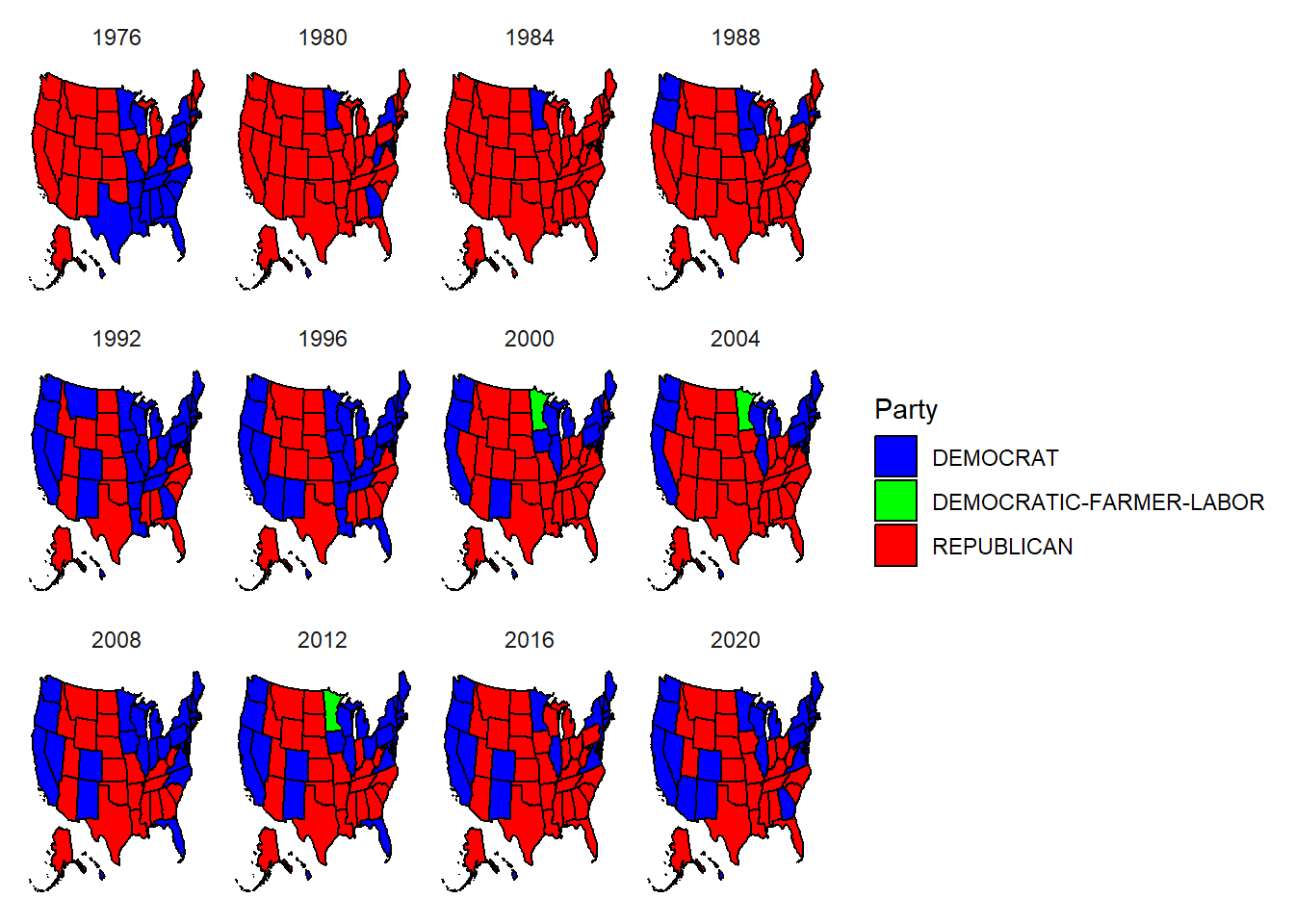
Step #3: Create visualization, map_winners, where each election year is represented using facet. - In order for each state to be colored to match the party correctly, data frame color_list was created to assign each party with it’s respective color.
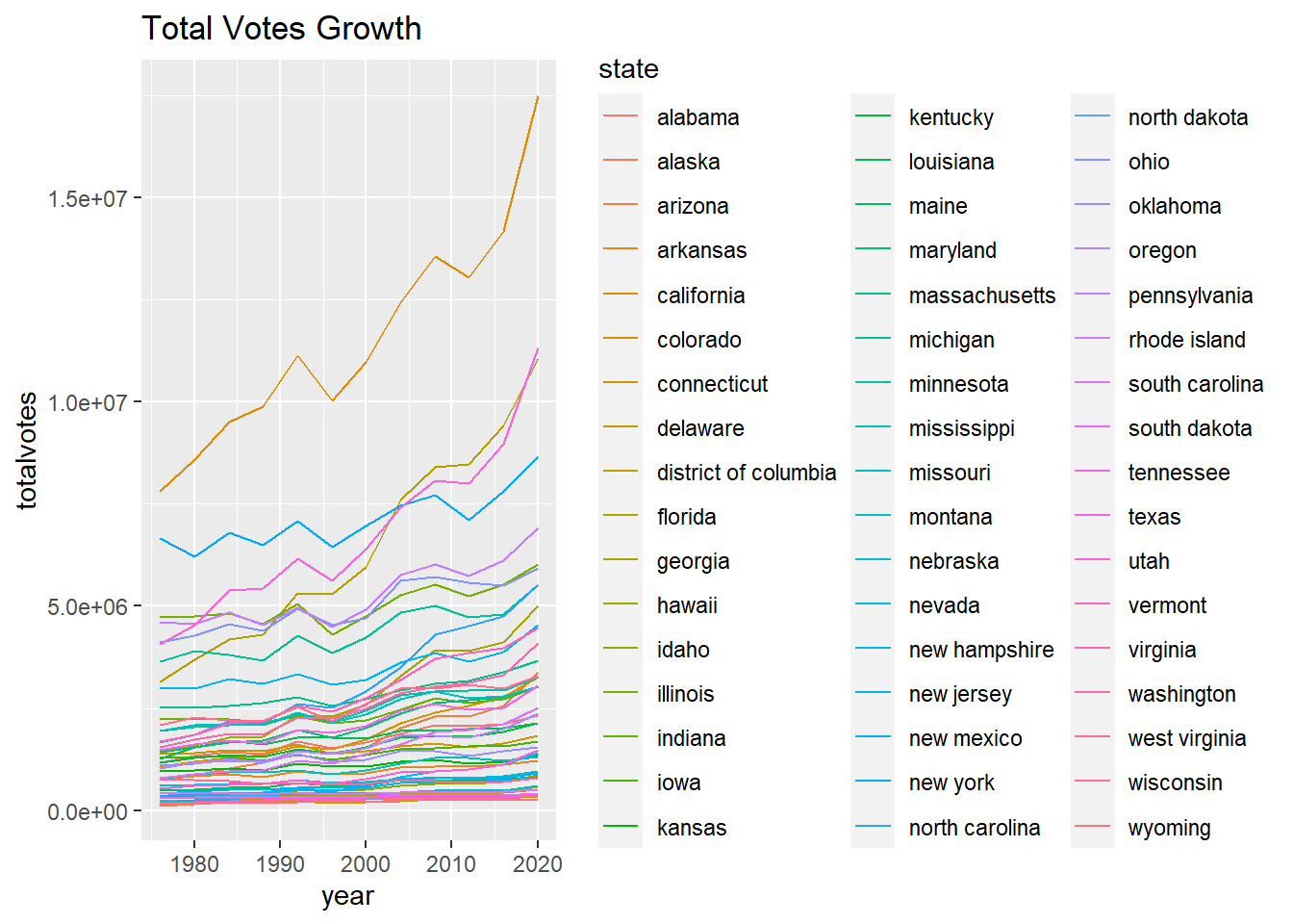
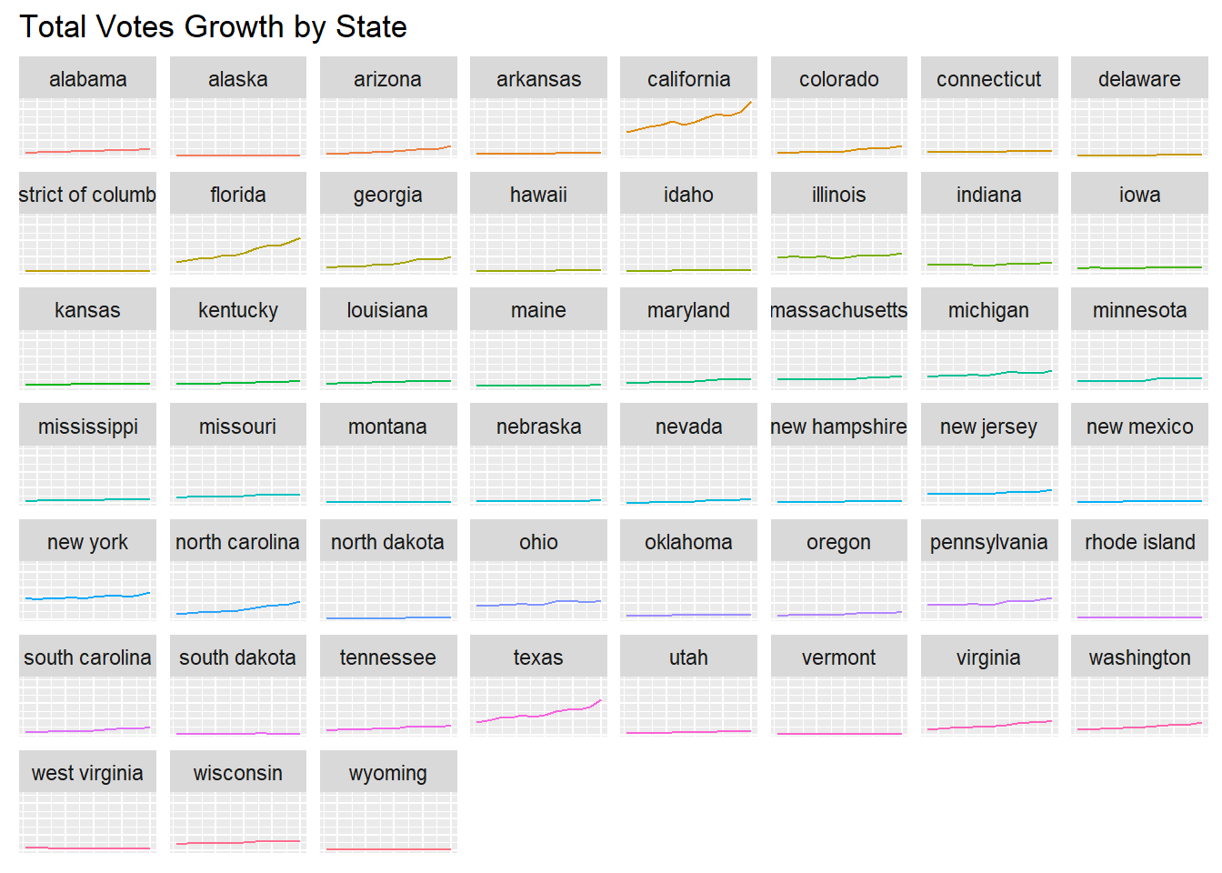
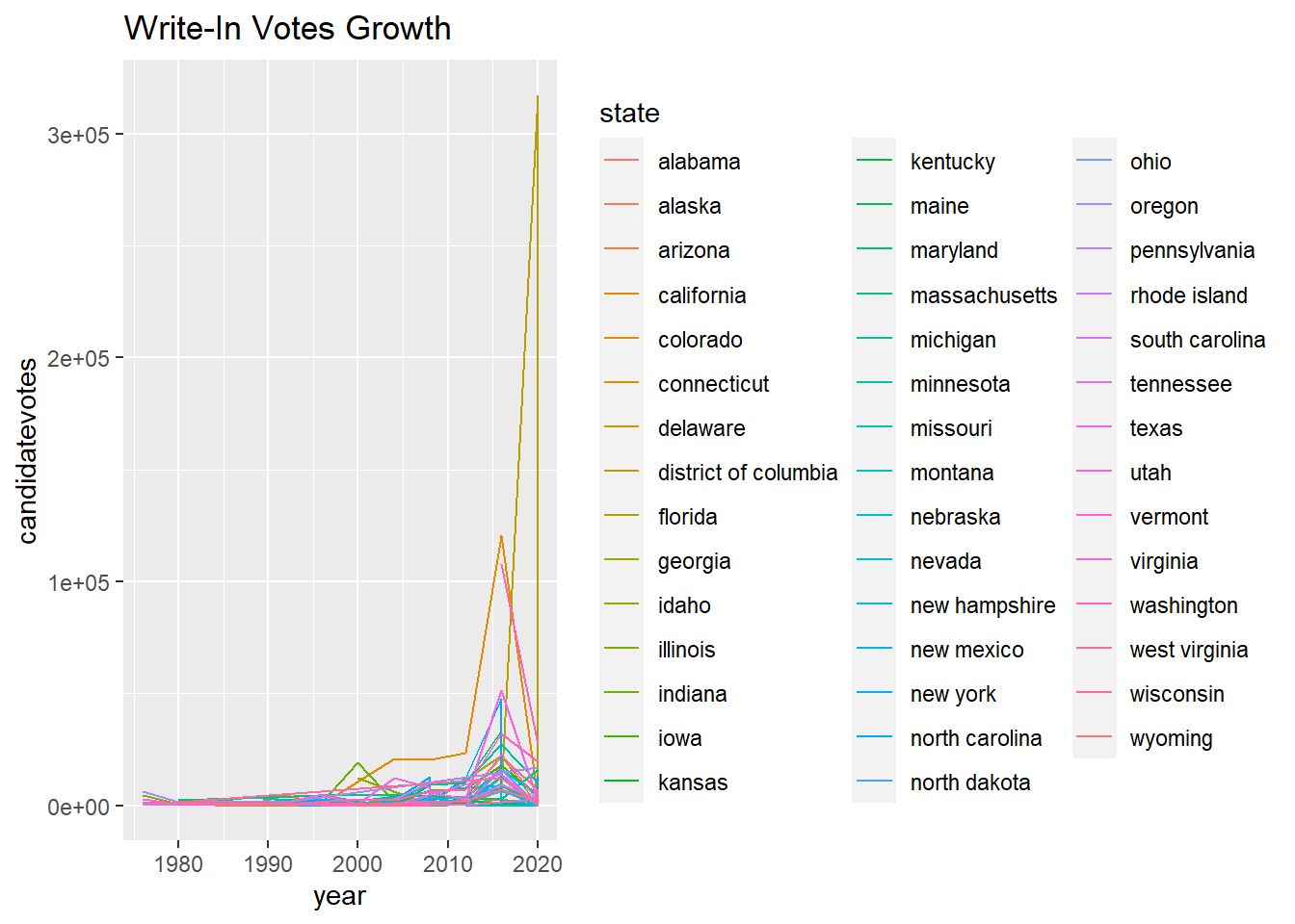
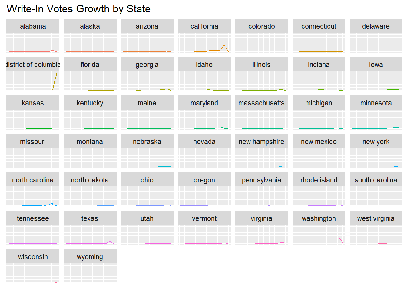
The following 2 visualizations represent the same data. the first of two represent all the data on a singular graph to better show the outliers in growth, while the second of the two represents each state individually.
Step #1: Create data frame total_votes_data to represent totalvotes for each state and year.
The following to visualizations are completed in a similar manner to #3 & #4, but instead of using totalvotes, we are using the number of Write-In votes.
Step #1: Create data frame writein_votes_data which represents how many write-in votes were recorded for each state in each election year.
`geom_line()`: Each group consists of only one observation.
ℹ Do you need to adjust the group aesthetic?
`geom_line()`: Each group consists of only one observation.
ℹ Do you need to adjust the group aesthetic?
`geom_line()`: Each group consists of only one observation.
ℹ Do you need to adjust the group aesthetic?
`geom_line()`: Each group consists of only one observation.
ℹ Do you need to adjust the group aesthetic?
Analysis
Visualization #1:
From a purely visual interpretation, visualization #1 can give us insight into which states have larger electorates than others. It is clear to see that states on the coasts or states on the exterior parts of the US have more voters than states in the interior. This makes sense due to the fact that the majority of larger cities and population centers are in states closer to the ocean/boarders, while states in the interior tend to have smaller populations because of the nature of that land being the “breadbasket”, where most of the agricultural production takes place. There are 4 states in the visualization that stand out as outliers to having larger voting populations. These states are Florida, Texas, California & New York. This makes sense due to the fact that these states contain some of the largest cities in the US, with NYC containing the #1 largest city, NYC, with a population of ~8.8 Million people as of the 2020 census. California follows closely behind with the second largest city, Los Angeles, with a population of ~3.9 Million people as of the 2020 Census. Texas has the 4th largest city Houston, and Florida contains the 12th largest and 44th largest cities, Jacksonville and Miami, respectively. (infoplease)
Visualization #2:
While it would make sense to assume that states with larger populations have a disproportional impact in determining the outcome of elections, according to visualization #2 as well as the actual results of national elections, this assumption would be incorrect and not supported by the visualization. If we look at the four states mentioned above, while there are instances where the outcome of the states popular vote did match up with the outcome of the election, like California going Republican ’80 & ’84 for Reagan, this did not match up with California’s majority of Republican in ’76, and the winner of the election Jimmy Carter for the Democrats. This is only one example of the states, but this is true for all of the other big states. They do tend to match the results of the national election, but it is not consistent enough to say that there is a correlation between the states with total votes determining the outcome of the election.
Visualization #3 & #4:
These visualizations help support my conclusion for visualization #1. This is because I concluded that the 4 states with the most total votes were California, Texas, New York, and Florida had the 4 highest total votes, and through visualizations #3 & #4, its is clearer to see that these states are the outliers compared to the rest of the states. Not only that, but these visualizations also show that compared to the other states in the US, the total amount of voters in these states is also growing more than the other 46 states, meaning that as time goes on, these 4 states will contribute more and more to the total popular vote.
Another Conclusion you can pull from these visualizations is that states with notably large cities like North Carolina with Charlotte and Illinois with Chicago, these cities are also growing with total votes, unlike states with notably small cities like Montana or Nebraska are staying rather constant.
Visualization #5 & #6:
In order to answer the question of the satisfaction of the electorate with the current state of the electoral system, I have decided to use the amount & growth of write-in votes as the marker for said satisfaction/dissatisfaction.
The main conclusion that I made from these visualizations comes from visualization #5. this visualization clearly shows that going into the 2012 election, voters were beginning to write-in votes way more than they had in the past, and then would decrease down towards the 2020 election meaning that for the second election of Obama and the electoral race between Clinton and Trump, people were not satisfied with the candidates that were available to them.
What makes this statistic more interesting is that the outliers for this data were California, Texas, and Washington DC. While I can understand that California and Texas had higher values due to the conclusions that we made above about their higher total voters, Washington DC makes an ironic point. The voters in the district have the least amount of representation in government and yet they are the most dissatisfied with the presidential candidates. I just find that to be interesting.
Future additions/improvements
While I think the work I have done here is a great start, I think there is a lot of additions I can make.
First, I think that the addition of population data would give me more insight into the types of voters who are voting and the amount of eligible voters who are/aren’t voting. If I were to have included this data or found a data set with this data included, I could have created visualizations that were not just total votes, but total votes per capita (of eligible voters), I could have a better understanding of the trust in the voting system and understand how many people who can vote are voting.
Second, I think it would be helpful to have been able to add an overlay of the electoral college results on top of the popular vote election results. This would have allowed me to compare the differences between the two and possibly allow me to conclude which of the two systems is better representative of the electorate.
Conclusion
In Conclusion, This project allowed me to explore the world of R and data visualization, and see the possibilities that these tools have to offer. This project also allowed me to better understand presidential election data and what it can show.
There is a lot more work that can be done on this project to make more concrete conclusions, and I plan to continue this research into the future. There are millions of more data sets available on the internet to join into the data I have already compiled, and more complexity I can create. Not only that, but with the addition of statistical analysis, which I plan to include in the future, I will be able to make more concrete conclusions about the realities of presidential election data.
MIT Election Data and Science Lab, 2017, “U.S. President 1976–2020”, https://doi.org/10.7910/DVN/42MVDX, Harvard Dataverse, V6, UNF:6:4KoNz9KgTkXy0ZBxJ9ZkOw== [fileUNF]