library(tidyverse)
library(ggplot2)

knitr::opts_chunk$set(echo = TRUE, warning=FALSE, message=FALSE)Challenge 5
challenge_5
cereal
Anirudh Lakkaraju
Introduction to Visualization
Read in data
df <- read_csv("_data/cereal.csv")dim(df)[1] 20 4colnames(df)[1] "Cereal" "Sodium" "Sugar" "Type" head(df)# A tibble: 6 × 4
Cereal Sodium Sugar Type
<chr> <dbl> <dbl> <chr>
1 Frosted Mini Wheats 0 11 A
2 Raisin Bran 340 18 A
3 All Bran 70 5 A
4 Apple Jacks 140 14 C
5 Captain Crunch 200 12 C
6 Cheerios 180 1 C Briefly describe the data
The dataset on cereals comprises 20 instances and 5 attributes, which include the cereal name, sodium and sugar amounts per serving, a categorical attribute denoting cereal type, and a numerical attribute indicating the health rating of the cereal. The data is arranged in a tabular format where each row represents a distinct cereal, and each column contains information about the cereal. The dataset covers various types of cereals, including well-known brands such as Frosted Flakes, Raisin Bran, and Cheerios. It can be utilized to scrutinize the nutritional aspects of breakfast cereals and compare different types of cereals by analyzing their sodium and sugar content.
Tidy Data (as needed)
Data is already tidy. Just have to check for missing values.
#Check for missing values
sum(is.na(df))
[1] 0head(df)# A tibble: 6 × 4
Cereal Sodium Sugar Type
<chr> <dbl> <dbl> <chr>
1 Frosted Mini Wheats 0 11 A
2 Raisin Bran 340 18 A
3 All Bran 70 5 A
4 Apple Jacks 140 14 C
5 Captain Crunch 200 12 C
6 Cheerios 180 1 C Univariate Visualizations
An intriguing facet of this dataset that warrants investigation is the distribution of sodium levels in cereals. To achieve a more informative histogram that accurately displays outliers, I opted to set the binwidth at 10 instead of the default value of 30. This prevented the histogram from appearing oversimplified and allowed for better visualization of the outliers.
ggplot(df, aes(x = Sodium)) + geom_histogram(binwidth = 10) + ggtitle("Cereal Sodium content")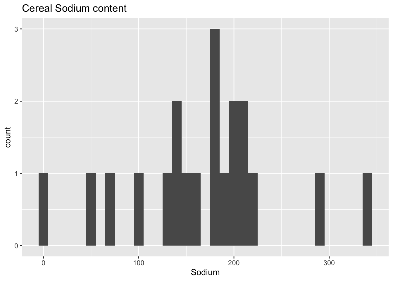
I opted for a histogram as it provides an overall understanding of the data distribution, which can be useful in identifying noteworthy outliers that warrant further exploration.
Upon analyzing the histogram, we can observe a few outliers, with some cereals exhibiting exceptionally low sodium levels, while others have extremely high sodium levels.
To see if there is a similar trend in the sugar content, we can compare it to the histogram of the sugar levels.
ggplot(df, aes(x = Sugar)) + geom_histogram(binwidth = 9) + ggtitle("Cereal Sugar Content")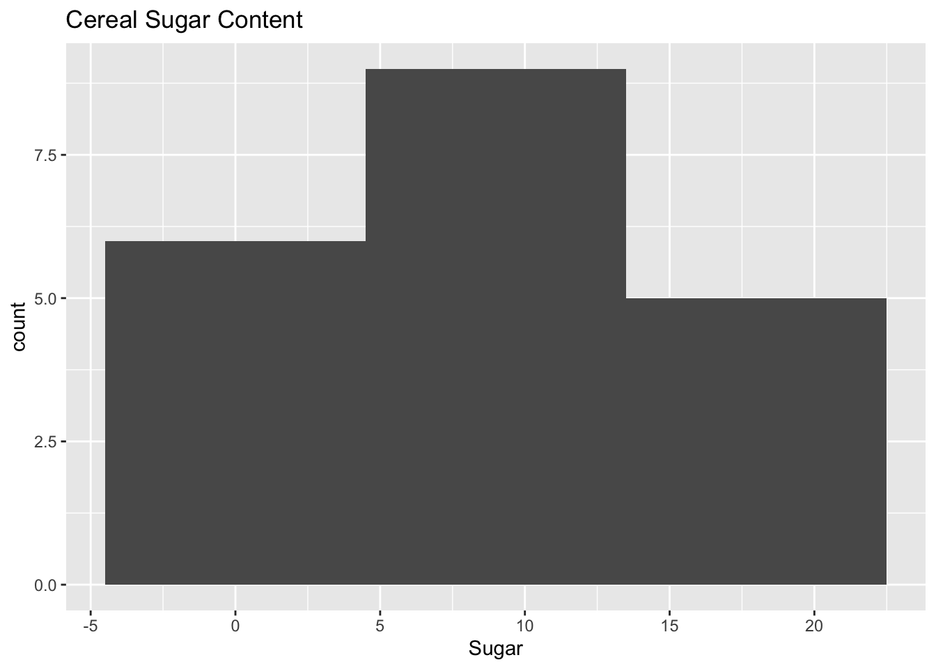
Compared to the previous histogram, this one appears to be more tightly packed. There doesn’t seem to be any significant outliers concerning sugar content, as most cereals have a value of approximately 10.
Bivariate Visualization(s)
ggplot(data = df)+ geom_point(mapping = aes(x = Sodium, y = Sugar,col=Type)) + ggtitle("Sugar vs. Sodium Content")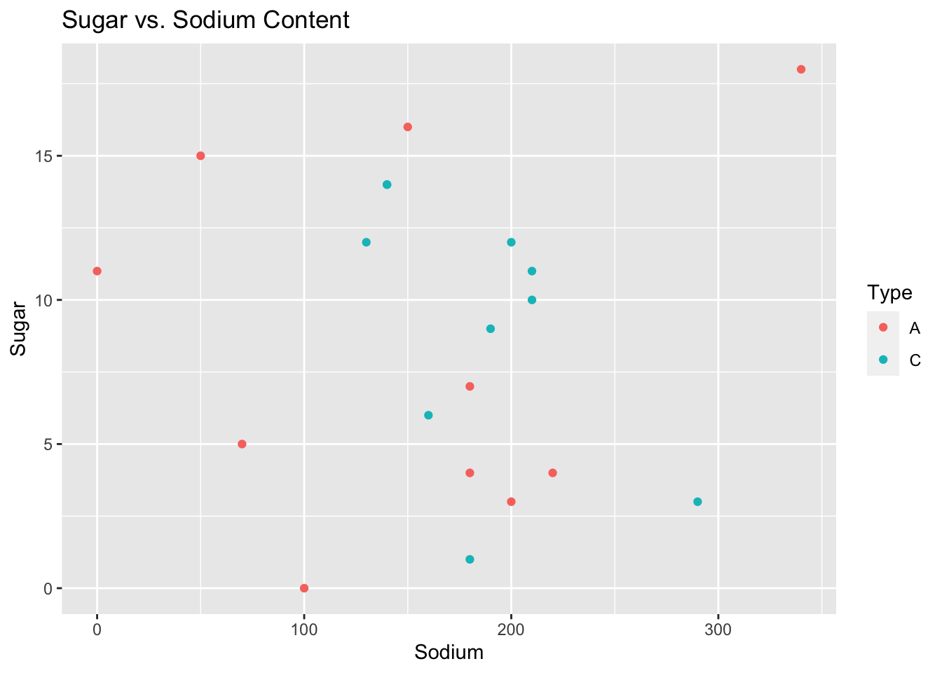
A scatter plot of sugar and sodium per cup in breakfast cereals is a useful visualization tool that can provide insights into the relationship between these two nutrient components in the cereal dataset. It can reveal patterns, correlations, and outliers, helping to determine the strength and direction of the relationship between sugar and sodium content in cereals.