library(tidyverse)
library(ggplot2)

knitr::opts_chunk$set(echo = TRUE, warning=FALSE, message=FALSE)
Challenge 5
challenge_5
FNU Avinesh Krishnan
Cereal
Introduction to Visualization
Challenge Overview
Today’s challenge is to:
- read in a data set, and describe the data set using both words and any supporting information (e.g., tables, etc)
- tidy data (as needed, including sanity checks)
- mutate variables as needed (including sanity checks)
- create at least two univariate visualizations
- try to make them “publication” ready
- Explain why you choose the specific graph type
- Create at least one bivariate visualization
- try to make them “publication” ready
- Explain why you choose the specific graph type
R Graph Gallery is a good starting point for thinking about what information is conveyed in standard graph types, and includes example R code.
(be sure to only include the category tags for the data you use!)
Read in data
Read in one (or more) of the following datasets, using the correct R package and command.
- cereal.csv ⭐
- Total_cost_for_top_15_pathogens_2018.xlsx ⭐
- Australian Marriage ⭐⭐
- AB_NYC_2019.csv ⭐⭐⭐
- StateCounty2012.xls ⭐⭐⭐
- Public School Characteristics ⭐⭐⭐⭐
- USA Households ⭐⭐⭐⭐⭐
cerealdata <- read_csv("~/Desktop/601_Spring_2023/posts/_data/cereal.csv")Briefly describe the data
head(cerealdata)# A tibble: 6 × 4
Cereal Sodium Sugar Type
<chr> <dbl> <dbl> <chr>
1 Frosted Mini Wheats 0 11 A
2 Raisin Bran 340 18 A
3 All Bran 70 5 A
4 Apple Jacks 140 14 C
5 Captain Crunch 200 12 C
6 Cheerios 180 1 C dim(cerealdata)[1] 20 4colnames(cerealdata)[1] "Cereal" "Sodium" "Sugar" "Type" str(cerealdata)spc_tbl_ [20 × 4] (S3: spec_tbl_df/tbl_df/tbl/data.frame)
$ Cereal: chr [1:20] "Frosted Mini Wheats" "Raisin Bran" "All Bran" "Apple Jacks" ...
$ Sodium: num [1:20] 0 340 70 140 200 180 210 150 100 130 ...
$ Sugar : num [1:20] 11 18 5 14 12 1 10 16 0 12 ...
$ Type : chr [1:20] "A" "A" "A" "C" ...
- attr(*, "spec")=
.. cols(
.. Cereal = col_character(),
.. Sodium = col_double(),
.. Sugar = col_double(),
.. Type = col_character()
.. )
- attr(*, "problems")=<externalptr> ncol(cerealdata)[1] 4In the dataset we observe the presence of four variables: the name of the cereal, the sodium and sugar contents, and a categorical label assigned to each entry referred to as “Type.” Although the specific differentiation between the various types remains unclear at this stage, it is evident that the dataset encompasses cereals categorized as type A and C
Tidy Data (as needed)
Is your data already tidy, or is there work to be done? Be sure to anticipate your end result to provide a sanity check, and document your work here.
There seems to be no need for any data tidying the dataset. We can see that there are no missing values and no variables with irrelevant values that need to be eliminated.
Are there any variables that require mutation to be usable in your analysis stream? For example, do you need to calculate new values in order to graph them? Can string values be represented numerically? Do you need to turn any variables into factors and reorder for ease of graphics and visualization?
Document your work here.
Univariate Visualizations
ggplot(cerealdata, aes(x = Sugar, fill = factor(Type))) +
  geom_histogram(binwidth = 5) +
  labs(title = "The amount of Sugar Content in Cereals") +
  scale_fill_manual(values = c("red", "blue"))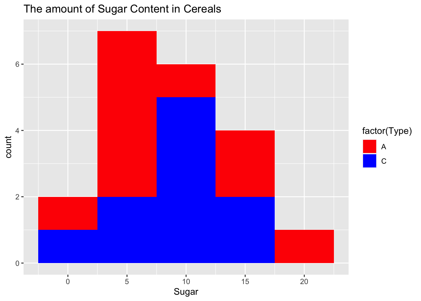
ggplot(cerealdata, aes(x = Sodium, fill = factor(Type))) +
  geom_histogram(binwidth = 5) +
  labs(title = "The amount of Sodium Content in Cereals") +
  scale_fill_manual(values = c("blue", "red"))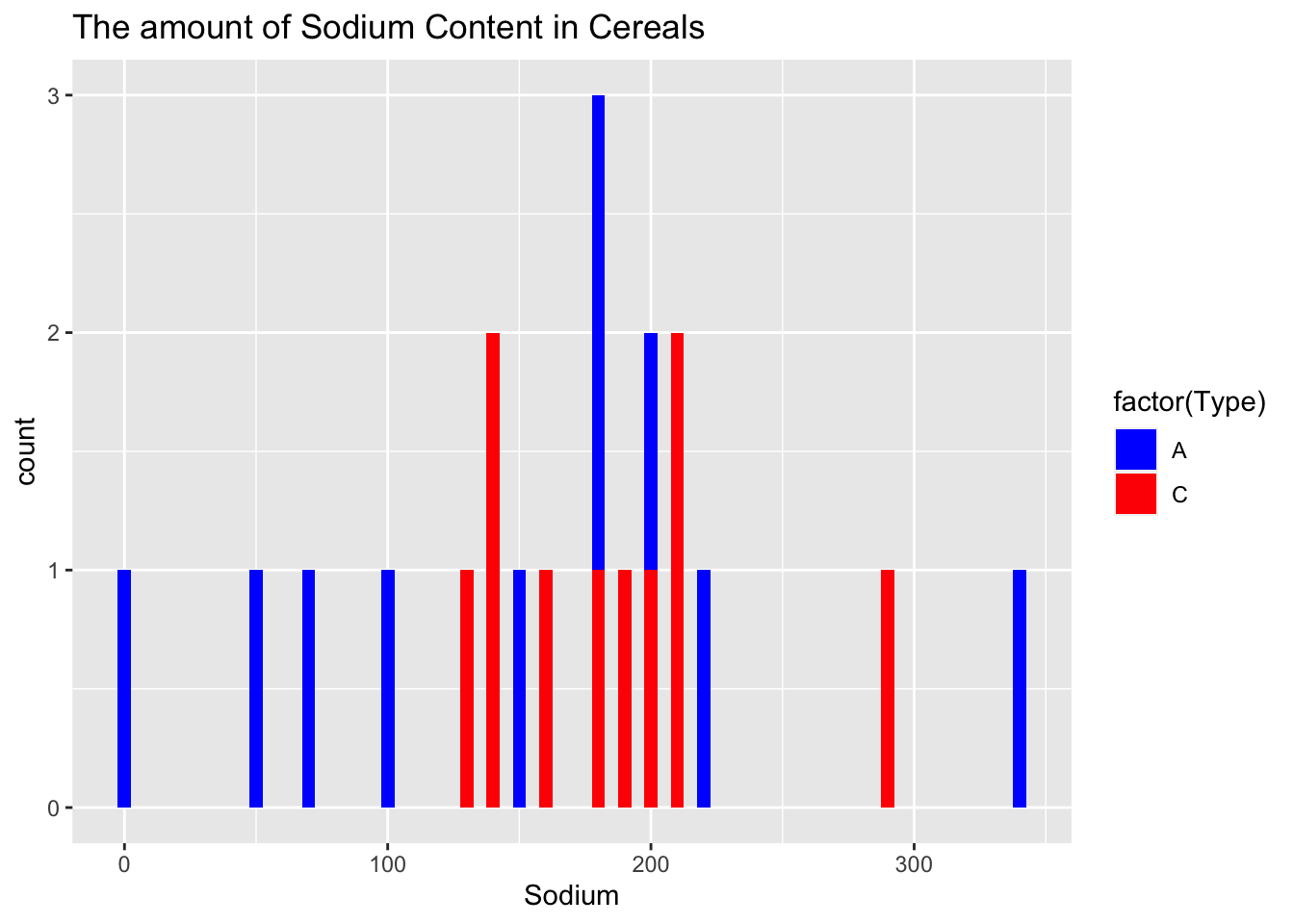
Bivariate Visualization(s)
ggplot(data = cerealdata) +
  geom_point(mapping = aes(x = Sodium, y = Sugar, color = factor(Type))) +
  labs(title = "The amount of sodium vs sugar") +
  scale_color_manual(values = c("red", "blue"))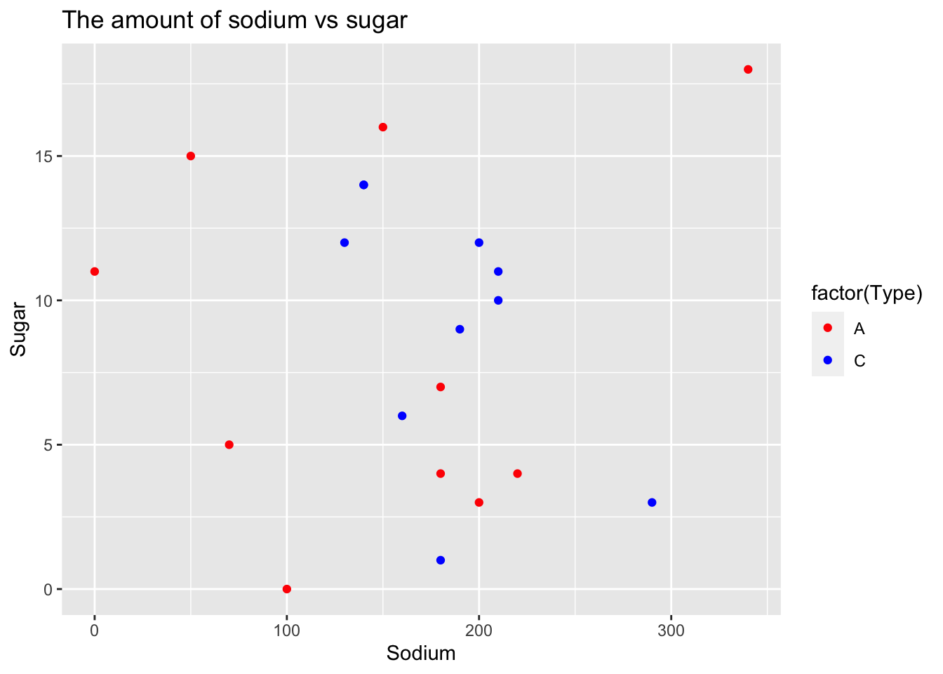
By observing the scatter plot, it is evident that the majority of data points are clustered around the median sodium level, with a few outliers on either side. On the other hand, the sugar content in cereals exhibits a wide range of variation. This observation aligns with the expected pattern, where cereals targeting children tend to have significantly higher sugar content, while cereals marketed towards adults are generally considered “healthy” and contain considerably less sugar.
ggplot(cerealdata, aes(Type, Sugar, fill = Type)) +
  geom_boxplot() +
  labs(title = "Amount of Sugar in Cereal by Type")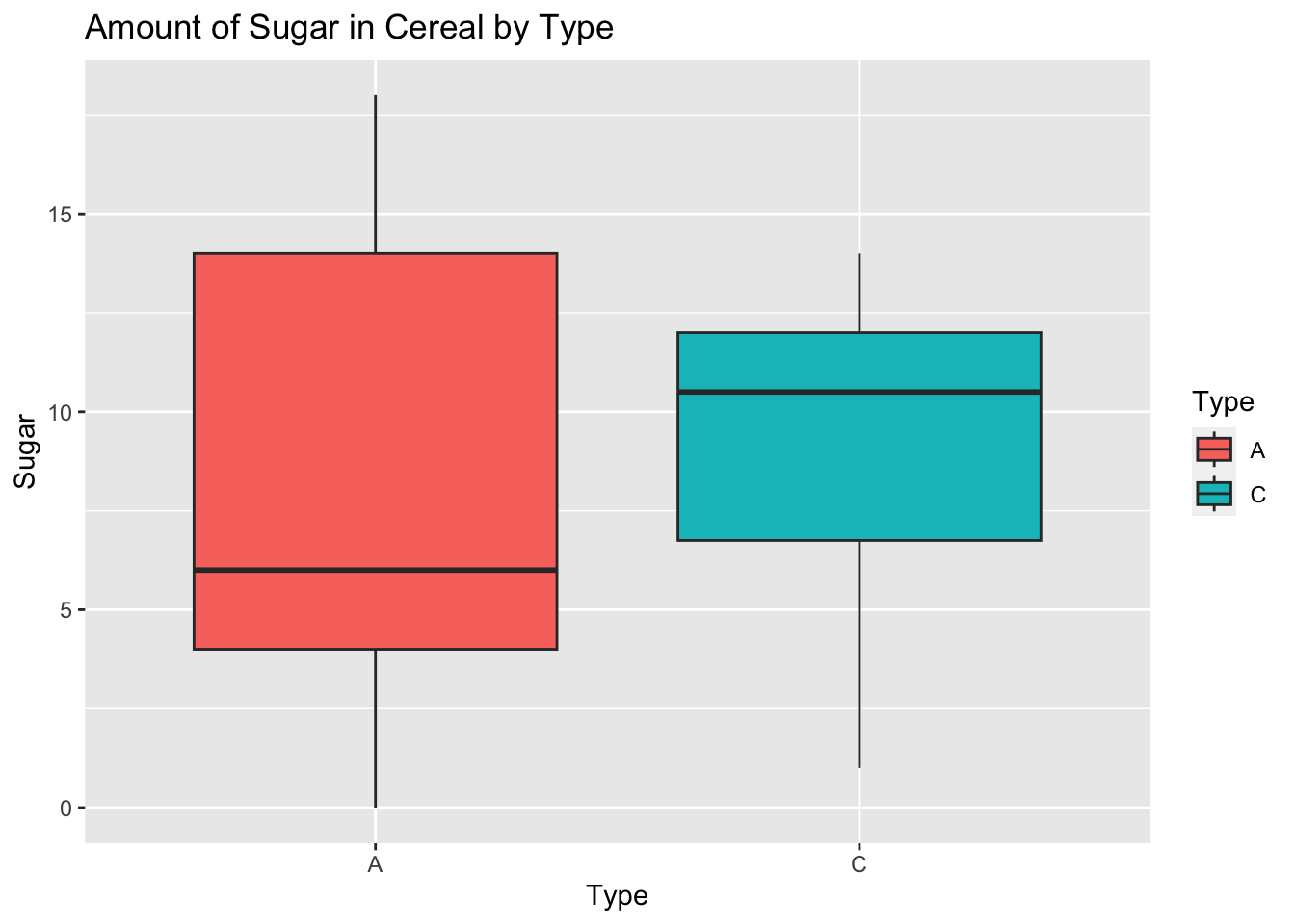
In the data, the sugar content in children’s cereal is higher compared to adult cereal.